A Fashion Designer Renovates to Match Her Style
An awkward space turns sanctuary with a few simple ideas
When a long apartment search finally ended, Victoria’s Secret designer Christine Yao returned to one of the first listings already crossed off her list. It was the one she ultimately closed on, and she was happy with her new home—except for her bathroom which felt like showering in a dark closet. An internet search led her to Sweeten and a match with a general contractor, who would help transform the space to echo the layout and feel of the baths she’d been pinning on Pinterest for months. With smart space reconfigurations (including a vintage sliding door) and good project management, he made it happen. In her own words, Christine tells the story, from how the thought of renovating scared her to the completion of her relaxing new dwelling.

Guest post by East Village homeowner Christine Yao
I had been living on the Lower East Side for about five years when I started looking for a place to own. My weekends became a routine, waking up and planning errands around my StreetEasy open house schedule and any listings my real estate agent sent me. The beginning was packed, usually a few on Saturday and also Sundays when I walked all over downtown and viewed up to six apartments. You quickly realize that when you are focused on staying in a specific area—for me that was roughly LES/Chinatown/East Village—there are a limited number of places to see. At first, it seemed like there were hundreds of apartments for sale, and maybe 50 you can afford. You feel like half of the 50 may not even be worth seeing from the photos but you go see them anyway. A friend who had gone through the home-buying process made a comparison to online dating—one can only tell so much from the photos, you just have to go and see it in person to really know! A few months in, I had lost out on two places, and felt a little hopeless.
“No place is going to be everything you want it to be, so why not budget some remodeling in and make it what you want?”
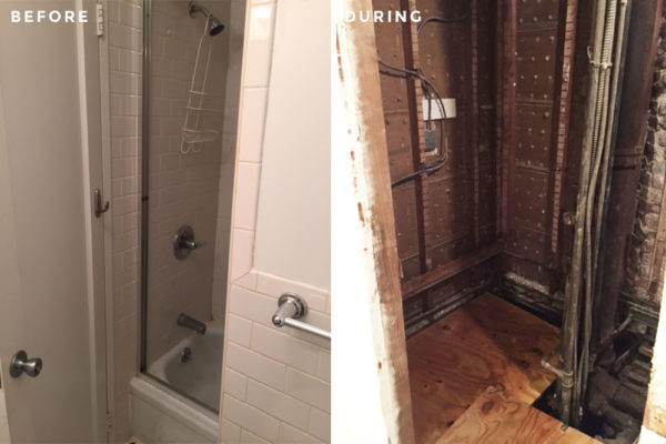
Then, finally, six months after I started looking, I had an accepted offer and closed on a co-op in the East Village. I had actually seen this apartment at the very beginnings of my search. My brother was in town on a Sunday when I dragged him from one open house to another. We thought the apartment was in an awesome location, and was a nice size. It needed some cosmetic work, but both agreed the bathroom was terrible. It had a wall right in the middle of it with the bathtub half concealed, so it felt like you were showering in a dark closet. It was cramped, with an awkward layout, and was just in bad shape. So I crossed it off the list. The idea of a bathroom renovation was overwhelming to me, on top of buying my first home. Then six months of searching made me re-think—maybe I could. No place is going to be everything you want it to be, so why not budget some remodeling in and make it what you want?
So now, I had a bathroom to renovate, a living space that needed a refresh, and no idea where to start. The internet brought me to Sweeten. I liked how simple and straightforward it made finding a contractor: you post your project and general contractors are matched for your job. I decided to go with our Sweeten contractor—his work was most similar to the aesthetic I was going for and he had completed a project on Sweeten with a great review.
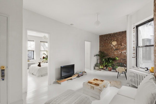
My plan for the entire apartment’s look was minimalist. I love a clean space that still feels warm and cozy. Greek cave hotels and Moroccan riads are a big inspiration for me. I did have a vision of wanting the apartment to feel like a vacation…somewhere tropical and feels relaxing when you are there. The kitchen, main living area, and two bedrooms just needed a redesign. But I couldn’t imagine my day-to-day in the previous bathroom—the door opening awkwardly, the dark shower, and not being able to enjoy a bath.
Sweeten brings homeowners an exceptional renovation experience by personally matching trusted general contractors to your project, while offering expert guidance and support—at no cost to you. Renovate expertly with Sweeten
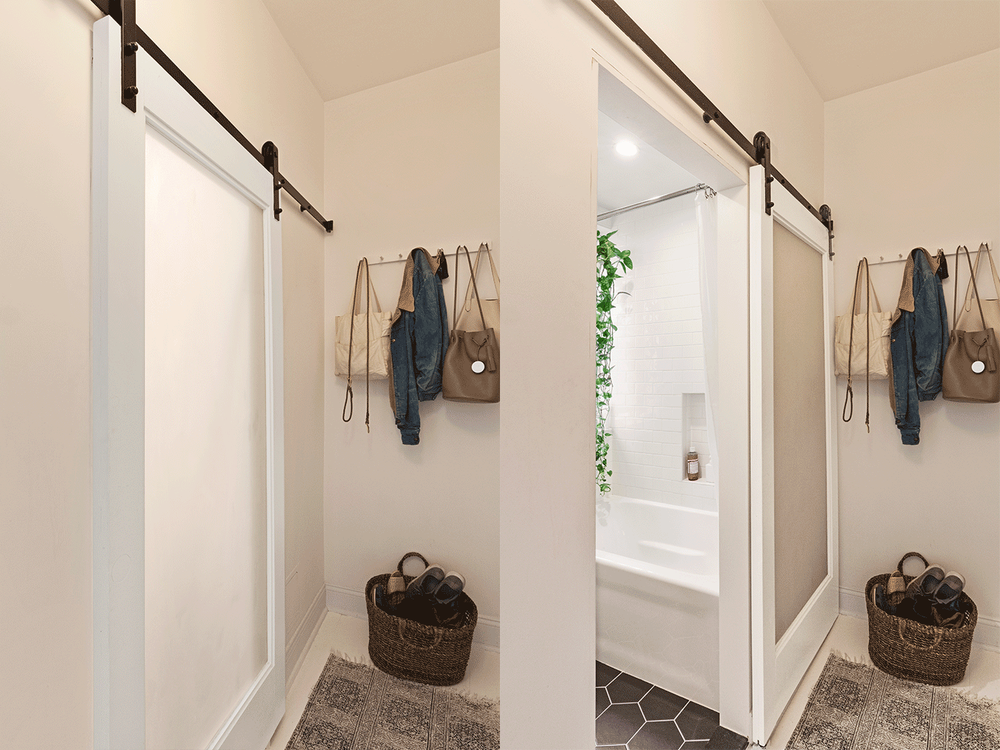
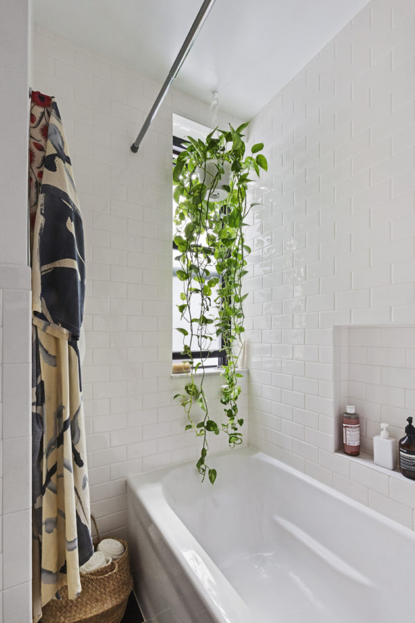
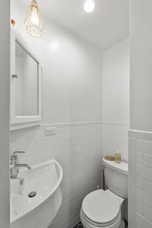
I was hoping the middle wall obstruction could be partially removed but we wouldn’t know if it was structural until the demo. Turns out the wall had all the building plumbing running through it, so needless to say, it had to stay. However, we found serious leaks happening on the floors above and below me (I am on the third floor of a five-story building), which the building would have to fix before we could move forward. Since pipes had to be replaced, the plumbing could be re-routed, allowing us to swap tub and toilet positioning. This worked out for the best: the toilet in a “nook,” and the bathtub by the window.
I had so many images on my desktop saved for ideas and realized they all had the common thread of black tile floors and clean, white walls with modern fixtures. I was getting a lot of inspiration from restaurant and hotel restrooms. I definitely wanted recessed lighting above the toilet (dimmers are a must for all lighting—mood!) and exposed plumbing under the sink for more leg room.
I ended up ordering almost everything on Wayfair, which has phenomenal customer service by the way. I must have looked at hundreds of sinks. We realized it had to be a corner sink or you wouldn’t have enough space to get on and off the toilet. Then the toilet had to be an appropriate size. Measured twice, measure one more time, then cross my fingers when it came in. It all fit into this Tetris game of a bathroom! I wanted a sliding door that would let light through and found an old office door at Big Reuse in Gowanus, Brooklyn. My contractor cut it down to fit the doorway and painted it.
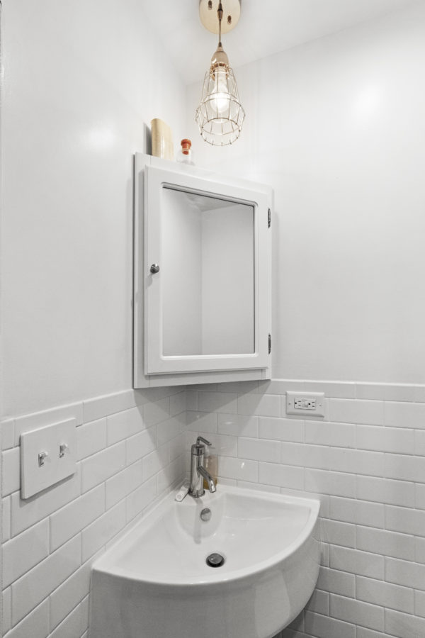
The renovation was running a couple months late due to waiting on permits, so taking things like a toilet and subway tile from Home Depot that were in stock was a priority. My Sweeten contractor was so easy to work with and made things stress-free on everything from dealing with the unexpected delays and permits to coordinating a time to receive a bathtub delivery. I also trusted his aesthetic and opinion on any design or materials questions I had.
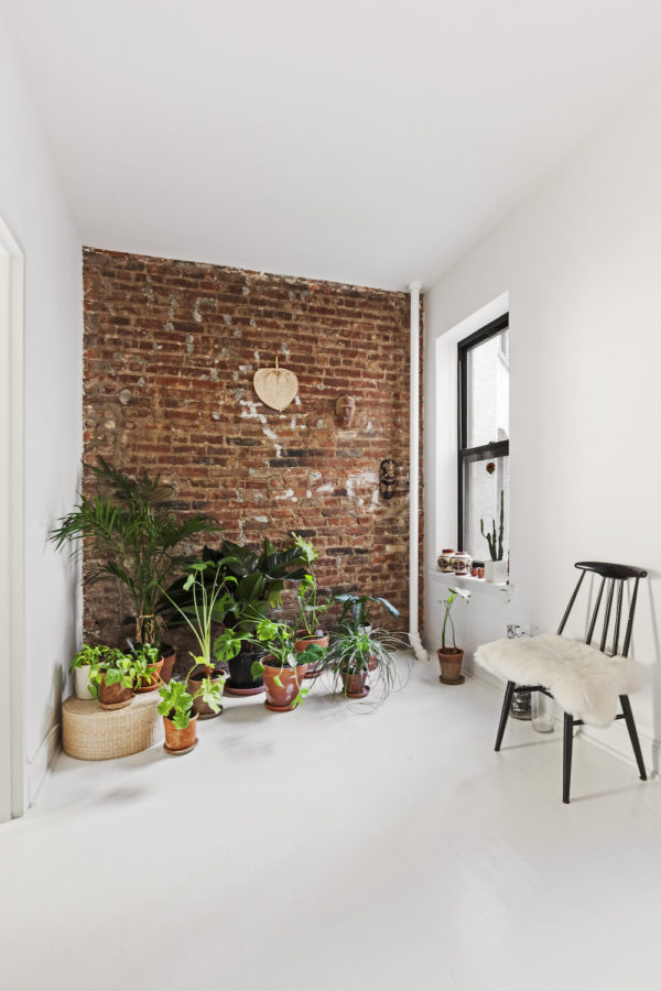
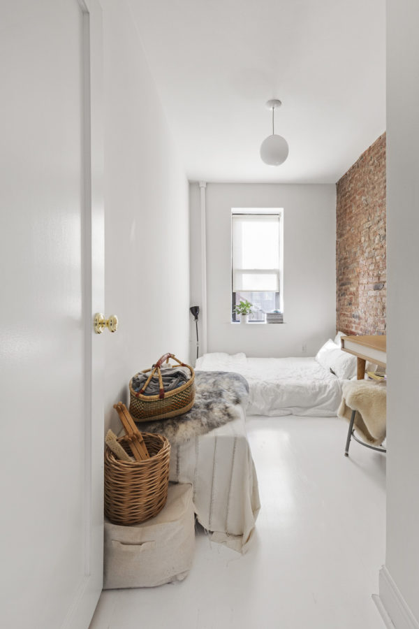
As far as the rest of the apartment, it’s amazing what fresh paint and swapping out things like lighting, doorknobs, and some cabinet doors can do. He did a fantastic painting job and the white floors are my favorite feature of my home. My original budget was $25,000 for renovating the bathroom and repainting the apartment. I ended up going $4,500 overbudget because I live in a co-op. The process of getting permits and running into unforeseen issues with plumbing in-between the floors increased the costs and timeline. A six-week planned renovation turned into three months. I think it was really just me underestimating the cost of labor and materials, especially living here in New York City.
The bathroom turned out better than I could have hoped and I am so thankful for the successful renovation I had with my contractor through Sweeten. Now that I’ve experienced the process, the advice I can offer is to be prepared for it to take longer than you think. And add another month. Be prepared to spend a good chunk of time every day on it—coordinating with your contractor, arranging delivery times, looking for fixtures, going to check on things, etc. Be ready to laugh when things go wrong. And go wrong again. It’ll be worth it when you are enjoying your renovated place, I promise.
Oh, I almost forgot about the kitchen—with all of my budget going to the bathroom and painting, I just took down the cabinet doors myself and painted. That’s a move I’ve done in many apartments I’ve lived in as a renter. It’s functional for now but I can’t wait to renovate this space next!
Thank you Christine, for sharing your story as a first-time homeowner and renovator! You proved that a few renovating ideas can make a big impact, and we love your fresh style.
BATHROOM RESOURCES: EliteTile black matte hexagon floor tile, Caracalla ‘Ceramica’ corner sink, Design House ‘Concord’ medicine cabinet, bathtub, Kohler ‘Purist’ sink faucet, Kohler ‘Purist’ shower fixtures: all from Wayfair. Daltile ‘Rittenhouse Square’ subway tile, Kohler ‘Cimarron’ toilet, sliding door hardware: The Home Depot. Vintage sliding door: Big Reuse. Dimond Home ‘Barrel’ pendant light (above sink): New York Lighting.
APARTMENT RESOURCES: Paint (doors and trim) in Decorator’s White, paint (walls) in White Opulence: Benjamin Moore. Paint (floor) in Decorator White in porch/patio finish: Behr. Progress Lighting ‘Opal’ globe pendant lights: Wayfair. Dimmers throughout: Lutron.
—
Love being surrounded by white bath subway tile? Here’s how first-time renovator Rima injected modern cool into hers.
Sweeten wasn’t the only one who loved what Christine did to her apartment, domino also shared her minimalist chic renovation.
Sweeten handpicks the best general contractors to match each project’s location, budget, scope, and style. Follow the blog for renovation ideas and inspiration and when you’re ready to renovate, start your renovation on Sweeten.
