Exposed Beams and Marble Frame a Luxe Renovation
When advertising executives Lia and Chris Wollen made the leap to homeownership, they didn’t have to go far. A waterfront condo, just four blocks from their Williamsburg rental, called to them with bridge views and appealing amenities. After envisioning the possibility of a townhouse, square footage in the two-bedroom was a concern, but with a stunning kitchen and bathroom renovation, plus strategic spending and saving in a few key spots, Sweeten helped them make this home their own (with time to spare for the arrival of a new baby this winter!). Read on for Lia’s take on this beautiful project.
Guest post by Williamsburg homeowner Lia Wollen
After three years of renting in Williamsburg, the time came to try and buy a place. My husband, Chris, and I hoped to find a spacious townhouse or something bigger than our current place. Planning for a family and wanting outdoor space, we felt that broadening our search to less trendy neighborhoods was our only option. After exploring most of Brooklyn, however, we found that we kept coming back to Williamsburg.
Six months into our search, standing just four blocks south of our rental and looking out at the East River from the roof deck of a two-bedroom on the market, Chris said, “Well, if we can do this, then I want this.” It was a top floor unit with a small terrace off the living room, high ceilings, tons of light, and views of the Domino Sugar Factory, the river, and Manhattan. It came with basement storage, a parking space, and a piece of the private roof deck. Square footage was a concern, and we agreed that we would have to do a renovation before moving in to accommodate long-term needs, but first, the offer. Ours was accepted.
I found Sweeten in a general contractor search online and filled out the project post form to be matched with general contractors. Not too long after that initial search, I saw a blog post like this one, of another gorgeous Sweeten renovation. One of the photos looked right out at the Domino Sugar Factory—a replica of our new view! I realized pretty quickly it was a condo from our building and emailed Sweeten to ask them for the contractor. They connected us with this Sweeten general contractor. We met with him to kick things off and were thrilled with the fit and his vision.
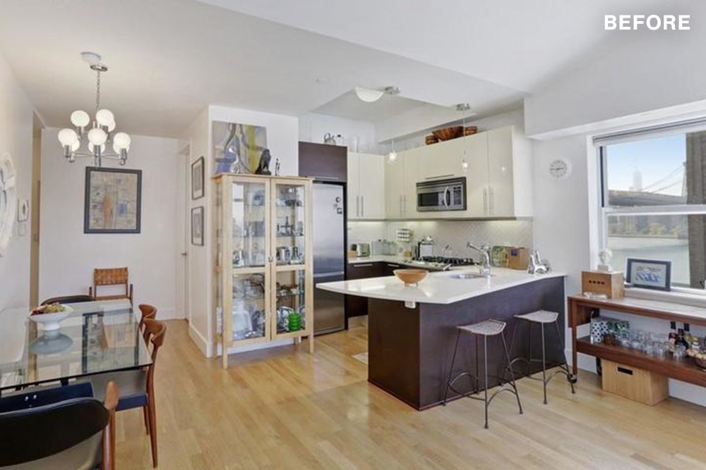
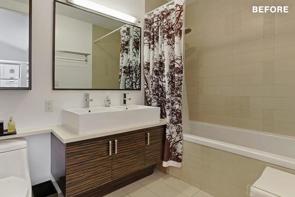
The focus of our renovation was the kitchen and bath. I love to cook and wanted a hard-working, welcoming space to gather in. The bathroom needed a feeling of calm, an escape from the city. Our contractor was strategic with us in his approach. He started big so that we could see the possibilities, and then collectively, we pulled each other back to set reasonable expectations. This process was critical when it came to prioritizing our wants and needs and managing the dollars.
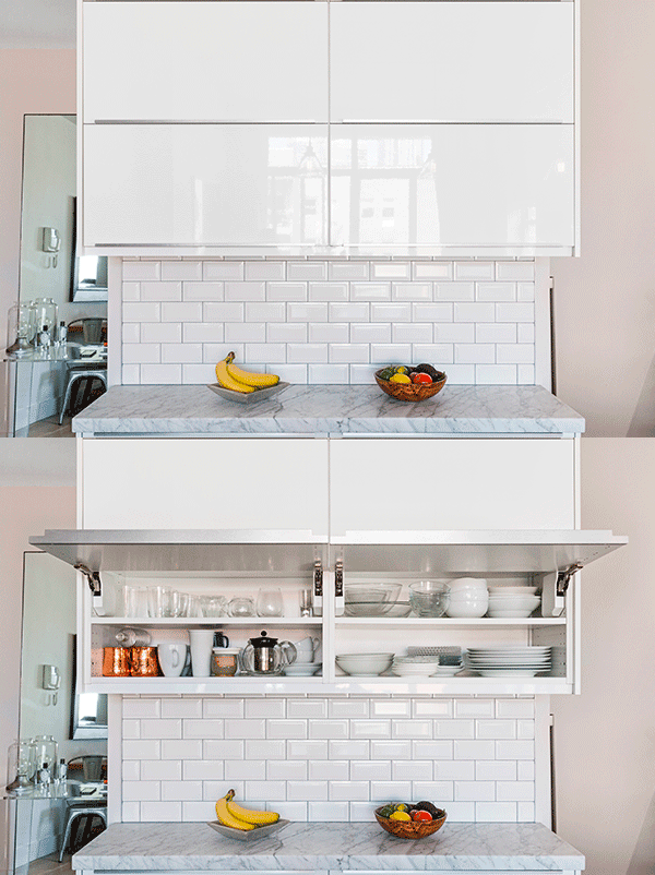
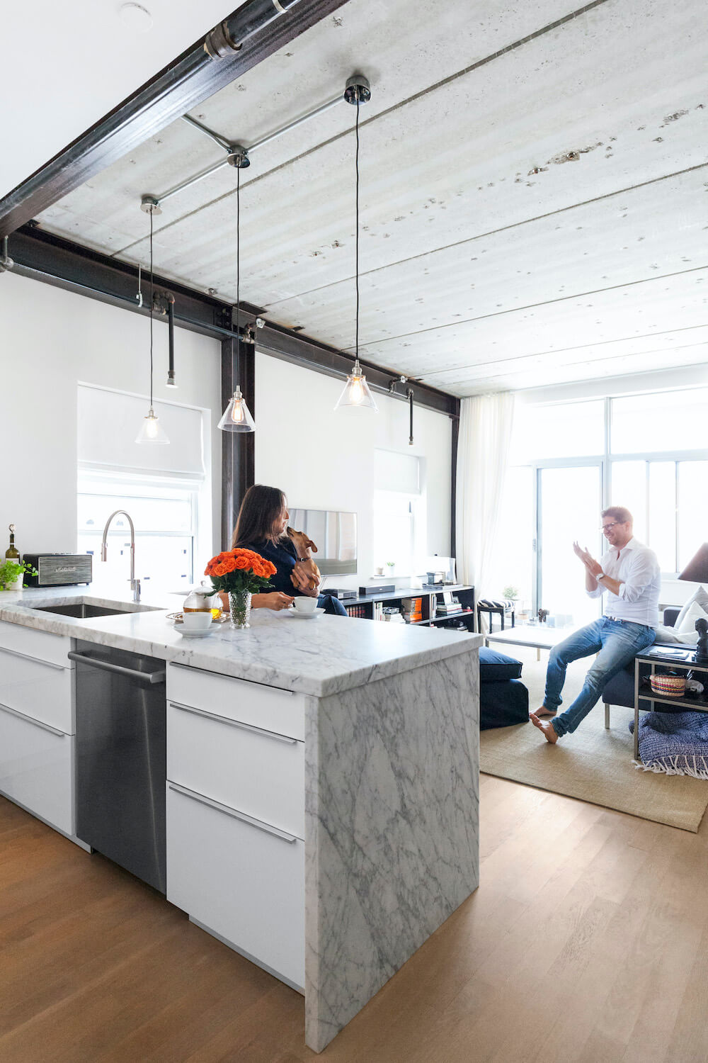
We underestimated the significance of overall design in renovating, but it was the beautiful and technical unifier underneath everything we were trying to accomplish. The contractor addressed the kitchen simply: hide the fridge, fill in the odd angles and edges of the ceiling, and provide more counter/storage space. This blew our minds. It cleaned up the whole space and looked like a kitchen that meant to be there, rather than an afterthought. Sweeten brings homeowners an exceptional renovation experience by personally matching trusted general contractors to your project, while offering expert guidance and support—at no cost to you. Renovate expertly with Sweeten
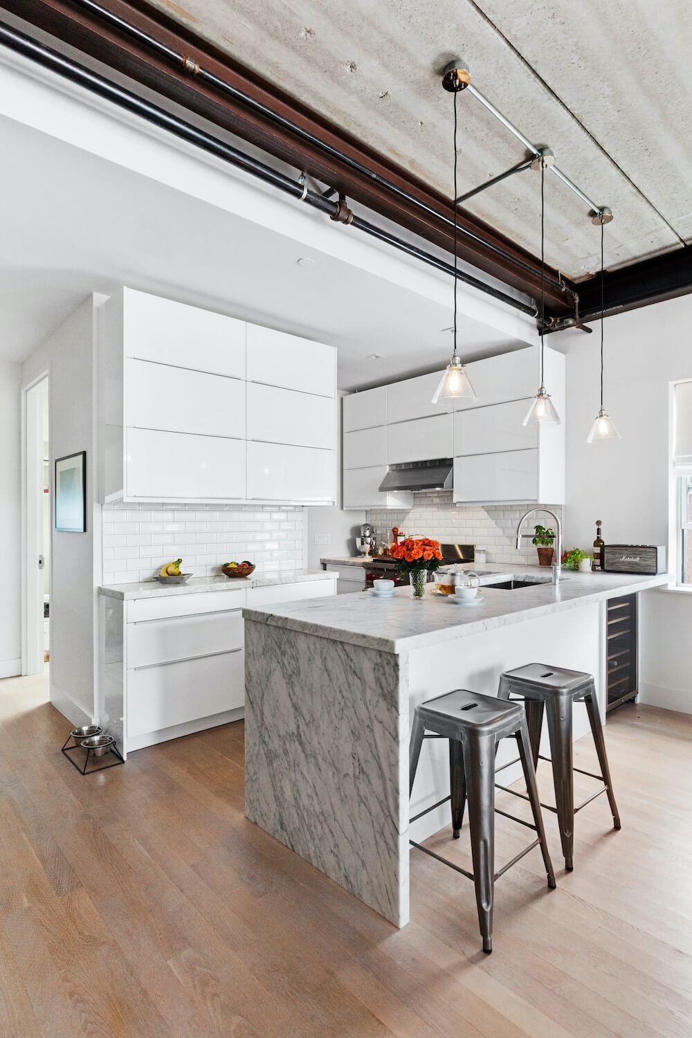
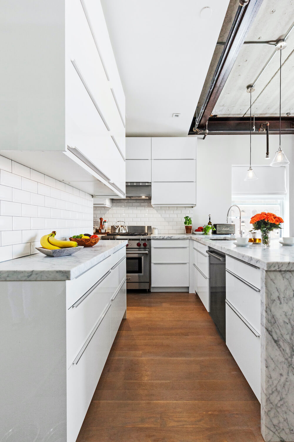
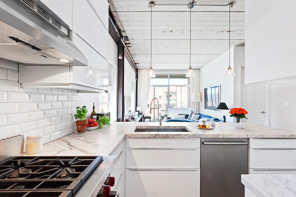
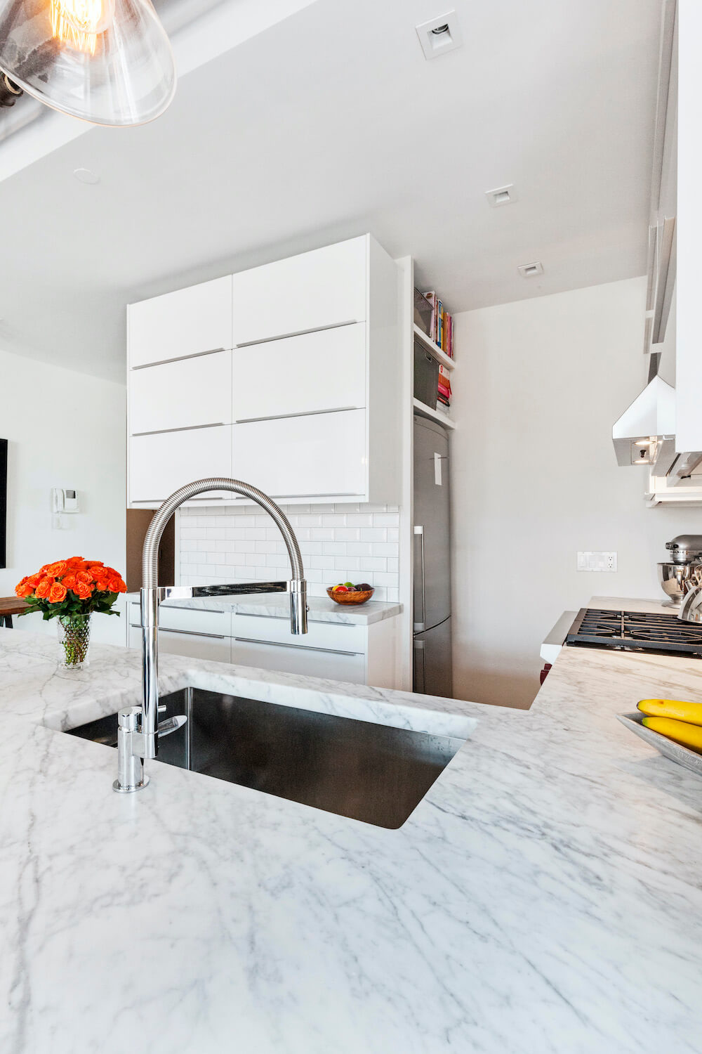
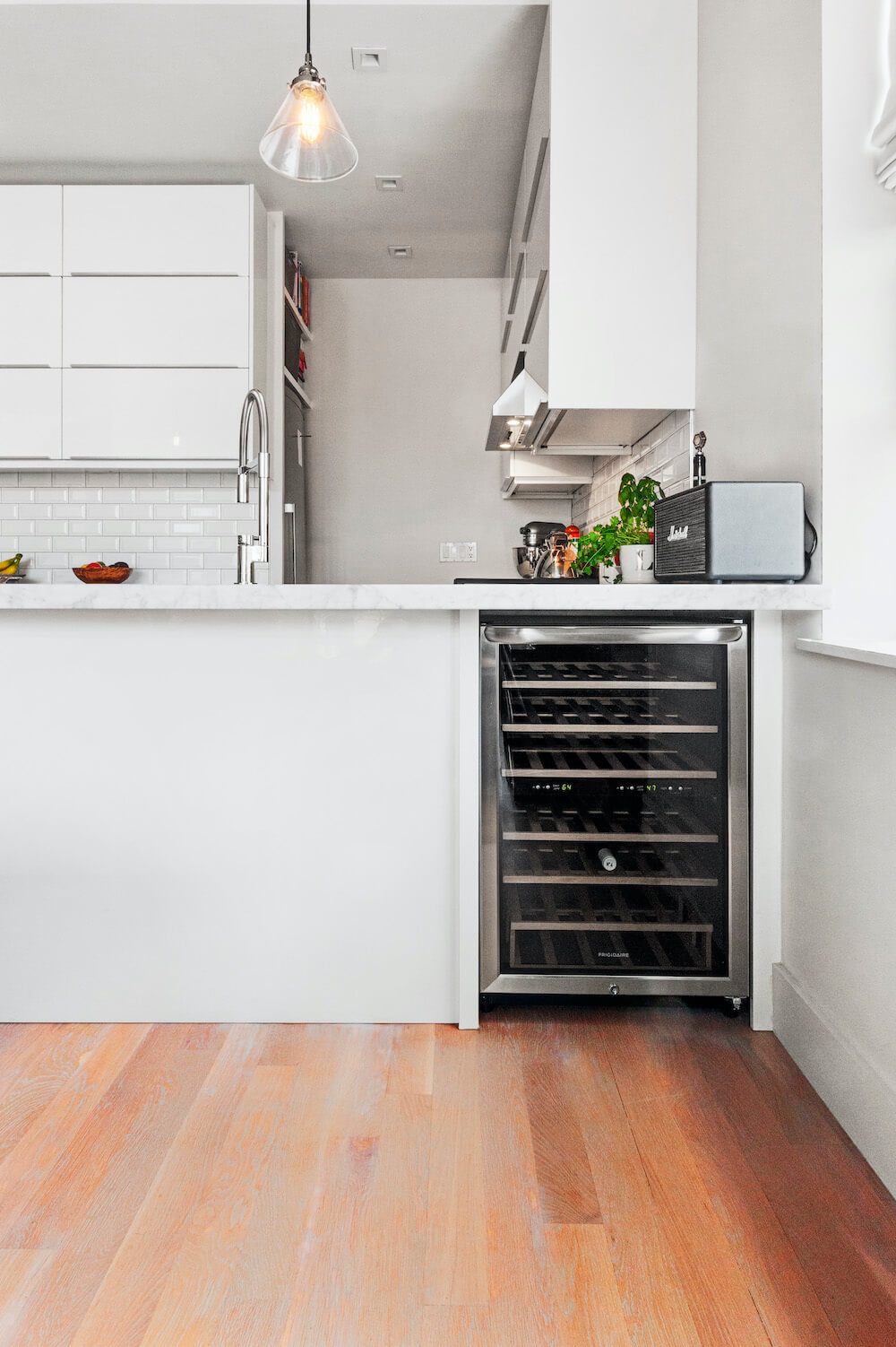
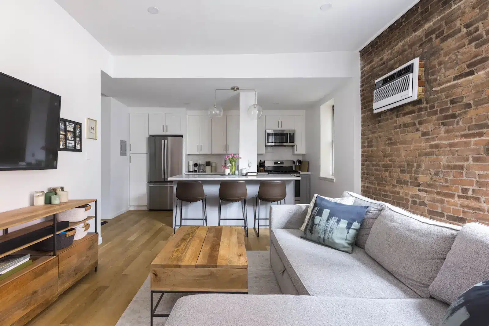
The most exciting proposal from our contractor was to open up the ceiling and expose building beams that were encased in the walls of the kitchen and living room. This eliminated awkward lines and revealed some industrial elements, playing off of the raw materials mirrored across the street at Domino. We achieved separation of living room and kitchen while retaining warmth in the space, by limiting how far we (and our budget) extended the look.
Another small but important detail was the flooring. The contractor and his team buffed out the overly lacquered yellow floors to get back down to raw wood, and we chose a sky gray matte stain.
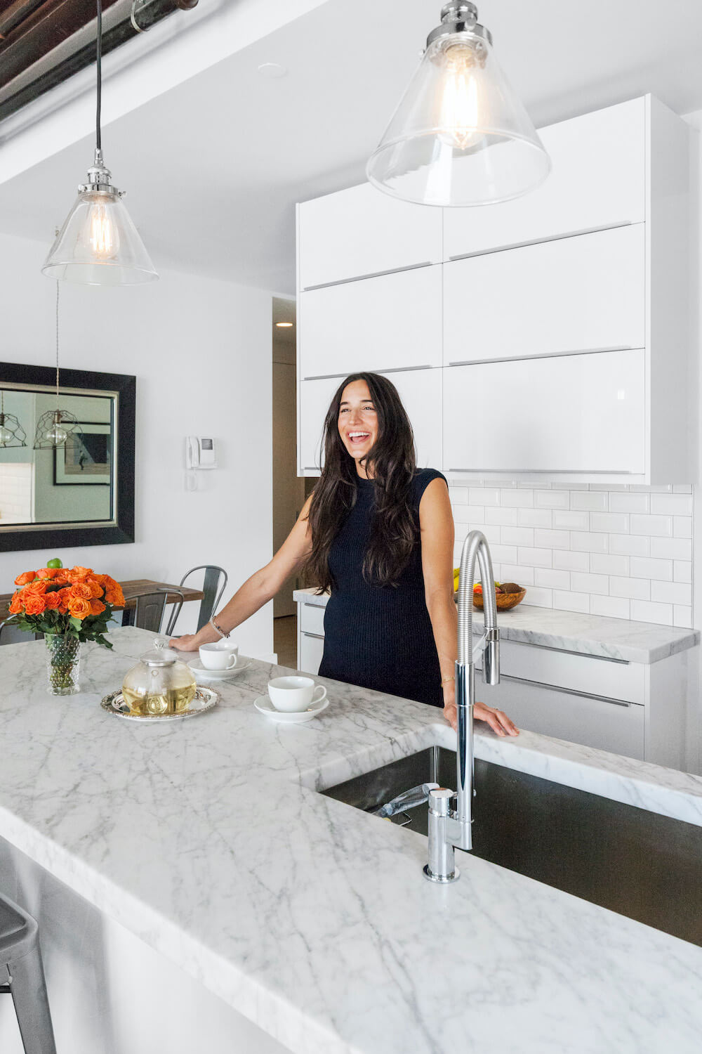
There were other more indulgent decisions made during the planning process, like a wine fridge. This felt like a low-cost, high-impact amenity you don’t typically get in the city and we were very excited about it. Chris insisted from day one that we have a garbage disposal, so that was non-negotiable. We also debated and ultimately agreed to a waterfall edge for the kitchen countertops. Our contractor had strongly recommended this as a focal point when entering the home, and he was absolutely right.

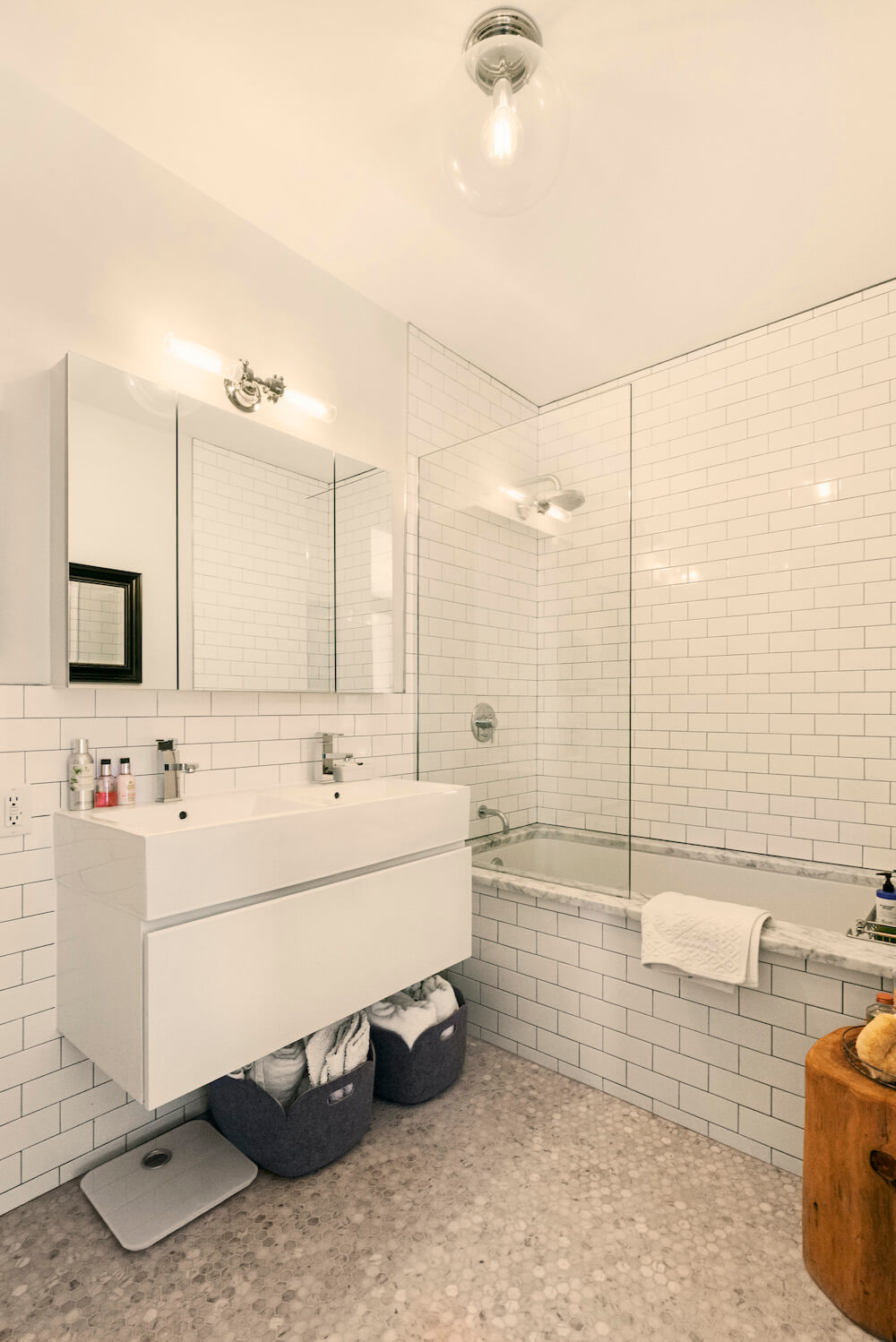
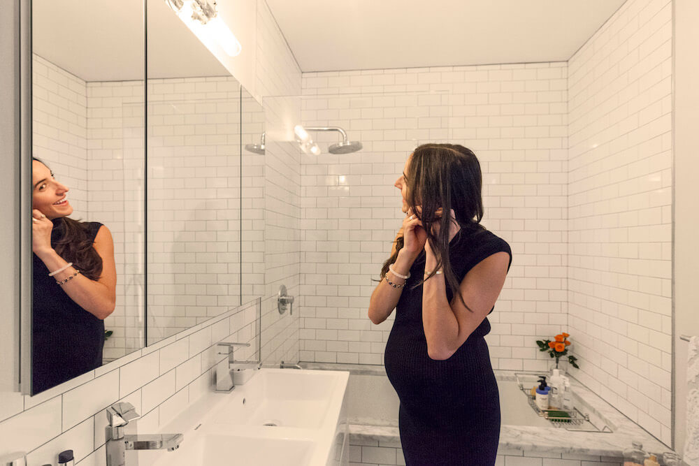
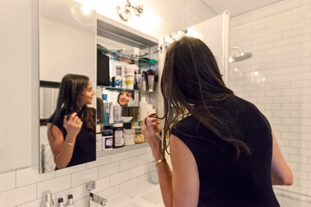
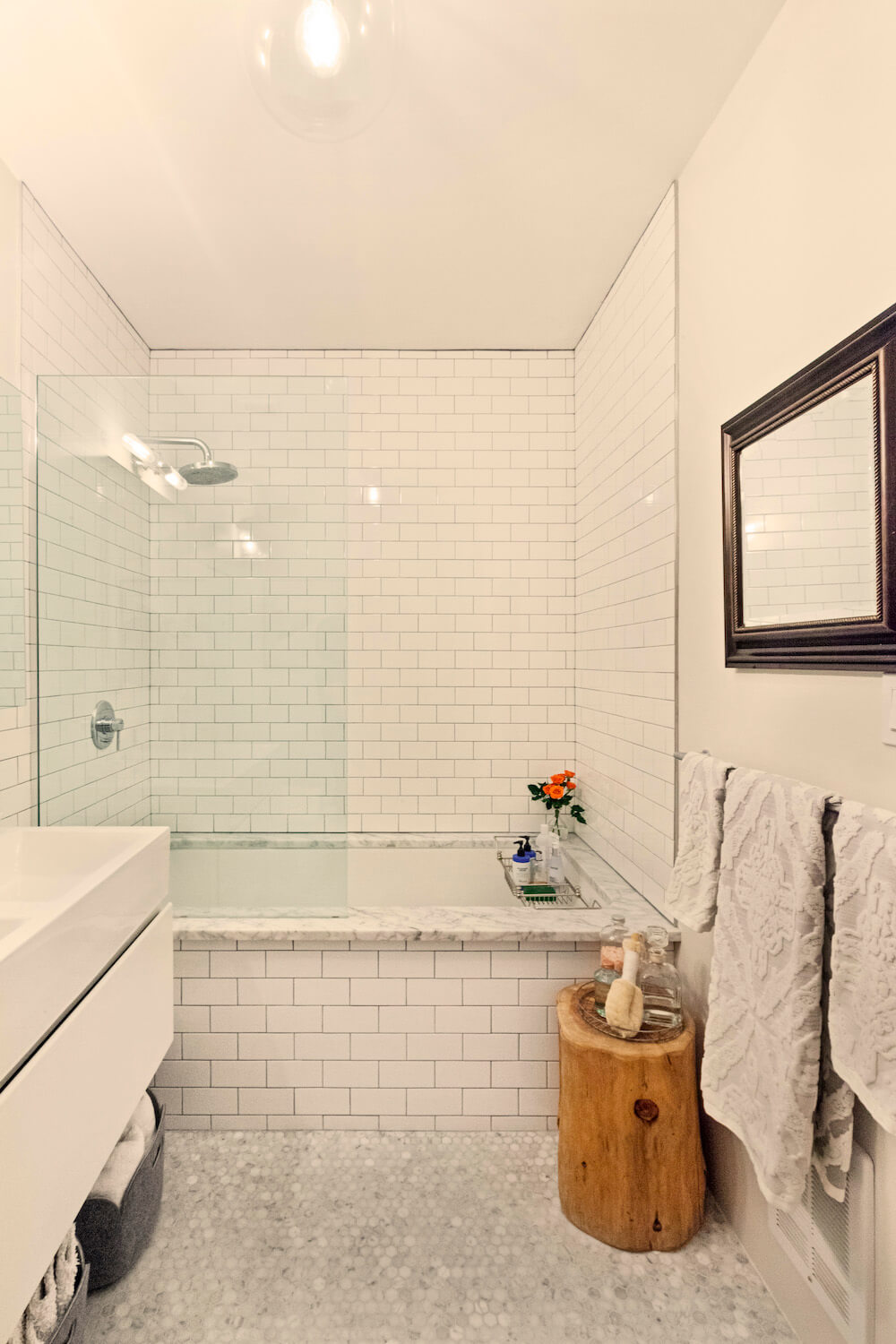
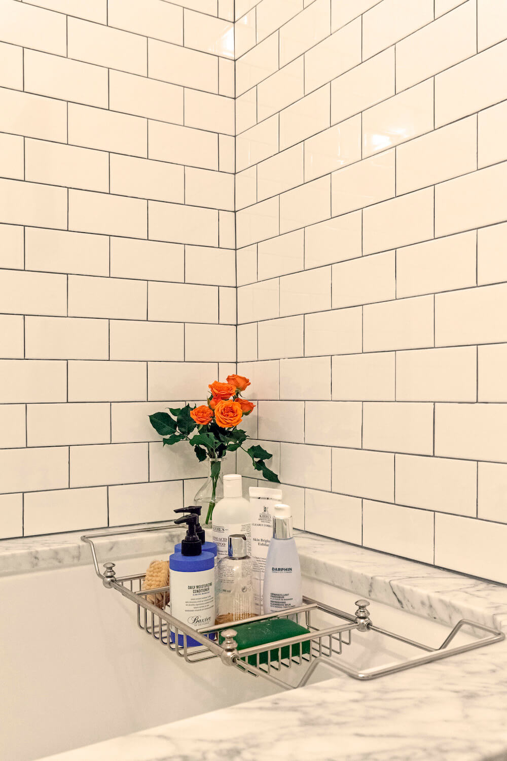
For the bath, we kept the tub, sink, and hardware, but had everything retiled. We used leftover marble from the kitchen for the tub and installed a glass shower partition to open up the small space. We also built a new medicine cabinet and drawer for the sink to accommodate storage, and I found some new light fixtures to modern it up a bit.
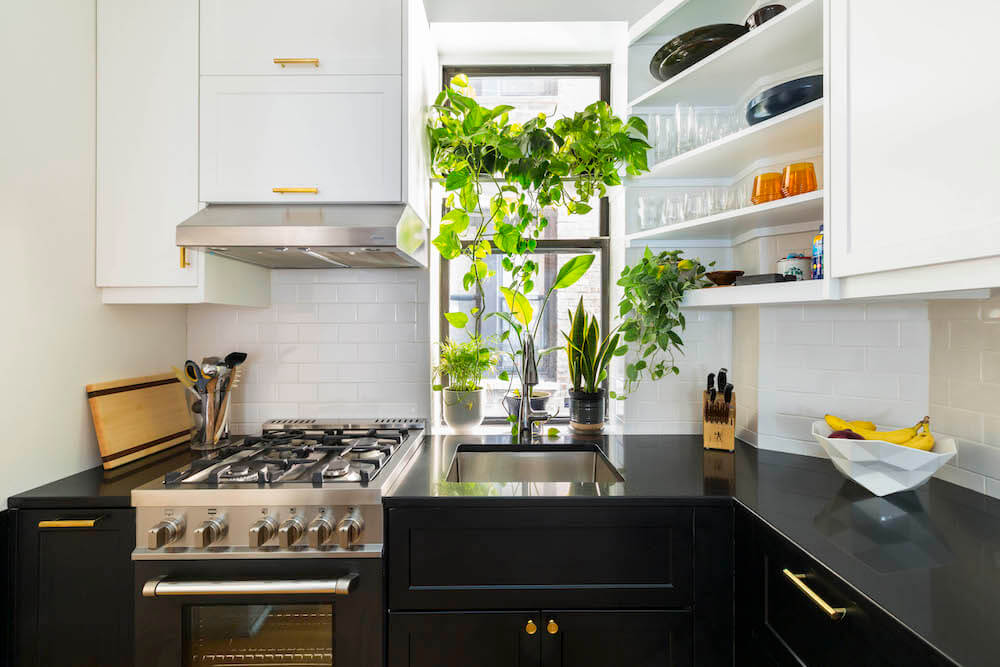
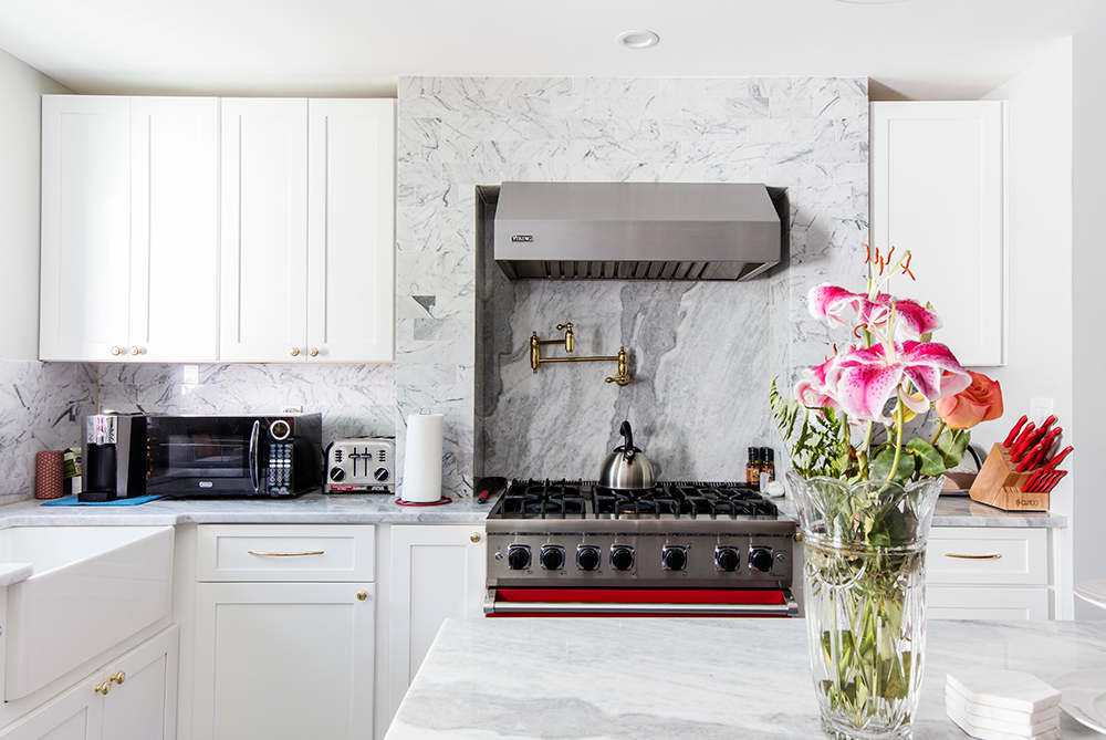
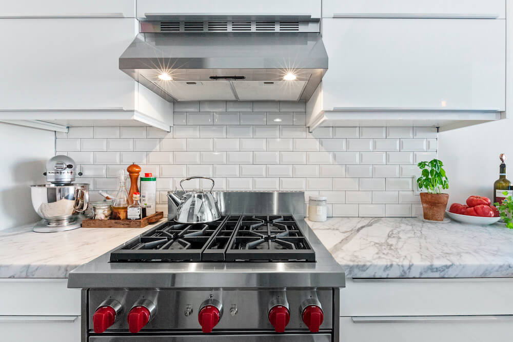
Chris and I have a very similar aesthetic, so choosing materials, appliances, and fixtures was pretty straightforward. Before construction, I spent a lot of time pulling looks and materials from home and design websites, so we had a strong point of view right away. My must-have was a Wolf Range with the iconic red knobs. Snobby, kinda, but an important design element in an otherwise minimalist kitchen. The thing is also a weapon! (Chris started a grease fire the first time we used it.) Keeping in line with the stainless steel, we also bought a new Bosch dishwasher.
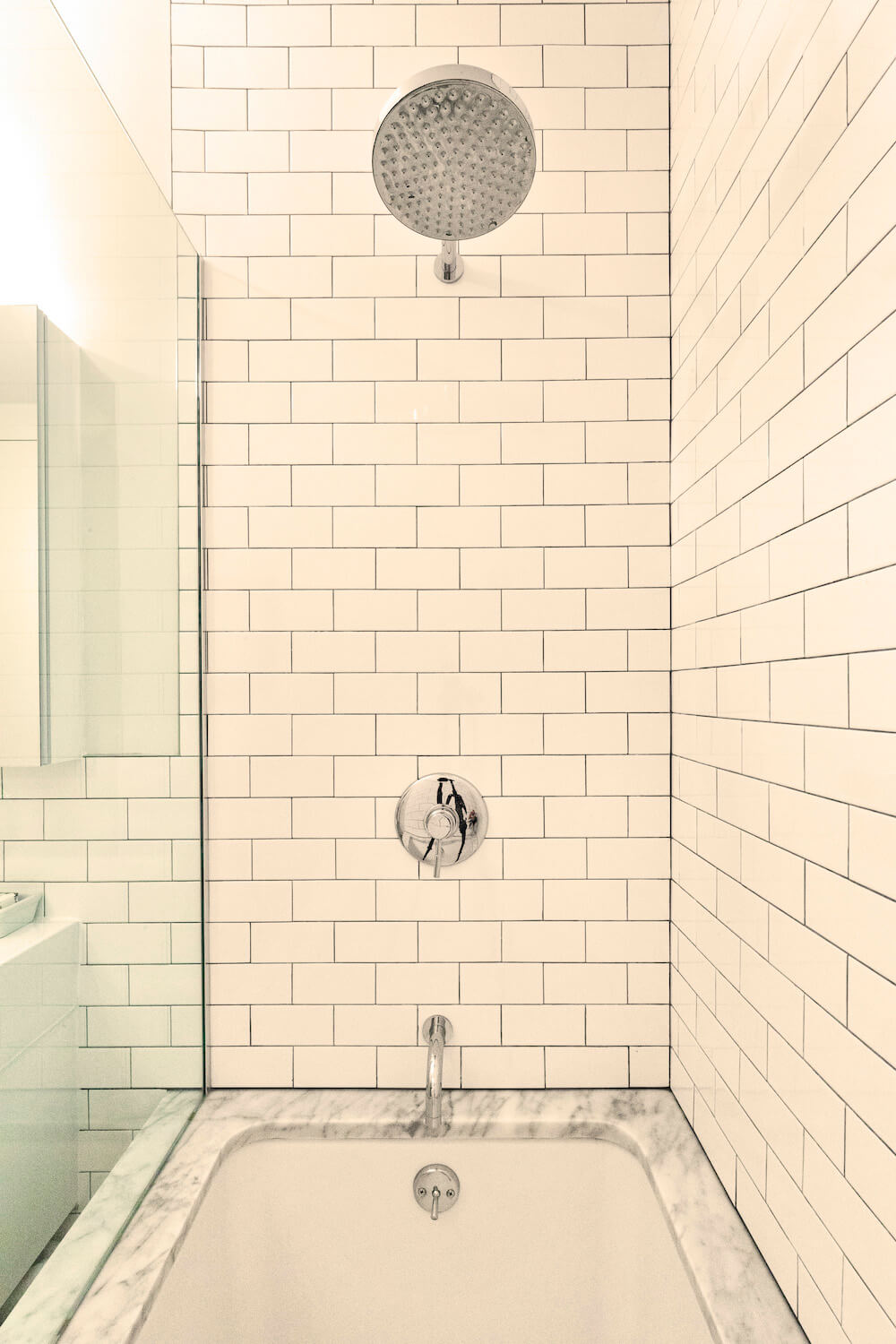
Material choices included Carrara marble, beveled and plain white subway tile with dark grout, classic New York hex tile in the bath, Edison bulbs, and glossy white cabinets. We chose IKEA cabinets because of another Sweeten renovation I caught on Instagram. It was very important to me that the cabinets went as high as they could go. I wanted an excess of clean-looking storage space and was not interested in dusting open shelving.
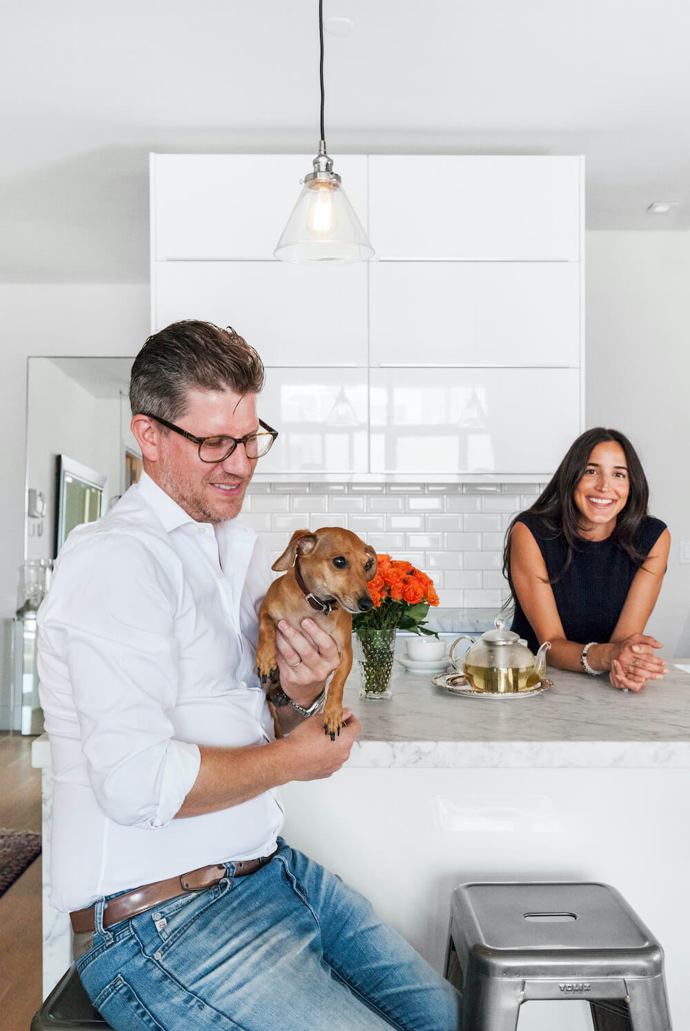
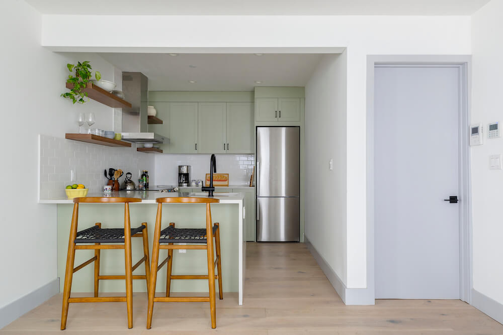
We were easy-going clients who trusted our contractor and his vision. We made things easier by not changing our minds and being open to his direction when we were undecided on something. The biggest decision, which we labored over the longest, was whether or not the kitchen should remain galley-style. The choice is obvious now, but there was something tempting at the time about toeing that suburban-house line with a big island to gather around. After the renovation, any concerns with square footage more or less went away. More, because we made so much out of what existed, and less because in March we found out we are expecting a baby boy this month!
Kitchen selects >> floors: Rubio Monocoat finish in hard oil, sky gray / cabinets: IKEA / counters: Carrara marble / backsplash tile: white beveled subway tile / dishwasher: Bosch / refrigerator: Summit Professional / range: Wolf / sink and faucet: Franke / lighting: Restoration Hardware
Bathroom selects >> floor tile: hexagonal Carrera marble / toilet: Toto: Aquia One-Piece / sink and faucet: FineFixtures / wall tile: white subway tile with dark gray grout / lighting: Restoration Hardware
—
Sweeten handpicks the best general contractors to match each project’s location, budget, scope, and style. Follow the blog for renovation ideas and inspiration and when you’re ready to renovate, start your renovation on Sweeten.
