An Architect Couple Turns a Small Fixer-Upper into a Gem
After spending many years patching up a rental they lived in together, two architects decided to purchase their very own fixer-upper on the top floor of an 1890s brownstone on Manhattan’s Upper West Side. One may wonder whether Kate Meagher and Arthur Liu had the same basic questions as non-design pros when it came to budget calculations, the cost of relocating plumbing, or even where to find a contractor, and the answer is yes!
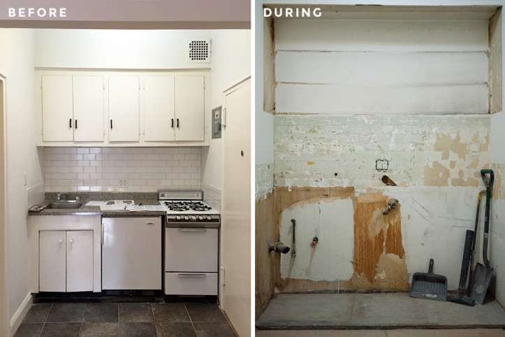
Having fallen in love with the view of the Hudson River, high ceilings, and the fact that the apartment hadn’t been touched since the ‘60s, they embraced the cozy new home to make <500-square-foot feel significantly bigger. The couple came to Sweeten to find a team to help them reconfigure walls, add space to the kitchen, and renovate the bath.
Here, Kate and Arthur tell us about their renovation journey, including a painting project that took longer than anticipated—but the results were well worth it.
Guest post by Upper West Side homeowner Kate Meagher
Arthur and I had been living in an apartment for around seven years, which belonged to his family. That apartment—much loved—was a constant work in progress. We improved the kitchen and bathroom, installed new lighting, and suffered through two floods (thanks, upstairs neighbors!) which required new ceilings and flooring yet again.
As architects, we loved it—it was great to have a rental which we could experiment on. At a certain point, however, it seemed that we should be directing our energy toward a place that was truly ours.
During our search, Arthur and I had gotten into a rhythm. After each Sunday’s open house tour, we’d stop in whichever neighborhood we ended up in, get a drink, and sketch floor plans over the broker’s listing sheets.
Could we fit a dishwasher? How did the closet compare with our old one? How much would it cost if the plumbing needed to be reconfigured? (Sweeten’s construction and renovation guides were extremely helpful setting initial budget targets.)
We were obviously looking for a fixer-upper, and when we saw this apartment, we fell in love despite its tiny size. It’s right next to Riverside Park, on the top floor of a beautiful brownstone. The ceilings are high and the bay windows still have the original curved glass.
In the winter, when the leaves are off the trees, we can see the Hudson. Best yet, outside of some electrical updates, the apartment hadn’t been touched since the 1960s. The main priorities for this apartment were to update and expand the kitchen, renovate the bathroom, and to squeeze as much storage space in without impacting the small footprint.
I had come across Sweeten at some point in our apartment search, and it was the first place we looked for a general contractor after we closed. Arthur and I both work on very large ground-up projects and don’t regularly work with contractors on the scale of a New York apartment renovation—we needed help finding someone!
Sweeten definitely filled a niche for us, and we posted our project. We interviewed several and chose our Sweeten contractor. I was struck by the notes he took throughout our initial walk-through, and that he asked for time to review further on his own. We felt he really listened and understood what we wanted and could accomplish it within our timeframe and budget.
Sweeten brings homeowners an exceptional renovation experience by personally matching trusted general contractors to your project, while offering expert guidance and support—at no cost to you. Renovate expertly with Sweeten
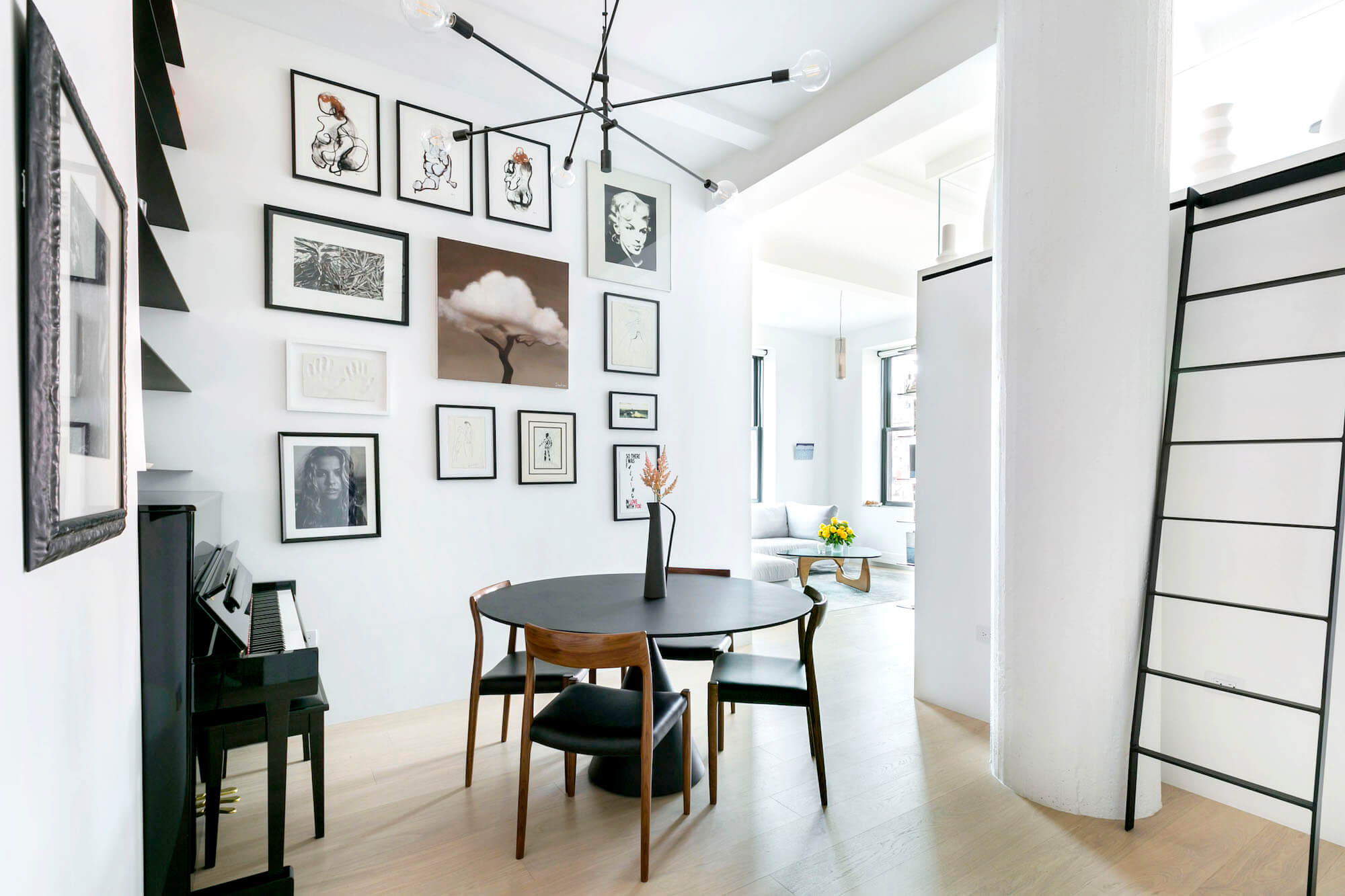
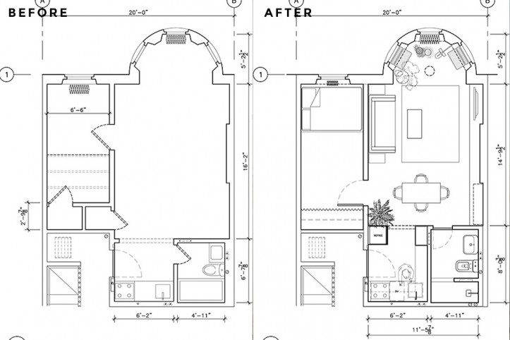
We love the classic detailing in the apartment and wanted to preserve everything we could that was more or less original. However, both our sensibilities skew contemporary/minimalist when designing, and we were looking to strike a balance. We decided to make only a few key alterations to the floorplan.
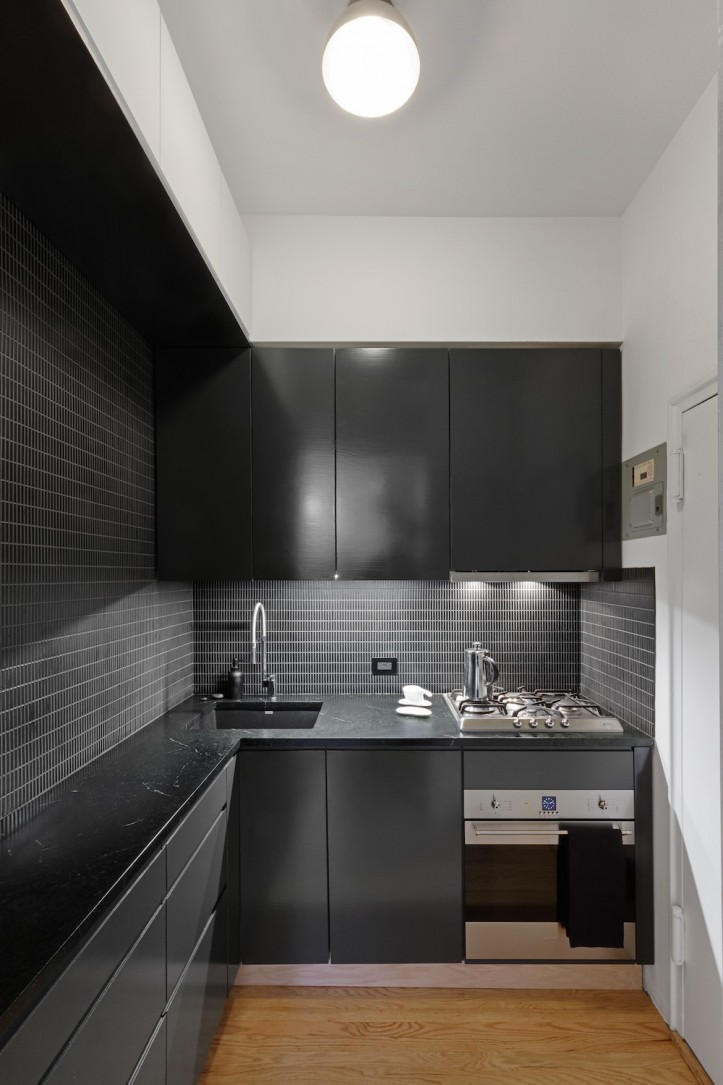
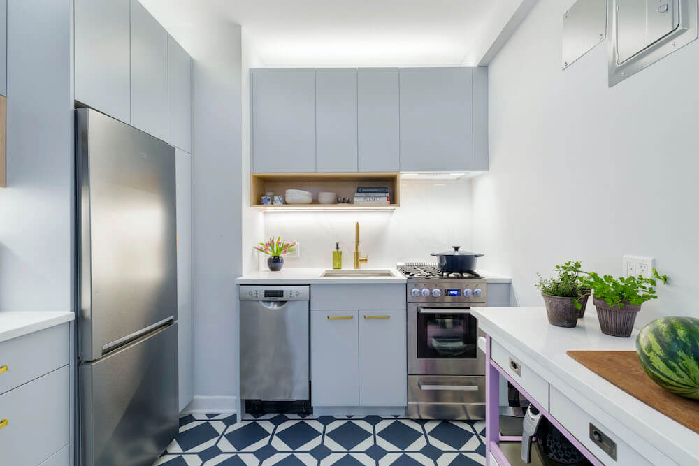
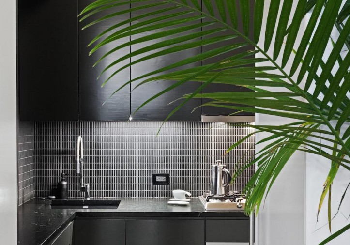
First, the wall separating the kitchen/bath zone and the living room was moved, gaining us a little more than a foot-and-a-half extra. The bathroom feels more generous now, and most importantly, it allowed us to configure a narrow L-shape for the kitchen. We chose tall doors for them to align with the height of the bay windows, and drew a custom profile for the door frames—beautifully executed by our contractor’s team.
The extra L-shaped length was critical to add a full-height refrigerator, full-height pantry cabinet, and an 18” dishwasher. We installed shallow 15-inch-deep cabinets in the new leg, and kept all appliances to the adjacent wall.
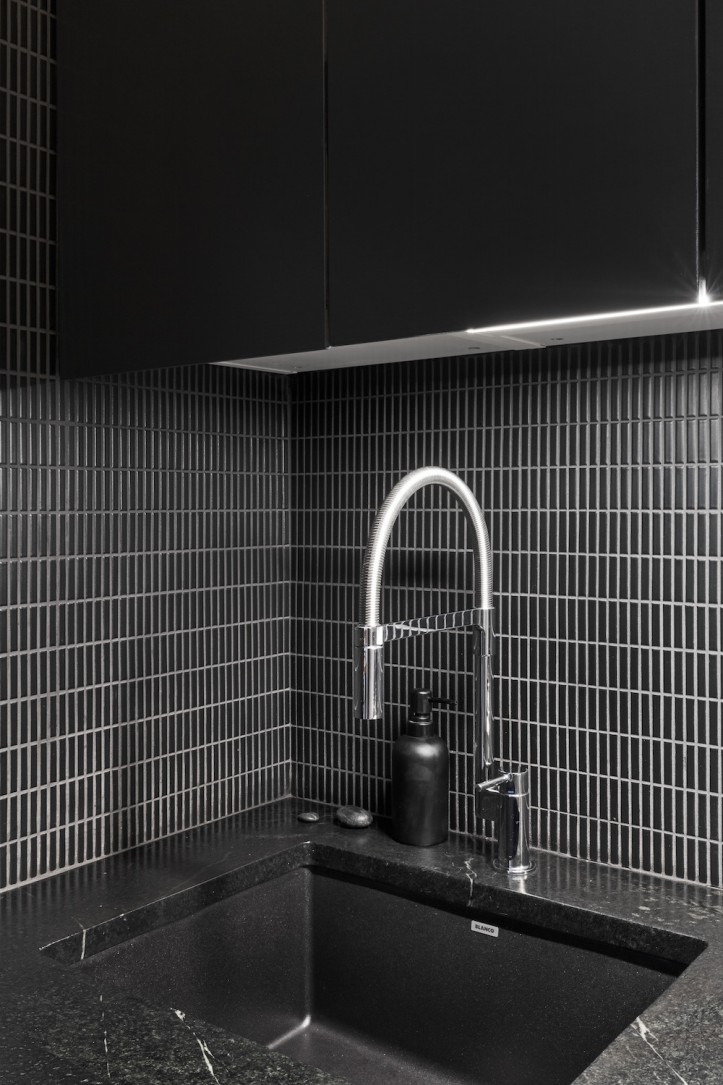
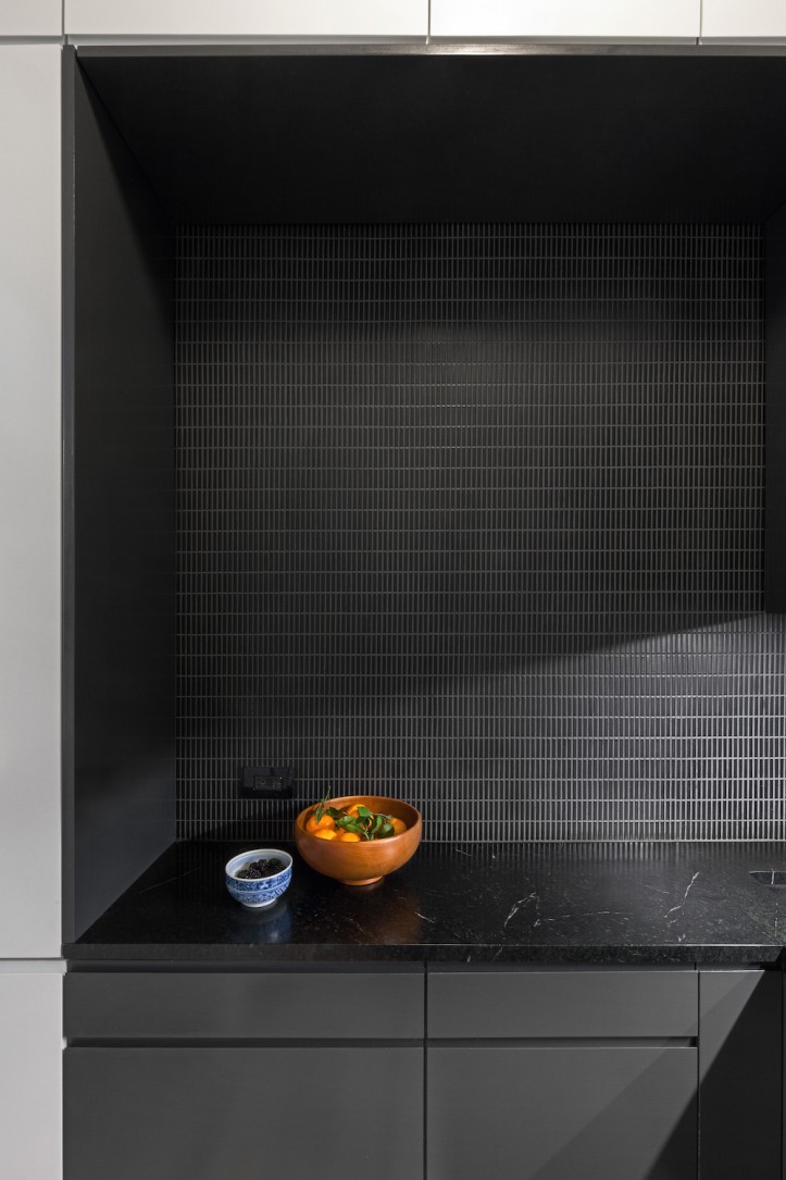
This preserved as much floor space as possible, and had the added benefit of retaining the original locations for the plumbing, gas lines, and ducted extractor—no permits to file or added expense of rerouting. We wanted a minimal aesthetic—black and white. Ultimately, we took our cues from a soapstone countertop we saw on a Sweeten blog post.
After visiting M. Teixeira’s amazing warehouse, we chose a stone that had a lot of green undertones in the black base. For the cabinet paints, we decided on an extremely dark black-green shade, and a cool white to complement.
This space ended up being a special project in the apartment. While our contractor’s team completed the major work—prepping the walls, installing wood flooring, adding lighting, installing the appliances and sink, and tiling the backsplash—Arthur and I ended up building the rest of the kitchen ourselves (!) using Ikea base cabinets that we modified and custom fronts. We also decided to just paint the fronts ourselves.
(*Note: after doing it and coming out the other side, this is NOT recommended. However, if you have the time, patience and space, you will save a lot.) For those of you interested in the details: We needed to paint 26 panels—some over ten ft tall—inside the apartment because, well, that’s the only space we had.
Working in stages, we brushed two coats per side, sanded, vacuumed and wiped down with a tack cloth between each coat. And our two cats meant even more obsessive vacuuming and confining them to the bedroom for most of the full month it took to paint—the threat of fur was everywhere.
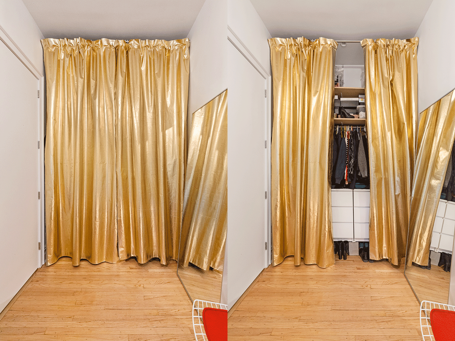
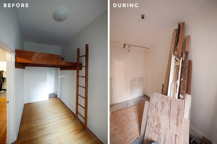
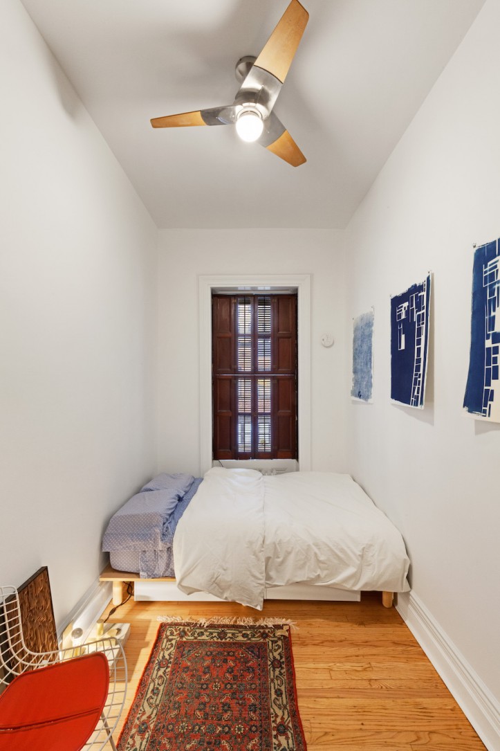
In the bedroom, our excellent foreman, Al, demolished a loft bed, and combined the small bedroom closet with an adjacent coat closet. We’ve hung a full-height curtain, so we can use every last inch of the ceiling height for storage. The entry door from the living room into the bedroom was moved toward the kitchen.
Previously, it was right in the middle of a living room wall, making that room very difficult to furnish. The team expertly restored the plaster walls, and matched new wood flooring inside the closet area and kitchen with the original (our contractor really pulled through with that find!). New moldings were also seamlessly integrated in areas that had been exposed.
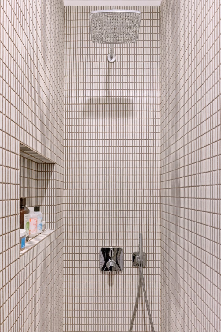
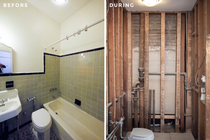
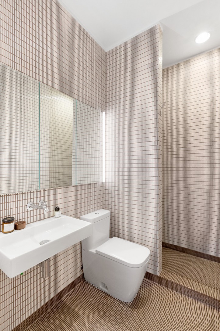
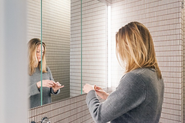
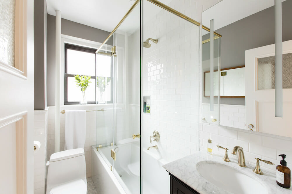
The bathroom skews warmer in tone than the kitchen, and was designed as a spare and sleek space. We replaced the tub with a wet room—an open shower without curtains or doors—and rain shower head to keep the lines clean and open up the room. (This required an LAA permit, which called for a master plumber.)
A wing wall keeps all the water from splashing out, and conceals a recessed shelf for products. The contractor’s team—Al specifically—were truly master tilers. We chose a tiny copper ceramic mosaic for the floor, shower curb and base, and creamy white, elongated tile for the walls. The grout is a warm brown that picks up on the terracotta edges of the white tile and the copper tones of the floor tile.
We, of course wanted every joint to match and it does. We opted for a large recessed mirrored medicine cabinet to contain clutter and a wall-mounted sink with no cabinet. Everything fits except the hairdryer, which lives in the credenza directly outside of the bathroom.
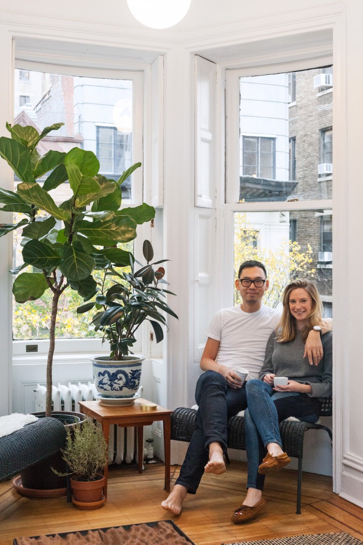
We are so happy with how the project turned out. Maybe it’s the sweat equity, but it is always very satisfying to see your design realized. We couldn’t have done it without our Sweeten contractor, Al and the team. They were a pleasure to work with throughout and we’d love to collaborate again.
Thank you so much, Arthur and Kate, for sharing your story. It’s always intriguing to hear about a home renovation from the point of view of architects! We hope you enjoy your new home.
KITCHEN RESOURCES: Kitchen base cabinets: Ikea. Cabinet hardware: Blum. Soapstone countertops: M. Teixeira Soapstone. Precision Black Granite Sink: Blanco. Faucet, FF2900: Franke. Backsplash, 3/8”x 2” matte black: Nemo Tile. Fully integrated 24” fridge: Blomberg. Fully integrated 18” dishwasher: Blomberg. 4-burner stove: 24” cooktop: Smeg. Wall oven, 24” electric: Smeg. Retractable 24” hood: Bosch. Lighting: Allied Maker, Michael Anastassiades for Flos. Paint, Chantilly Lace (apartment,) Gray Sky and Midnight (kitchen millwork): Benjamin Moore.
BATHROOM RESOURCES: Bathroom floor tile, .5 x .5 copper: Appiani. Bathroom wall tile, 3/8″ x 2” in high-gloss Dandelion: Nemo Tile. Vintage hardware: eBay. Raindance showerhead: Hansgrohe. Bouroullec Thermostatic with Volume Control and Diverter: Axor. Starck handshower: Axor. Sink / Vanity: WS Bath. Toilet, Happy D.2: Duravit. Lighting, Twiggy T1: Edge Lighting.
—
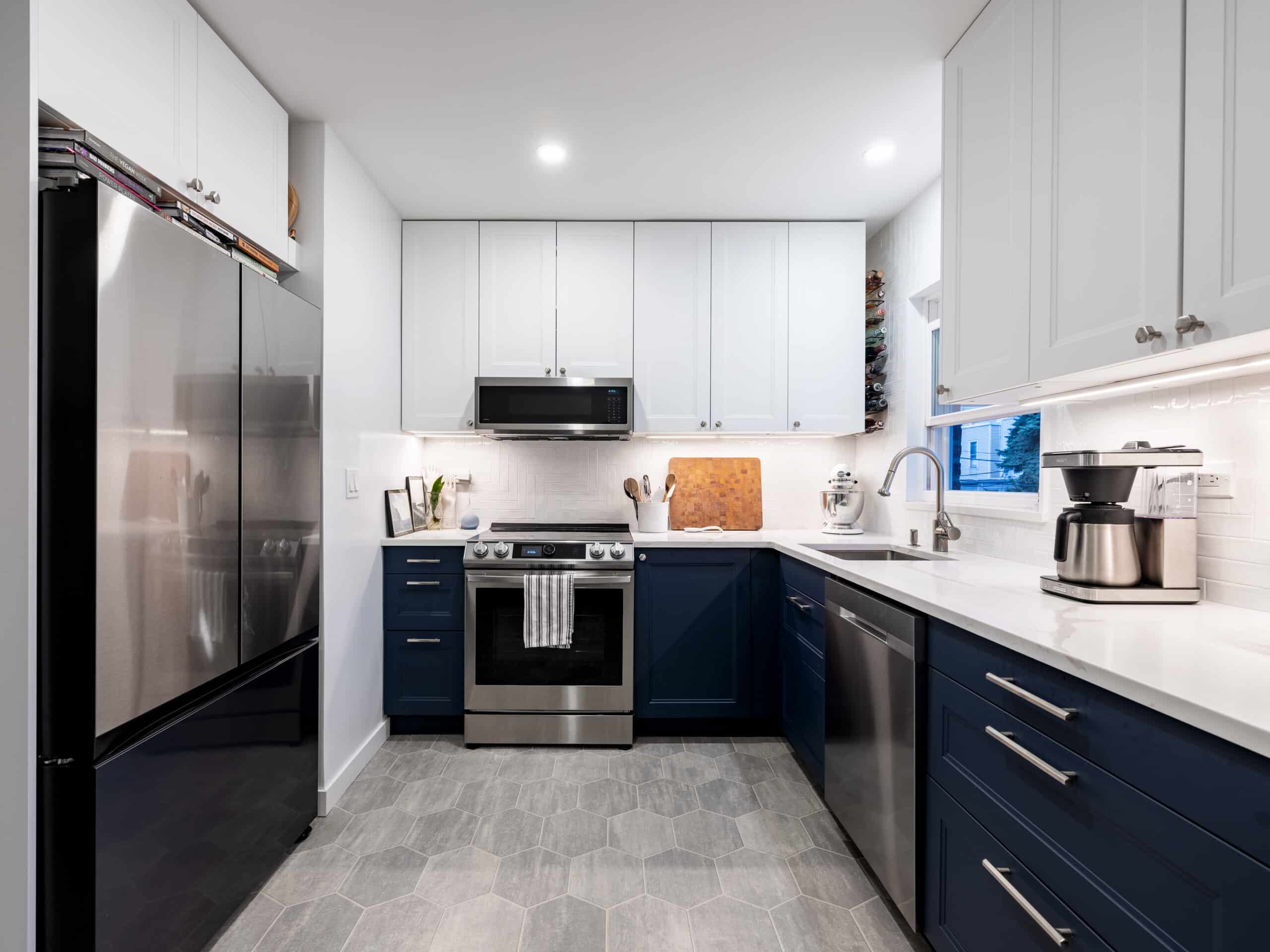
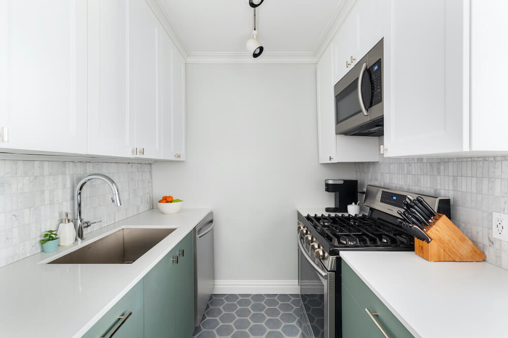
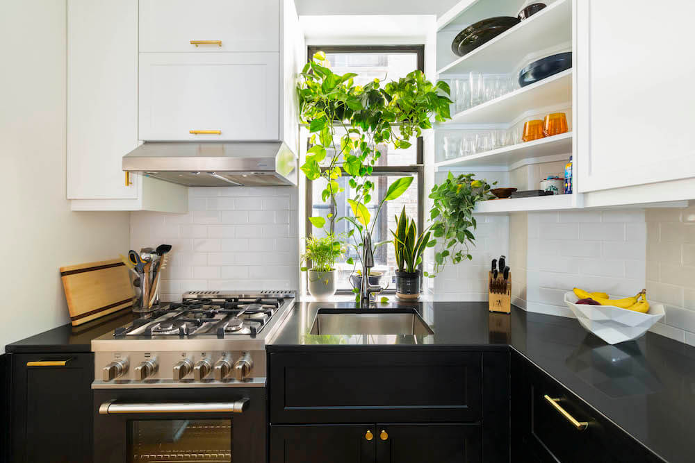
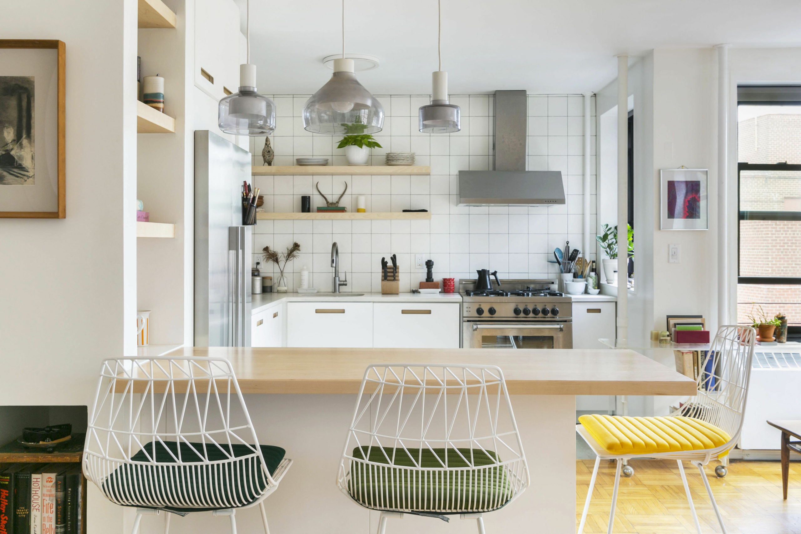
Check out these other small but mighty kitchens.
Sweeten handpicks the best general contractors to match each project’s location, budget, scope, and style. Follow the blog for renovation ideas and inspiration and when you’re ready to renovate, start your renovation on Sweeten.
