A Loft in a Former Silk Warehouse Gets a Redo
Tara and Ryan turn an industrial space into a warm family home
Tara, a former teacher-turned-homemaker, and Ryan, a software developer, had always loved the 1800s cast-iron buildings in the SoHo district of NYC. When the couple, who now have a 19-month-old son, had a chance a few years ago to buy into the neighborhood, they jumped at it.
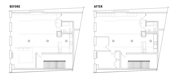
Despite the architectural details within their newly purchased loft, the space was outdated and a partial wall was used to create the only bedroom in the home. Here’s the story of how Tara and Ryan posted their project on Sweeten and worked with their contractor to renovate their 1,200-square-foot co-op apartment.

Guest blog post by Tara and Ryan
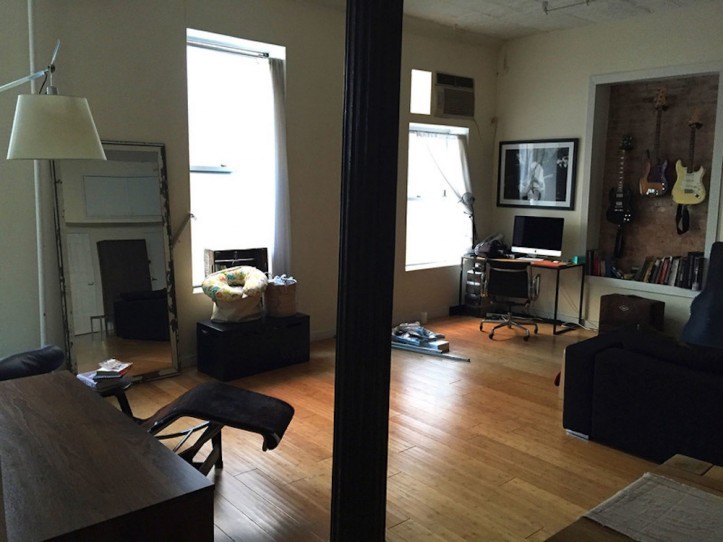
In 2012, we had the opportunity to buy a loft in a former silk importer warehouse and fell in love with the possibilities. The space showcased several classic neighborhood features, such as cast-iron Corinthian columns, 13-foot tin ceilings, oversized windows, and exposed brick walls.
However, it also needed a lot of work. The kitchen and bathroom were dated. The bamboo flooring was uneven. There was no storage and the only bedroom had a divider instead of a full wall. We lived in the space for a few years while we considered our options. Then we got pregnant with our son, Wyatt, so we decided to act fast to make room for our new family addition.
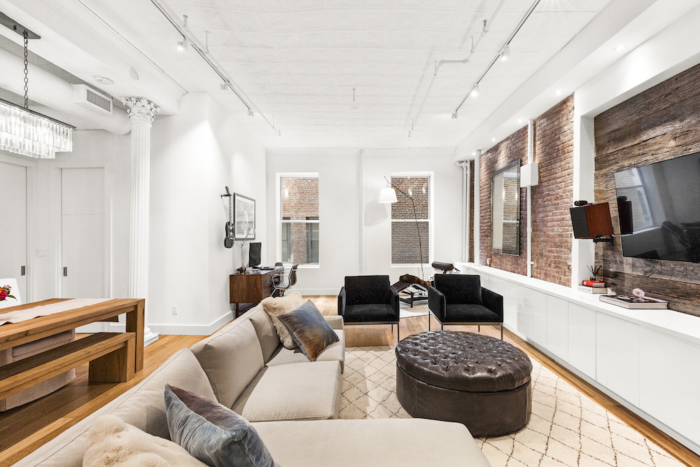
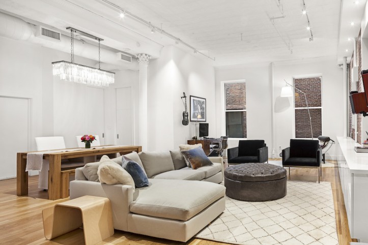
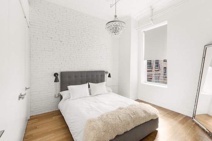
Our renovation vision was to embrace the original loft aesthetic with an industrial-meets-modern design. We wanted to re-expose the brick along the entire length of the living room wall. It was a similar case in the master bedroom, where we wanted to add an accent wall.
The columns and original tin ceiling would be left untouched; we loved their rustic, industrial character. That raw look would contrast with the clean, modern, and white gloss cabinetry in the kitchen and living room built-ins that we wanted. The brands we chose were based on quality, modern aesthetic, and resale value.
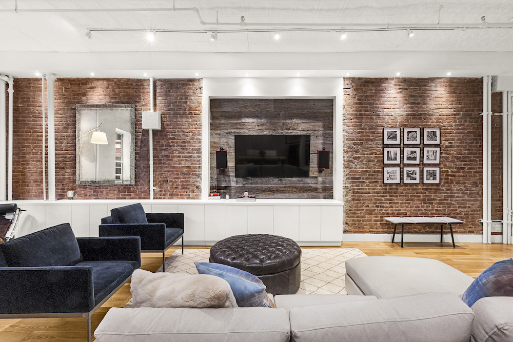
We were unsure of what to expect when the brick in the living room would be exposed. In addition to finding a few more steam, electrical, and drain pipes than expected, we also uncovered a square archway (the brick wall was a firewall running down the center beam of the building and the arch was a former large doorway from its time as a warehouse).
During the co-op conversion, these archways were covered by standard framing and wallboard to separate the apartments. However, the feature was aesthetically unpleasing. We solved the problem by covering the drywall and turning it into a “feature wall” with reclaimed barn siding. Finally, we showcased the wall with down-lit recessed lighting—an idea we got from a movie. To keep the décor minimalistic, we made maximum use of our new storage.
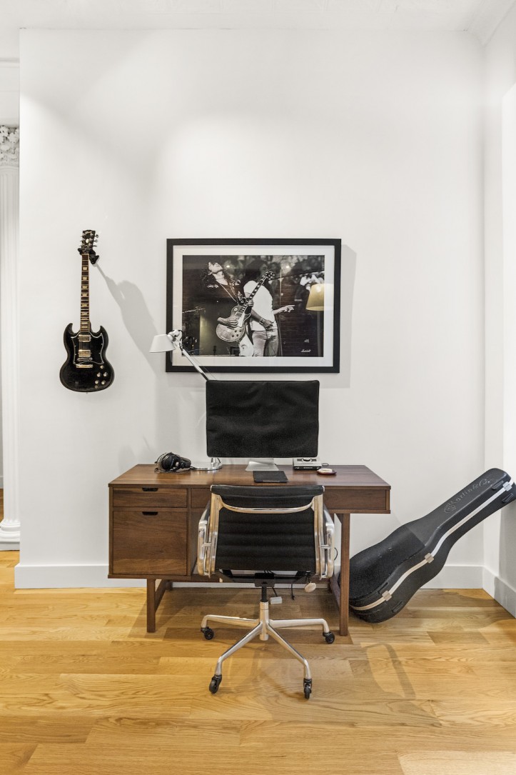
The built-ins along much of the living room wall are compartmentalized for baby toys, books, media, and our vinyl collection. On the opposite wall sits a desk for paperwork and musical inspiration; Ryan has played the guitar since he was 13 and hopes his son, Wyatt, inherits his passion.
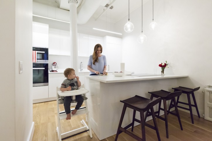
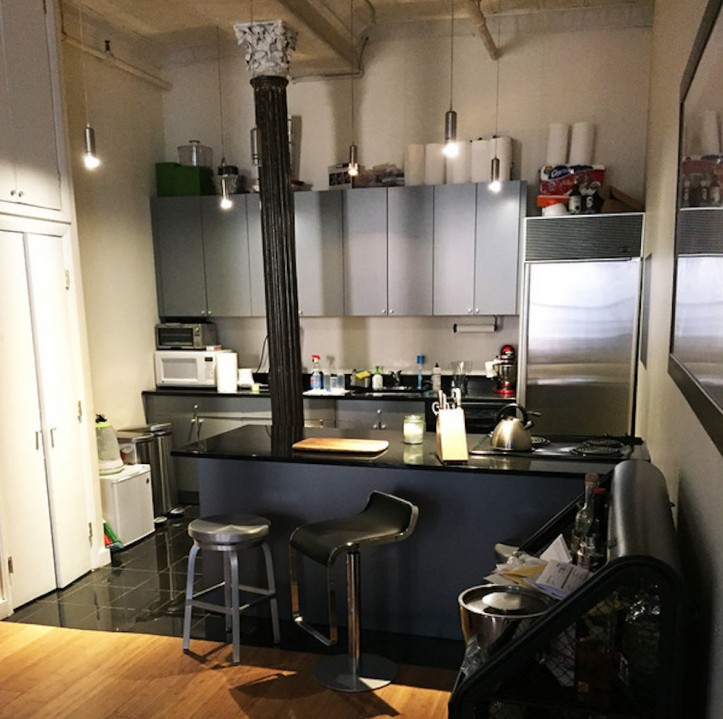
For the kitchen, we essentially kept the same layout. We had looked at several floor plan options that would have potentially altered the kitchen/bathroom layout and location. After exploring those options, we realized moving those “wet” spaces over our downstairs neighbor’s “dry” living room would drastically increase the cost and complexity of our project.
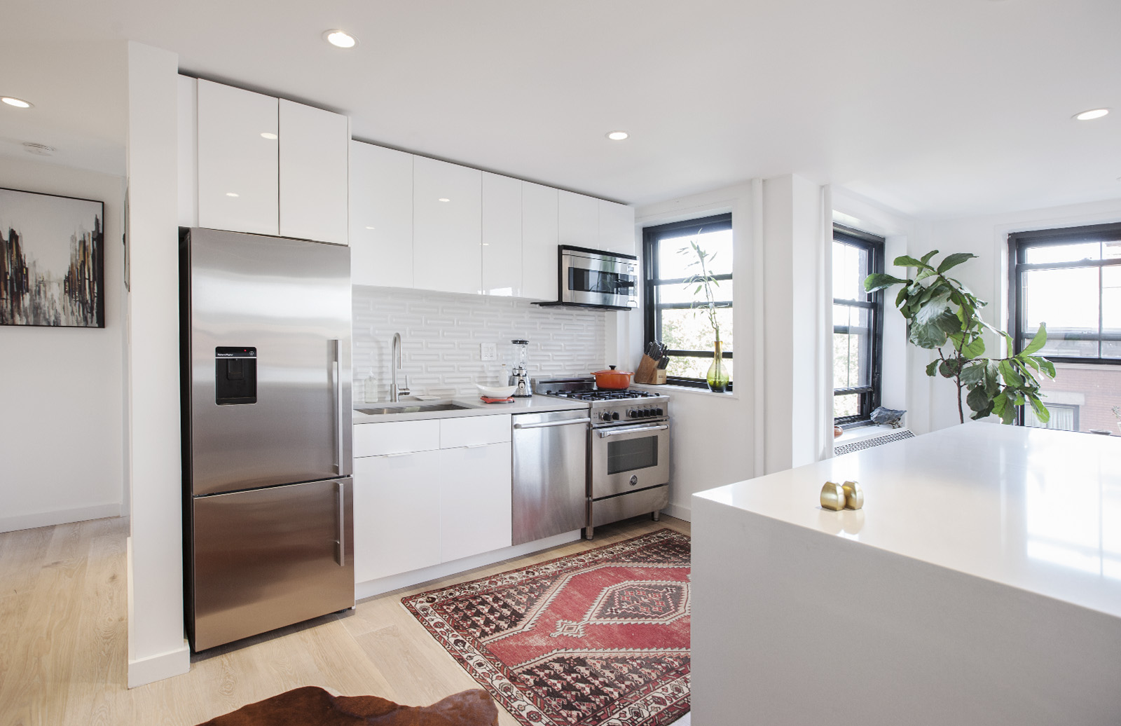
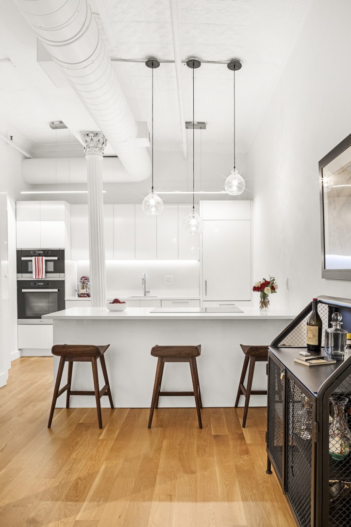
We did push the kitchen island out (toward the dining area) about a foot. That improved the ergonomics of the kitchen, particularly when navigating an inconveniently located cast-iron column. We replaced the cabinets, which gave us the flexibility to tweak the functionality, such as replacing the range on the former island with an induction cooktop.
That left room in the island for three rows of deep drawers, which was a much better use of space for storing pans, utensils, and cookware than cabinets. We also found room to add an 18” wine fridge in the island.
The wall and speed oven combination moved to the back wall, formerly dead counter space for a microwave and toaster oven. We did consider whether the column would interfere with the kitchen flow, especially with ovens on the other side. But it ended up working out fine.
The high-traffic area (sink, refrigerator, cooktop) is together on one side of the column. The sink, dishwasher, and refrigerator were replaced but stayed in exactly the same locations, requiring minimal plumbing. Even though we added appliances, we gained storage space just by reconfiguring and making better use of the space we had.
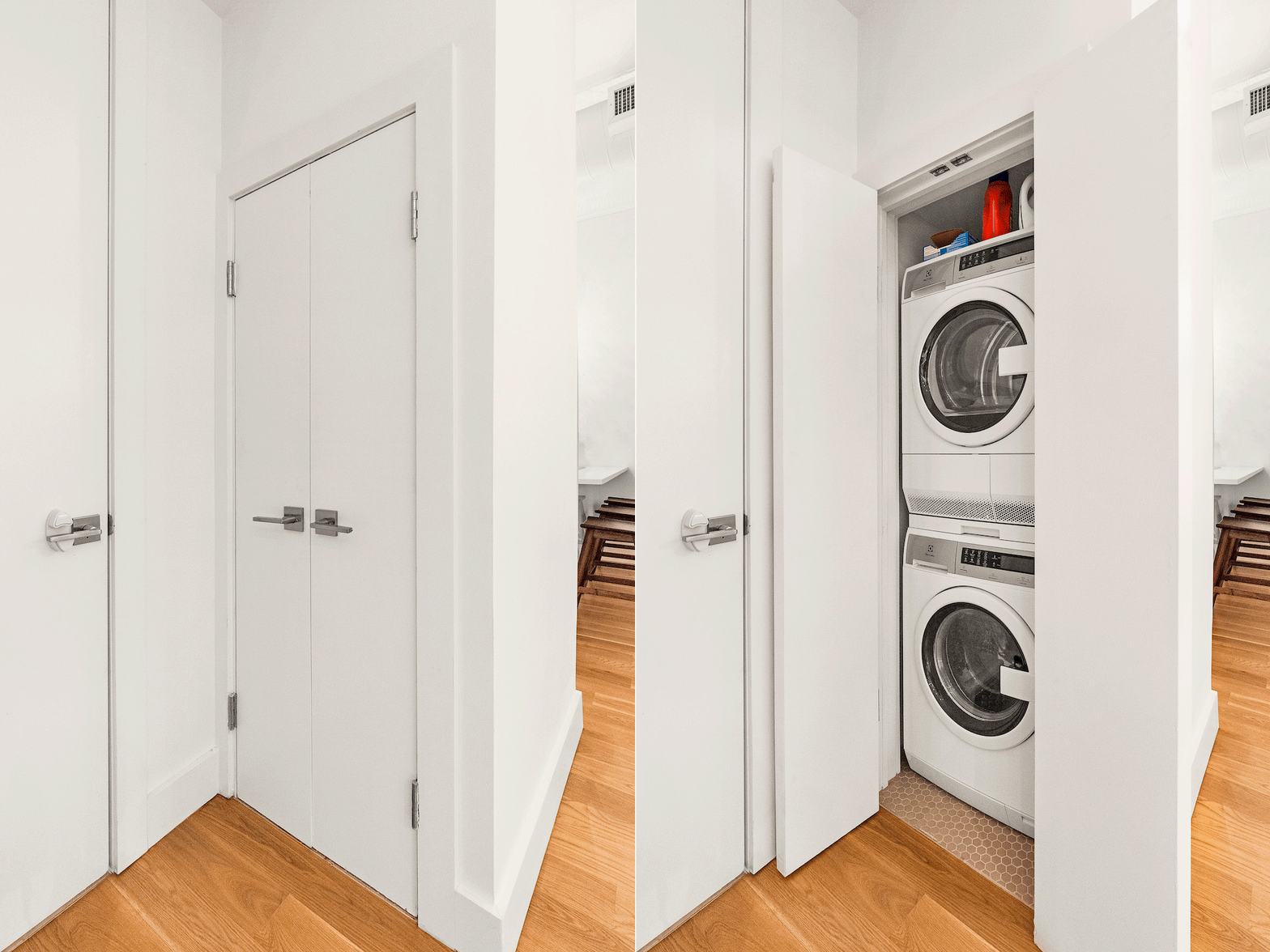
The existing washer-dryer combo unit had been in a column directly facing the kitchen island, a terrible location for laundry for traffic flow—and hygiene. The water heater was directly above the washer-dryer, making the whole section difficult to move.
The simple solution was to rotate the units 180 degrees, so that laundry door was accessed next to the bathroom, which made more sense. The water heater was left as is.
Sweeten brings homeowners an exceptional renovation experience by personally matching trusted general contractors to your project, while offering expert guidance and support—at no cost to you. 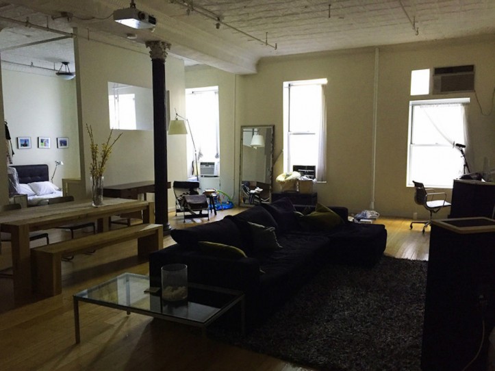
Renovate expertly with Sweeten
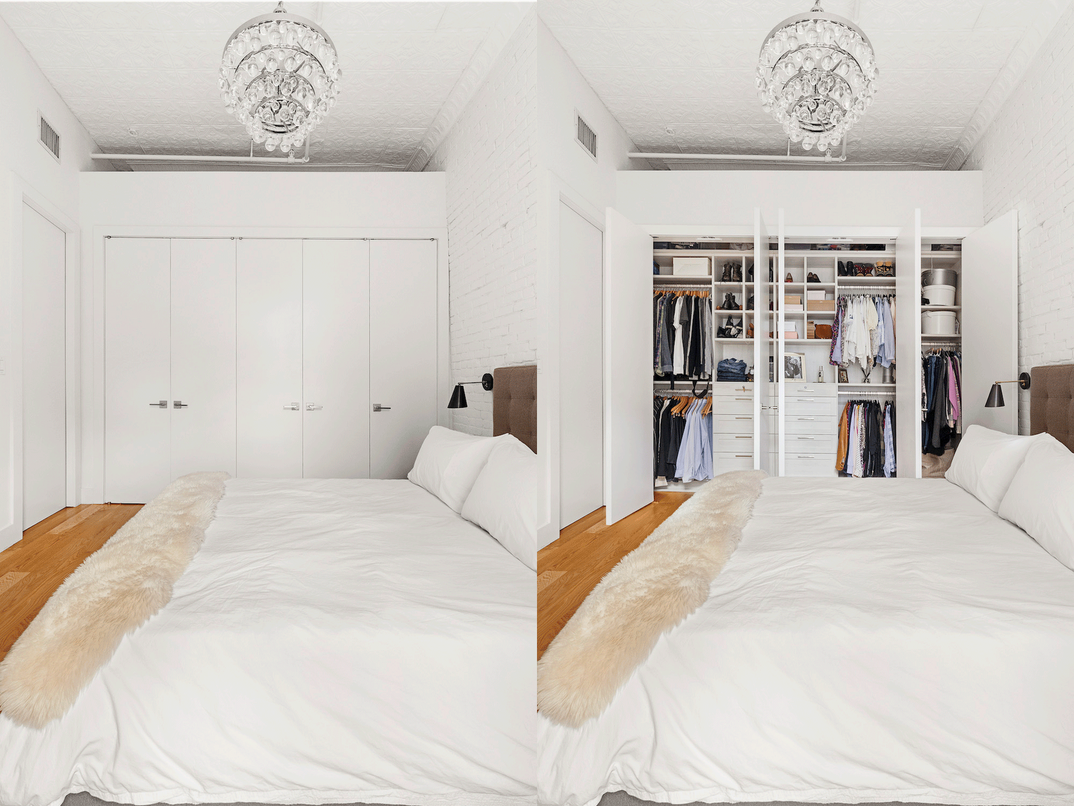
A big priority was to formally close off the master bedroom. Working with a 100-year-old former warehouse came with some challenges. One was a column near the bedroom. Although it is beautiful, it just happened to get in the way of every floor plan.
Working with our architect, we had to be creative in positioning the bedroom walls in a way to maximize their floor space while working around the columns. Using pocket doors helped solved the problem since the column would have left no room for standard hinge doors. Storage was a priority throughout the loft.
The master closet is a wall-sized, reach-in, modular custom closet.
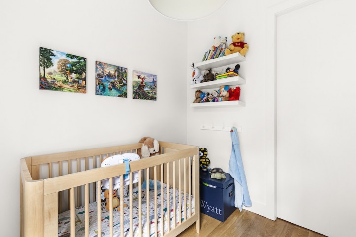
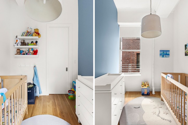
For the baby’s room, we took some space from the living room to add the second bedroom. Carving out the space was a challenge when constrained by the column, windows, door placement, and not taking too much square footage out of the master.
In the end, we were just barely able to segment an 8-foot x 10-foot room.
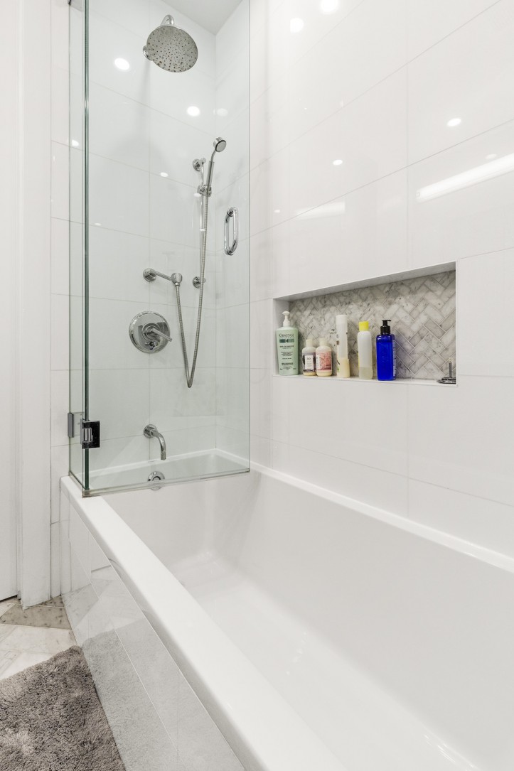
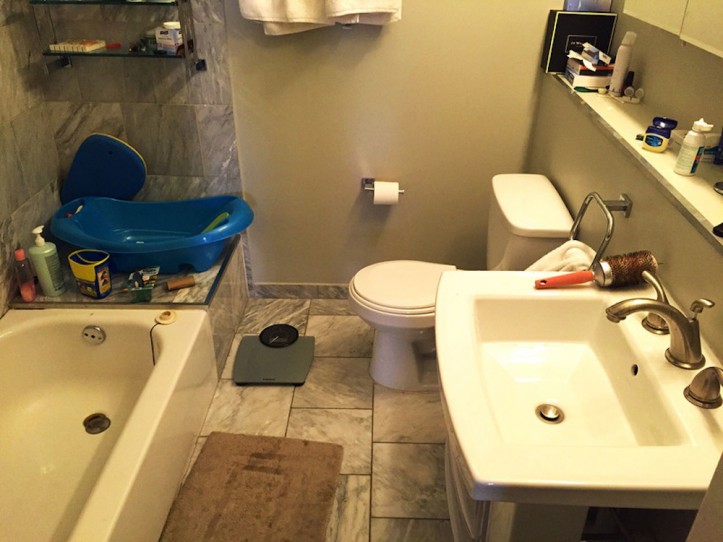
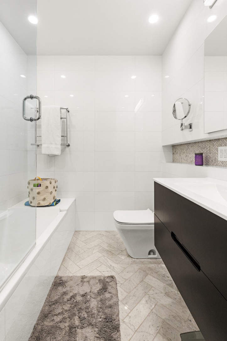
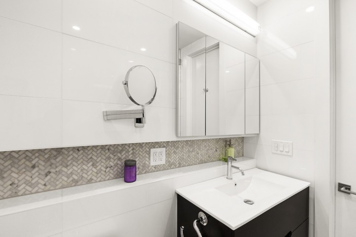
The bathroom had a clean, modern makeover with oversized floor-to-ceiling marble tiles. The floor plan stayed the same, but we were able to make substantial improvements with a few minor design adjustments. Once we demo’d, we found that the half-height wet wall behind the pedestal vanity was overbuilt and could be moved inward.
This reclaimed a few inches of space needed for the new floating vanity. We also framed out a LED-lit, recessed shelf above this wet wall, giving the area more purpose. The medicine cabinet was set inside the wall, saving some airspace. These little adjustments made the wall feel a few inches deeper and between the shelf, floating vanity, and medicine cabinet, it provided a lot more storage.
Above the bathroom’s dropped ceiling, and with a lot of maneuvering, we made space for the blower of the new ducted central air system.
As is common in New York City, our apartment was heated with building-controlled steam heat. Our unit got a disproportionate share of that heat. In frustration, we removed the steam radiator altogether while adding a heating and cooling central air system.
We also replaced the worn-down bamboo tiles with new white oak hardwood floors throughout the rest of the apartment, which we painted a designer white. It keeps the whole space feeling open and bright.
Sweeten was great in helping us realize our vision. They understood our scope of work and did a great job at pairing us with excellent contractor options. Then, they walked us through the contractor selection process, helping us make an apples-to-apples comparison of the bids. The Sweeten contractor we ultimately chose to work with turned out to be an excellent pick. They became true partners in our process.
One tip we want to pass on to future renovators is, if possible, rent a place close by so you can check in a few times a week. We did and were able to do weekly (sometimes multiple times per week) walk-throughs with our contractor. That gave us time to plan, troubleshoot, and exchange creative ideas.
They also used software to track all aspects of the project, including timelines, material selections, work pictures—all of which was tremendously helpful and well organized, allowing us to complete our project within the planned four months. Sadly, a friend’s renovation that is similar to ours and started at the same time is still going.
The most exciting part of this process is seeing our vision come to life. And getting storage because babies come with so much stuff!
Thank you, Tara and Ryan, for sharing your wonderful apartment with us!
KITCHEN RESOURCES:
Design No. 2 cabinets: Miralis.
Integrated refrigerator, #IT-30CIID: Sub-Zero. 24″ speed oven with trim kit, H6200BM; 30″ convection wall oven, #H6280BP; dishwasher, #G4970US; and induction cooktop, #KM6370: Miele. Trinsic faucet: Delta.
Stainless under-mount sink: Just Manufacturing. Cabinetry/media unit: custom flat panel cabinetry by Miralis, designed by Sweeten contractor. 8″ hardware pulls, #BP55279G10: Amerock. Quartz countertop and backsplash in Pure White: Caesarstone.
Wainscott bar stools: CB2. Glass Jug pendant lighting (kitchen island): ABC Home & Carpet. Essence Linear pendant overhead lighting: Lumens. Foyer bench: The Line NYC. 24″ compact washer/dryer: Electrolux.
NURSERY RESOURCES: Paint in November Skies, #2128-50: Benjamin Moore. Embroidered Star Burlap pendant light: Restoration Baby & Child. Rug: Pottery Barn.
LIVING ROOM RESOURCES:
Flooring: 5” Select White Oak, natural color, sealed with a satin finish (no stain). Couch: Room & Board. Highline Industrial chairs in Indigo: ABC Home & Carpet. Dara 8′ x 10′ rug: Restoration Hardware.
Tufted round leather storage ottoman: RHTeen. Built-in cabinets: Miralis. Chaise: Design Within Reach. Halifax door levers: Kwikset. Pocket door hardware and locks, #PD006056PRIV: Baldwin.
DINING ROOM RESOURCES: Table, chairs, bench, and bar: Restoration Hardware. Dining chandelier: Timothy Oulton.
MASTER BEDROOM RESOURCES: Lure chandelier in Lure Polished Nickel: Crate & Barrel. Custom modular TCS: The Container Store.
MASTER BATHROOM RESOURCES: Shower fixtures, hardware, and Fleetwood robe hook: Restoration Hardware. Starck tub: Duravit. White 12″ x 24” wall tiles and 4″ x 12″ Carrara marble floor tile: Roca. Durastyle DualFlush toilet: Duravit. Verdera medicine cabinet, #K-99010: Kohler.
—
An uptown carriage house that was converted into a loft gets the industrial-meets-modern makeover in Meg and Brett’s renovation.
Sweeten handpicks the best general contractors to match each project’s location, budget, and scope, helping until project completion. Follow the blog for renovation ideas and inspiration and when you’re ready to renovate, start your renovation on Sweeten.
