A Brand-New Brooklyn Kitchen, Bath, and Walk-In Closet
Two years after Kelly purchased her studio apartment in a lovely Brooklyn Heights co-op, she was ready to take on a major overhaul of the old appliances and cheap cabinets in the kitchen and bath. Unsure of the style she was after, Kelly sought the help of a designer who could run with big transformations to her little abode. Read on for our reveal of Kelly’s sparkling new kitchen, bathroom, and bonus closet renovations!
“Courtney was fantastic! Her process for learning about the project, the space potential, and understanding who I am is her true talent. I always felt that I had a voice and control over the design, which was important to me, but Courtney effortlessly brought it to life.”
-Kelly, Brooklyn Heights homeowner
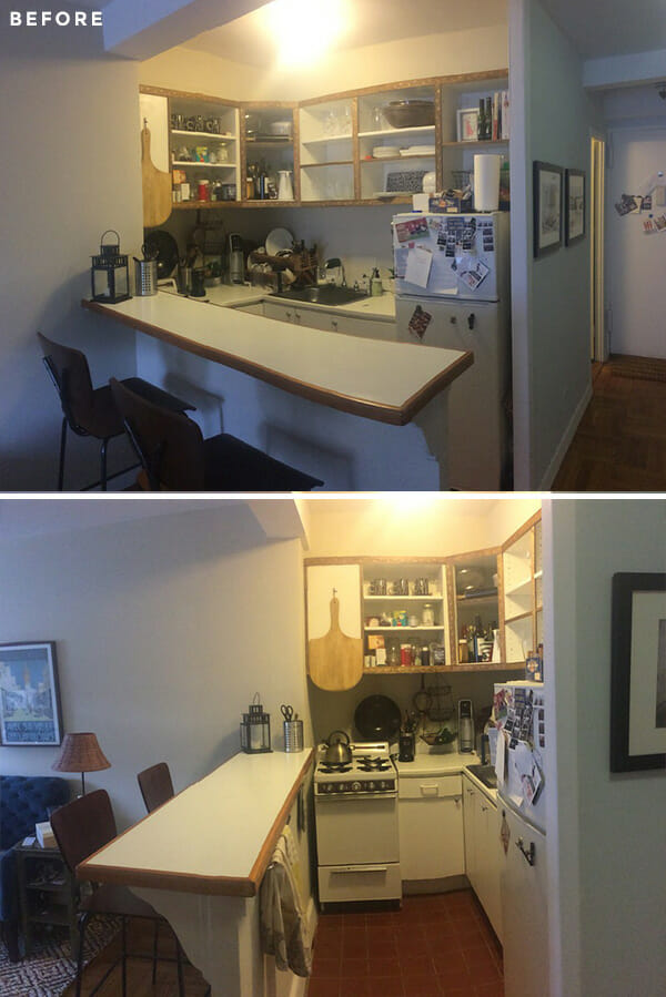
Kelly had come to realize that living in a studio apartment meant that the kitchen would forever be the focal point—it “needed to rock”, as she put it. With old appliances and “cheap” cabinets and counters, the kitchen lacked a ton of functionality. An earlier attempt at open shelving left all sorts of things exposed, the cabinets extended just halfway to the ceiling, bar seating offered zero storage topped with a thin strip of counter prep space, and the stove and fridge were both miniature-sized. Kelly wanted to find an interior designer whose imagination wasn’t limited by tight spaces. She posted her project on Sweeten and we matched her with Sweeten Expert Courtney, a pro at bringing ambitious texture and color to spaces large and small.
Sweeten brings homeowners an exceptional renovation experience by personally matching trusted general contractors to your project, while offering expert guidance and support—at no cost to you. Renovate expertly with Sweeten
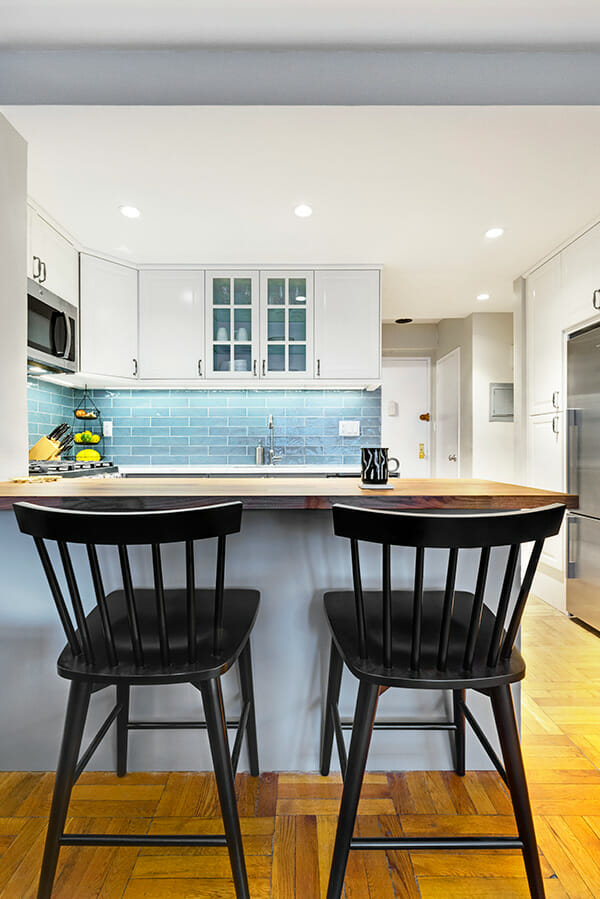
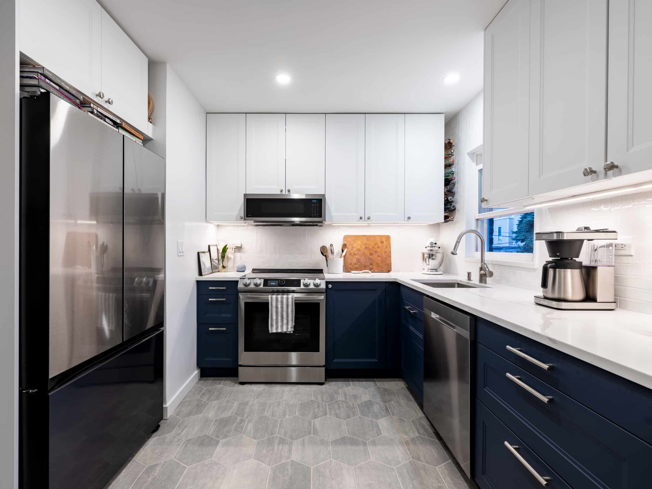
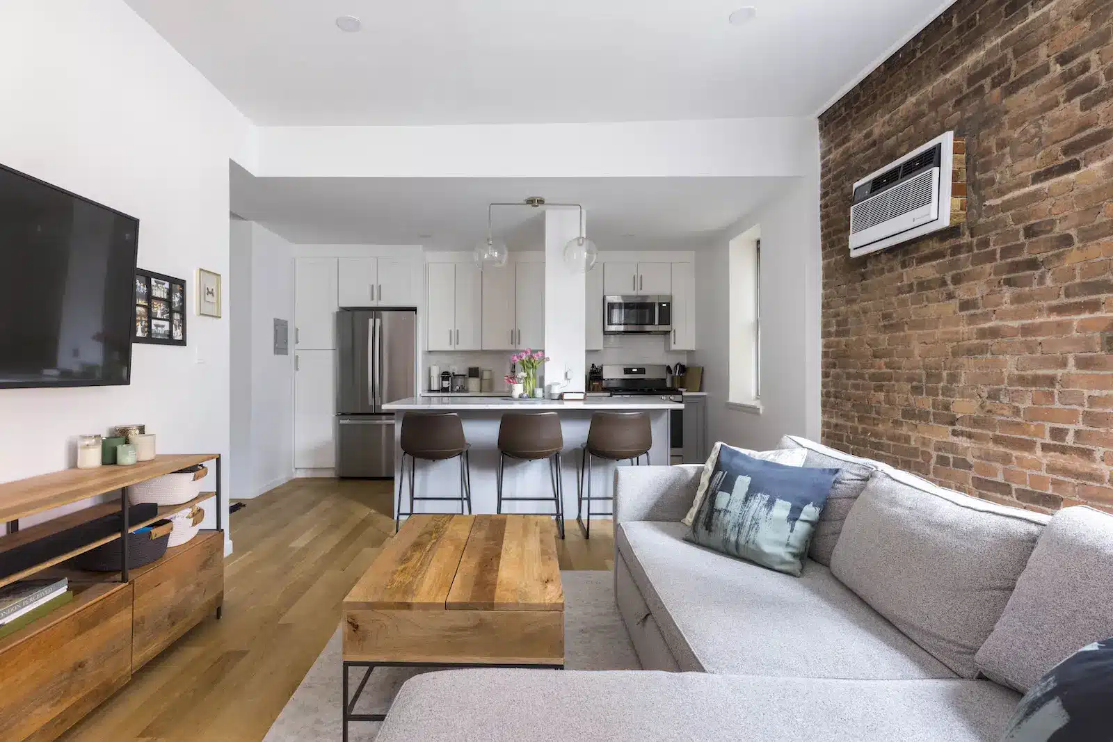
Since Kelly wasn’t yet set on any specific style choices for her kitchen, Courtney was able to provide plenty of inspiration to get the renovation process started. The plans called for a few big fixes: Kelly’s team would extend the kitchen cabinets to ceiling height for more storage and finish the cabinetry with a variety of classic doors and transparent glass panes. The bar counter was significantly enlarged, granting more prep and dining space and doubling the kitchen’s drawer storage. And to accommodate a full-sized stove and fridge, Kelly moved the fridge out of the galley altogether.
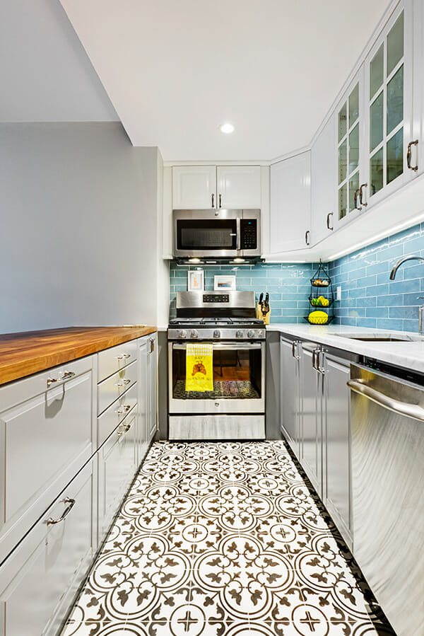
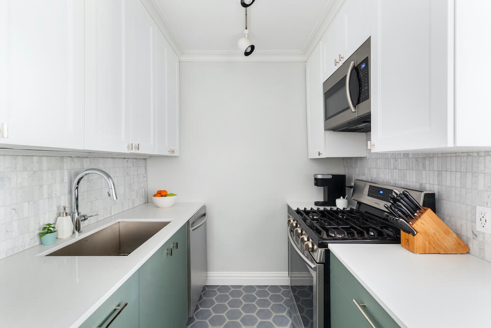
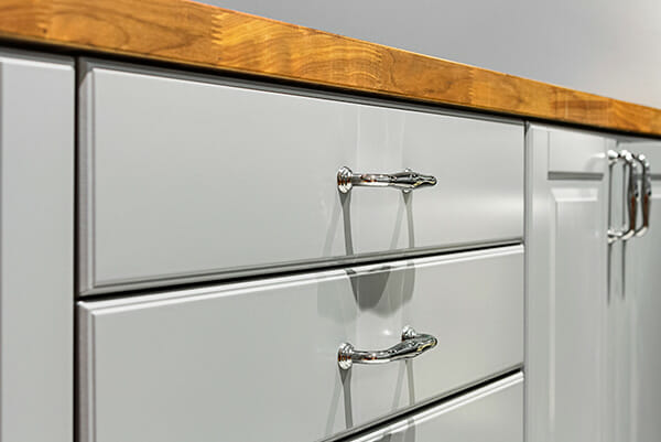
Kelly appreciated Courtney’s talent for mixing affordable items with the right amount of higher-end items for a polished look. The previous flooring consisted of brick-colored tiles that dragged the room into darkness. Kelly chose eye-catching cement tiles in a white and soft black mosaic, evoking a sense of Moroccan-inspired decor. Kelly bid adieu to the old, sagging cabinets and selected a dove gray IKEA set for the bottom base with a matte white finish for the uppers, plus elegant chrome hardware for all.
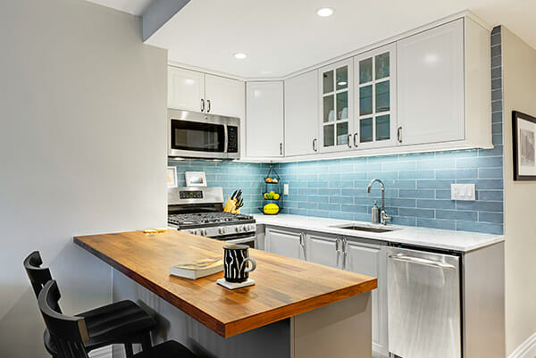
For her newly-enlarged bar counter, Courtney helped Kelly pick butcher block for its warmth and price point, offsetting that material with a natural stone for the opposite counter. Ready to pack a lot of texture into the small space, Kelly added another pop of personality with a subway-style backsplash of luminous blue hand-glazed ceramic tiles. This detail, along with new undercabinet lighting was the key to unlocking all of that brightness.
The rickety oven range was replaced with a sleek stainless stove and Kelly scored a matching microwave stationed directly above it. A new dishwasher now resides where the old fridge once stood, and Kelly had new storage and pantry cabinets constructed along the opposite wall, framing the fridge perfectly. Kelly did away with the harsh ceiling light and opted for low-profile recessed lighting instead, complementing her new space gorgeously.
The renovation plan grew to include the bathroom as well as the secret to the success of any great NYC studio: a highly organized walk-in closet! Without changing the footprint of the bath, Kelly carried several of the design choices from the kitchen over for continuity and coherence.
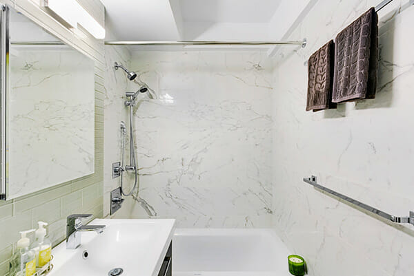
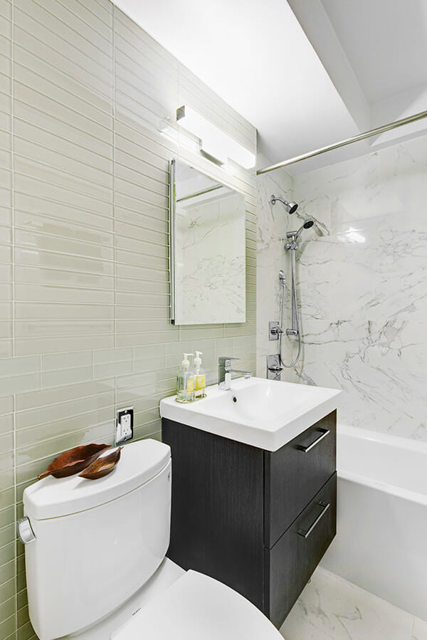
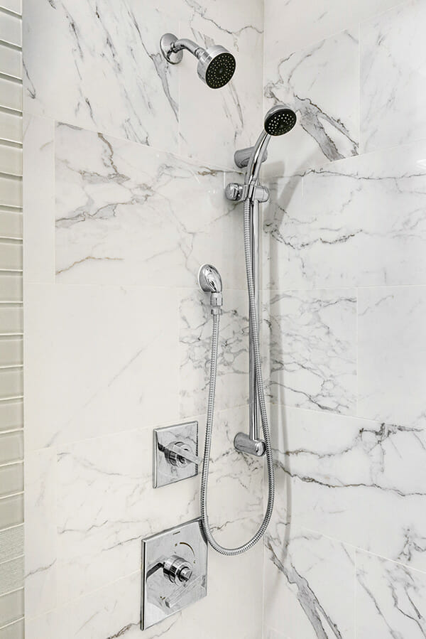
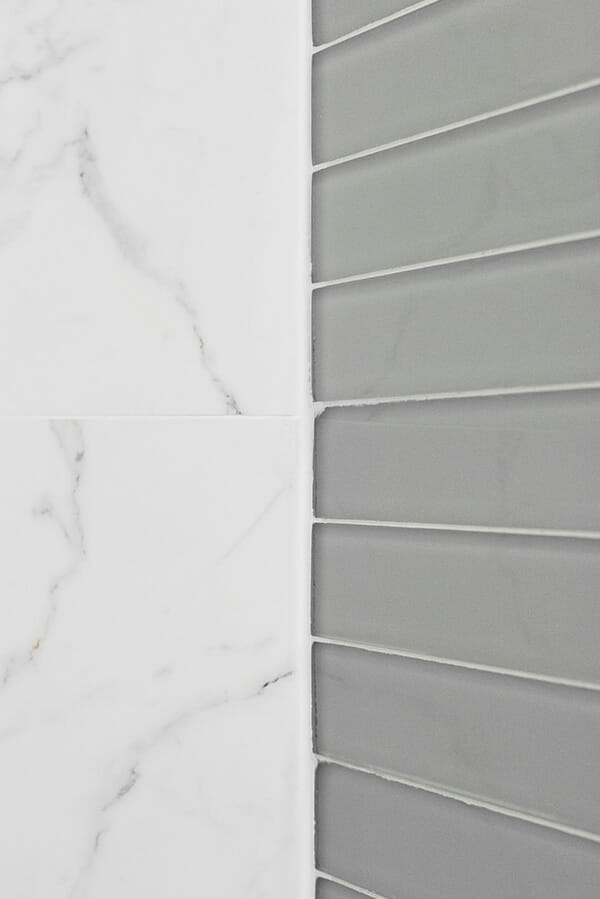
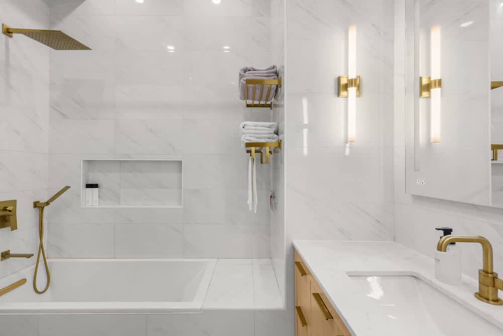
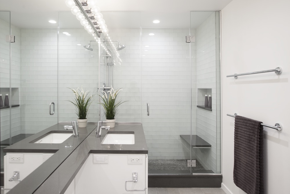
She went with the same marbled stone look for the floors and shower walls while replacing the tub with a new white porcelain upgrade. In other splash-prone areas surrounding the sink and shower, Kelly decided on a pale gray glass tile stacked in clean, contemporary lines. The old vanity was replaced with a dark wood cabinet boasting deep storage drawers and a large rectangular sink basin, crowned with a simple mirror and a soft-glow lighting strip. Two chrome shower heads were installed, one flexible and the other stationary, creating an elegant spa oasis.
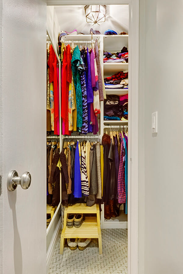
The last perk of this smart renovation came in the form of customizing the studio’s remaining closet, including shelving, section dividers, and a full-length mirror.
Kelly’s lovely, revamped studio is proof that no space is too small for showcasing personal taste and imagination. We’re thrilled to hear that Courtney’s eye for design and hustle helped Kelly re-create this beautiful space!
—
Sweeten handpicks the best general contractors to match each project’s location, budget, scope, and style. Follow the blog for renovation ideas and inspiration and when you’re ready to renovate, start your renovation on Sweeten.
