From Fixer-Upper to Dream Home: A Brooklyn Designer’s Renovation
With an entire townhouse to renovate and a baby boy on the way, a Brooklyn designer took on broken windows and fire hazards with “completely nuts-o” patterns and prints and an Airstream-inspired kitchen. Read on to see what happens when you give a designer the keys to a total fixer-upper.
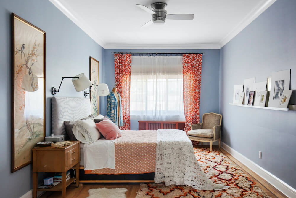
For us, a fixer-upper was a must.
There was the professional itch; as an interior designer for an architecture firm specializing in Brooklyn brownstones, I had house-envy. I had a Pinterest board called “Someday house ideas” slowly filling with the most affordable versions of all my favorite finishes. It has 600 pins.
And then there was practicality; although we loved our huge and quirky one-bedroom in Boerum Hill, it had no way to create a second bedroom and no access to the sleeping area except a dizzying spiral staircase. Time to move on.
In our (VERY) stressful house hunt, we were the runner-up offer on four houses before The One. It was an unusually wide two-family brick Tudor townhouse in Kensington, around the corner from my husband’s elementary school. The block is tiny and quiet, across from a beautiful gatehouse of Greenwood Cemetery. There is a bountiful apricot tree in the front yard and a huge grapevine in the back.
There was even—the Brooklyn equivalent of a tennis court or horse stables—a driveway. But the best part was the friendly atmosphere. Many of our neighbors have lived their entire lives on this block, and we were thrilled to join them.
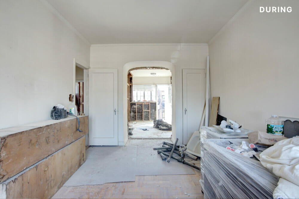
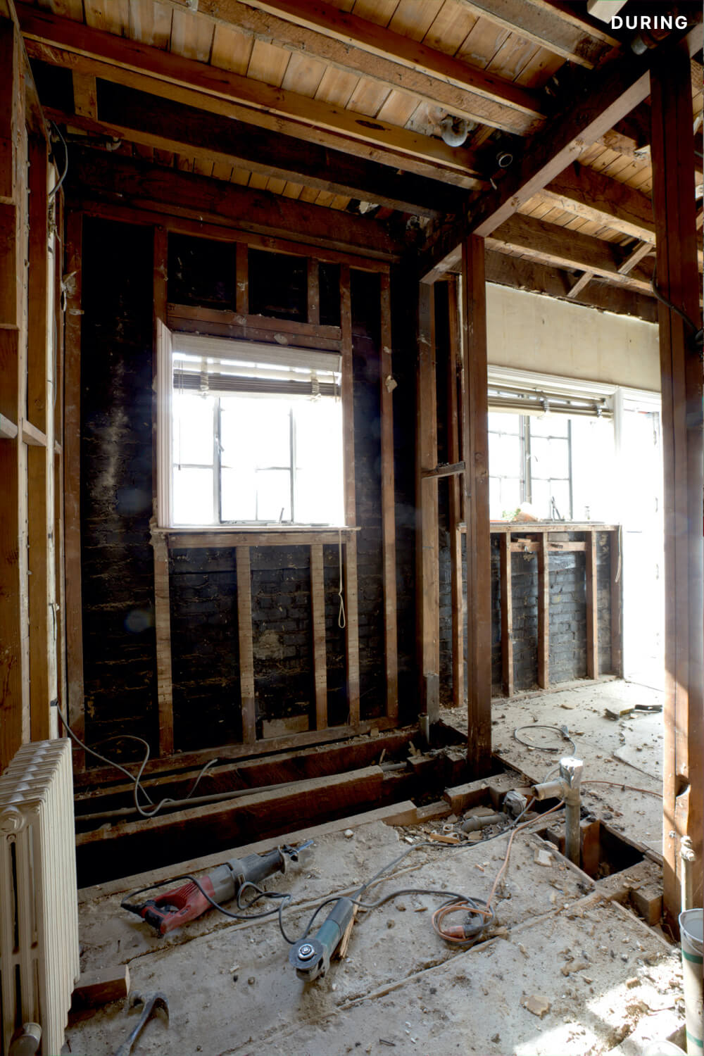
It was a major job, though. The home had only one owner since it was built in 1941, and it had been decades since the home had been well-maintained. Everything practical had to go: plumbing, gorgeous-but-ruined steel windows, cloth-wrapped aluminum electrical wiring that the home inspector begged us to replace “so I can sleep at night. Really. Please. PLEASE.”
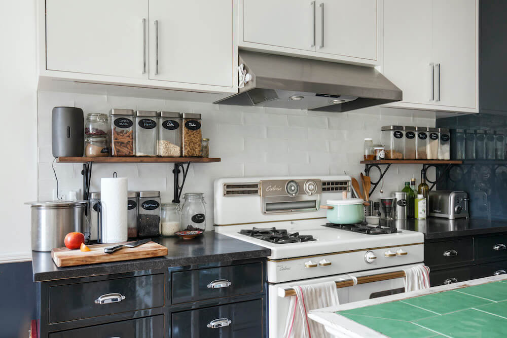
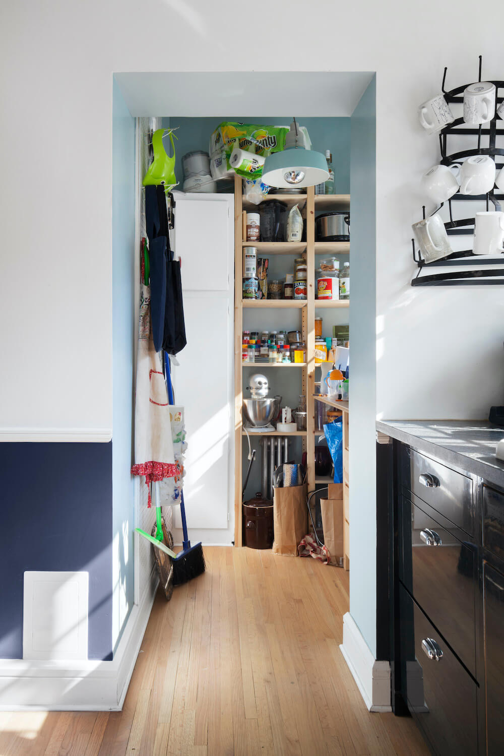
The structure was great, however, and it was full of personality and charm. I adored the arched doorways and beautiful 1950s Caloric stove, and I wanted to maintain ’40s details even where everything would be new. I collected bright and cheerful images of tiled bathrooms, Airstream-inspired kitchens, and patterned floors. I prepared a full set of construction drawings, selected all my finishes, and looked for a contractor.
I know some general contractors that my office uses, but I wanted to keep my personal renovation separate to avoid conflicts of interest. I was thrilled to find Sweeten, posted my project, and then selected a contractor from a list of really excellent matches. I got pregnant, and the clock began to tick as we ran into a contract delay with the team we’d chosen.
I was paralyzed with stress, back at square one with a due date and a house full of lead paint and death-wiring, holed up in the basement with my belongings around my ears like a hoarder. There was some crying. But I called Sweeten, and they swooped into action. Within 48 hours, they had amicably resolved the issue and found me three new excellent contractors to interview, all of whom could start immediately. Our Sweeten contractor was particularly impressive, calling me with thoughtful questions about my drawing set and offering ideas for cost-savings. I could not believe how fast the Sweeten team saved the day.
At Sweeten, we’re experts at all things general contractors. Here’s how Sweeten works: We pre-screen them for our network, carefully select the best ones for your remodeling project, and work closely with hundreds of general contractors every day.
Our house was originally a two-bedroom apartment on the top floor, with a duplex on the first floor and garden level. But at some point, the garden level had been finished as an apartment in its own right, and we preferred to have our duplex upstairs with rentable space on the bottom. By eliminating the need for a separate entrance to the second floor, we were able to open up the center staircase to the living room and turn the entry from a dark, tiny box into an open alcove, flooding the front of the house with light. The difference has been amazing.
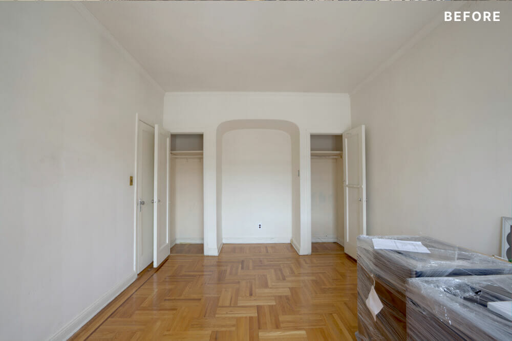
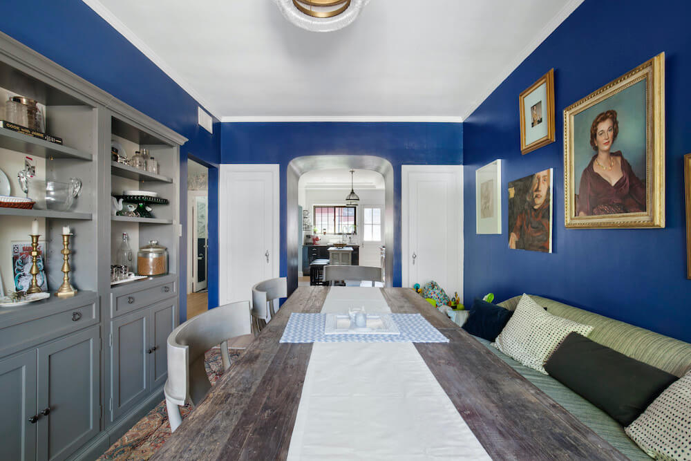
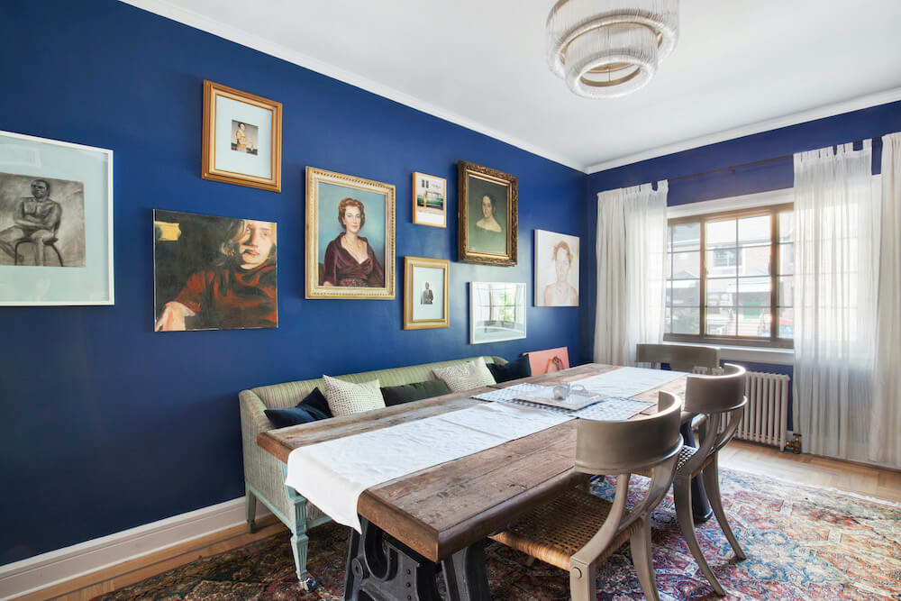
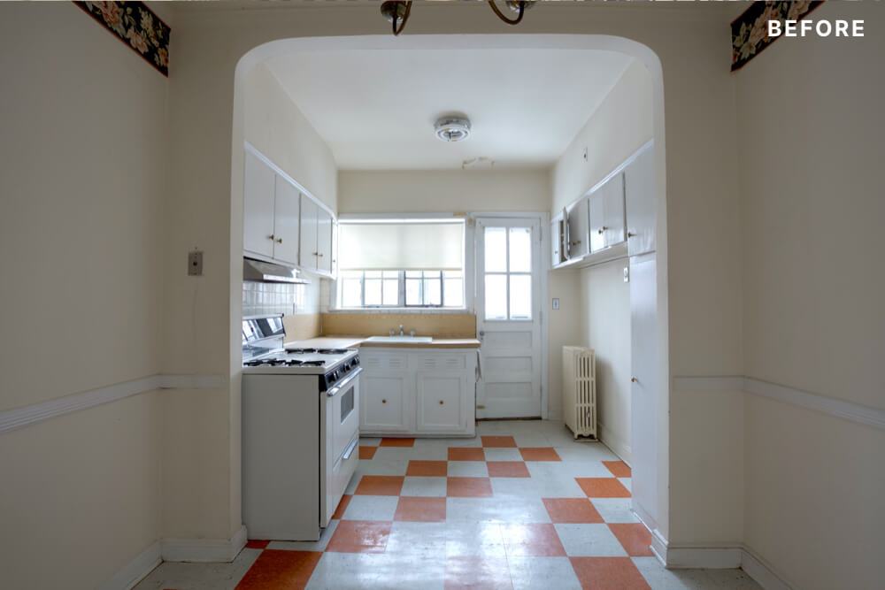
We also took advantage of a neat arched niche that sat between two closets in the bedroom on the first floor. The back wall of this niche was up against the kitchen, and by punching through, we created a doorway from the kitchen into what is now the dining room. Suddenly there was a clear view all the way through the house, without removing the lovely original details.
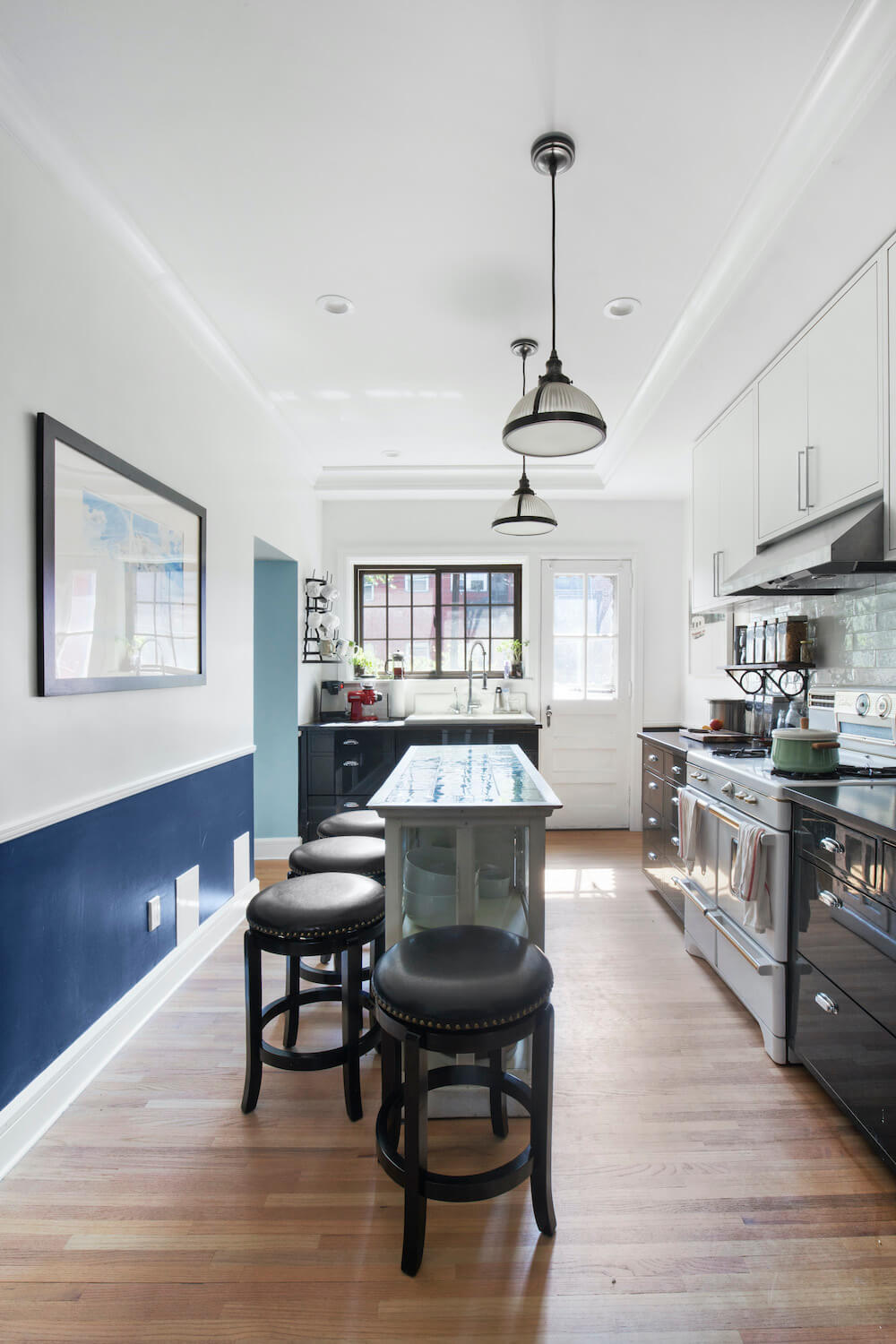
My kitchen design truly started with two amazing finds: an old stove and a salvaged Sub-Zero fridge I snagged for a song at Build It Green in Gowanus. Its front panel was a dark, glossy charcoal, which perfectly matched what I was already thinking for my lower cabinets. It felt like fate.
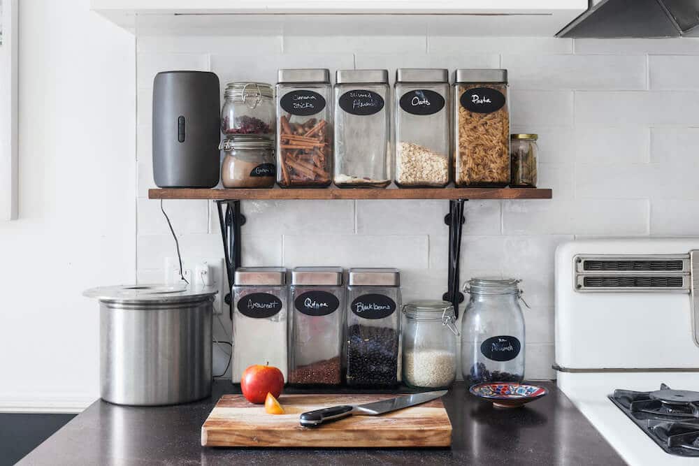
For the uppers, I went with matte white and a beautiful, hand-made subway tile. It has an uneven surface that softly reflects light, which I love. Since I like to keep my cooking ingredients out all the time, I had the cabinets installed unusually high to fit a shelf for jars underneath. The counters are a honed Jet Mist granite, giving me the look of soapstone without any of its typical green tint, which would have clashed with my Sub-Zero.
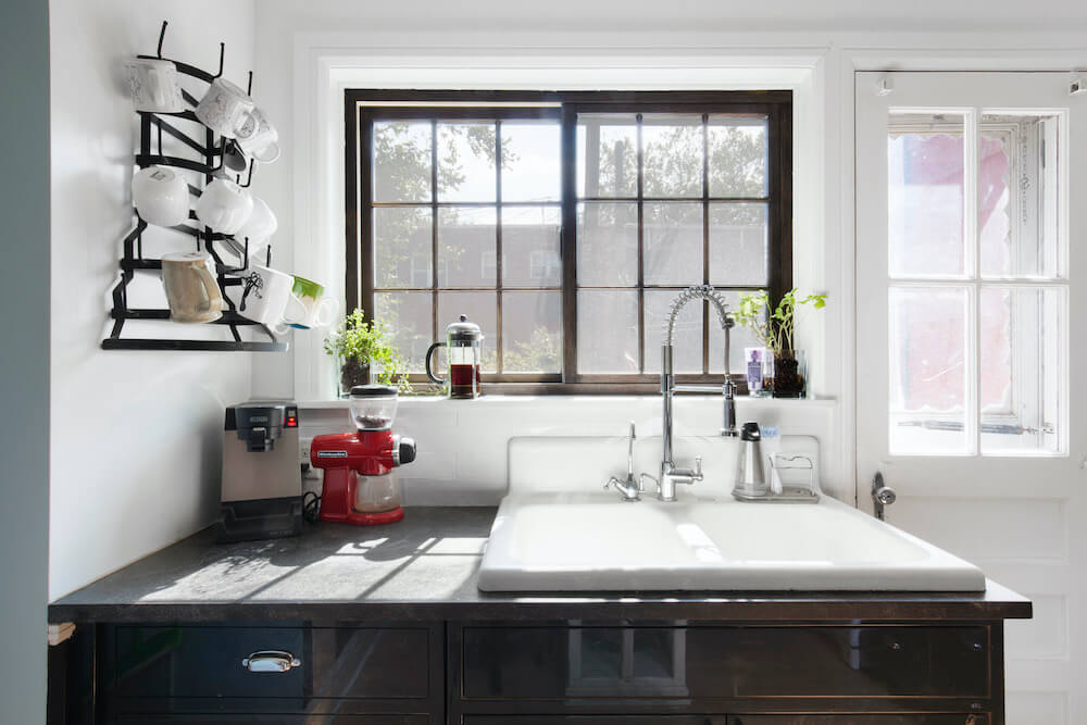
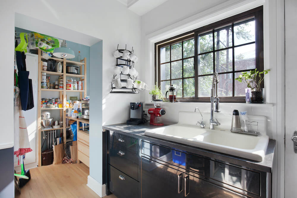
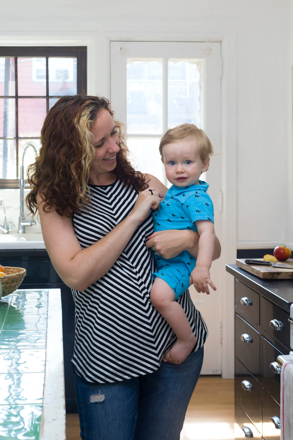
I also scored a vintage enamel sink from BIG, and paired it with the restaurant-style sprayer faucet of my dreams from Signature Hardware – it really lives up to the hype. Our most unusual score, though, was the island. I happened upon it one night driving down the block on my way home from work. It’s an amazing furniture piece a neighbor was throwing away, and it was exactly the perfect dimension for our kitchen. Although I’d planned to replace the top with butcher block, I’ve so loved the wavy green tiles that I’ve kept it just as I found it. Sweeten brings homeowners an exceptional renovation experience by personally matching trusted general contractors to your project, while offering expert guidance and support—at no cost to you. 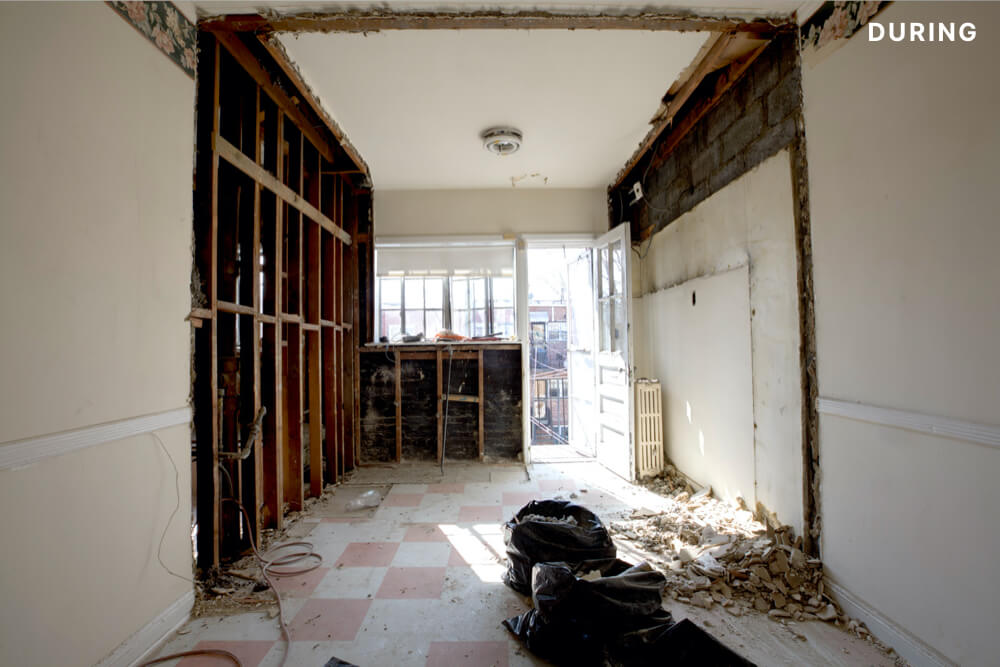
Renovate expertly with Sweeten
Post your project on Sweeten for free and make your dream renovation a reality. Sweeten simplifies home renovation by connecting homeowners with top-rated general contractors, handling the vetting process and project management. To learn more about how we can help, check out our home renovation services.
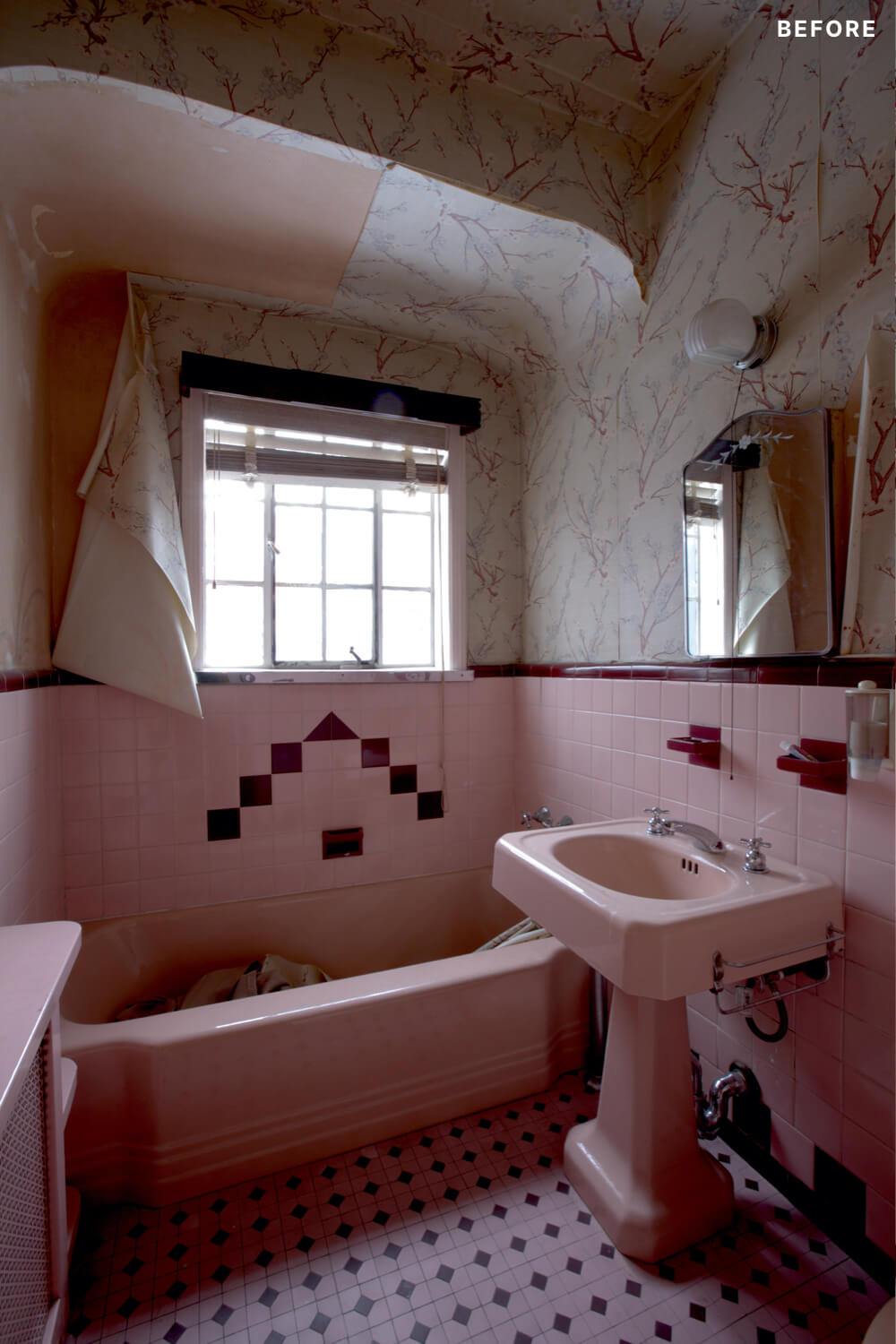
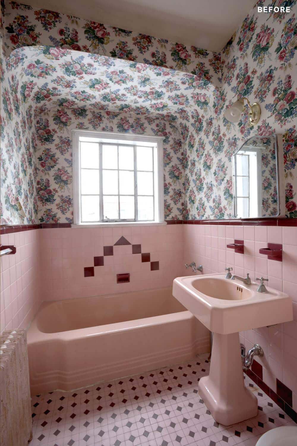
Every pink its very own shade! The coolest discovery came in peeling off the wild pink floral wallpaper; directly on the original walls, we found delicate hand-painted Chinoiserie scenes of a river, swans, and boats. A neighbor told us that all the houses had them, but that slowly over the years they’ve been lost. Sadly, it was badly damaged, so we only have photos.
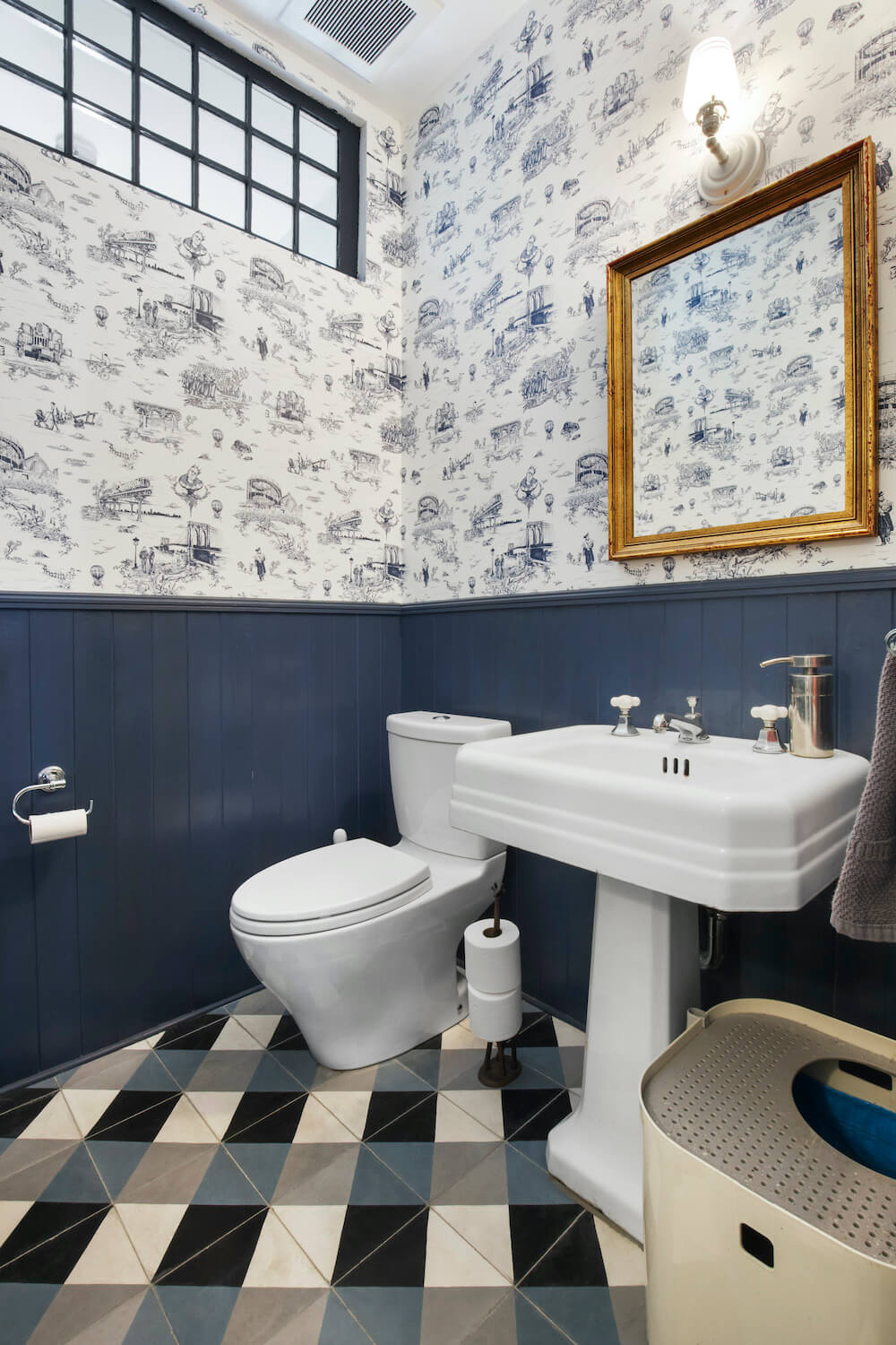
The new powder room is wonderful, though, and a better use for our space. I used a salvaged pedestal sink and a window from Olde Good Things for a high transom, so the room isn’t entirely cut off from its original window. And at long last, we found a home for the Brooklyn Toile wallpaper from Flavor Paper (made just one block away from our old apartment!), which was designed by Mike D from the Beastie Boys.
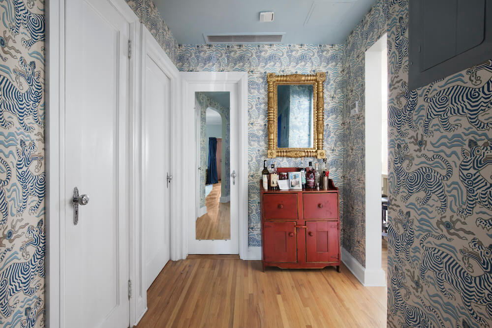
My husband spent years longing for this paper, which features a dreamy mix of Notorious B.I.G. and angelic Nathan’s hot dogs and men in fur hats and Park Slope stroller mommies. I picked a cement floor tile of navy and gray plaid, had the paper custom-matched to it, and then papered the hall just outside it with my favorite Schumacher print of completely nuts-o Tibetan tigers. Because my clients never let me have that much fun.
The other layout updates were upstairs, where we turned a kitchen into the master bathroom and closet of my dreams. The new shower is about the size of the studio I lived in during grad school. The tiles in there were my biggest splurge, with a pretty ’40s-inspired white and blue marble floor and cornflower blue walls with period-appropriate black tile trim. In fact, I used a thread of either blue or orange throughout the whole house, which helped tie together my otherwise colorful selections.
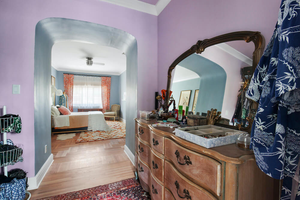
Upstairs had the same arched niche which we again punched through for flow, and stole some closet space to create a linen closet in the hall. We repurposed original doors, which have amazing Deco knobs and backplates. The original bath’s odd standing shower became a washer-dryer unit.

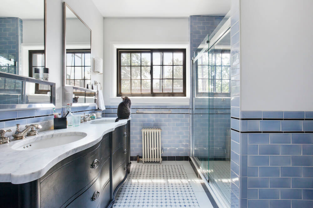
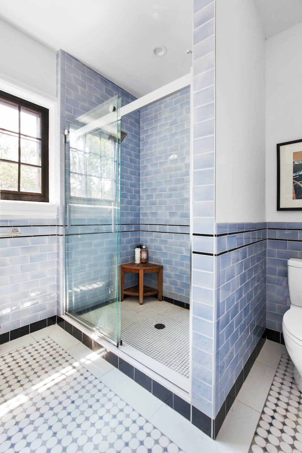
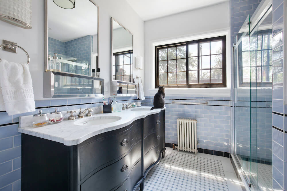
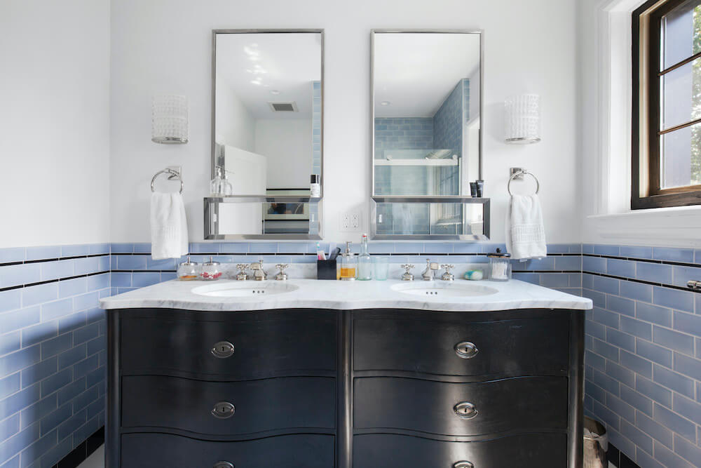
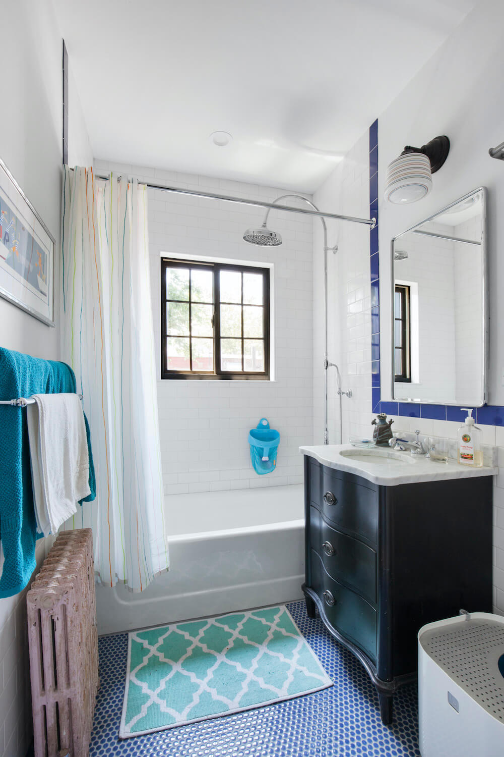
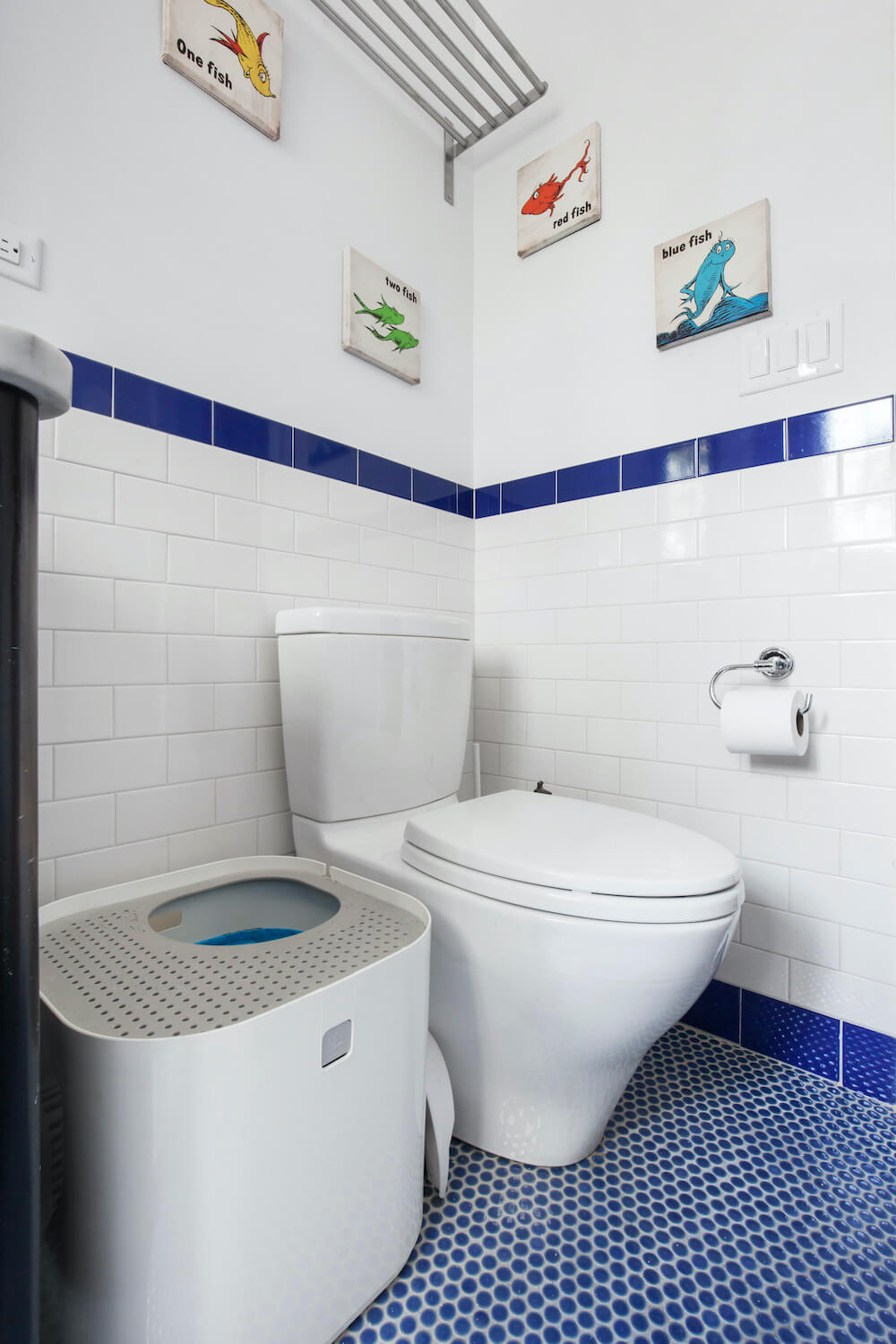
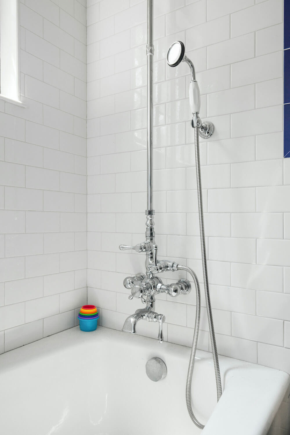
Our son’s bathroom, beyond losing its shower to the washer-dryer, kept its layout with cosmetic updates only. I found a cornflower blue penny round for the floor, with family-friendly gray grout that hides the dirt, and paired it with white subway tile and a cobalt blue bullnose tile. The black vanity is made to look like a repurposed dresser, but it is actually a sneaky Restoration Hardware reproduction that matches the one in the master bath. My favorite touch is the shower, with its pretty vintage-style handheld showerhead and its huge oversized rain head.
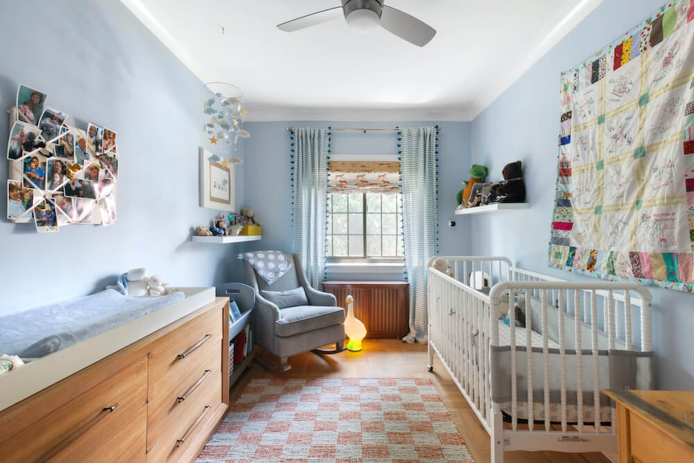
Our son’s nursery was the room I was most itching to decorate as the renovation finished. The dresser is vintage, and I made blinds by cannibalizing a Home Depot shade with a Spoonflower fabric of wonderful tigers, to whom we now bid goodnight in our bedtime routine. The mobile was a gift from his grandmother, from an artist she knows in Brooklyn whose Etsy shop (AllySen) sells similar creations. Lucy Goosey, the giant plastic goose nightlight, is a particular favorite and another gift from family. We tried to scatter family throughout the room, from photos and cards to the quilt hanging above the crib, made for my husband when he was born. I was a very happy camper when that room was finished before our son, Mac, arrived!
As for other original details, we tried to reuse a few light fixtures, but only one held up to re-wiring. The rest were mostly purchased from Schoolhouse Electric and Y Lighting. The floors were refinished with a wonderful no-VOC satin-finish natural oil product called Rubio Monocoat, which everyone loves when they visit. And my contractor and the crew thought I was crazy to replicate the original black windows with their traditional mullions, but they fit the Tudor style of the house perfectly, and I was adamant. Luckily, the guys all changed their minds when they were installed and stained. Or they were polite enough to pretend.
Throughout the project—completed on-budget and on-time, a minor miracle—I was so happy to see the crew every morning. I do NOT recommend living in the basement during a renovation unless you know exactly what you’re getting into, but it was our only option, and the crew was wonderful. It also made meetings a breeze, as I would pop upstairs on my way to work, discussing any questions that had arisen the day before. The crew’s foreman was reliable in every way, particularly for solving problems intelligently and with an eye for design. He is worth his weight in gold.
In the end, we made our deadline, but more importantly, we made the home I had hoped for. I used to stand in the half-framed kitchen, imagining our little boy padding around the loop made by our newly-opened doorways. Sure enough, every night Mac does his laps, chasing the cats and toppling over onto floors that the team patched and sanded and made to look like they have always been this way. We love our old stove, although the left burners have to be lit with a match. We love our neighbors, and the stories they tell of all the families who have come through over the years. We made this old home new again, and for that, I am deeply grateful to Sweeten and our Sweeten contractor and all the rest.

We continue to putter with smaller projects: painting the garage door, glamming up the entry with our practical and beautiful Shoe-seum (I am slowly being edged out by my husband’s sneakers). Perhaps if we ever manage to tackle the backyard, we will have another Sweeten post for the scary concrete underground wine cellar that turns everything into mildew. But for now, we are enjoying our small projects after the big project was handled by the pros.
Ready to renovate? Start the journey here for free!
Here you can learn more about our services and locations. Alternatively, browse more home renovation inspirations, processes, and cost guides.
Kitchen selects >> cabinets: custom / counters: HG Stones: honed Jet Mist granite / refrigerator: Build It Green: Sub-Zero / range: vintage / dishwasher: Fisher & Paykel / sink: Build It Green: vintage / faucet: Signature Hardware / wall tile: Somer Tile
Master bath selects >> floor tile: Tile Bar: Ann Sacks / shower floor tile: Waterworks / wall tile: Complete Tile / toilet: Toto / shower door: Kohler / vanity: Restoration Hardware / faucet: Randolph Morris / shower head: Elements of Design / plumbing accessories: Pottery Barn / paint: Benjamin Moore / lighting: Hudson Valley Lighting
Second bath selects >> toilet: Toto / vanity: Restoration Hardware
Half bath selects >> floor tile: Mosaic House: Mariposa / sink: Olde Good Things: vintage / toilet: Toto / paint: Benjamin Moore / wallpaper: Flavor Paper: Brooklyn Toile
Nursery selects >> blinds: Spoonflower fabric / mobile: Etsy (AllySen)
Other selects >> hall wallpaper: Schumacher / lighting: Schoolhouse Electric and Y Lighting / flooring finish: Rubio Monocoat
