Apartment Combo in East Harlem
“TheSweeten is brilliant. There really is no other way to properly access the best providers to address a renovation… I valued [GSDO’s] honesty and integrity the most. You have to trust the people that you are working with.”
–Paul K., East Harlem Homeowner
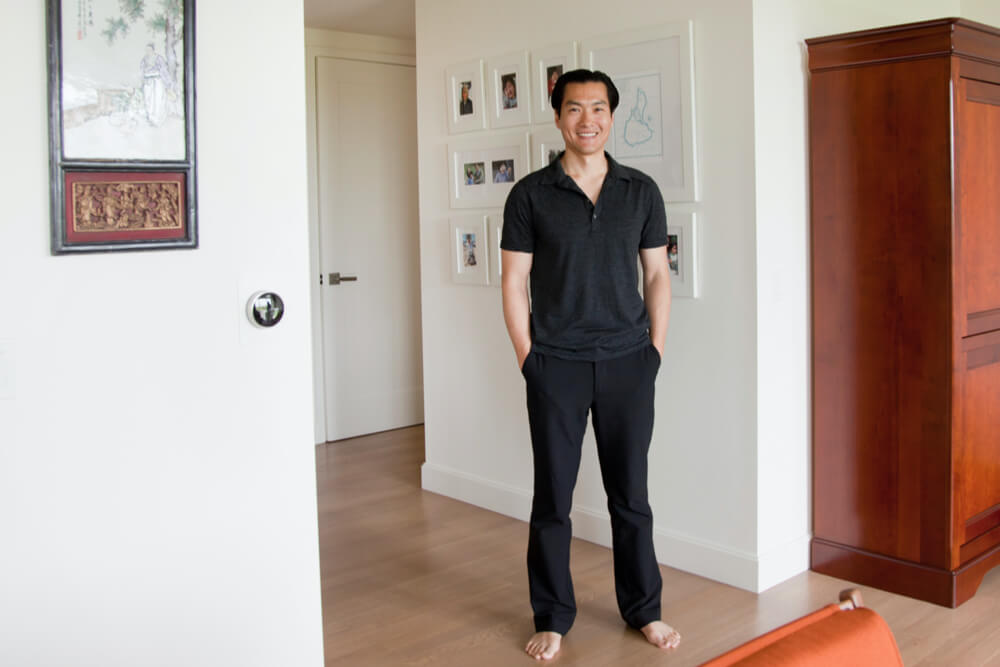
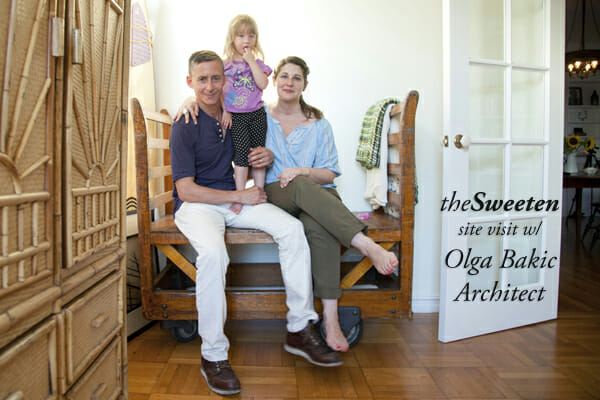
Apartment combinations are a common project we see at theSweeten, and we have several of them to share in the next few months — starting with this week’s site visit up in East Harlem. A couple years ago, homeowners Paul (photographed above) & Teresa relocated from Union Square to a newly renovated building in the more family-oriented, uptown neighborhood where their young son could enjoy the park and have a little extra space to play. Then, last year, the family was also able to purchase the apartment adjacent to their own, so they posted to Sweeten to find an architect to draw up the plans for a legal combination of the 2 units which were connected by the elevator corridor. From their matches, Paul & Teresa chose to work with Adam Glickman & Lauren Schlesinger of tS firm GSDO to design their spacious, 2,800 sqft version of a “classic 8.”
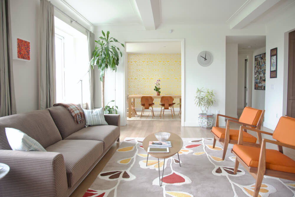
From 2009-2011, the historic building underwent a complete renovation by a local developer who not only brought it up to date, but also up to LEED Gold rating. Paul & Teresa loved the modern edge that the developer brought to the 1920’s building through the updated construction details, and wanted to follow suit with the combination project.
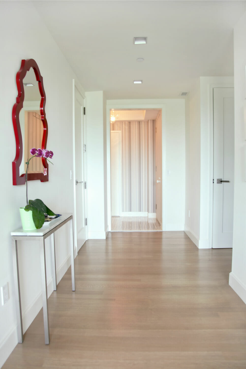
Straight ahead is the former apartment entrance — now a threshold into the expanded entry foyer that connects the home’s 2 wings. Sweeten brings homeowners an exceptional renovation experience by personally matching trusted general contractors to your project, while offering expert guidance and support—at no cost to you. Renovate expertly with Sweeten
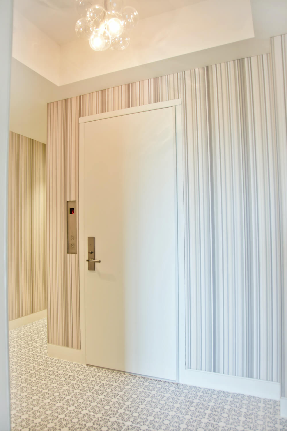
The original front door was actually re-used for the new entry, and was specially installed by the contractors onto the existing elevator door frame. Before the renovation, the corridor ceiling was illuminated with a lighting cove, but the architects re-designed the lighting feature to give it a more residential character; we love the new bubble chandelier by Pelle Designs that was hung in place of the lighting cove. Lauren & Adam helped Paul & Teresa select new materials, which lead to a unique application of upholstery on the walls, after the homeowners fell in love with Maharam’s “Ruban by Kvadrat” textile.
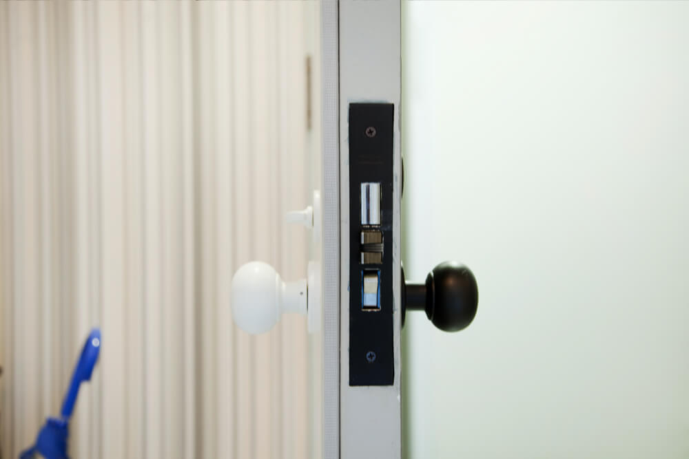
In order to secure the upholstery in place, the contractors wrapped the material onto large panels of plywood, then mounted each panel to the wall and built the trim out around the new surface. The result appears impressively seamless along the corridor walls, but we get a peak at the layered construction in the profile of this opened fire exit door.
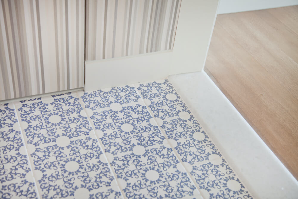
Silk-screened floor tiles are a nice, subtle compliment to the upholstered walls. Tiles are Iris 1 from Ceramica Bardelli.
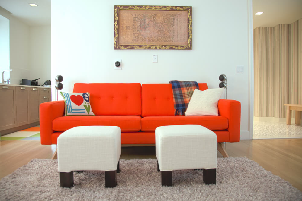
The second living room becomes a less formal media room with fun furnishings and pops of color, like this red sofa from Gus and the no-shed shag rug from De la Espada. The pair of ottomans are from CB2.
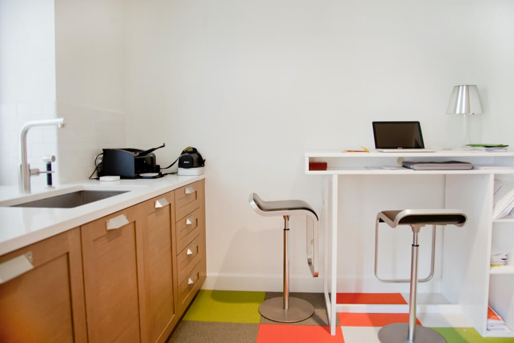
Tucked behind the media room, a former kitchen has become a multi-use space; part pantry, part satellite office, and potentially, part wet-bar – this little space looks like it would come in handy for informal entertaining!
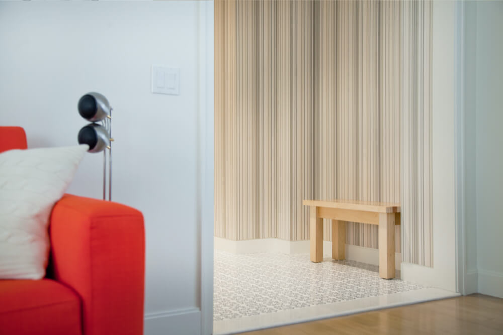
What a great new space! Many thanks to GSDO, and to Paul & Teresa for sharing their home with us!
Do you have a new vision for your space? Post your project to theSweeten!
