Architect’s Vision Brings Art Deco to Life in Queens Townhome
Soft hues and arching pass-throughs inject light in an Art Deco renovation
- Architect: Can Vu Bui and Lane Rick, principal architects at the Office of Things, and in collaboration with architect Matthew Storrie, found a general contractor by posting the 1920s rowhouse project on Sweeten
- Where: Glendale neighborhood in Queens, New York
- Primary renovation: A front-to-back reenvision of the home’s 600-square-foot ground floor, bringing in space and light and solving storage problems throughout
- Architect’s quote: “As architects, we spend a lot of time designing custom details—our relationships with the contractors who can make them are critical. It’s great to work with craftspeople who bring insight and expertise to the project.”
Written in partnership with architect Can Vu Bui. “After” photos by Miao Jiaxin.
Opening up a claustrophobic layout
“Be patient and be bold,” Can Vu Bui, a Brooklyn principal at Office of Things (Instagram: @officeofthings), a collaborative architecture and design studio, likes to tell his clients. This was his mantra going into the main floor gut renovation of an Art Deco–era rowhouse in Glendale, Queens. Bui’s slow, steady approach led to a striking result.
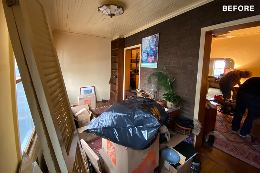
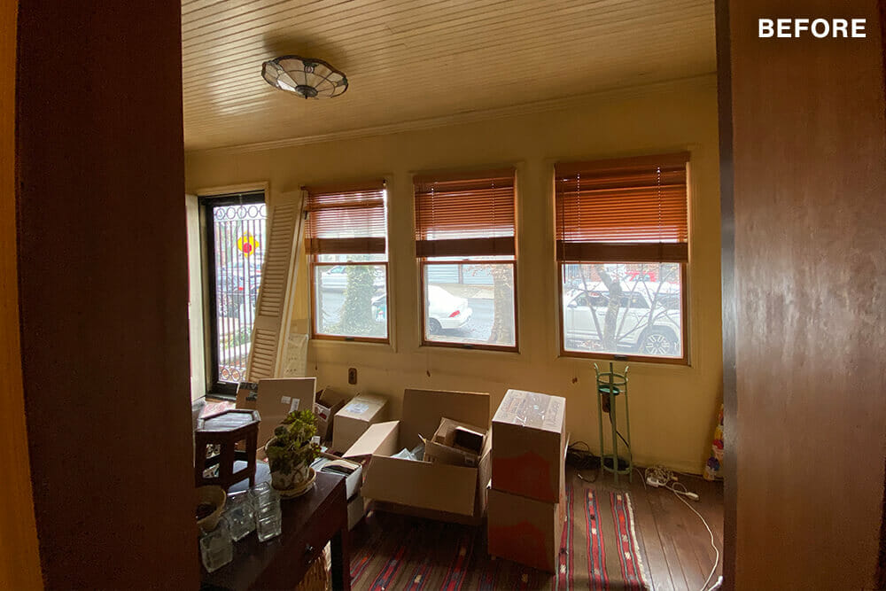
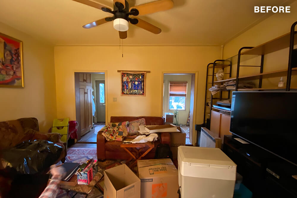
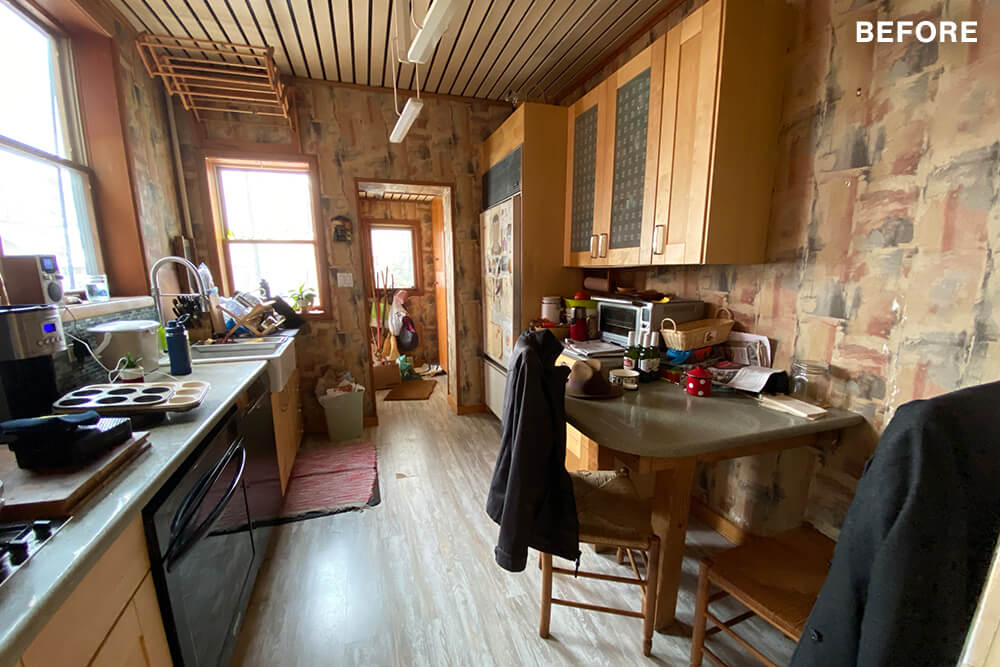
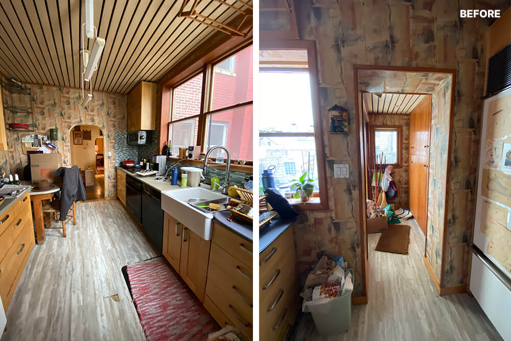
The homeowners had been living in the home when they hired Bui, and were ready for dramatic change on the brick building’s first floor. They planned on revising the existing layout to bring air and light to a chronically dreary space.
After coming up with a concept reflecting light modernism, Bui created a project plan and posted the job on our website. They worked with the homeowner to review bids and portfolios before hiring a contracting firm in Queens.
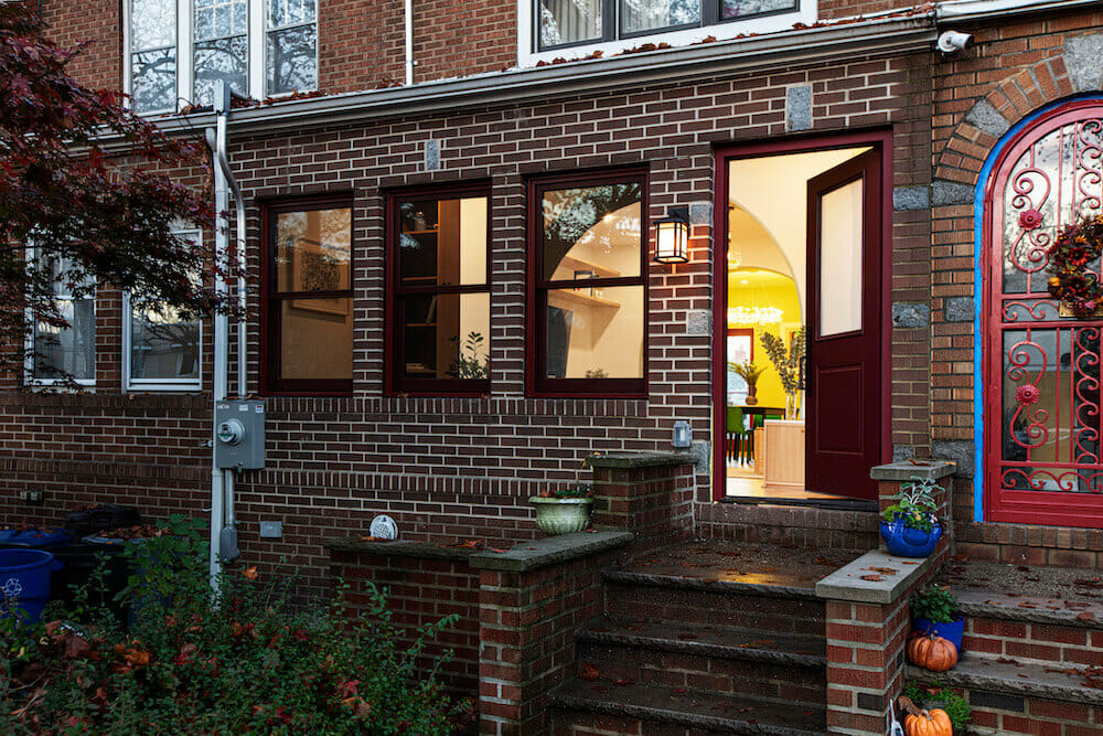
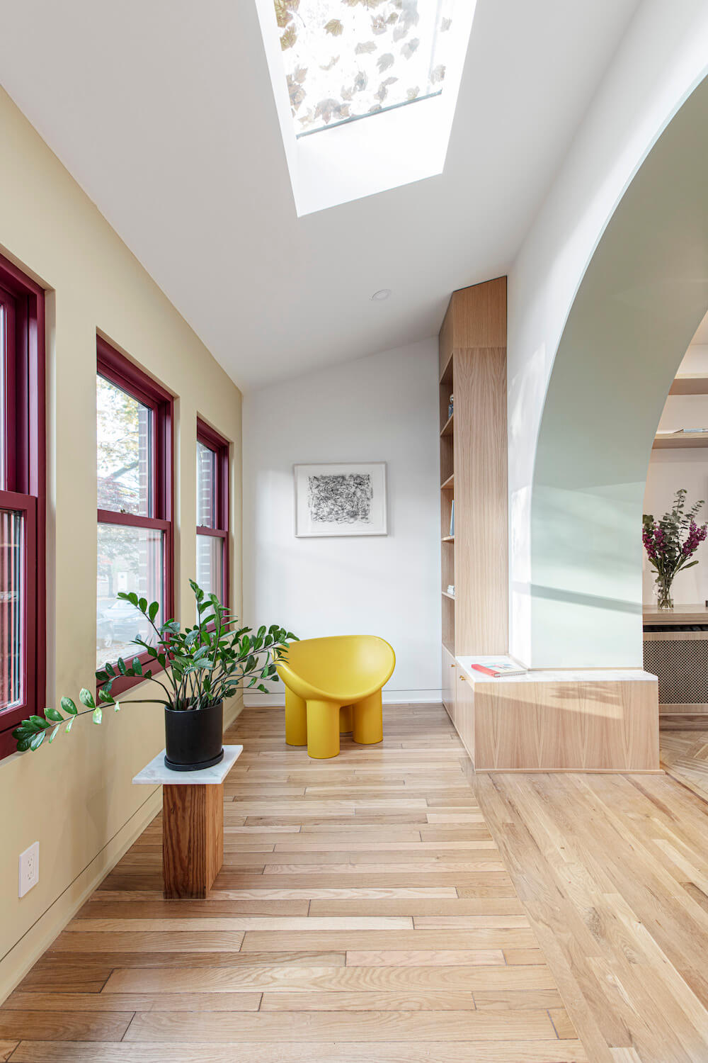
Starting out, the team had their work cut out for them. “The house’s primary problem was a direct product of its 1920s design,” the architect said. The brick-and-mortar building, surrounded by townhomes, had a narrow, chopped-up floor plan.
The challenges of opening the 600-foot main floor space, according to Bui, were abundant. A load-bearing masonry wall blocked light from reaching the living and dining rooms. Walls that separated the stair, kitchen, and dining area inhibited flow, creating “small, claustrophobic” spaces, he said.
“We designed custom millwork that provided a pantry, cabinets, and a low bench.”
Art Deco-approved arches
The light and space problems at the top of Bui’s task list were only the beginning of a complex renovation challenge. “This project presented an opportunity to address these functional issues,” he explained, but also to create a cohesive and aesthetically pleasing ground floor from the previously disjointed layout.
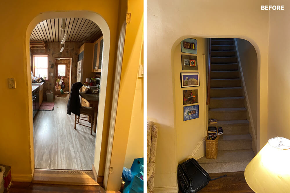
Door frames and wall openings were haphazardly placed throughout the building, yet amidst the chaos, some intriguing original architectural elements remained. Bui was particularly drawn to several doors with softly curved tops, which hinted at the building’s potential elegance.
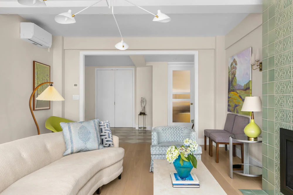
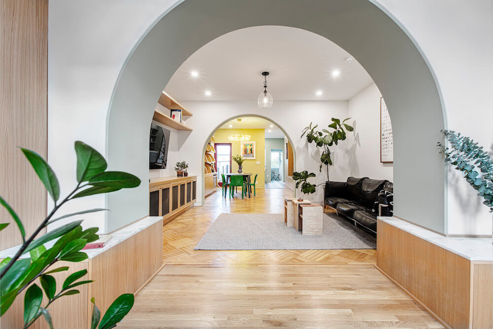
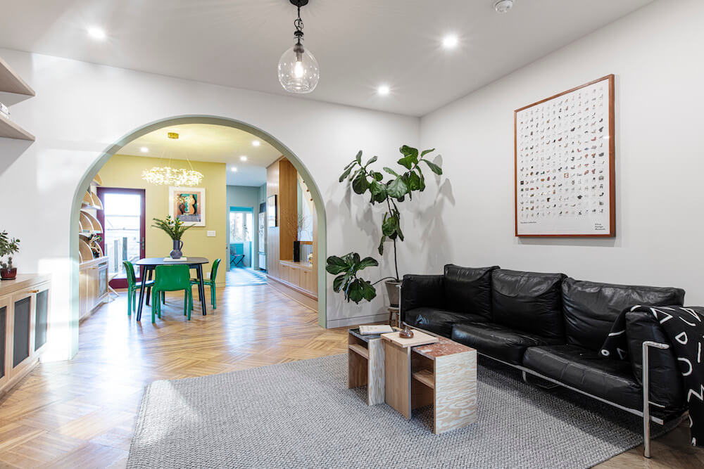
Envisioning a harmonious flow between the rooms, Bui conceived of a design that incorporated sweeping curves. “We replaced the existing, jarring walls with graceful structural arches,” the architect explained. “This transformation allowed for an open and interconnected floor plan, bathing the interior in natural light.“
Renovate expertly with Sweeten
Sweeten brings homeowners an exceptional renovation experience by personally matching trusted general contractors to your project, while offering expert guidance and support—at no cost to you.
Stairs open up with storage
Despite the desire for openness and light, maximum storage space was still needed for functionality and day-to-day life, particularly in New York City homes, according to Bui.
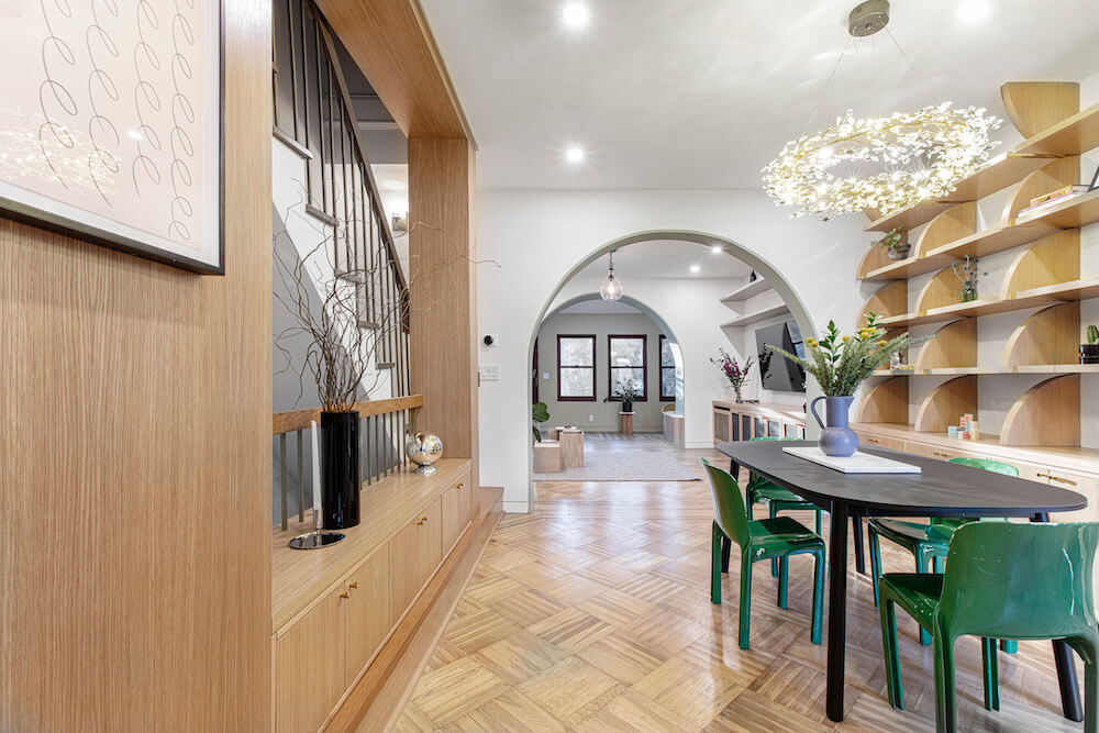
According to his plan, the general contractor opened the wall between the existing stair and dining room, removing a large, square center section. Next, the contracting team revised the staircase, adding a landing a few steps from the base and then introducing a turn, so that the last few steps led into the dining room. The changes helped the narrow stairs and small dining room feel instantly less claustrophobic.
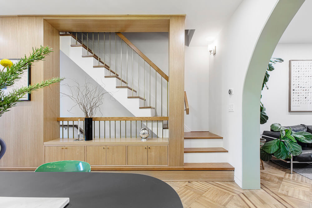
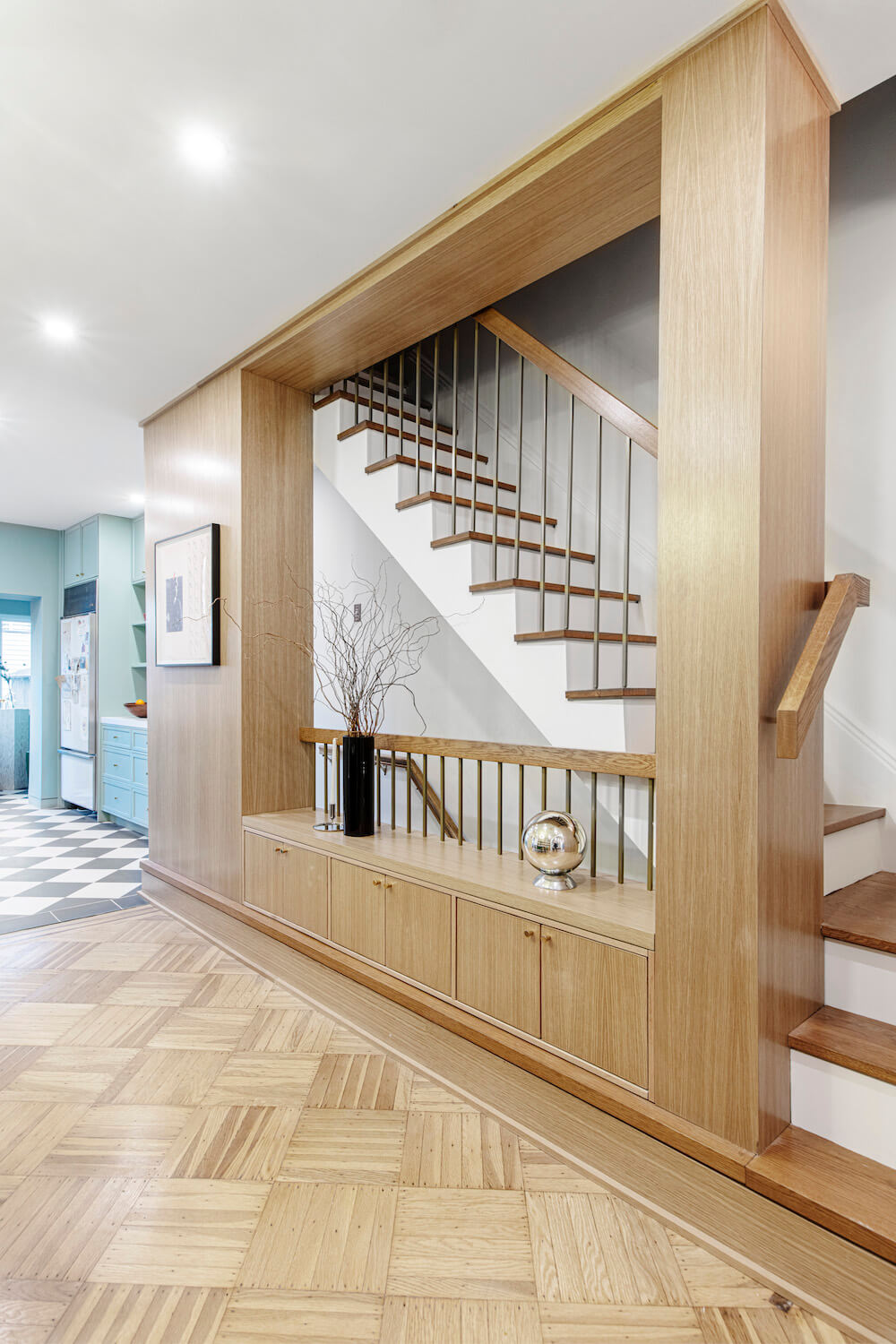
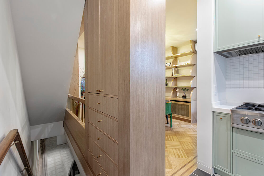
However, the breaking through of the wall eliminated key storage space. Bui found a fix. “We designed custom millwork” surrounding the new wall opening, he says, “that provided a pantry, cabinets, and a low bench,” as well as custom handrails. In the end, a partially exposed stairway brings light and drama to the home.
Paint colors and bright finishes
The walls and the interior planes of the arches are painted in muted shades—green, ochre, and blue. Curved millwork is also seen on a full wall of open storage in the dining room. The brushed oak is stained with a hint of gold. Brass accents bring warmth to the rooms.
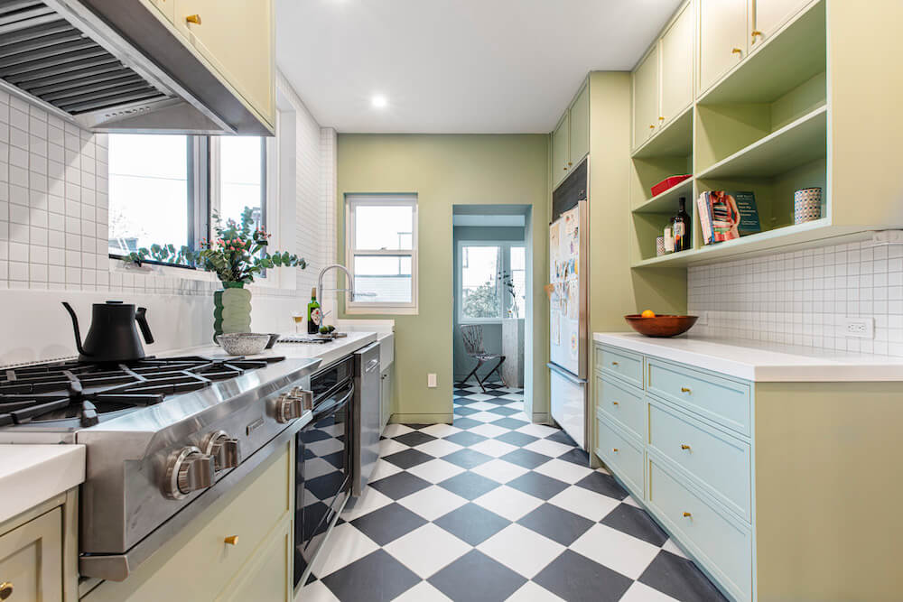
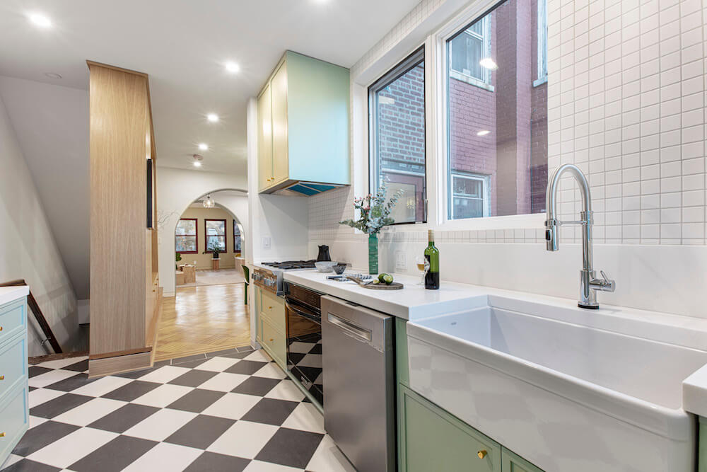
“Many homeowners and designers fear color,” he said. “It makes sense—you don’t want to be stuck with the wrong one.” The architectural team worked closely with the homeowner throughout the process, providing renderings, tests, and mockups to prevent surprises. For instance, the shade of gold on the walls in the foyer and dining room carefully bookends the space without overwhelming or darkening the area.
“The pale green in the kitchen and reading nook plays homage to classical French country homes,” Bui said. The effect is an inviting color path leading one through the house. “Our goal,” Bui said, “is to let color boldly elevate the feeling of a space.”
Architect + Sweeten general contractor = Teamwork heaven
Throughout the process, the architect and Sweeten general contractor worked together closely, executing Bui’s vision. “As architects, we spend a lot of time designing custom details—our relationships with the contractors who can make them are critical. It’s great to work with craftspeople who bring insight and expertise to the project.”
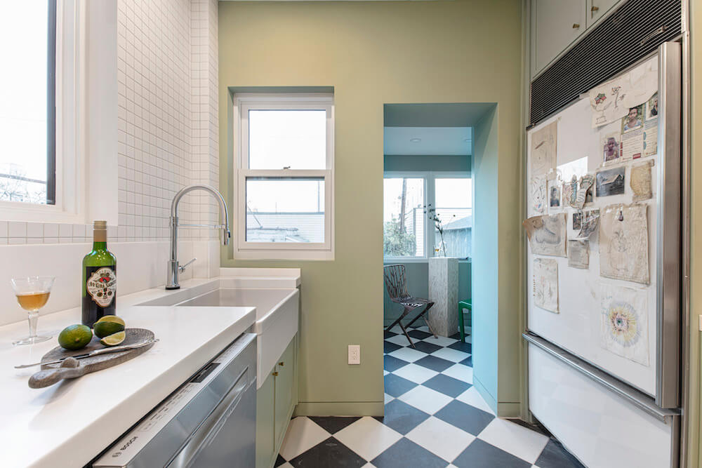
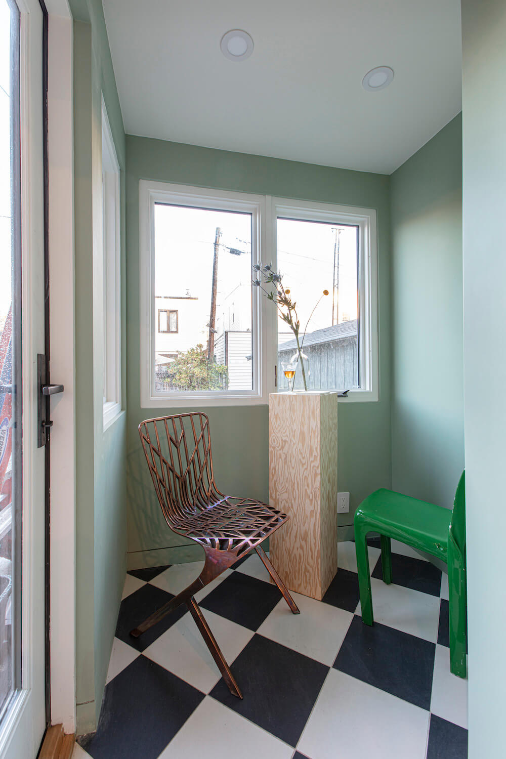
In the end, Bui explained, the renovation made over the once spiritless space—it feels bright and modern, but not harsh or humorless. Furthermore, color and flow now have a direct impact on the comfort one feels in their surroundings. “This is a home, after all,” Bui said. “It should feel special.”
Thanks for sharing your Glendale, Queens rowhouse renovation story with us, Can Vu Bui.
—
If you’re thinking of a home remodel, read our NYC remodeling cost guides for the kitchen and bathroom.
Sweeten handpicks the best general contractors to match each project’s location, budget, scope, and style. Follow the blog, Sweeten Stories, for renovation ideas and inspiration and when you’re ready to renovate, start your renovation with Sweeten.
Renovation Materials
LIVING AREA RESOURCE: Paint in Cedar Grove, Heirloom Gold, and White Dove: Benjamin Moore. Light fixtures throughout: LF Illumination.
KITCHEN RESOURCES: Anchorage floor tiles: Daltile. Kitchen cabinets and hardware: Custom. Milk Glass Spectra solid surface countertops and backsplash: Wilsonart. Fireclay apron sink: Franke. Refrigerator/dishwasher/stove: Existing.
