A Teacher Writes a New Lesson Plan for Her Kitchen
A developer’s dark style is transformed by its new owner with high-gloss cabinets, drawers turned sideways, and a comfy window seat
Project: Redesign a kitchen with a bright sheen in Bedford-Stuyvesant, Brooklyn Sweeten brings homeowners an exceptional renovation experience by personally matching trusted general contractors to your project, while offering expert guidance and support—at no cost to you. Renovate expertly with Sweeten
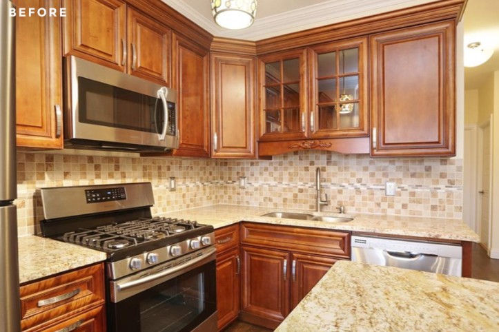
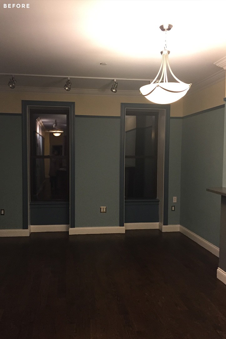
Before: There was much to love about the two-bedroom condo in Bed-Stuy that Ursula, a math teacher, recently purchased. The developer, who had just converted a brownstone into four apartments, did a good job. However, the brand new kitchen just wasn’t her style. The dark mahogany cabinets and kitchen island weighed it down as did the floorboards of a similar color. The cabinets above the range also gave the space a claustrophobic feel. “The developer seemed to have an imagination when it came to painting. The walls were blue and yellow and very specific to his taste,” said Ursula.
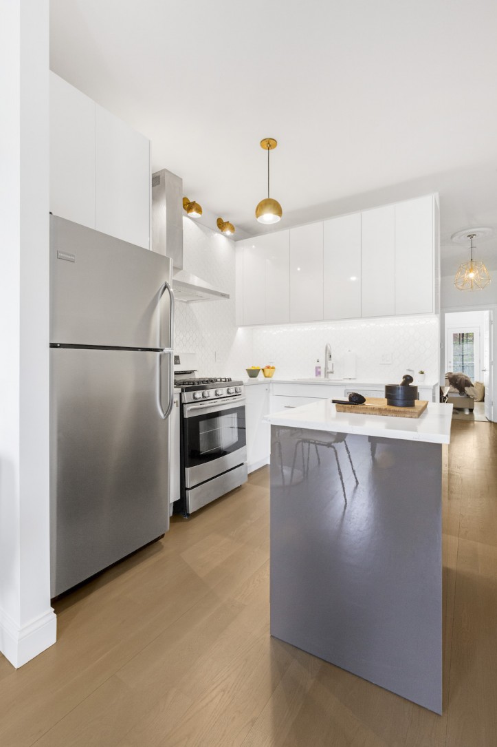
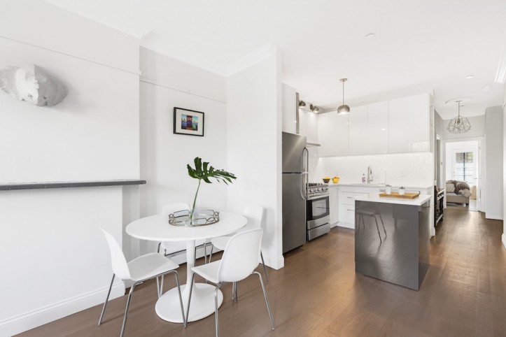
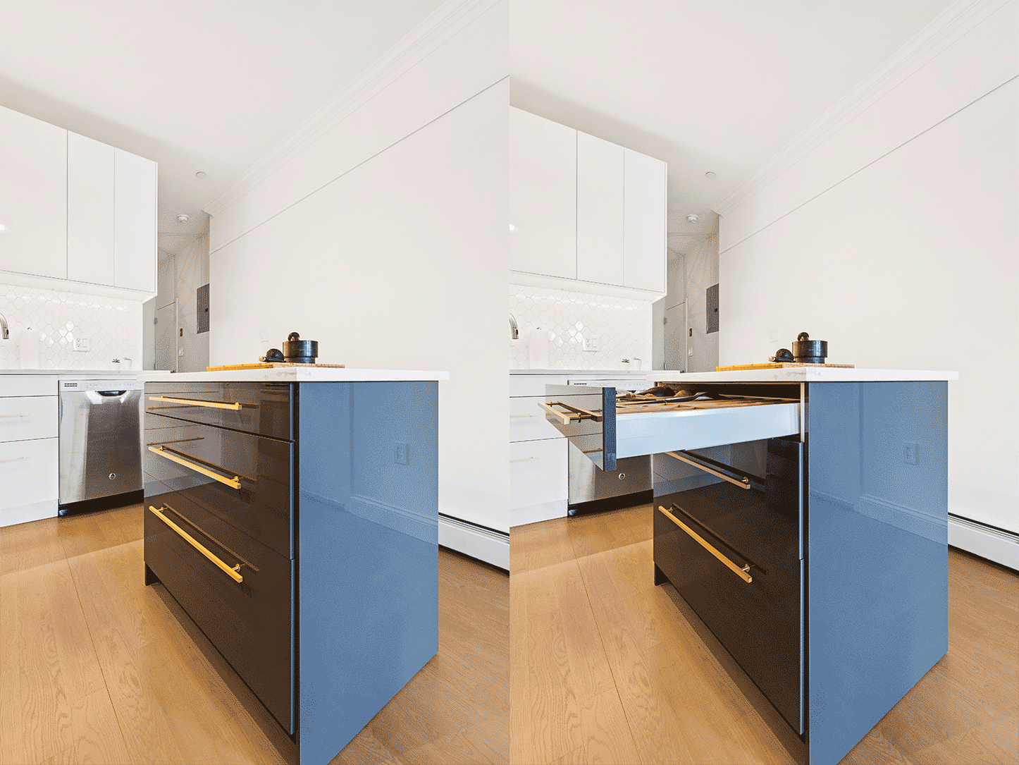
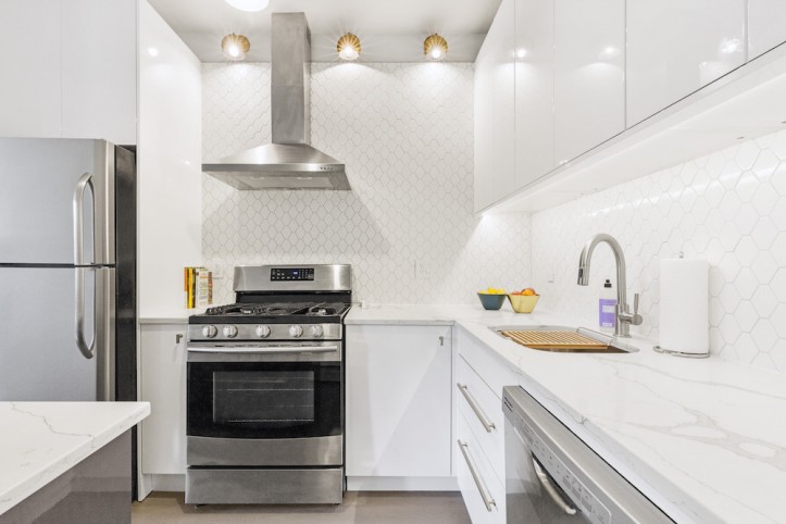
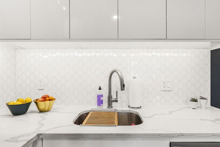
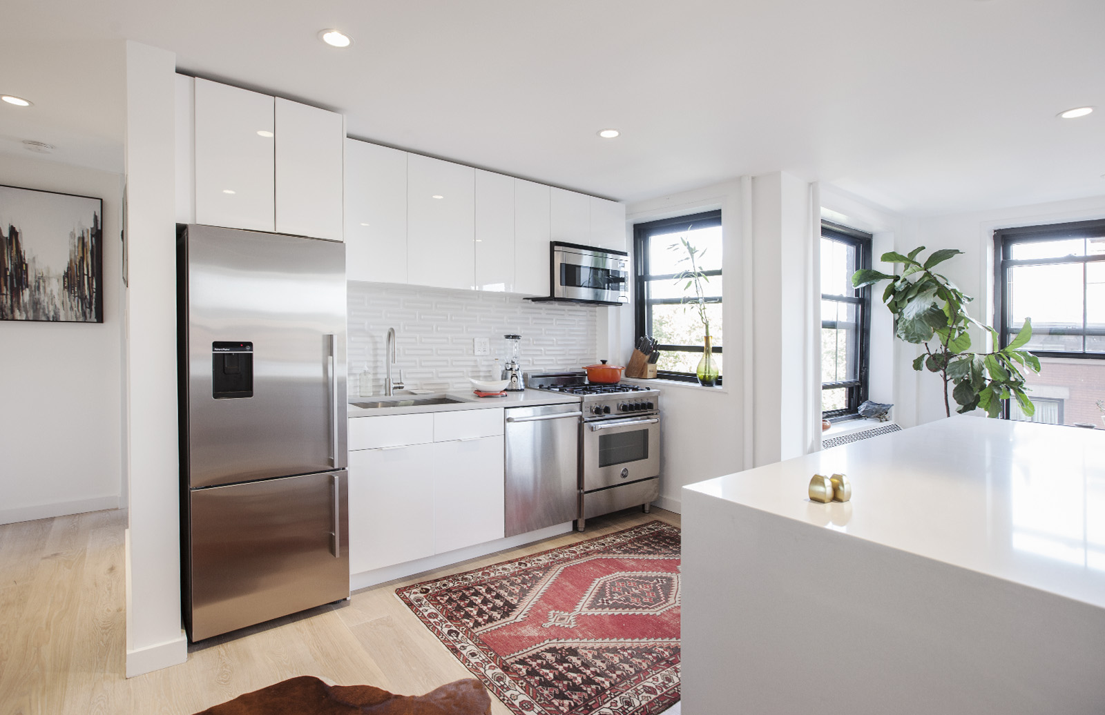
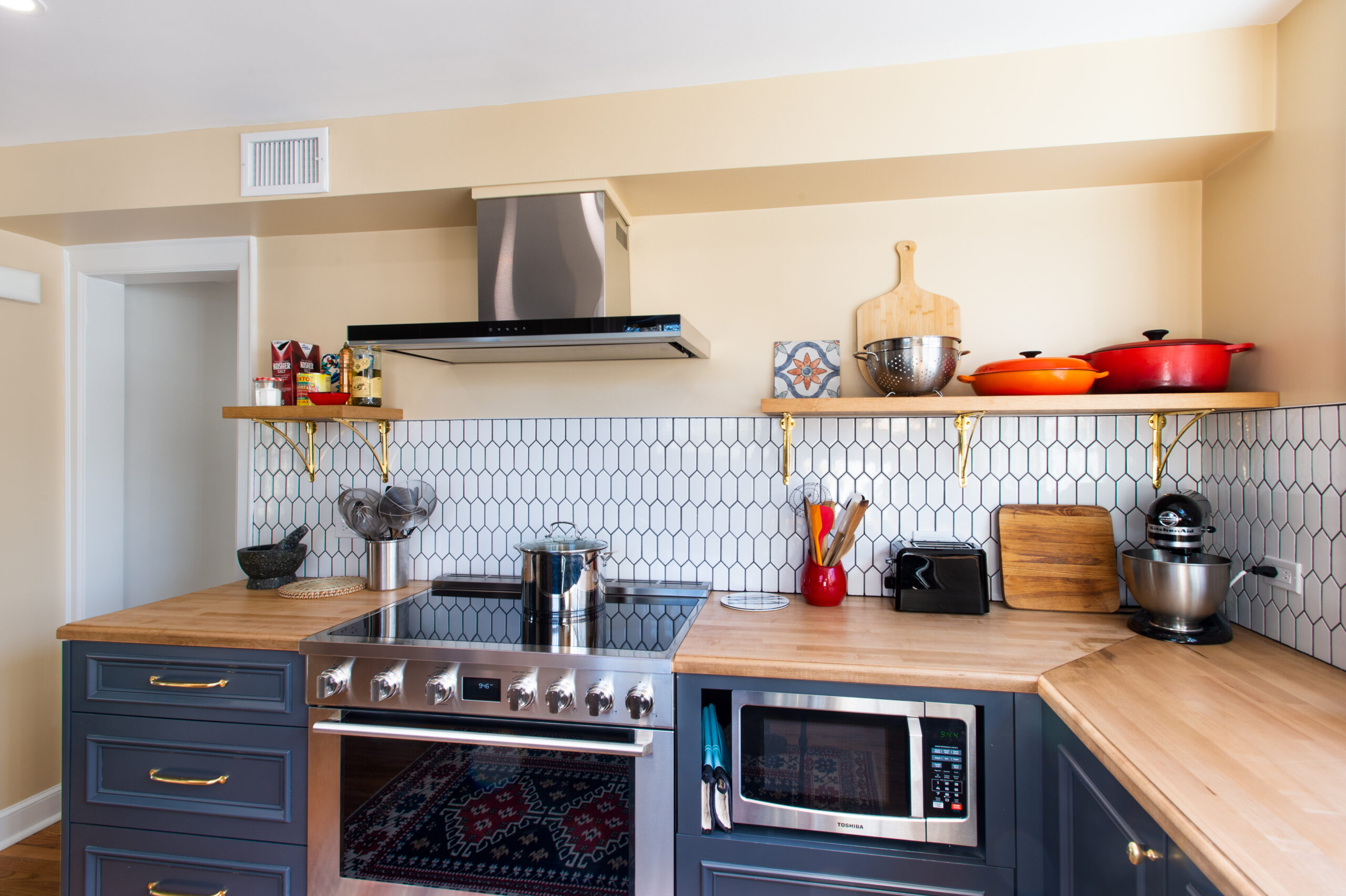
After: Since her new apartment only has windows on the front and back, Ursula used Sweeten, a free service matching homeowners with general contractors to tap her Sweeten contractor and harness that light. So out went the dark cabinets. The wood floors were stripped and restained. To open up the kitchen, the cabinets and microwave above the range were out, too (“it just isn’t a pretty appliance,” said Ursula, speaking of microwaves). In their place is now a sleek hood. With the space more open, the hexagonal tiles chosen for the backsplash became a focal point. “I think it must be the math teacher in me, but there is just something about them that I love,” she said. A “dresser”-style island features three drawers for silverware, cutlery, dishes, and some pots and pans. “My beech cutting board is always on top of the kitchen island for food prep,” says Ursula. “It is conveniently in front of the oven, so I just have to turn around to cook.” The storage unit’s glossy gray tone offers contrast to the mostly white space. Her Sweeten contractor also utilized every inch of cabinet space including a stubborn area next to the oven. There, a drawer installed on its side—a cabinet wouldn’t fit—became a convenient pull-out spice rack. As for the microwave, a much smaller one is hidden in the upper cabinets.
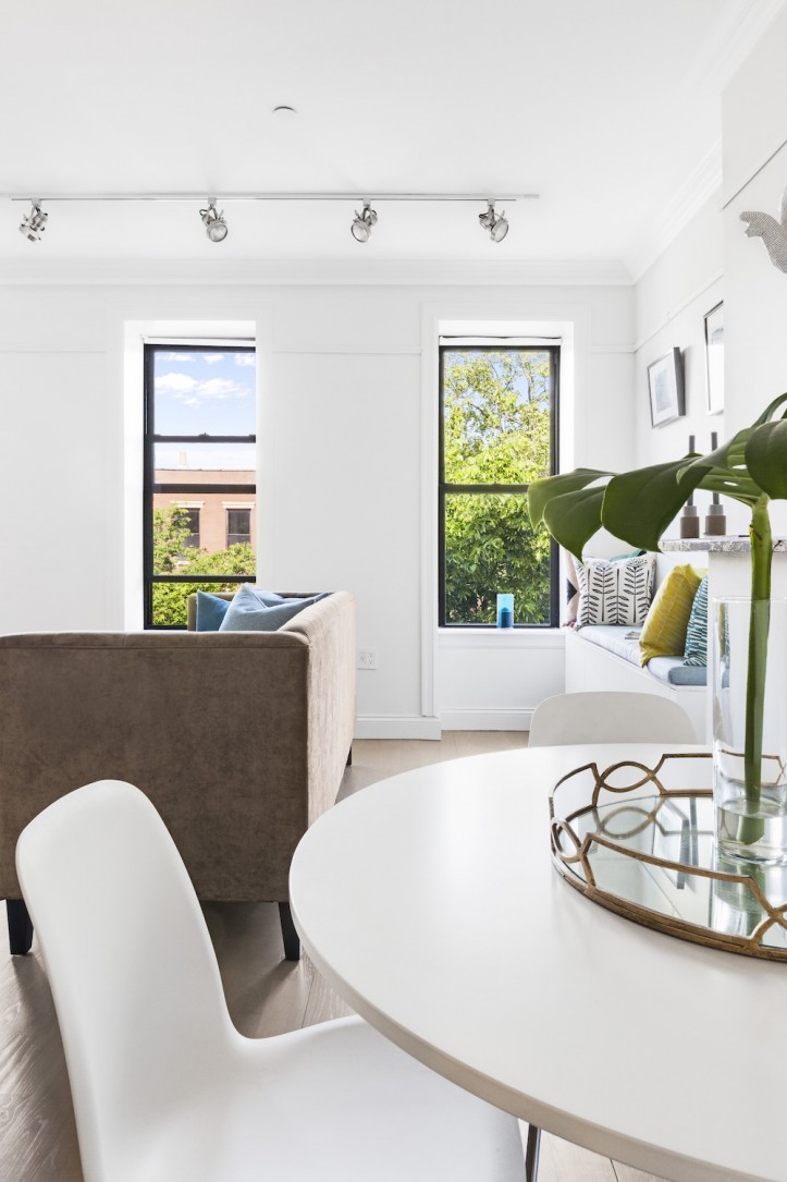
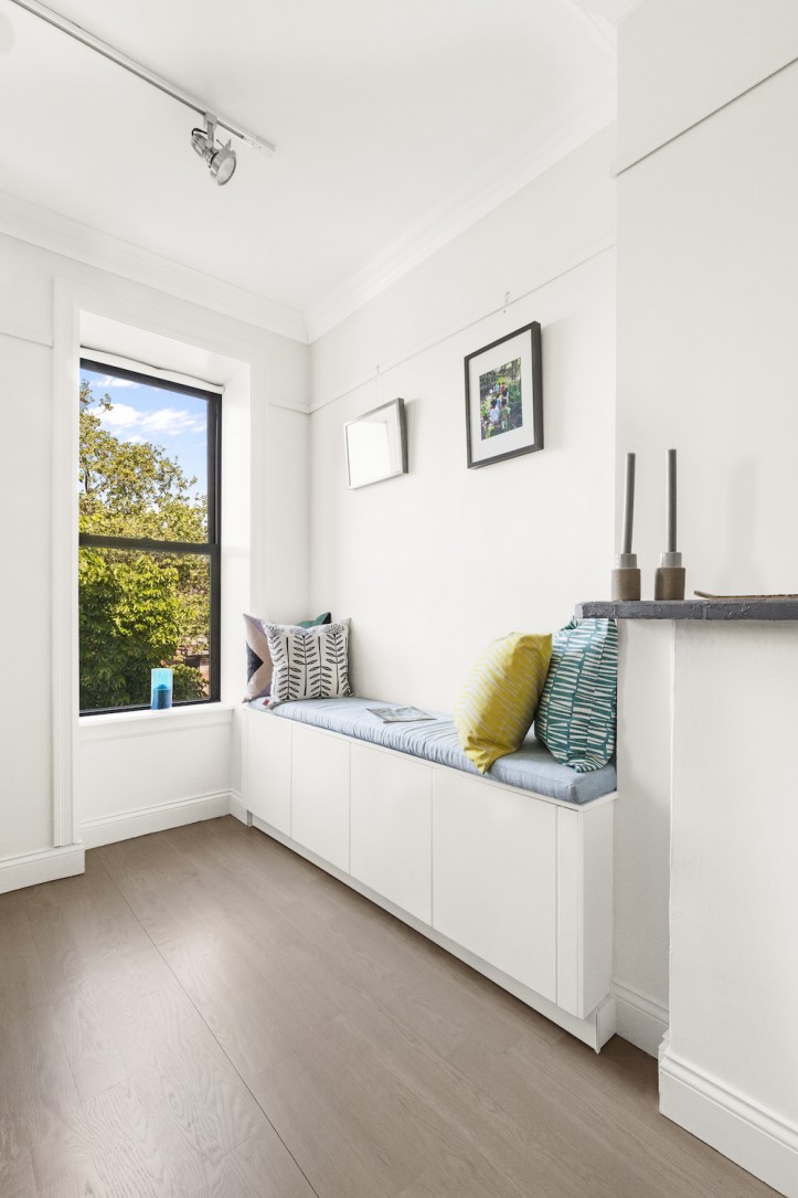
Bonus: Ursula’s Sweeten contractor used the same kitchen cabinet system from Ikea to create a bench seat near the window. Now, there’s more storage space and extra seating for when guests come over. “That’s one of my favorite areas in the apartment because it is a little unexpected,” she says.
Style finds: Backsplash tiles: Nemo Tile. Cabinetry and island from Ringhult line; hood: Ikea. Cabinet hardware: Hardware Hut. Countertops and sink: Galactic Tile. Paint in Decorator’s White: Benjamin Moore. Lighting: Schoolhouse Electric. Microwave: GE. The fridge, dishwasher, stove, and faucets are unchanged.
—
Cabinets are responsible for so much more than storage—they provide the look and feel of the kitchen, and bring the space together to create a cohesive design. When considering whether to go with pre-fab or custom, check out our tips on choosing the right cabinets for your home.
Sweeten handpicks the best general contractors to match each project’s location, budget, and scope, helping until project completion. Follow the blog for renovation ideas and inspiration and when you’re ready to renovate, start your renovation on Sweeten.
