Sweetening the Bathroom: I Like You Just The Way You Are
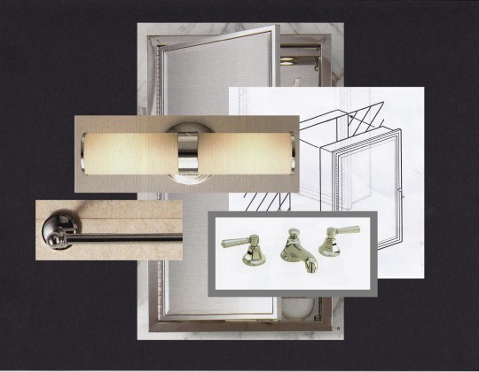
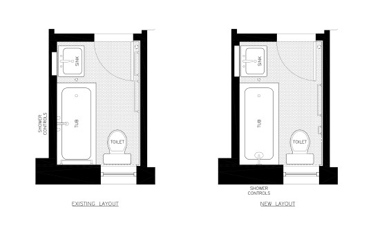
I kept the layout virtually the same. The only change I made was to move the showerhead and tub controls to the short side of the tub. I decided to reglaze my tub and reuse my sink and toilet, which were both in good condition. I selected a 3×6 white wall tile with a crackle glaze that was very similar to the existing one. And I proposed to regrout and reuse the existing 1″ white hexagonal tile floor. I chose a new medicine cabinet, towel racks, and sconce light that were very similar in size and spirit to the original ones. Sweeten brings homeowners an exceptional renovation experience by personally matching trusted general contractors to your project, while offering expert guidance and support—at no cost to you. Renovate expertly with Sweeten
There was a design change just before demolition. My contractor Martin thought that it might be difficult to regrout the joints in the floor tile cleanly and suggested that we replace it. I selected a floor tile identical to the existing one and placed an order.
There was another surprise during demolition. After removing the existing floor tile, which I had thought was original, we found an installation of identical tile just below it, with several large cracks running through it. We decided to rip this out in order to install the new floor tile on a new stable, level mortar bed.
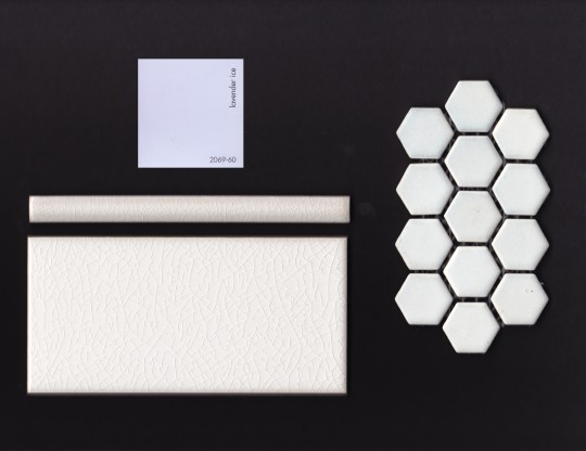
I had specified a white crackle glaze wall tile because it was the closest that I could find to the original tile. But the new tiles were just slightly more cream-colored than the bright white original ones. When holding one sample tile against the original wall this was not discernible. But as we unpacked the new wall tile the difference became quite powerful. Instead of the cool white palette I had in mind, the palette of the original bathroom, the palette now shifted towards something softer and warmer.
I chose wall and floor grout colors that were sand-colored, to emphasize the warmer tone of the new wall tile and also minimize staining. And I chose a pale lavender color to paint the walls, to give the room a slightly antiquated, almost Victorian feeling.
The design evolved during construction, in response to site conditions and the new materials, so that the remodel became more than a straightforward replication. I feel that I rolled with the punches admirably, responding to the character of the new wall tile and choosing a new floor tile and grout colors quickly and judiciously.
But throughout the project I had lingering doubts about clinging to the old bathroom design. As much as I loved my bathroom, I also wondered if it would be better to develop a new palette of finishes, to try to do something entirely different.
