Mid-Century Modern in Brooklyn: A Pied-à-Terre Renovation
Janet and Jerry envisioned a chic pied-à-terre in their Brooklyn brownstone—a stylish city escape to complement their Long Island home. This top-floor unit, though small and dated, held immense potential. See how, with the help of Sweeten, they transformed a cramped, dark one-bedroom into a light-filled, loft-like space, embracing Scandinavian and mid-century modern influences.
From exposing original beams to creating a sun-drenched shower and private roof deck, this brownstone renovation is a testament to thoughtful design and the power of a well-chosen team.

- Homeowners: Janet and Jerry posted their 1910 Brooklyn brownstone remodel on Sweeten
- Where: Crown Heights, Brooklyn, NY
- Primary renovation: A cramped one-bedroom apartment turns into a loft-like home
- Homeowner’s quote: “Through it all, we felt lucky to work with Sweeten, which connected us with both our architect and contractor and helped us troubleshoot on many occasions.”
Post your project on Sweeten for free and make your dream renovation a reality. Sweeten simplifies home renovation by connecting homeowners with top-rated general contractors, handling the vetting process and project management. To learn more about how we can help, check out our home renovation services.
Written in partnership with homeowner Jerry. “After” photos by Pixy Interiors.
The final project for a brownstone remodel
This is it. Our apartment. The pied-à-terre we’ve long waited to move into. We have a primary residence on Long Island, but we work in NYC and spend about half our time here. We decided to invest in a multi-family townhouse in Crown Heights, Brooklyn, rent each of the main units and keep the smaller, fourth-floor apartment for ourselves.
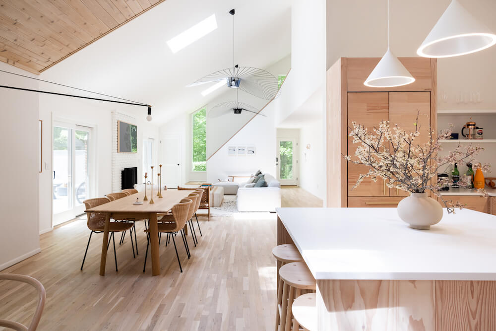
From the time we first saw the top-floor space, we knew it would be our city home. Like the other two rental apartments we remodeled with Sweeten in this brownstone, this one-bedroom unit needed work. It was dark and chopped up, the kitchen was a wreck and the bathroom was in disrepair. We started thinking about how to refresh the under 600-square-foot space and make it feel larger. Our goal was to create an open and airy studio. We planned to maximize natural light and use natural materials for an organic feel.
More space with natural light
In our rentals, we’d worked to preserve the building’s architectural features. But in this unit, previous renovations had removed most original detail. Hardwood floors had been replaced with linoleum. Moldings that might have graced the overhead plaster were replaced with a drop ceiling. Only the window moldings and the fireplace remained. Given this situation, we felt free to rethink the space. We decided to use modern elements as influences for the new interior. Our brownstone remodel had Scandinavian style and Californian mid-century modernism.
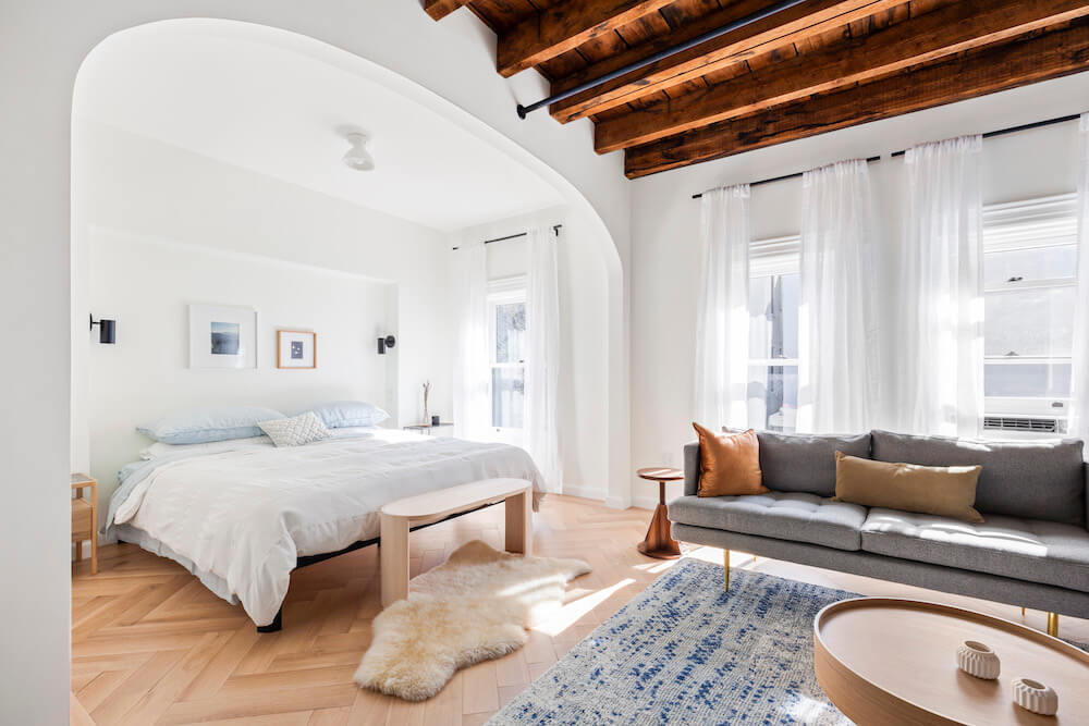
Our architects, MNDPC, worked closely with Janet and our Sweeten contractor to achieve several architectural changes. First, we moved the entrance from the fourth floor down to the third, making the stairway part of the apartment’s interior. This increased privacy and usable space, and also allowed us to increase the living room’s natural light with a skylight at the top of the stairs.
Our contractor suggested the beams looked really good unpainted and unfinished.
A brownstone remodel exposes the beams
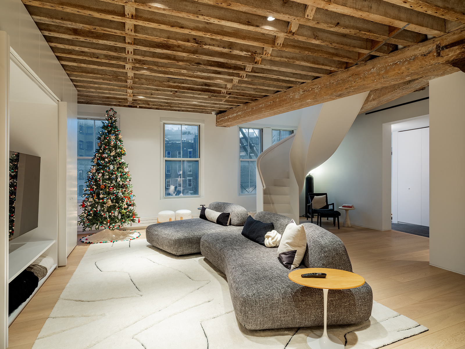
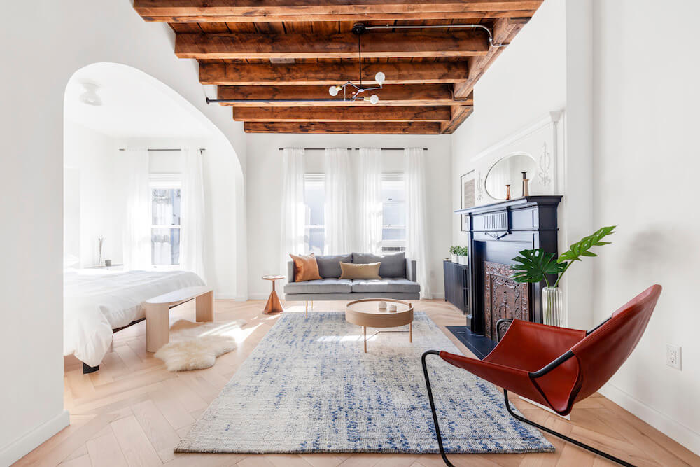
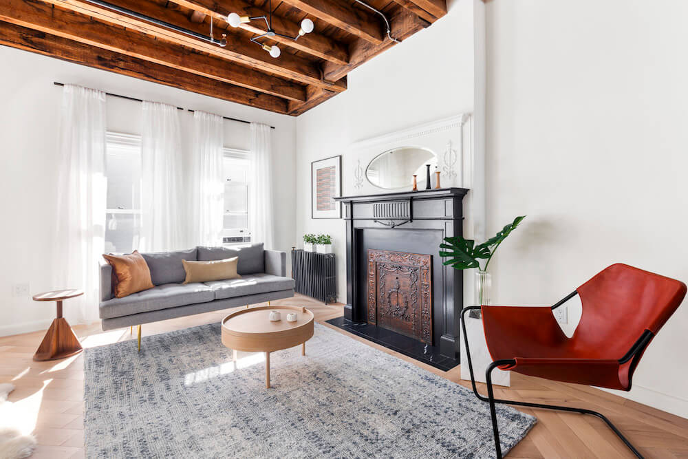
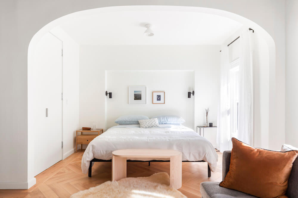
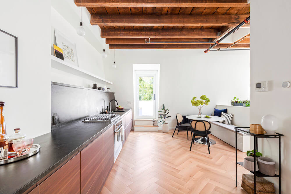
Next, we exposed the living-room ceiling. Opening it to the original wooden beams provided for more vertical space and a lofty room. Initially, we were going to paint the wooden ceiling and exposed beams white. Our contractor suggested the beams looked really good unpainted and unfinished. The adjacent sleeping area, however, would have a new lowered ceiling, and an archway. These subtle architectural elements bring the space together while simultaneously differentiating the sleeping and living rooms.
The arch plays nicely with horizontal lines throughout the apartment, including the exposed beams and the long kitchen countertop. It also connects with a number of graceful curves, like the rounded mirror over the restored fireplace and the rounded lighting fixtures.
Here’s how Sweeten works: We pre-screen them for our network, carefully select the best ones for your remodeling project, and work closely with hundreds of general contractors every day.
Sweeten brings homeowners an exceptional renovation experience by personally matching trusted general contractors to your project, while offering expert guidance and support—at no cost to you. Renovate expertly with Sweeten
We moved to the problematic floors, which were covered in vinyl and old carpeting. We wanted natural wood and after much searching, we chose white-oak flooring. The planks would lay in a custom herringbone, or chevron, pattern. Unfortunately, there was a long lead time for the wood to be custom cut (nearly two months coming from Europe), not to mention a high price. Just before going back to the drawing board, we found a pre-cut herringbone at half the price. It came out fantastic.
A minimal kitchen for a second home
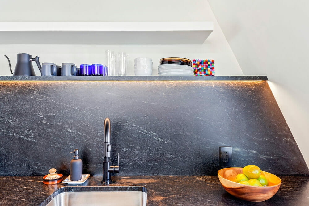
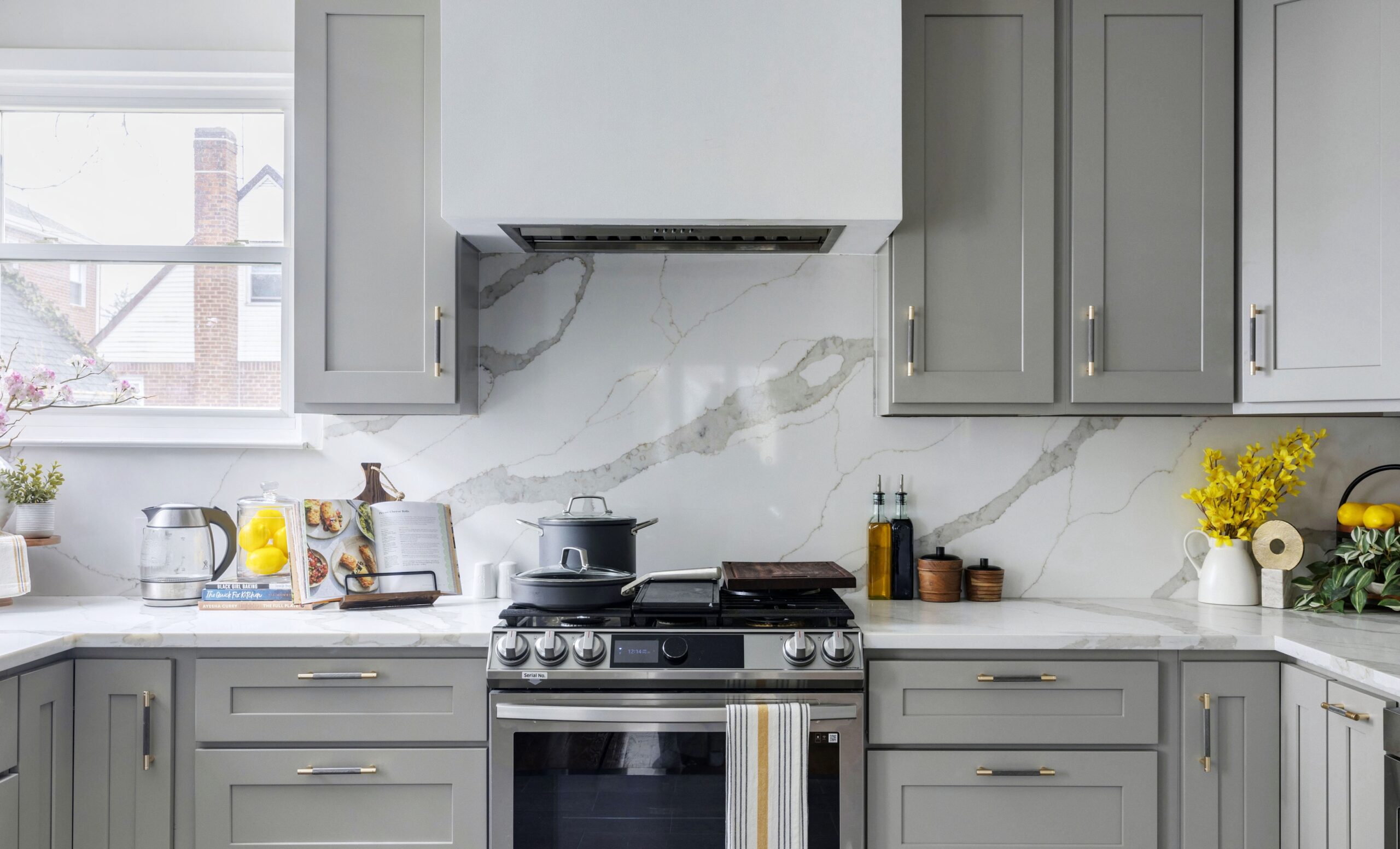
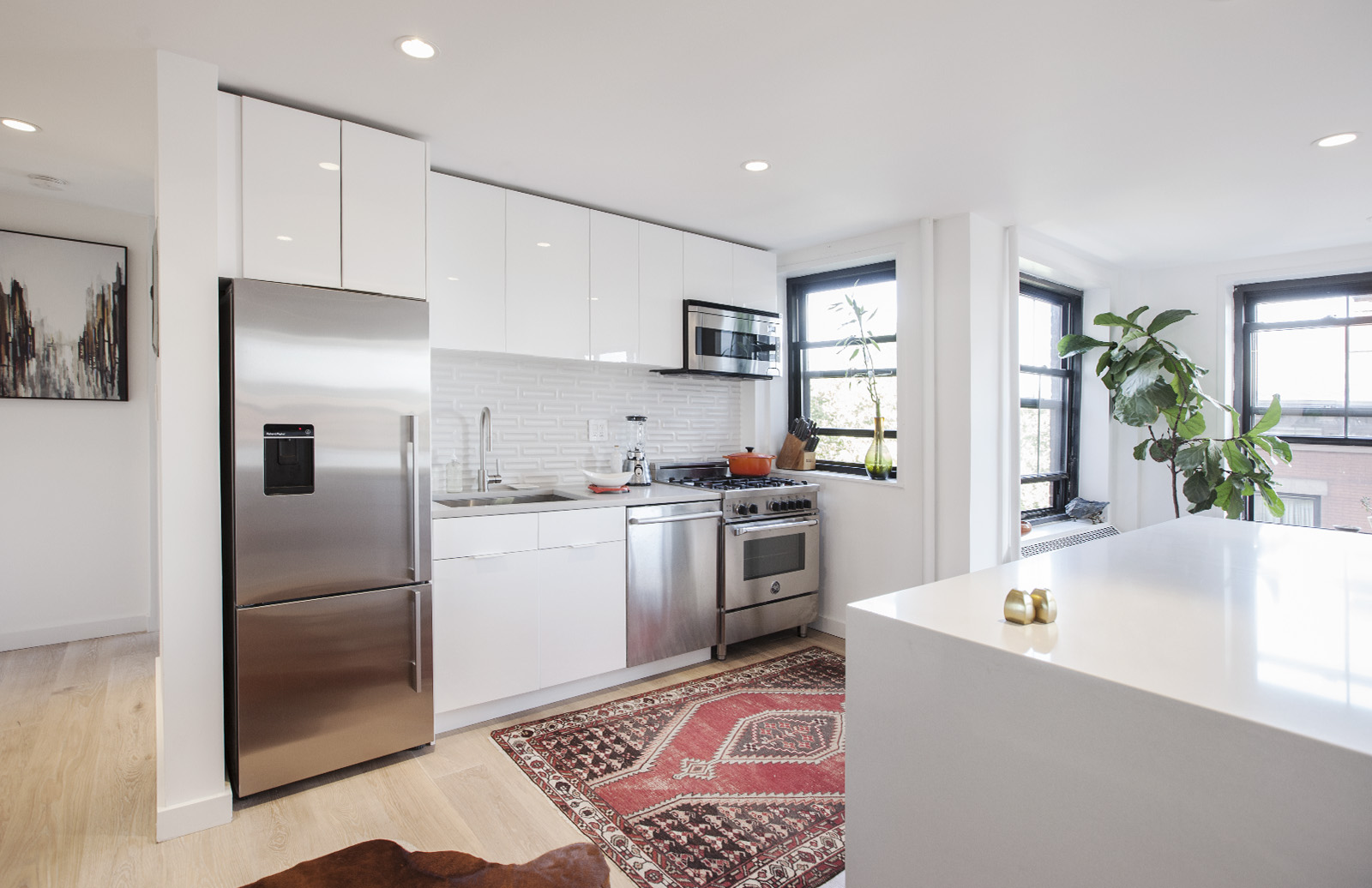
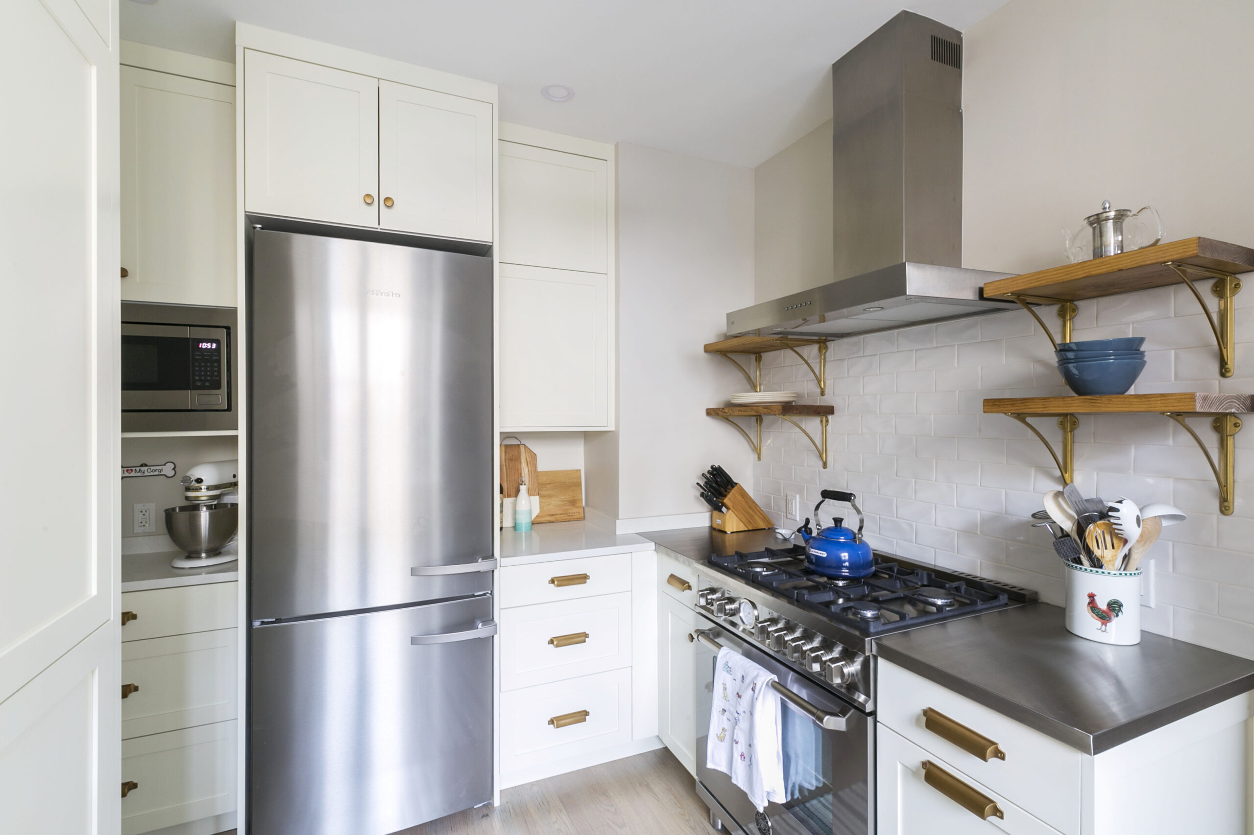
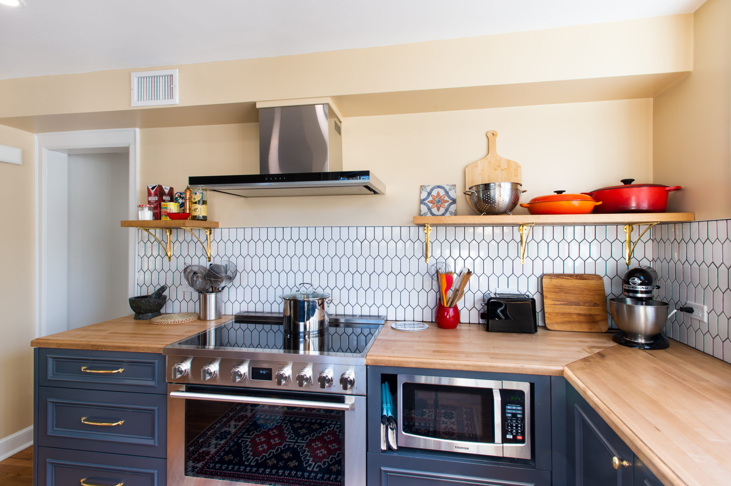
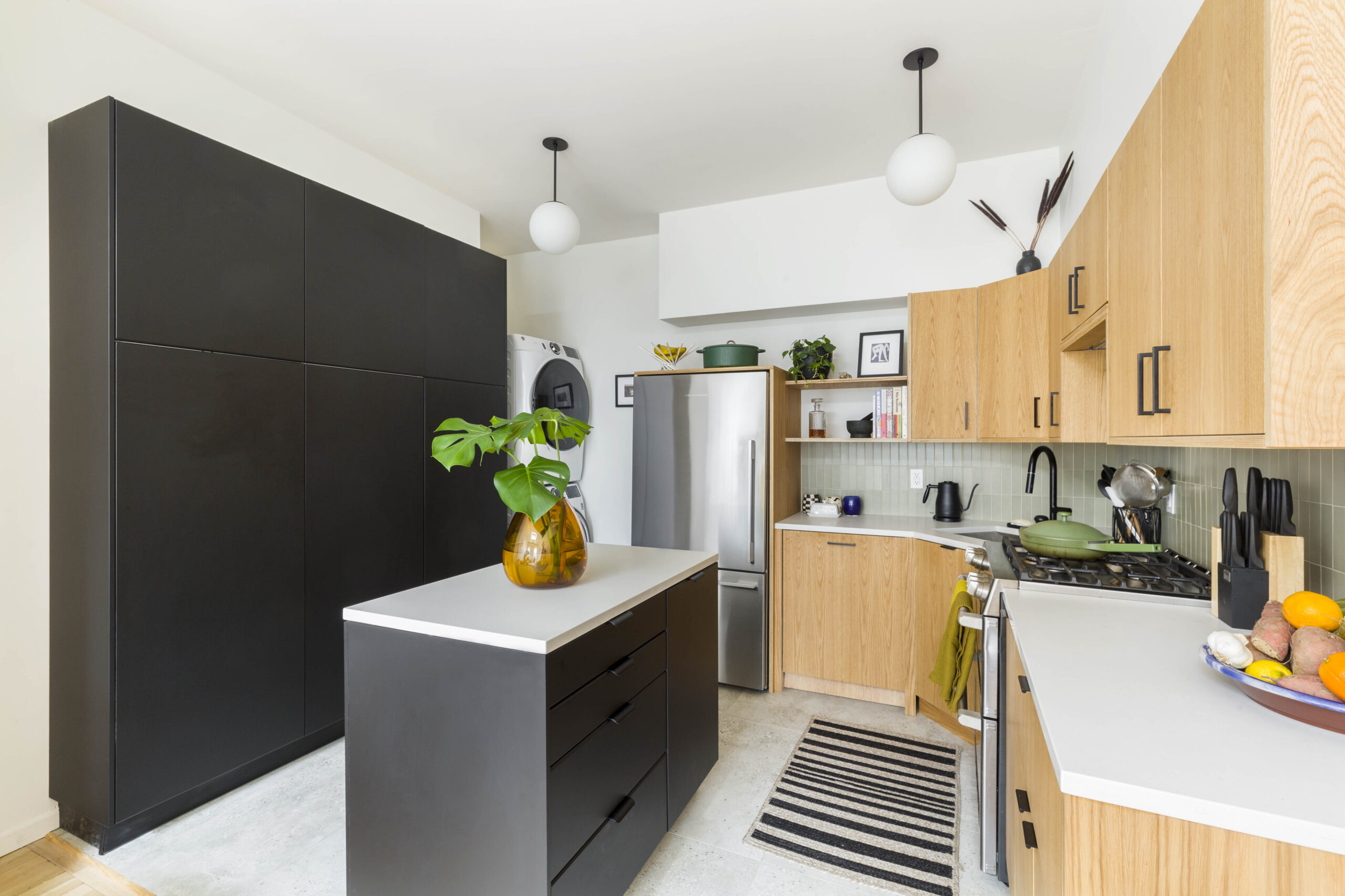
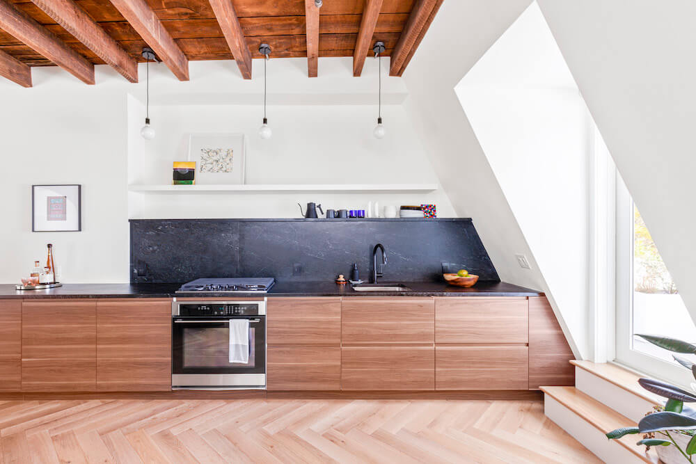
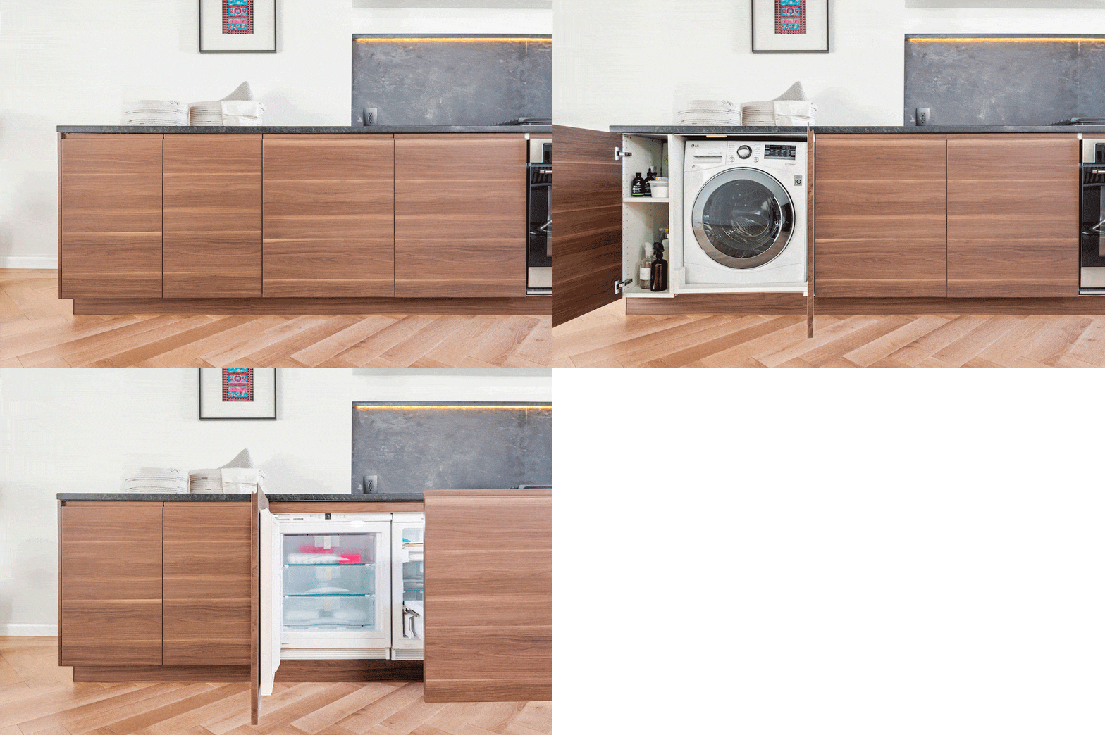
With the new floors in place, the kitchen build-out began. The couple chose dark wood cabinets from Ikea, a stylish and budget-friendly option. To complement the cabinets and withstand daily use, they selected soapstone countertops. The veined black stone not only provides striking contrast but also serves as a stunning backsplash, echoing other dark accents in the apartment. A minimalist approach was key, so appliances—including a washer/dryer combo, refrigerator, and pull-out freezer—were seamlessly integrated into the cabinetry. Pendant lights illuminate the countertop, while a chandelier graces the living area above the restored fireplace. These, along with the bedroom fixtures, strike a balance between industrial, modern, casual, and polished aesthetics.
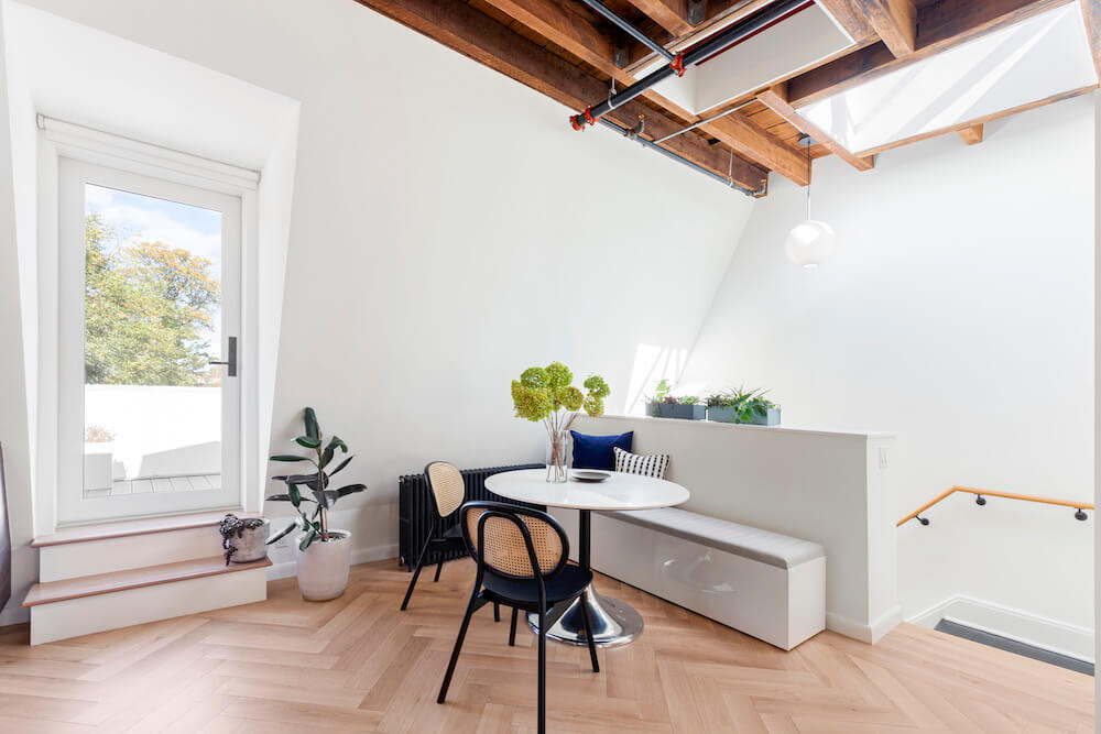
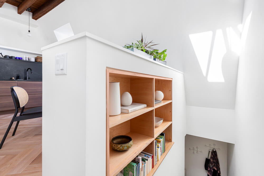
Bringing sunlight inside
In the bathroom, we managed another stunning redesign thanks to our architects we found through Sweeten. The shower, a vertical space with a skylight, is flooded by day with natural sunlight, making it feel almost like it’s outside. One disappointment that turned out fine was with the stone floor tiles. We spent a lot of time picking them out, but after accepting our order, the supplier said that only one box of tile was available.
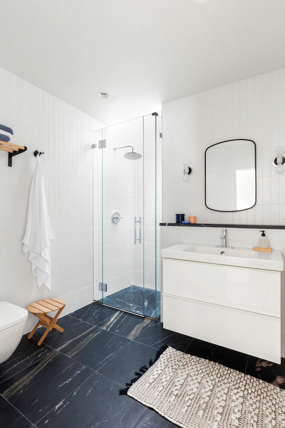
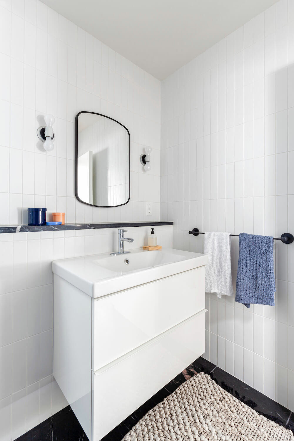
Our contractor solved the issue. He took a large slab of the same stone and custom cut it into a single 3’x3’ shower base as well as a door saddle, and a stone shelf. We chose an in-wall toilet to maximize space.
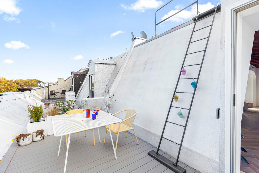
Having knocked down walls and invited light in every way imaginable, we felt successful in our visual opening of the space. We went even further by creating an outdoor area. The roof had formerly been inaccessible but we replaced a window with a glass door; it leads to a new roof deck with views of the neighborhood and Manhattan in the distance.
Happy at home
This project beautifully illustrates the power of collaboration and careful planning. From the initial vision to the final details, Janet and Jerry, with the help of Sweeten’s expertise, have created a truly special space. It’s a testament to the value of finding the right team and embracing the renovation journey.
Thank you, Janet and Jerry, for sharing your entire home with us!
Ready to renovate? Start the journey here for free!
Here you can learn more about our services and locations. Alternatively, browse more home renovation inspirations, processes, and cost guides.
Renovation Materials
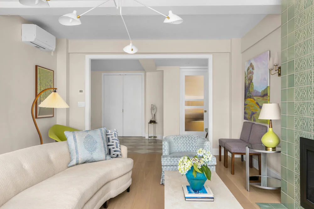
LIVING ROOM RESOURCES: Wall paint in Cotton Balls: Benjamin Moore. Poolesville European white oak flooring: PID. Chandelier above fireplace: Schoolhouse Electric. Theresa Rand coffee table: Menu Design Shop. Doorknobs: Omnia.
DINING AREA AND STAIRWAY RESOURCES: Hackney marble dining table, storage bench: CB2. Rattan cane chairs: Industry West.
BEDROOM RESOURCES: Ceiling light, sconce lights: Schoolhouse Electric. Mill C bedside table with laptop tray: CB2. Spindle Nightstand: Industry West. Airisto bench/side table in ash: Finnish Design Shop.
KITCHEN RESOURCES: Paint in Cotton Balls: Benjamin Moore. VOXTORP kitchen cabinets and sink: IKEA. Ipanema Reserve countertops and backsplash: M Teixeira Soapstone. Faucet, #1959LF-BL: Delta. Liebherr undercounter refrigerator and freezer: Liebherr. Pendant lights: Schoolhouse Electric. LG all-in-one 2.3 cu. ft. front-load washer and electric ventless dryer: LG. Fellow Stagg Pour Over kettle: Williams Sonoma.
BATHROOM RESOURCES: 18″ x 18″ Marine Black Phyllite floor tiles: M Teixeira Soapstone. Matte white wall tiles 3”x9”: COLORI. Kohler shower fixtures; Contemporary and Purist Line fittings: Kohler. Duravit toilet: Duravit. GODMORGON vanity, ODENSVIK sink : IKEA. Faucet: Grohe. Hardware, lighting, towel bar, tissue holder, robe hook, Swedish utility rack: Schoolhouse Electric. Mirror: CB2. Waffle towels: Snowe.
ROOF DECK RESOURCES: Ultimate Wood Swinging French door: Marvin. Automated shade: Shade Store.


