The Art of Patterns in the Kitchen
A fun crop of ways to make cooking more colorful
If patterns in the kitchen feel outdated to you, think again. We’ve got proof that they’re making a steady (and stylish!) comeback. From personality-filled wallpaper prints to classic tile patterns, Sweeten homeowners are playing with subtle—and some not-so-subtle—forms of contrast in the kitchen. Read on for five unique takes on pattern play.
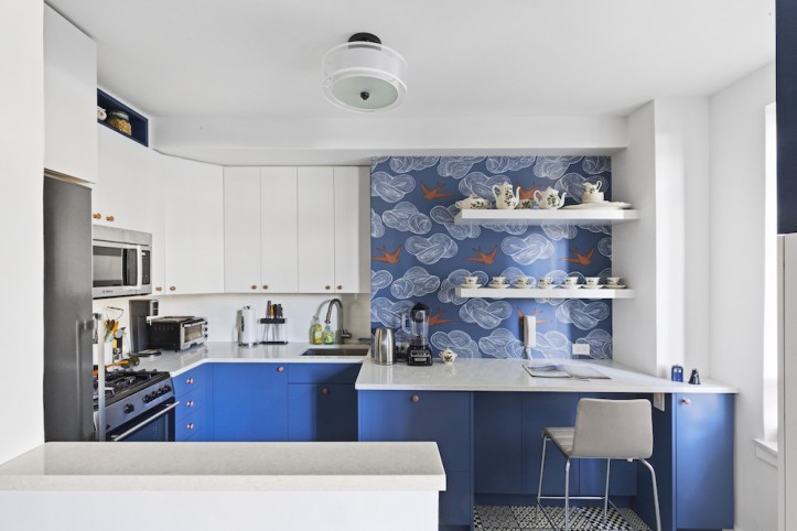
Captivated by a Hygge & West design featuring orange birds on a blue background, Mollie used the wallpaper to set the tone for her kitchen’s color scheme. She also chose a playful black-and-white tile to continue the thread of whimsy from the walls to the floor.
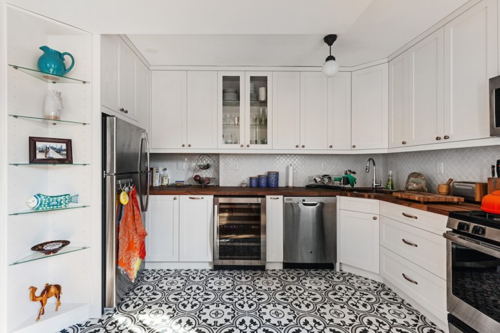
Amanda designed her kitchen from the ground up after selecting a Mediterranean-inspired tile for the floor. The rest of the design was chosen to complement the one-of-a-kind flooring.
Sweeten brings homeowners an exceptional renovation experience by personally matching trusted general contractors to your project, while offering expert guidance and support—at no cost to you. 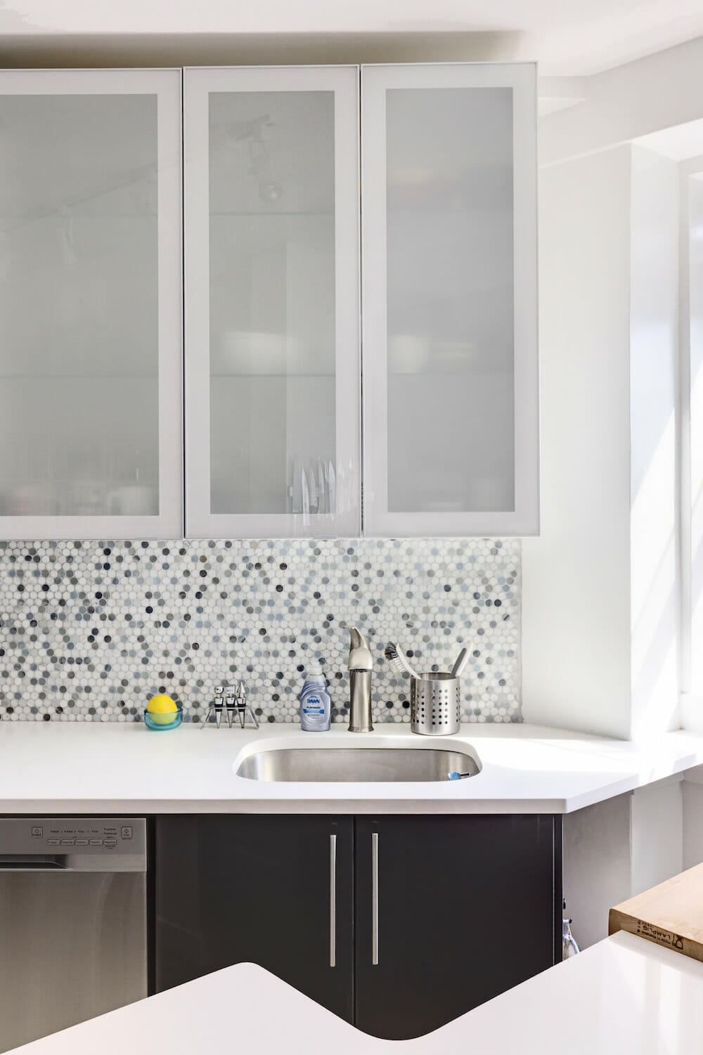
Renovate expertly with Sweeten
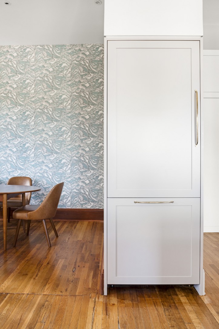
After going with blue-gray cabinets in the kitchen, Ainsley extended the color scheme into the dining room with an abstract blue and white wallpaper that pairs well with the warmth of the wood furniture and flooring.
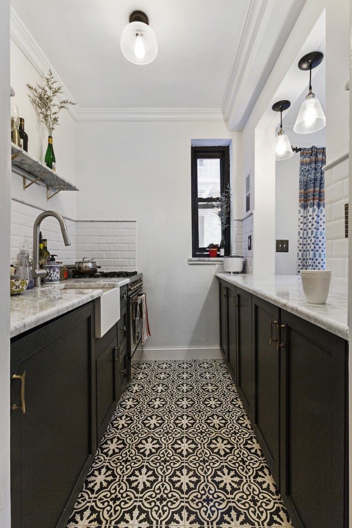
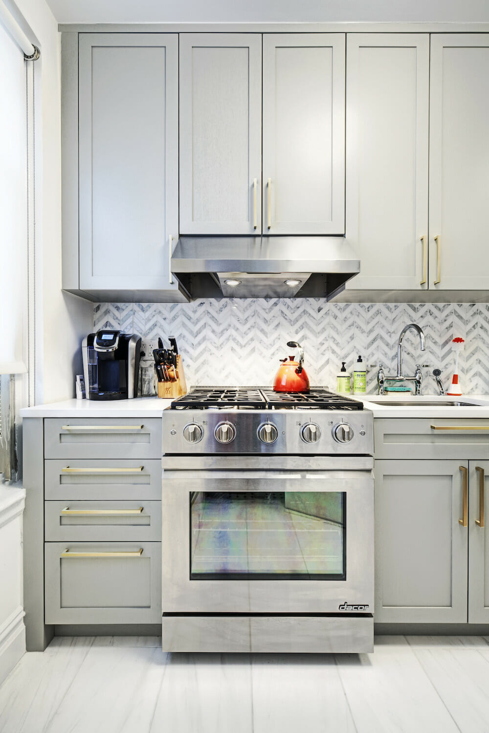
Looking to preserve the classic design of her prewar kitchen, Emily chose a simple black and white color scheme. For the floor, Spanish tile injects some old-world charm and ties the look together.
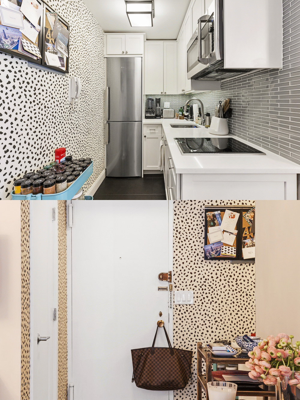
With limited square footage, Nancy knew that bold colors would make her kitchen feel cramped. Instead, a fun wallpaper with a dizzying array of black dots across a white backdrop makes a lively addition.
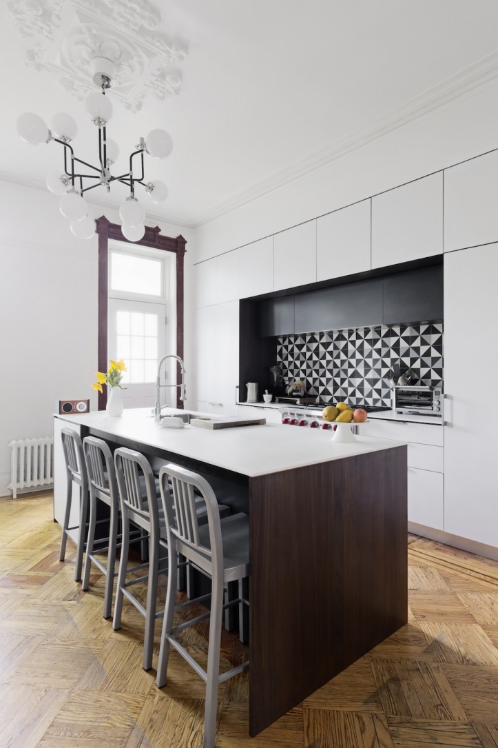
In Kavi’s kitchen, the new backsplash provides plenty of drama. White subway tiles were replaced with a kaleidoscope of black, gray, and white triangular tiles for a look that’s modern and luxe.
—
Not ready to commit to a pattern in the kitchen? Consider testing out a bold print in the bathroom.
Refer your renovating friends to Sweeten and you’ll both receive a $250 Visa gift card when they sign a contract with a Sweeten general contractor.
Sweeten handpicks the best general contractors to match each project’s location, budget, and scope, helping until project completion. Follow the blog for renovation ideas and inspiration and when you’re ready to renovate, start your renovation on Sweeten.
