7 Reasons All-White Kitchens are Timeless
An all-white kitchen can become a calming backdrop, or a stunning showstopper
The dependable all-white kitchen color palette remains popular for the wide-ranging looks it brings to the kitchen. The clean slate of a single white hue brings visual calm when on its own. Add to that tile shape, pattern, and texture and you’ll start to see a personality emerge. It works as a supportive background when paired with gold hardware or dark wood for contrast. This classic neutral compliments modern, industrial, and every style in-between. Here, seven Sweeten kitchens show why white is the perennial choice.
Sweeten matches home renovation projects with vetted general contractors, offering guidance, tools, and support—for free.
A fresh start in an all-white kitchen
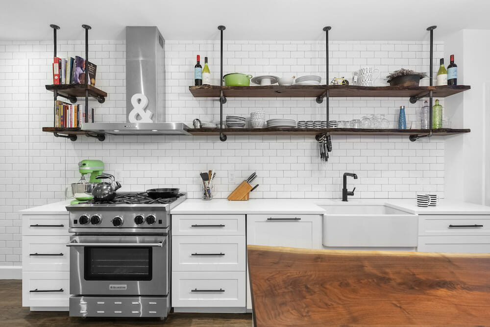
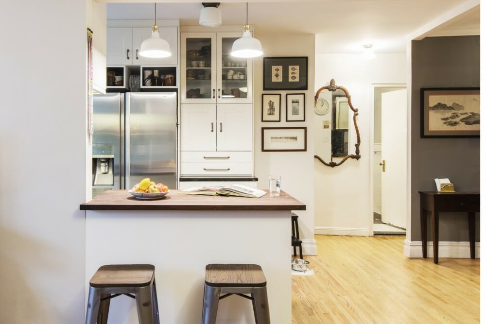
As new parents-to-be, homeowners Tara and Brian were looking for something more modern. They wanted to ditch their dated kitchen with a faulty layout. After finalizing the floor plan, the homeowners chose a simple white subway tile backsplash to ground the room. The clean tile became a cohesive backdrop for an exotic live edge walnut island countertop—a must-have for Tara. The dark shelves stand out and provide a pleasant contrast.
Renovate expertly with Sweeten
Sweeten brings homeowners an exceptional renovation experience by personally matching trusted general contractors to your project, while offering expert guidance and support—at no cost to you.
A traditional kitchen goes modern
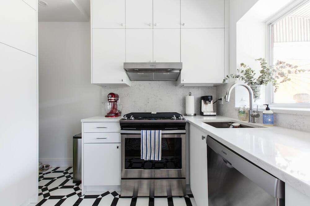
After seven months of living in their first home, Marc and Steve decided it was time to renovate their crowded, outdated kitchen, which was once dark and claustrophobic. The homeowners wanted their kitchen to feel open and bright. To achieve this, the duo installed sleek white cabinets and countertops. The window above the sink was swapped out for a larger window letting in more natural light. A black-and-white patterned floor added a graphic urban look.
A warm, minimalist all-white kitchen
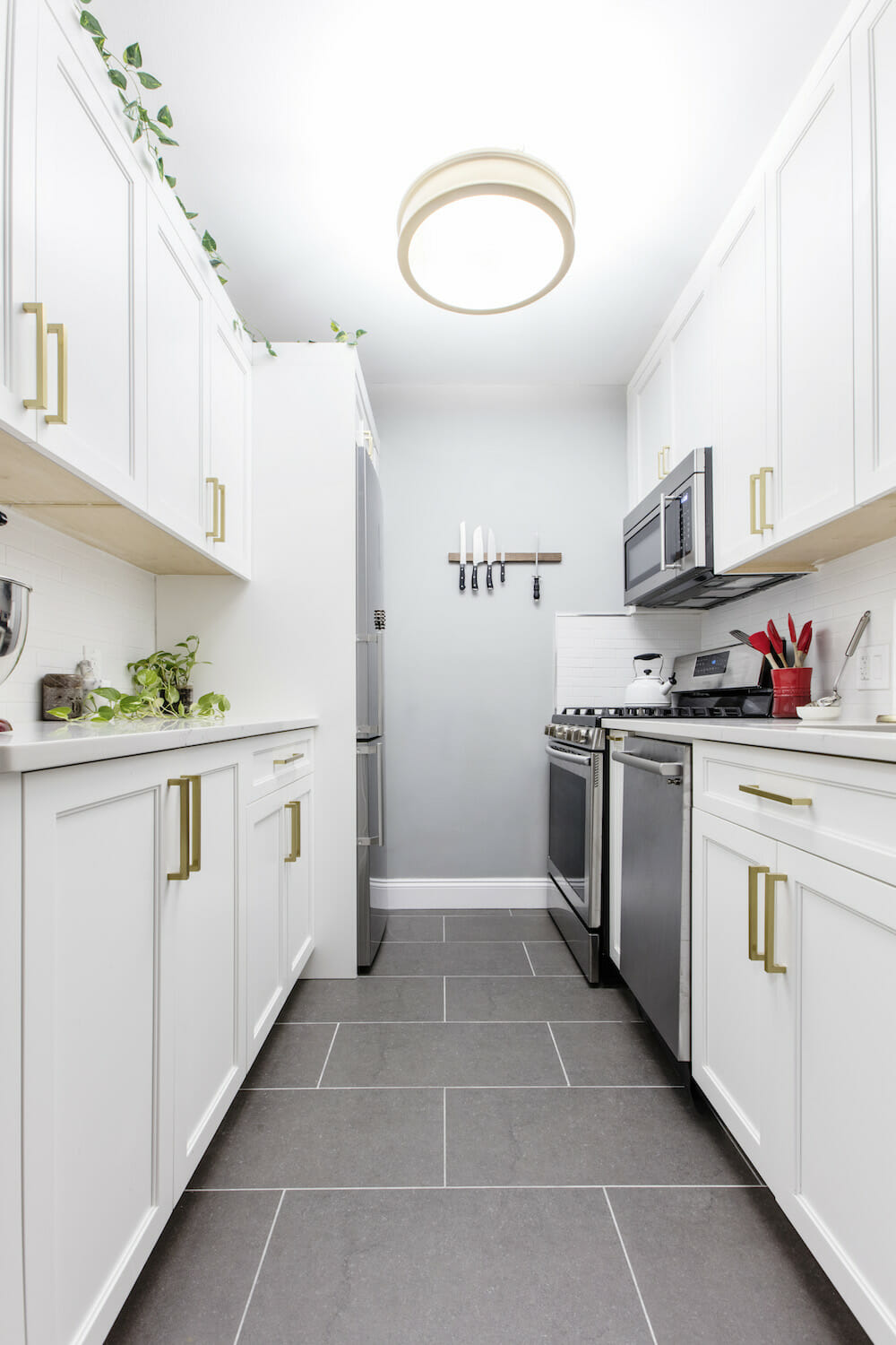
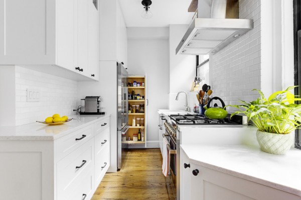
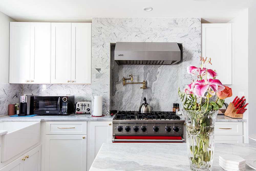
Manhattan homeowners Elie and Matt wanted to remodel their washed-out gallery kitchen. Custom-made white cabinets, along with a white quartz countertop and backsplash moved them in a direction that was more in line with their taste. The pop of gold hardware and large-format gray tile flooring made the kitchen feel luxurious, yet crisp and simple. Their new all-white kitchen makes Elie and Matt feel at home in the open, welcoming space.
A simple and current all-white kitchen
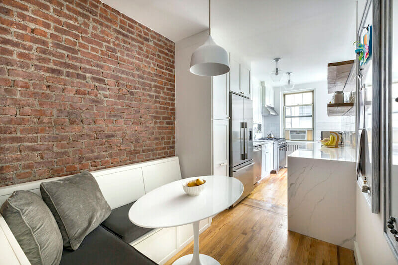
With a kitchen that had gone through “a hodgepodge” of renovations, Sarah and Eddy decided they needed a complete change and a unifying design. Their kitchen was dark and dated. The goal was to achieve the opposite. The subway tile backsplash, grouted with dark gray, contrasted well with the open wood shelves. Keeping within the clean white look, an arabesque-patterned tile behind the stove was a nice design surprise. A neutral-toned banquette also stands out against a newly-discovered brick wall.
Let there be light
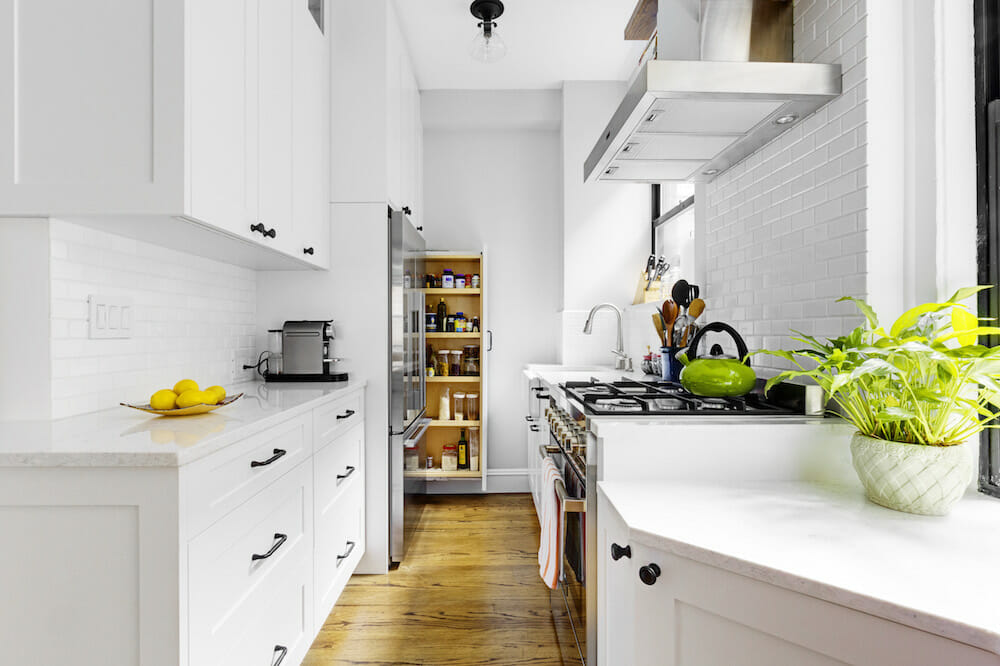
Two newlyweds in Manhattan knew their kitchen was in need of an update before moving in. The kitchen had been worn, with dark clunky cabinets, while the dining room table made the kitchen feel cramped. After adding white cabinets with black knobs and a white quartz countertop, the space was revived. Extending the countertop underneath a window expanded the kitchen’s reach. The natural light shines through the new counter-to-ceiling windows, making the all-white kitchen gleam.
Using architecture to add texture
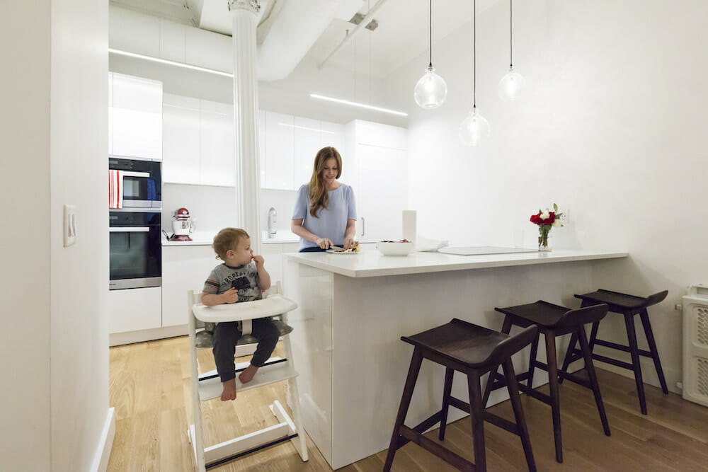
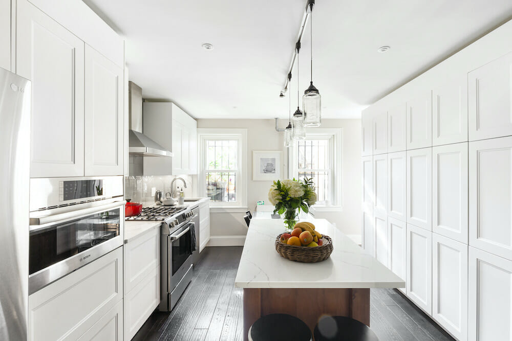
All-white, with floor-to-ceiling storage
—
Sweeten handpicks the best general contractors to match each project’s location, budget, scope, and style. Follow the blog, Sweeten Stories, for renovation ideas and inspiration and when you’re ready to renovate, start your renovation with Sweeten.
