A Simple 1920s Home Reimagined with a Minimalist Aesthetic
Evoking the charm of the 1920s with a modern twist, this Brooklyn home embodies a seamless blend of old and new. The homeowners, faced with the challenge of honoring the home’s original character while infusing it with contemporary functionality, embarked on a remarkable renovation journey.
- Homeowners: Sweeten homeowners, Kyli and Luke, posted their 1,200-square-foot single-family remodel on Sweeten
- Where: Midwood, Brooklyn, New York City
- Primary renovation: Updating their entire 1920s home to be less dark and more modern
- Sweeten’s role: Sweeten matches home renovators with vetted general contractors, offering guidance, tools and secure payments—for free.
A home with potential
It’s incredible what you can do to a house without knocking down a wall. We had to look beyond a lot of challenges, 40-year-old decor, an antiquated electrical system, and thin, stained wooden floors. But we saw something we could work with.

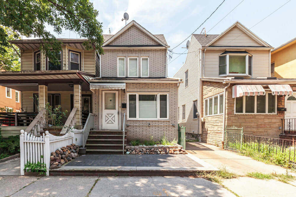
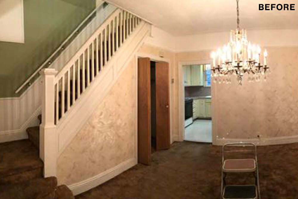
The house had a great layout. We loved the open first floor, with its nine-and-a-half-foot ceilings and perfect flow—the foyer, living room, and dining room were all open but the spaces were distinct. The second floor lacked overhead lighting and had wood paneling in every room, but was accessed by a beautiful staircase. Potential! We knew we could make it modern while preserving its ‘20s spirit.
Hidden architectural designs
Not that it would be easy. The family we bought the house from had owned it for 34 years and it had a very retro feel. We hoped that the layers of carpet and wallpaper might conceal architectural delights, but were disappointed that the few special details we uncovered, like parquet inlays, were beyond salvaging.
We knew that foundational work would eat most of the budget, with the floors and walls requiring considerable attention.
The initial scope that we listed out for Sweeten offered a basic overview of our project, listing last: “Inspect/clean electrical panel.” We mentioned the possible need to replace or expand it, but didn’t realize how much work it would actually require. Finding out that we needed to replace all of the wiring was one surprise that our renovation served up.
We scheduled walk-throughs to see the work at various stages, including…the electrical portion. Seeing exactly what had been done before the walls were closed up was informative and reassuring.
Combining the old with new
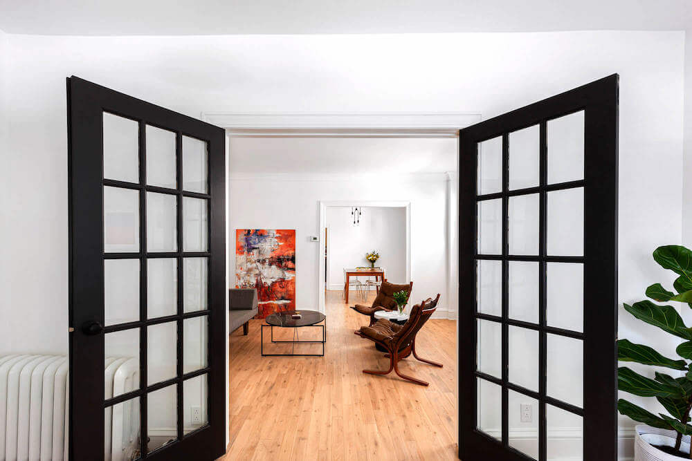
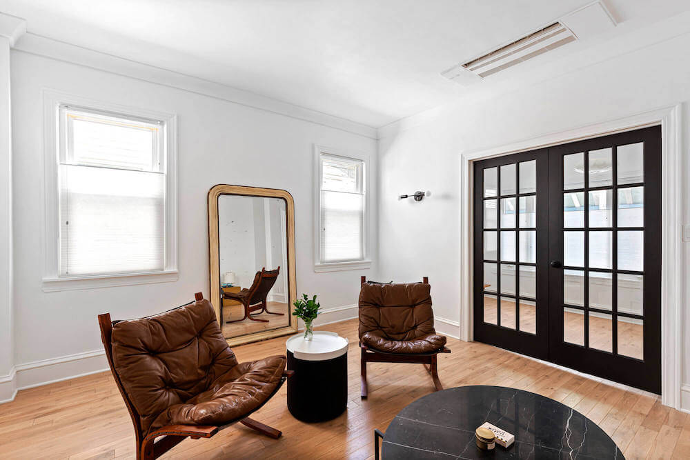
We didn’t move or remove a single wall but we did add French doors in the foyer to create a barrier to summer heat and winter cold. Because most of the first floor is open concept, the interior doors help to keep the temperature even and comfortable year-round, while also creating a dramatic entry into our living space.
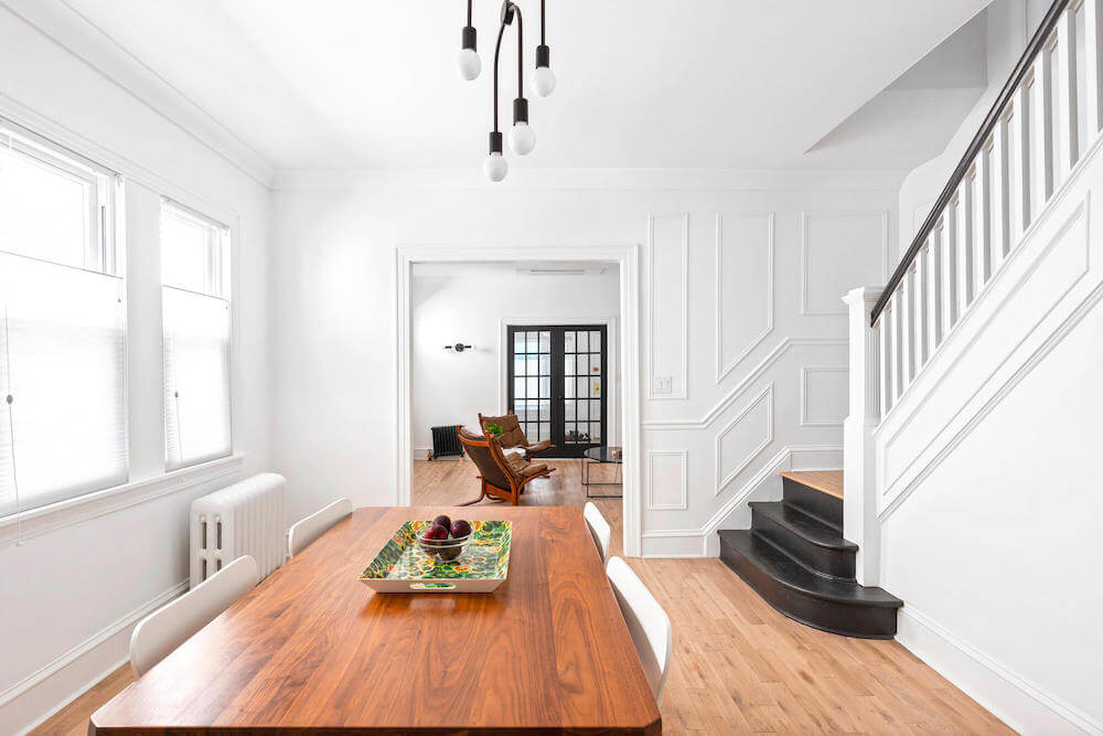
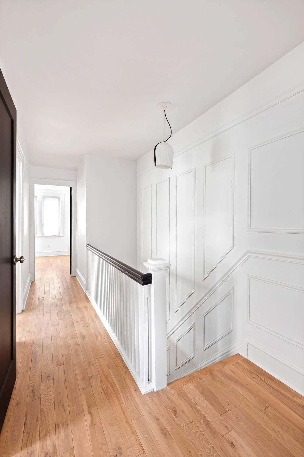
One of our goals was to build in details that appeared original. Where we could, we blended the old with the new that included a molding update. We complemented the existing molding on the stairs with new molding on the adjacent wall. Our contractor matched the living room ceiling to the dining room’s original trim and a ceiling medallion was installed, a hint at deco design. It was in this room that the house finally gave us a gift. Our contractor unearthed a window hidden inside the dining room exterior wall—a lovely find that, with some attention, brought us a lot more light.
Sweeten brings homeowners an exceptional renovation experience by personally matching trusted general contractors to your project, while offering expert guidance and support—at no cost to you. Renovate expertly with Sweeten
Choosing the materials
We stripped, skim coated, and painted the walls and redid two bathrooms investing in materials that would last. New floors were installed, windows were repaired, and energy-efficient ductless AC went throughout the house.
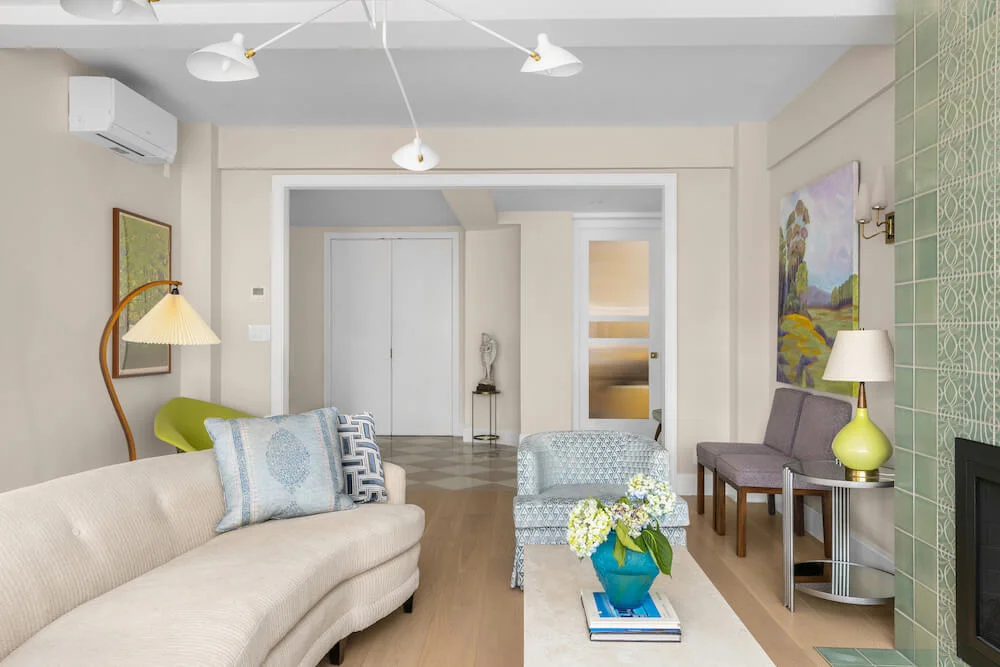
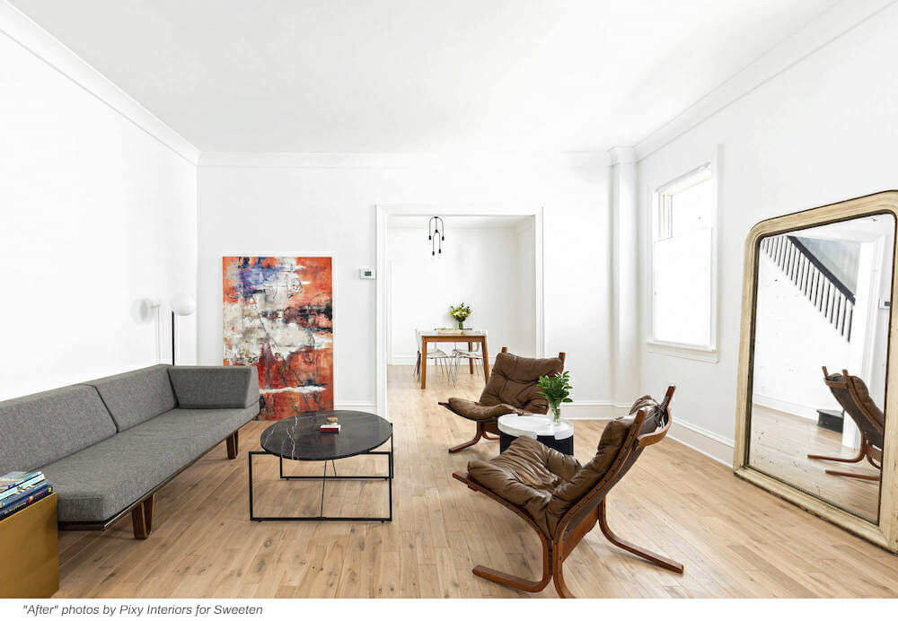
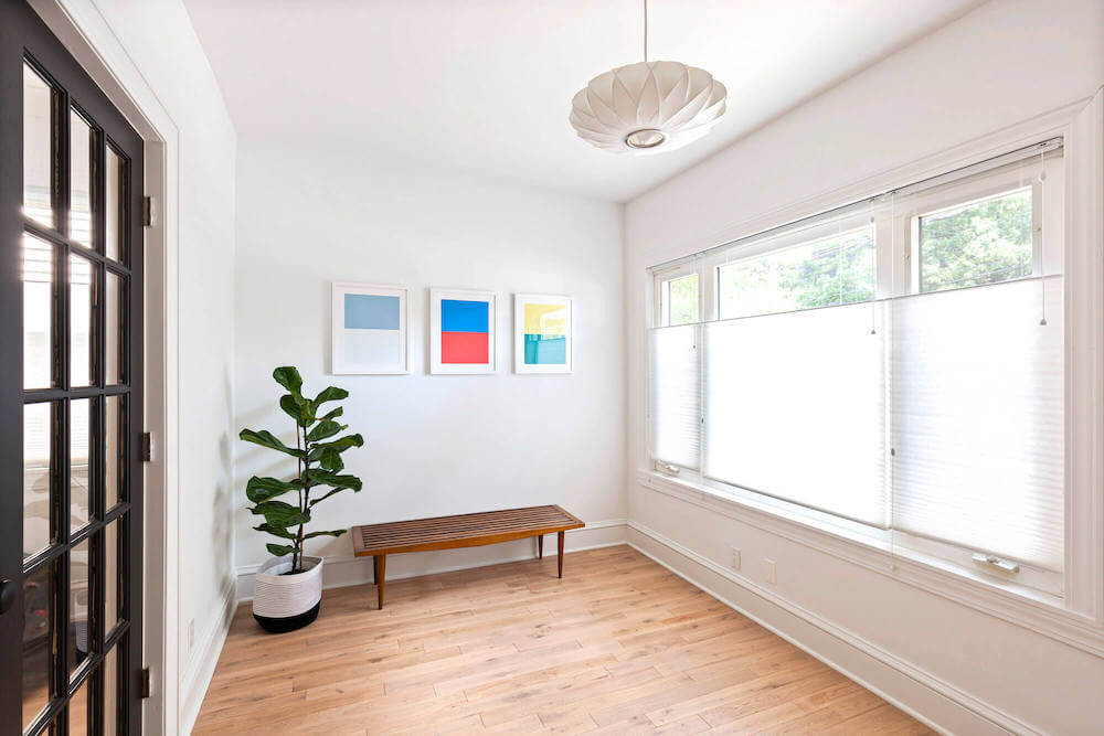
The house felt instantly spacious and bright. The two things we were looking for in every choice we made: quality and classic style. From flooring and tiles to paint and different types of fixtures, we chose finishes we knew would last and look good for decades.
Our color scheme, like everything else, is stark, graphic, and, most importantly, bright. White with the occasional swath of black feels timeless and pulls together everything from the foyer to the upstairs bath. A discreet beach vibe is there for those who look—low-key seashell references are hidden in a few small spots, a nod to the fact that we’re a 25-minute walk from Marine Park.
Getting things done to code
We wound up doing nearly twice as much work and extending our schedule to four times the original plan. We spent a little over $120,000, including materials, a four-month apartment rental, and contractor costs.
We were scrupulous about everything being done to code. Our Sweeten contractor had great communication skills and sent updates, photos, and videos via WhatsApp. We scheduled walk-throughs to see the work at various stages, including the point when the electrical portion was complete.
Seeing exactly what had been done before the walls were closed up was informative and reassuring. As a civil engineer, Luke was heavily focused on ensuring that the electrical, plumbing, and structural elements were sound.
An extensive renovation
This renovation taught us a lot! It wasn’t our first experience, but our biggest by far. We used many subcontractors, including electricians, HVAC specialists, plumbers, hardwood flooring installers, and plaster experts, and asked a lot of questions about the best processes, the ideal order for tasks, and how to complete them on a reasonable schedule.
The best part of the renovation? Seeing the “after” months later, after being so overwhelmed by the “before”! We didn’t gut the house, but we came close. The difference is dramatic. We are absolutely thrilled.
Thank you, Kyli and Luke, for sharing the results of your Midwood, Brooklyn remodel with us!
Renovation materials
LIVING SPACE RESOURCES: Paint for walls, ceilings, and trim in Super White; French doors in Onyx: Benjamin Moore. Bella Legno 3 ¼” solid white oak flooring in Sahara premium: Purchased through the contractor.
FOYER RESOURCES: Nelson Saucer Pendant Lamp: Herman Miller.
LIVING ROOM RESOURCES: Venus sconce light fixture: Cedar and Moss.
DINING ROOM RESOURCES: Simone chandelier: Schoolhouse Electric.
UPSTAIRS HALL RESOURCES: ARC Pendant light fixture: Le Klint.
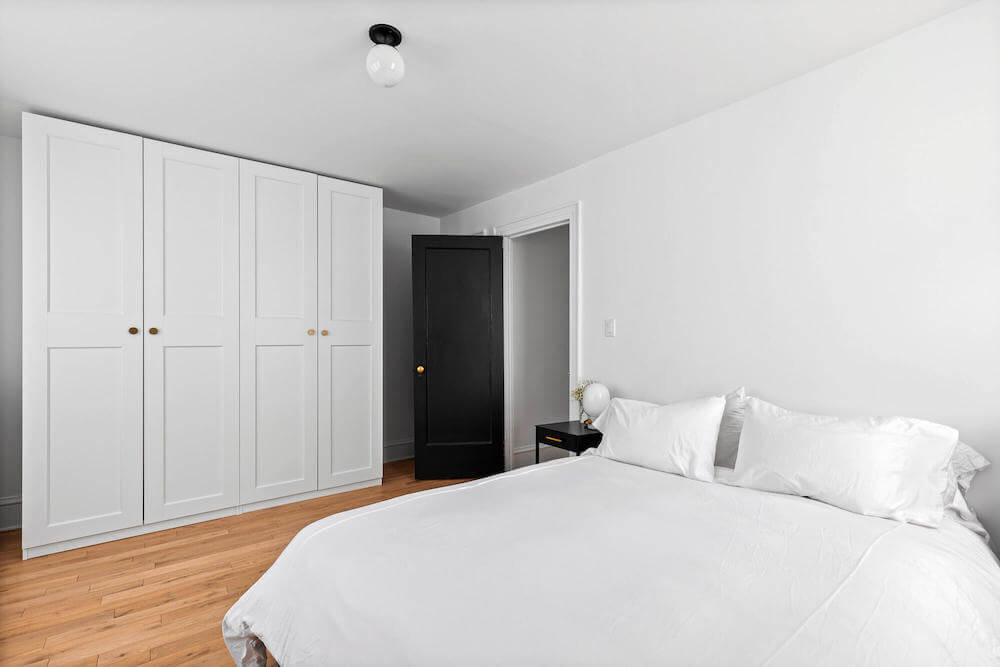
MASTER BEDROOM RESOURCES: Moss 6″ surface-mount light fixtures: Cedar and Moss. Pax closets: Ikea.
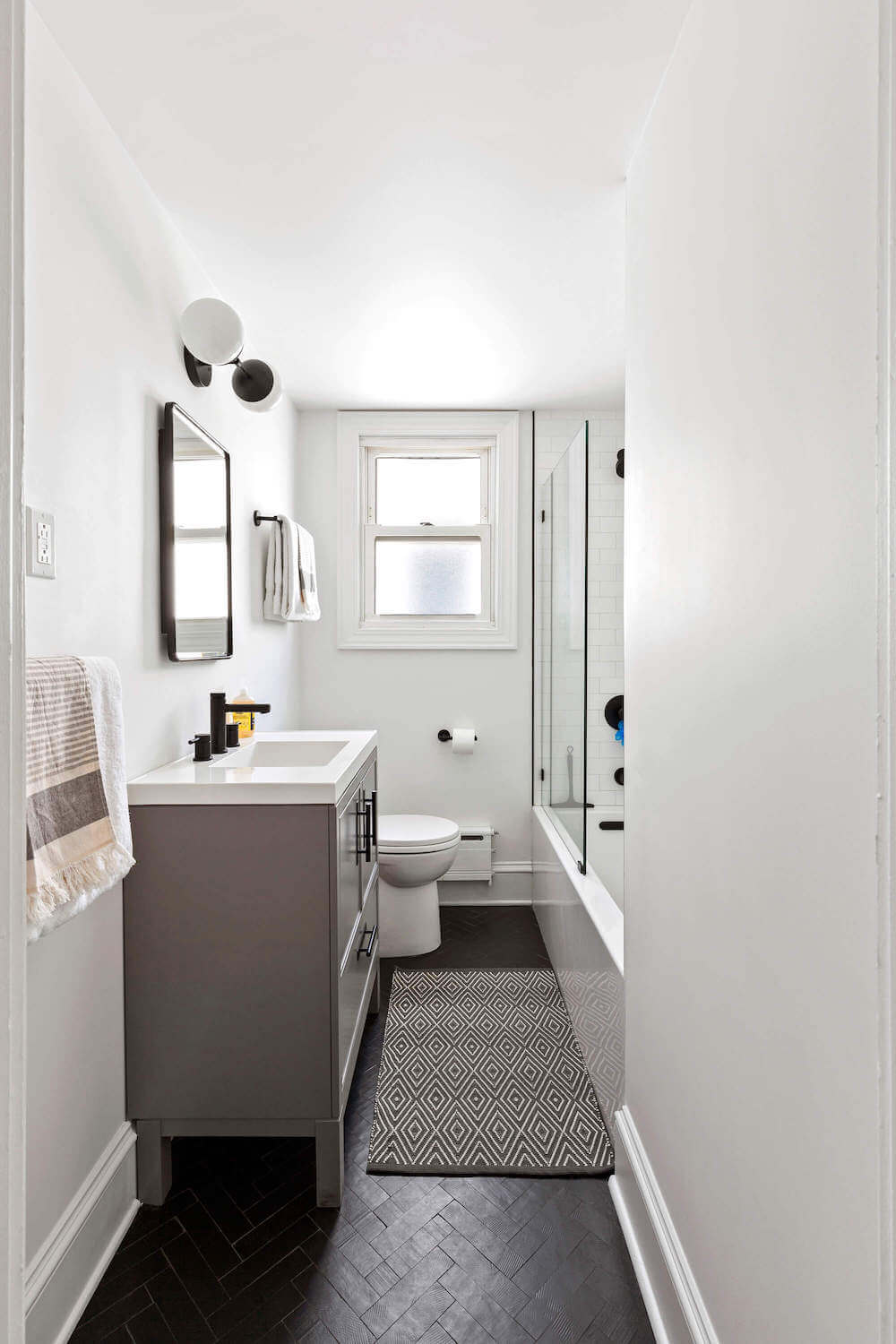
FULL BATHROOM RESOURCES: Salluto mix in nero floor tile: Ann Sacks. Kanso white 3 x 6 shower wall tile: Ann Sacks. Trinsic hardware and shower fixtures in matte black: Delta. Shower glass doors: Glass Warehouse. Kohler sink: Kohler. Kohler Rubicon vanity in mohair grey: Kohler. Moen Align faucet in matte black: Moen. Cadet toilet: American Standard. Theo sconce light: Cedar and Moss. Vanity mirror/medicine cabinet: Pottery Barn.
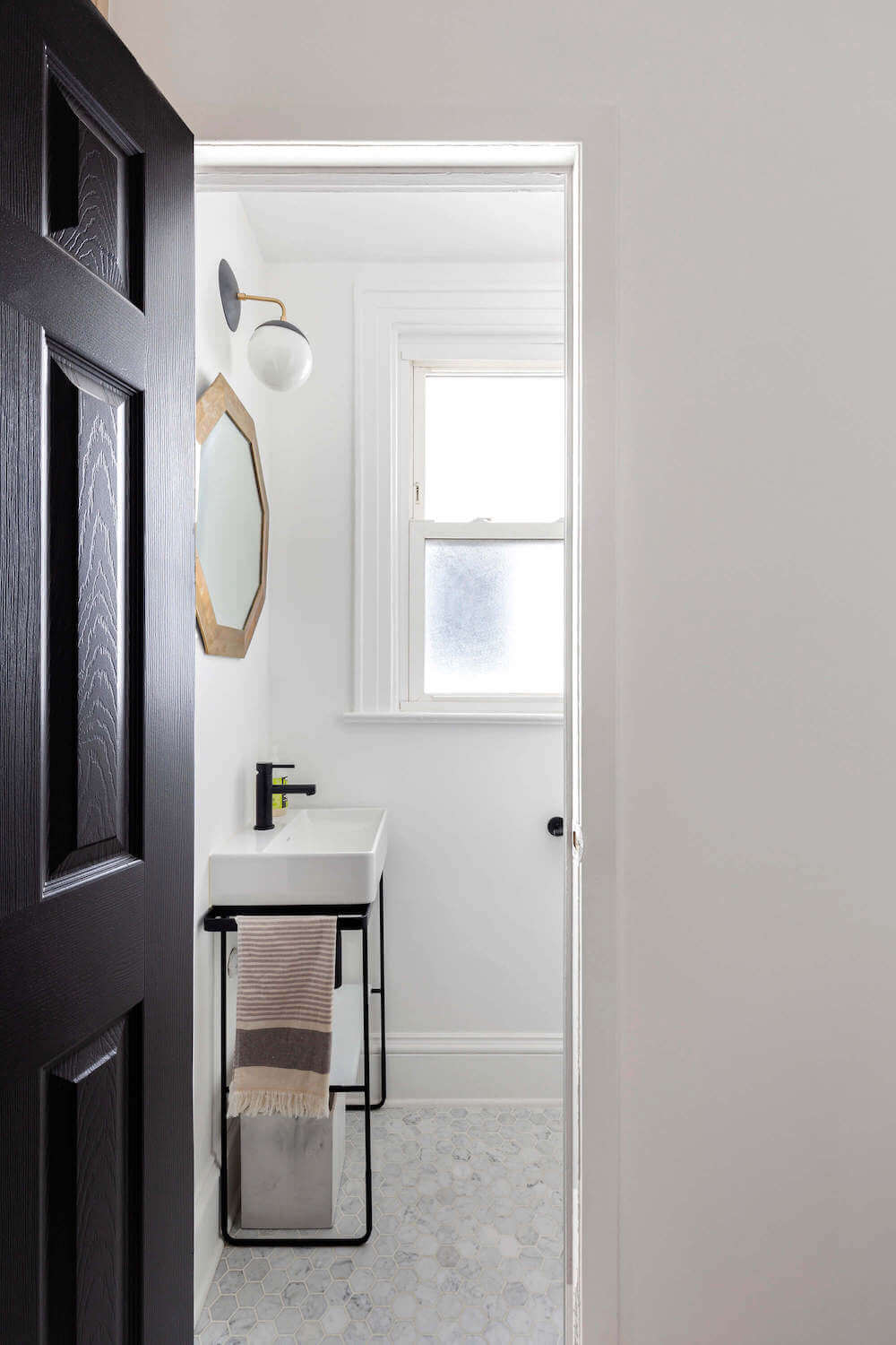
POWDER ROOM RESOURCES: BATHROOM RESOURCES: Hexagon 2″ x 2″ marble mosaic floor tile in white: Luxsurface. Duravit DuraSquare console sink: Duravit. Moen Align faucet in matte black: Moen. Trinsic hardware in matte black: Delta. Mirror: Vintage. Cadet toilet: American Standard. Alto sconce light: Cedar and Moss.
Ready to renovate your home?
Post your project on Sweeten today and get matched with our vetted general contractors for free! Find endless home renovation inspiration, detailed guides, and practical cost breakdowns from our blogs.


