A Home Remodel in Atlanta Caps a Thoughtful Refresh
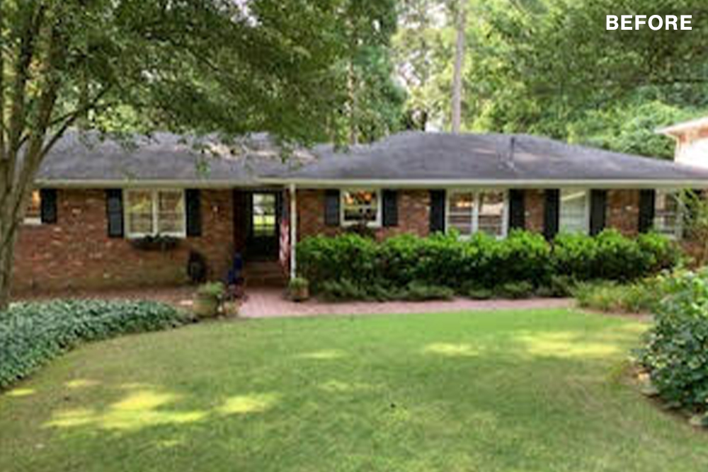
Step back in time and enter a mid-century modern masterpiece! This Buckhead, Atlanta renovation breathes new life into a classic 1950s ranch, transforming it into a haven of clean lines, pops of color, and timeless design. The project goes beyond aesthetics, though. Smart layout changes, including the addition of a mudroom, create a space that’s as functional as it is stylish – perfect for modern living. But the true star of the show might just be the stunning kitchen, where sleek cabinetry and statement lighting set the stage for culinary creations. Dive in and discover how this mid-century marvel was brought back to life!
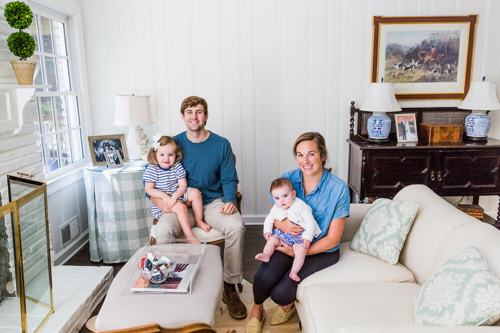
- Homeowners: Jenna and Hagan posted their project on Sweeten for a 3,000-square-foot mid-century home remodel
- Location: Chastain Park in Buckhead, Atlanta, Georgia
- Primary renovation: A reenvisioning of the floorplan as well as a new master suite, kitchen, bathrooms, and windows
- Homeowner’s quote: “Our contractor was transparent on costs, and his efforts resulted in a pleasing final product.”
Written in partnership with homeowners Jenna and Hagan. “After” photos by Joanne Kent.
A ranch-style Georgia home with appeal
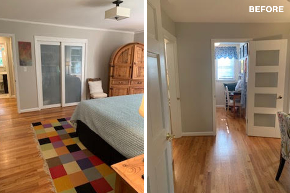
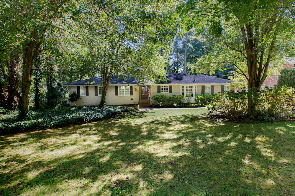
We bought this 1958 home in Atlanta’s Buckhead section with plans to renovate right away. Nothing was wrong, per se, but we knew we wanted to remodel. The plan was to improve the layout and exterior façade and update the kitchen and bathrooms. A big project would also turn the primary bedroom into a true master suite.
We are Jenna and Hagan, now parents to two daughters: Clay, 2, and Sloan, 7 months. Henry, our dog, lives here, too. When we found the house, we were still expecting our second child and I was working from home due to the pandemic. More space and some rooms to relax in were all we could think about.
A mid-century remodel focused on good bones with potential
Our ranch-style home, in the Chastain Park neighborhood, comprises 3,000 square feet. It has a backyard with mature trees, and the house benefits from pretty views and lots of natural light. The interior was traditionally styled, and we liked it. We felt, however, that we could make it work better for our family, and set out to do that. We posted our project on Sweeten and the team quickly sourced four quality contractors for us to consider. We soon found a general contractor who inspired our confidence.
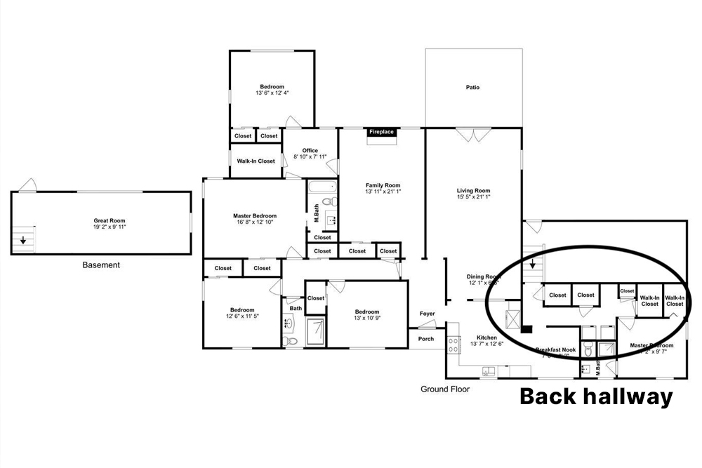
We brought floorplans to our meetings, as layout changes were the most challenging part of the project. Our house had a lot of storage space that we saw a potential to put to better use. These would include the bedroom areas as well as more useful spaces for the kitchen area.
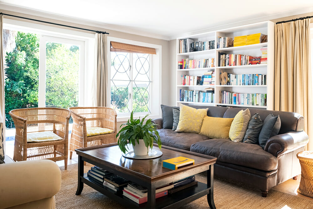
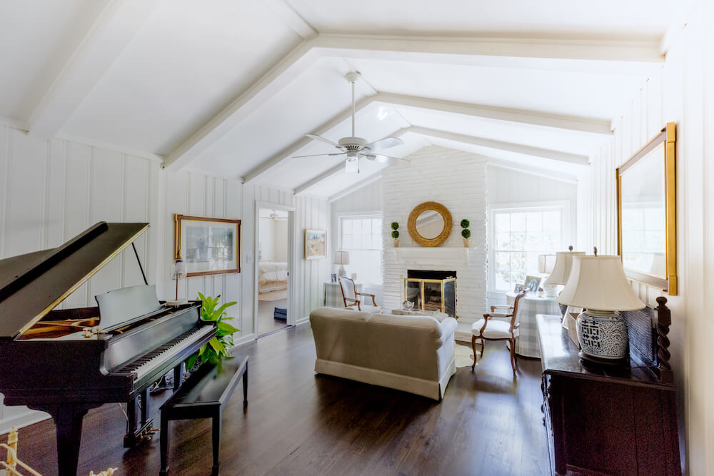
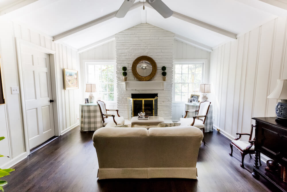
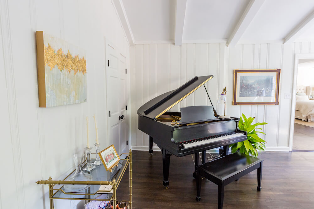
In the den, our contractor removed a large built-in shelf that had started to separate from the wall. We also painted this room and stained the floor dark brown.
At Sweeten, we’re experts at all things general contractors — we pre-screen them for our network, carefully select the best ones for your remodeling project, and work closely with hundreds of general contractors every day. So, we’ve tapped our internal expertise to bring you this guide.
“The contractor replaced the windows top to bottom to improve insulation. We could see early signs of rotting wood in the old windows.”
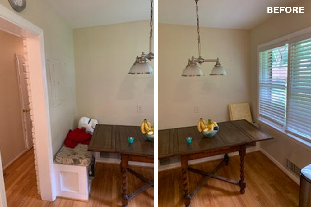
A new bay window brightens the kitchen
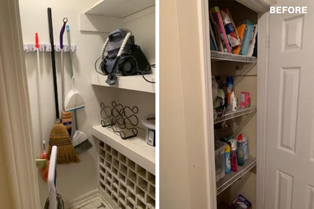
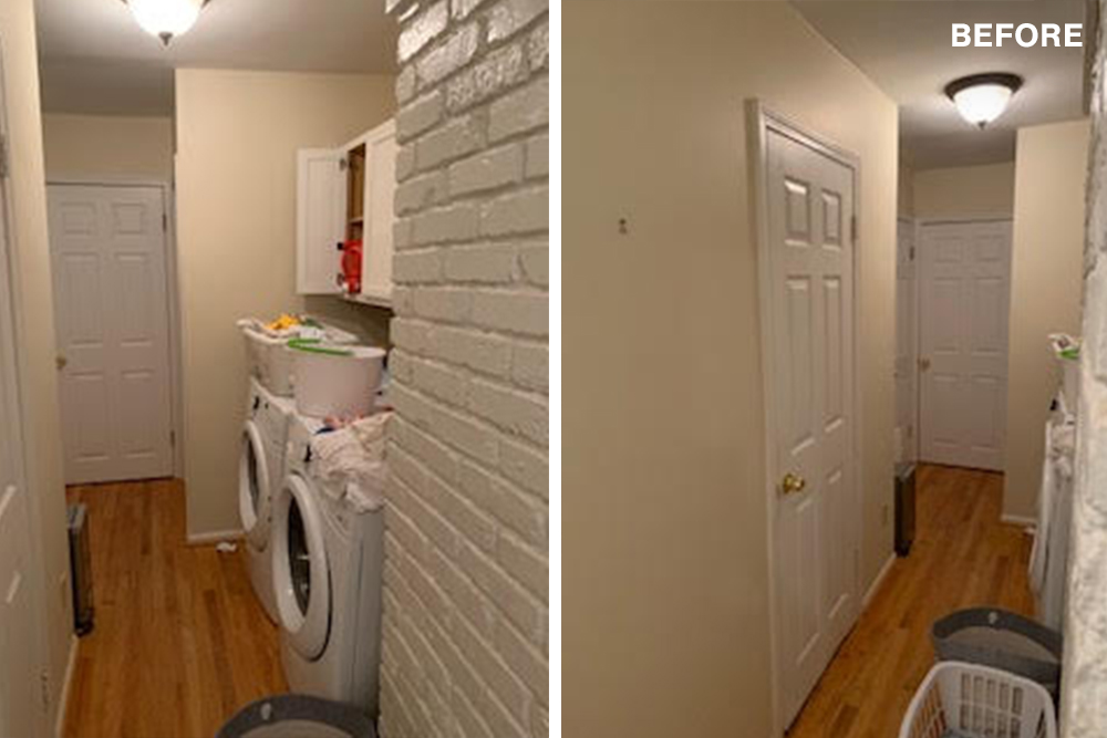
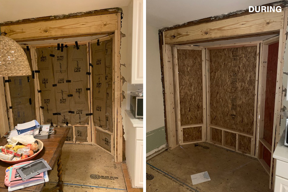
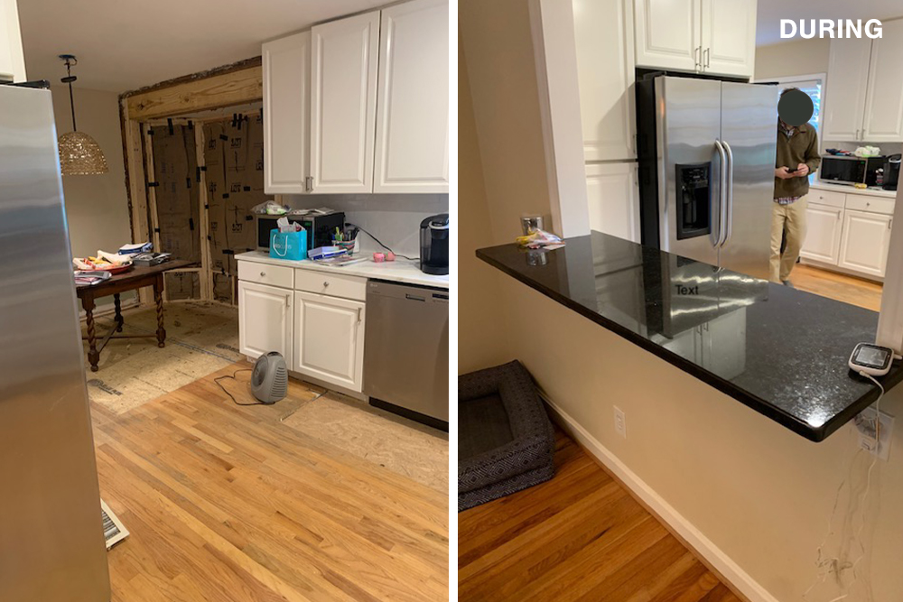
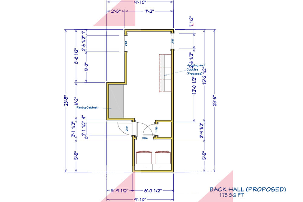
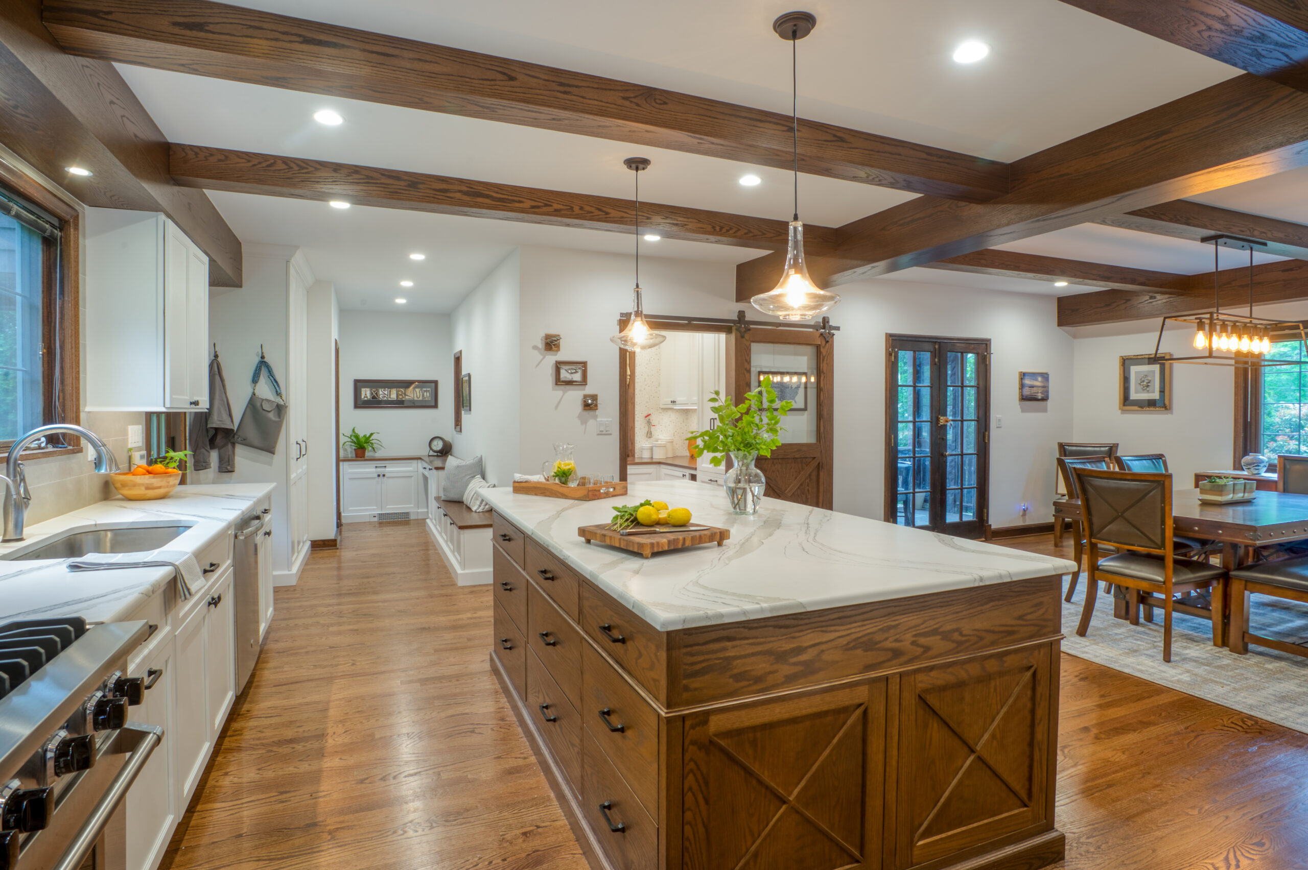
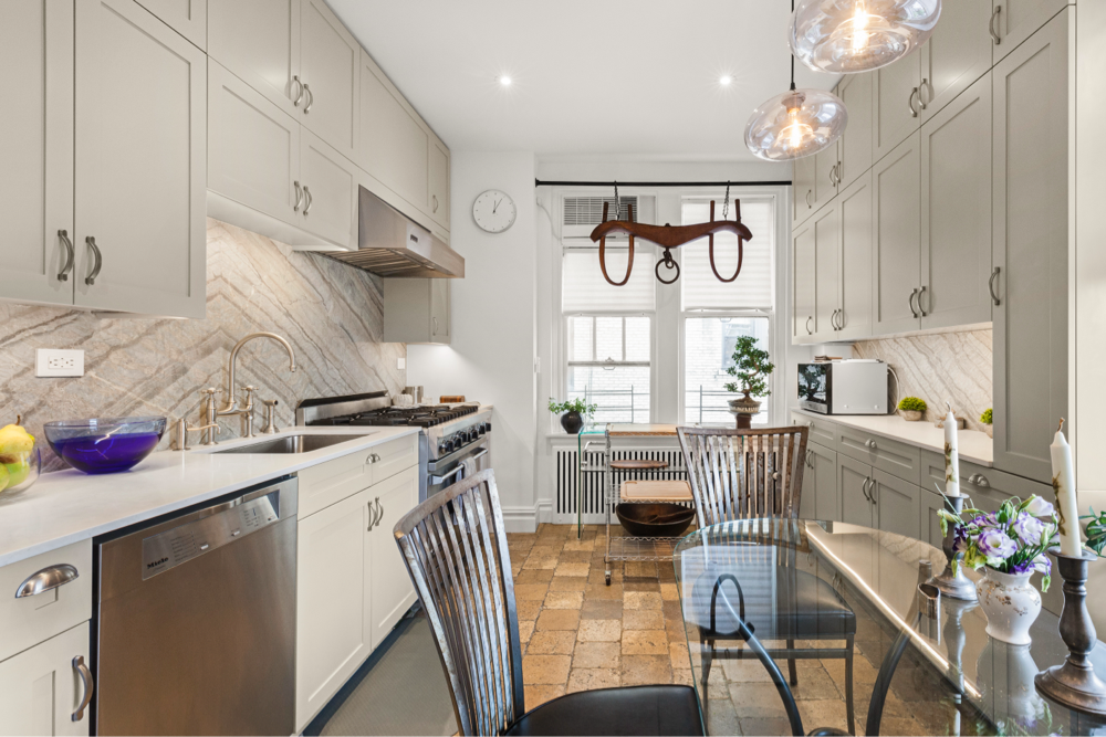
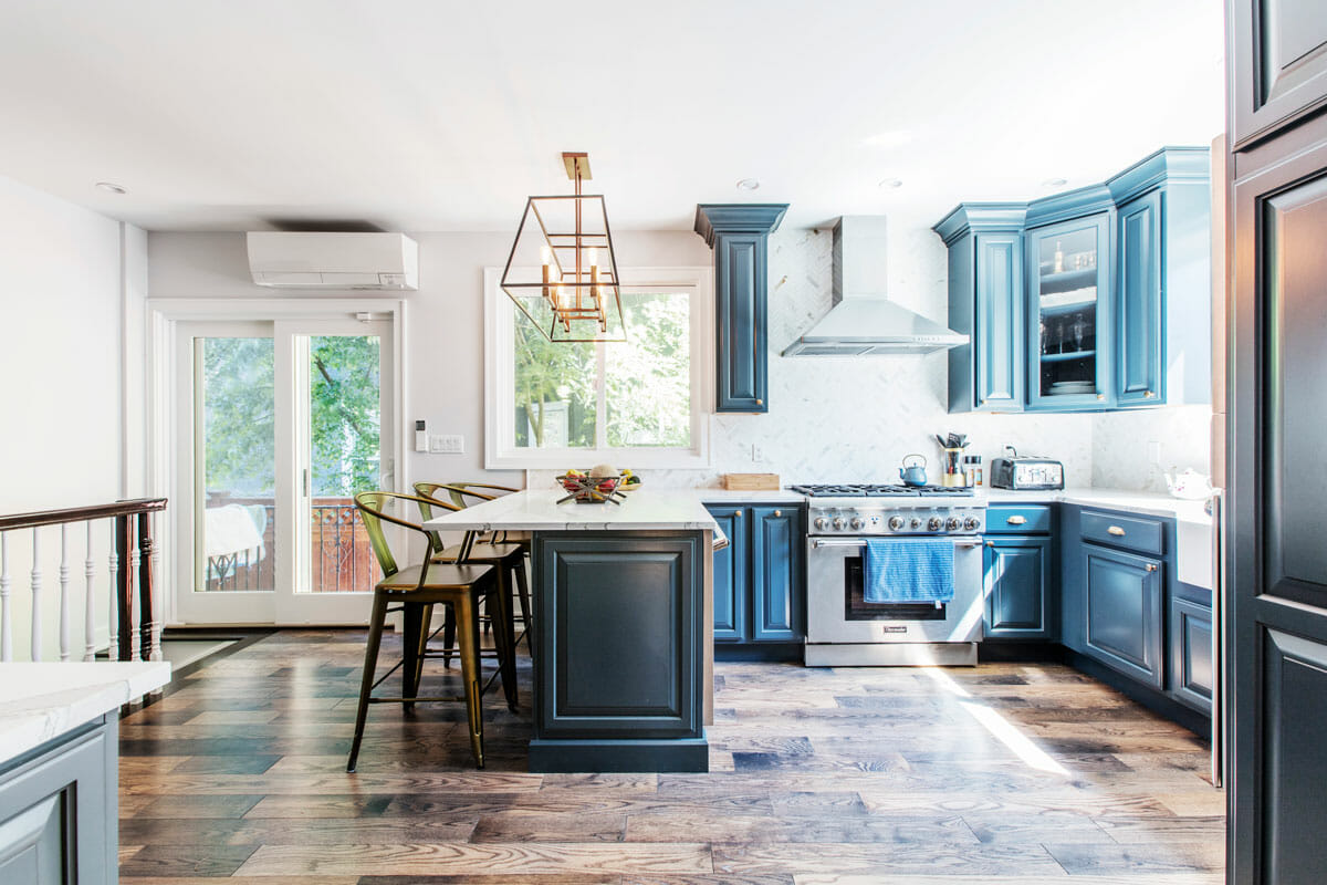
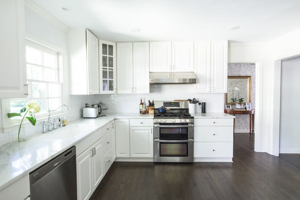
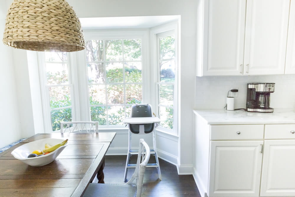
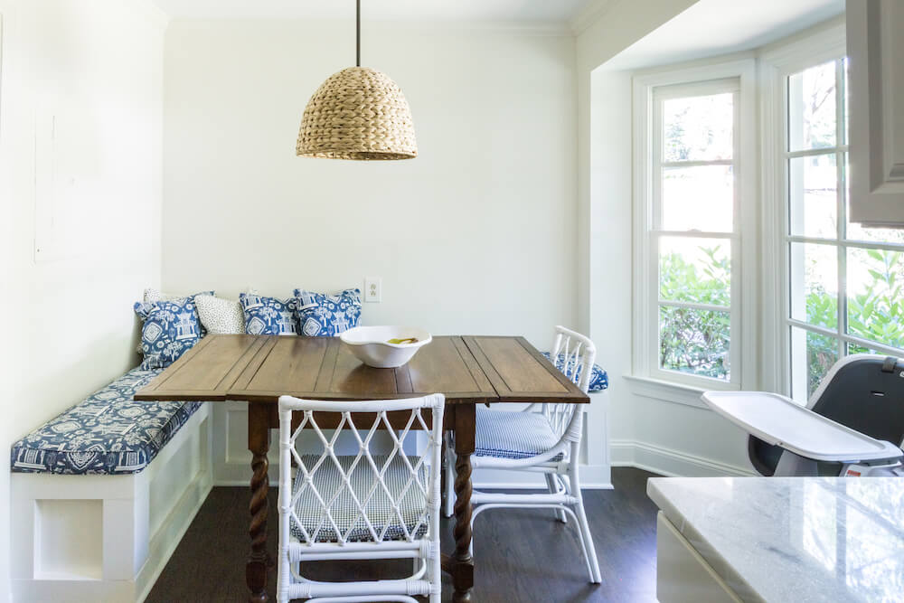
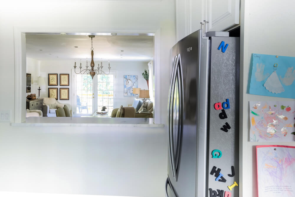
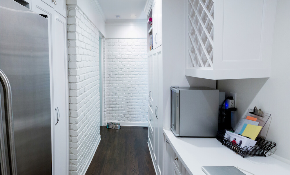
The plan for the kitchen included putting in a bay window in the existing breakfast nook and installing Dolomite marble countertops. We ordered a new kitchen sink and added a subway tile backsplash. We kept the existing cabinets, switching out the knobs for a fast refresh. To increase function in this section of the house, we turned to old closets. Opening up the boxed-in space of the four lining the back hallway made space for a butler’s pantry with a second fridge. We also built a laundry room in this area in a follow-up to the larger renovation.
Renovate expertly with Sweeten
Sweeten brings homeowners an exceptional renovation experience by personally matching trusted general contractors to your project, while offering expert guidance and support—at no cost to you.
Transforming closets for a master suite
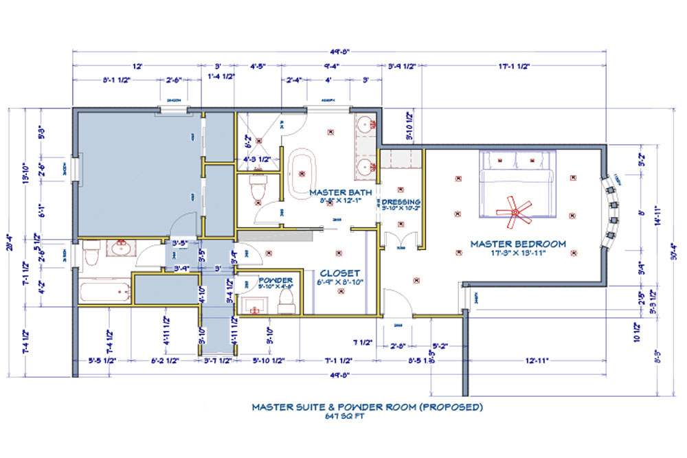
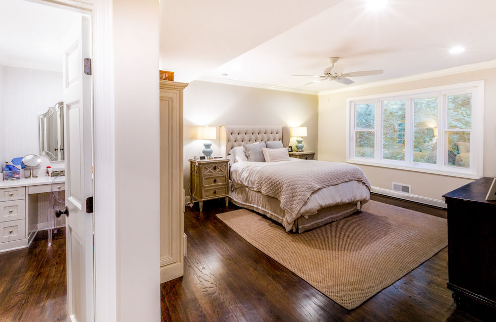
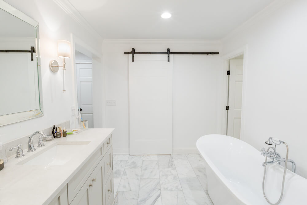
In the back of the house, closets (again) and one of the offices gave their square footage to enlarge our master suite and another bedroom. For the master suite, we imagined a large, open bedroom area looking out into the backyard. We would also add a walk-in closet, a big bathroom, and a powder room. The remap worked brilliantly. An existing door was repurposed as a sliding barn door and leads to our master walk-in closet. The contractor built a secret door at its back that lets us quickly get to the kids’ bedrooms during the night. It has come in handy!

Three bathrooms with new tile
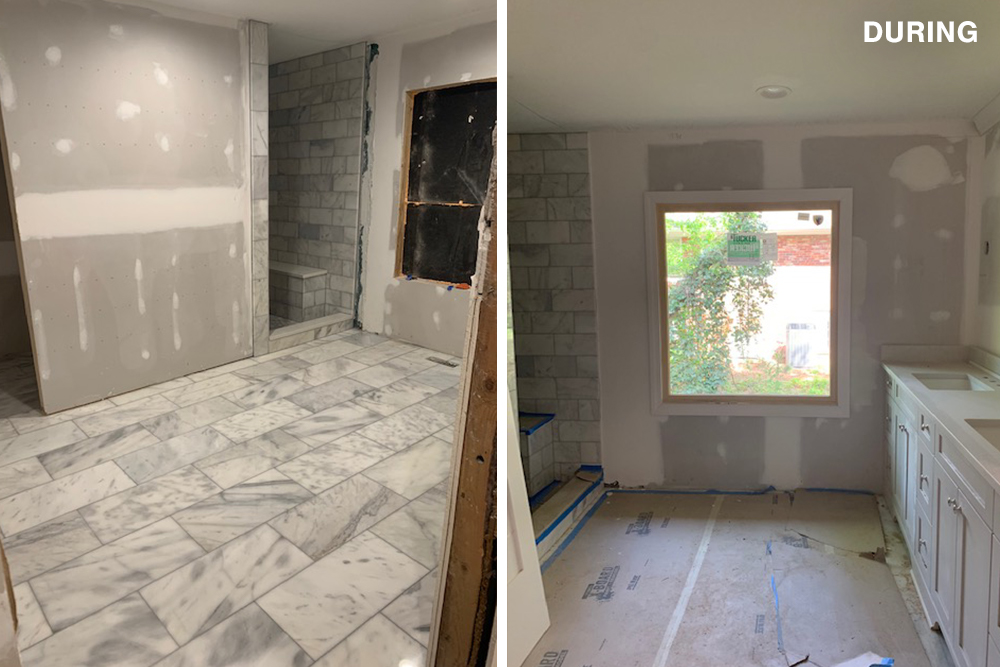
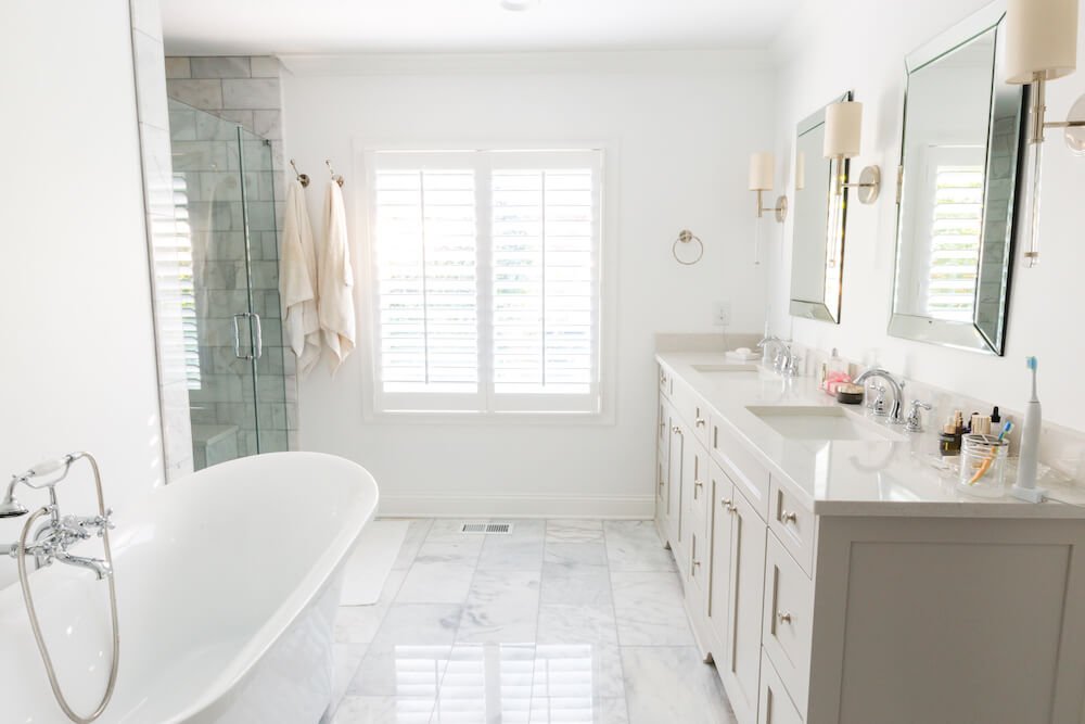
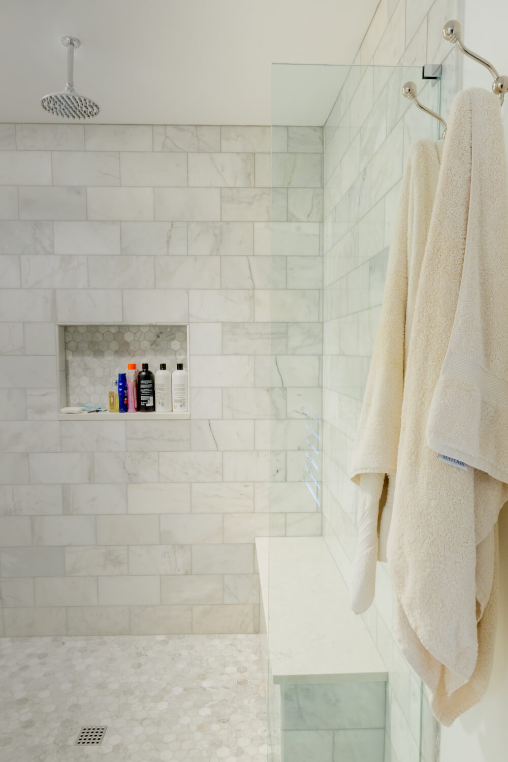
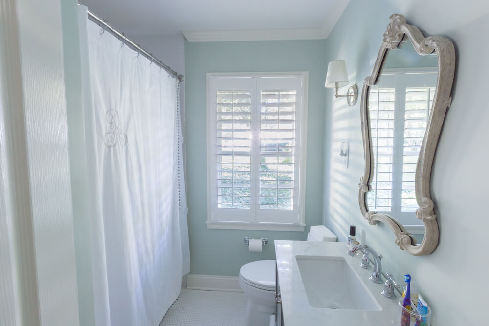
Bathroom renovations came next. We did them economically—as in almost simultaneously. Each bath got new tile, though we retained usable fixtures and hardware where we could. At one point, we had three bathrooms torn up. The one in use had a shower only, and our two-year-old was terrified of showers! We were pleased when the child’s bathroom, replete with new tub and penny tile floor, was finished—not to mention the other three. Our beautiful master bath, with a freestanding fluted bathtub, a glass-walled shower, and double sinks got the full marble treatment. The color palette was a mix of gray and white, including sleek large-sheet floor tiles.
Whole-house improvements for curb appeal
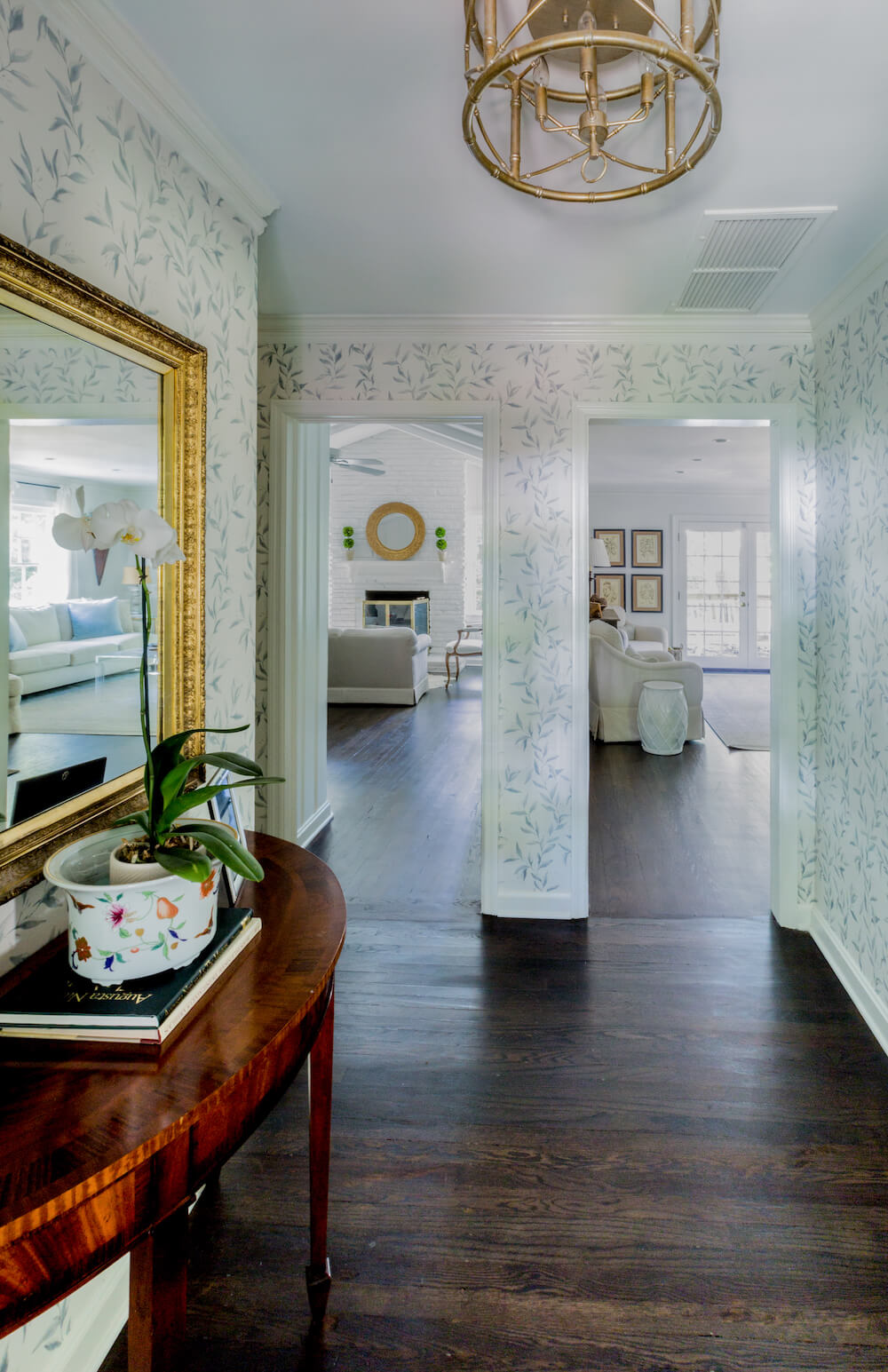
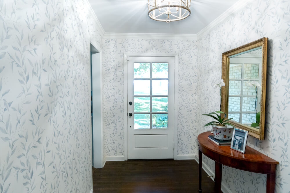
Much of the house had hardwood flooring in need of refinishing. From the bedrooms to the living room, den, foyer, and kitchen, the contractors sanded and stained them. In another global redo, the contractor replaced the windows top to bottom to improve insulation. We could see early signs of rotting wood in the old windows. The new kitchen bay window looks great from the inside and enhances the home’s curb appeal. The house would also get a new coat of exterior paint.
A Sweeten general contractor to count on
Through it all, our Sweeten contractor was reliable and competent. He was diligent with the permitting process, a delay-ridden challenge during Covid. (Key takeaway: Be 100 percent sure you need a permit and factor it into your timeline!) Our contractor was transparent on costs, and his efforts resulted in a pleasing final product.
It’s been a feat, but finally, we feel settled. Jenna and I waited so long for our master suite—it feels magical to have our own space. The girls, and Henry the dog, are happy. We are home.
Thanks for sharing your Atlanta remodel story with us, Jenna and Hagan!
Resource materials
LIVING SPACE RESOURCES: Swiss Coffee and Edgecomb Gray paint: Benjamin Moore. Black walnut wood floor stain: DuraSeal.
MASTER BATHROOM RESOURCES: Bathroom and shower floor and wall tile in Carrara marble: Floor & Decor. Bathroom mirror: Wayfair. Element quartz bathroom countertop: Hawthorne. Cooper shower system with rainfall and hand shower in chrome: Signature Hardware. Clear glass door with chrome Victorian-style handle: Echols. White ceramic rectangular undermount sink: Mazi. Sink fixtures: Kohler. Custom vanity with maplewood front and soft-close hardware: Kitchen and Bath Design Group. One-light Fremont nickel sconces: Savory House. Tub and fixtures: Build.com. Barn door and hardware: Original door repurposed.
CHILD’S BATHROOM RESOURCES: Element quartz bathroom countertop: Hawthorne. Bright White Ice 3″ x 6″ Festival subway ceramic tile (in shower): Floor & Decor. Brilliant White glossy Satori Hudson porcelain penny round mosaic tile, 12″ x 12″: Lowe’s. White ceramic rectangular undermount sink: Mazi. One-piece Santa Rosa comfort height elongated 1.6 GPF toilet: Kohler. Light sconce: Ballard Designs.
KITCHEN RESOURCES: Bellevue Bridge kitchen faucet with brass sprayer and polished chrome lever handles: Signature Hardware. Dolomite “Shadow Storm” kitchen countertops: Top Tops. Subway backsplash tile: Lowe’s. Dining table pendant light: Lowe’s.
Ready to get started?
Post your project on Sweeten for free and make your dream home a reality. Sweeten puts you in control of your renovation, from finding the perfect contractor and gathering design inspiration, to using cost guides to plan your budget wisely.
