A Remodel Pulls Off a Few Tricks
Ali and Mark’s new 560-square-foot home in a 1910 building featured all of the charms one would expect to find in a West Village neighborhood. Despite this, a few characteristics would need to be attended to, including odd-angled walls and a windowless bathroom. The couple posted their West Village renovation project and found a Sweeten architect and a Sweeten general contractor to bring order to their walls, build a European-style wet room, and combine a simple contrast of materials. Read on to see how they achieved design and function in all of the right places.
Our apartment has some really nice things about it—it’s a corner floor-through, with eight big windows, in a really nice neighborhood. It also has some quirks such as the floor, which is remarkably uneven, and the angles of the walls, none of which are 90 degrees. (Our building is on a corner of an old downtown street and is slightly wider at one end than it is on the other.) But the bones are good, as they say, and our ambitions were narrow.

We wanted a really nice kitchen as well as a wet-room-style bathroom that would make the most of its tiny footprint and distract from the lack of windows. A friend of ours recommended a Sweeten architecture team, who were kind enough to take on our project even though it’s smaller than jobs they normally do. Walking through the space, we discussed whether to tackle the floors now or later and how to get more space out of the kitchen.
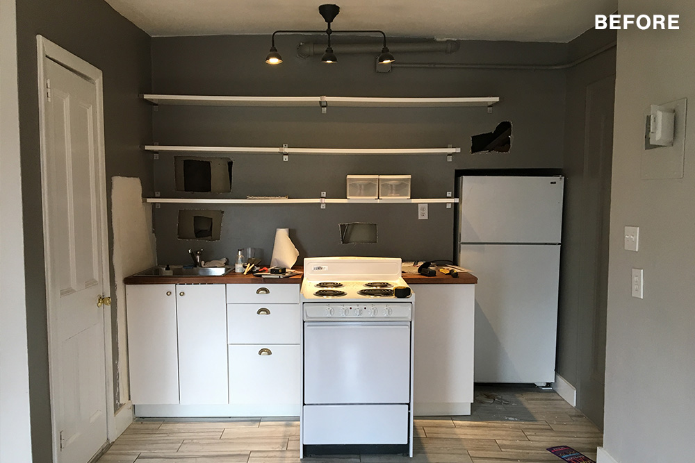
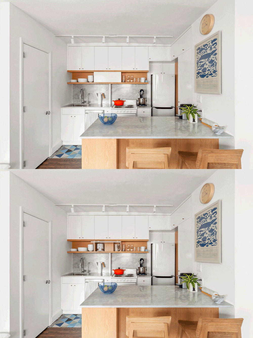
We agreed that ripping up the floor could expose even bigger, potentially budget-restrictive problems and that a new stain might sufficiently improve the overall vibe. In the kitchen, we all suspected, based on the footprint of the unit above ours, that the eastern wall (the wall with the sink, refrigerator, and range) was encroaching on the interior space more than it needed to be, and that it might be hiding a window (a window looking out on a dark airshaft, but still, a window.) The architects came by and knocked some holes in the wall and confirmed that suspicion, which we took into account while drawing up plans.
The bathroom evokes the best possible reaction: that unique combination of joy and surprise.
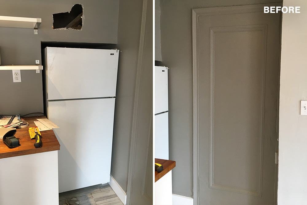
It became clear pretty quickly that the window we found wasn’t going to make an appearance in the new kitchen (its height would conflict with counter height and it wouldn’t let much light in, anyway). It was hidden again behind the wall, but we did push the surface back to gain another foot or so of width, which feels like a big win. The only drawback was the repositioned wall now exposed a water pipe; we decided to just build the counter and shelves around it.
At Sweeten, we’re experts at all things general contractors — we pre-screen them for our network, carefully select the best ones for your remodeling project, and work closely with hundreds of general contractors every day. So, we’ve tapped our internal expertise to bring you this guide. Sweeten brings homeowners an exceptional renovation experience by personally matching trusted general contractors to your project, while offering expert guidance and support—at no cost to you. Renovate expertly with Sweeten
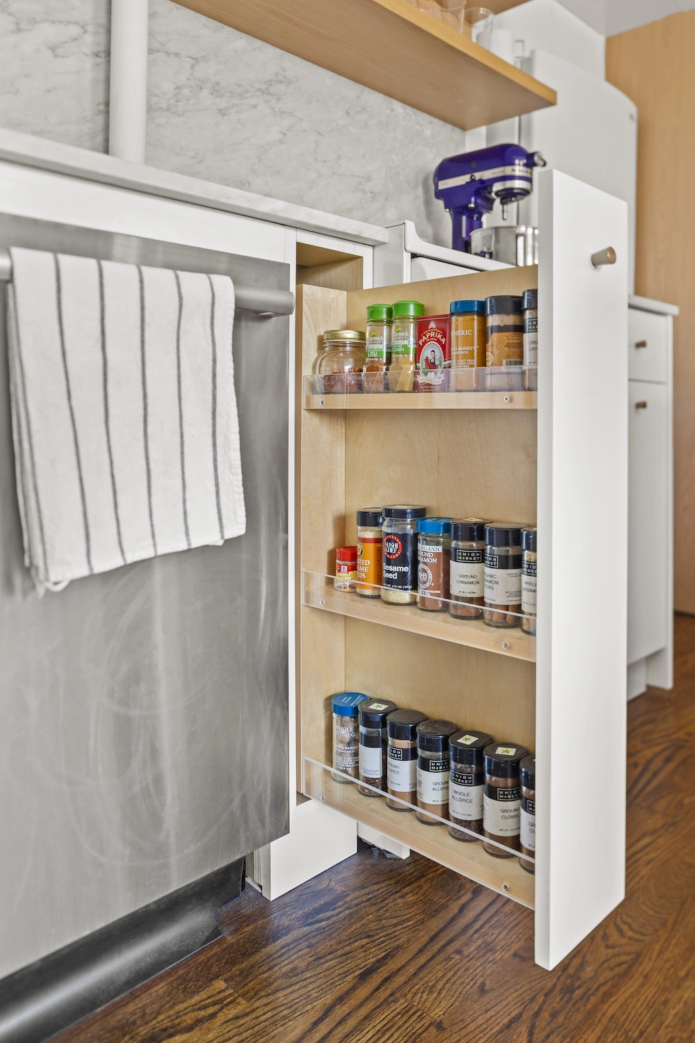
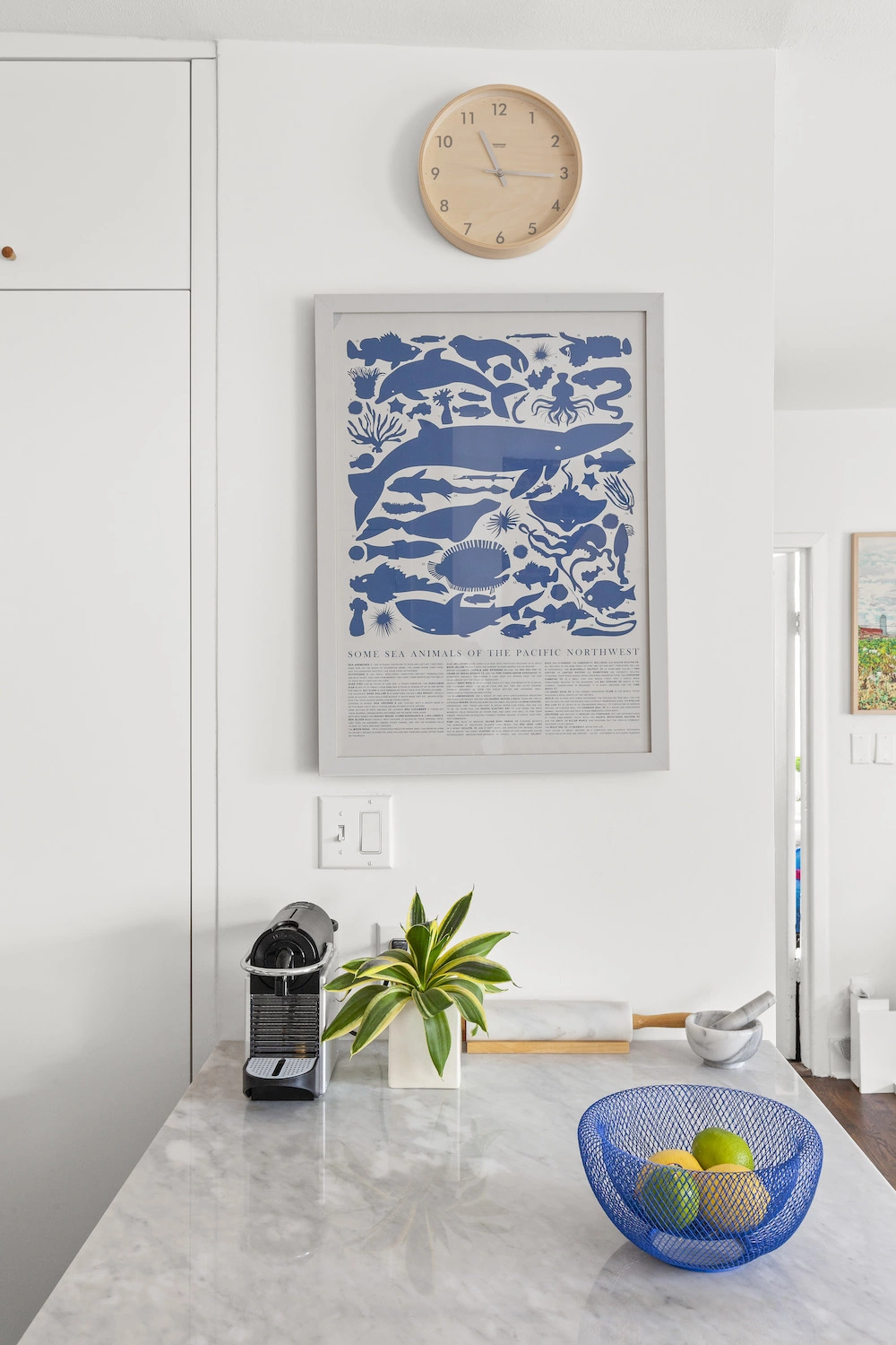
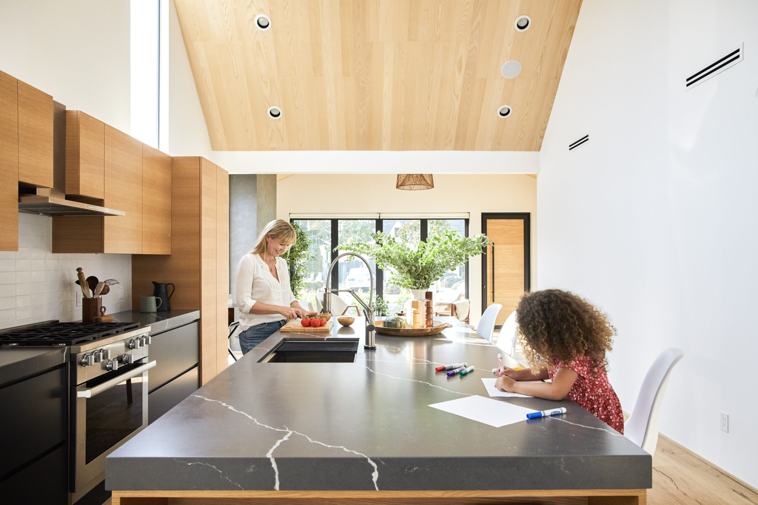
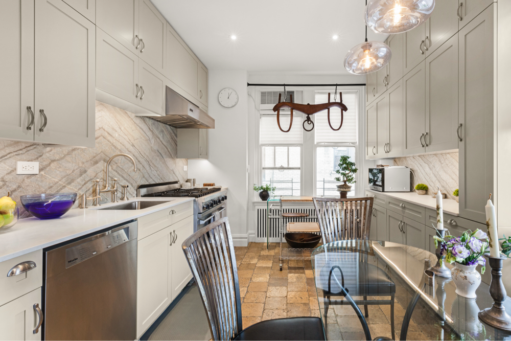
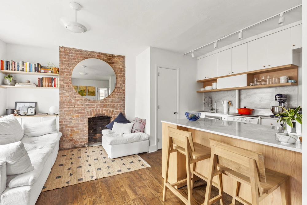
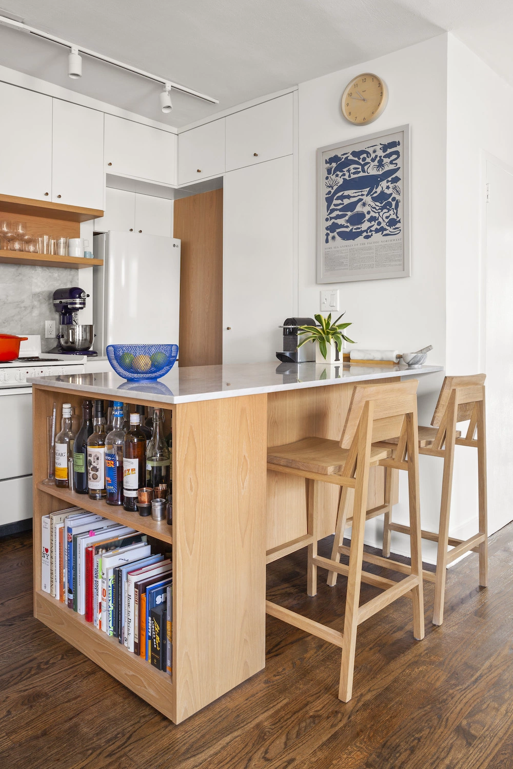
Our main ask in the kitchen was some open shelving for easy access to plates and glassware (we know, we know, such a thing right now) and as much storage as possible. And we wanted an island to eat at and chop on, which was probably pushing it in terms of the square footage. The Sweeten architects devised this great peninsula that’s like a Swiss Army knife. It has tons of cabinets and drawers on one side, shelves along the other, and still plenty of space to sit and eat.
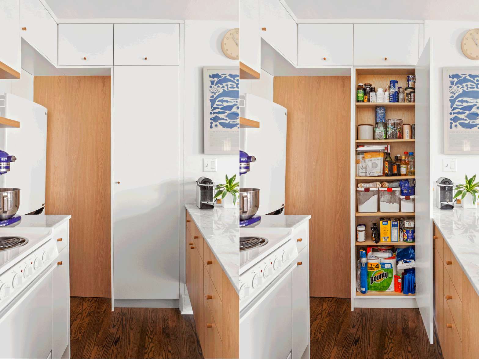
They also drew up this narrow pantry concept and stuffed it into an unused sliver of space between the peninsula and the fridge, and my, does this pantry change everything. Cabinet storage is even double-stacked above the fridge. Sometimes it feels like we have too much kitchen storage.
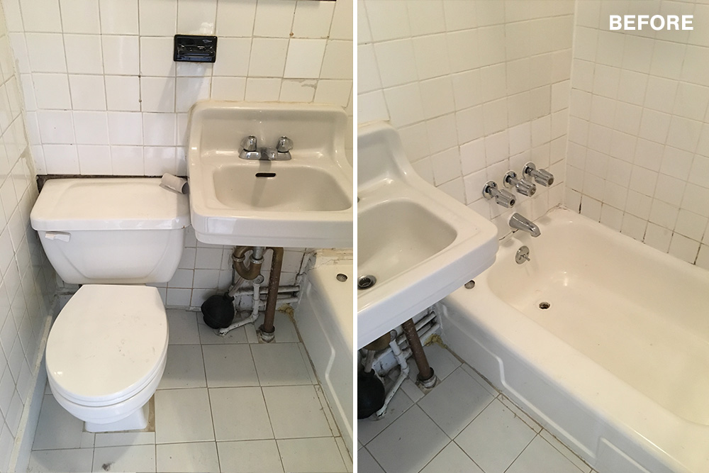
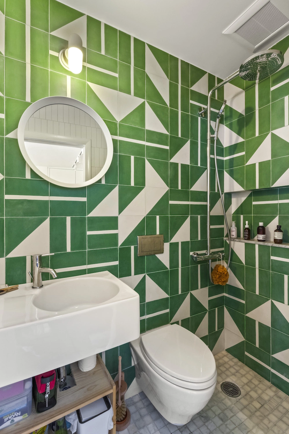
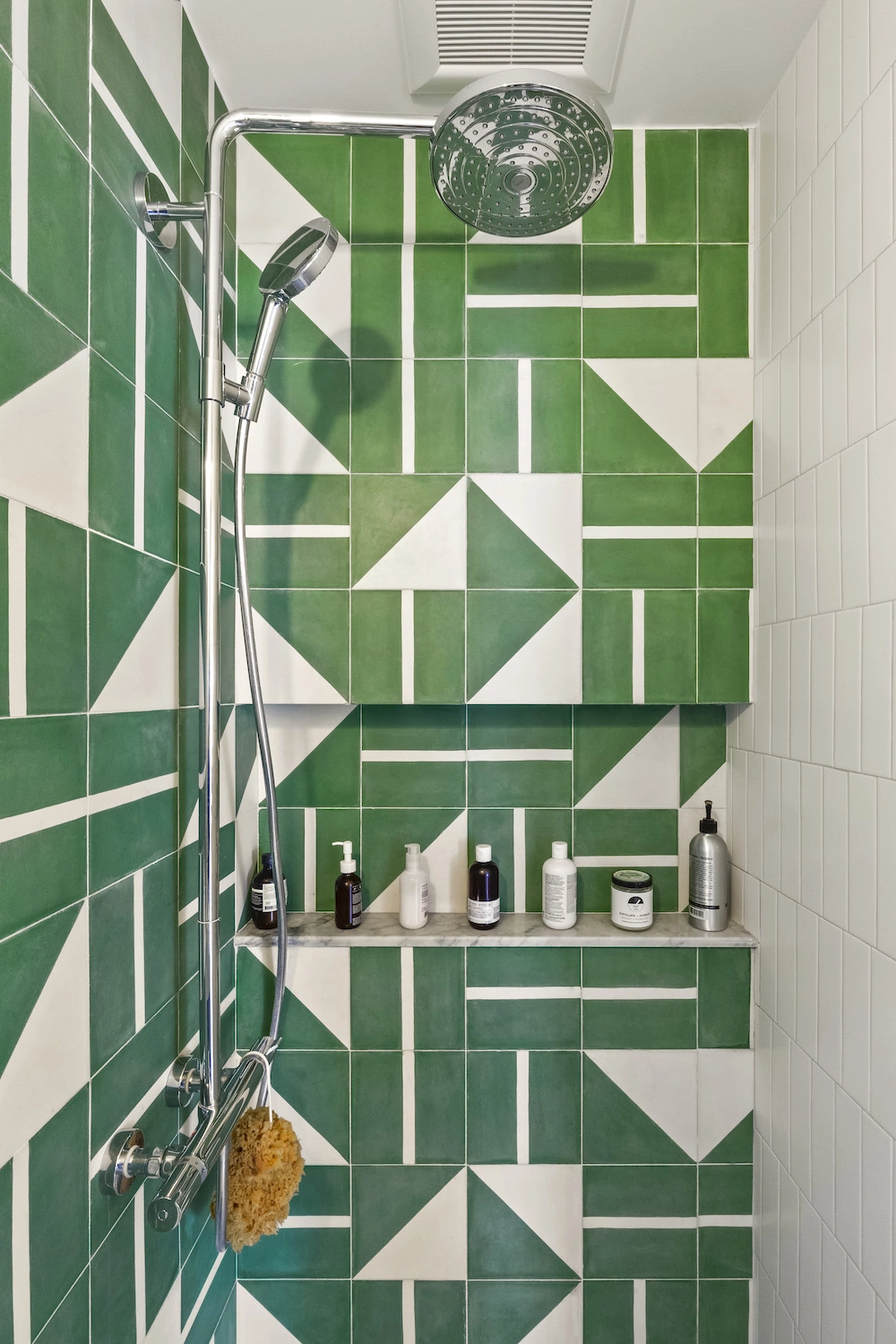
The bathroom is approximately 12 square feet. I’ve been in showers larger than our entire bathroom. Nobody wants to feel bummed out when they’re showering. Ali had this idea to cover the entire thing in big bright tile, like some bathrooms we’d seen while traveling. The architects delivered on this with green and white (er, “lawn” and “milk”) cement tiles from Morocco, which we absolutely loved. This quickly became the most exciting part of the project. They also found a really nice rain shower and toilet, both of which are thrilling to use in their own ways.
There is no curtain, just a gentle slope in the floor to drain the water. When you shower, half the bathroom gets drenched but miraculously not the sink area. Because the shower isn’t enclosed, it really feels like the entire bathroom turns into a shower.
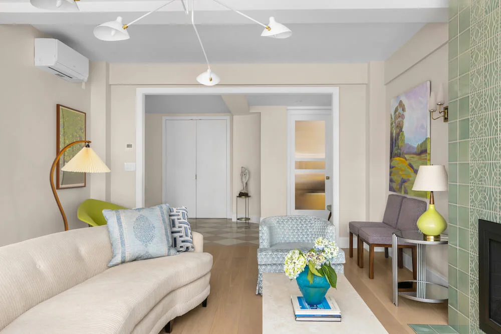
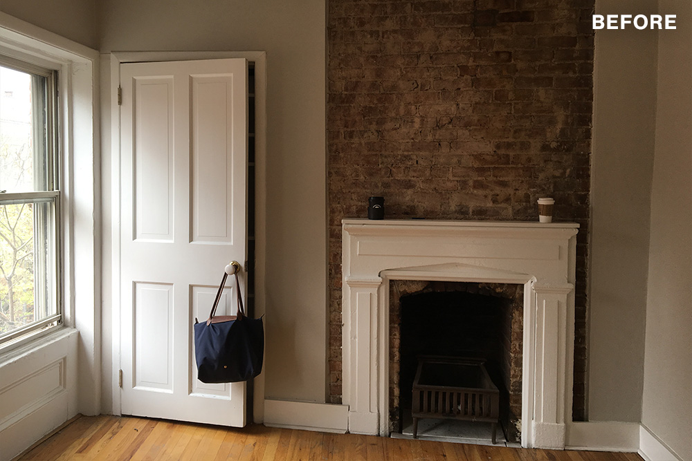
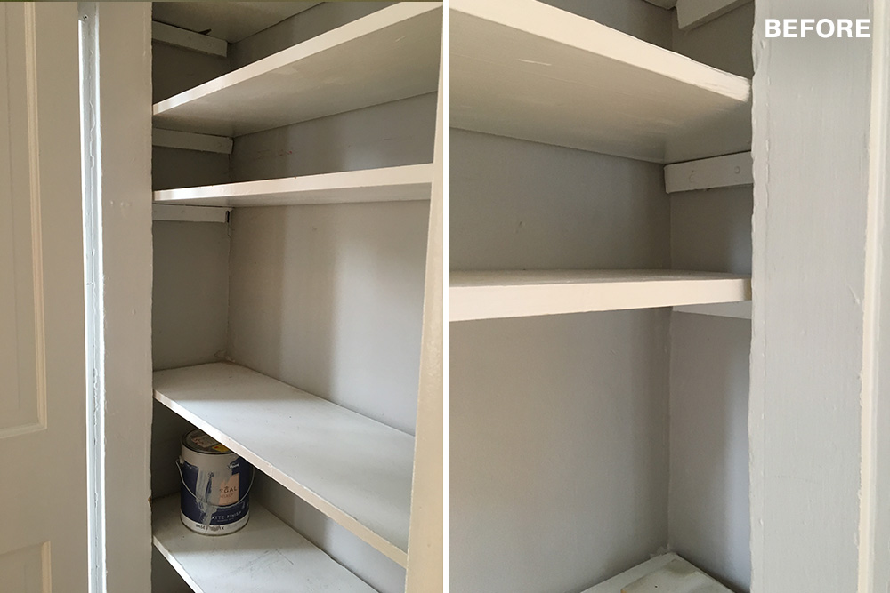
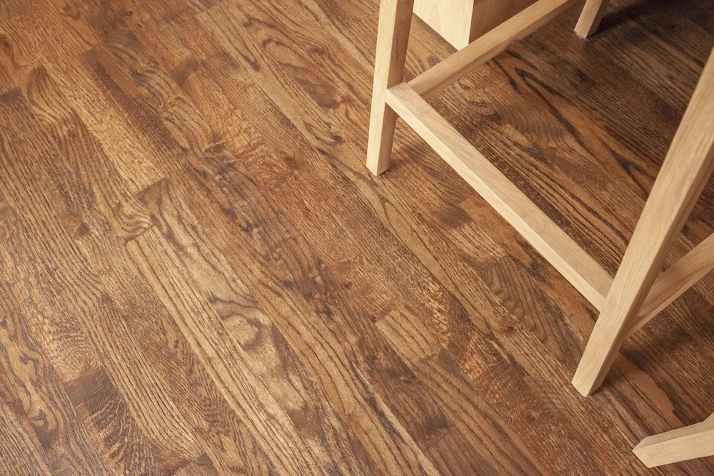
The rest of the work was cosmetic. The Sweeten contractors sanded the scuffed up old wood floors and we picked a new, darker stain, a mixture of a couple of stain options we’d sampled. We also continued the hardwood from the living room area into the kitchen, which had been a kind of gray faux-wood beforehand. Our architects thankfully talked us out of whitewashed floors, which would have been hell to keep clean. We also shaved down the mantle from the living room’s (non-working) fireplace, and tore out a pointless little closet in the corner next to it. After the work was done, Mark installed bookshelves here.
All of the apartment’s doorknobs were replaced, many of which didn’t quite work, and several weird chandeliers were taken out of the kitchen and bedroom closet that had probably been there forever. These little things helped the space so much, making all the little pieces feel intentional.
The architects’ overall aesthetic was evident by the use of light wood tones throughout which contrast the new dark floors, and the white Carrara marble on the backsplash and island catching the sunlight from the windows. We tried to echo these choices with furnishings wherever possible.
Our Sweeten contractors handled the majority of the renovation work and a custom millworker installed the kitchen and worked really fast. We were basically living out of hotels or staying with relatives while we waited out the work. We probably asked for some unrealistic things in terms of the timeline—the project took about eight weeks from start to finish—but it managed to be delivered on time.
We’ve now been living in the space about four months and are thrilled by how it turned out. The sunlight is so good and the dark floors are beautiful. The kitchen has clown-car-levels of hiding places. And, of course, the bathroom, which is both fun to use and fun to show off. When we open the door there’s always a moment when people are caught a little off guard by the green tile. It evokes the best possible reaction: that unique combination of joy and surprise.
Thank you, Ali and Mark, for sharing your West Village renovation with us!
KITCHEN RESOURCES: Wood floor stain, 50/50 mix of Jacobean and Provincial: Minwax. Custom kitchen cabinets: Interiors Palace. Cabinet hardware, #WM1095 by Jade4Wood: Etsy. Carrara marble slab countertop and backsplash: Sourced by general contractor. Kraus Bolden faucet in chrome: Lowe’s. LG 24″ refrigerator, #LBNC10551W: AJ Madison. 18″ dishwasher, 800 Series: Bosch. Track lighting: WAC Lighting. Paint color in White, #PM-2: Benjamin Moore.
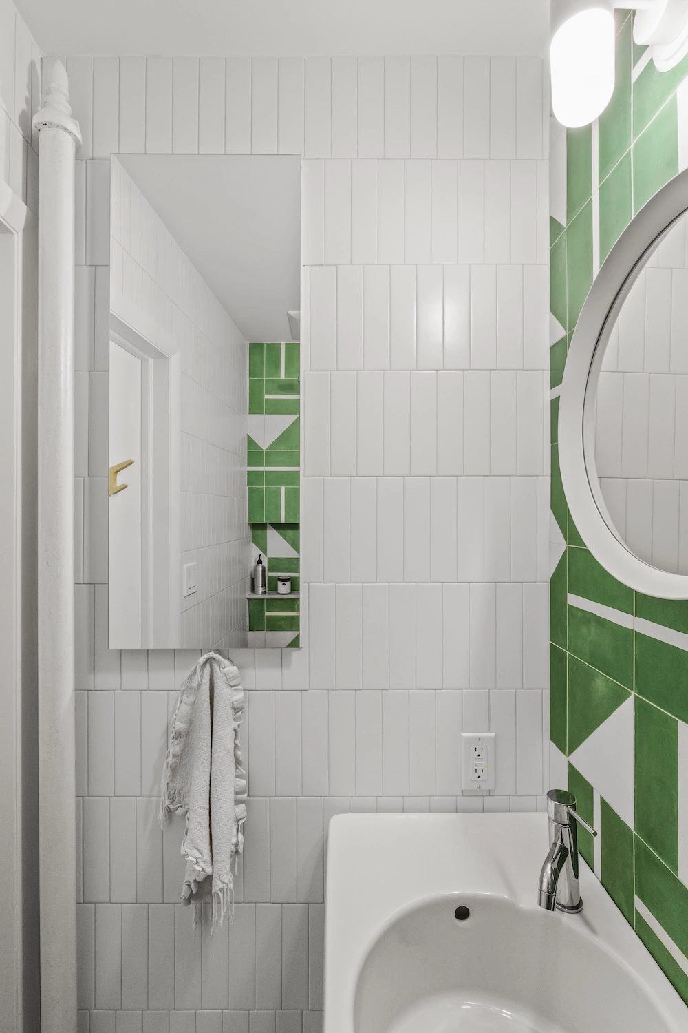
BATHROOM RESOURCES: 2″x2″ Carrara mosaic floor tile: Carraratiles.com. Moroccan concrete bathroom wall tile: Popham Tile. Metro Series bathroom wall tile in white: Nemo Tile. Glacier Bay faucet, #67732W-6001: Home Depot. Raindance Select S shower fixtures: Hansgrohe. Scola sink vanity: Duravit. Toilet with in-wall tank system: Toto. Ostana light fixture, Storjorm round mirror: Ikea. Medicine cabinet, PL Series: Robern.
—
Two architects renovated their own home and opted for a wet-room-style bathroom.
Ready to Renovate Your Home?
Post your project on Sweeten today and get matched with our vetted general contractors for free! Find endless home renovation inspiration, detailed guides, and practical cost breakdowns from our blogs.
