Corey’s Williamsburg Kitchen Renovation — Sweetened!
There is so much eye candy in this week’s guest post, it would be easy to miss the custom craftsmanship and design details that took this Williamsburg kitchen from contemporary cookie-cutter to industrial haven. Thankfully, we have all of the story in all of its glory from the homeowner, a multidisciplinary artist and teacher. Read on for Corey’s take and for some good old-fashioned real estate envy.
Guest post by Corey, Williamsburg homeowner
Burned out by a decade of renting in the city, we entered the buyer’s market with little knowledge of how volatile it would be. After a search that saw us move too slowly on a modest but well-located unit, and then get completely outbid on a dream apartment, we stumbled upon a two-bed, two-bath condo in Williamsburg. Not wanting to miss out again, we put in a bid and were surprised to get the place. That could very well have been the end of the story, but what fun would that be?
We’d be the first to admit that the unit we purchased was totally serviceable. Only a few years old, it was a corner apartment with decent square footage and great city/bridge views in an increasingly popular zip code. The unit had been rented to a prolific painter who’d kept the walls white and the creativity high. It was a serviceable blank canvas; what it wasn’t was the dream apartment we’d lost out on months earlier. Regardless of how excited we were to be new owners, we just couldn’t shake the “if only…” feeling for that spot and started thinking about ways to incorporate elements from the coveted (but now somebody else’s) space into our new home.
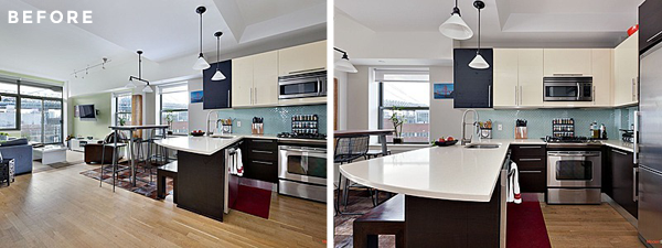
I had no idea where to start, but after a search on New York renovations, I stumbled upon Sweeten and spent a few days ghost-stalking various featured projects on the site. This gave me many ideas and the more we explored changes for our space, the bigger the scope of this potential project became, so we decided to focus on the area that could make the biggest impact: the kitchen. As it was, the apartment opened into a cramped one with little countertop space, limited storage, basic appliances, and no defined dining area. There was unused space above the cabinets and an odd mixture of lighting fixtures. In a nutshell, it was a cookie cutter kitchen in a cookie cutter condo and we really wanted something with more character.
I put together a project post on Sweeten with a fairly clear idea of the feeling we wanted the place to evoke, even if the specifics weren’t totally defined. Sweeten introduced us to a few design teams and we decided to work with Sweeten Expert Thomas and his design/build team based on images of some of the spaces they had designed in Little Italy. We had them come out to the apartment to see what we had and right away, the team showed enthusiasm for the project and the type of aesthetic we were hoping to achieve. In hindsight, that was probably the most important decision we made – identifying the team that seemed to best understand the vision we had and showed a willingness to get us there (and stay within our budget) was key.
Thomas’s team introduced us to their design/build approach and though I had no experience with the model, it became clear we would be working very closely to get the space just the way we wanted it. But what was that, exactly? Aside from being slight on storage and functionality, our complaint was that the kitchen was generic, so looking to the neighborhood for inspiration, we envisioned a design that embraced the industrial history of the area without being too rustic. We also wanted to maximize the space by creating a more open floor plan. Through conversations with the design team, we zeroed in on a classic palette incorporating white, gray, brown, charcoal, black, etc.
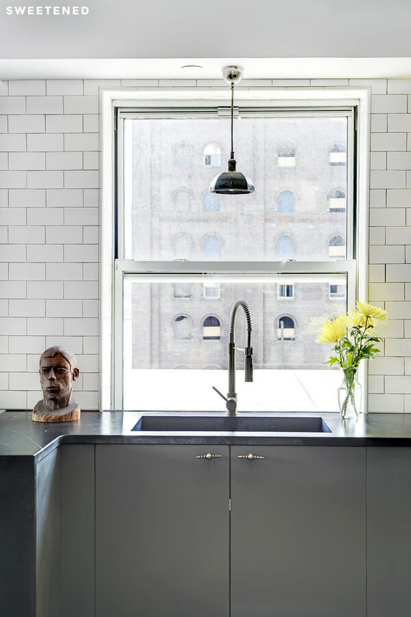
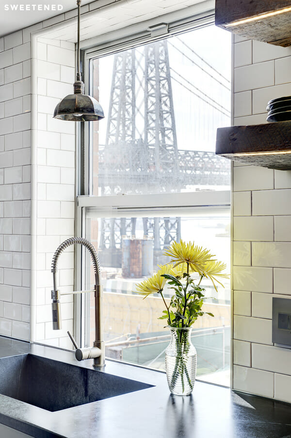
Palette aside, there was little hope of gaining storage or making the space feel more open without a pretty drastic change to the layout. Thomas and his team walked us through possible reconfigurations; we entertained the idea of installing an island or lengthening the counter, but because of the central placement of the sink and dishwasher, the only way to address the problem was to relocate both. Cue the plumber. The upside? We were able to position the sink in front of the window (where it probably should have been in the first place?) and create a longer countertop surface as well as additional storage both above and below. Sweeten brings homeowners an exceptional renovation experience by personally matching trusted general contractors to your project, while offering expert guidance and support—at no cost to you. Renovate expertly with Sweeten
They say the devil is in the details and we learned this firsthand once the floor plan had been chosen and the time came to fill it. We have an admittedly eclectic style so the conversations about materials were lengthy and the direction of the design changed a few times. We went in knowing we liked metal, glass, tile and wood because they suggested the “industrial” feel we liked, but it was most important that we assembled comfortable and clean materials. We knew we wanted appliances that would allow for entertaining and easy food prep and a look that would match, so a lot of time was spent narrowing down the colors of the tile and millwork and countertop and shopping for new appliances.
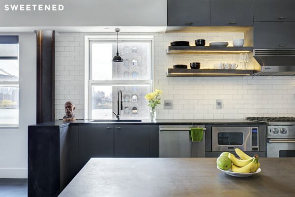
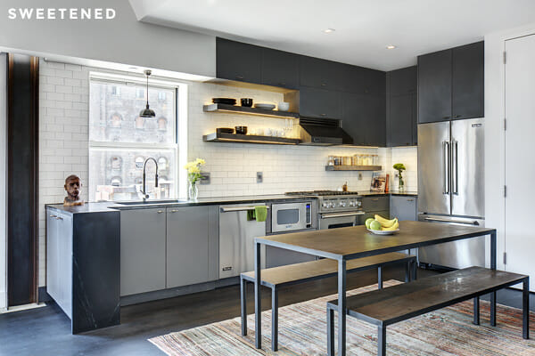
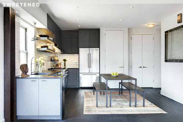
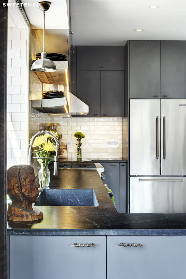
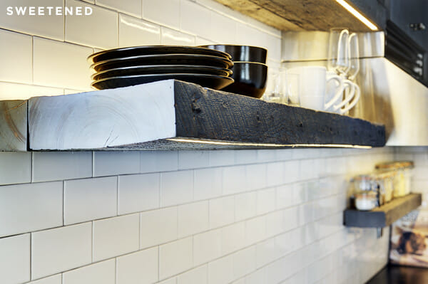
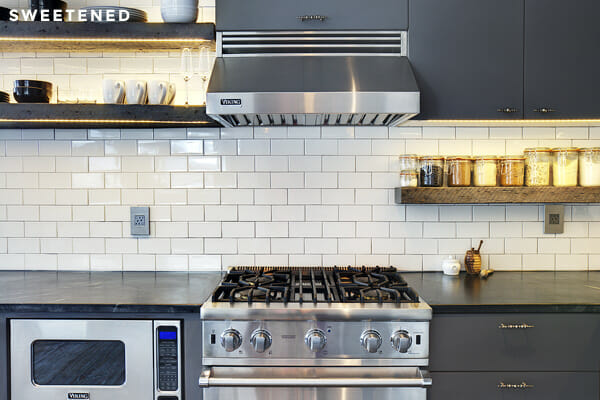
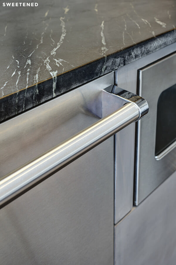
As part of the design/build process, we were able to combine an IKEA pre-built cabinet base system with custom doors, buffed and polished to create a bespoke look – a color that did not exist before we requested it! We finished the cabinetry with hardware from Anthropologie and found the backsplash tile at Nemo Tile. Thomas added open shelving repurposed from wood that his team sourced, and complemented the look with a decorative but spare hanging pendant from ABC Carpet and Home. The dishwasher, range, and fridge are all Viking. We found the table and benches at ABC Home before we bought this place and love how they work here.
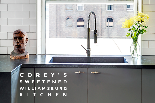
There are many things about the design that I love, and each component is like a puzzle piece that connects to a memory. The feature that I still find the most exciting is the countertop. Once we knew we’d be relocating the sink, and nearly doubling the counter surface area in the process, I knew it was critical to choose the right material as it would be prominently featured. Thomas had shown us a space they were finishing with a soapstone countertop and we inquired about the possibility of doing that in our space. They were more than willing to help us make that work and took us out to their supplier’s stoneyard to look at slabs. While there, we saw the integrated countertop/sink configuration on display and were sold. We also opted for a “waterfall” edge which helped distinguish the kitchen/dining areas.
I would be lying if I said it was all completely painless, but as I look back, it’s obvious that every trial we ran across, whether it be plumbing surprises or tile irregularities or whatever, we chose a design firm committed to making good on our contract together. They were as invested as we were in seeing the space come out the way we wanted and along the way the team at Sweeten (Jean and Shera) were both very much in the loop and always asking how they could assist. I doubt I will embark on another renovation anytime in the near future but if I did, I’d certainly return to Sweeten and would recommend them to anyone looking to transform their home.
—
Thanks, Corey, for this tour of your gorgeous kitchen and for your thoughtful recollections of the journey. We could not agree more with you: finding a team that understands your vision and shows the willingness to get you there is the most important renovation decision you’ll make. Sweeten handpicks contractors to match each project’s location, budget, scope, and style – post your renovation project on Sweeten and get matched to contractors who get your vision and will get you there.
