Home / Blog / Before & After / Kitchens
A Prospect Park South Renovation Elevates Kitchen Storage
In Ditmas Park, Brooklyn, New York City, this before-and-after Prospect Park South renovation shows how smart, selective updates can brighten and improve storage in both the kitchen and closets.
- Homeowners: Nikkia and Daniel posted their kitchen and closet upgrade on Sweeten
- Where: Ditmas Park, Brooklyn, New York City (near Prospect Park South and Kensington)
- Primary renovation: A selective kitchen renovation that brightened the space with painted cabinets, new hardware, white subway tile, and quartz counters, plus a smart corner storage infill; paired with a bedroom closet overhaul that combined two narrow closets into one organized system
- With: Sweeten general contractor
Meet the homeowners and their home
We are in Ditmas Park this week for an extra fun assignment. Usually, we chronicle all the shiny new things in a New York City renovation. This time, the challenge is to figure out what stayed in this family’s kitchen and closet upgrade.
One quick look at the before-and-afters might suggest a classic gut. A closer study reveals a surgical project with smart design enhancements that let a Ditmas Park family keep what worked while fitting in extra storage and style.
The renovation project followed the existing layouts while introducing storage-oriented upgrades and cohesive finishes. For kitchen remodeling in Prospect Park South, this change shows how seamless it is to add storage and polish.
Planning to renovate? Get free cost estimates from our partner GCs!
Get matched with our vetted general contractors and receive at least 3 quotations for free! You can also find endless home renovation inspiration, detailed guides, and practical cost breakdowns from our blogs.
Before: Dark finishes, inefficient storage, no backsplash
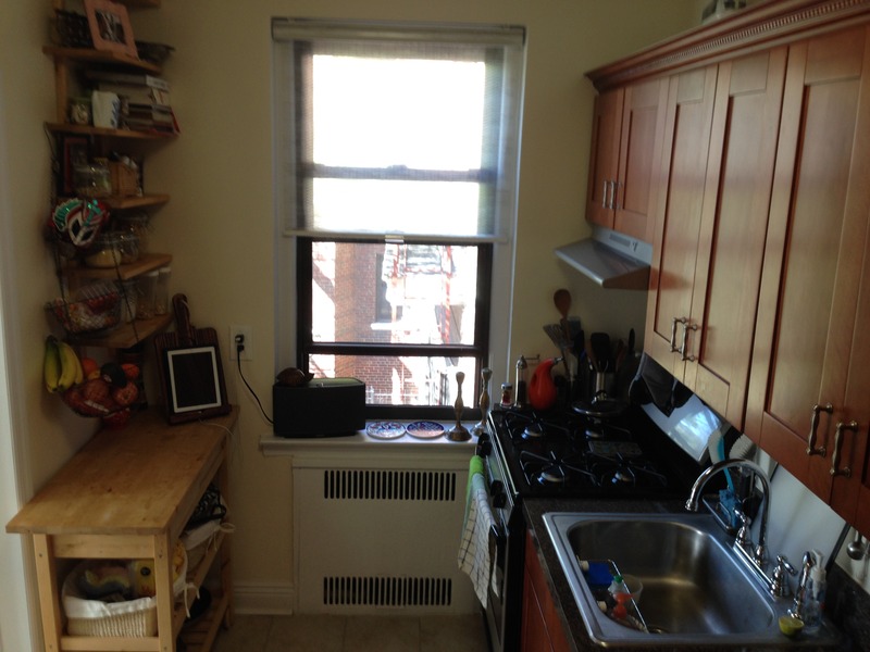
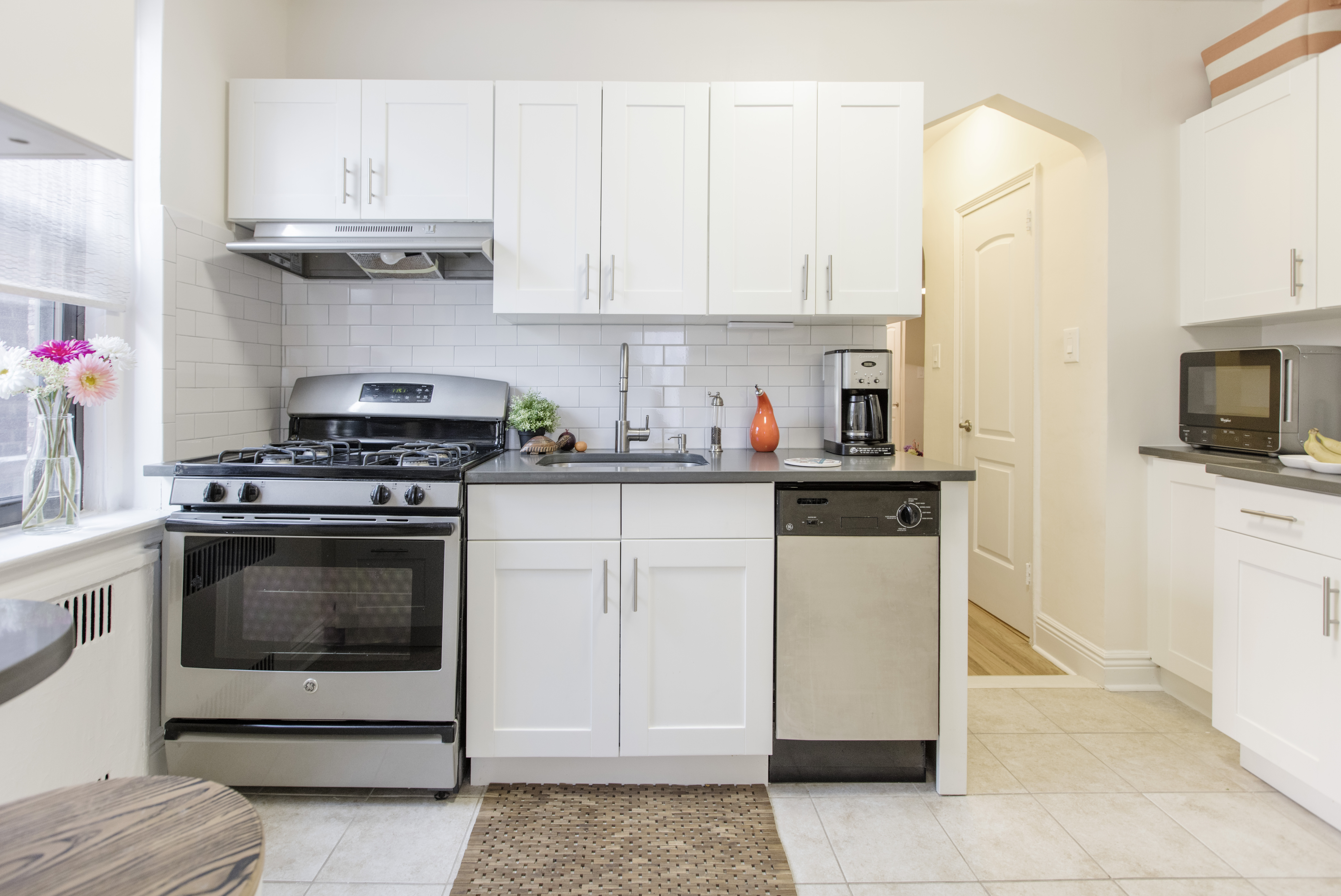
Nikkia and Daniel moved into their 850-square-foot two-bedroom with restored floors and fresh paint. The kitchen had newer cabinets and appliances, but the dark finish and heavy trim blocked natural light.
The layout made key storage inaccessible. There was no backsplash in the busy stove and sink area. The windowed corner had only slim open shelves, which meant wasted space.
In the bedroom, two narrow adjacent closets were no match for two wardrobes, and a dividing wall took up valuable inches. Their renovation project called for a more modern, light, and open kitchen without major architectural changes, plus combining the two closets into one smarter and larger system.
Lightening up finishes and improving storage are often at the top of renovators’ lists of priorities because of how drastically they can transform a space.
Goals: Light, storage, and minimal disruption
The renovation goals were clear: brighten the kitchen and increase storage. In the bedroom, merge the two tiny closets into one organized system. The team selected a contractor known for clever, storage-oriented upgrades.
This renovation project can be an inspiration to homeowners considering kitchen remodeling in Prospect Park South, as it shows how defined goals can be met through a targeted scope and careful planning.
Debating cosmetic updates vs. a gut remodel in Prospect Park South? Read our guide on gut renovations to better understand budgets, timelines, and what to expect.
Design decisions that made the difference
Here are the design decisions that made the difference in their Ditmas Park renovation: Sweeten brings homeowners an exceptional renovation experience by personally matching trusted general contractors to your project, while offering expert guidance and support—at no cost to you. Renovate expertly with Sweeten
Cabinet refresh, hardware, and white paint
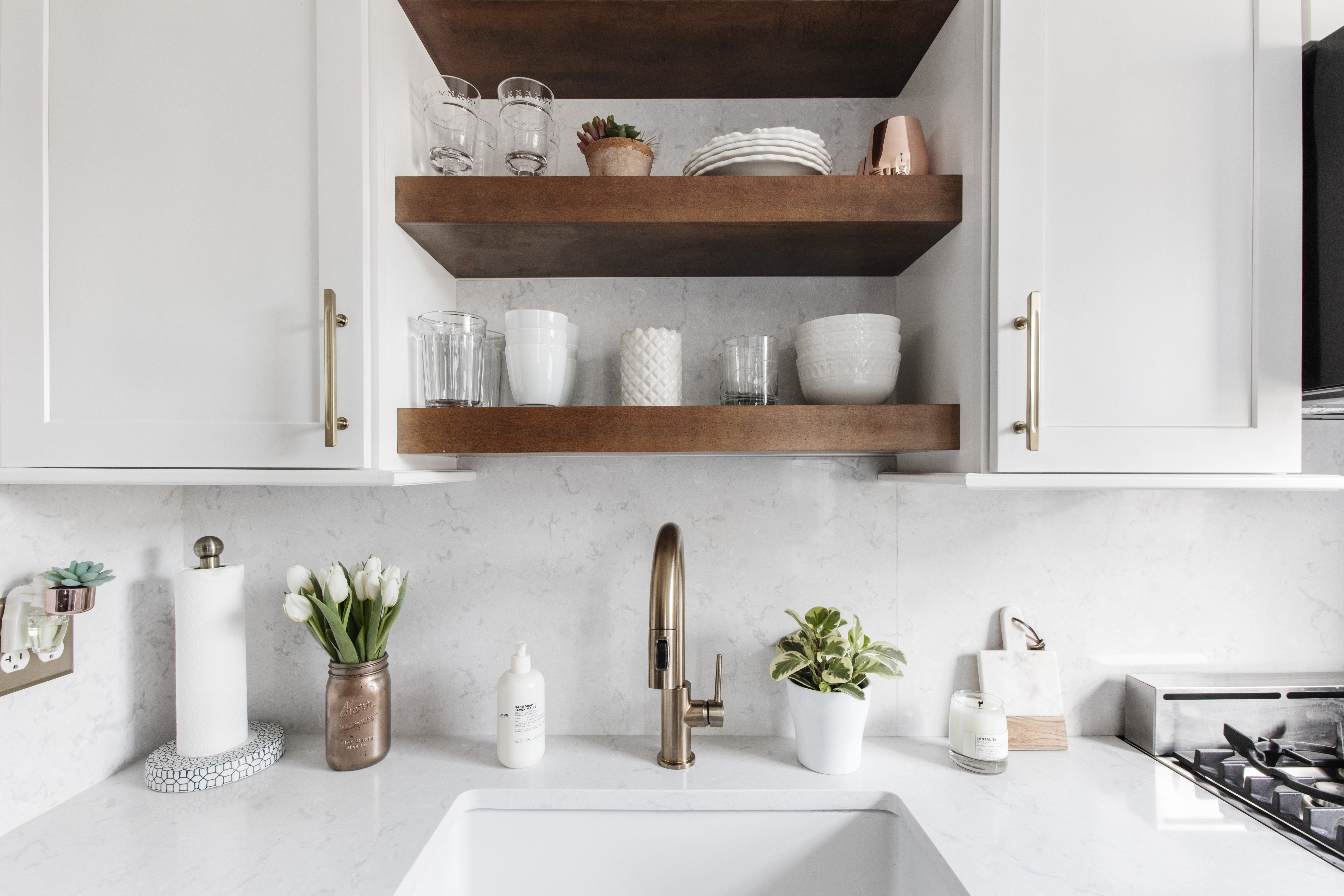
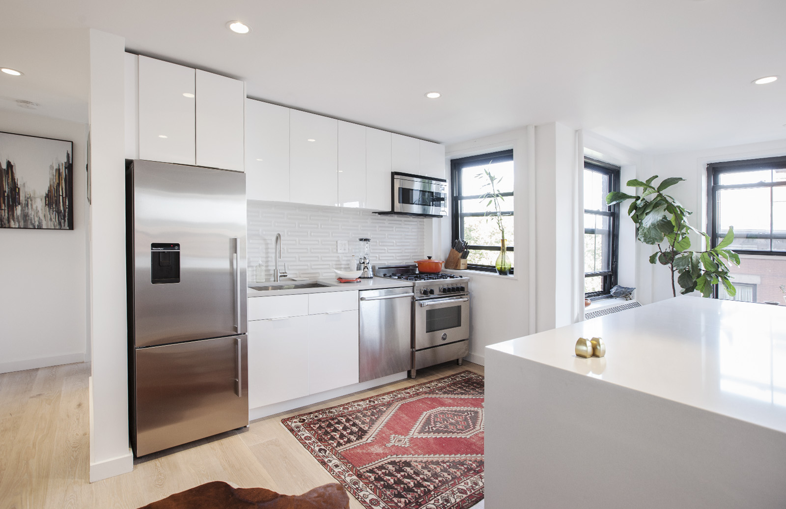
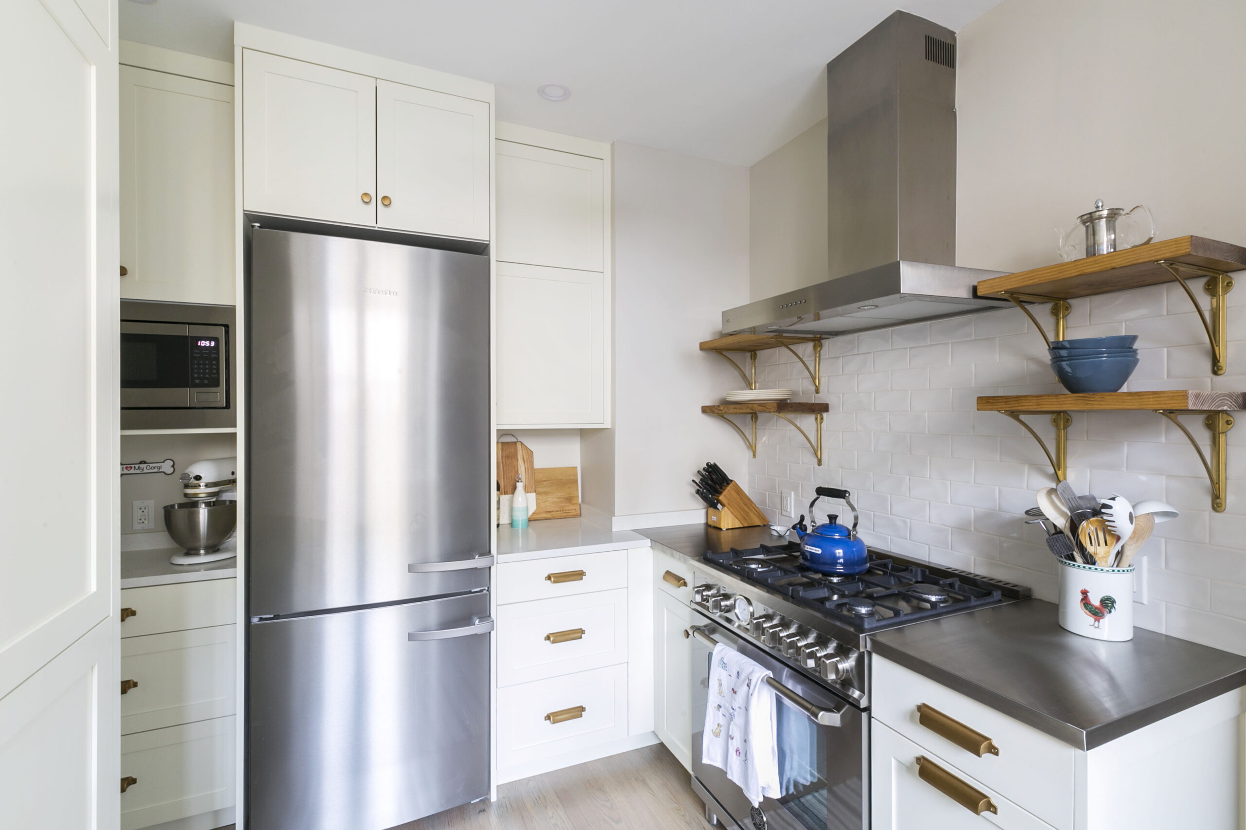
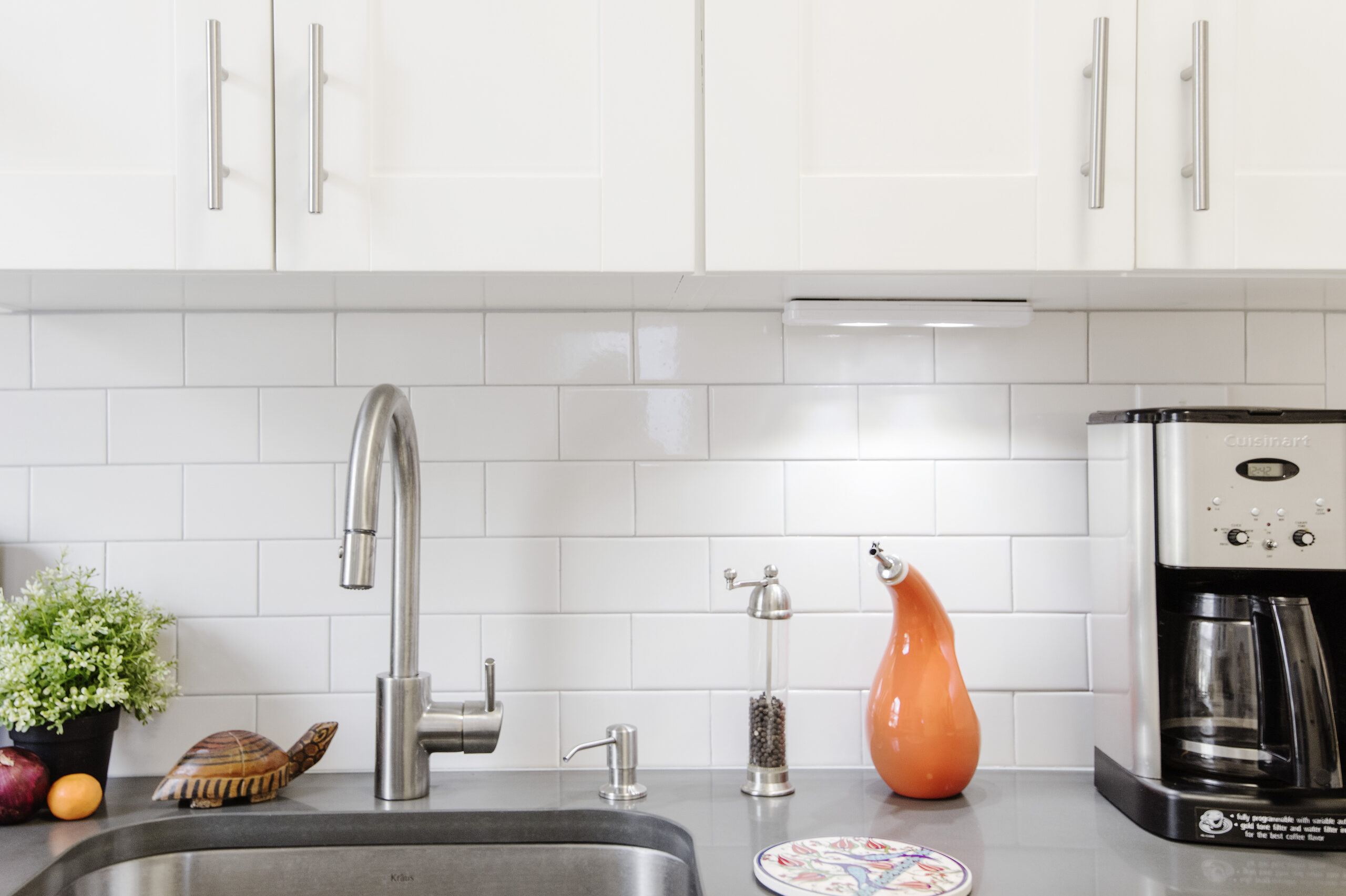
The contractor removed the traditional crown molding that added visual weight to the uppers. All cabinetry was repainted in Benjamin Moore “Simply White,” and hardware was swapped to complement the Shaker lines. The result is instantly lighter, cleaner, and more modern.
A paint and hardware refresh is a fast win for any kitchen remodeling Prospect Park South project, especially when the cabinet boxes are sound.
Classic subway backsplash and quartz counter swaps
White subway tile from Home Depot now wraps the stove and sink prep zones, which protects the freshly painted walls. Two laminate counter runs were upgraded to a contemporary gray quartz. That choice adds durability and bounces light around the room.
These timeless and widely available materials are easy to spec, which results in a kitchen renovation Prospect Park South residents love seeing, thanks to predictable costs.
Sink and faucet upgrades for daily use
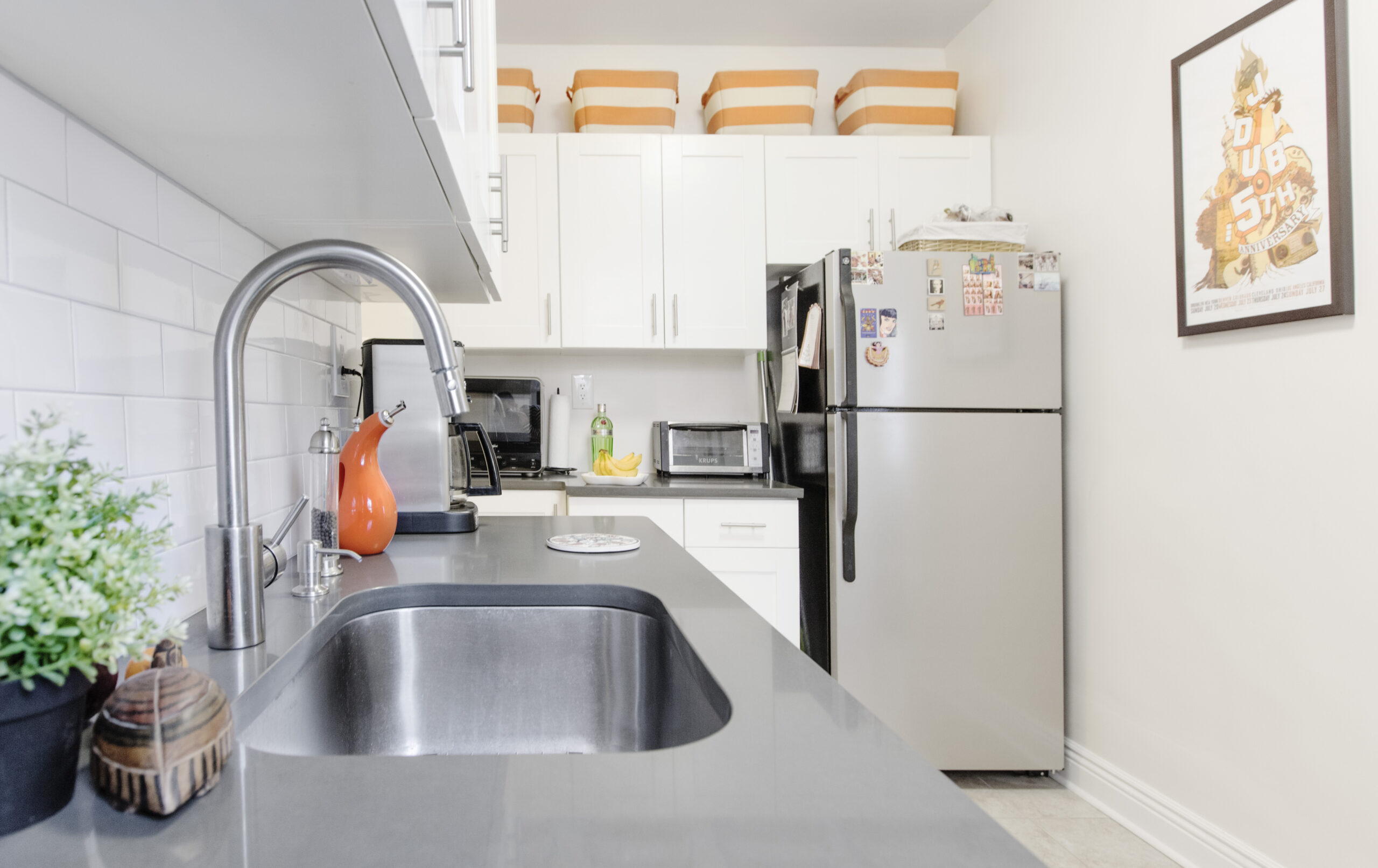
A deeper undermount sink paired with a Grohe single-handle faucet makes cleanup and prep smoother, and the change did not require moving plumbing.
After: Smart storage infill and closet overhaul
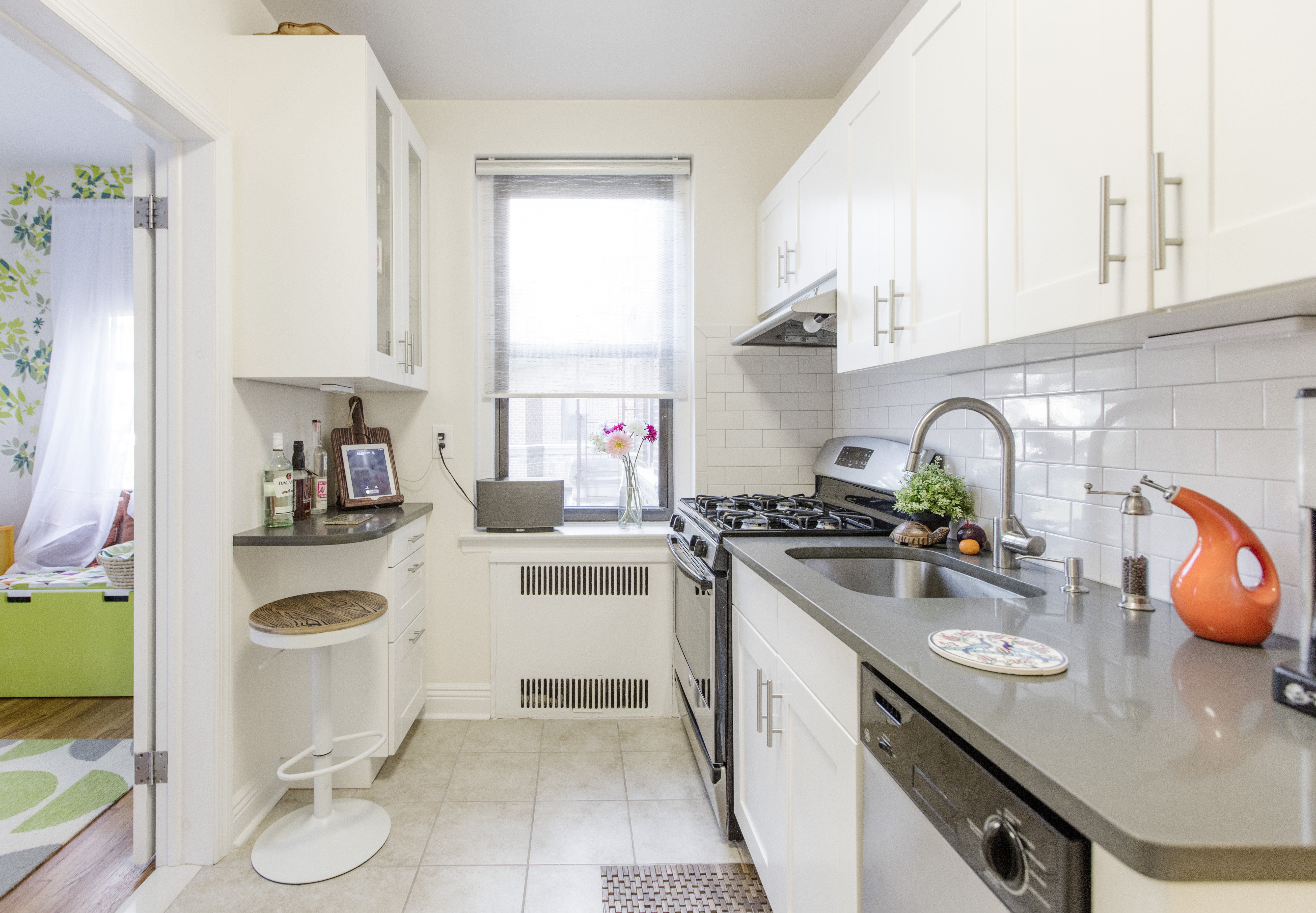
The most significant upgrade was also the most unassuming. The team replaced the ill-fitting shelves and rolling cart in the window corner with expertly matched cabinetry and a counter that continues the kitchen’s U-shape. Deep IKEA drawers now keep cookware by the stove, and a translucent upper cabinet displays glassware. The extended counter edge doubles as a small eat-in perch. No walls were moved, and the layout stayed intact.
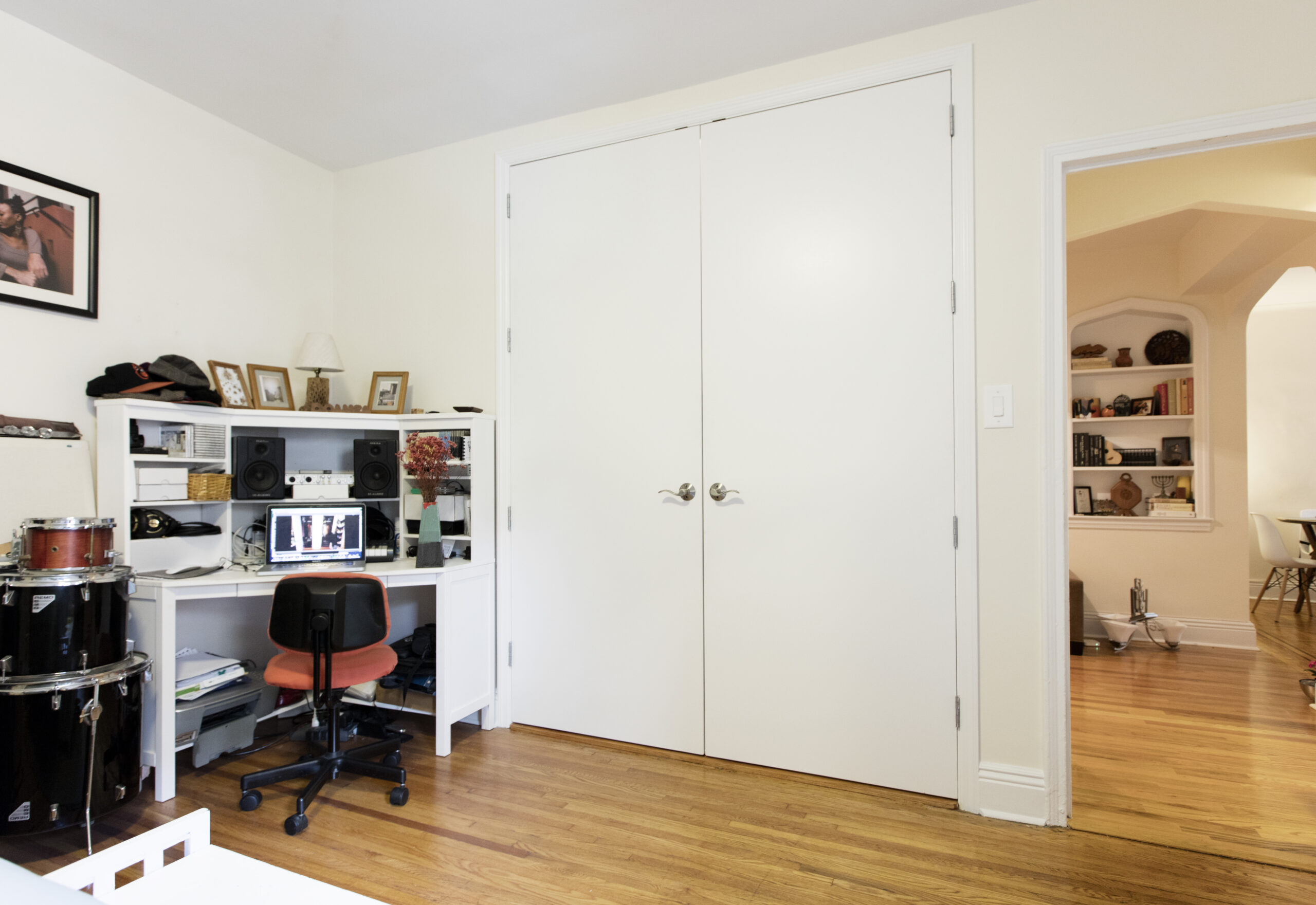
In the bedroom, the contractor removed the dividing wall between two narrow closets and rebuilt the interior with double hanging rods, open shelving, drawers, bright all-white finishes, and interior lighting. New 96-inch swing doors without the previous builder-grade insets, plus updated trim, make the addition look seamless and modern.
Coordinating the closet work while trades are already on-site is a smart add-on for readers exploring kitchen remodeling in Kensington. You maximize one project window and minimize disruption.
What stayed the same
The appliances, original cabinet boxes, and floor tile stayed. This choice saved thousands and kept the project on a tight timeline. Selective upgrades, including paint, hardware, quartz, tile, and sink and faucet, delivered maximum visual change with minimal disruption.
This is the classic renovation approach we often recommend for kitchen renovations Prospect Park South projects, when timing and budget are key.
Materials and fixtures
Kitchen selects:
Benjamin Moore: “Simply White” paint color for cabinets
Home Depot: white subway tile
Grohe: single-handle faucet
IKEA: deep-drawer storage
Home Depot: olive oil dispenser
Working with Sweeten
We match homeowners with trusted general contractors and provide guidance at no cost. This Ditmas Park project in Brooklyn, NYC, located near Prospect Park South and Kensington, shows how selective changes can transform a kitchen. It reflects the practical approach we bring to kitchen remodeler Prospect Park South clients.
Ready to start your own renovation journey?
Post your project on Sweeten for free and make your dream kitchen a reality. Sweeten puts you in control of your renovation, from finding the perfect contractor and gathering design inspiration to using cost guides to plan your budget wisely.
Frequently asked questions
You decide between a partial kitchen refresh or a full gut in an NYC apartment by determining whether you’re reimagining the space or simply going to ‘rip and replace’. In a partial refresh, the layout is unchanged, and plumbing/electrical stay in their current locations. Choose a full gut if you’re planning to move major appliances and/or drastically alter the existing space.
A partial kitchen remodel takes 3 weeks to 2 months. Work typically flows from cabinet preparation and painting to countertop templating and installation, to backsplash installation and final plumbing/hardware, with short pauses for curing between steps. Learn more about kitchen renovation timelines by checking out our blog.
Yes, you can live in an apartment during a partial kitchen renovation, but it’s best to move out during demolition because of dust and noise. After demolition, the kitchen will be off-limits for days or weeks. Check out the considerations on whether to stay or go during a renovation by reading our blog here.
You can tell that refinishing existing cabinet boxes instead of replacing them could work for you based on their condition and whether or not the style and functionality are ideal. If you like the look of the cabinets and the storage meets your needs, refinishing can be a great way to preserve what works while saving time and money.
Sweeten handpicks contractors to match each project’s location, budget, scope, and style. Follow the blog for renovation ideas and inspiration and when you’re ready to renovate, start your project on Sweeten.
