The Co-op That Walnut Built
Tara and Brian got a little creative to update their Park Slope home
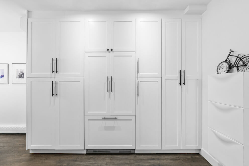
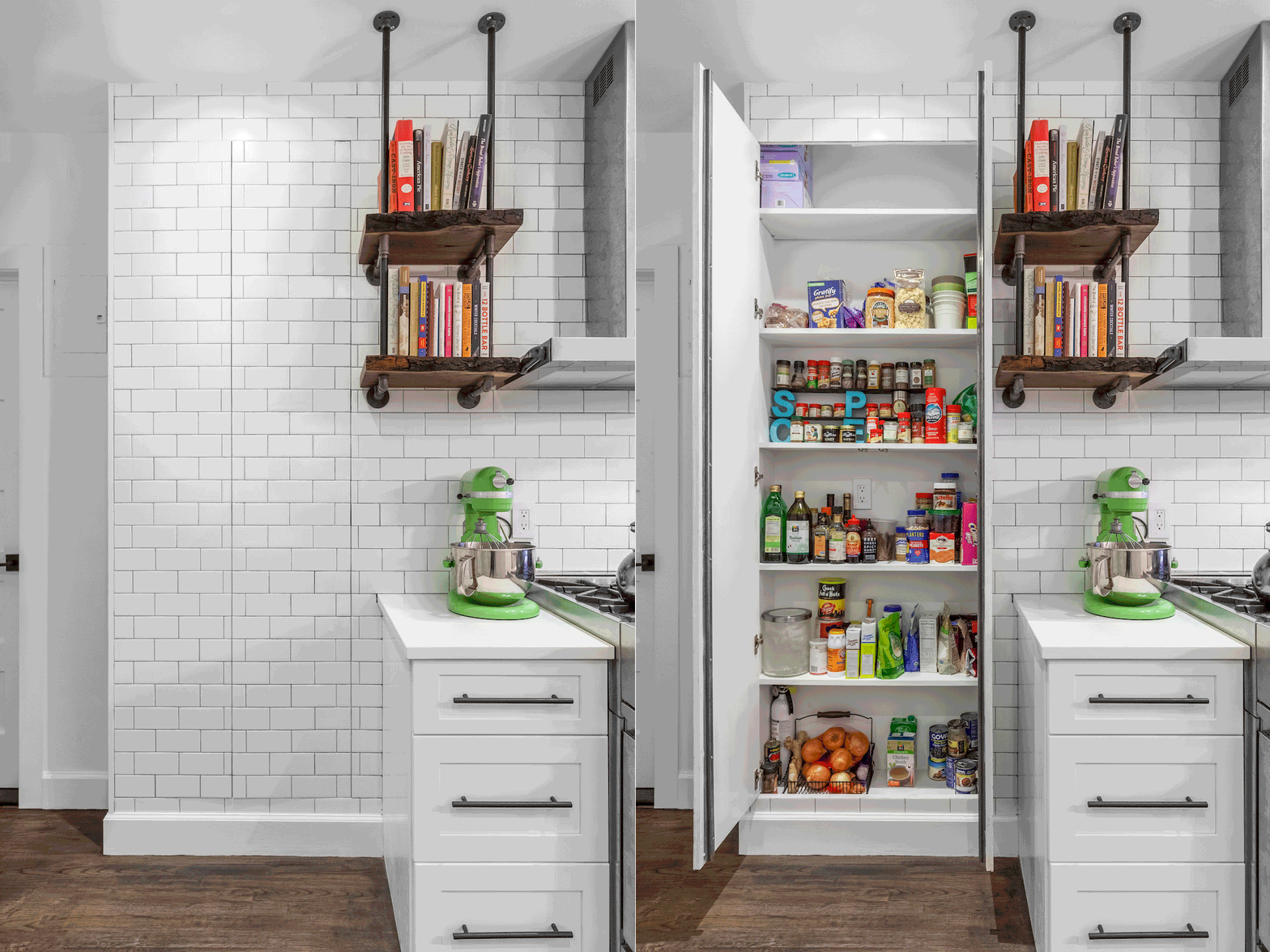
It’s a shallow pantry, but it is enormously useful.
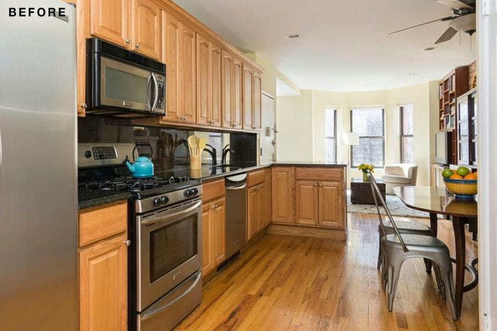
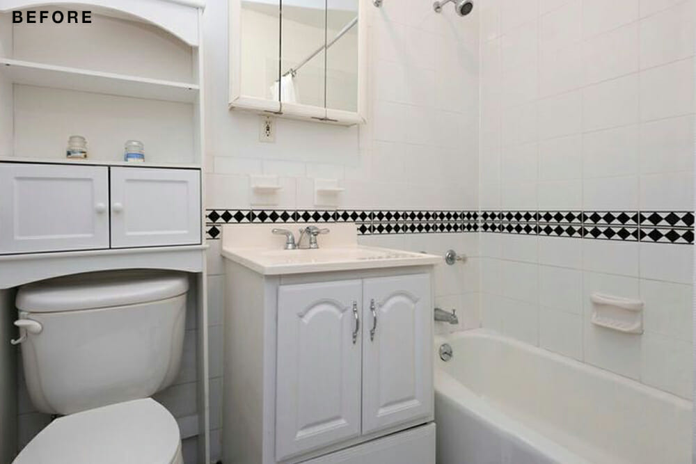
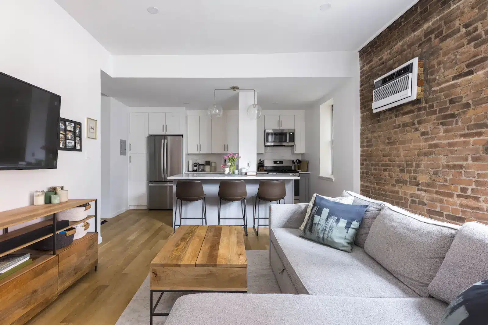
However, it was outdated. Oak cabinets in the kitchen and patterned tiles in the bathroom, all from the ’90s, made the room feel old. A kitchen peninsula awkwardly dissected the eating area and living room. The fridge took up prime real estate, blocking light from the apartment’s rear. “The previous owners had lived there for eight years and hadn’t really updated it,” Tara said. They decided to post their project to Sweeten, a free service matching homeowners with vetted contractors, and chose a general contractor.
The couple decided to do most of the renovation before moving in so Tara, who was pregnant at the time, wouldn’t inhale any dust. Once the water was connected and the messy work complete, Brian and Tara took up residence while their contractor worked around them.
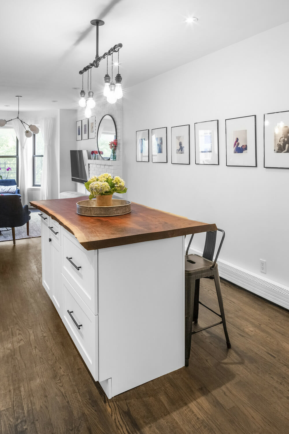
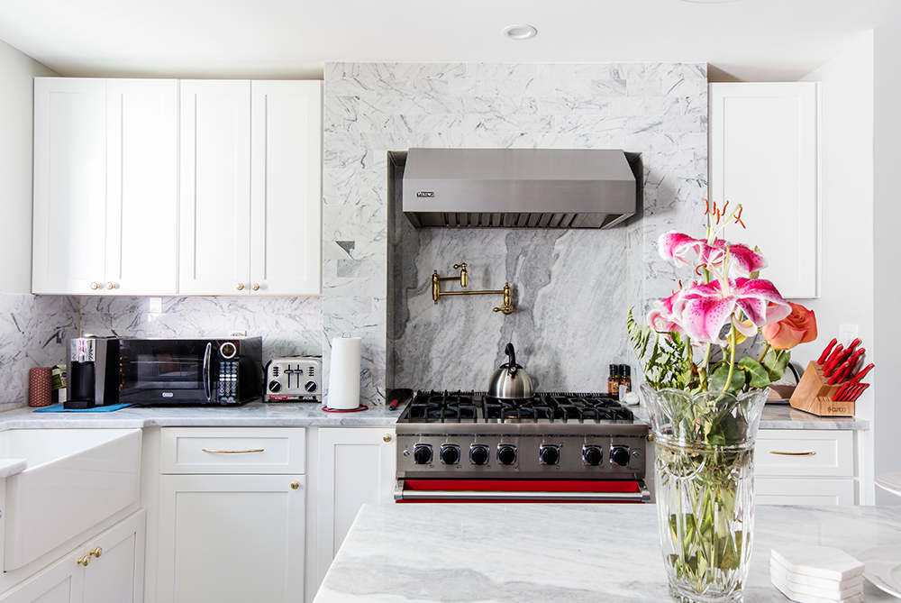
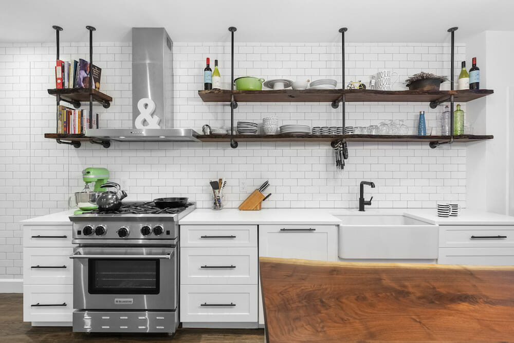
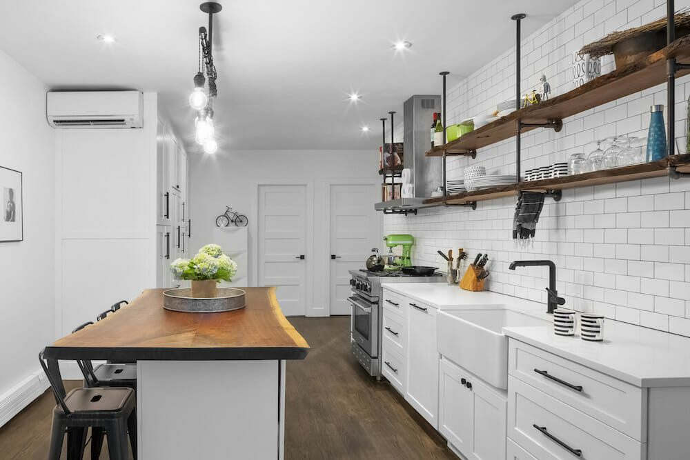
For Tara, adding that kitchen island was non-negotiable and it turned out to be one of the crowning glories of the renovation. Their contractor had a reclaimed wood supplier in Pennsylvania and the couple picked out a big slab of walnut. They went for a rustic look, leaving two sides with a live edge and enhanced the wood’s cherry red tone with a lacquer. “I remember when I was a kid, the kitchen island was the center of existence,” she said, adding that now when they have friends over, that still proves true.
Their contractor suggested a workaround for the refrigerator. The area already had three big clunky closets across from the main kitchen. Why not match those closets to the new cabinets in the kitchen and hide the fridge in there? It turned into a perfect solution that helped the flow of space between the living room, kitchen and the back of the apartment.
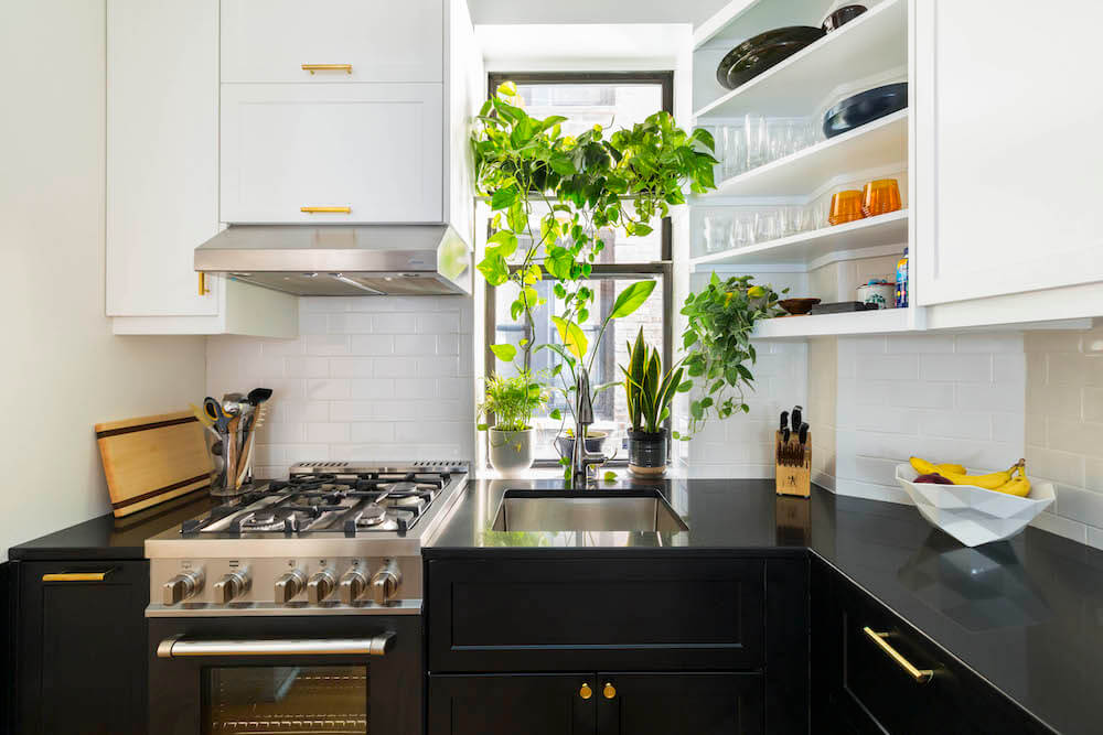
To create a sense of openness in the kitchen, Tara and Brian ditched the cabinets above the counter in favor of open shelving. Their contractor used the walnut from the new kitchen island to create the shelving. The red proved the perfect accent of color and texture to the couple’s color palette of black and white.
Sweeten brings homeowners an exceptional renovation experience by personally matching trusted general contractors to your project, while offering expert guidance and support—at no cost to you. Renovate expertly with Sweeten
Sticking closely to that color scheme, Tara wanted a darker stain with a matte finish on the wood floors. Brian thought it needed more gloss. “We spent a lot of time figuring out what stain to use,” Tara said. “My husband eventually came around.”
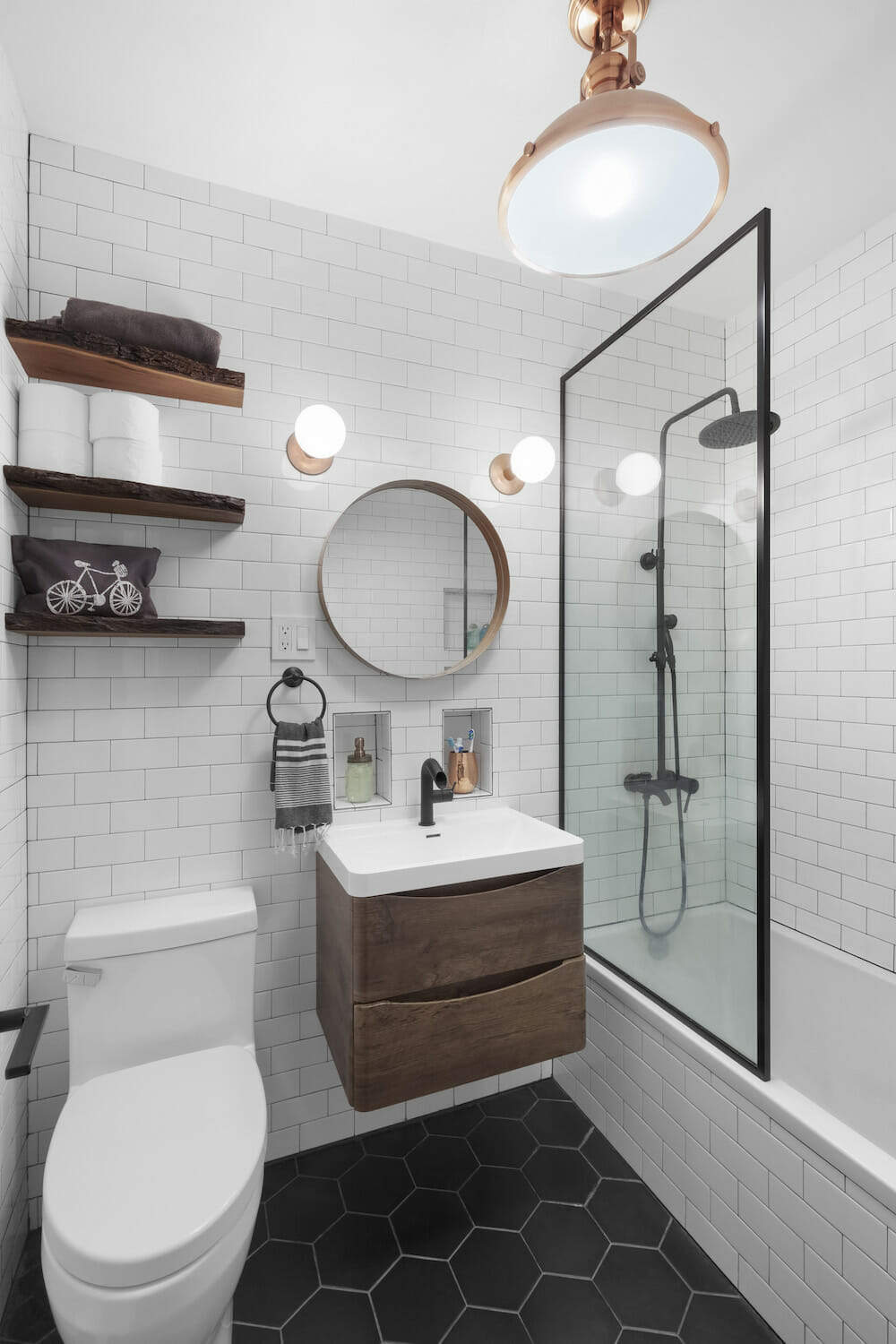
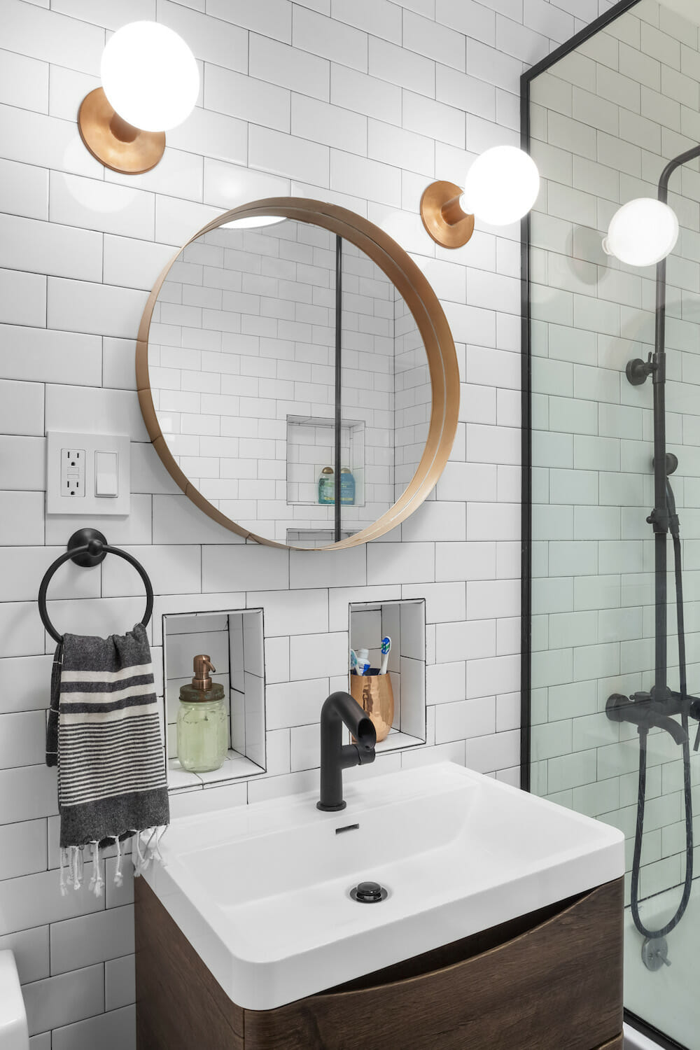
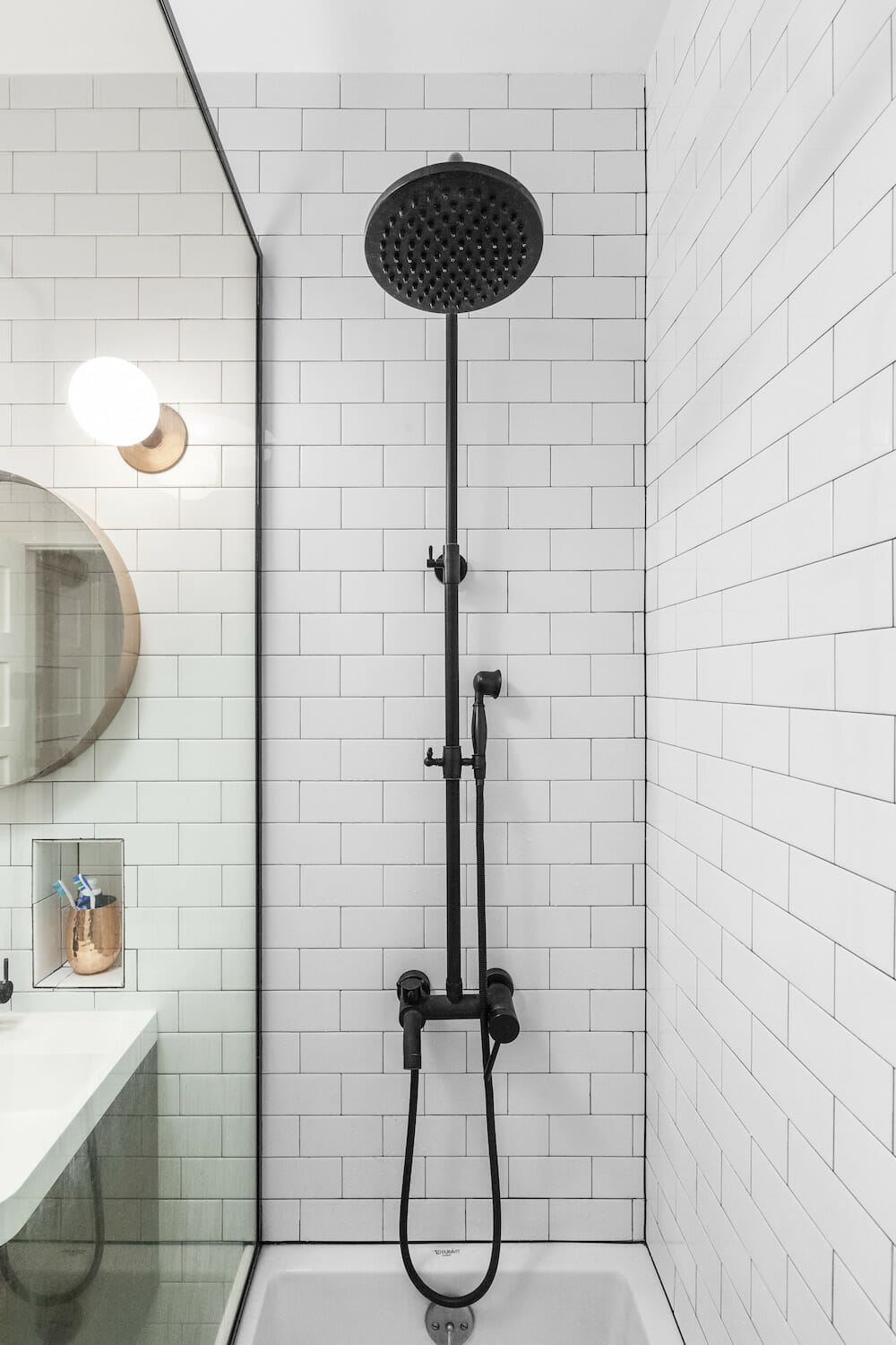
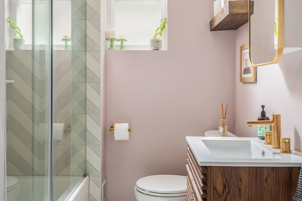
She also felt strongly in favor of a glass partition rather than a shower curtain, “to make the space look bigger.” Brian pointed out the difficulties of maneuvering around a partial glass barrier when bathing their soon-to-arrive infant. To get on the same page on the glass, Tara volunteered to take the lead on baby bathing responsibilities. “At the moment she is still getting washed in the kitchen sink because it is so big,” she said.
If we thought creatively, we could make the most of all the space that would otherwise have gone unused.
The renovation hit a snag when their general contractor uncovered some serious water damage to the bathroom flooring. The couple had planned on keeping the original bathtub since they thought it was in pretty good shape. This new discovery meant they needed a new one. On the bright side, it gave Tara the chance to cross something off her “want” list: a bath with a tiled side. “Our contractor was very upfront with what was needed and what the cost would be,” Tara said, of the mid-project pivot. “He gave us options of what to do about it.”
The renovation took three months to complete. During the project, Brian and Tara communicated often with their Sweeten contractor via text message and in person. “He was so great because we would text with him and he would keep us up-to-date even on minor details,” Tara said.
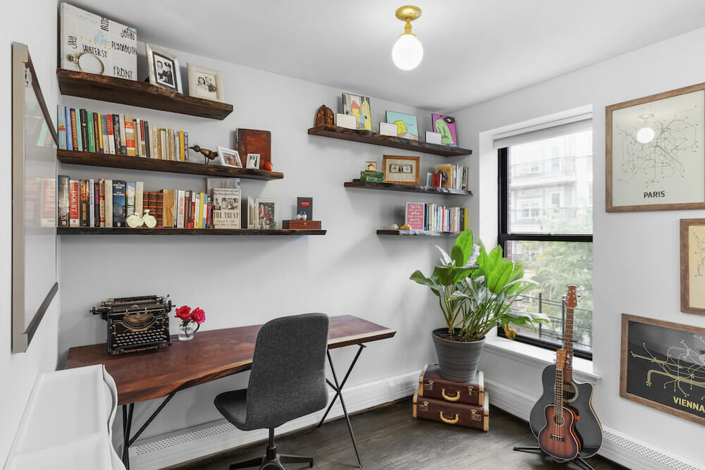
The couple also learned the art of compromise during the process. “Brian had to remind me of what was practical even if I really wanted something,” Tara said. But at the same time, don’t be afraid to get creative, she advised. The secret pantry behind a tiled wall and walnut shelving in the bathroom are two examples of making inspired decisions on the go. “We realized if we thought creatively,” said Tara, “we could make the most of all the space that would otherwise have gone unused.”
Thank you, Tara, Brian, and baby Elenor, for sharing your wonderful apartment with us!
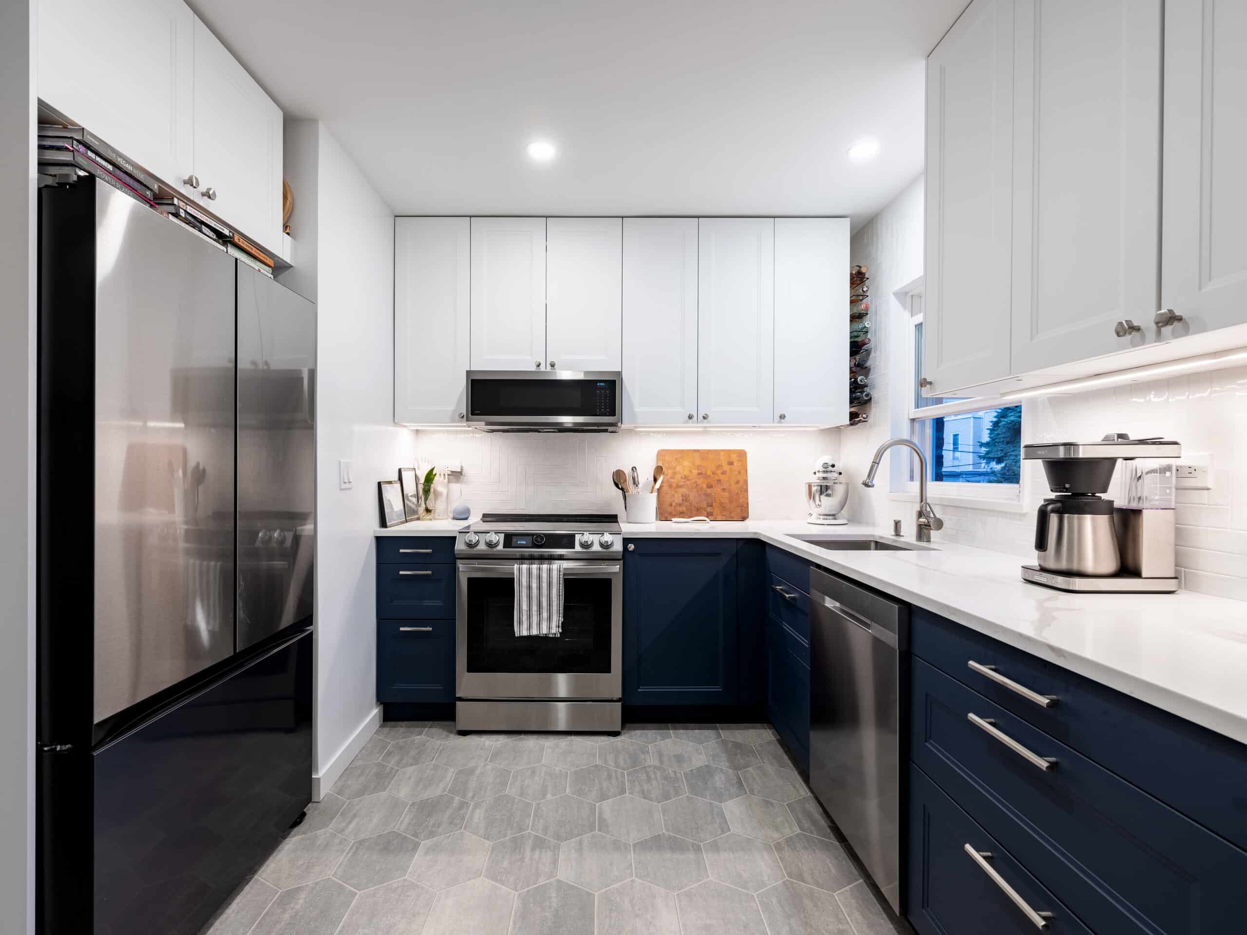
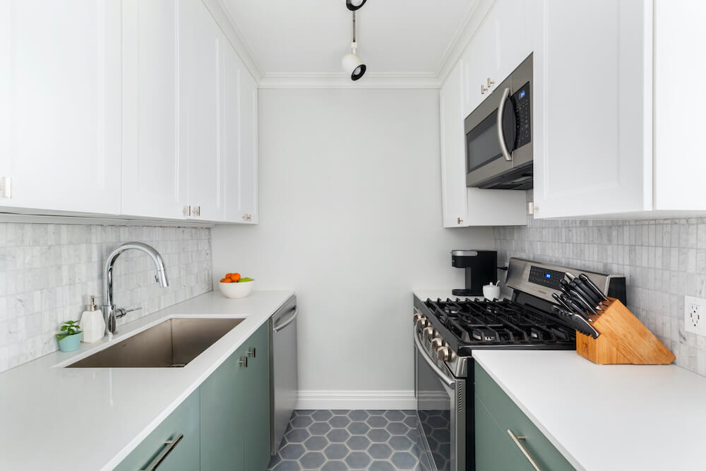
KITCHEN RESOURCES: Cabinets: Empire Cabinets. Cabinet hardware: Blueman Hardware. Countertops: Empire. Merola glossy subway tile backsplash, #1001484480: Home Depot. Refrigerator: Fisher & Paykel. Dishwasher: Bosch. Stove: Blue Star. West Ninth Vintage Industrial 6-light kitchen island pendant, #WNVT1028: Wayfair. Emerald-line wall paint in matte finished Decorators White: Sherwin Williams.
BATHROOM RESOURCES: Merola Tile Hexatile bathroom floor, #1000955197; Merola glossy subway wall tile, #1001484480: Home Depot. Hardware: Nameek. Juno black wall-mounted shower head and hose, #JS9944: Juno Showers. 32″ free-standing vanity with reinforced acrylic sink: Moreno. Toilet: Icera. Fixtures near mirrors: KhalimaLights.
LIVING ROOM RESOURCES: Reef branch chandelier: Dutton Brown.
—
Here are the costs to renovate per square foot in New York City.
Sweeten handpicks the best general contractors to match each project’s location, budget, scope, and style. Follow the blog, Sweeten Stories, for renovation ideas and inspiration and when you’re ready to renovate, start your renovation on Sweeten.

