A Small-Space Success Makeover Story in Upper West Side
Inspired by the desire to create a modern and functional living space, a couple living on the Upper West Side embarked on a journey to renovate their small apartment. Faced with the challenge of maximizing space and functionality, they sought the expertise of a contractor and interior designer to transform their home. Through collaborative design choices and strategic renovations, this project exemplifies the potential for small-space living to be both stylish and comfortable.
A little demolition, a lot of strategic resurfacing
Nothing good could come of a crew of firefighters crashing down your door and barreling in to extinguish a roof fire. Could it? Dianna and Todd had been planning to renovate their fifth-floor apartment on Manhattan’s Upper West Side since the day they’d closed on it. But it was after FDNY firefighters paid them a visit and squelched a soon-to-surge blaze on their 1910 co-op building’s rooftop that they decided to move on their ideas. Their unit sustained no major damage from flames, smoke or water, but the fast-moving defenders destroyed their door and its frame and left behind a trail of broken plaster and blemished floors.
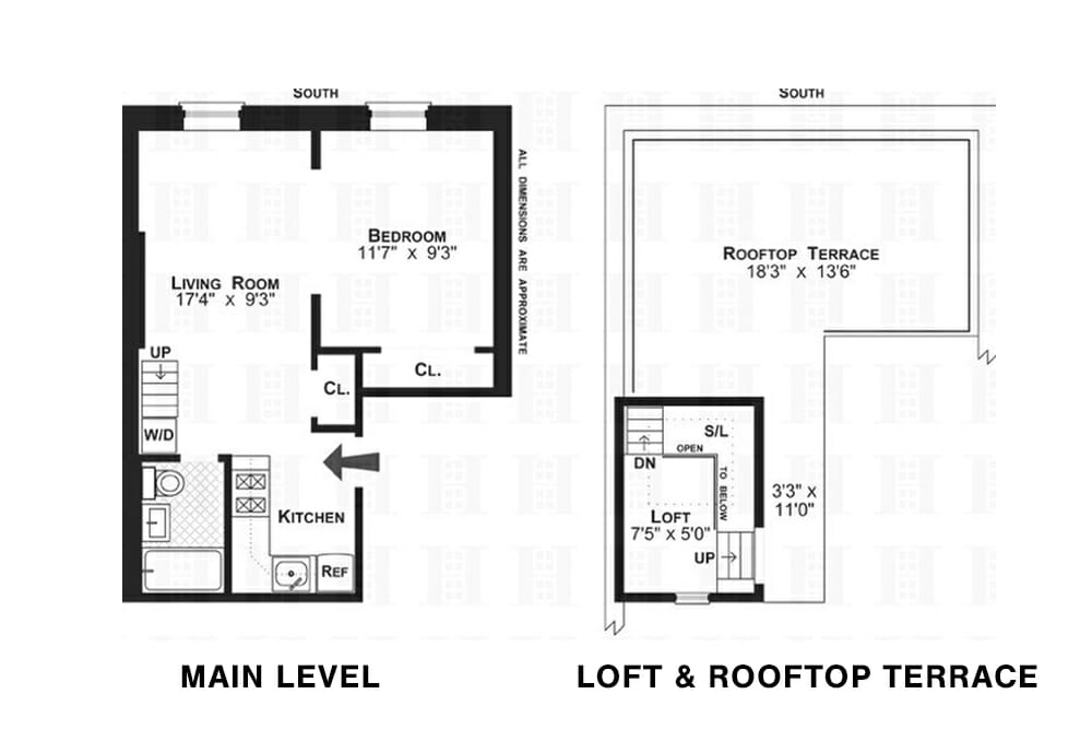
“We were so appreciative of how quickly and thoroughly the FDNY responded,” Dianna recalled. “We counted eight fire trucks and 35 firemen.” The close call affirmed their love for the high-floor dream duplex, which they had lived in for three years. And now Dianna, an advertising agency director, and Todd, a college professor, had the incentive they needed to turn the 440-square-foot, studio alcove apartment around.
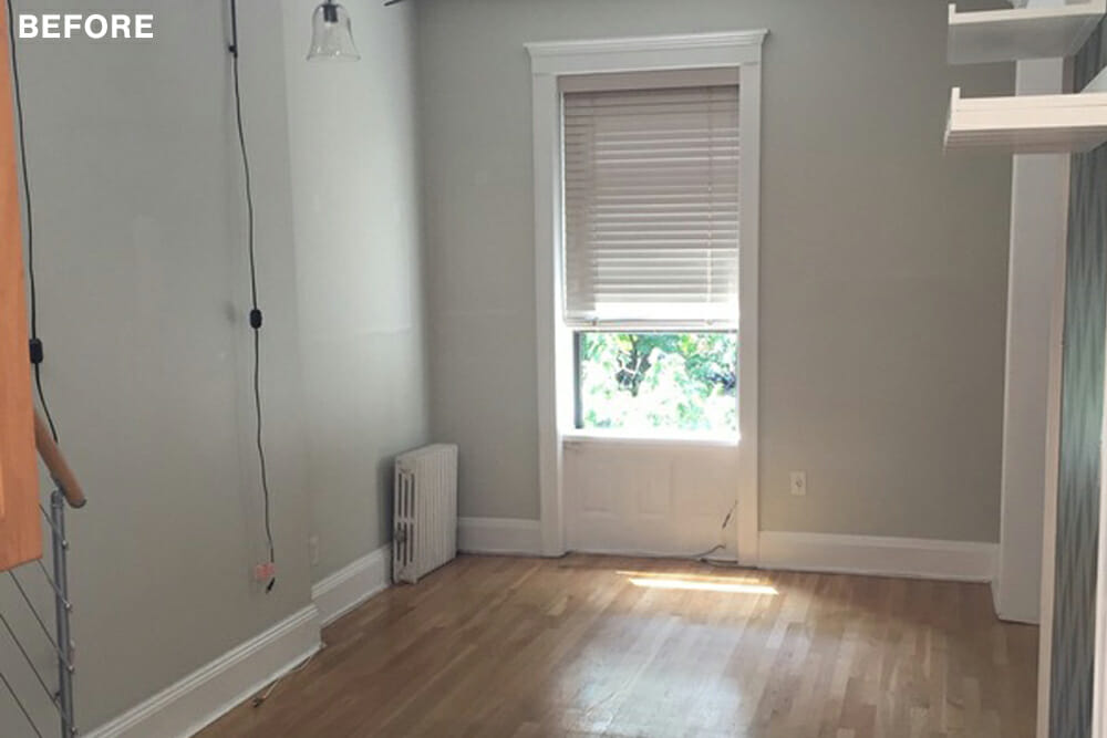
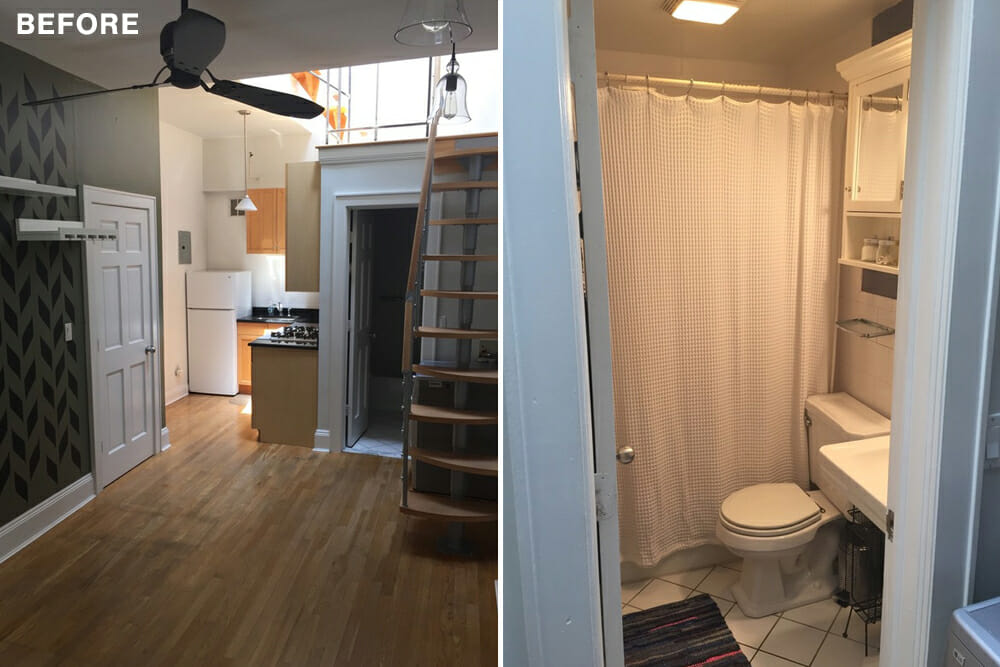
The damaged walls and floors were the most obvious problems, but they weren’t the only ones. The kitchen needed new appliances, and the cabinets and bare sheetrock walls were begging for a facelift. The cramped bathroom had little storage and an old tub with pitted enamel. The wood floors and the treads of the suspended staircase looked scuffed and worn. It had been close to 20 years since the apartment had undergone a renovation. Dianna and Todd wanted to give their place a 21st-century sprucing.
The contractors felt the couple could hold spending down by keeping the existing layout, putting the bulk of the work into the kitchen and bathroom, and updating the other areas with color and practical design.
Dianna and Todd’s contractors advised them that they could and should scratch below the surfaces in the areas where they really wanted to see change—not only on the ruined walls and floors, but in the kitchen and bath, too. Elsewhere, they could focus on simpler upgrades and still feel wowed by the results. Their plan for the kitchen was to spring for shiny new appliances, refresh the cabinetry, and add a luxe-looking backsplash. The bathroom would receive a complete overhaul, including a glass-walled shower. The floors and floating staircase would get a stain-and-paint makeover. In the living and sleeping spaces, the walls would be fixed while other improvements would come from color upgrades and new furnishings. The end goal: Modernize the apartment while increasing the functionality of every space.
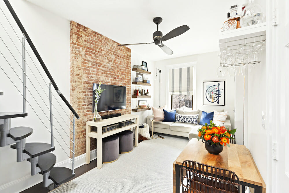
The “magic of paint,” transformation, as Dianna calls it, began with the floors. The contractors sanded the honey-toned wood throughout, then restained the surfaces in a striking near-black; a gray overwash muted the inky result, making the floors look lived-on and lessening the need for constant cleaning.
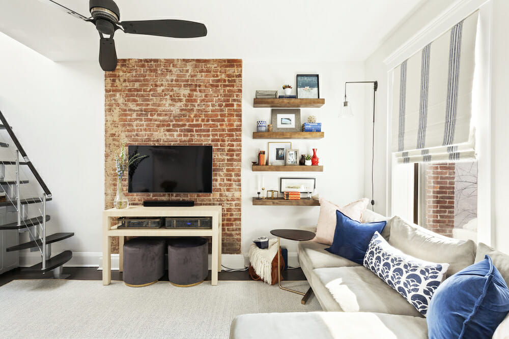
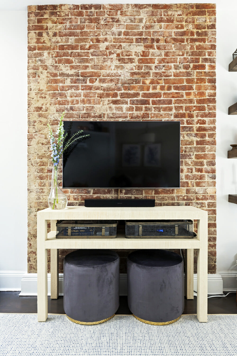
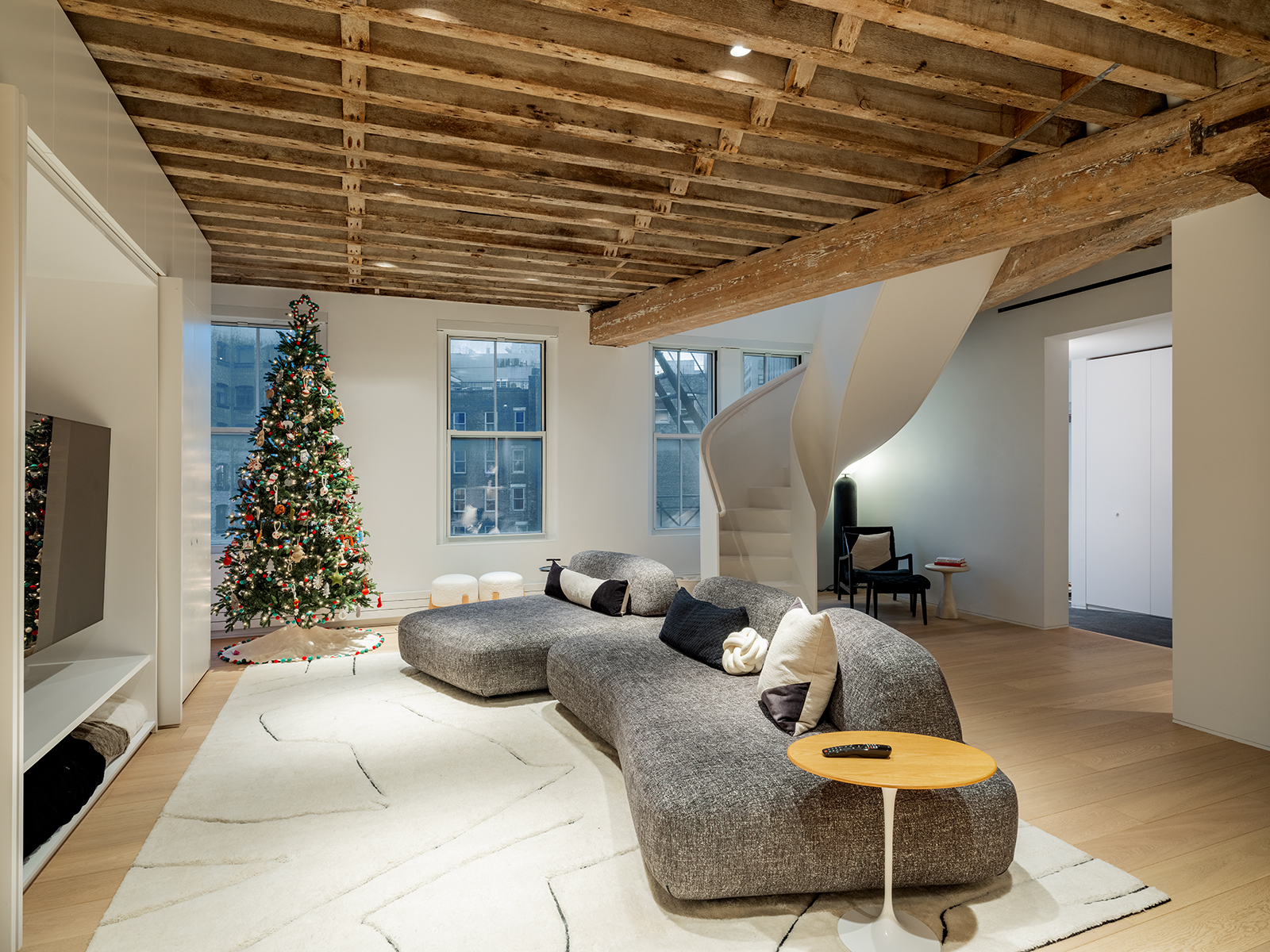
To counter the dark floors, the couple opted for bright-white walls in the living room, lightening it up and giving it a fresh, clean look. One of the ah-hah! moments of the renovation, however, surprised everyone. When the contractor took down some marred plaster in the living room, workers revealed a stretch of red brick underneath. “It had so much character,” Dianna said. They left it exposed.
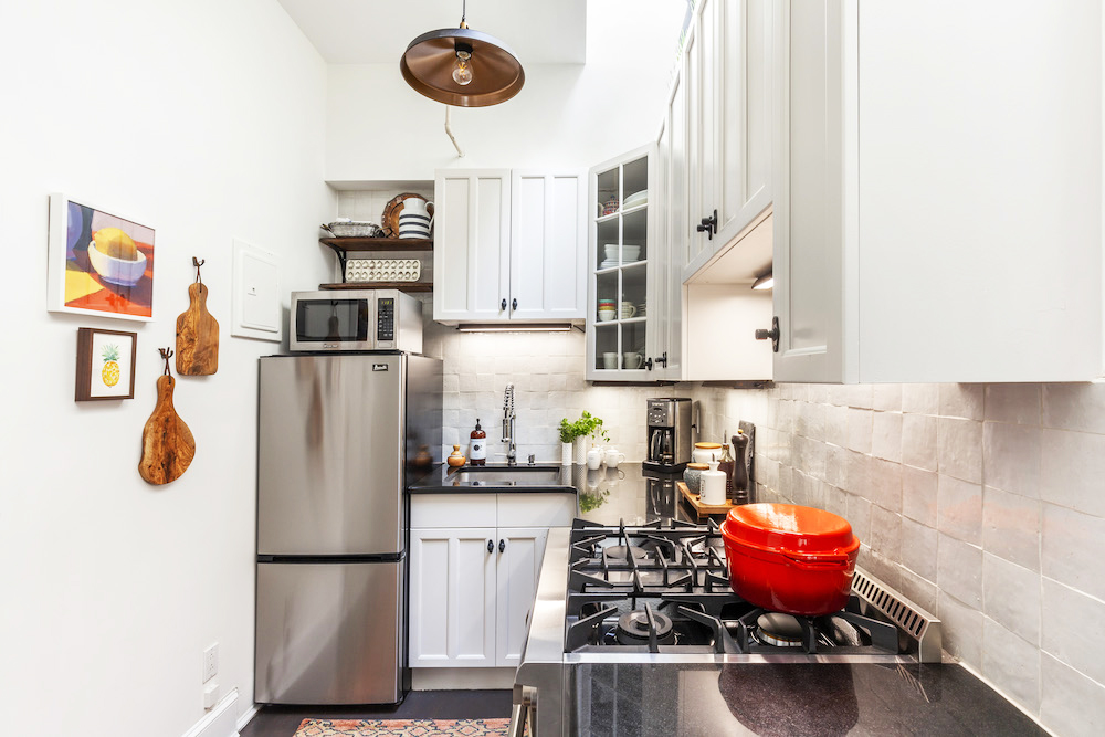
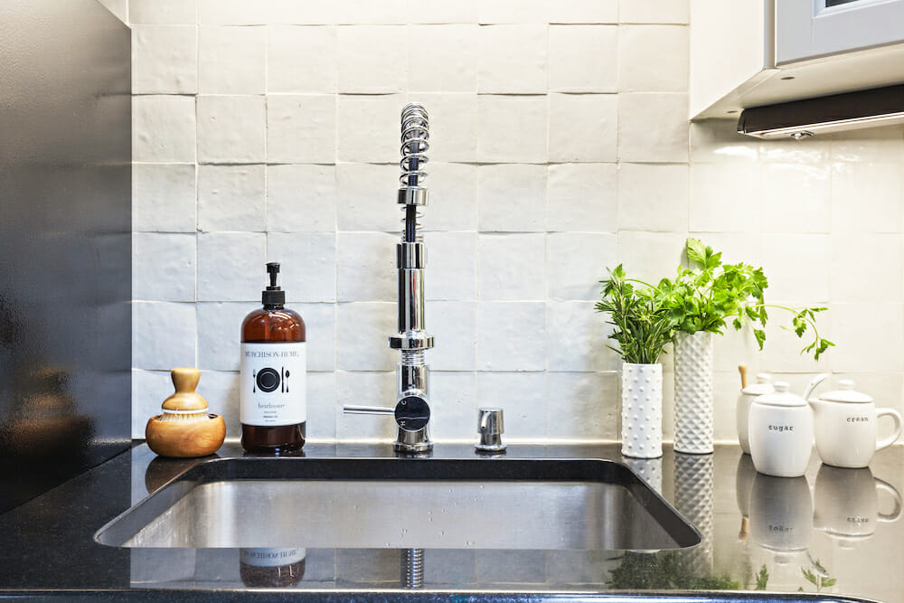
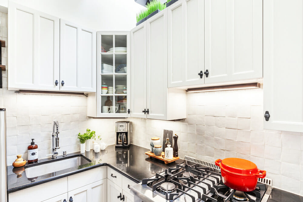
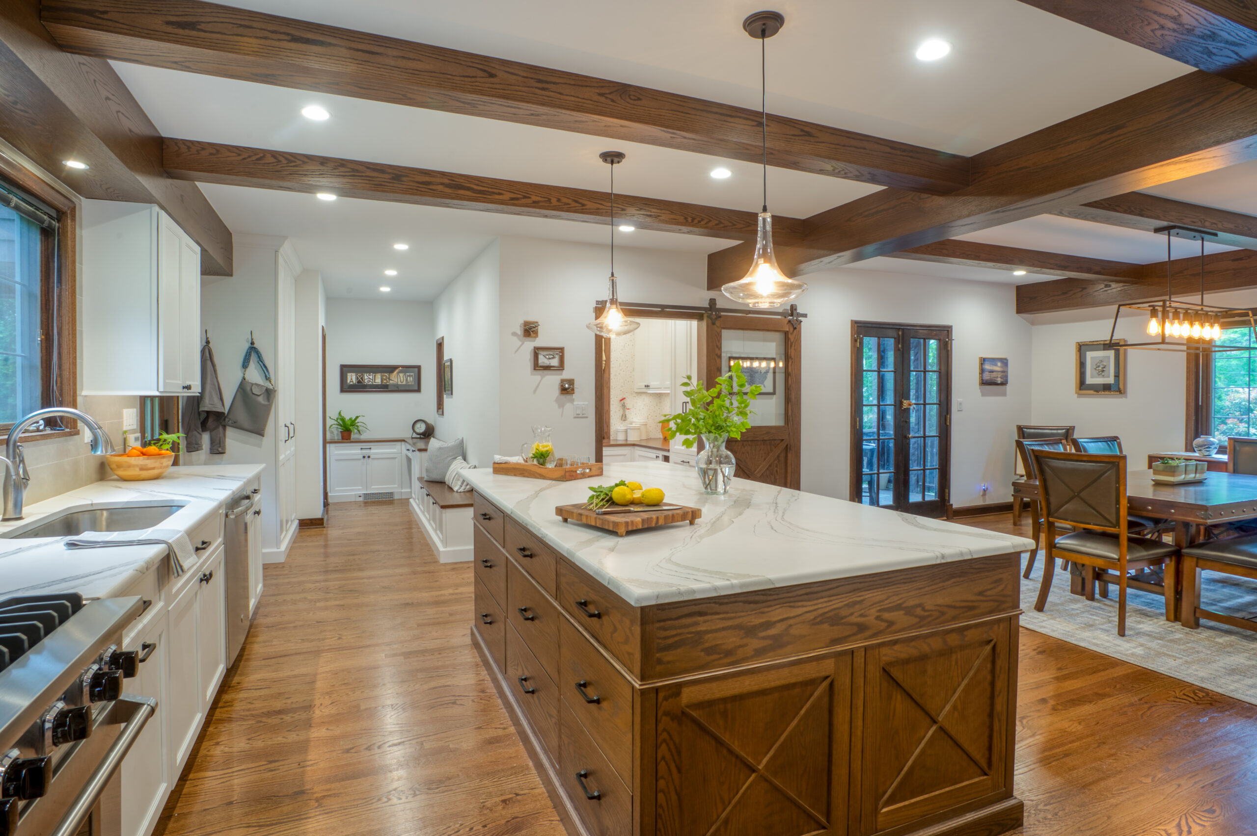
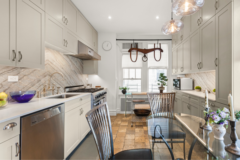
The kitchen was an oft-used room and a priority, but the couple decided against a gut job. They felt it had keepable components, and decided to preserve the black-granite countertop and cabinetry, which would be easy to update with paint. Once again, the clients wanted to do away with honey-brown wood, so the Sweeten contractor sanded and repainted the cabinets and doors in an almost-white greige and added new black-iron hardware. The savings allowed the homeowners to splurge on fun tile instead. Dianna chose handmade Moroccan terra cotta tile to create a stunning textured backsplash. They chose high-end appliances in a classic stainless finish. Sweeten brings homeowners an exceptional renovation experience by personally matching trusted general contractors to your project, while offering expert guidance and support—at no cost to you. Renovate expertly with Sweeten
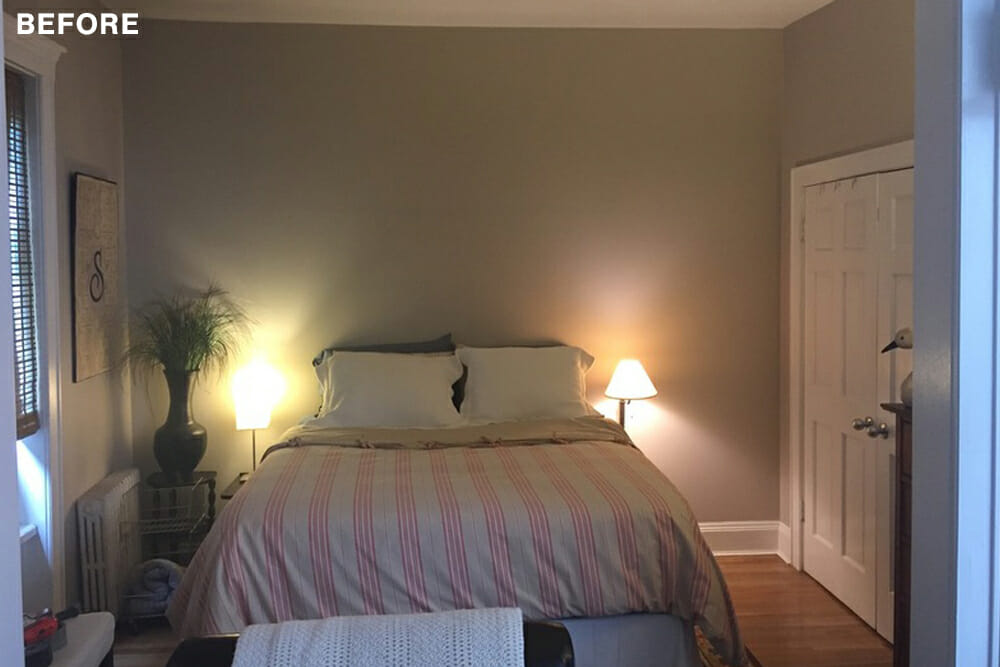
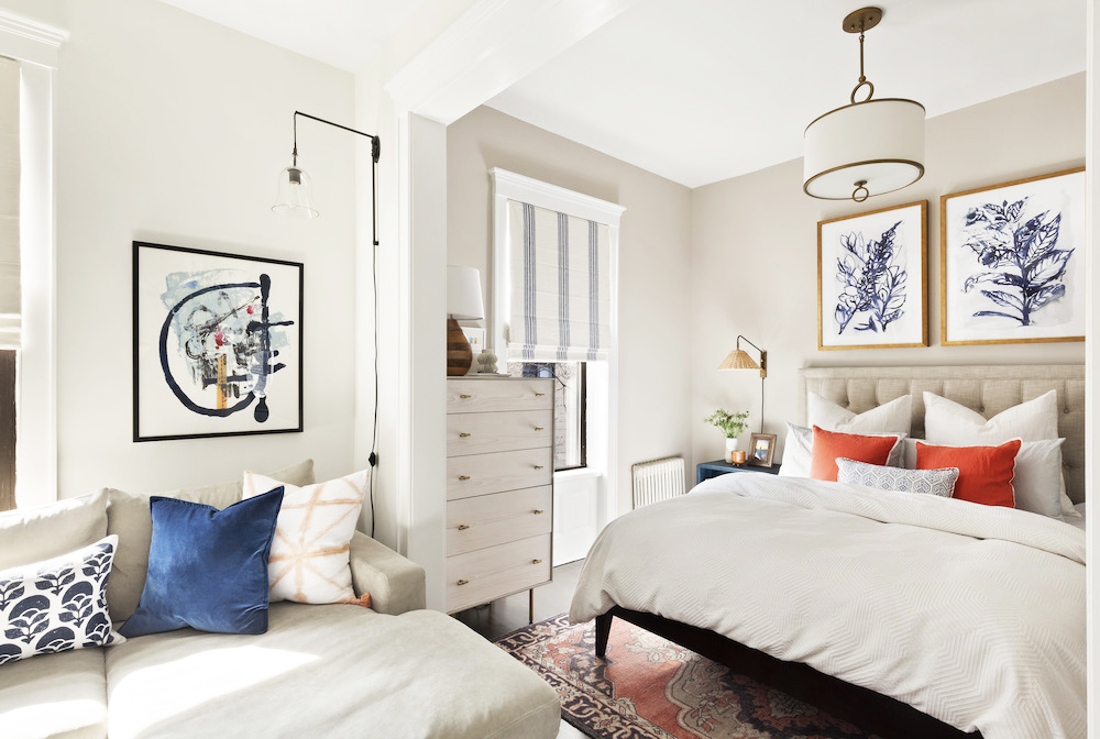
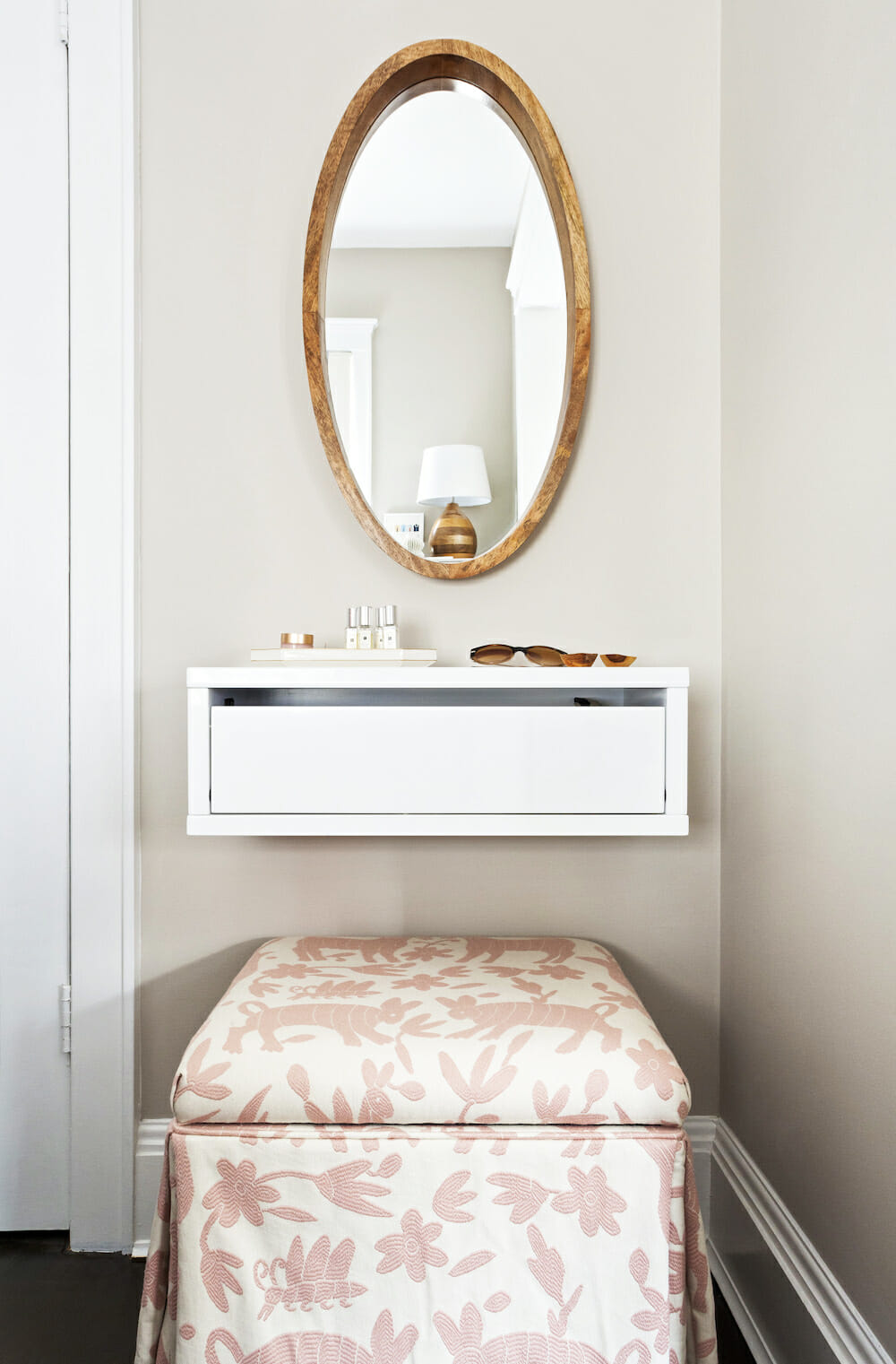
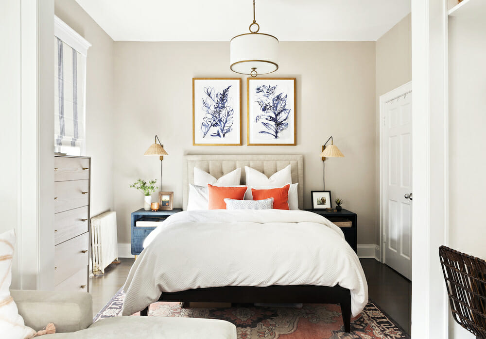
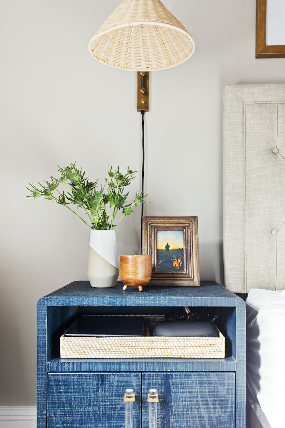
The bedroom, flanking the kitchen and living-room space, came together around the “something-old” rug the couple had wanted to keep. It served as a perfect centerpiece for a room with a more romantic feel and connected with the other rooms as well. The couple chose a neutral upholstered headboard to blend with the greige-painted walls. The cheery coral color comes in pops and the navy in unexpectedly blue bedside tables and wall art. A small corner became a classic-meets-modern vanity nook.
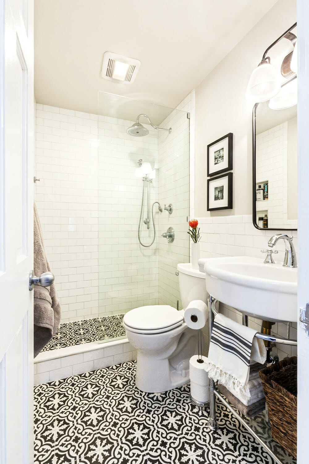
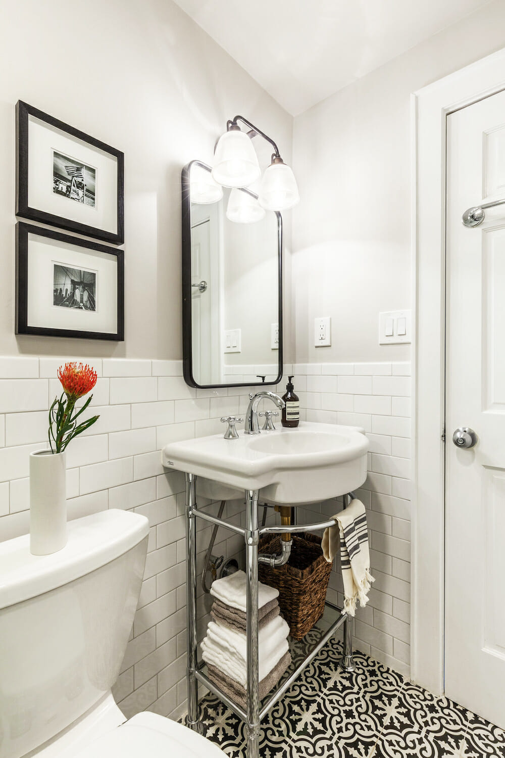
The couple’s bathroom, the biggest job of all, began with their general contractor’s gutting of the space. With the old tub, shower curtain, and clunky wall-mounted medicine cabinet gone, the room felt much bigger. They decided to go with shiny white subway tile on the walls and a simple and contemporary stand-up shower with a glass half-wall.
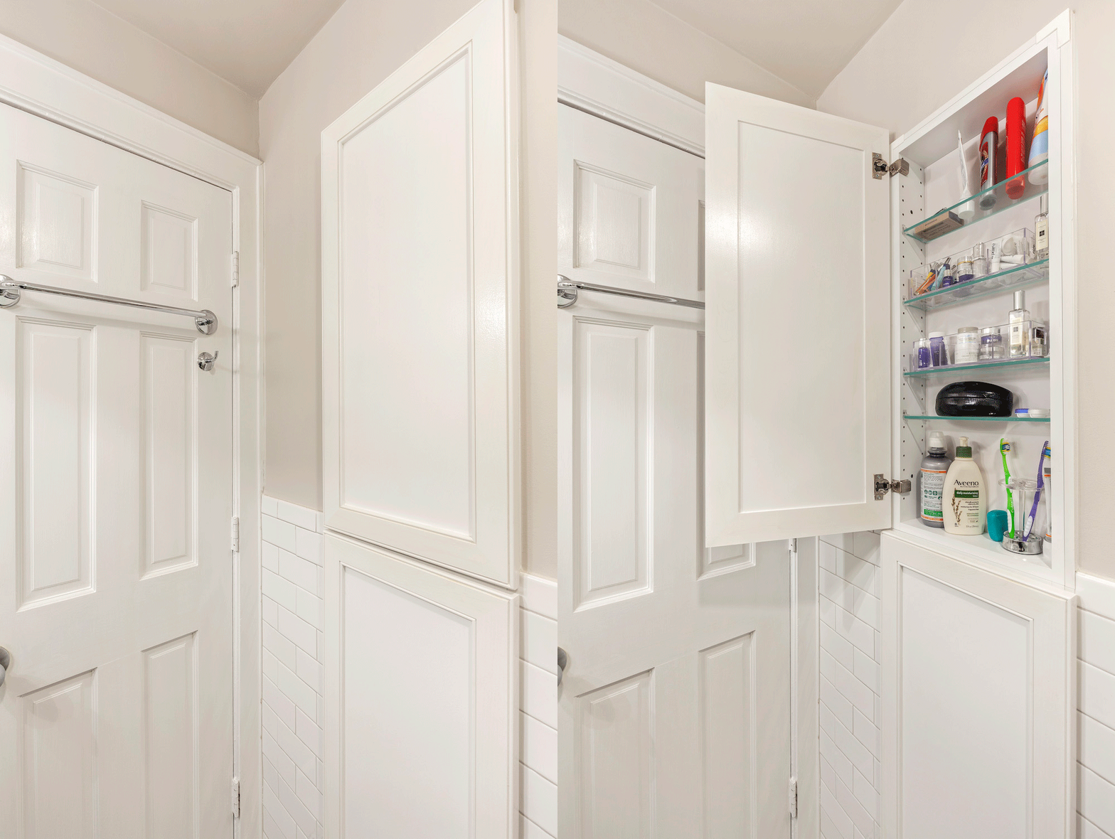
When workers were unable to install recessed cabinetry over the console sink (more brick behind the sheetrock, this time a negative!), they suggested tucking recessed floor-to-ceiling cabinets behind the door. “It seemed small at the time, but those cabinets provide valuable storage space,” Dianna said. The homeowners splurged on special handmade encaustic tiles in a splashy black-and-white pattern bringing a shot of graphic boldness to the room and connecting it to the whole apartment.
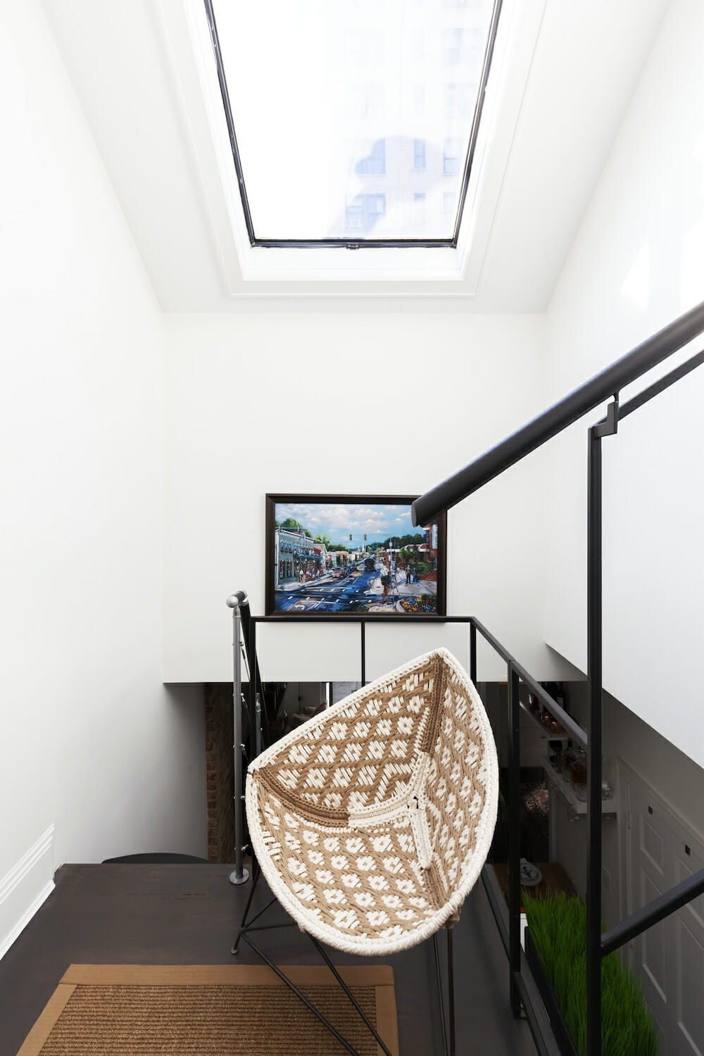
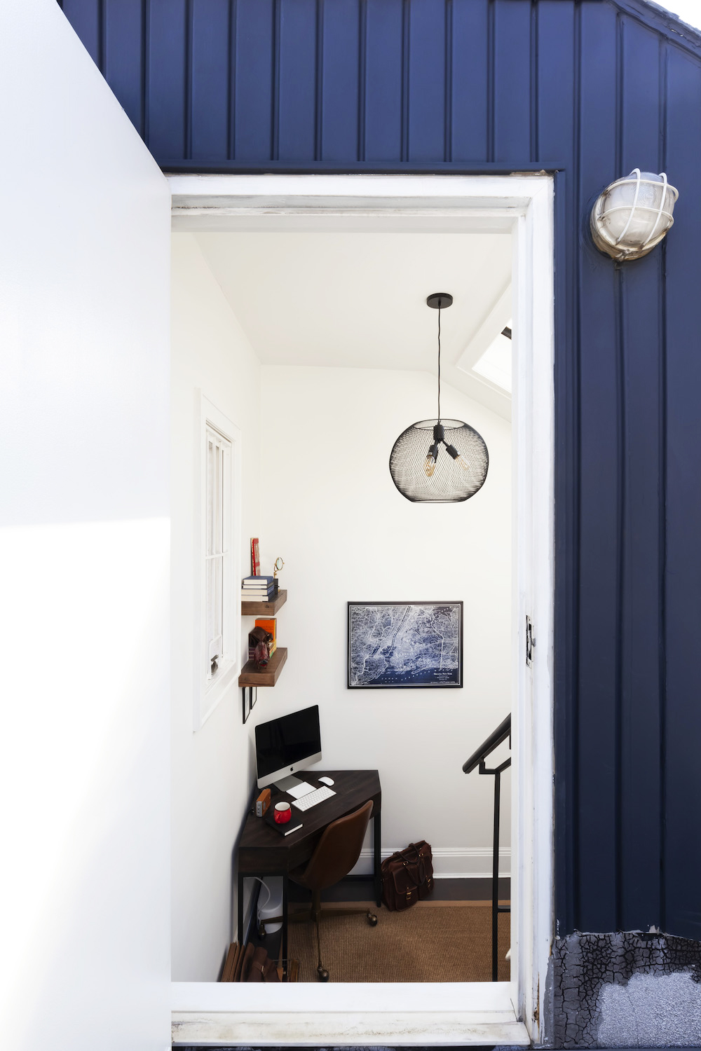
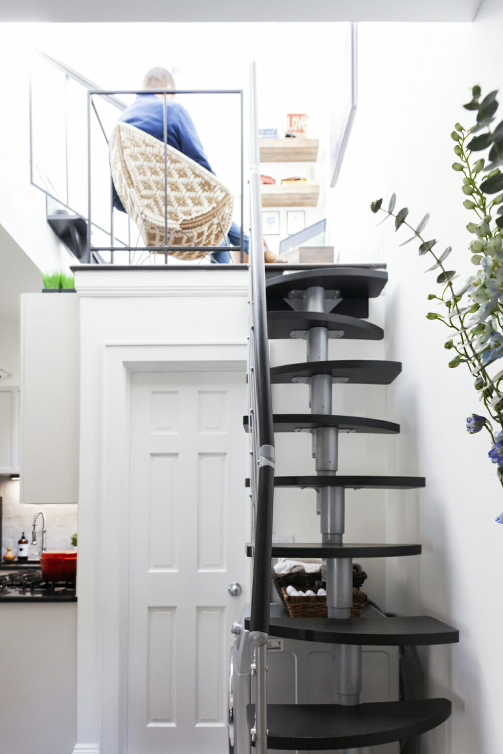
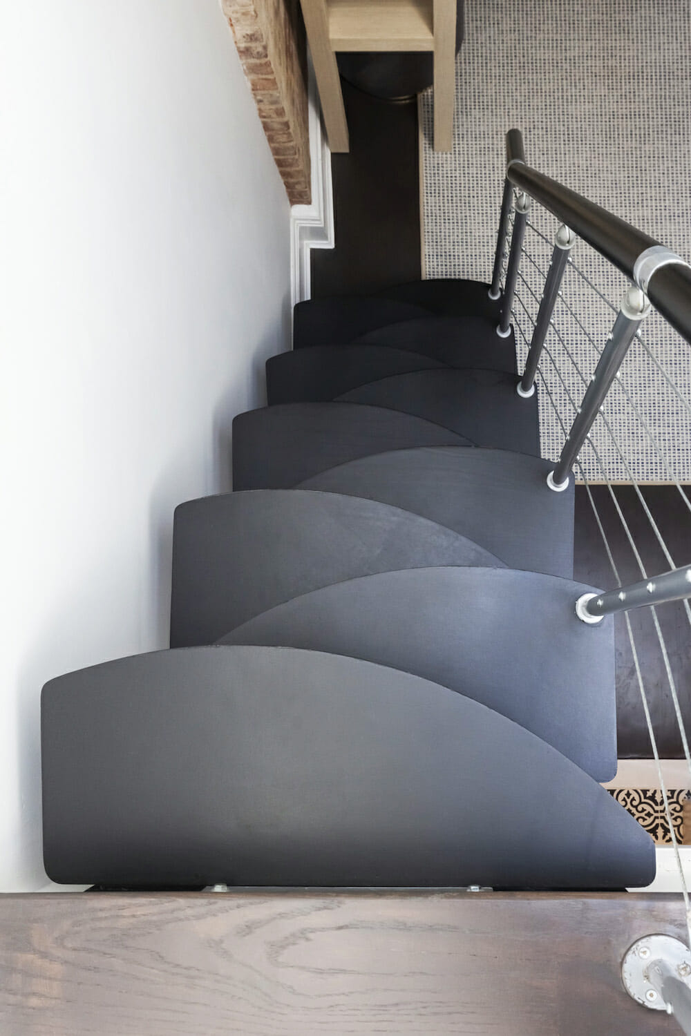
The rarely used loft space at the top of the stairs to the roof deck found new life as a library and office space. The staircase’s free-floating wooden steps going from brown to a modern matte black. The banisters got a coat of black as well.
Once the renovation was completed, they brought in interior designer Julia Oddo. The homeowners, both fans of a rustic-modern aesthetic, decided on a simple-but-striking color palette, compliments of a Kazakhstan-style rug they had purchased and wanted to keep. The soft, tufted carpet had a bold black, white, and coral pattern. They decided that the made-over apartment would have a dominant scheme of bold blacks and whites, soothed by a livable, muted gray-beige on the walls of the smaller areas. Coral would serve as an accent color, along with a classic navy blue.
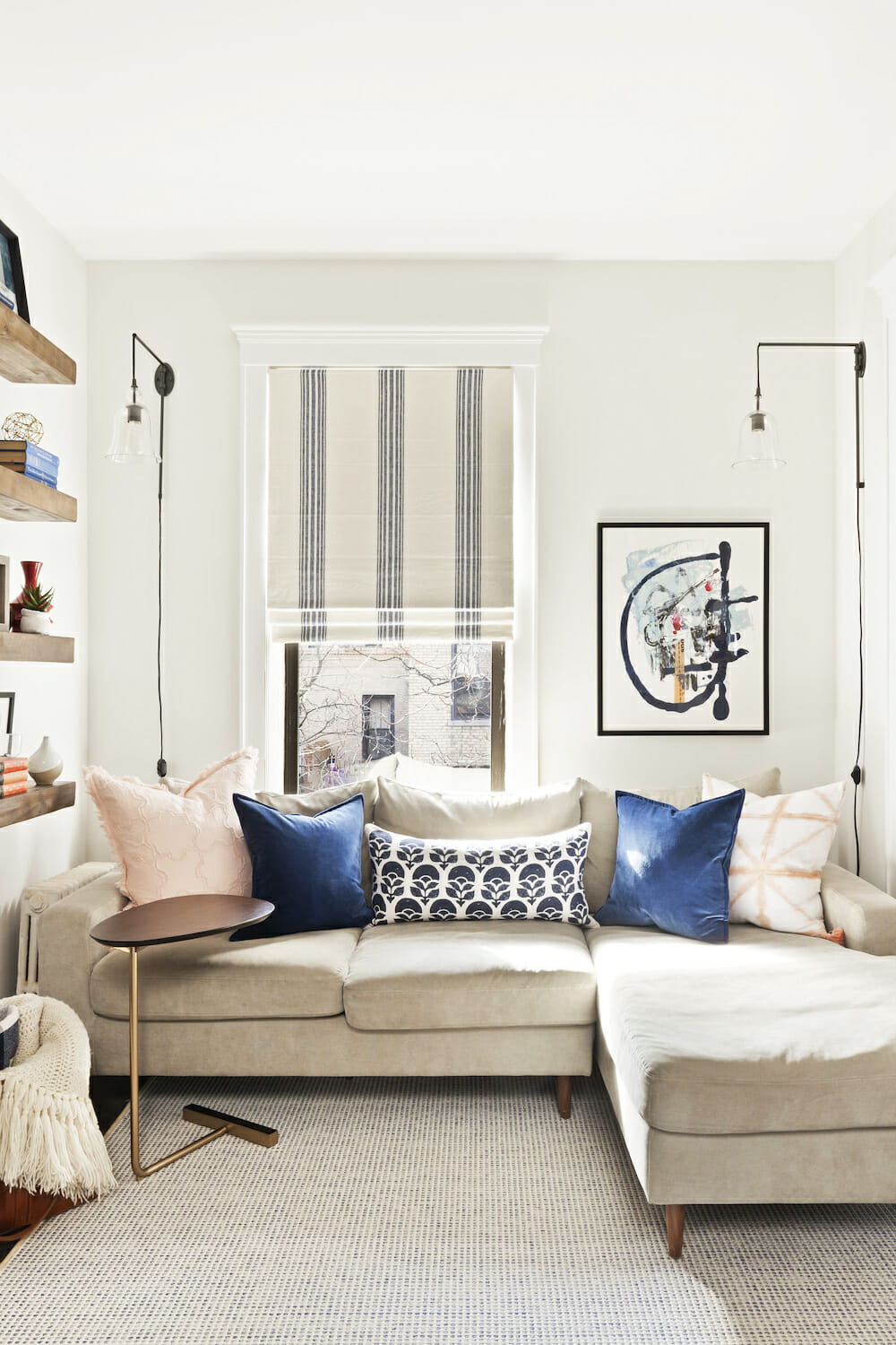
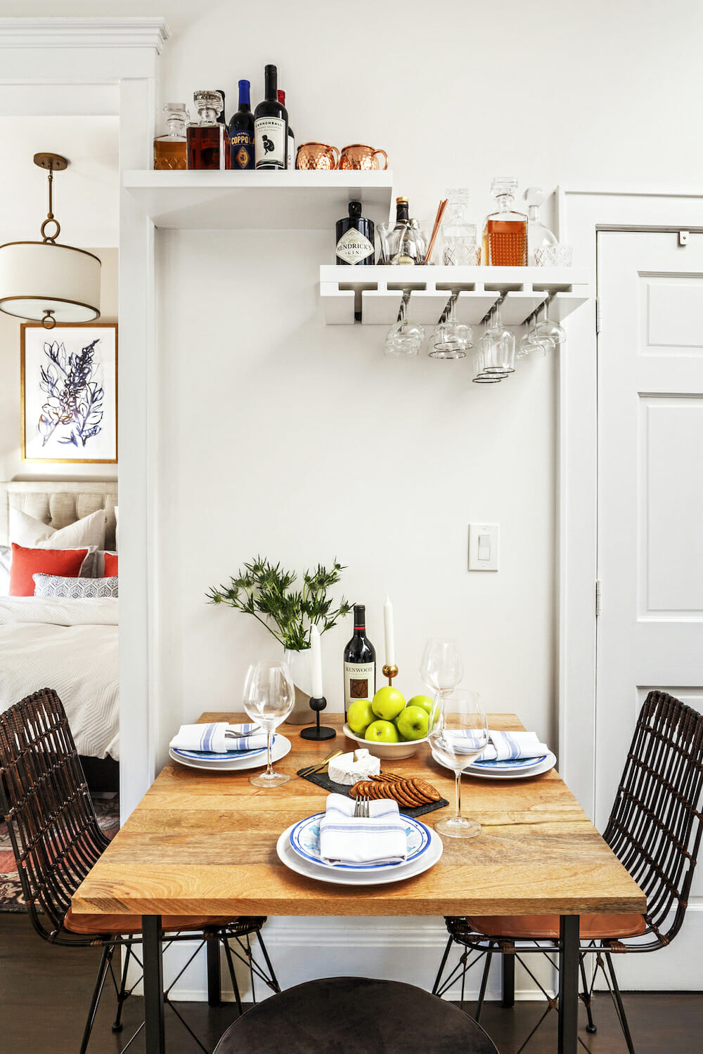
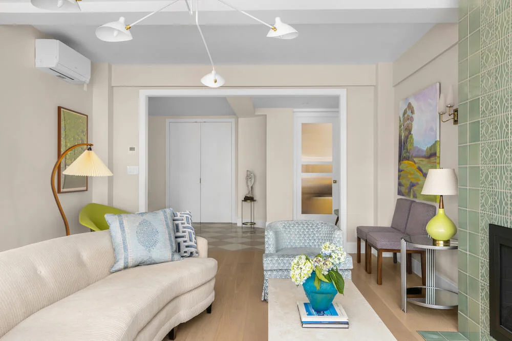
A key pivot was the changing-up of the light fixtures; the homeowners chose hanging wall sconces for the living room and bedroom, where floor and table lamps had formerly demanded too much space. For furnishings, the couple chose a neutral three-seater sofa and swapped a large shelving unit for floating bookshelves and a console TV stand. Dual-purpose ottomans double as extra seating and storage. Julia had other ideas for making the most of every inch, by using flexible furniture in transition spaces. In the pass-through between kitchen and living room, they found space for a drop-leaf table to accommodate dinner-party guests and used floating shelving to create a reach-up “bar cart” on the wall.
Now, though, living with the rewards of their hard work, they feel nothing but happy. “The end result is amazing!” Dianna said. “Sometimes we just sit here, and stare in awe.”
Thank you, Dianna and Todd, for sharing your home with us!
Ready to renovate? Start the journey here for free!
Here you can learn more about our services and locations. Alternatively, browse more home renovation inspirations, processes, and cost guides.
DESIGN NOTES FROM TC INTERIORS’ JULIA ODDO:
The inspiration for this project was the rug that Dianna and Todd once had in their living room. The rug, now in their bedroom, has a soft coral design mixed with a black-and-white pattern. The couple also mentioned that they loved navy, which I thought would pair perfectly with the colors of the rug.
With their style being rustic modern, I combined smooth and polished elements (a modern wall-hung vanity, side table, poufs) with textured ones (bedroom sconces, a console table, chaise longue, and other accents). Choosing the rug for the main area was tricky because of the layout and functionality of the space. We went with a custom carpet that pulled the whole space together. We had a lot of fun bringing color in with artwork, pillows, and small accessories. I wanted the space to not only look aesthetically pleasing but to give it personal touches so it feels like home.
LIVING ROOM AND LOFT RESOURCES: Regal Select wall paint in Super White, #OC-152; stair treads in Black, #HC-190; entry door in Balboa Mist, #OC-26: Benjamin Moore. Rust-oleum’s Varathane wood floor stain in Kona and Weathered Gray; LG washer-dryer combination: Home Depot. Ceiling fan and sconce light fixtures: Existing.
KITCHEN RESOURCES: Paint in Super White, #OC-152; cabinets in Balboa Mist, #OC-26: Benjamin Moore. Countertop: Existing black granite. Weathered White Zellige backsplash tile: Clé. Tolson cabinet hardware: Rejuvenation. Stove: Thor. Refrigerator: Avanti. Microwave and sink: Existing. Vigo Edison faucet: Amazon. Craftmade Lighting matte black and gilded pendant light fixture: Destination Lighting. GetInLight under-cabinet lights in bronze: Amazon.
BATHROOM RESOURCES: Aura Bath & Spa paint: Benjamin Moore. Glass Warehouse frameless fixed glass shower panel: Wayfair. Rounded rectangle metal framed mirror; Tolson hook: Rejuvenation. Delta Cassidy shower system: Faucet.com. American Standard Retrospect pedestal console sink top; Nuvo faucet in chrome: Amazon. American Standard Cadet 3 toilet; Jeffrey Court subway wall tile in Fresh White: Home Depot. Quoizel Lighting Prismatic Glass light fixture in Palladian Bronze: Destination Lighting. Bordeaux cement floor tile in the Pacific Classic Collection: Cement Tile Shop.
BEDROOM: Regal Select wall paint in Collingwood, #OC-27: Benjamin Moore. Axiom Pendant light fixture in brass: Crate & Barrel. Flynn single wall sconce in wicker: Serena & Lily. Slice wall-mount storage shelf as vanity: CB2.
