Park Avenue Views Uninterrupted: A Minimalist Condo Transformation
Sometimes, a single wall can be a formidable barrier—not just to light, but to a homeowner’s entire vision for their space. For John, a minimalist with an eye for stunning views, his new Manhattan condo presented a classic urban dilemma: wall-to-wall windows overlooking Park Avenue, but a layout that kept the brilliance at bay.
Aspiring to a modern, clean aesthetic, he hired architect and designer Aurora Farewell, who works in New York and Connecticut, to oversee the project and to take the space to spare and spectacular. Aurora posted the project and together with John chose their Sweeten contractor.
Sometimes a wall is all that stands between a renovator and a clear vision
- Homeowners: Homeowner, John, posted his two-bedroom luxury apartment renovation on Sweeten
- Where: Manhattan, New York City
- Primary renovation: Changing the layout of a two-bedroom and making it more minimalistic
“After” photos by Kate Glicksberg for Sweeten.
A fresh minimalist space
A Manhattan apartment with wall-to-wall windows overlooking Park Avenue demands an undistracting interior. That’s just one reason why it was a match for John, a minimalist seeking to upsize in the city. The finance exec closed on the two-bedroom abode in the Murray Hill neighborhood and was committed to an expansive renovation before moving in.

Post your project on Sweeten for free and make your dream renovation a reality. Sweeten simplifies home renovation by connecting homeowners with top-rated general contractors, handling the vetting process and project management. To learn more about how we can help, check out our home renovation services.
For John, the decision to finally purchase an apartment of his own in Manhattan was two-fold. First, he’d been renting for years, initially a studio and then a one-bedroom apartment, both in a nearby area of Midtown East, and he wanted more space. Second, he was ready for a serious investment: John wanted to begin building equity in a luxury apartment. What better place than in a full-service condo on a prime Park Avenue block?

Expanding living space
The 1,200-square-foot unit, which had giant, greenhouse-style windows in nearly every room, was in an upscale building in the high 30s, and had everything—room to stretch, impressive sunlight, and 24-hour views of one of the city’s best architectural catwalks.
John lived in his former apartment until his new home renovation was complete. “I closed on it in July 2018 and the renovation began in October,” he said, after he had obtained building and city approvals. The new apartment, he said, more or less doubled his living space. John was an experienced renovator, having done previous construction on homes in Utah and Florida. He had a vision and a good idea of how he wanted to approach the redo. “The biggest questions I had,” he said, “were ‘How much will this cost?’ and ‘How long will it take?’”
I was hoping to not have to use my oven for file storage anymore.
Taking down walls
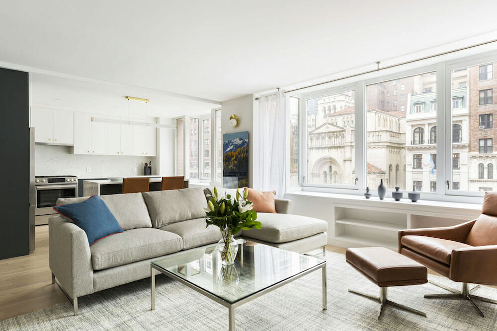
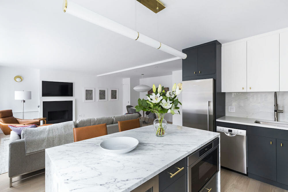
The unit, in a 20-year-old building, had a layout that felt inefficient, if not unlivable, John said. His biggest gripe was an awkward partition wall that closed off the kitchen from the living and dining rooms. According to his architect, they worked to create an open floor plan unifying the kitchen, dining, and living spaces, “as well as to allow for a more gracious master bath and master bedroom.”
Next, they moved on to a long list of features and finishes, all of which, John said, was “in working condition, but dated.” A simple design was needed based on clean lines and spare decor. He favored neutral “background” colors on walls, floors and cabinets, and furnishings that were practical and useful.
Practical goals
Aurora agreed with John’s ideas and thought they meshed perfectly with her own vision, focused largely on the apartment’s bank of east-facing windows. “The tall panes of glass overlook the stately building façades that line Park Avenue, and up to the sky,” she said. “The morning light in the apartment was beautiful, and I wanted to fix the layout so that John could appreciate it in full.” As it was, she said, the window wall’s impressive span was broken by the kitchen partition, plopped right in the middle of—and from either side blocking—the breathtaking view.
After reviewing the multiple Sweeten bids, Aurora and John decided on their contractor, who coordinated with them and advised on a number of aspects of the project. In addition to the literal big picture, Aurora and John had practical goals. “I was hoping to not have to use my oven for file storage anymore,” he said, stressing that this was not an exaggeration.
Sweeten brings homeowners an exceptional renovation experience by personally matching trusted general contractors to your project, while offering expert guidance and support—at no cost to you. Renovate expertly with Sweeten
Sweeten simplifies home renovation. We connect homeowners with top-rated general contractors, handling the vetting process and project management. To learn more about how we can help, check out our guide to home renovation services.
Adding hidden storage
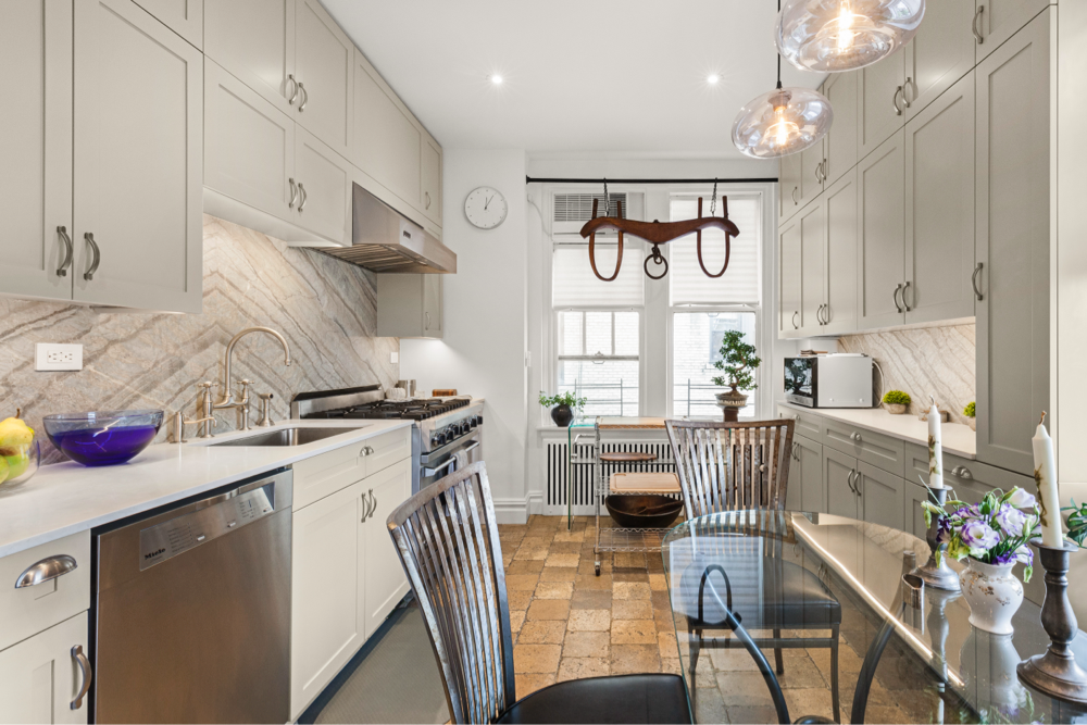
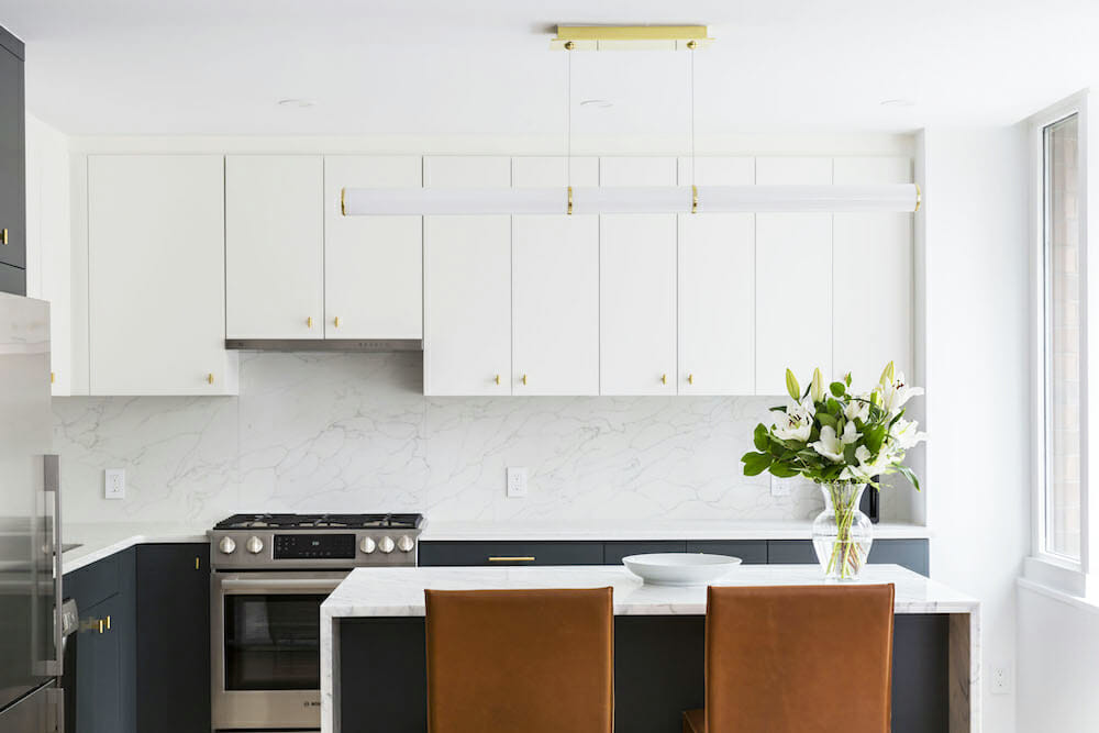
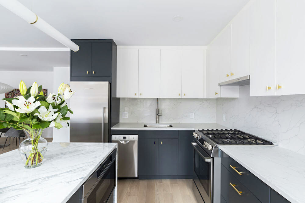
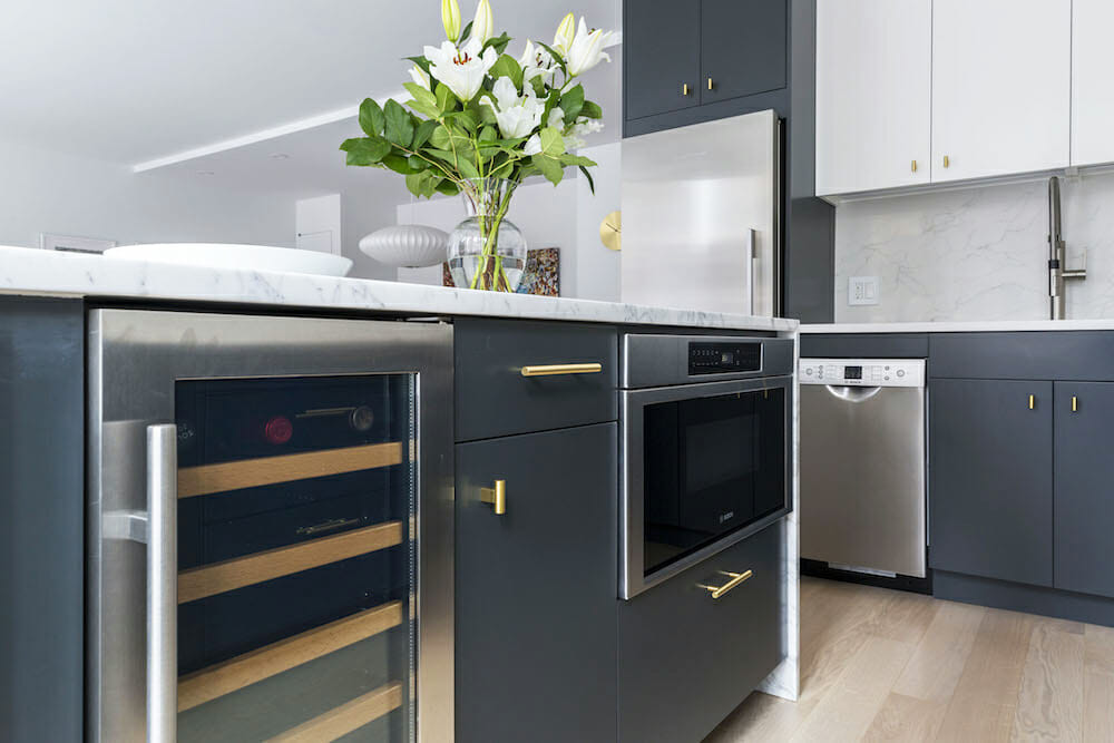
Seeking to maximize the amount of storage space in the apartment without compromising on design, they decided to rip out the wall between the kitchen and dining area, which came at the expense of the pre-existing utility closets that had been built into it. To compensate, the contractor built two closets on opposite walls of the dining area, one to accommodate coats and luggage, and the other to store sporting goods and other sundry stuff. With that wall out of the way, the contractor’s team installed the new kitchen comprising slate-gray designer cabinetry, Calacatta marble countertops, and high-end stainless-steel appliances.
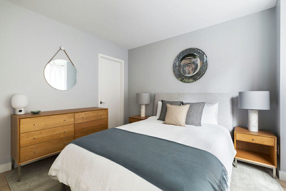
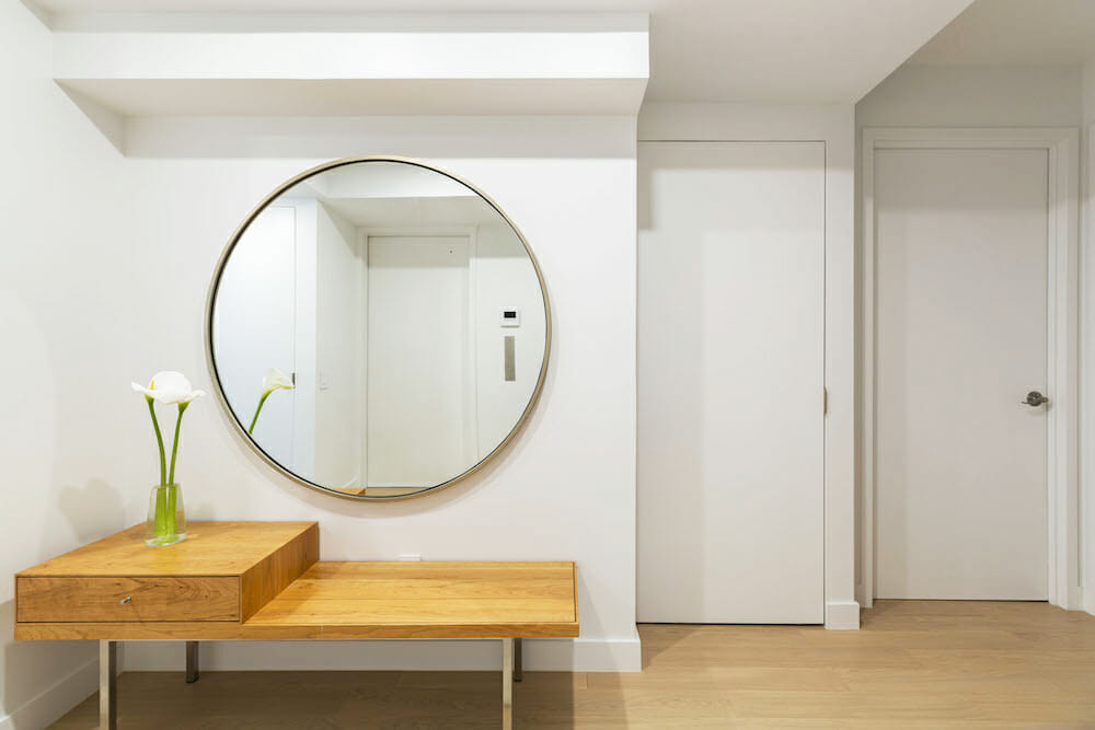
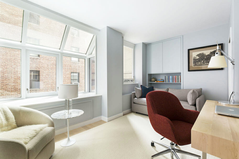
Storage was a priority for other rooms as well. In the master bedroom, the plan dictated bumping into the current clothes closet, which would then be expanded on the opposite side, in addition to building a new shoe closet. The guest bedroom, which would also function as John’s home office, would be kitted out with enclosed cabinets and shelving.
Gutted bathrooms with complete upgrades
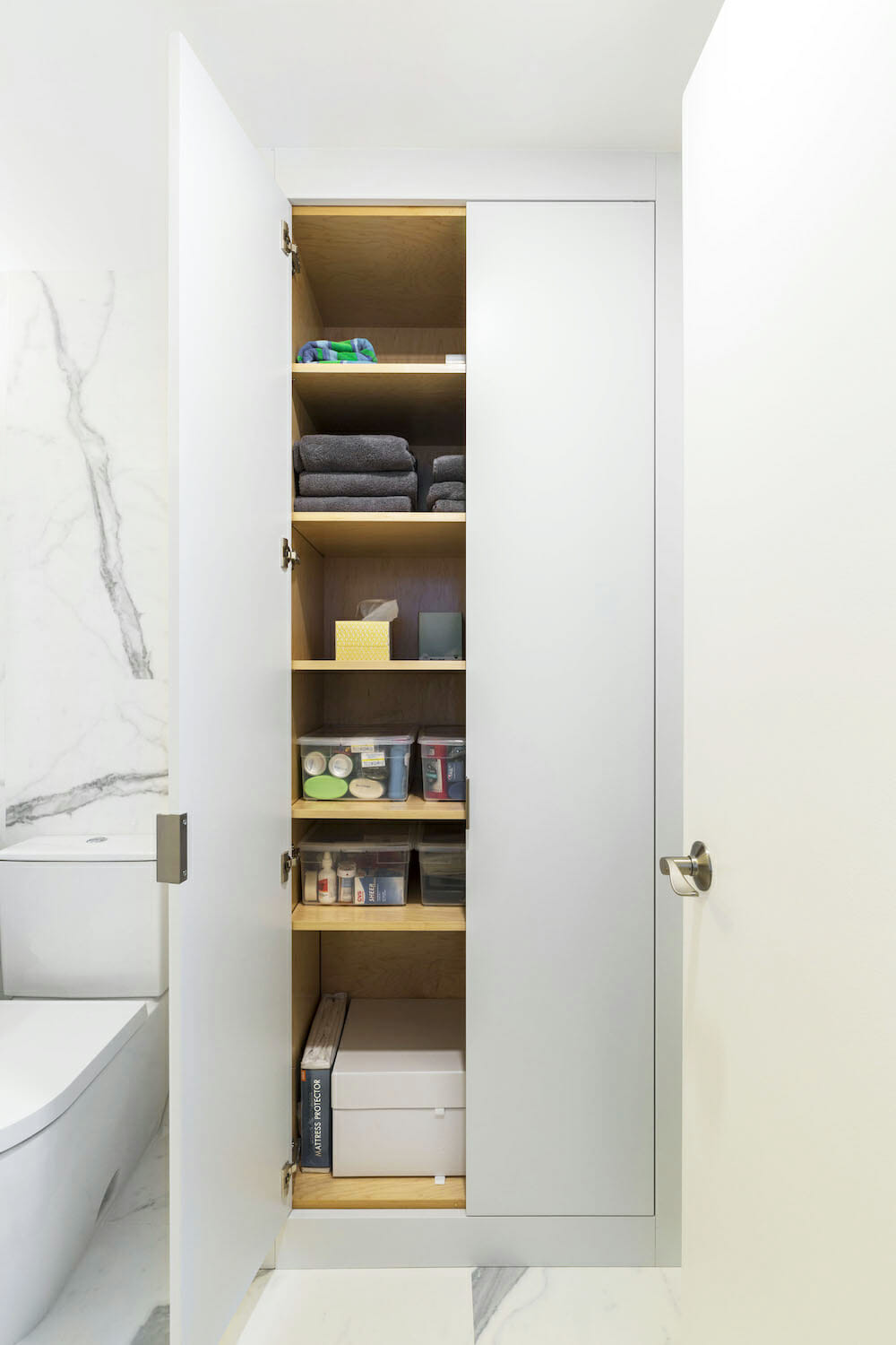
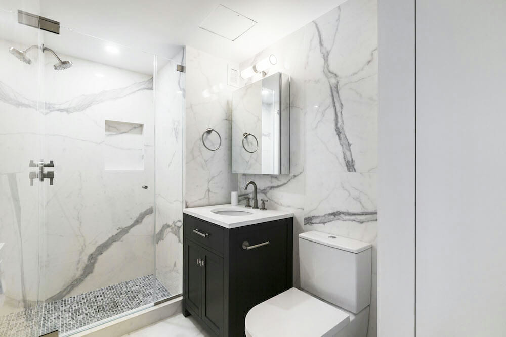
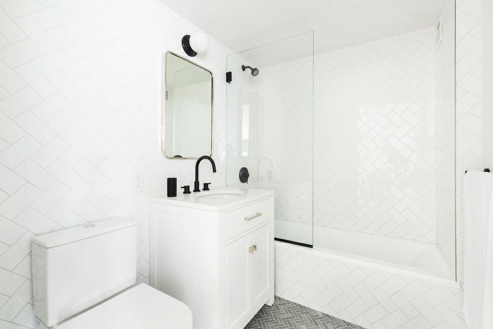
The bathrooms, both of which were gut-renovated, received complete upgrades with porcelain tile, patterns, and custom millwork. In the master bathroom, Aurora increased the functionality with a new linen closet, which the contractor bumped into a wall in order to build.
The six-month renovation went smoothly, John said, with “no major hiccups along the way,” save the necessary pulling of an unanticipated permit from the New York City Department of Buildings before the removal of the kitchen partition. The wall, the architect explained, was non-load-bearing but still tricky to take down, since it was part of the building’s original construction plan.
Crediting the contractors
John credited his Sweeten contractor as a key player in the project, noting that the building team was among the critical reasons why the project was a success. He suggested taking all you can from the experts you’ve assembled to help you through the project, while at the same time tuning in to your own intuition. “Once you make a decision,” he said, “stick with it. Otherwise, you run the risk of not only second-guessing yourself, but of delaying delivery of materials and installation. If one step in the process is delayed, it can have a domino effect on subsequent tasks.”
John said that those steps, at least when they proceeded smoothly, were some of the most satisfying components of the job, day-by-day, and week-by-week, as he watched his new space change. What came slowly at the beginning then accelerated, transforming to progress and carrying through to a pleasing conclusion.
“I feel,” John said, “like I’ve found not just a place to live and sleep, but a permanent home in the city.”
Thank you, John, for sharing your new home with us!
DESIGN NOTES FROM ARCHITECT AURORA FAREWELL AS TOLD TO SWEETEN:
We wanted to appreciate the natural light in full. Unfortunately, it was interrupted by the dividing wall, home to closets and a massive fridge. We agreed a continuous row of windows would be better.
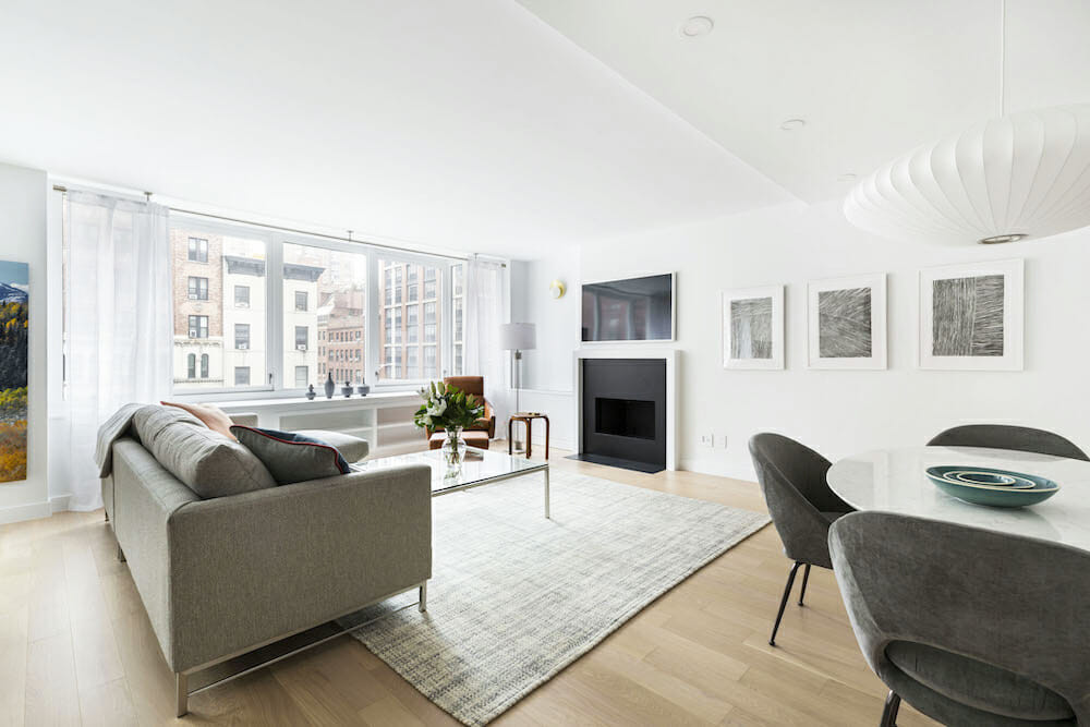
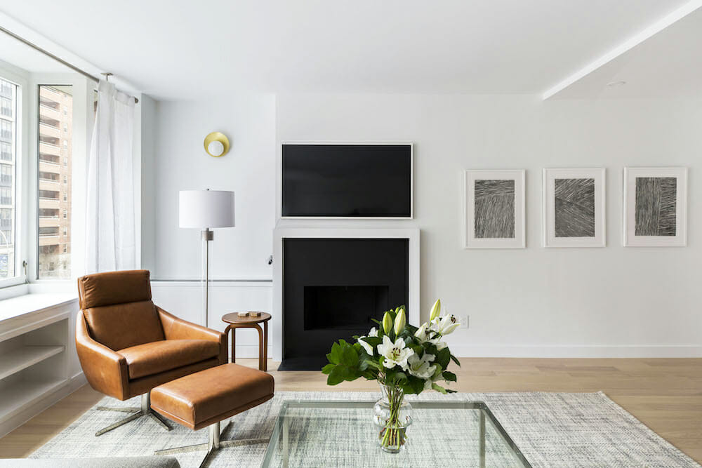
We relied on light fixtures to act as focal points in the space and to illuminate the client’s artwork without needing to use additional art lights. Two brass wall sconces are placed strategically in the living room to provide ambient light, and a statement fixture anchors the kitchen area, illuminating across the entire length of the island. Both this and the oversized dining room pendant act as sculptural elements. Carefully placed 3-inch ceiling soffits facilitated critical adjustments in architectural lighting, including the addition of the beautiful kitchen island pendant, without sacrificing overall ceiling height. The fireplace surround and hearth were redone in slate with a minimal, painted mantel.
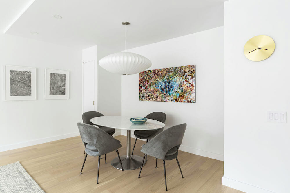
In the dining area, symmetric closets flanking the dining table replace the storage lost in the removal of the functional wall and closet bank separating the kitchen and living room. The kitchen island is Calacatta marble with waterfall sides that give it weight despite its smallish scale; it stands as an object in the kitchen and speaks to the elliptical dining table, which has similar marble veining. By downsizing the dishwasher, we created space for the refrigerator to move, while maintaining critical site lines throughout the apartment. The architectural moves are simple, but bring coherence to the overall plan.
The master bathroom is clad in large-format porcelain tile in light-gray veining chosen for durability and aesthetic appeal, with just enough pattern to not overwhelm the space. The bathroom is timeless and the combination with porcelain tile and minimal grout mean that it will remain pristine for years to come.
The interior finishes and furnishings internalize the terra cottas and wrought-iron tones from the streetscape, placing the emphasis on the view beyond the windows. The flooring throughout the apartment a light-toned wood-topped engineered floor from PID that the client chose himself. Leather-clad bar stools and a small table bring warmth to the space, while ceramics in the window lend scale to the buildings beyond.
Ready to renovate? Start the journey here for free!
Here you can learn more about our services and locations. Alternatively, browse more home renovation inspirations, processes, and cost guides.
Renovation materials
LIVING SPACE RESOURCES: Paint in Decorator’s White, #OC-117: Benjamin Moore. Wood floors: PID. Ceramics: Sarah Paloma.
KITCHEN RESOURCES: Calacatta Bettogli marble countertop: PMI. Quartz backsplash in Crystal White: Polarstone. Lower cabinets in Graphite and uppers cabinets in Decorators White: Manhattan Kitchen and Bath. Cabinet hardware: Schoolhouse. Dishwasher and stove: Bosch. Refrigerator: Fisher Paykel. Sink: American Standard. Culina Semi-Pro faucet: Blanco. Mini Endless kitchen island pendant: Roll & Hill. Riviera island stools: Citizenry.
BATHROOM RESOURCES: Custom millwork: Created by general contractor. Shower fixtures; towel bars: Signature Hardware. Grey marble shower floor tile: TileBar. Hutton Collection sink/vanity; light fixture. Restoration Hardware. Vanity mirror/medicine cabinet: Kohler. Starck toilet: Duravit. Essence sink faucet: Grohe. Kala White floor tile: Porcelanosa.
GUEST BATHROOM RESOURCES: Subway tile; herringbone floor tile: TileBar. Toilet: Duravit. Sink/vanity: Restoration Hardware. Mirror: Rejuvenation. Light fixture: Shower fixtures; towel bars; faucet: Signature Hardware.
DINING ROOM RESOURCES: George Nelson ceiling pendant: DWR.
LIVING ROOM RESOURCES: Brass Pearl sconces: Cedar and Moss.
MASTER BEDROOM RESOURCES: Revere Pewter paint, #HC-172: Benjamin Moore. Light fixtures and desk: Room and Board.


