Studio to Stunner: A Film Editor’s Fort Greene Renovation
In a city where square footage dictates destiny, film editor Mollie Goldstein faced a classic New York dilemma: cash out or creatively conquer. With co-op prices skyrocketing, she chose the latter, transforming her “starter” studio into a cinematic masterpiece of color and clever design.
Forget the moving boxes; Goldstein wielded wallpaper swatches and a contractor’s vision, proving that sometimes, the most dramatic plot twist is staying put.
She decided to renovate instead of move
Guest post by Fort Greene homeowner Mollie Goldstein
About a year ago, I started noticing that prices for apartments in my Fort Greene co-op building had skyrocketed. I live in a studio, so the question of upgrading to a true one-bedroom was always on my mind. It had also been ten years since I bought my 500 square foot “starter apartment,” so I was starting to wonder if it might be time for a more “grown-up” dwelling. In short: Was now the time to cash out and buy something bigger elsewhere?
Upon consideration, though, I realized that 1) I love my building, 2) I love my neighborhood, and 3) my apartment is the exact right size for one person and one dog. The increasing market value, however, meant that I had equity I could borrow against, and so I decided to renovate the kitchen and bathroom and make myself a new apartment without having to uproot.
Post your project on Sweeten for free and make your dream renovation a reality. Sweeten simplifies home renovation by connecting homeowners with top-rated general contractors, handling the vetting process and project management. To learn more about how we can help, check out our home renovation services.
That decision turned out to be the easy part. When it came to planning a renovation—or even finding someone to help me plan a renovation—I had no idea what I was doing and no clue how to get started. After some time on the Internet, I thought a design/build firm might make the most sense for me, since I had no confidence in my ability to either design a proper space or supervise a contractor. But when I talked to the reps for several Manhattan firms, they laughed at my budget and sent me packing. Google eventually led me to Sweeten, where I posted my project. The kind staff there double-checked my budget, but at least they didn’t laugh—and neither did the Sweeten general contractor I was eventually paired up with.
She was amazing, and I felt an instant rapport with her. I’d had no experience in construction, but I do collaborate for a living (I’m a film editor), and I immediately recognized that she was a gem. The design process was so much fun. Because I was renovating in order to stay put, I wanted to design spaces purely for myself. Both rooms had always been serviceable, but the hasty repairs made before I moved in ten years earlier were showing their age, and I knew there had to be better ways to take advantage of the space I had available (especially in the surprisingly large-for-NYC kitchen). Sweeten brings homeowners an exceptional renovation experience by personally matching trusted general contractors to your project, while offering expert guidance and support—at no cost to you. Renovate expertly with Sweeten
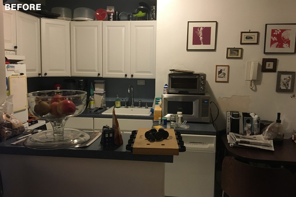
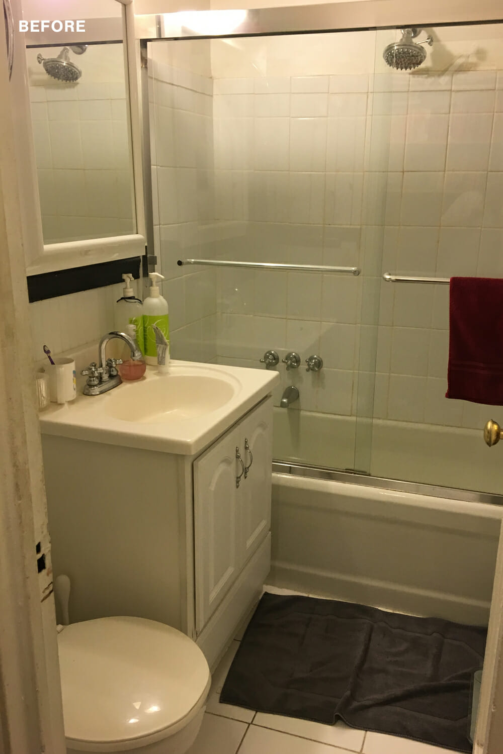
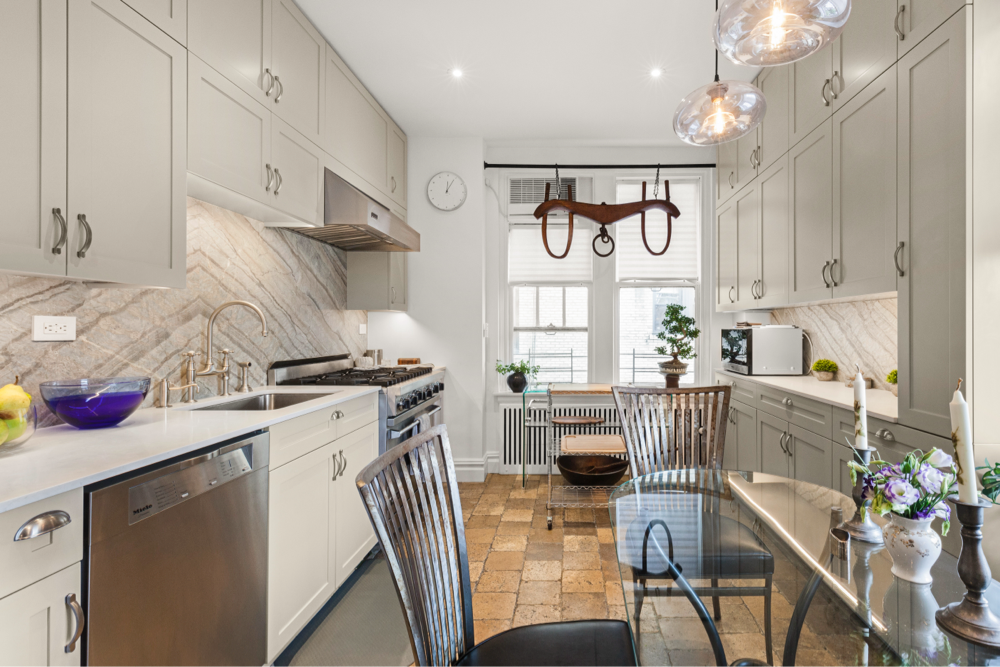
It drove me crazy that the kitchen cabinets didn’t reach the ceiling (so much wasted space!) and I hated stacking my spices on top of the stove. I also had a random hole in my kitchen wall where a neighbor’s contractor had drilled through and then disappeared. The bathroom was grungy in its off-white color scheme and constantly sprouting various leaks and cracks. I also love pattern and color, and I knew I wanted to create a personalized kitchen and something other than a standard white bathroom.
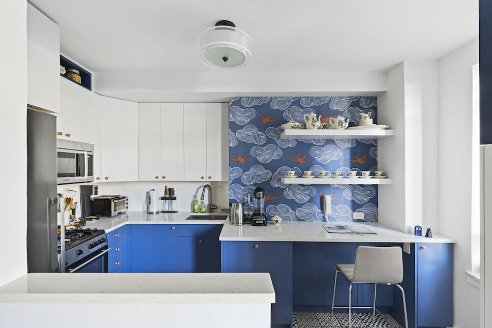
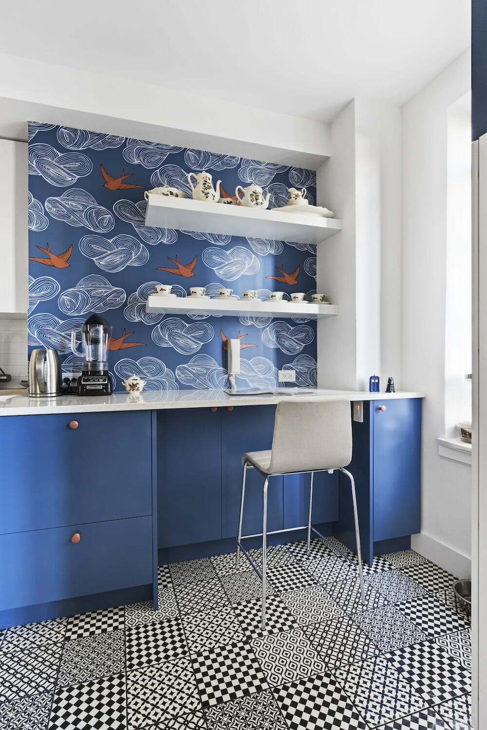
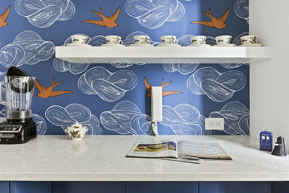
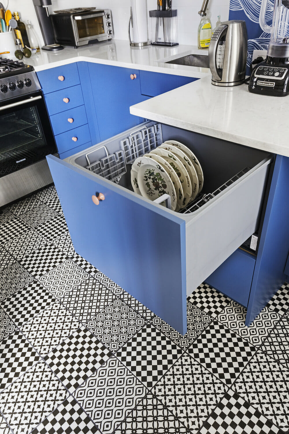
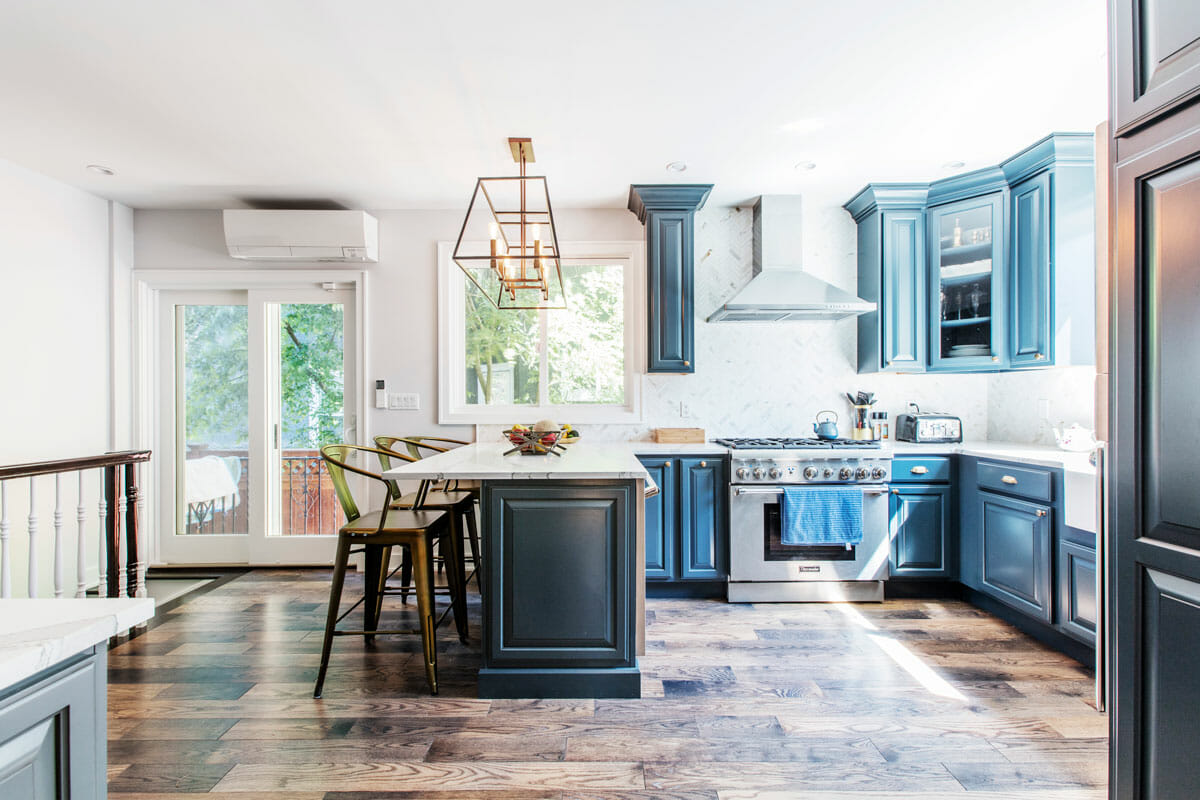
The kitchen design came together very quickly. I gave my contractor a few wallpaper swatches and a random list of priorities: I wanted a dishwasher, but it had to be less obtrusive than the current model; I needed a place for cookbooks; I was desperate for more storage; and could she please include a cute little spice drawer? Within a few days she sent me a rendering that was very similar to the final product. The Hygge & West wallpaper (which I’d had my eye on for a while), set the tone for our color scheme and she designed a clever built-in with a hidden-drawer dishwasher by Fisher & Paykel that I loved right away.
Sweeten simplifies home renovation. We connect homeowners with top-rated general contractors, handling the vetting process and project management. To learn more about how we can help, check out our guide to home renovation services.
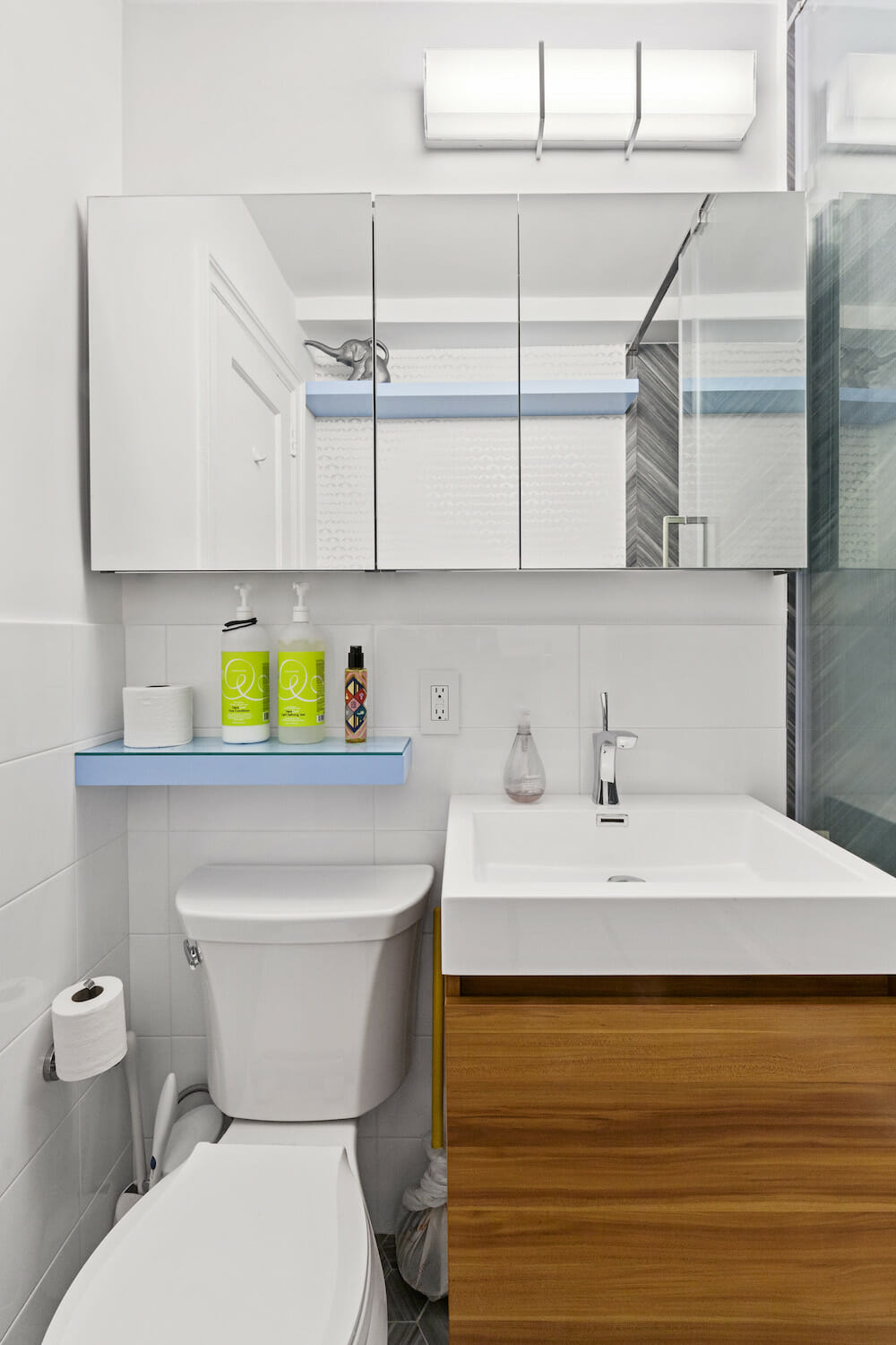
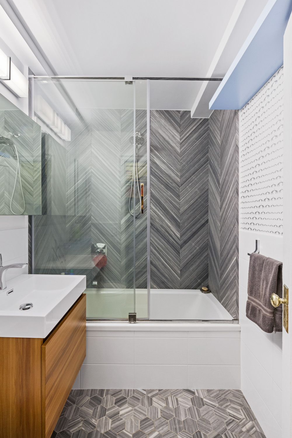
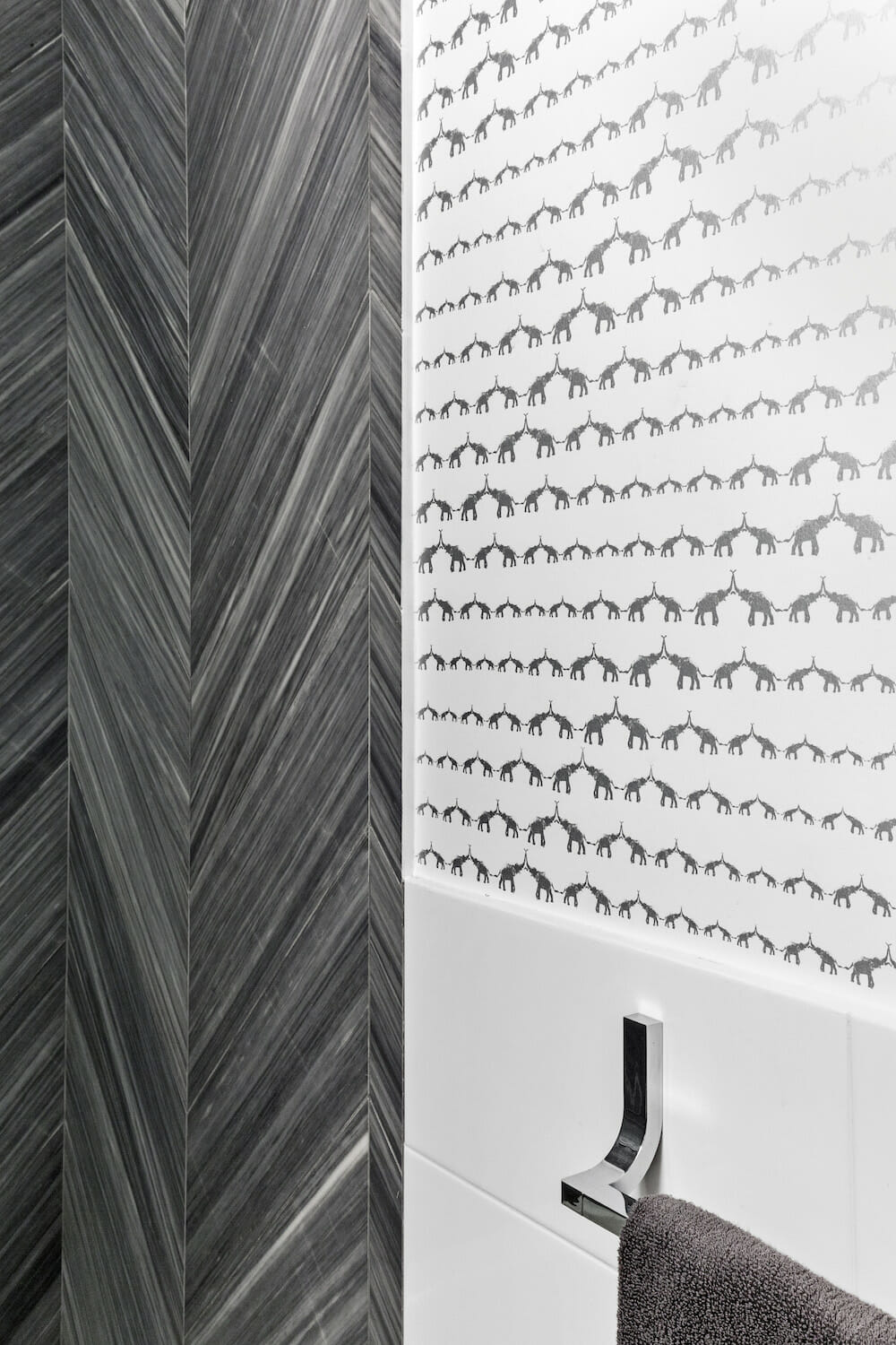
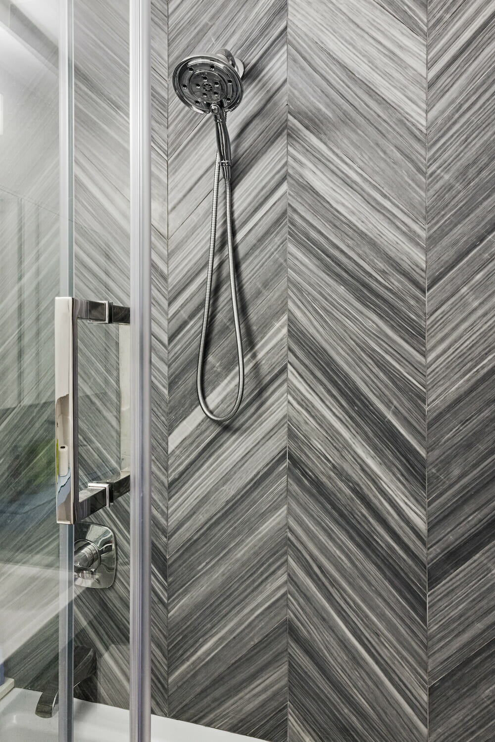
The basic layout of the bathroom was pretty easy, too, but we struggled a little more with the design. I knew I wanted something special, but I didn’t exactly know what it was. I sent my contractor a list of tiles I liked, none of which were appropriate, but she looked at them all and distilled the essence of what I was looking for, sending back the chevron marble from TileBar that we eventually went with around the tub (with its hexagon cousin for the floor).
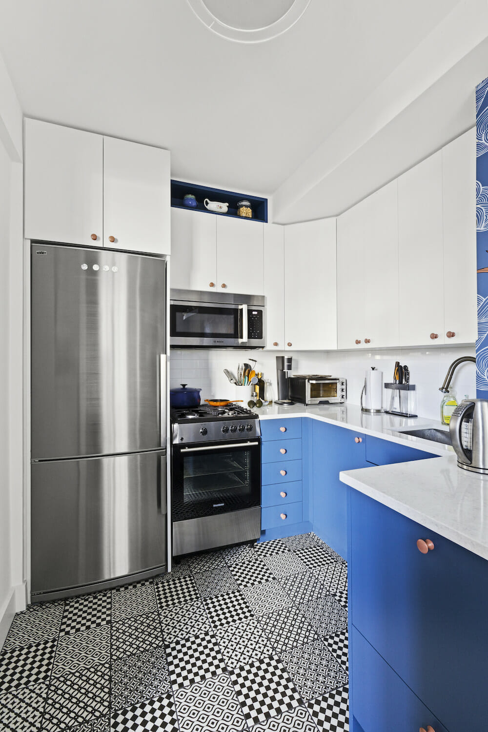
And as it happened, one of those other rejected bathroom tiles ended up as the kitchen floor — when we were looking at all our samples together, I slid that Bestile Moderna sample over to the kitchen pile, and, while neither of us had seen it coming, we both loved the black & white pattern against the blue cabinetry. The floor has since become one of my absolute favorite things about the kitchen.
Thanks to my contractor and her team, construction went pretty smoothly (for me). I moved out for five weeks while they dealt with all the problems of a crumbling kitchen ceiling, hauling debris out through a co-op lobby, and having to send back tile that arrived scratched. I’m sure there were a hundred other stumbling blocks that I never heard about, and I remain deeply grateful for the opportunity to work with trustworthy contractors whose standards were even higher than I expected.
Now that Maggie (my dog) and I have moved back in, I’m in love with my new space. Showering in my beautiful marble shower every morning is a treat, and I cook much more—and much more enjoyably—now that I have all the counter space I need. Both the kitchen and the bathroom are neater and less cluttered than ever before now that there is a place to put everything. I’m incredibly happy that I took the renovation plunge.
Ready to start your own renovation journey?
Post your project on Sweeten for free and make your dream home a reality. Sweeten puts you in control of your renovation, from finding the perfect contractor and gathering design inspiration, to using cost guides to plan your budget wisely.
Renovation materials
Kitchen selects >> cabinets: custom / cabinet knobs: Home Depot / counters: LG Viatera: Cirrus / sink: Vigo / faucet: Hansgrohe / fridge: Summit Appliance / range: Blomberg / dishwasher: Fisher & Paykel / microwave: Bosch / floor tile: TileBar: Bestile Modena Blanco Nero porcelain tile / wallpaper: Hygge & West: Daydream (Indigo)
Bathroom selects >> floors: TileBar: Milan Gray Hexagon Marble tile / vanity sink, #JS-50324-PL-PRTSET1: Virtu / faucet, #552LF-MPU: Delta / tub: Kohler: Archer / toilet: Kohler: Wellworth / wall tile: TileBar: Milan Gray Chevron Marble tile / white wall tile: TileBar: ceramic tile / wallpaper: Walnut Wallpaper: Baby Elephant Walk
