A DUMBO Renovation Goes Chic-Casual
In the heart of Brooklyn’s historic DUMBO, a 1,050-square-foot condo has undergone a stunning transformation, a testament to the power of vision and meticulous design. Co-founder of Roar + Rabbit, Mitzie Wong, and media executive Jenifer Herrmann, began a journey to infuse their two-bedroom space with “casual luxury,” blending wall paneling, hidden appliances, and striking tile patterns into a harmonious whole.
From a once “dark and boxy” kitchen to spa-like bathrooms and a bespoke home office, this renovation, facilitated by Sweeten, reveals how thoughtful material choices and a keen eye for detail can redefine urban living.

- Homeowners: Co-founder of design firm, Roar + Rabbit (Instagram: @roarandrabbit), Mitzie Wong, and Jenifer Herrmann, a media executive, posted their project on Sweeten
- Where: DUMBO in Brooklyn, New York
- Primary renovation: Overhaul an entire 1,050-square-foot condo
- Homeowner’s quote: “Sweeten helped us find this team and advised us on important points like timelines and communication strategies.”
Post your project on Sweeten for free and make your dream renovation a reality. Sweeten simplifies home renovation by connecting homeowners with top-rated general contractors, handling the vetting process and project management. To learn more about how we can help, check out our home renovation services.
Guest blog post by Sweeten homeowner Jenifer. “After” photos by Kate Glicksberg for Sweeten.
Landing the perfect space
We had a clear vision from the day of the close: to create a living space with a look and feel of casual luxury. The building, in historic DUMBO, is a block from both Brooklyn Bridge Park and the waterfront. The apartment is a true two-bedroom—with windows and natural light in both—overlooking the street and trees.
The price point was reasonable enough that we could buy the condo and have money to renovate before moving in. Mitzie is a furniture designer and we were confident the space was a good canvas. It would make a good home.
New home office, featured wall panels, coordinated bathrooms
We were looking to add character to each room, with a focus on mixed materials and quality finishes. We were excited about renovating the kitchen as well as two bathrooms using the same tile in different ways. The master bedroom would be outfitted with wall paneling.
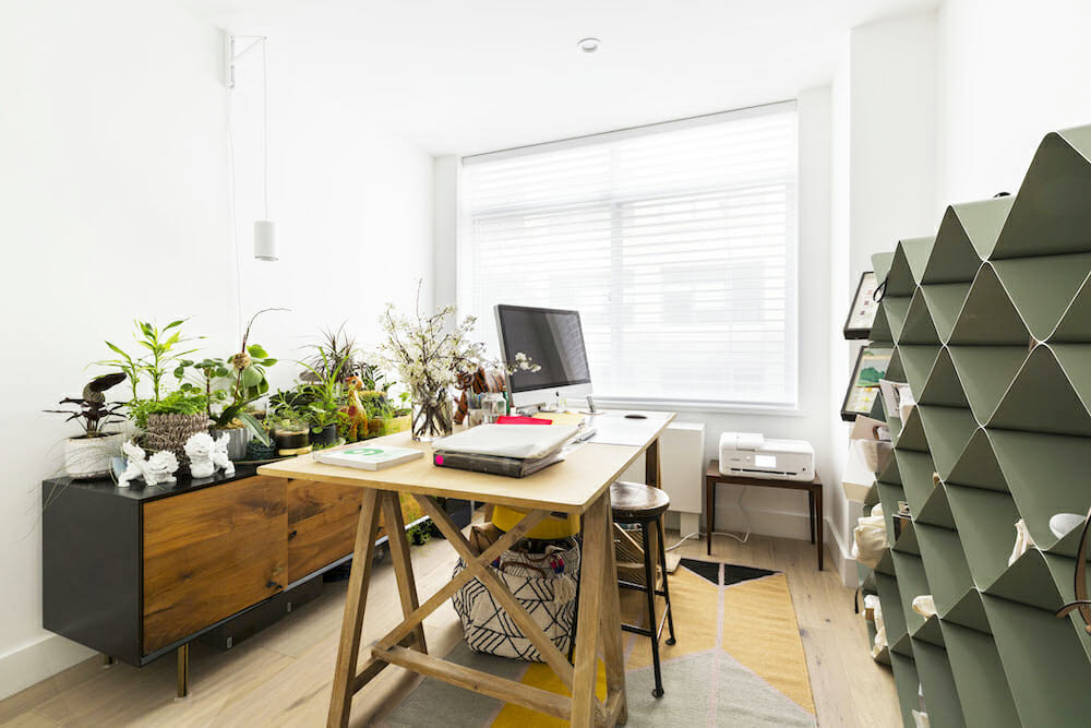
Maximizing storage was key since Mitzie works from home. The second bedroom would be her workspace, and she wanted (needed!) to separate work from life with an office. We were determined to accomplish it all, transforming the condo into a home reflecting both our personalities and styles.
Sweeten simplifies home renovation. We connect homeowners with top-rated general contractors, handling the vetting process and project management. To learn more about how we can help, check out our guide to home renovation services.
A mood board emerges
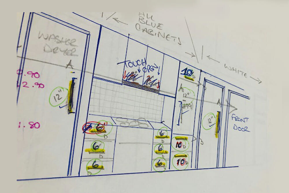
Once we’d hired our Sweeten contractors—and asked a lot of questions about costs and the timeline—we began with concept boards. These kept us organized with the number of decisions we had to make throughout the planning. We started with a set of detailed floor plans and measurements (CAD renderings were helpful for seeing the big picture).
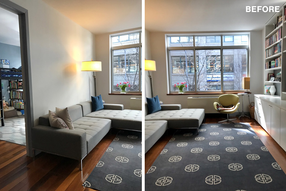
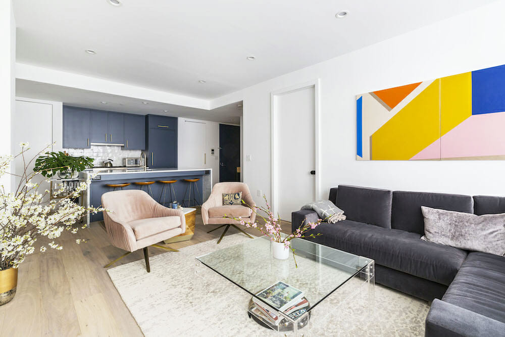
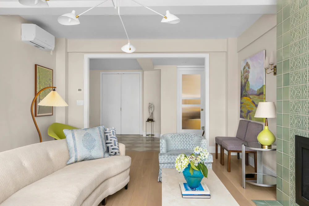
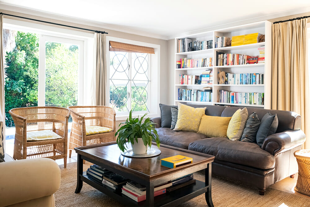
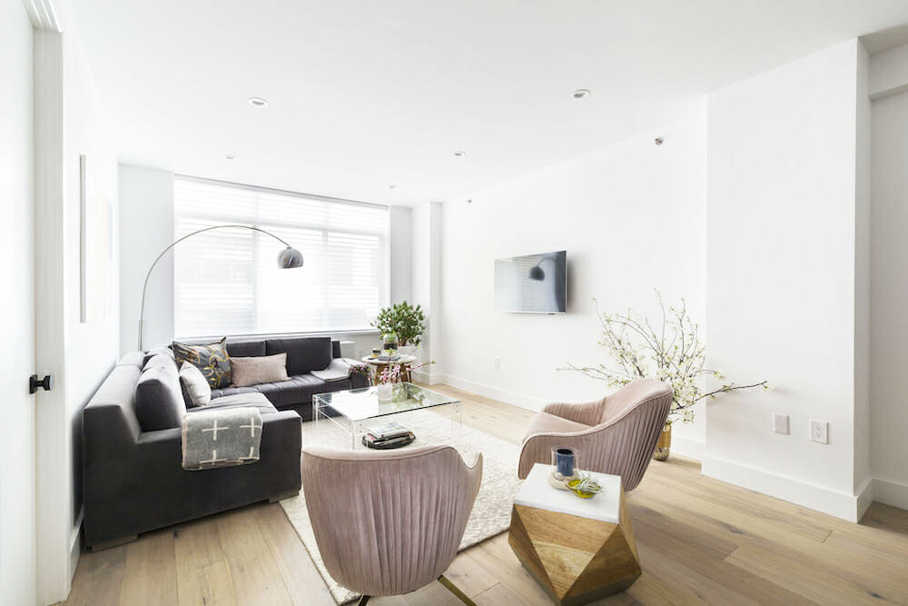
The color palette was off-white, blue, and gray, with accents of pink in textiles and black for hardware. We created a list of materials we wanted to incorporate such as marble, brass, and wood. All of these hues and surfaces are visible in our living room, which is the heart of our place.
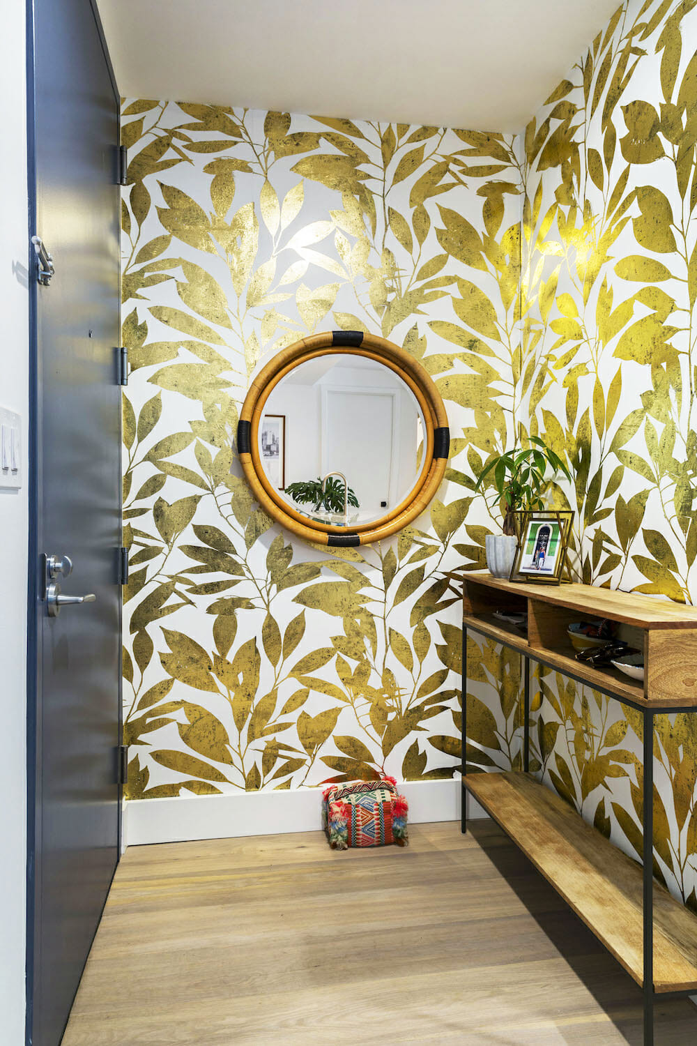
Since the same wide floorboards were used throughout the apartment, we eliminated the saddles at our door thresholds to maximize that continuity. We made a schedule for ordering materials and a checklist for received items—a system that carried us through the renovation, helping us track appliances, fixtures, hardware, and odds and ends. Sweeten brings homeowners an exceptional renovation experience by personally matching trusted general contractors to your project, while offering expert guidance and support—at no cost to you. Renovate expertly with Sweeten
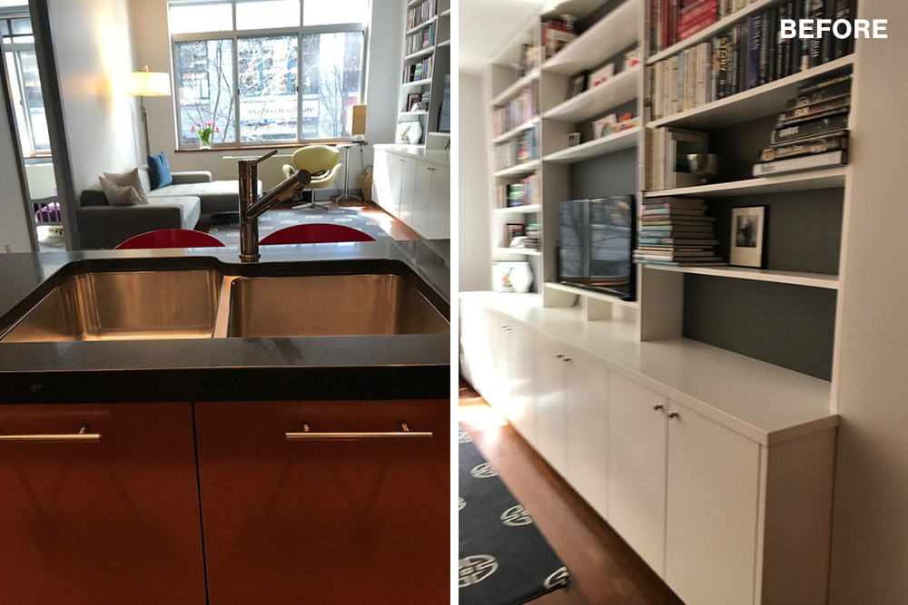
The key to open concept spaces: built-in cabinets
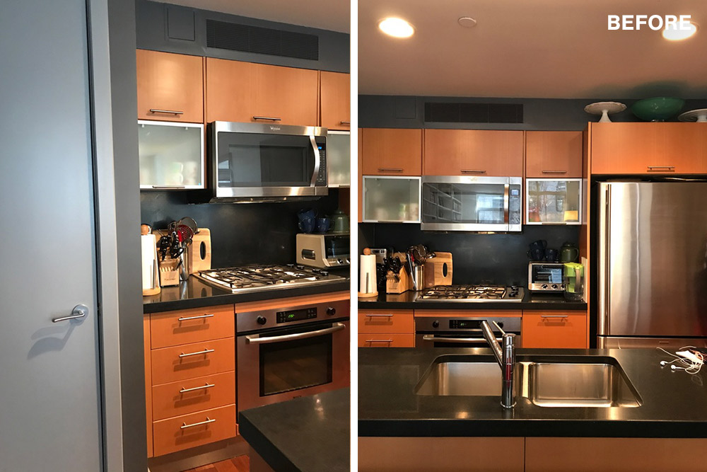
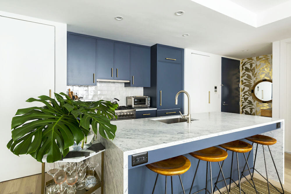
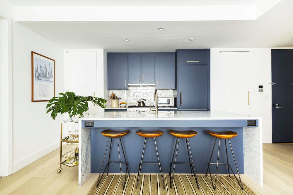
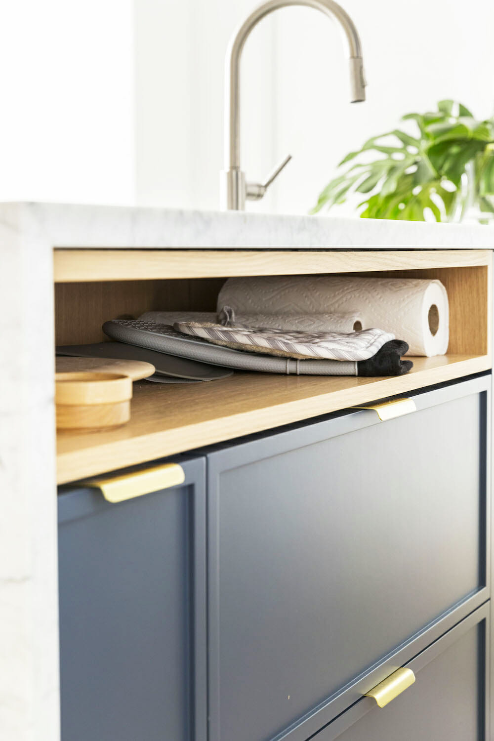
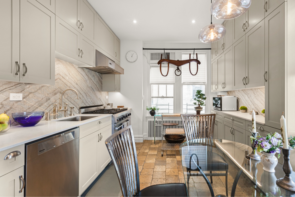
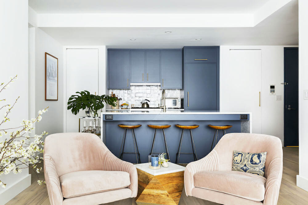
The kitchen was a dark and boxy room that needed love. Our goals were to maximize storage, update the appliances, and simplify the overall aesthetic. This was especially important as the kitchen opens to our living room.
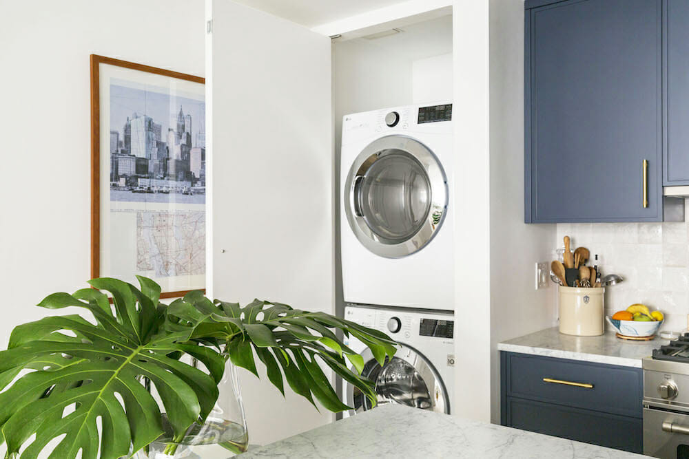
A large island was a key addition, to function as a dining and entertaining area. We chose a refrigerator and freezer with panel doors matching the cabinets. On the other end of the kitchen wall, our contractors removed the door frames holding the washer/dryer for a streamlined effect.
Our apartment was filled every day with a team of busy contractors and subcontractors. It surprised us, but once the project was complete, we missed seeing and chatting with these talented guys.
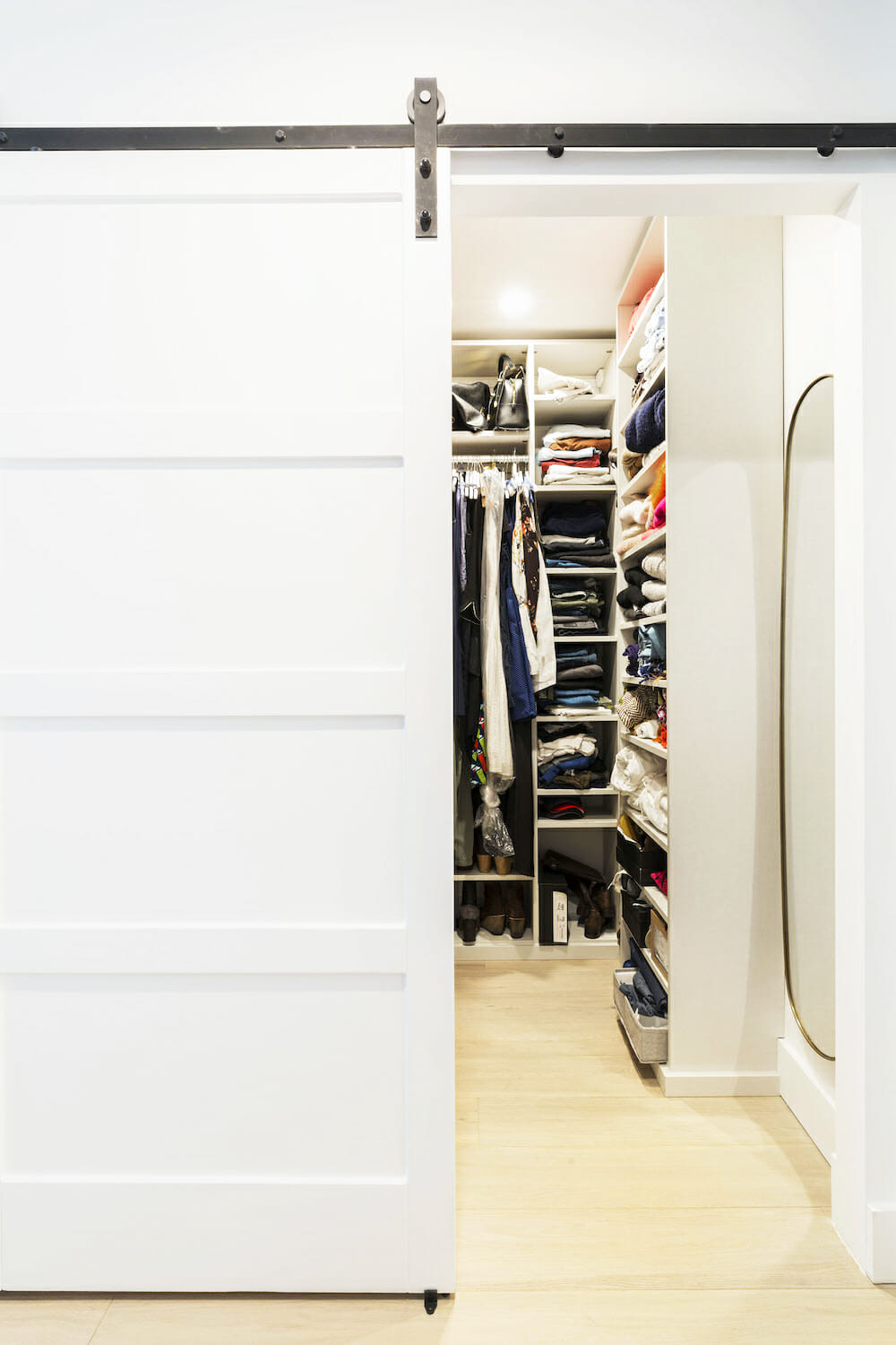
Wall paneling defines a plain wall
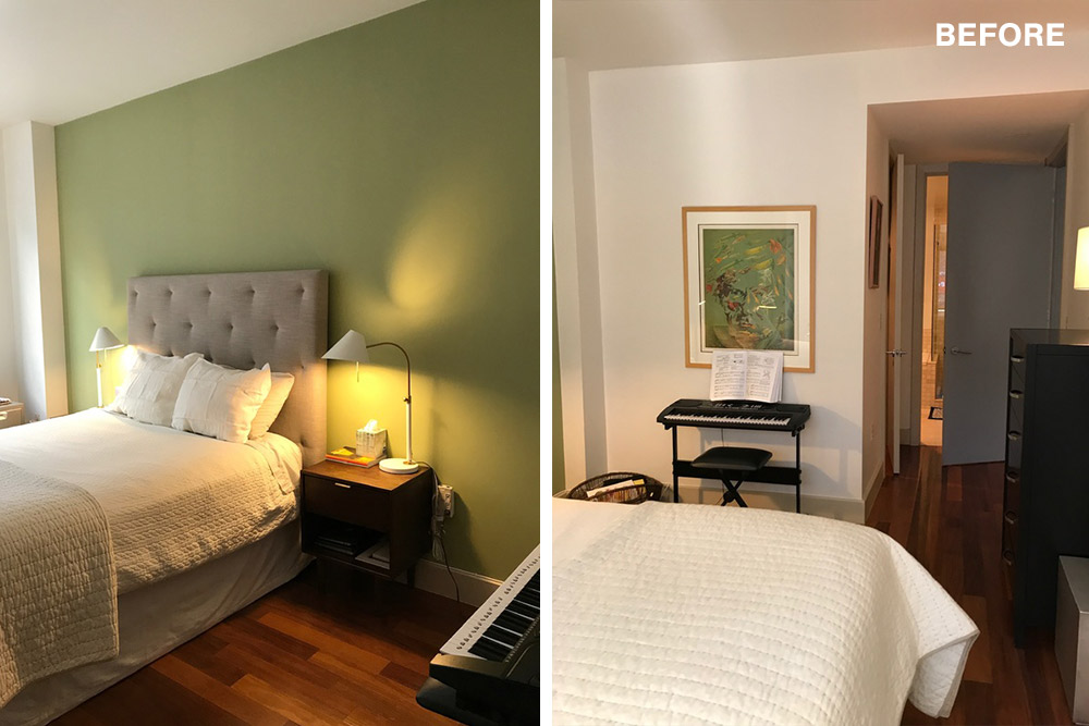
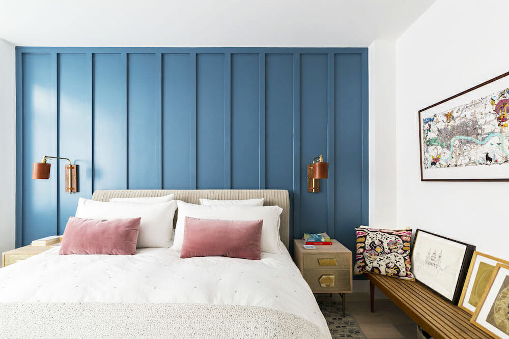
Wall paneling was added to give our bedroom depth and character which became a feature. This accent wall moved the attention away from some existing buildouts in each corner of the room, and a recessed area that could not be reconfigured.
Our contractors hired a master carpenter who created the wall paneling with 2 1/2″-wide lengths of plywood, and finished the wall with satin-finish paint. In this room as well as the second bedroom, which became Mitzie’s office, we added custom closets and remote-control blinds. Mitzie’s plants in her office were outfitted with grow lights to keep them green year-round.
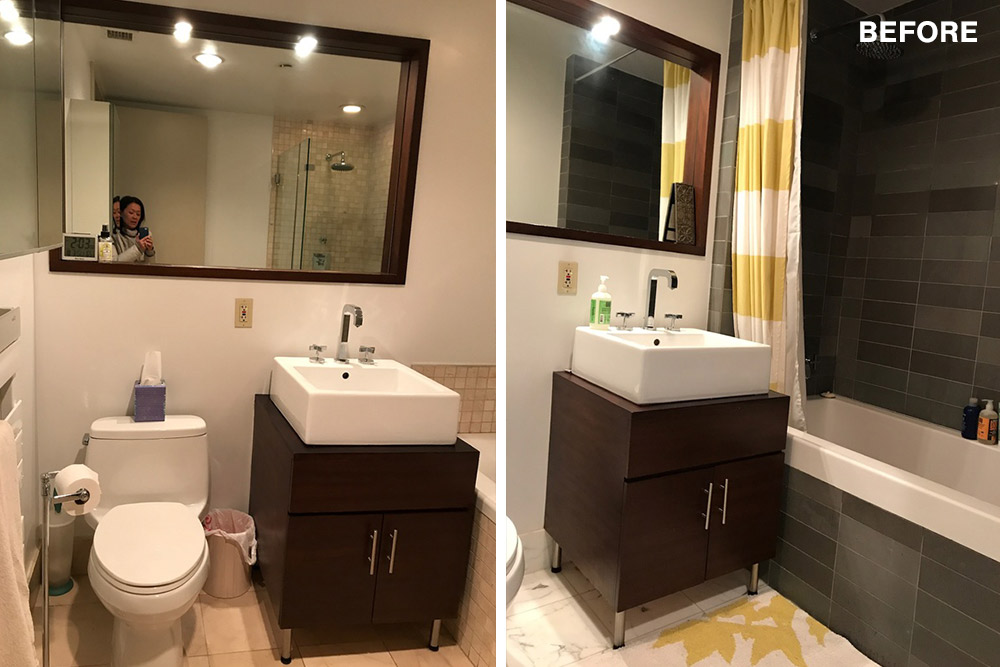
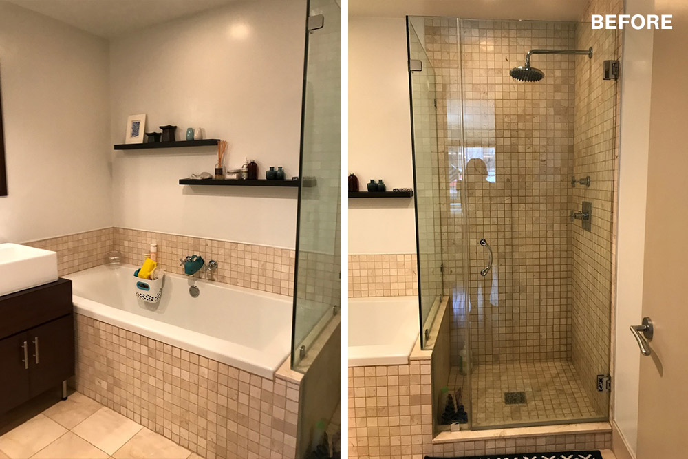
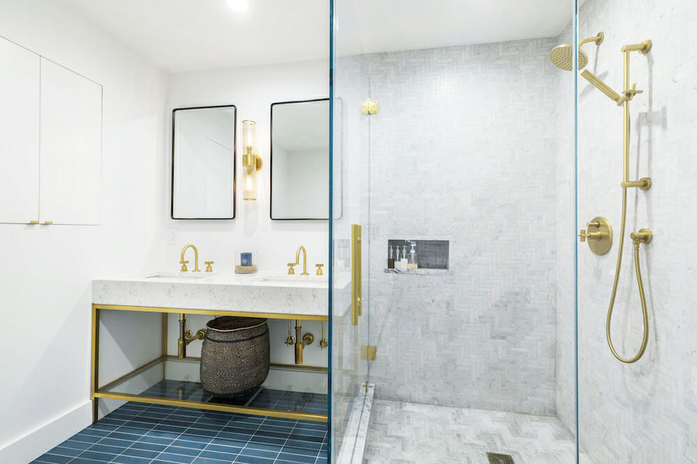
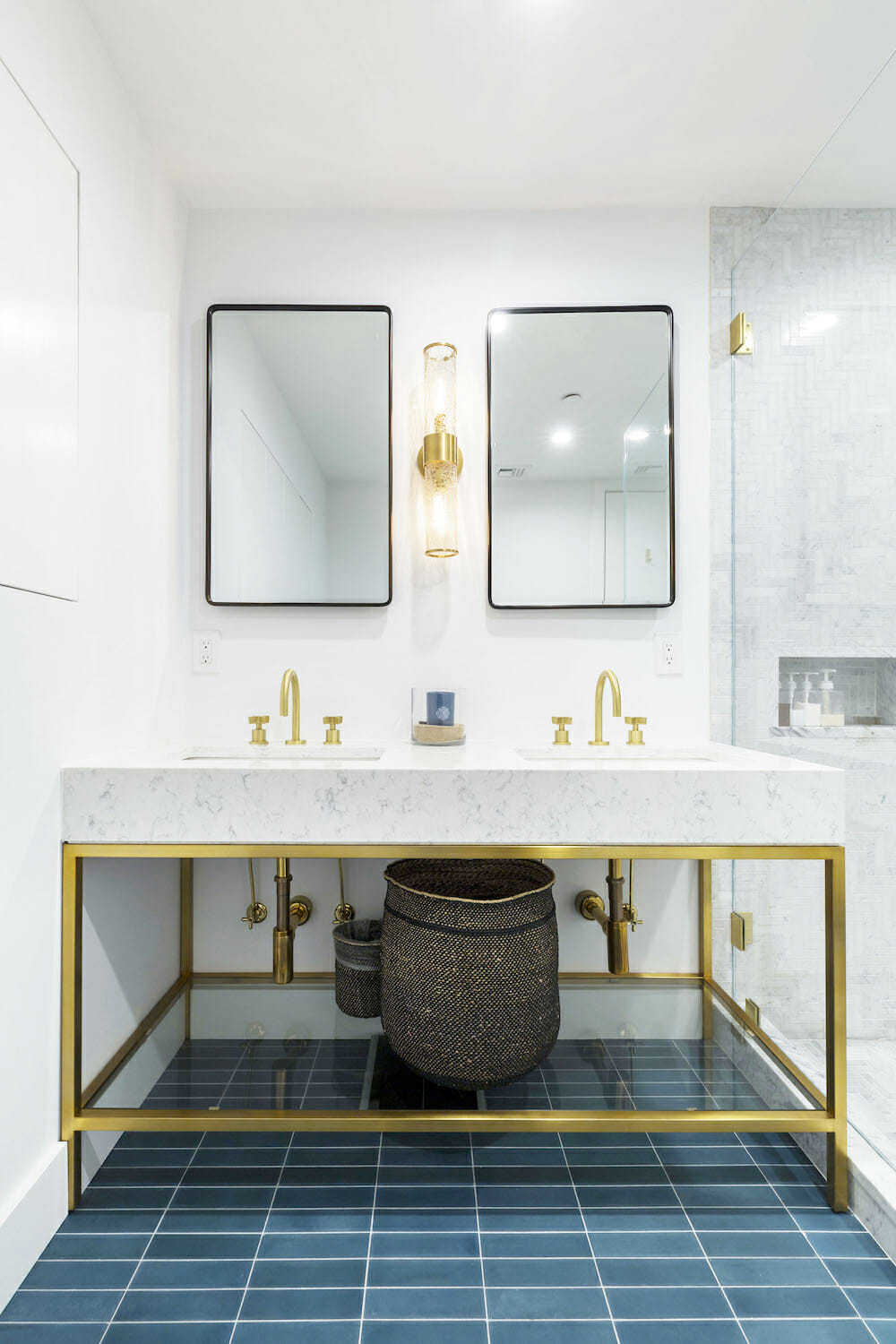
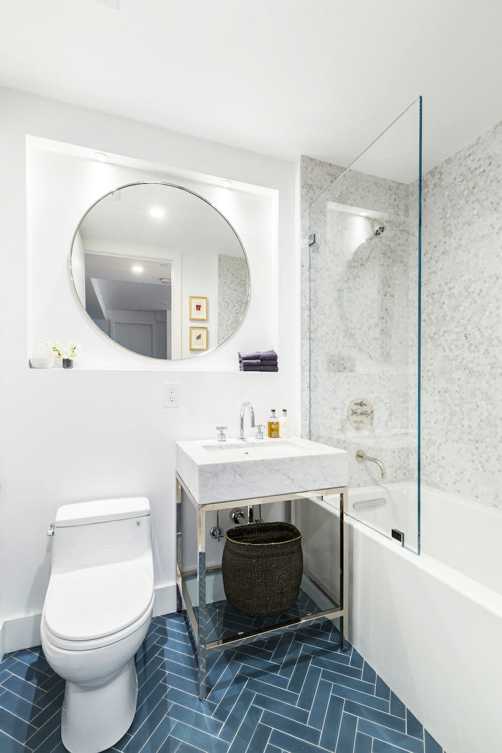
We found a great tile company and chose the same style for the floors in both bathrooms but installed in different patterns. Our big goal for the master bath was to add a double vanity—a tight squeeze and ultimately a feat, since we didn’t find a 60-inch-wide unit with storage that we both liked.
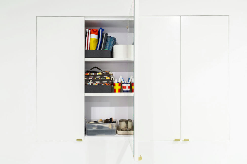
The vanity we chose has no cabinets, but luckily, during demolition, our contractors pointed out an extra 6-8″ in depth between the wall studs—space for hidden storage. The carpenter who’d created the bedroom paneling custom-made a four-door, concealed built-in.
The shower recesses and door saddles are cut from the same marble slab as the kitchen countertops.
During the renovation process
Throughout the renovation, our Sweeten general contractor proved critical in the job’s technical aspects. Their invaluable suggestions included creating a dropped ceiling to add recess lighting, hiding wires and cables, adding electrical sockets and USB plug-ins, and installing dimmers.
Our apartment was filled every day with a team of busy contractors and subcontractors, including painters, an electrician, a carpenter, and a plumber. It surprised us, but once the project was complete, we missed seeing and chatting with these talented guys.
Sweeten helped us find our renovation team and advised us on important points like timelines and communication strategies.
But a five-month renovation is survivable, even when in the end you are living out of a suitcase at a dear friend’s house. In the end, we were thrilled with our relaxed and beautiful apartment and proud of our role in making it.
Thank you, Jenifer and Mitzie, for sharing your home with us!
Planning to renovate? Get free estimates from us!
Get matched with our vetted general contractors and receive at least 3 quotations for free! You can also find endless home renovation inspiration, detailed guides, and practical cost breakdowns from our blogs.
Renovation Materials
Kitchen Resources
- Miralis cabinets in custom Hale Navy Blue: MCK+B.
- Dawson collection cabinet hardware: Rejuvenation.
- Carrera marble countertops: HG Stones.
- Zellige 4” square weathered white terracotta tile backsplash: Cle Tile.
- 22” stainless steel under-mount sink: Kraus.
- Brizo stainless steel single-handle pull-down faucet: Brizo.
- 30” Cristal stainless steel under-cabinet range hood: Faber.
- Liebherr 30″ refrigerator/ 2-drawer freezer combo: Liebherr.
- Fisher Paykel 24″ double dishwasher: Fisher Paykel.
- Bertazzoni 30″ stainless steel master range with 5 burners: Bertazzoni.
- Paint in Chantilly Lace #OC-65: Benjamin Moore.
Bathroom Resources
PRIMARY BATHROOM RESOURCES:
- Floor tile in solid cement federal blue rectangle tile and shower wall tile in Carrera marble 1” x 4” x 3/4” herringbone tiles (turned 90 degrees): Cle Tile.
- Baldwin satin black door handles: Baldwin.
- Hardware: 1 1/2” satin brass edge pulls and West slope collection shower fixtures: Rejuvenation.
- Hudson Collection 60” double washstand in Viatera minuet marble and aged brass finish: Restoration Hardware.
- Vintage medicine cabinets in antique bronze finish: Pottery Barn.
- One-piece Toto toilet in Cotton White: Toto.
- Liaison medium sconce in aged brass finish: Kelly Wearstler.
- Paint in Chantilly Lace #OC-65: Benjamin Moore.
GUEST BATHROOM RESOURCES:
- Floor tile in solid cement rectangle tiles and shower wall tile in Carrera marble penny tiles in Honed White: Cle Tile.
- Baldwin satin black door handles: Baldwin.
- Hex black metal towel bar: CB2.
- West Slope collection shower fixtures and sink faucet in polished nickel; 36″ round vanity mirror/medicine cabinet in polished nickel: Rejuvenation.
- Hudson Collection vanity in Carrera marble and polished nickel: Restoration Hardware.
- One-piece Toto toilet in Cotton White: Toto.
Bedroom Resources
- Ava brass wood and leather hard wired wall sconces: Lostine.
- Accent wall paint in Mozart Blue, #1664 and remaining walls in Chantilly Lace, #OC-65: Benjamin Moore.
- Hunter Douglas silhouette remote-controlled shades: M&A Design.
- Roar + Rabbit upholstered bed, jeweled drawer dresser, and nightstands: West Elm.
- Walk-in closet linen shelving and drawers with brushed chrome finish: California Closets.
- Rogue large oval mirror brass: CB2.
- 4-panel barn door and 6′ black sliding track hardware: Rejuvenation.
- Baldwin satin black door handles: Baldwin.
Living Room/Entryway Resources
- Deventier white oak floorboards throughout the apartment: PID Floors.
- Wall paint in Chantilly Lace, #OC-65: Benjamin Moore.
- Hunter Douglas silhouette remote-controlled shades: M&A Design.
- Roar + Rabbit rolling bar cart and layered rhombus drum: West Elm.
- Moderna velvet sofa: Restoration Hardware.
- Rhye wallpaper in hand foil: Custhom.
- Montara 28.5” mirror: Serena & Lily.
- Console: West Elm.
- Closet Dove shelves in brushed chrome finish: California Closets.
Office Resources
- Floor: Deventier white oak floorboards: PID Floors.
- Closets Dove shelves and brushed chrome finish: California Closets.
- Paint in Chantilly White, #OC-65: Benjamin Moore.
- Hunter Douglas silhouette remote-controlled shades: M&A Design.
- White matte Aspect Grow light: Soltec Solutions.
- Flatweave rug: Hawkins New York.
