An Upper West Side Co-op Reno Designed to Fit
Olivia and Greg take on a refresh with no time to spare
Olivia and Greg were expecting their first child when they began the remodel on their 1,300-square-foot co-op in a classic Upper West Side prewar building. Olivia, a journalist, and Greg, a lawyer, thought the neighborhood would be perfect for kids with its beautiful parks, play areas, and museums. The apartment had great details—large windows, plenty of light, built-in bookshelves, and nice moldings—but needed a serious refresh.
They posted their project on Sweeten, a free service matching homeowners with vetted contractors, and found the right contractor to create the contemporary look they were after. They wanted to update the kitchen and a bathroom—which later became both bathrooms—with new tiles and fixtures, plus enlarge the master bathroom. In the master bedroom, they needed a brand new built-in closet. But the pressure to finish before their baby’s birth added an extra layer of stress and it all came down to the wire.
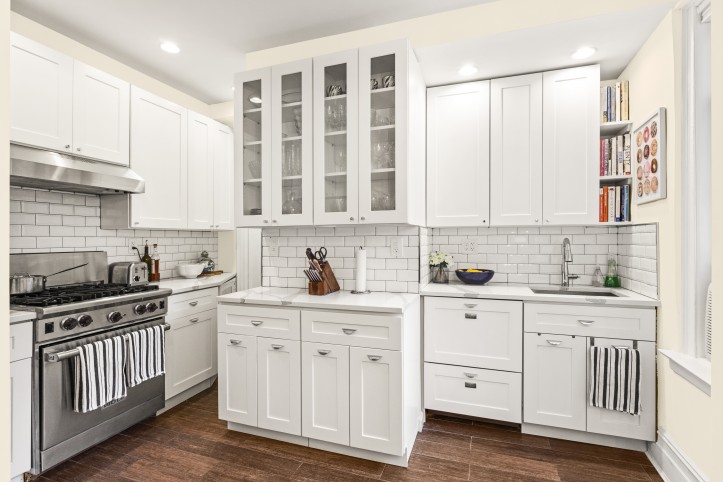
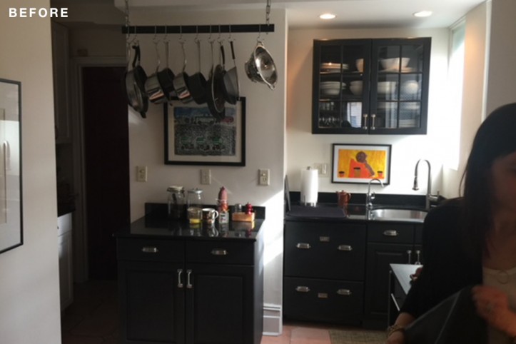
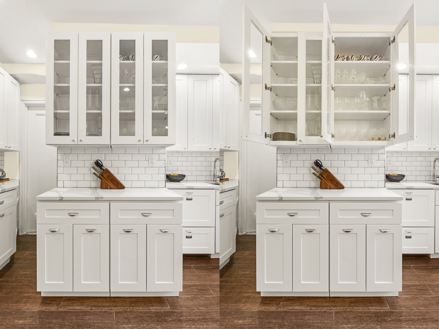
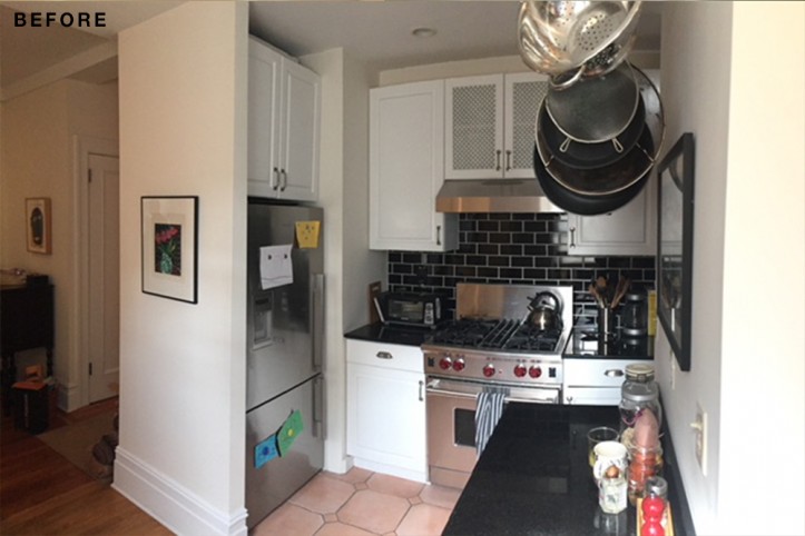
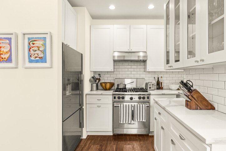
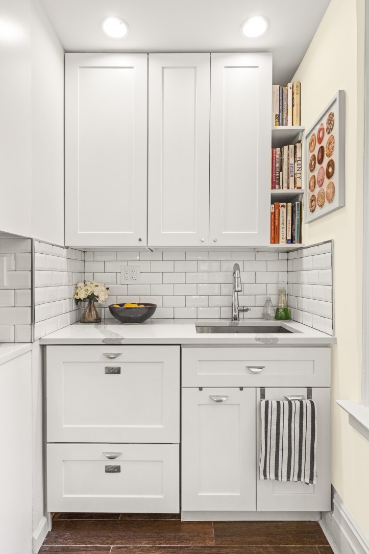
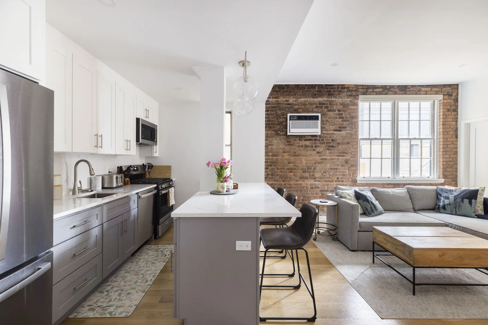
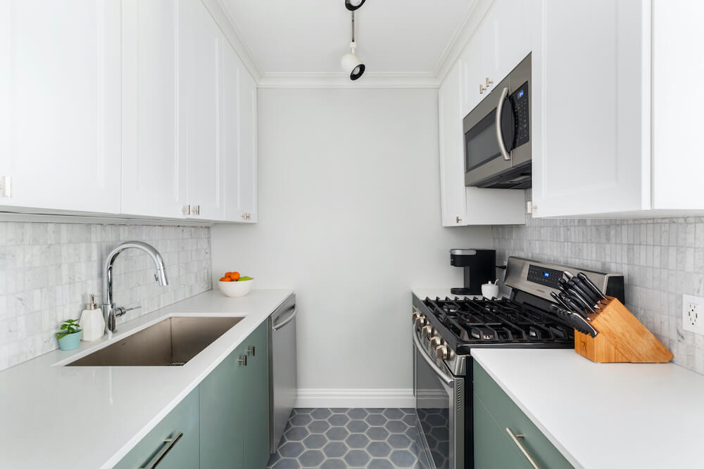
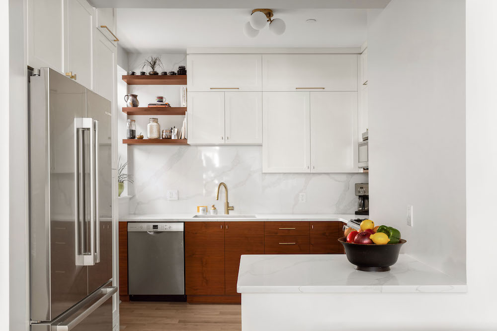
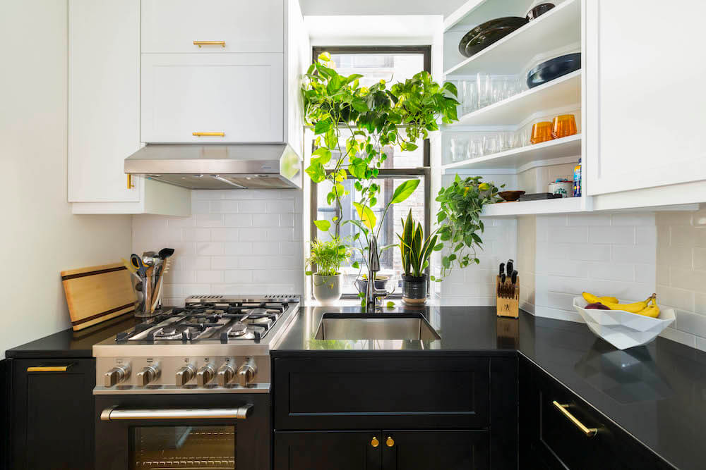
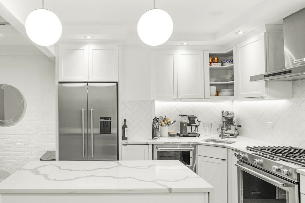
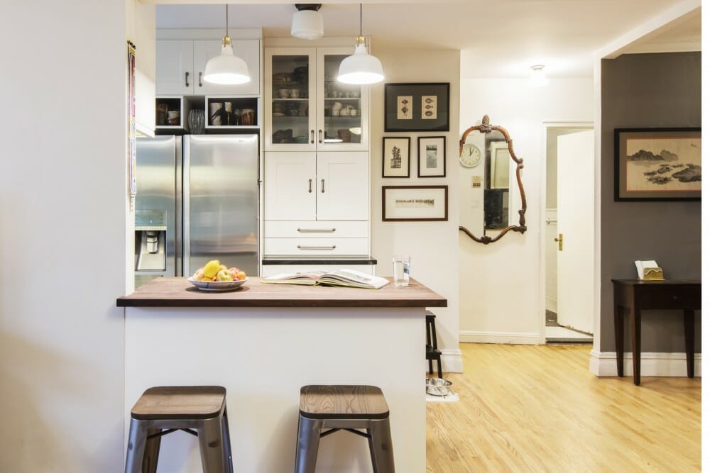
Their previous kitchen in the West Village was small and they were excited to trade up to the larger space in their new home. Pipes in the walls made it difficult to move anything, so to keep costs down, they kept the same footprint. The existing kitchen cabinets were a mismatched black-and-white assortment, and Olivia imagined her dream space as a modern, all-white kitchen. They decided to reface most of the cabinets, painting them white with new hardware. The cabinets above the sink didn’t correctly fit the space, so custom cabinetry was crafted for the uppers as well as the lower cabinetry in the midsection of the kitchen, where pots and pans used to hang. There, another piece was designed to fit the space better with more storage built above, featuring glass doors to display their wedding china and glassware.
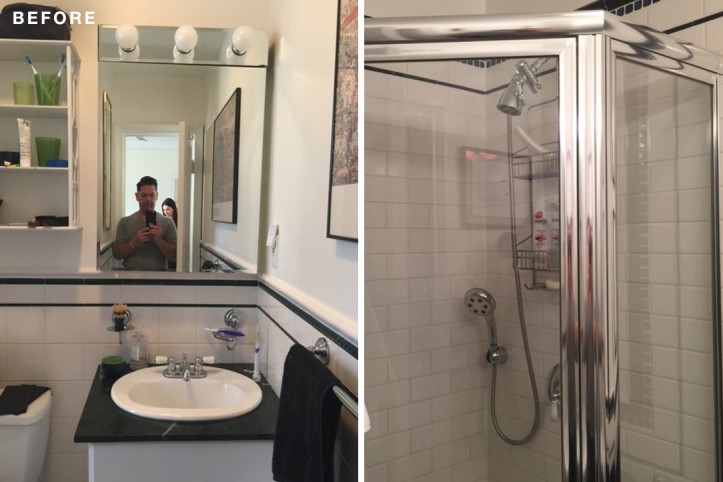
The shower was so tiny, Olivia said, By the middle of my pregnancy, I could barely fit in it!
Since the couple loves to cook and are big cookbook collectors, they created a nook to display some of their favorites. They kept the appliances, which were brand new. For the floors, porcelain tile resembling dark wood that was more durable and stain-resistant replaced the old red tile. “Definitely a plus with a new baby,” Olivia said. Now, the wood look matched the rest of the apartment.
(Above) Before of the master bathroom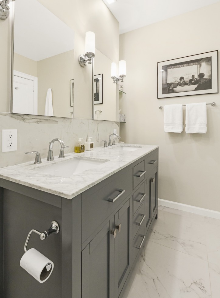
Both bathrooms were outdated. In the master bath, the shower was so tiny, Olivia said, “By the middle of my pregnancy, I could barely fit in it!” The fixtures were old and the shower floor was plastic rather than tile. They really wanted a larger, more luxurious master bath and their dream was to have double vanities. To achieve this, they took space from an existing hallway and a closet in the master bedroom.
Sweeten brings homeowners an exceptional renovation experience by personally matching trusted general contractors to your project, while offering expert guidance and support—at no cost to you. Renovate expertly with Sweeten
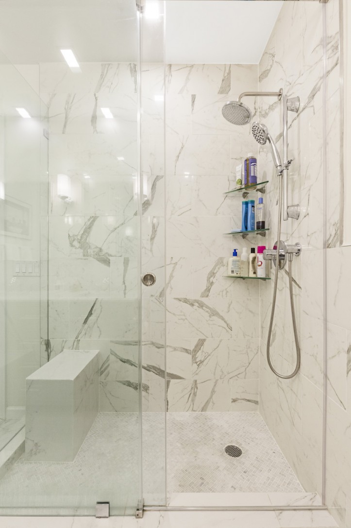
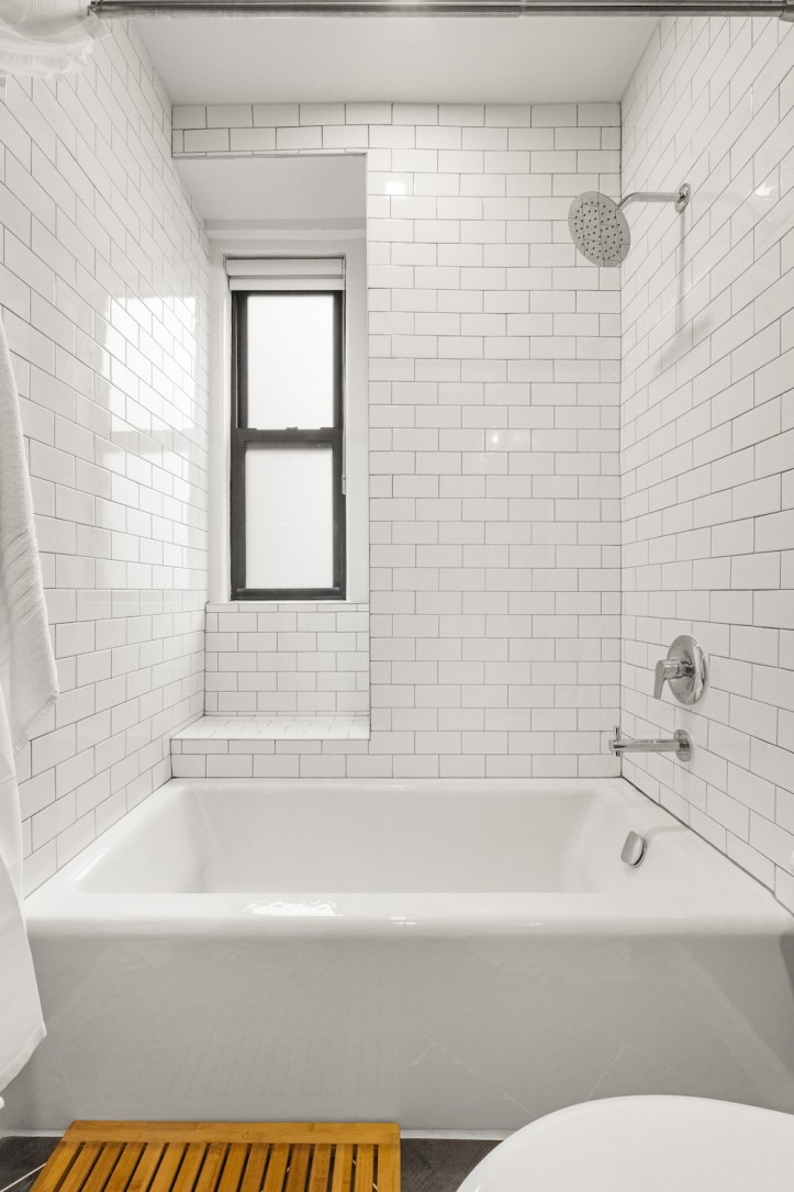
Their Sweeten contractor was able to design a seat in the shower to look like it was floating, sizing it just right so it wouldn’t take up too much space. “We wanted something that looked good but was also functional so that I could shave my legs and relax during a hot shower,” Olivia said.
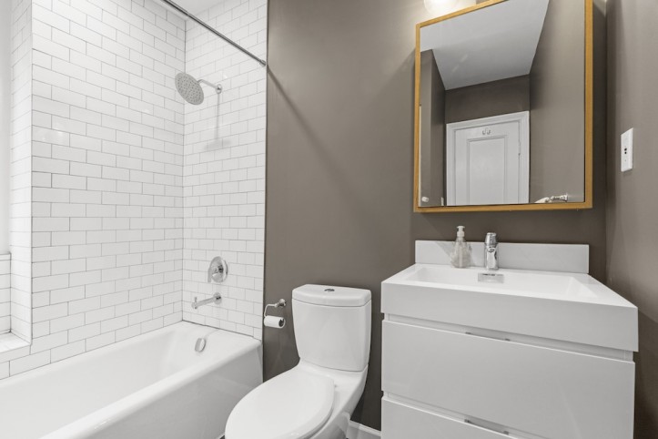
They ended up adding the guest bathroom about two months into the project—it was not in the original budget. “I ended up convincing Greg that if we didn’t update it now, it would never get done, especially with the baby coming when we would be very preoccupied,” Olivia said. “Our contractor was able to work with us to get it done in a cost-effective and timely manner.”
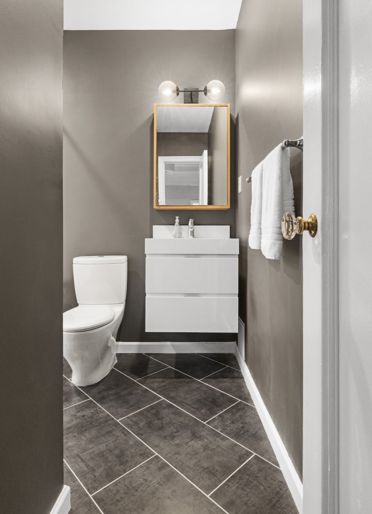
The walls were painted dark gray in stark contrast to the bright white vanity and shower subway tiles. Olivia was inspired by the restaurant Union Fare in Union Square and wanted to replicate the style. “The contractor initially thought we were crazy,” she said, “but he ended up liking it.”
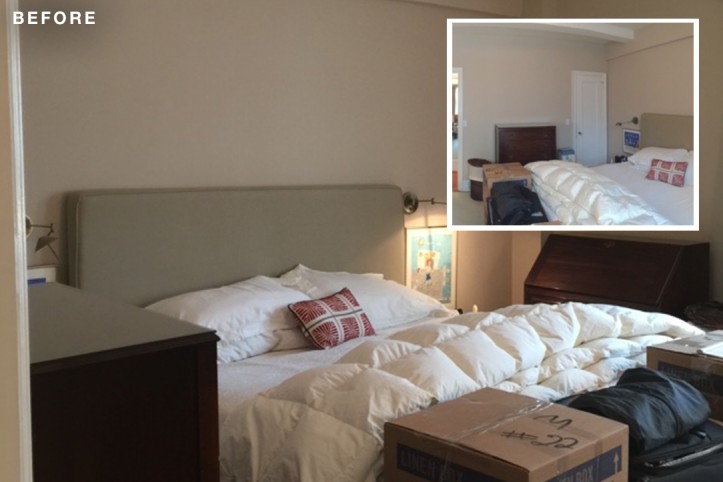
(Above, inset) Before of the master bedroom closet wall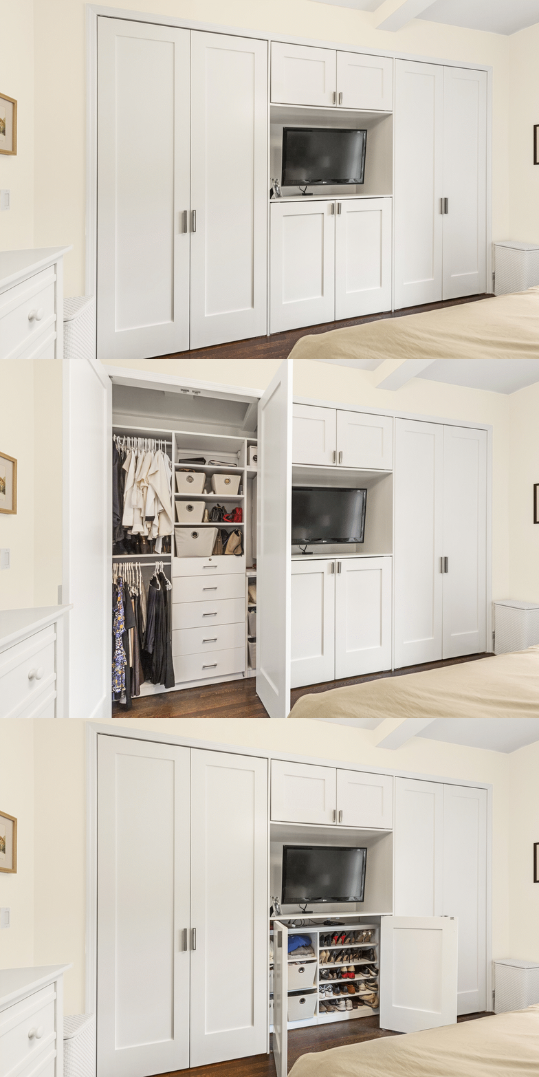
To replace the lost closet in the master bedroom, their contractor created an envy-inducing new unit from California Closets. He was meticulous in his measuring to make sure that they could still have a king-sized bed, two nightstands, and closet doors that wouldn’t open up into the bed.
Designwise, they wanted adequate space for the two of them to hang clothes and for well-spaced shelving to fit items like sweaters. “I’m also pretty short,” Olivia said, “so we had to make sure that the hanging bar was low enough that I could still access my dresses and sweaters. The closets are amazing and really feel like a huge luxury.”
As if remodeling isn’t stressful enough, the pressure to stay on schedule was ever present. They moved out during the renovation. “We had tools and dust littering the baby’s nursery just two weeks before Olivia’s due date, which definitely made us all nervous,” Greg said. Luckily, their Sweeten contractor was extremely responsive to them any time of day. “As first-time homeowners, we had a million questions, and he couldn’t have been nicer and more professional to deal with,” Olivia said. “He also has an incredible eye for design, so we didn’t need to hire an outside designer to help us make decisions for items like the backsplash or tiles.” They shared their Pinterest boards and their contractor pulled materials matching their inspiration.
Even as newbies, though, the couple had faith in the process. They learned to be patient and to check up on the work as often as they could to get in front of any problems. They discovered that “renovating can be addicting! Once you start, you’ll begin to realize all the imperfections in your home which could add on tens of thousands of dollars to your project,” said Olivia. “But don’t get distracted. Stick with the original plan; you can always renovate again at another point.” In the end, it all worked out. The renovations were done in early December and Max was born the day after Christmas.
Thank you, Olivia and Greg, for sharing your home with us!
KITCHEN RESOURCES: Kitchen: Cabinet hardware: Richelieu. Sink/Faucet: Vigo. Stove: Wolf. Fisher & Paykel dishwasher and refrigerator: Designer Appliances.
MASTER BATHROOM RESOURCES: Shower temperature knob: Grohe. Showerhead: Delta. Toilet: Toto. Sconce lighting: Pottery Barn. White Dove paint color: Benjamin Moore.
GUEST BATHROOM: Toilet: Toto. 251 First lighting above medicine cabinet: Bellacor. Coachman’s Cape (walls) and Simply White (trim and ceiling) paint: Benjamin Moore.
MASTER BEDROOM: Cabinet closets: California Closets.
—
This couple in Morningside Heights added side-by-side built-in wardrobes to their master bedroom.
Refer your renovating friends to Sweeten and you’ll both receive a $250 Visa gift card when they sign a contract with a Sweeten general contractor.
Sweeten handpicks the best general contractors to match each project’s location, budget, and scope, helping until project completion. Follow the blog for renovation ideas and inspiration and when you’re ready to renovate, start your renovation on Sweeten.
