A Bland Apartment Reveals Surprise Gems
What did Miguel do when he moved into a boring white box he called home? He took creative control—the apartment, too had unexpected design finds!
After living in the gritty and creative city of Berlin for several years, Miguel, a native New Yorker who works in the music industry, decided to move home. He searched for about nine months for an apartment with character, but in the end, settled for a one-bedroom in a 1950s co-op that he described as bland, cookie cutter, and a white box. At least the location was good—by the water in Cobble Hill. He posted his profile and turned to a Sweeten contractor banking on transforming the 700-square-foot apartment—this is his third renovation—into a unique home with custom closets. What he didn’t bet on was uncovering beautiful details the apartment had all along.
Sweeten: Did you renovate your apartment soon after the purchase or were you living in the space for a while?
Miguel: I had it for about nine months. I lived on a mattress on the floor because I just moved back from ten years in Berlin, so I was really starting from scratch. Part of living in the apartment beforehand was to figure out what to do with it. You need to live in the space so you can see how it is going to function in different seasons.
Sweeten: Where is the apartment and when was it built?
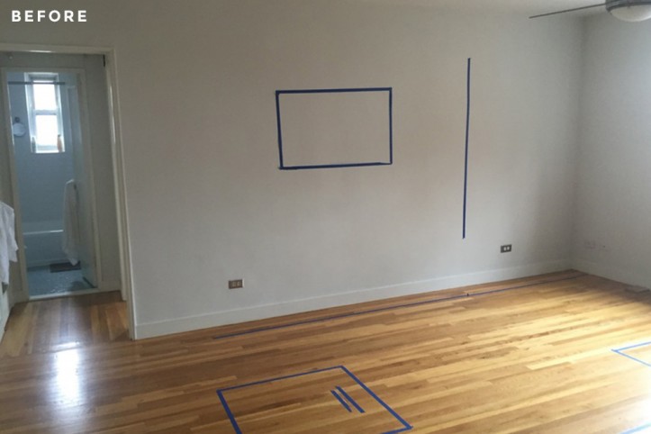
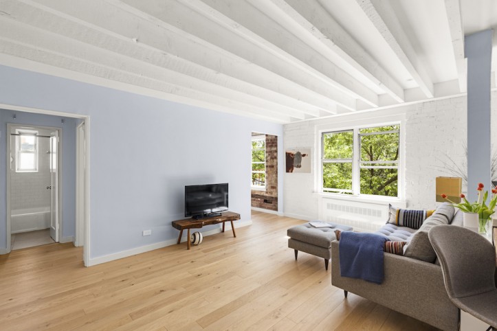
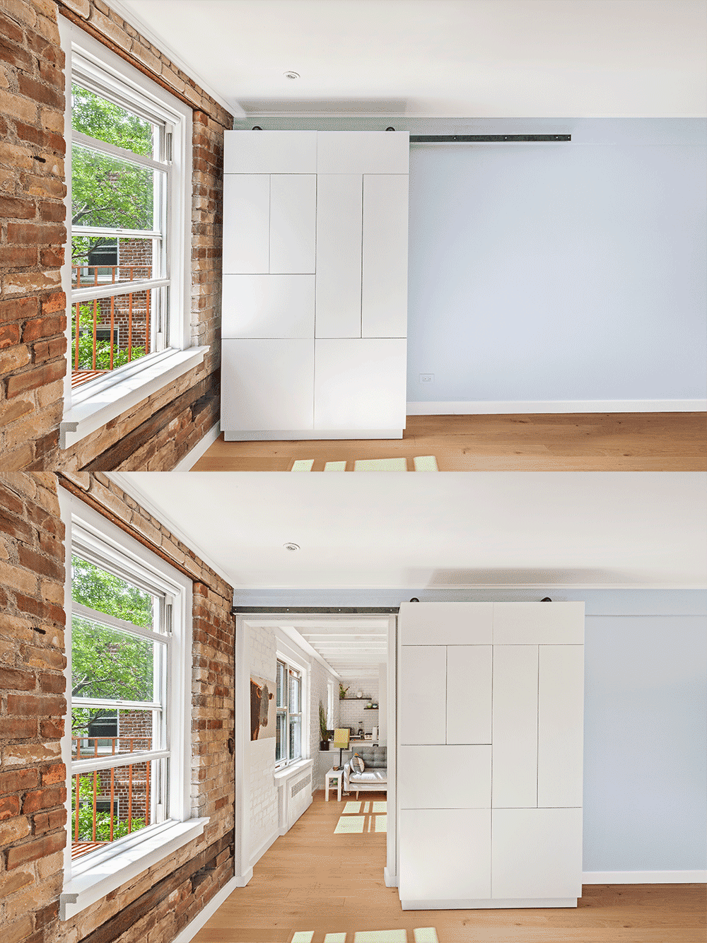
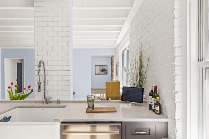
Miguel: It is by the water in Cobble Hill. The neighborhood is tree-lined and historically protected. The apartment is about 700 square feet and in a 1950s co-op. It looked like a cardboard box. It had absolutely no character, so one of the hardest things was to incorporate character. It was boxy with a kitchen, living room, and bedroom with no flow between the rooms. I opened up another part of the wall between the living room and bedroom, like a doorway, and now light from the bedroom window can spill out.
Sweeten: Did you know about the ceiling beams and exposed brick wall before you started the renovation?
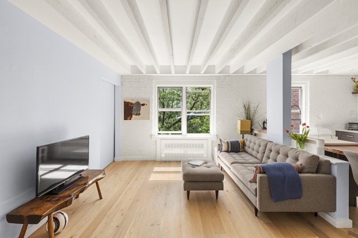
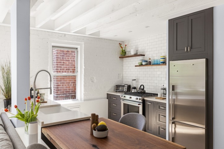
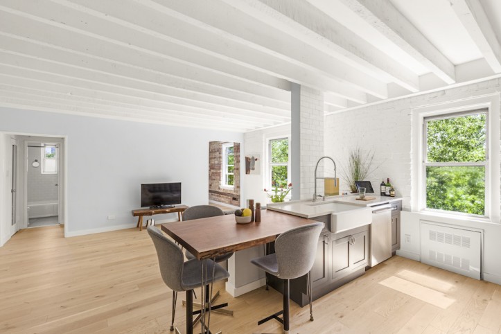
Miguel: They were not planned at all. My contractor was fixing some electrical stuff and we found this beautiful brick wall behind there and then we found the beams. The beams and the brick walls were a game-changer.
Sweeten: How did you incorporate them into the renovation?
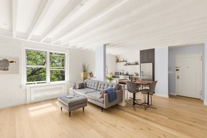
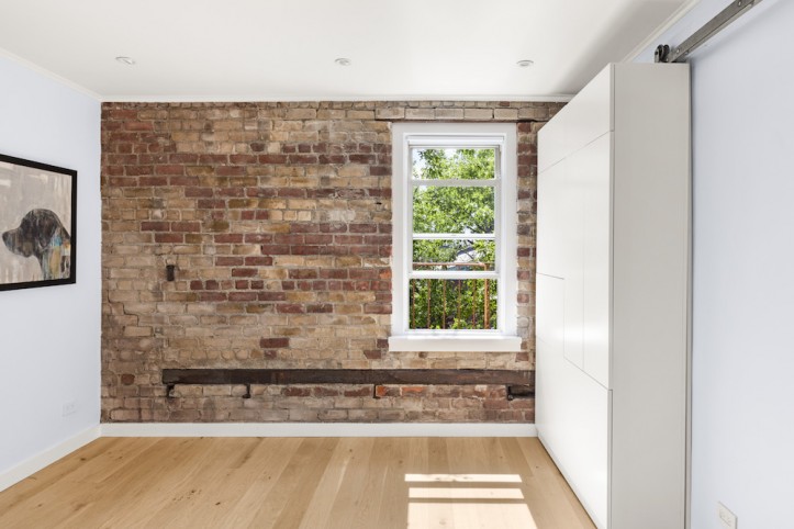
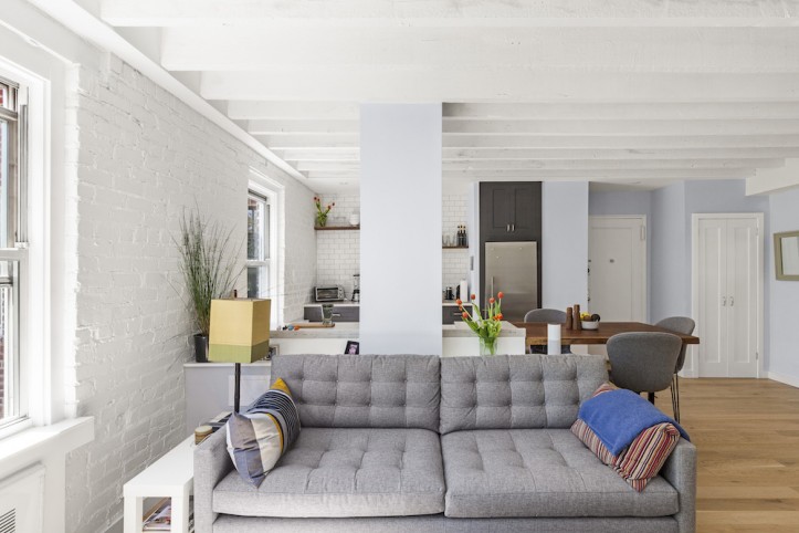
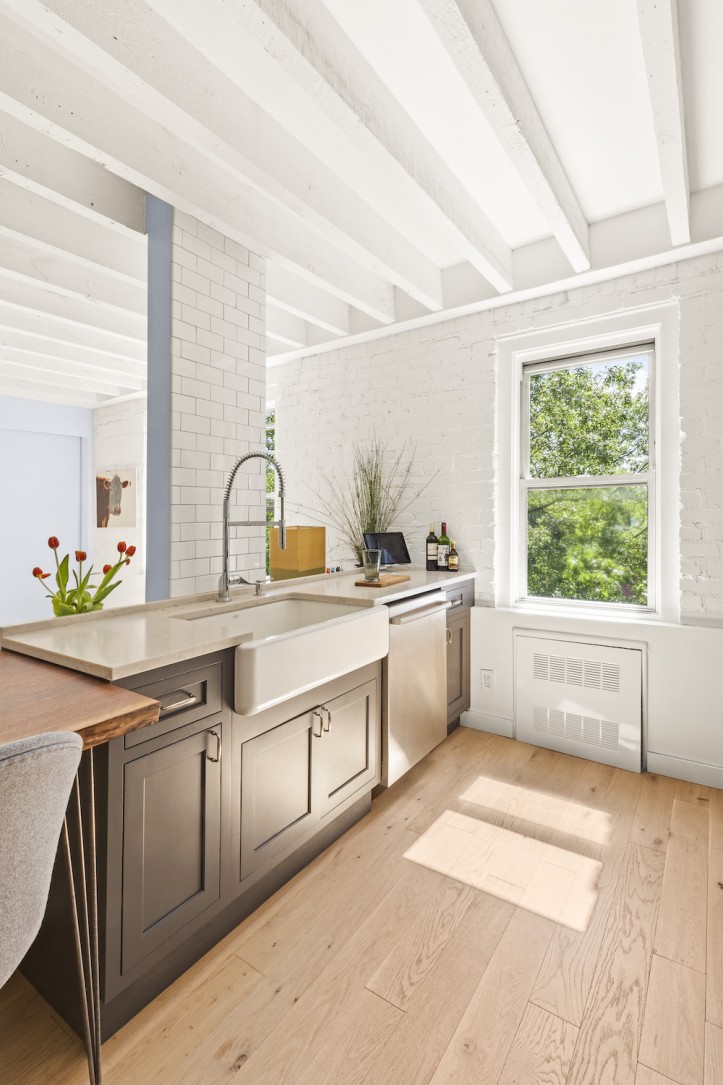
Miguel: The brick wall in the living room was not so pretty so I painted it all white, but left the bedroom original. In this way, the texture continues from the living room to the bedroom in two different colors. The ceilings were not very high so I wanted to paint the beams. There was a lot of discussion with my Sweeten contractor about that. He didn’t want me to paint the beams, but we did in the end. It comes down to a personal taste thing. Sweeten brings homeowners an exceptional renovation experience by personally matching trusted general contractors to your project, while offering expert guidance and support—at no cost to you. Renovate expertly with Sweeten
Sweeten: What did you do with the floors?
Miguel: The floors were the original thin pine floorboards, but there was almost nothing underneath so they creaked. We put in a layer of soundproofing with an engineered wood floor on top. The heat gets pretty hot here in NYC and wood expands and contracts which engineered wood handles better than solid wood.
Sweeten: Was there anything else you did to add character?
Miguel: We added crown molding. The walls were literally just sheet rock and the window. Adding crown molding made the windows look bigger and gave them texture. Now, it is almost like a picture frame.
Sweeten: What did you do about storage?
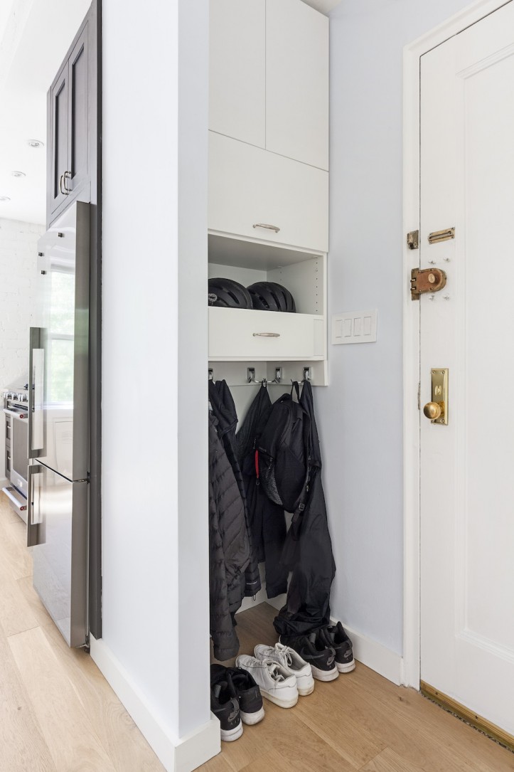
Miguel: I got rid of a wall of storage closets as you walk in. I made up for it by building two small, custom closets on either side of the entrance. This also created a small “entryway” which was missing, but I still needed more storage.
Around the same time, I had also wanted a door for the new opening between the bedroom and living room. I thought about a glass door, but that didn’t feel right. I contacted a local millworker in Brooklyn and asked if a wardrobe could be put on rollers. They said the railings that it would roll on needed to be tight against the wall to stop it from toppling. It is kinda amazing. You never know if it is going to work out right, but it worked out perfectly. So now I have a way to close off the room AND a place to store my clothes and shoes.
Sweeten: The kitchen counter has a nice mix of materials. How did that come about?
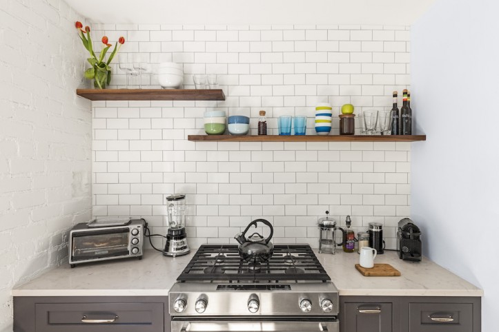
Miguel: Another challenge was trying to find a dining table. I didn’t have room for one, but I had room for a kitchen counter. I decided to make a table out of a slab of walnut with hairpin steel legs as an extension of the counter. When guests come over, I can move it anywhere in the apartment as a standalone table. It also adds a nice segue to the living room. Above the other counter and range, I decided to keep open shelving. It makes the kitchen feel big as opposed to having a wall of cabinets.
Sweeten: How did your Sweeten help you?
Miguel: My contractor was really smooth. I loved that he was fair. There are always going to be mistakes on the contractor’s end and on mine. I changed my mind a bunch of times—sometimes things in my head didn’t translate into reality. He was really patient with me and open to my crazy ideas.
RESOURCES: Wood floor: Madera Trade. Paint: Benjamin Moore in Gray Cloud and Super White. Kitchen cabinets: StarMark Cabinetry. Cabinet hardware: Restoration Hardware. Countertops: Pental Quartz. Backsplash: Nemo Tiles. Dishwasher: Bosch. Stove: KitchenAid. Fridge: Fisher & Paykel. Custom sliding closet: Wishbone Woodworking. Custom dining table: Reco Brooklyn.
—
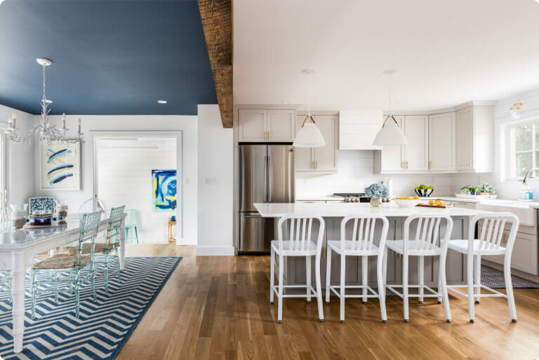
A large kitchen island with an extended countertop provides the perfect combo of prep space and dining table in Katharine and John’s renovation.
Sweeten handpicks the best general contractors to match each project’s location, budget, and scope, helping until project completion. Follow the blog for renovation ideas and inspiration and when you’re ready to renovate, start your renovation on Sweeten.
