How Computer Code Turned Up a Diamond in the Rough
A couple creates their dream home with walnut wood floors, a spa bath, and enough kitchen storage to turn heads
A year-long search—involving a specially-written code!—led Jonathan, a consultant, and Cecilia, a social media strategist and beauty blogger, to a mid-century co-op apartment in Queens. The unit was in a serious state of disrepair, with cracked doors and windows and a dangerously unstable kitchen countertop.
Read about how the couple changed the floor plan, turned a powder room into a full spa bath, and created a space to suit their lifestyle.
Prior to moving in together, Jonathan and his girlfriend, Cecilia, were each living in Manhattan on the Lower East Side. The criteria for their search? He wanted a large space and a fixer upper with a good school district; she wanted the convenience of a supermarket, shops, and a subway stop close by.
Their budget had them looking in Windsor Terrace, Forest Hills, Sunnyside, and Hamilton Heights, in addition to Elmhurst. For their search, Jonathan used his background in quantitative finance to adapt code that he had written to find his first apartment in 2008, which scoured the major real estate websites for properties that fit their fairly strict criteria and price range.
The code took into account various factors, such as home value increase over time, new developments, transit efficiency, growth in commercial investments, and the neighborhood’s increasing value over five-plus years. When this apartment came up—roughly a year after they started searching—it was way under budget, and the couple pounced on the opportunity.
The space was located in a very convenient neighborhood in Elmhurst, with shops and necessities nearby and just a 25-minute subway ride from midtown. They purchased the 1960s-era apartment with the intention to renovate.
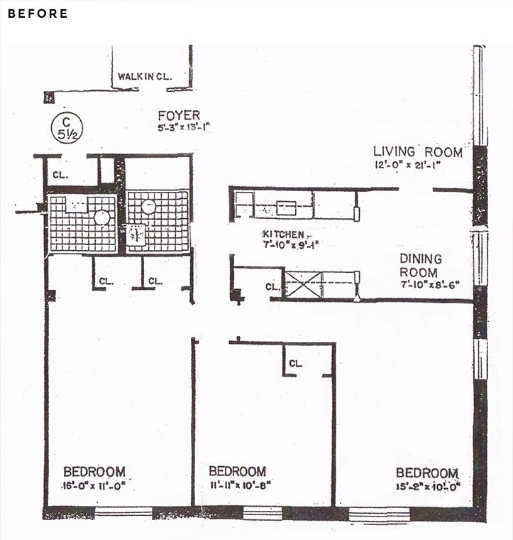
The reasonable price meant there was enough left over to splurge on the renovations, so they planned to add their own personal touch with high-end finishes. At roughly 1,300 square feet, the 3-bed, 1.5-bath co-op was more space than they expected to find, and the layout allowed them to implement some drastic changes to make the space more usable.
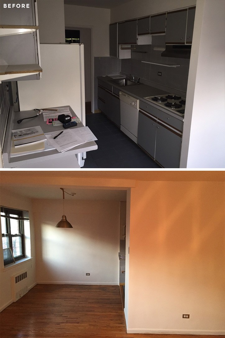
Jonathan and Cecilia could see that the apartment had good bones. Despite the positives, it was extremely outdated and many things—such as the cabinets, heaters, windows, and doors—were falling apart. The kitchen counter would teeter if you placed any weight on it, and would even come off its foundation if you pressed down.
The previous owners had done unpermitted renovations in the past, and the apartment had not been well taken care of. The original layout had long narrow halls, closets in weird places, a closed kitchen, and cramped rooms.
Initially, Jonathan looked for contractors on his own, until an architect friend told him about Sweeten. He posted his project and wrote up his description. He said, “I received a lot of quick responses—more than me going out on my own, and the bids were much more competitive than any from my own research.
The Sweeten contractor that I went with was a one-stop shop for everything. He had an architect, a designer, and a project manager—they pretty much did all the heavy lifting. They were super responsive and took care of a lot of the issues that arose throughout the process. Knowing that they have been vetted through Sweeten definitely gave me peace of mind.”
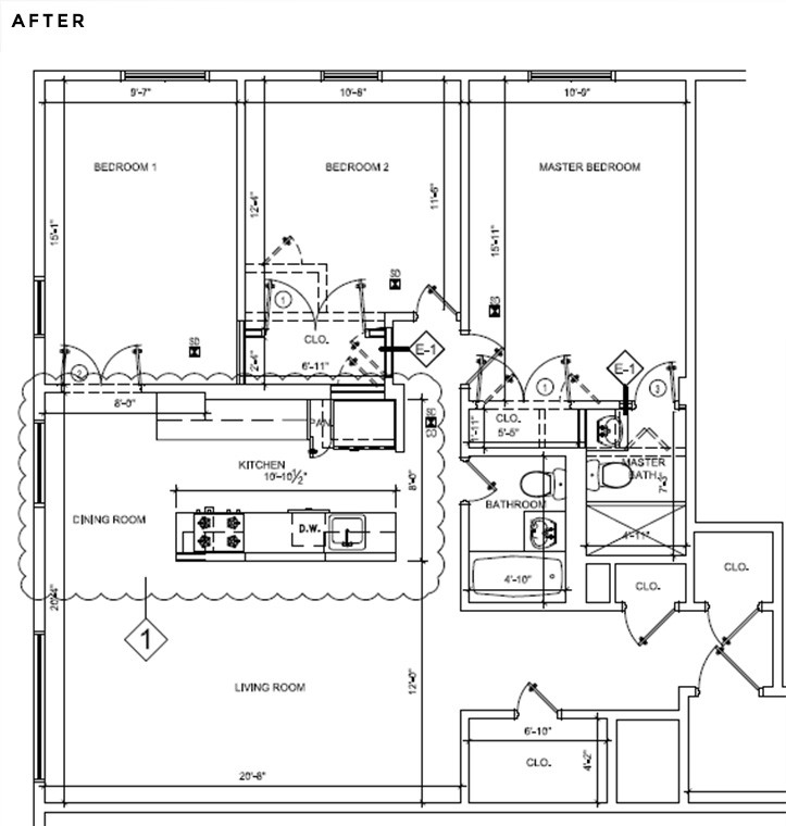
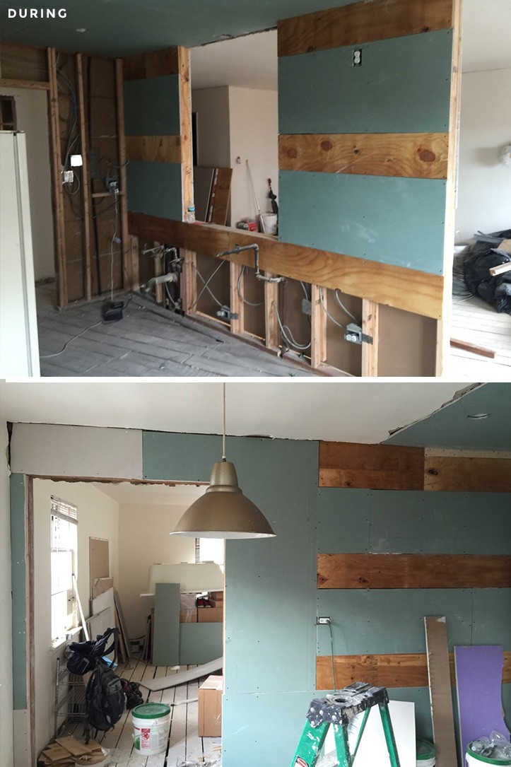
Jonathan and his Sweeten contractor set out to solve problems related to space usability and efficiency, and to make the apartment feel more open and modern. They decided that if a wall could be knocked down, they would do it. They turned hallways into closets and closets into open spaces.
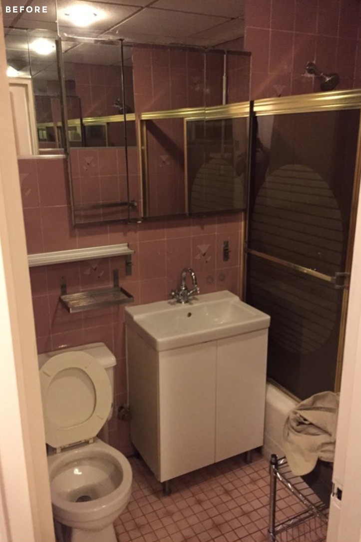
They also wanted to convert the half bath into a second full bath—Cecilia already claimed the first one, so Jonathan needed one of his own!
Given their preference for clean lines with modern touches, they did not want too much in terms of the built-ins and crown molding. “The kitchen was the part of the renovation we were most excited about.
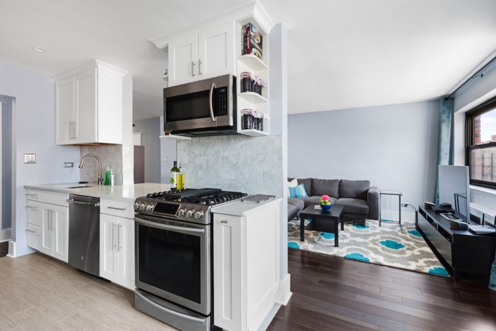
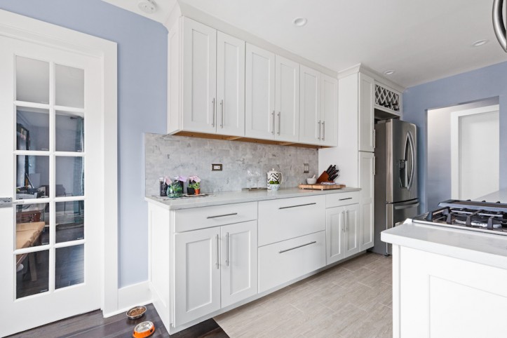
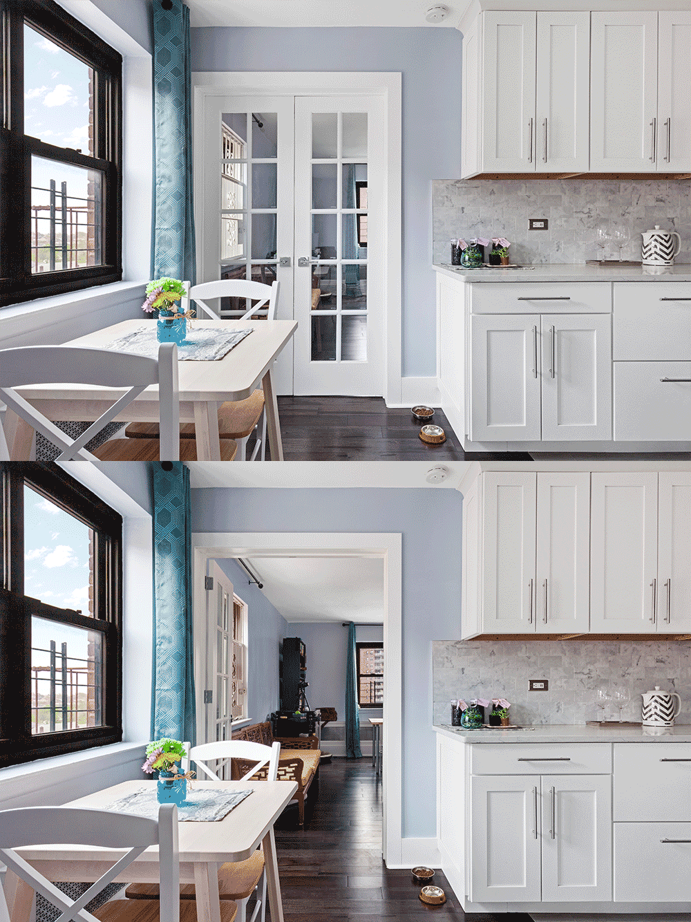
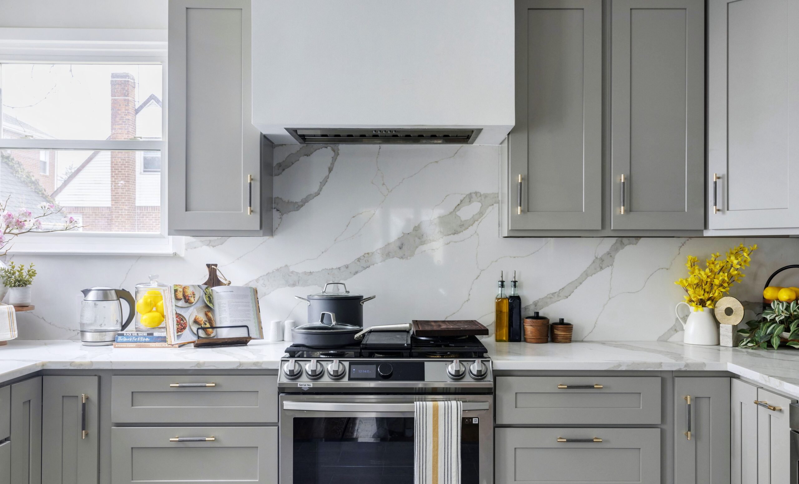
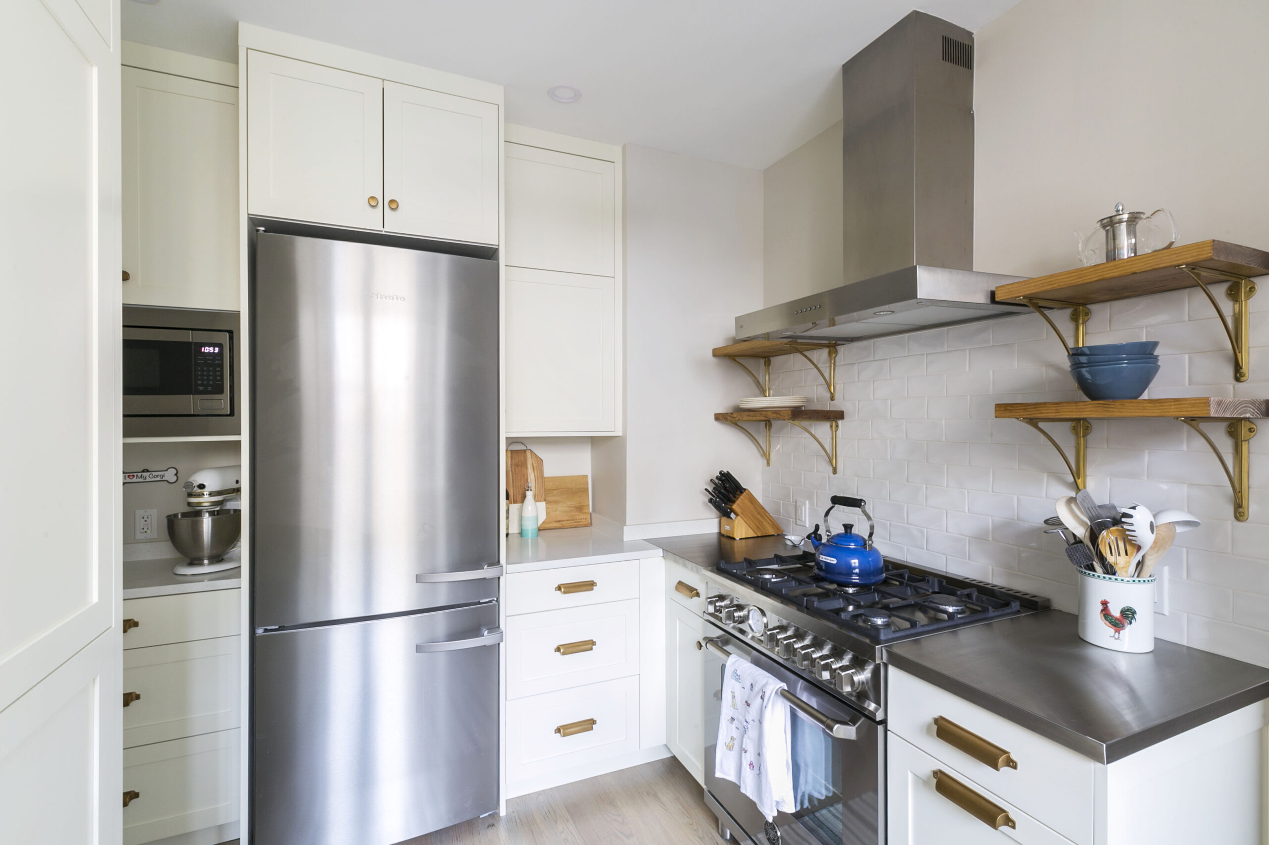
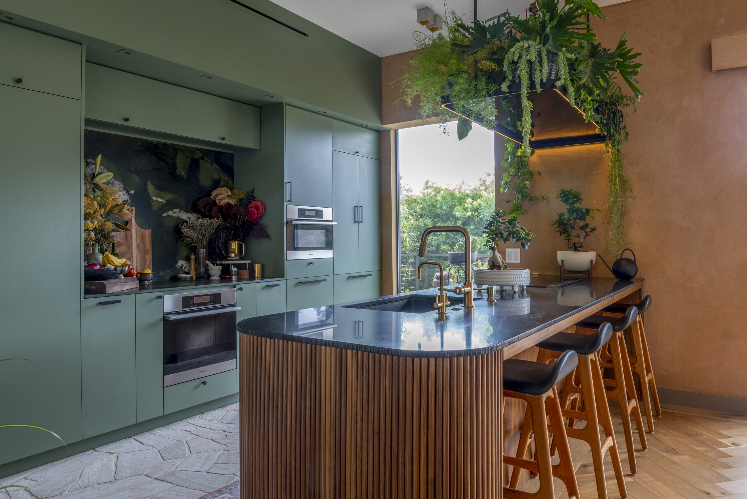
Because Cecilia loves to cook and I like to entertain, we wanted people to naturally gather around the kitchen for good food, good drinks, and good times,” says Jonathan. With dark furniture in the rest of the apartment, they went for white shaker cabinets, gray-white texture on the backsplash and white counters with a bit of speckling for an overall contrasting look. Appliances were stainless steel and marble was installed wherever possible. Sweeten brings homeowners an exceptional renovation experience by personally matching trusted general contractors to your project, while offering expert guidance and support—at no cost to you. Renovate expertly with Sweeten
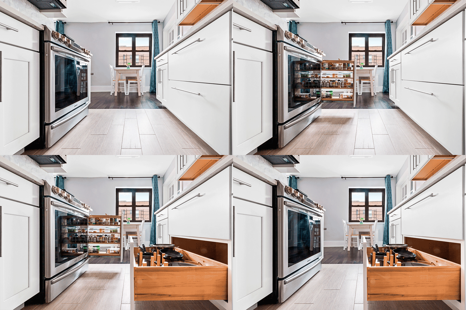
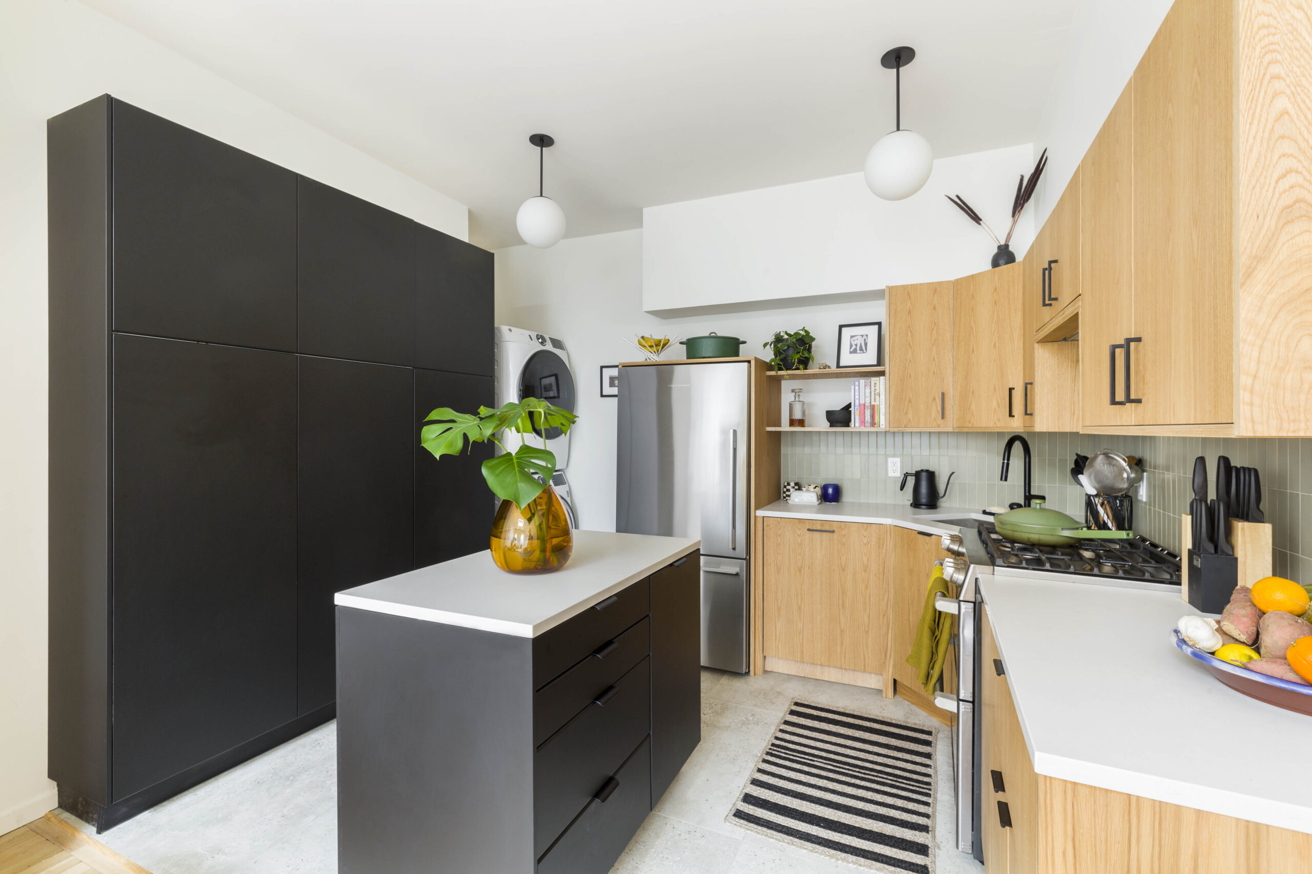
An incredible amount of storage and counter space was added, with every inch of space maximized.
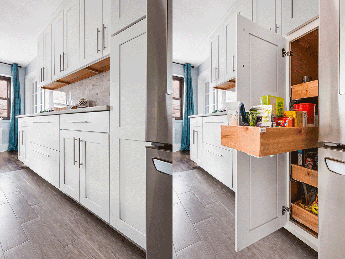
A pull-out spice rack and deep drawers were among the storage solutions they chose. “Having those large drawers for pots and pans with the ability to customize the holders was a must. A floor-to-ceiling pantry with pull-out drawers made our snacking life that much easier.
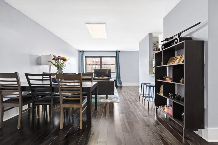
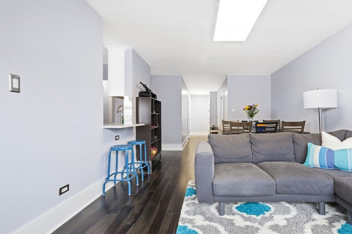
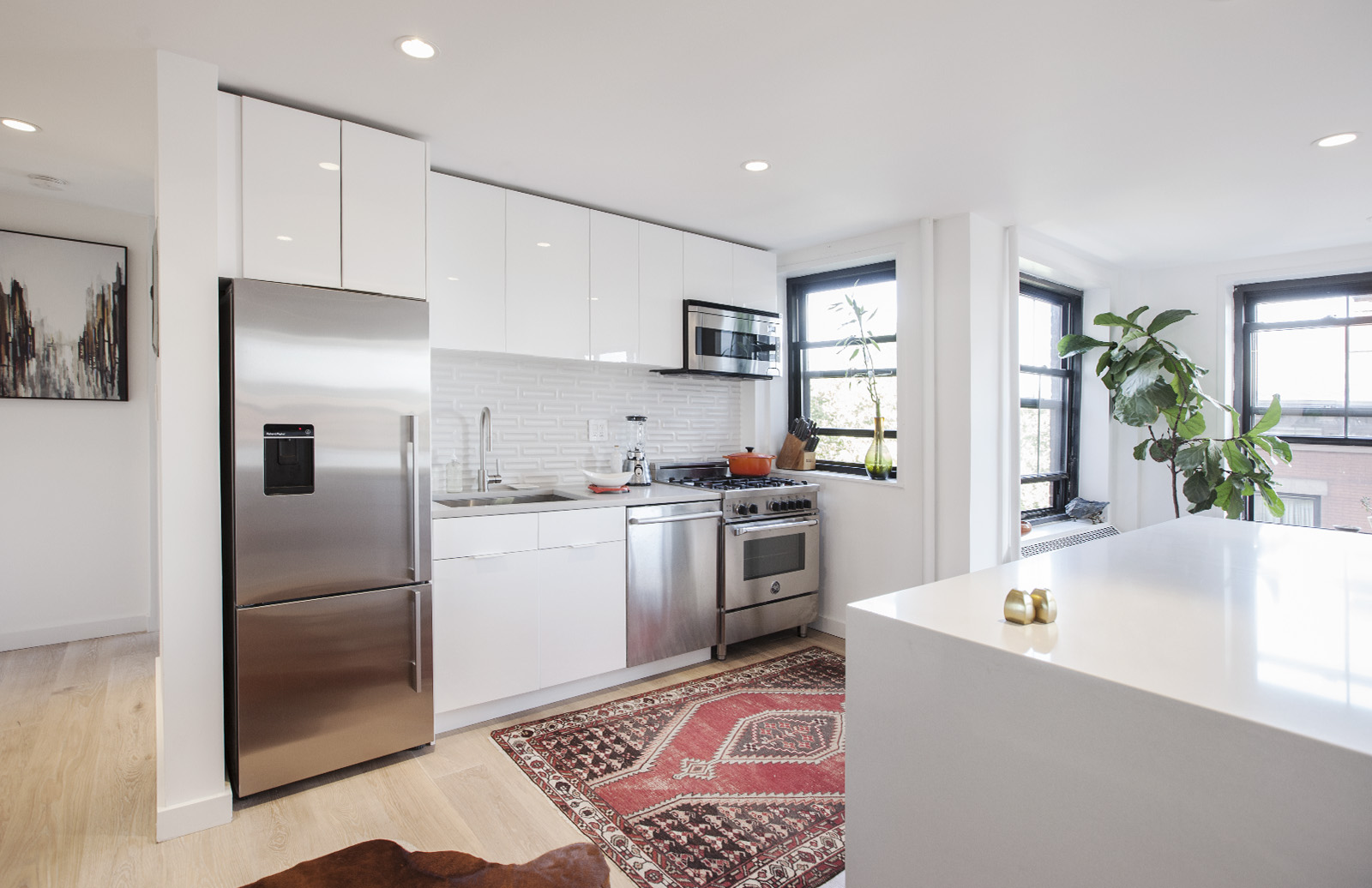
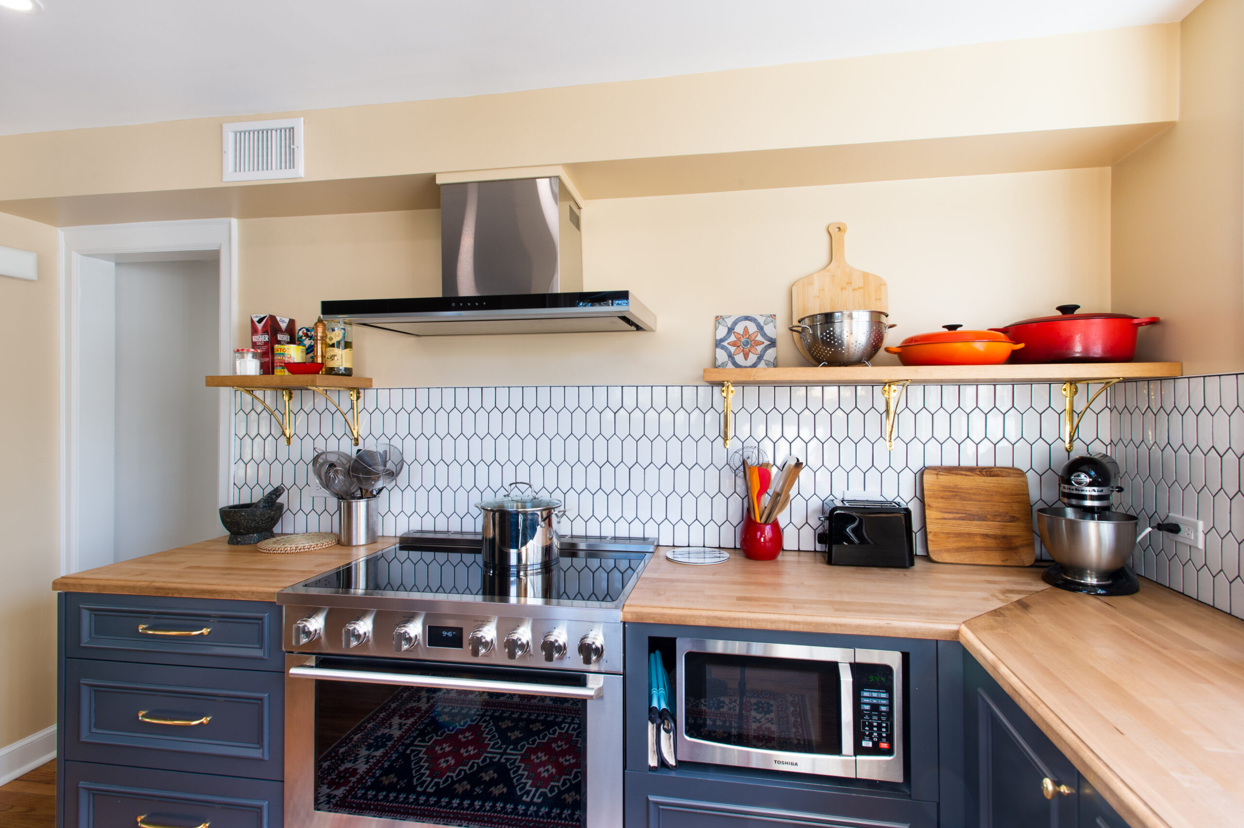
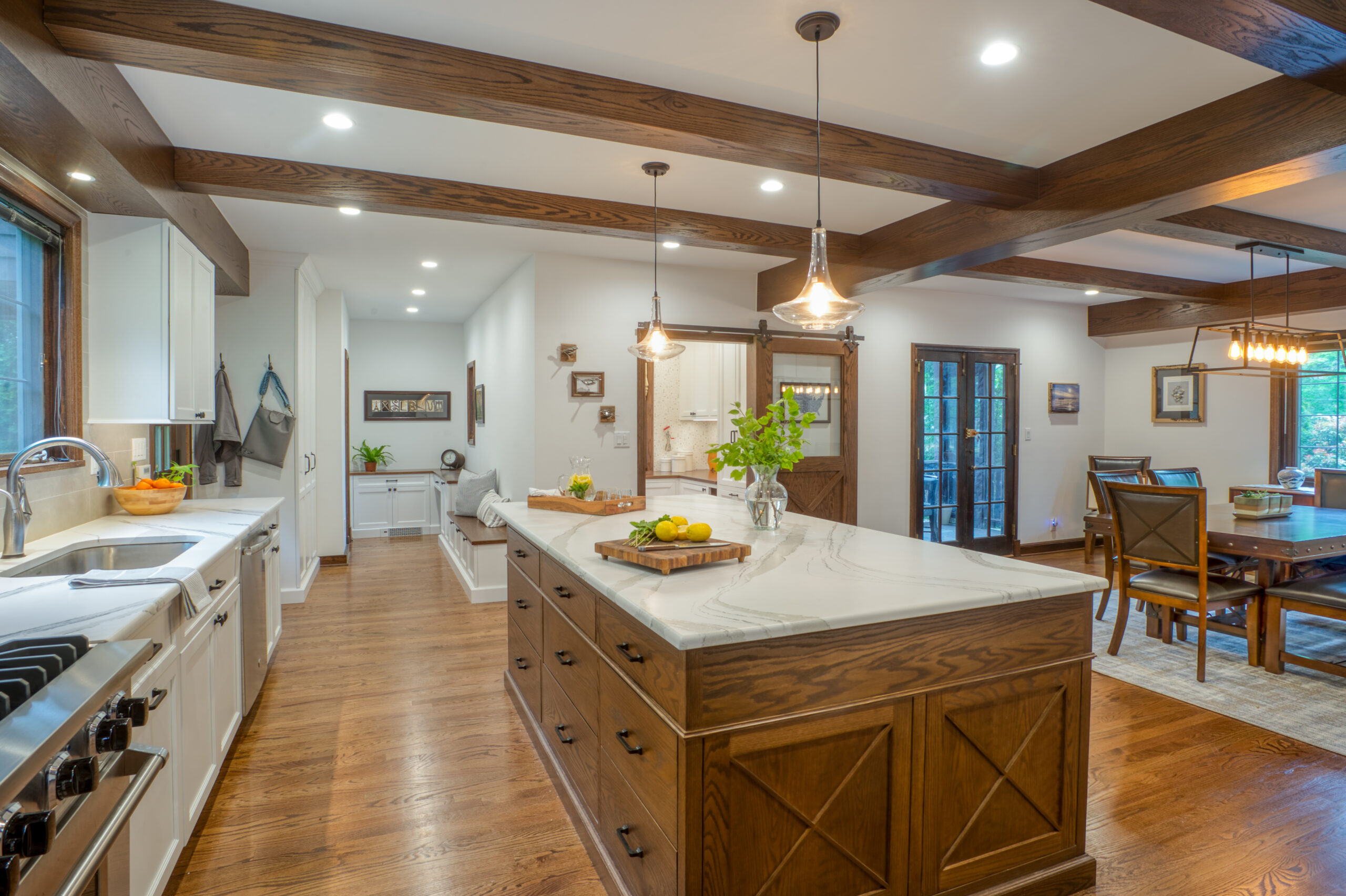
We decided on open shelving in select areas to make the kitchen feel more open. A pass-through was also created, so a spot on the living room side was used for counter seating. We wanted large appliances to really be the wow factor in our kitchen. I love our five-burner stove—especially the griddle!—and our massive fridge and great dishwasher.
Having this generously proportioned kitchen and large-scale appliances has been amazing, especially compared to our previous apartments,” explains Jonathan.
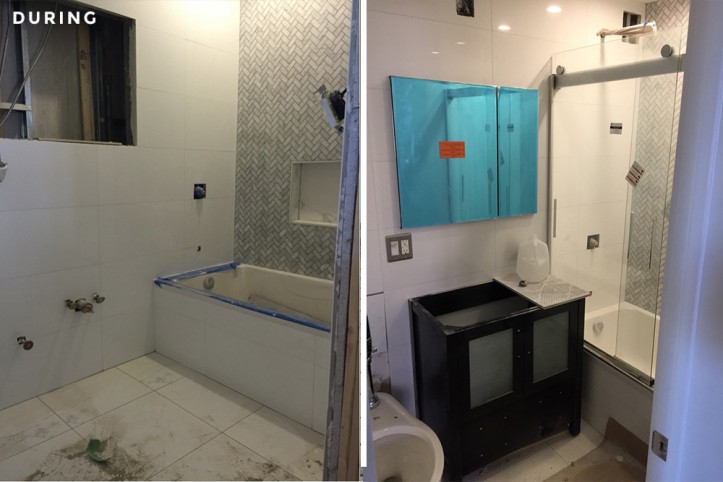
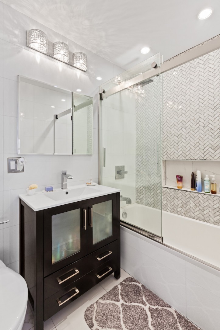
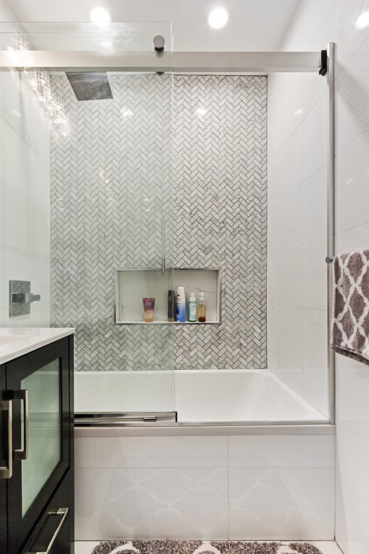
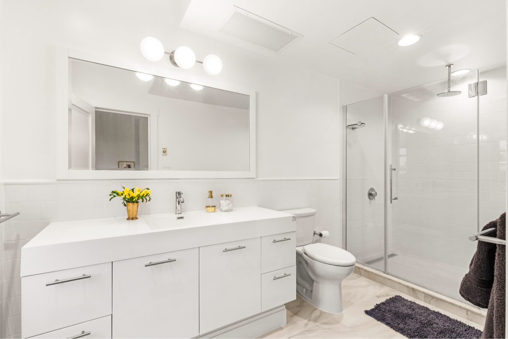
In the original full bath—Cecilia’s bathroom—they went with a white theme. She wanted it to be bright and classy, so they chose glossy white marble tile for the floors and large-format porcelain tile for the walls, with an accent wall of marble 2-inch subway tile laid in a herringbone pattern.
This gave the space more texture and made it feel more custom. They also added a niche for toiletries and bath products.
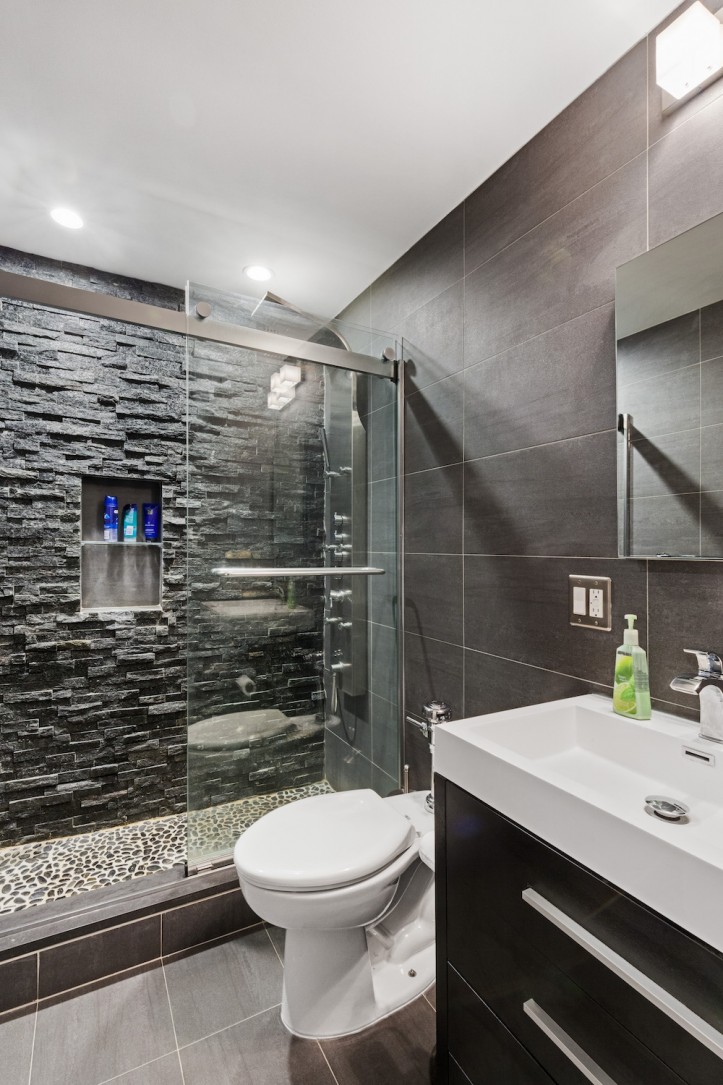
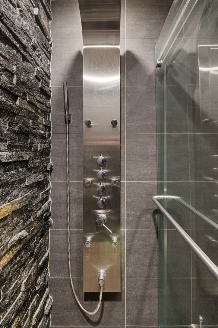
In the second bath, Jonathan added a large shower by taking some space from the master bedroom closet. “Since it was my bathroom, I had full reign and wanted it to resemble a spa.” The Sweeten contractor added slate tiles throughout, as well as a pebbled shower floor and a large shower panel with rainfall and waterfall features. In both baths, they installed tankless toilets per co-op requirements.
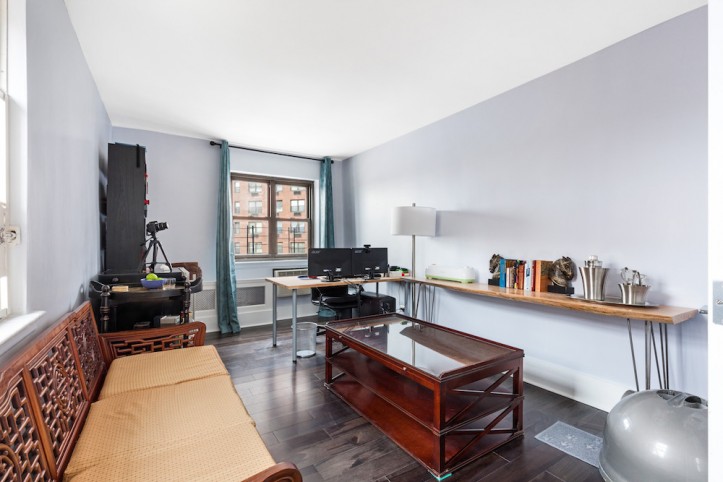
Throughout the apartment, they had originally planned on going with light bamboo flooring. When their Sweeten design/build firm sent over samples of both light and dark wood, however, they fell in love with a dark walnut flooring from Triangulo. For the office space, they decided on French doors to allow some openness between the living room and office, while providing privacy if needed when Jonathan worked from home in the evenings.
The biggest challenges of the project related to changes to their original design: “A lot of it was due to unforeseen circumstances,” Jonathan explains. “The original broker stretched the truth about where pipes were, what construction was done legally, what was underneath the floors, as well as what we would be permitted to do.
We originally had a plan that was going to be signed off, but once we contacted the live-in super, problems started to arise. We had to do two to three different drafts, which caused scheduling delays as well as caused friction with the co-op board and staff. The entire process took about two months just to get approval because of these issues. Eventually, we got everything set up, and once construction started, there were only a few slight hiccups. Everything went fairly smoothly.”
After finishing the renovation, Jonathan’s recommendation to future renovators is to be open and flexible with the initial vision. “Most people have an idea of how exactly they want things, and are unwilling to do something different or new. That’s good but rarely does your budget or space allow you to have everything that you want.
I originally wanted to remove some of our closets because I thought we had too many, but my girlfriend and designer suggested that we keep them for both value and utility. Having lived here for six months, I can safely say that I’m glad we kept the closets.”
Jonathan feared that the end product wouldn’t match up to his vision. He and Cecilia have very different design aesthetics, and he wasn’t sure if they would mesh well together. “In the end, I think the apartment has a good flow and calming color tones, which is something nice to come home to after a hectic day.
Another big question I had was whether we could actually do everything in the timeframe the contractors set out—about four to five months. It was an ambitious schedule, and while there were small items that needed to be addressed after we moved in, they were minor. In the end, we completed the project on deadline, and are very happy with how it turned out.”
Many thanks to Jonathan and Cecilia for sharing your great renovation story with us!
KITCHEN RESOURCES. Wood textured porcelain floor tile: Classic Tile. Custom hardwood cabinets: Waypoint. Quartz countertops: MS International. Carrara marble subway tile backsplash: Builder Depot. Kohler Simplice faucet: Build.com. Kohler Ticor sink: Faucet Direct. LG French Door refrigerator, #1000633969: Home Depot. Samsung 5-Burner Slide-in Stove with Griddle, #1000054140; GE Top Control dishwasher,#1001835490; Samsung microwave, #1000045147; Home Depot.
MASTER BATH RESOURCES: White marble floor tile: BuildDirect. White porcelain large wall tile: EFloors. Carrara marble herringbone accent wall tile: Mosaic Tile Direct. Delta Arzo rainfall shower: Home Depot. Architec 60″ soaking tub: Duravit. Kohler Levity sliding shower door: Home Depot. Tankless toilet: American Standard. Fresca Torino vanity: eFaucets. Faucet: Dowell. Hardware: Dyconn.
SECOND BATH RESOURCES. Slate rock floor tile: AllModern. Astro Silver Ledgestone (hydrophobic) wall tile: Tile + Stone Source International. Pebble tile shower floor: Pebble Tile Shop. Golden Vantage Pressure Balance Tower shower panel: Amazon. No-tank toilet: American Standard. Kohler Levity sliding shower door: Home Depot. Fresca Senza Vanity: Fresca. Hardware: Dyconn.
—
No matter the size of your apartment–even if it’s a good size with room to spare–an efficient layout makes all the difference. In Tim and Lindsay’s 1,500-square-foot apartment renovation, reconfiguring the layout was crucial to maximizing the usability of their space.
Sweeten handpicks the best general contractors to match each project’s location, budget, and scope, helping until project completion. Follow the blog for renovation ideas and inspiration and when you’re ready to renovate, start your renovation on Sweeten.

