Before & After: Lee’s Midtown East Kitchen and Bath Renovation — Sweetened!
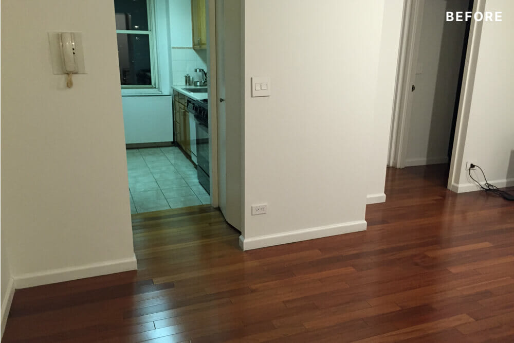
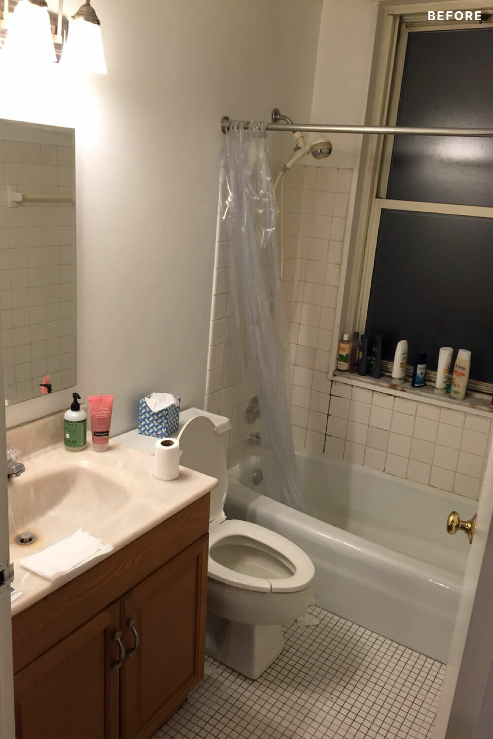
Here, we have one of those before and afters that is a bit hard to believe at first look. Lee Hoffman, the CEO and founder of the photo-sharing app Memoir, bought a 1+ bedroom, 1 bathroom co-op in Midtown East last year. The original kitchen and bathroom were beyond a little forlorn; the kitchen was hidden behind a walled entryway – more of a hallway than a room. This might have been initially helpful given its 1978 vintage, but not ideal in an apartment that depended on the kitchen window for extra light in the living room. And we can only assume that this bathroom had seen better days, right? Lee did months and months of research on ways to update the space and came to Sweeten to find a contractor who could give some serious attention to this unloved little kitchen and bath pair. We sent Sweeten Expert Evros to handle things, envisioning some nice new cabinets and tile – the usual works. We definitely did not see this whole new look coming!
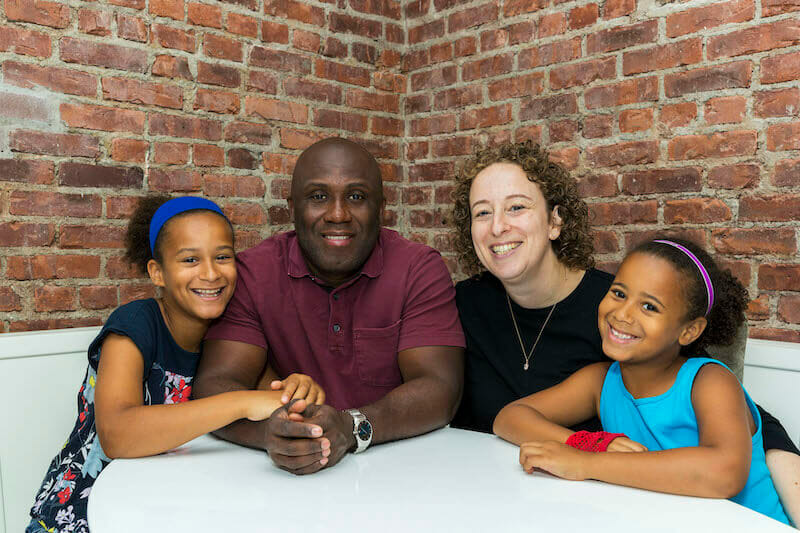
– Lee Hoffman, Manhattan homeowner
While there is more than enough to see in these “before” photos, Lee found himself up against one major, invisible force: the co-op’s previous tenant had been a smoker and the original stock finishes were covered in smoky residue. The kitchen was virtually sealed off from the living room, and its big window was partially blocked by cabinetry and a fridge that had been wedged into the galley. Lee knew he could swap in new cabinets and appliances, but when he learned that the dividing wall was non-load-bearing, he began to picture taking down the wall to let light into the living room from two directions. He put together a lengthy list of big and small updates (wall demolition all the way down to soft-close cabinets) and took the same approach to bring light and modern appeal to the crumbling bathroom.
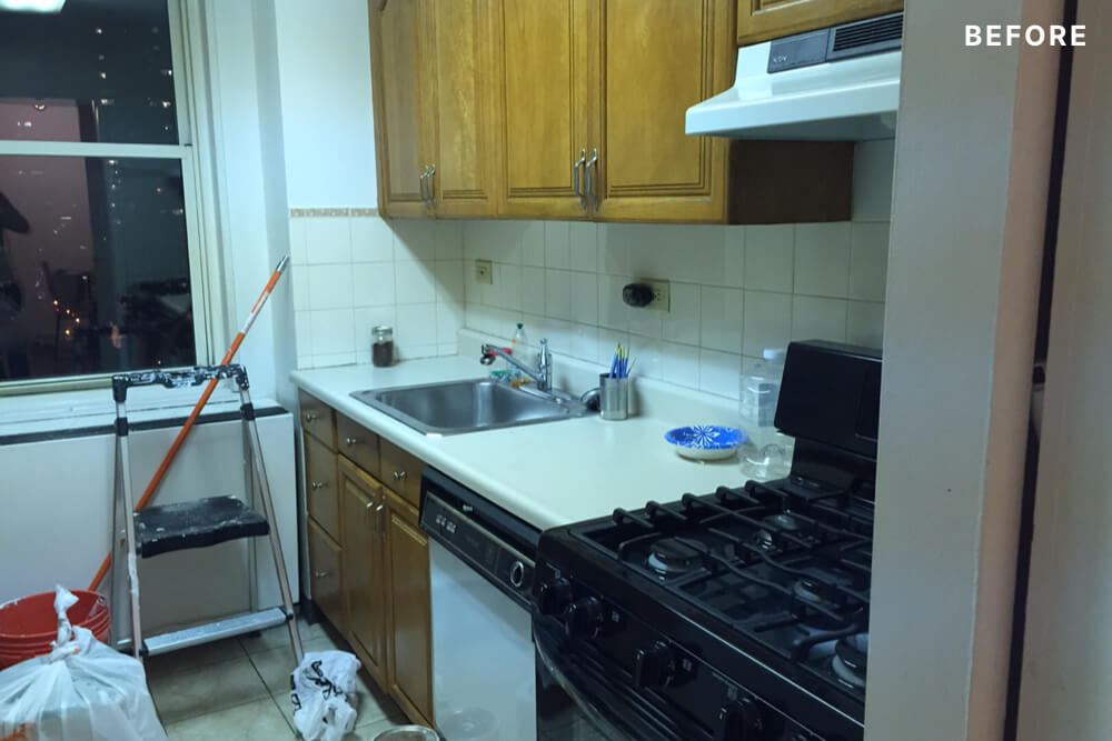
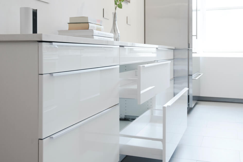
Lee took on the kitchen with all of the resolve of a tech entrepreneur. He spent a month talking to every cabinet maker in NYC before accepting that even the lowest price for a high-end, custom built set was way beyond what he was willing to put in for the entire project. Even the next tier down felt costly, and the slightly more budget-friendly options at big box retailers didn’t seem like an obvious slam dunk. After reading positive reviews about IKEA cabinets, and realizing that a whole new IKEA line was about to hit the market, he found himself psyched by the look of the white, high-gloss lacquer Sektion option. The cost-benefit of going with IKEA was immediately evident: for well under $10k, Lee got a full set of kitchen cabinets and was really happy with the quality. The downside? Getting delivery right took weeks of follow-up and re-shipments to get all of the pieces on site. A great deal overall, but most definitely not without headaches and hand-holding. But details, details…take a look at what happened when the wall came down and the cabinets went in!
Sweeten brings homeowners an exceptional renovation experience by personally matching trusted general contractors to your project, while offering expert guidance and support—at no cost to you. 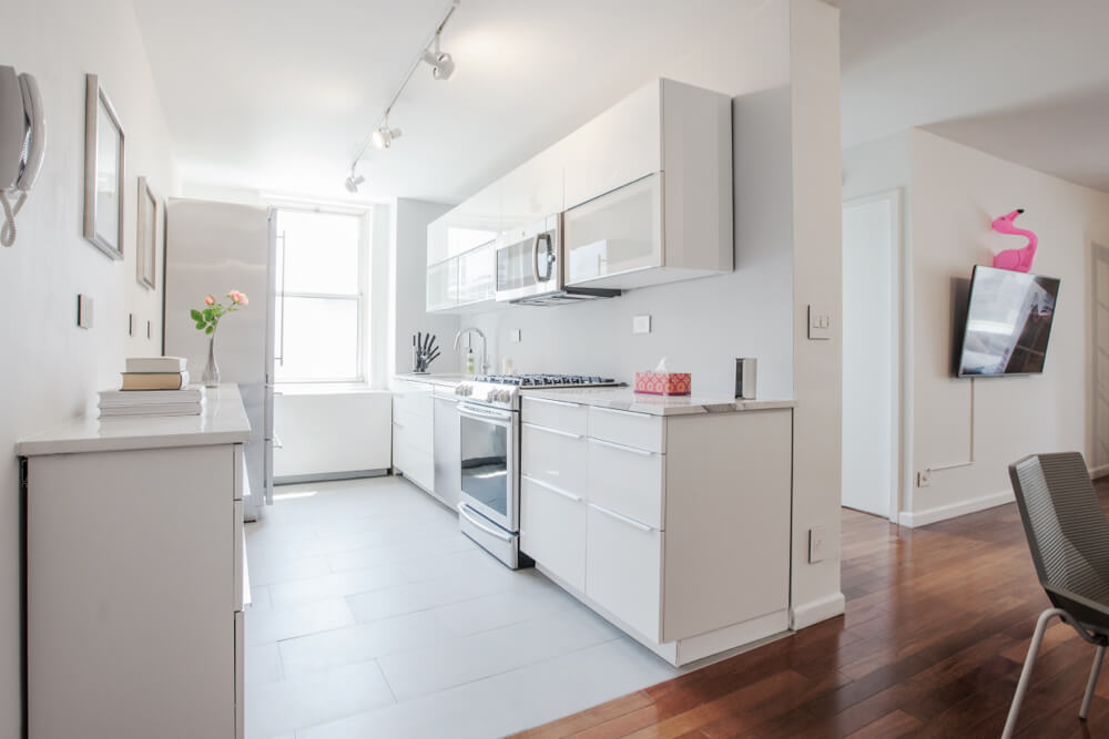
Renovate expertly with Sweeten
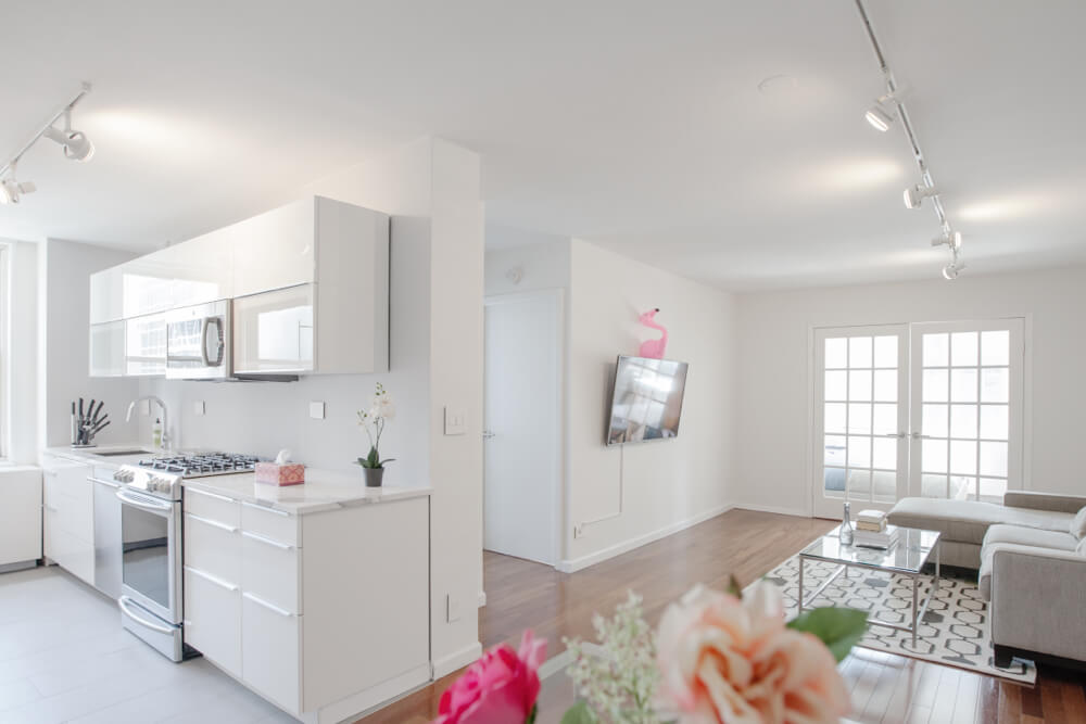
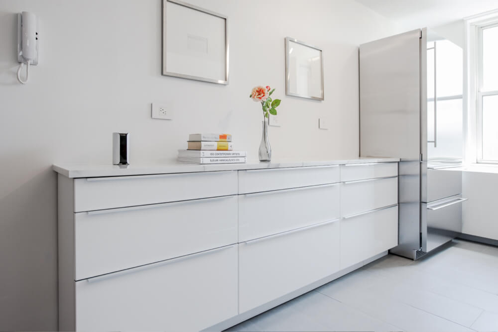
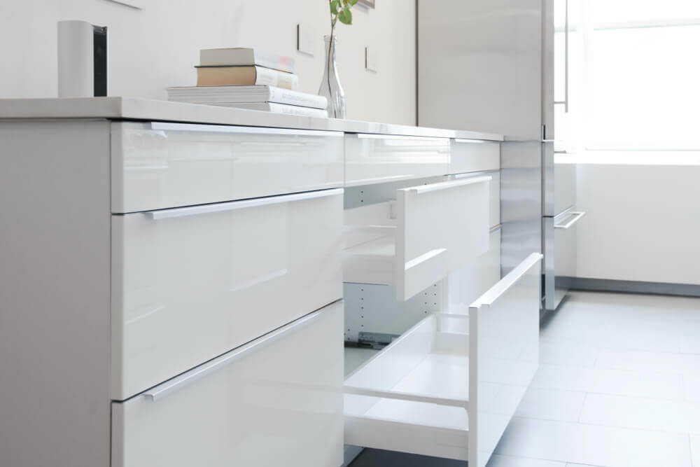
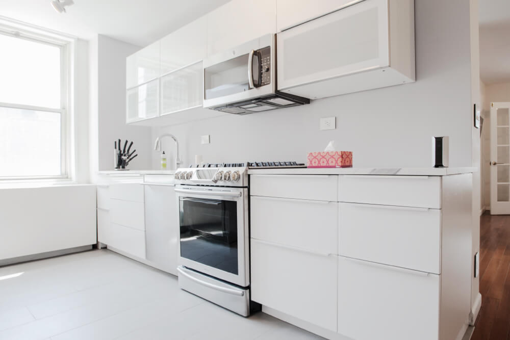
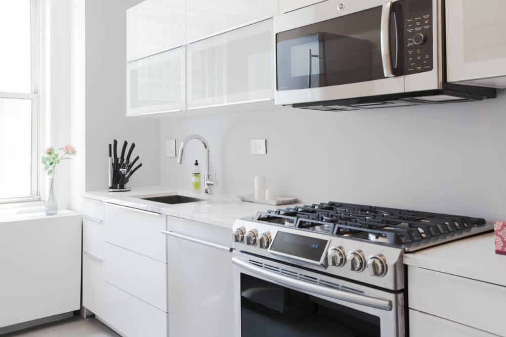
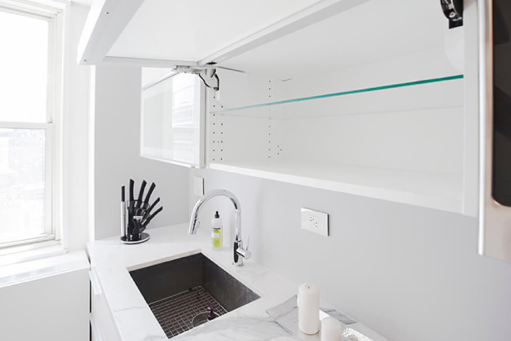
Lee’s research paid off in other parts of the kitchen. He loved the look of white marble and spent six months on the hunt for a quartz countertop with a similar feel, ultimately landing on a porcelain slab by Euro West with an almost-identical yet indestructible effect. Lee compared the slab side by side with marble at Mark and Benneton in Brooklyn and never looked back. To keep his budget focused, Lee decided to skip a typical tiled backsplash. With the newly opened room, and with an upper row of cabinets only on one side, it ended up being a smart choice. Lee thought carefully about cabinet placement – drawers only along the left (16″ depth to maximize open space) and a slim row of upper cabinets centered on the right. The team installed the counter-depth Liebherr fridge against the back wall and lined up all other appliances – a Samsung stove with sleek visual controls, a stainless steel Blomberg dishwasher, and a Blanco Quatrus sink on the opposite side – leaving plenty of room in all directions for food prep and hosting.
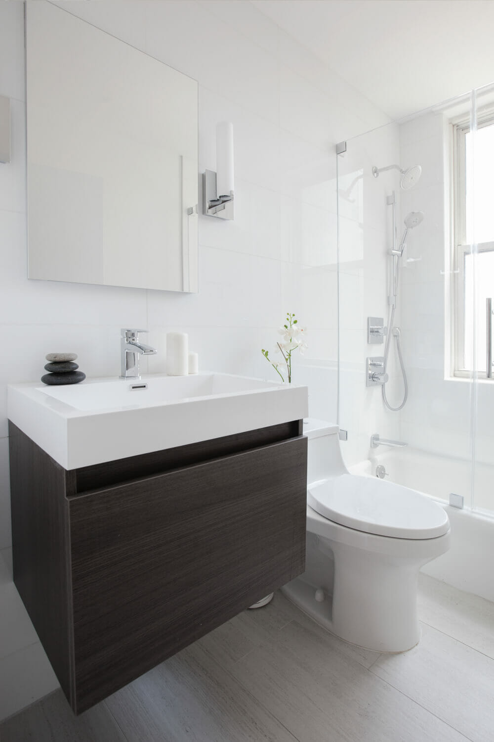
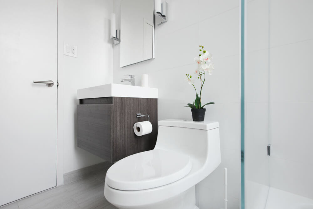
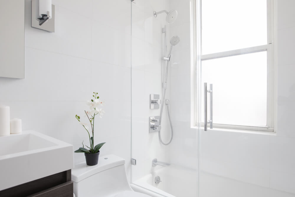
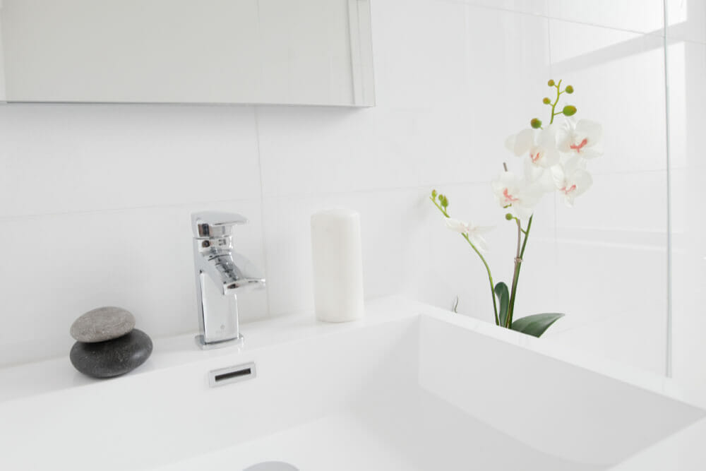
Lee was entirely unsentimental about the bathroom. Everything had to go and in its place, lots of clean, bright whites and crisp glass. Lee found happiness in a touchless San Souci Kohler toilet, “designed for OCD people” (yup…we know and love a few of those folks), and also went with a Kohler recessed medicine cabinet above the Fresca sink vanity. The bathroom hardware is all Hansgrohe – we love that full shower suite with all of its bells and whistles. Lee’s heavy research brought in one more big catch: he found a specialty frameless shower glass from Mirage Shower Doors that eliminates the slight green aura that lots of shower doors end up with and lets the Glassos white wall tiles do their thing.
Big thanks to Lee and the Sweeten team for a stunning redo, and for all of this insider research!
Kitchen Selects >> countertop: porcelain slab Euro West / sink: Blanco Quatrus / stove: Samsung / dishwasher: steel Blomberg / fridge: Leibherr / cabinets: white, high-gloss lacquer IKEA Sektion
Bathroom Selects >> toilet: Kohler / sink vanity: Fresca / shower glass: Mirage Shower Doors / hardware: Hansgrohe
Sweeten handpicks contractors to match each project’s location, budget, scope, and style. Follow the blog for kitchen and bathroom renovation ideas and inspiration and when you’re ready to renovate, start your project on Sweeten.
