A Condo Divides and Conquers
Proper bedroom walls finally go up in a family home
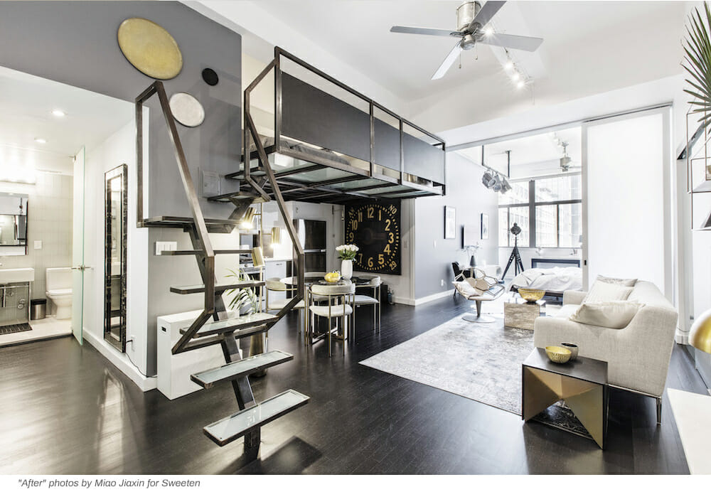
Located in the heart of downtown Brooklyn, the 808-square-foot apartment’s open layout, high ceilings, and a southeast-facing wall of windows were the main attractions for Sophie, a freelance translator and stay-at-home mom, and Michael, operations manager at Bureau van Dijk. After living there for four years, the couple really wanted to create a defined space for their 2-year-old son, Zacharia, and a baby girl soon to arrive in May, that the siblings could claim as their own. As part of the remodel, they wanted to carve out a peaceful space for themselves to relax as well.
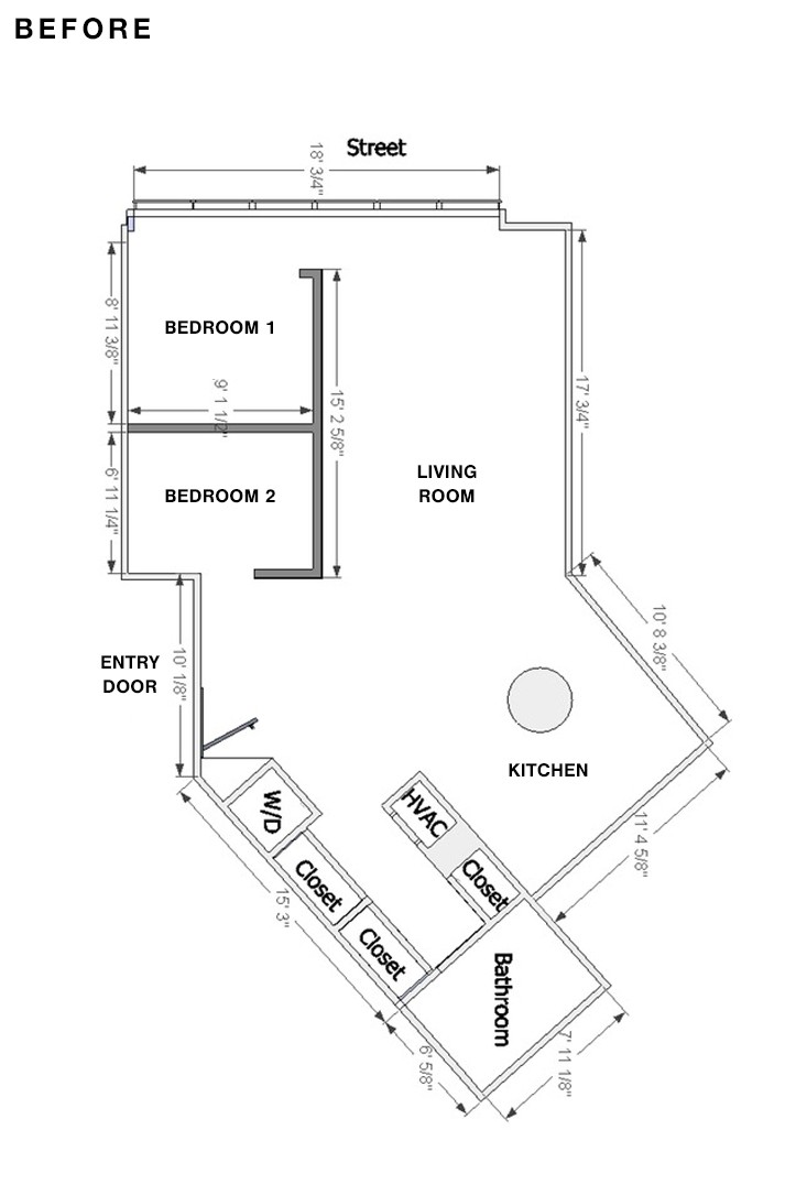
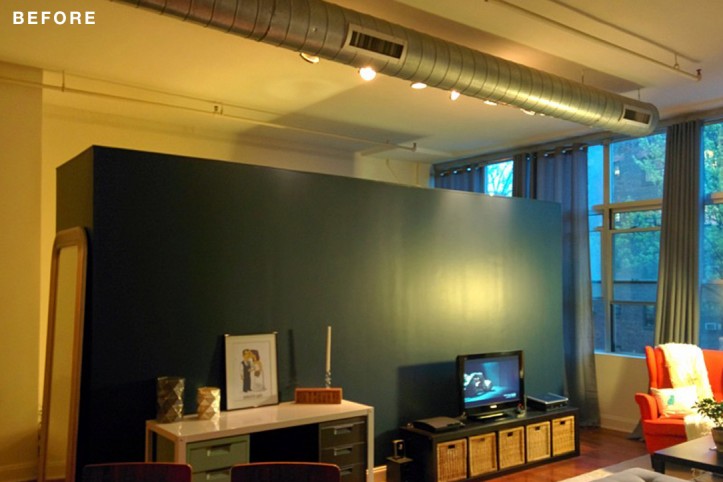
The building, an eight-story concrete structure that was once a toy factory, was converted to 56 condos around 2005. The couple loved the industrial look of the apartment, especially the big concrete column, and high ceilings with exposed HVAC metal vent. However, the divider wall that split the loft layout into what Sophie said was “kinda two bedrooms,” didn’t go up to the ceiling and had no doors, so there was no sound isolation or privacy. Also, she said, “the second bedroom was really tiny and didn’t have much light coming through.”
With clear goals in mind, they posted their project to Sweeten, a free service matching homeowners with vetted general contractors, and were matched with their contractor.
The new wall would help them shape the modern and industrial look that complemented the building. Since this project was about defining living spaces, it focused on function over style, although, Sophie said, “the resulting look of the space was important to us, and we tried making conscious design choices to match our style.” They chose hardware with linear shapes while traditional base moldings were replaced with straight profiles, along with trim around the door frames.
If asked to prioritize between an entrance hall and a children’s bedroom in NYC, the bedroom wins.
To increase the size of the kids’ bedroom and keep enough space for their own bedroom, Sophie and Michael tested various configurations for every feature they wanted using 3-D renderings from the software program Sketch Up. Their decision-making process was guided by such questions as: “How far should they extend the bedrooms?”, “Would the kids’ room allow them to grow with a bunk bed?”, “How much natural light would reach the space?”, and “How high/big should the transom window be?”
Sweeten brings homeowners an exceptional renovation experience by personally matching trusted general contractors to your project, while offering expert guidance and support—at no cost to you. Renovate expertly with Sweeten
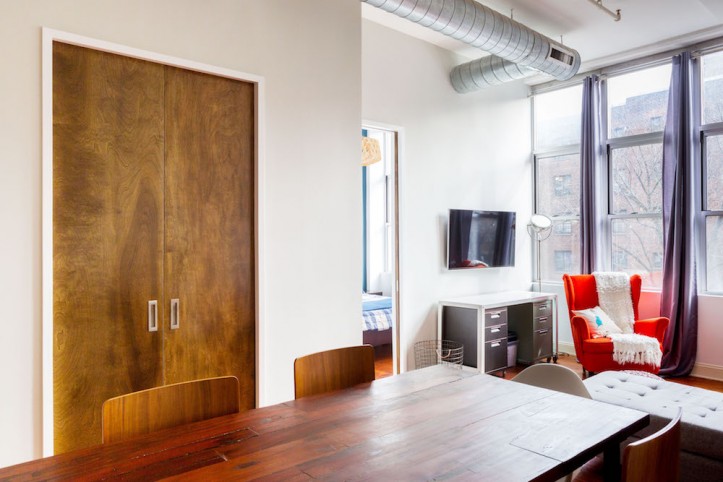
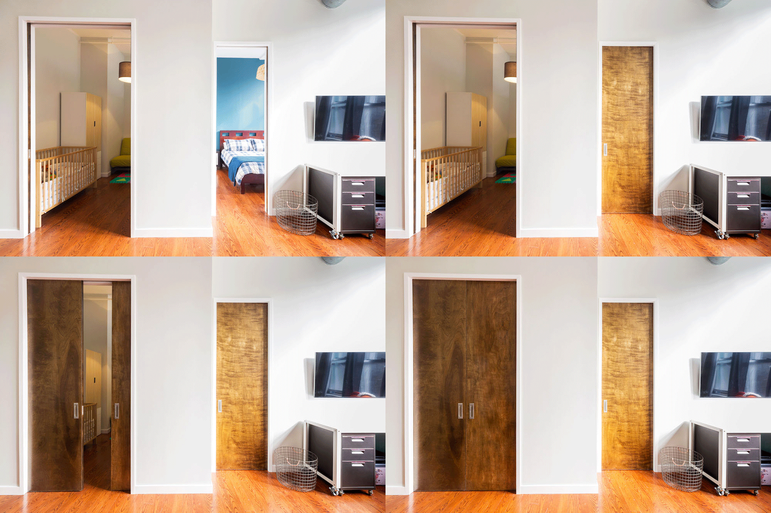
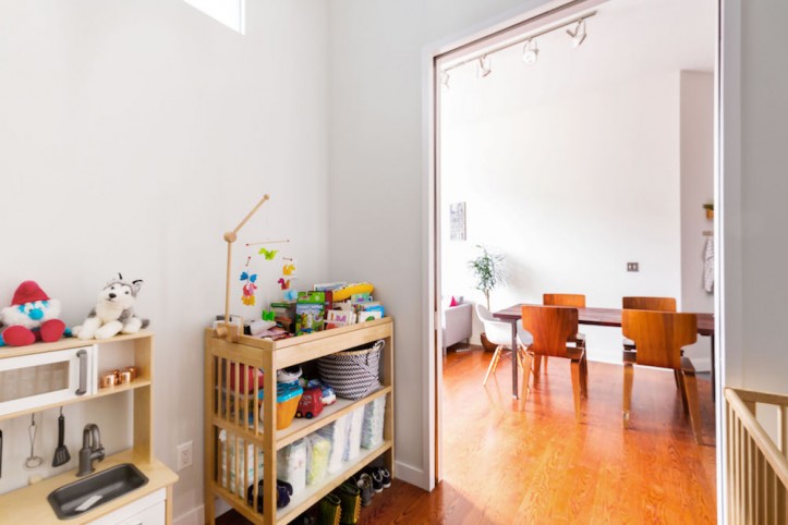
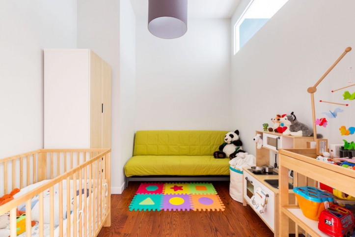
“We had a fair amount of square footage in the hall entrance, which was not well-used,” Sophie said. “If asked to prioritize between an entrance hall and a children’s bedroom in New York City, the bedroom wins. The presence of a sprinkler limited us, but we were able to take two feet [width-wise].” And now, two strollers can still fit in the hallway. “It’s a win-win,” Sophie said. Extending one extra foot lengthwise helped to accommodate more furniture for the kids while leaving sufficient space in the dining area. “For the master, we decided not to extend it by that same one foot because it would have brought the wall to the middle of the windows, reducing our living room too much and affecting the amount of natural light coming through,” she explained.
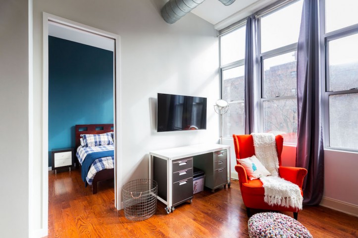
While they had some initial concerns that the bump-out would break the flow of the apartment, “it actually helped create a better flow and even defined a separation between our living room area and our dining room area since there’s a virtual line where the wall comes forward. And the kids’ bedroom is now a usable and decent-sized room.” Their Sweeten contractor also found a solution to connect the HVAC vent to the rooms and keep them flush with the walls rather than extending outward into the room.
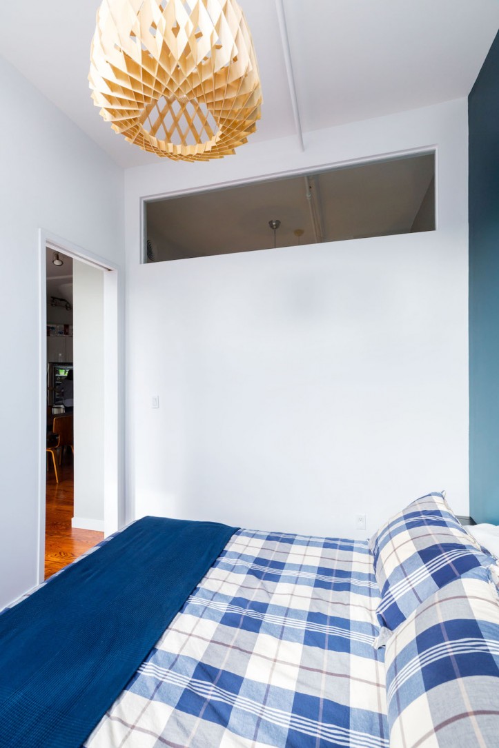
To preserve as much natural light as possible the living space and bedrooms, they designed a transom between the two bedrooms and opted for pocket doors. “We wanted the kids to have a French door,” Sophie said, but they would have swung too widely into the apartment and taken up too much space. The soft-close pocket doors were painted a darker stain to contrast against lighter walls. It was also a departure from the red tone found in their wood floors—which they weren’t fans of. “That will be yet another project,” she noted.
Every renovation comes with a little stress. In this case, since the whole family had no sleeping quarters for a while, they moved to an Airbnb for about two weeks. “That didn’t leave much flexibility in the timeline for unexpected surprises,” Sophie said. “Fortunately, our contractor stuck to the deadline with just a little bit of delay, but it was still manageable.”
They felt it was great to have Sweeten’s assistance from the start, giving them more confidence than just randomly searching the Internet on their own. “The process to schedule appointments with the contractors was fast and efficient,” Sophie said. “Knowing that we could contact one specific person at Sweeten’s client services if an issue arose compared to just having a generic email address is reassuring.”
Before a renovation, “you think you’ve covered your bases, but there are so many details, it’s sometimes hard not to get overwhelmed,” Sophie said. Choosing paint colors was one of the things that became maddening. It’s one thing to see it on paper or in 3-D on the computer, but “you’re not really sure how it feels until you actually see the space in person,” she said. Admittedly obsessed with finding the right shade, she explained, “We ended up picking up all the inspiration books and samples we could find at the hardware store; then I’d compare all the colors to pictures on Pinterest, going back and forth on nearly identical shades.”
The couple is “extremely happy with how the kids’ bedroom turned out,” Sophie said. Now that the renovation is finished, and the nursery has doors to close, Zacharia has a quiet place to rest during nap time and at night. And, said Sophie, “having defined spaces makes it a lot easier to keep our apartment feel put together.”
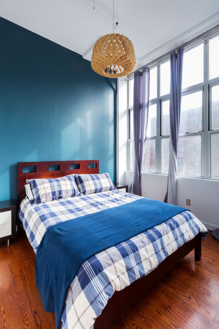
MASTER BEDROOM RESOURCES: Wall paint in Newburg Green; paint on all other walls in Super White: Benjamin Moore. Horgen 1-Light pendant ceiling light: Maxim.
KIDS’ ROOM RESOURCES: Rullan shade and Gothem cord set for ceiling light fixture: Ikea. French doors and hardware: Johnson Hardware. Pocket door frame with soft-close hanger: Amazon. Wood floor stain in Jacobean finish: Minwax. Solid brass flush pulls and edge pull hardware: Deltana.
—
Building a windowed wall in Deeksha and Joe’s apartment allowed them to create an office and guest bedroom without sacrificing the natural light from a nearby window.
Refer your renovating friends to Sweeten and you’ll both receive a $250 Visa gift card when they sign a contract with a Sweeten general contractor.
Sweeten handpicks the best general contractors to match each project’s location, budget, and scope, helping until project completion. Follow the blog for renovation ideas and inspiration and when you’re ready to renovate, start your renovation on Sweeten.
