Home / Blog / Before & After
Newlywed writers turn a dark kitchen into a bestseller
When Amanda and her husband set out to upgrade from their two-bedroom Windsor Terrace apartment in Brooklyn, they had a few adjectives in mind—light, airy, warm. They loved the neighborhood as well as the great light in their rental, but as work-from-home writers, desired larger bedrooms and a more spacious kitchen.
They had also just gotten married, and if you’ve ever had a registry, you understand why they needed more kitchen storage! Here’s the story of how a visit with friends led them to a new home, and how an irresistible pattern sparked their kitchen design.
Although Amanda’s initial intention was to stay in Windsor Terrace, the direction of her apartment search changed when she and her husband visited some friends at their new home in the Clinton Hill Co-ops (CHC). They loved the feel of the complex and the apartment space itself, and realized that this was where they wanted to be.
After a few months of checking out CHC listings as they came on the market, the couple landed a two-bedroom, one-bath apartment. Coincidentally, it was the mirror image of the one their friends owned!
As writers who both work from home, Amanda and her husband appreciated that the two bedrooms were equally sized; one could be used as a roomy home office as well as guest quarters for out-of-town visitors.
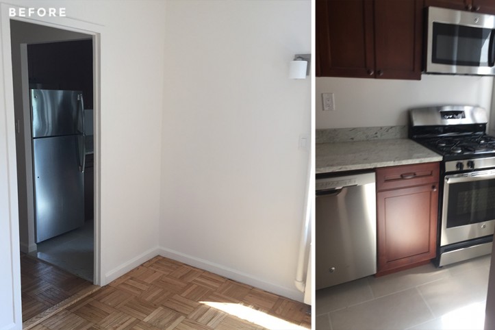
At around 1,000 square feet, the unit also had southern exposures that provided the lovely, warm light they had been in search of. The only issue was the kitchen: it was dark and closed off, and connected to a strange pass-through pantry that housed a bar counter.
Although it had been recently renovated, the craftsmanship was poor, as there were already cracks and scratches in the cabinetry and flooring. At first sight, Amanda thought it would be a deal-breaker. She was eager for a simple move, and very hesitant to embark on a renovation of any kind.
But slowly, she and her husband talked themselves into it—after all, the apartment was ideal in every other way.
So as they began the process of closing on the apartment, Amanda posted their kitchen renovation to Sweeten. As a first-time renovator, she wasn’t sure how to decide between the various bids.
Our in-house team came to the rescue: a call with one of Sweeten’s project advisors proved to be useful. The chat gave Amanda the chance to think out loud and consider the pros and cons of each bid, and she selected her contractor.
Amanda’s vision for the kitchen reflected the feeling she wanted for the apartment as a whole: clean and bright, but not too modern or sterile. “We both love to cook and wanted to feel comfortable there, like we could make a mess,” Amanda explained.
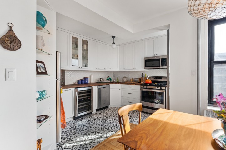
They began by knocking down the walls that separated the kitchen and pantry from the living room and dining nook. (This is a common theme in the CHC kitchens!
For more inspiration, check out Laura and Matthew’s kitchen, as well as Mario and Joe’s project.) One of the doorways from the kitchen to the hallway was closed off to extend the kitchen space across the entire wall. Sweeten brings homeowners an exceptional renovation experience by personally matching trusted general contractors to your project, while offering expert guidance and support—at no cost to you. Renovate expertly with Sweeten
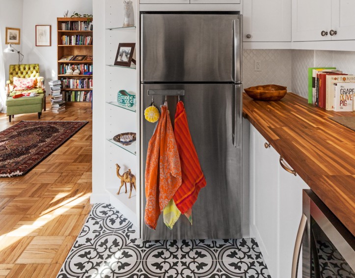
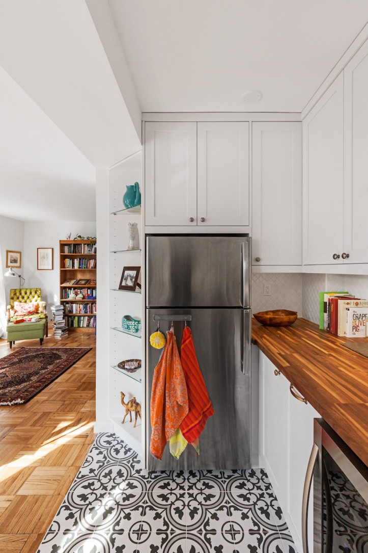
In a brilliant move, their Sweeten contractor turned the unused space next to the refrigerator into diagonal built-in shelving, now the perfect spot to display photos and items from their travels.
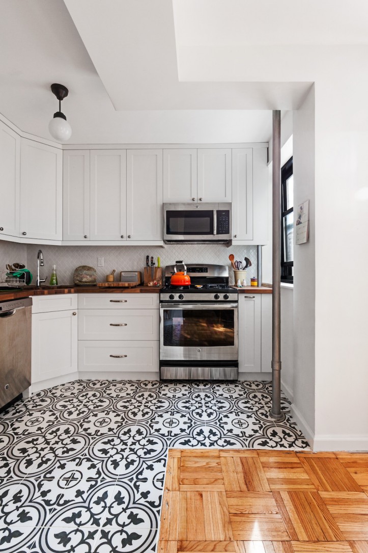
Once the space was opened up, the couple turned their attention to the details. Early on, Amanda fell in love with a Mediterranean-inspired patterned tile in black, grey and white, and built the entire kitchen design to complement it.
Although she had originally considered the tile as a backsplash, it made more sense as flooring—a wise suggestion from her mom. For the millwork, their Sweeten contractor sourced custom cabinetry with simple lines in a white shaker style.
A single set of glass doors was installed to break the solid run of uppers. A rich walnut countertop was chosen for an added layer of drama—they had first considered using a lighter wood, but the darker wood coordinated better with the floors, a decision supported by their contractor.
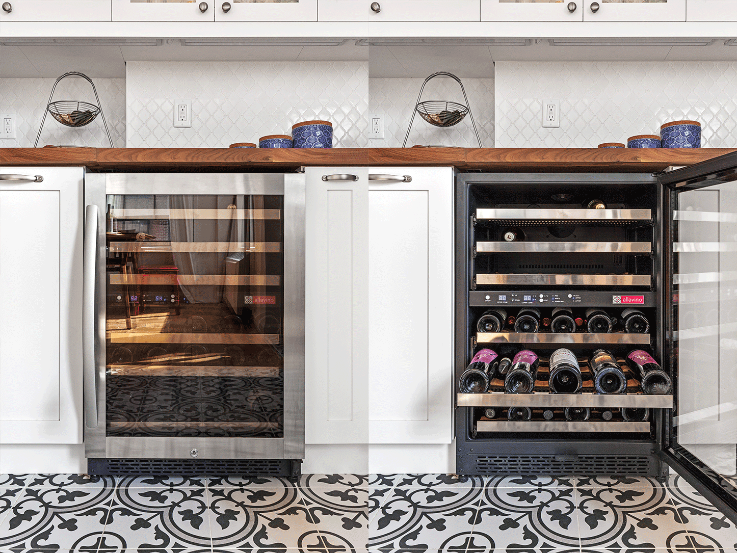
Although the work surface requires some upkeep, Amanda reports that she “adores them!” Brass knobs and pulls for the cabinets were next, along with a vintage-inspired metal light fixture for the ceiling. While they kept their fairly new appliances from the apartment’s previous renovation, they added a wine fridge next to the dishwasher.
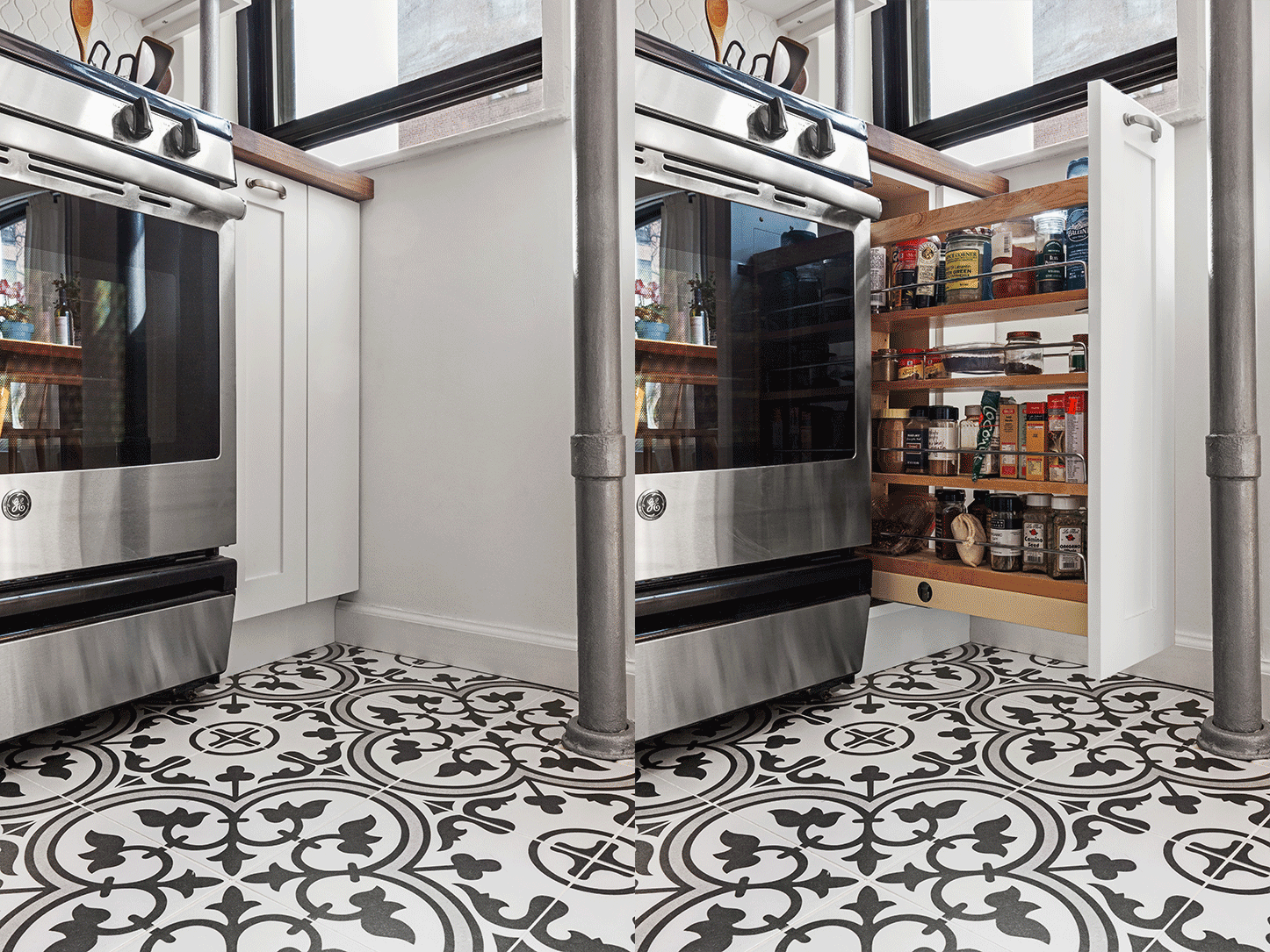
Throughout the process, Amanda worked with her Sweeten contractor to resolve issues as they arose. In one incident, the cabinetmaker realized that the measurements had been off, and that a cabinet would have been essentially unusable because of an immovable obstruction.
He worked with the contractor to revise the layout overnight, and went into production with very little delay. Aside from this challenge, things went mostly according to plan, not to mention the shortest wait time for board approval that we’ve ever heard—about two weeks! (Could it be because Sweeten has done dozens of renovations in her building?)
Now that they’re done, Amanda has words of wisdom for aspiring renovators: “Don’t rush the process. We were impatient and moved all our things in right after the demolition stage.
This meant that all of our belongings went into one bedroom, stacked and wrapped in plastic. We went to stay with our in-laws for the duration of the project. Our contractor was very understanding and worked quickly, but didn’t cut corners and finished on schedule—it took about a month in the end.
Although this didn’t happen with us, a hurried contractor might be tempted to be less detailed-oriented. Trust the contractor! He knows what he’s doing and how long it’ll take to do it.”
As a book lover, Amanda’s one regret is that they didn’t think to carve out space in the wall shared between the kitchen and the hallway for built-in bookshelves.
Still, as a first-time renovator, we think she did an amazing job, and like other Sweeten clients, she can always return for another renovation someday!
Thank you, Amanda, for sharing this lovely space. We hope that you and your husband enjoy cooking up your next literary masterpieces.
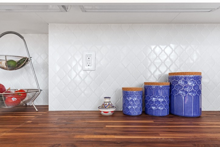
KITCHEN RESOURCES: EliteTile Artea Porcelain Tile floor tile: Wayfair. White shaker cabinets: custom. Mushroom knobs and Arendal pull cabinet hardware: Top Knobs. Faucet: Wayfair (similar). Walnut wood counters: custom. Arabesque white backsplash tile: Tiles by Kia, Astoria, NY. FlexCount wine fridge: Allavino. Capiz Scalloped chandelier: Serena & Lily.
—
The New York Times featured three of Sweeten’s renovation projects highlighting one kitchen layout designed three different ways.
Sweeten handpicks the best general contractors to match each project’s location, budget, scope, and style. Follow the blog for renovation ideas and inspiration and when you’re ready to renovate, start your renovation on Sweeten.
