From the Suburbs to a Manhattan Co-op
A couple renovates for city living with a touch of Paris
Suburban life isn’t for everyone. That’s, at least, the conclusion one couple arrived at when they decided to trade life in the ‘burbs for a 1,100-square-foot prewar co-op on Manhattan’s Upper West Side. But their new home was hardly turnkey. With a previous reno under their belt and an eye for the apartment’s potential, the homeowners posted their project on Sweeten, a free service matching renovators with vetted general contractors, eventually hiring a design-build firm to see their vision through. The result: A Paris-inspired apartment with clean, modern elements and a hint of traditional style.
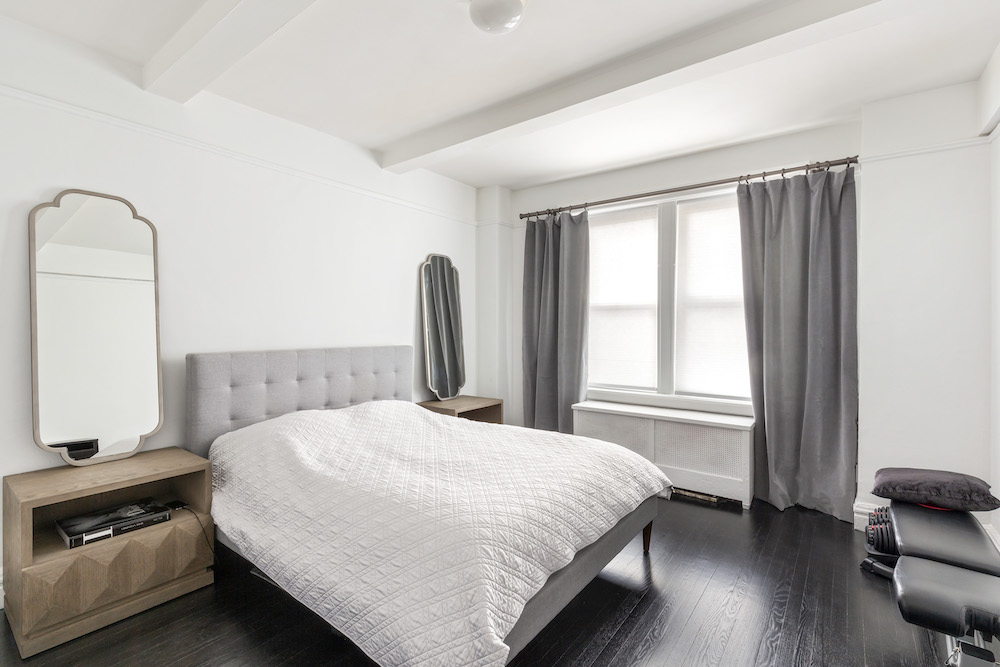
All great things in life take time. And while the decor of our apartment is still a work in progress, renovating it all happened on time with no issues. That’s a major feat given the number of updates we were looking to make.
We previously tried living in the suburbs and realized it just wasn’t for us. So we decided on the Upper West Side and then rented in the neighborhood while we looked for a place. When we found this apartment—a prewar co-op built in 1929 with original beams—we knew it would need a full renovation. We saw a lot of space potential but really wanted to maximize it for our needs. The apartment was just old and uncared for.
Luckily, we had some renovation experience under our belt, having done a smaller one at our home in the suburbs, but renovating in the city is a whole different ball game.
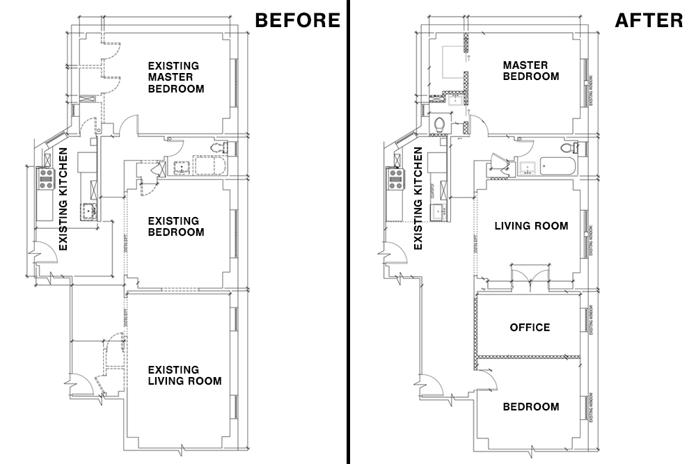
When we posted our project on Sweeten, they matched us with a design-build firm and after our initial interview, we knew we really liked them. But what ultimately sealed the deal for us was hearing feedback on this firm from Sweeten. That input added confidence to our decision.
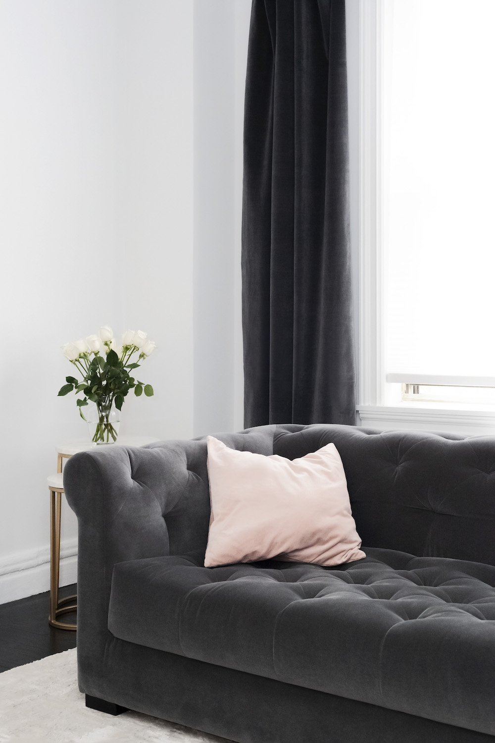
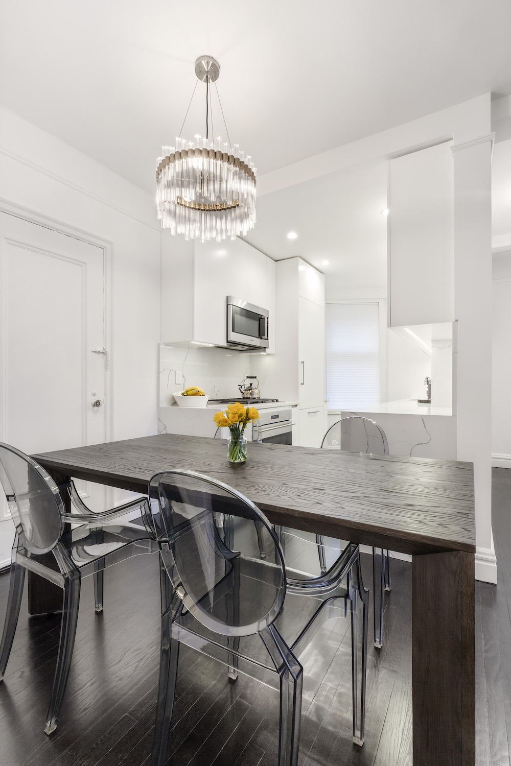
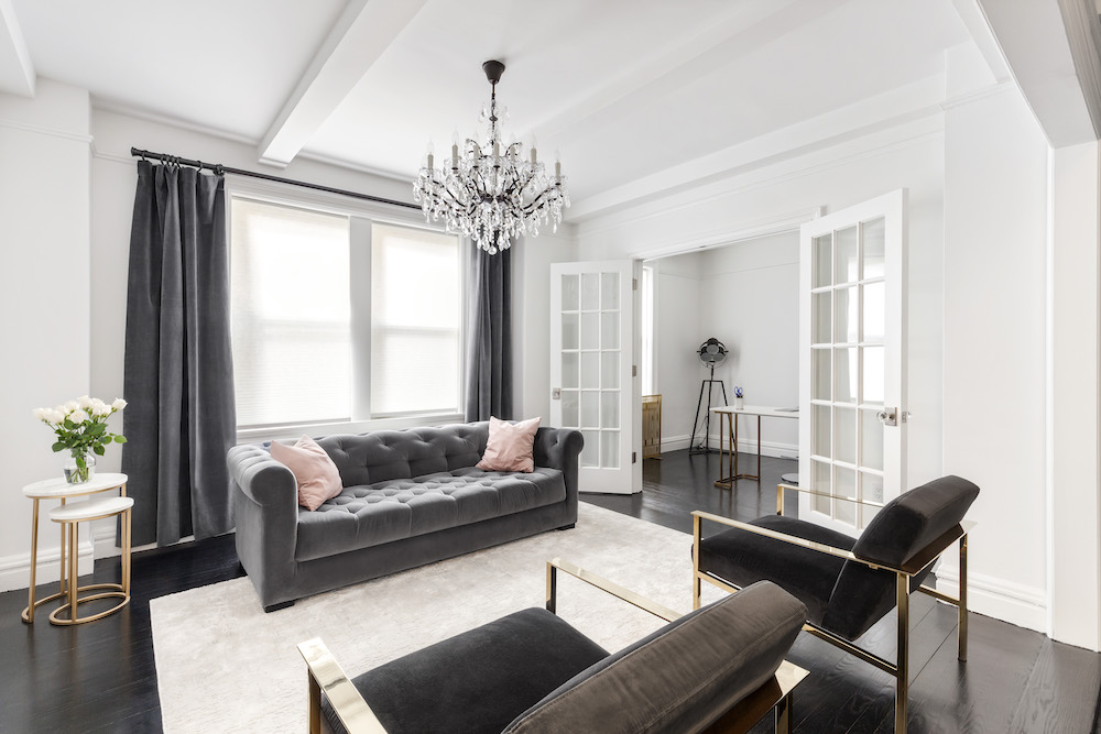
Our overall vision for the design was inspired by a Paris apartment. Although we knew we didn’t have the right format apartment for that, we wanted to combine clean modern elements (like our kitchen) with some traditional touches, like crystal chandeliers.
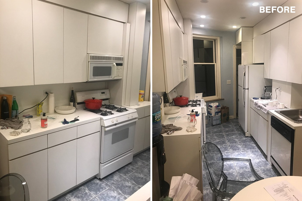
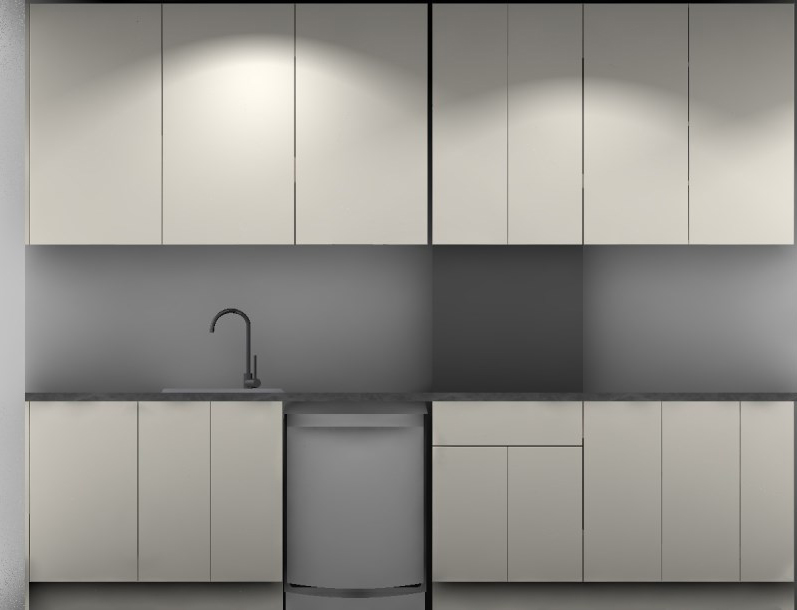
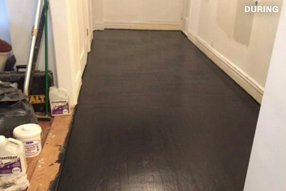
For starters, the kitchen was a disaster. It felt like it was last renovated in the ‘70s. Everything was old and falling apart, the space was poorly used, and the floors were covered in an ugly blue tile. We always knew we wanted very dark floors and a clean, white minimalist kitchen with matching countertops and backsplash. We also thought that installing wood floors in the kitchen to match the rest of the apartment would help make the space look slightly larger and not cut off from the other rooms.
Because of all the gear, our contractor suggested we add a smaller closet in an additional room which we didn’t realize we’d need at the start of the renovation.
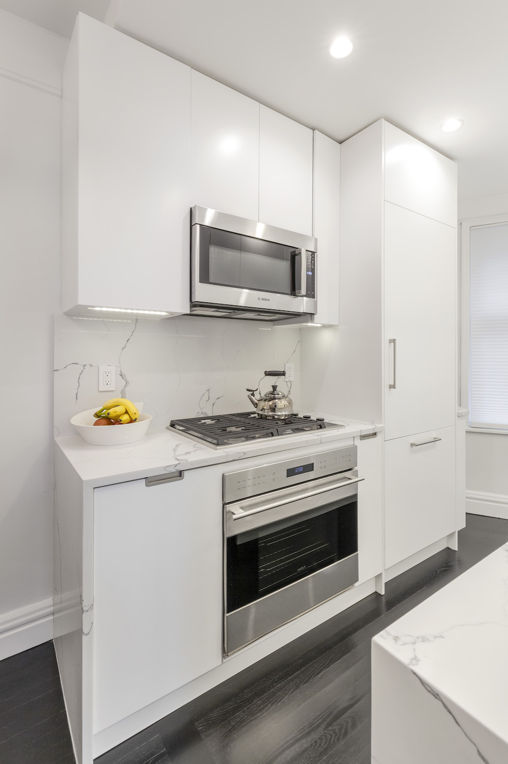
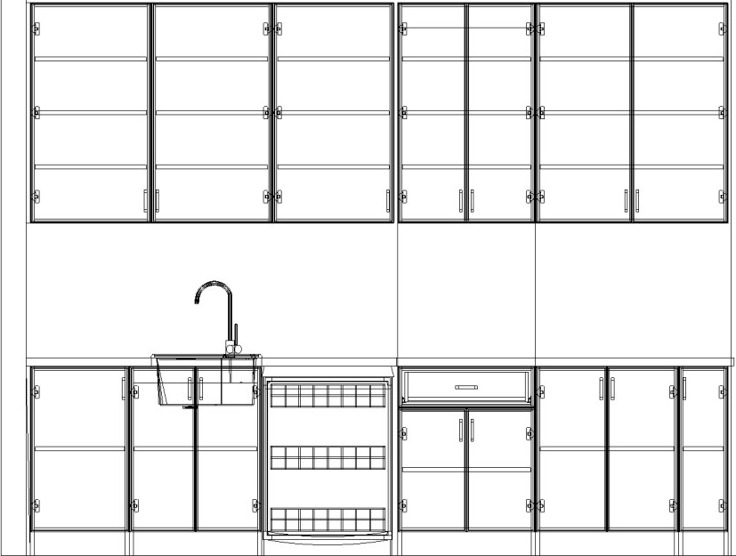
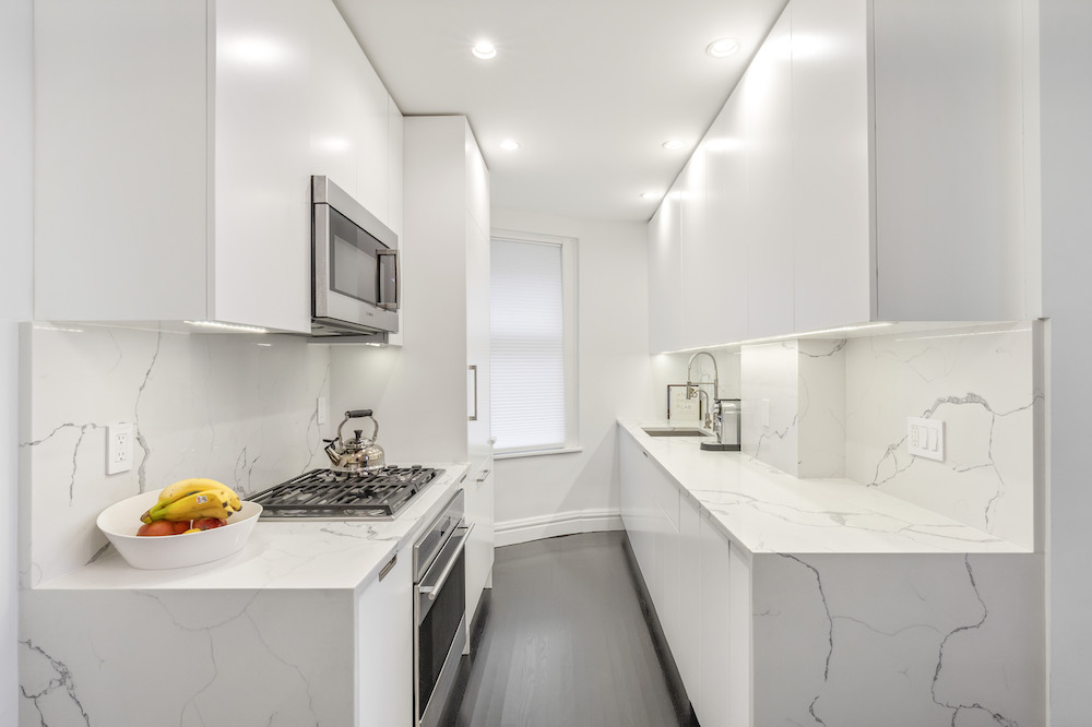
The kitchen itself is a standard New York City galley and maximizing the space was important to us. To do so, we hoped to have the cabinets installed all the way up the ceiling, turning every possible square inch into a useful space. We also wanted to fit in a large refrigerator, a dishwasher, washer/dryer unit, and a water filtration system.
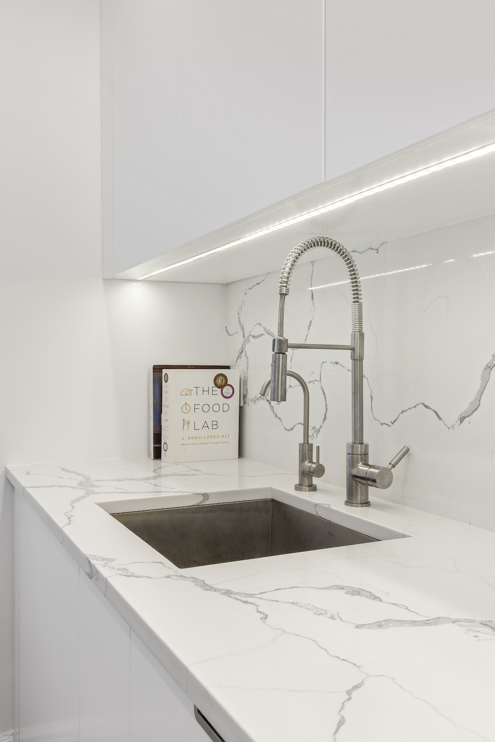
What we were trying to accomplish in the kitchen and bathrooms was a clean, modern white look that would serve as a point of contrast to the more traditional look of the rest of the apartment. In the kitchen, that meant minimizing the use of hardware with push-open cabinets, a paneled fridge and dishwasher, and a hidden washer and dryer inside one of the cabinets. We are very happy with the number of cabinets we got in the end. Smart additions like a spice rack help with organizing pantry items.
Sweeten brings homeowners an exceptional renovation experience by personally matching trusted general contractors to your project, while offering expert guidance and support—at no cost to you. 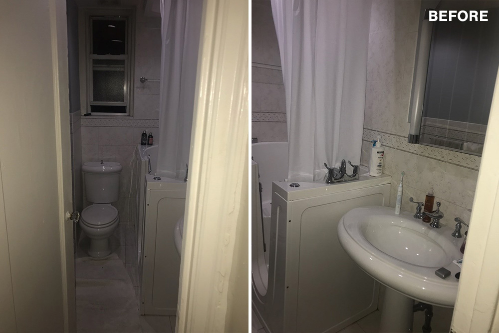
Renovate expertly with Sweeten
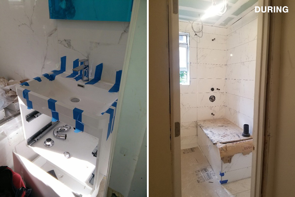
All of that was a lot to ask, but there was more. The bathroom was another disaster. It had a walk-in shower installed for universal design that we didn’t need and that took up so much space. The old sink was huge and didn’t provide any storage, and overall, the space lacked the modern look we were after.
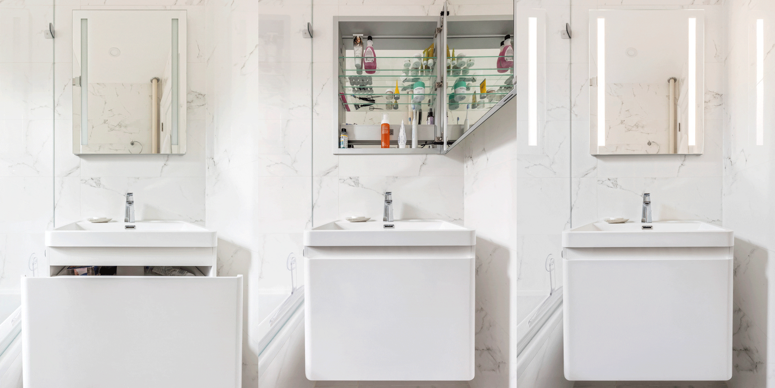
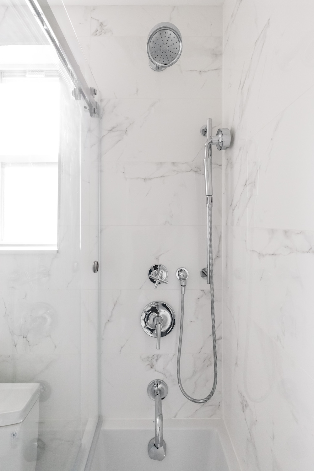
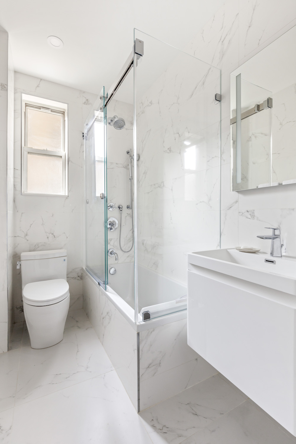
We used large marble-look tiles from the floor to the ceiling to visually enlarge the space. A glass shower enclosure kept the look nice and clean and avoided the heavy look of a shower curtain. We also added a floating cabinet for more storage under the sink and a built-in mirror with extra lighting. It ended up looking beautiful!

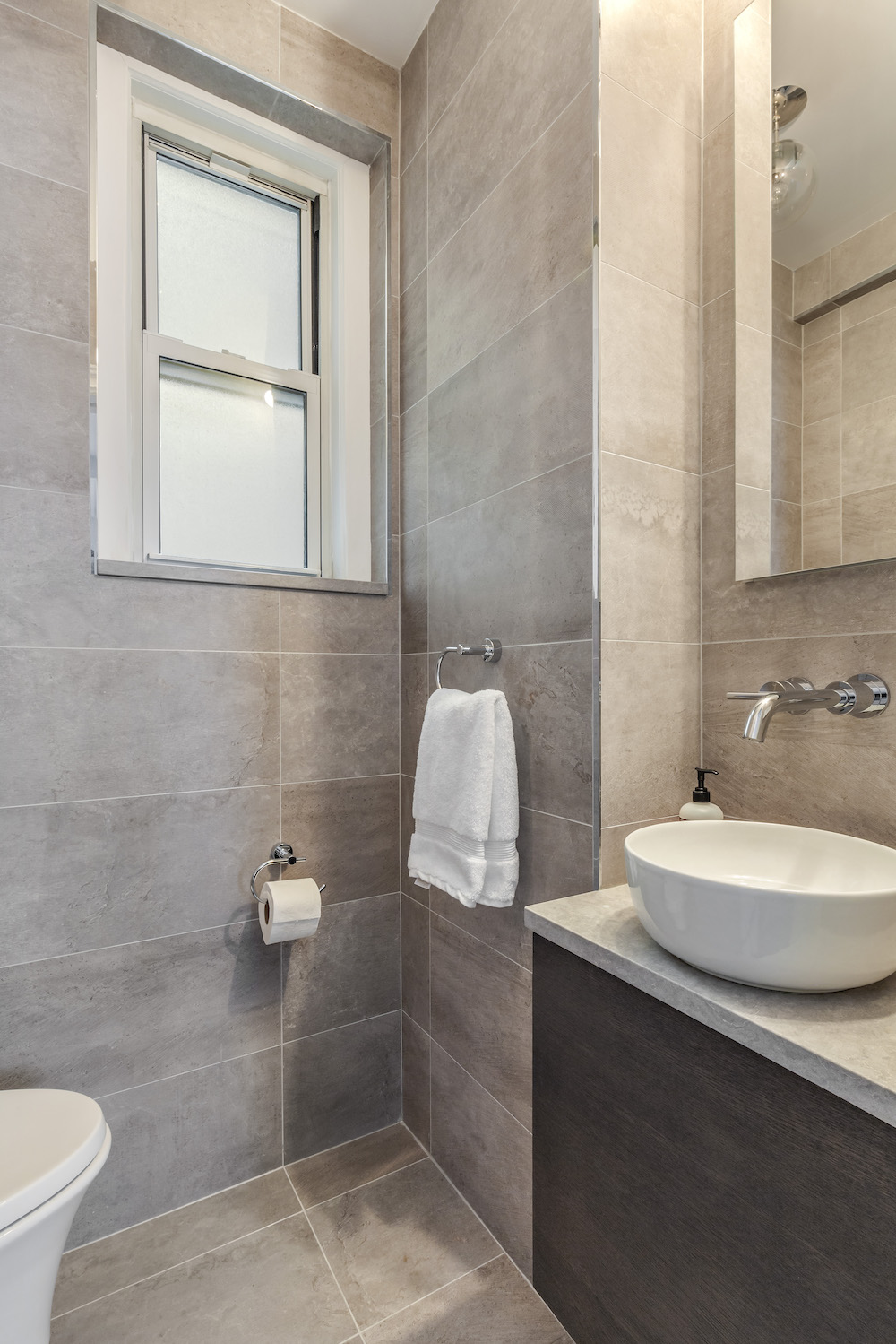
A second, smaller bathroom that was previously used as a storage room was another challenge. We were able to maximize space fitting it with a proper toilet and a small sink with a similar floating cabinet. The same floor-to-ceiling tile trick—this time in a stone color—opens up the room quite a bit.
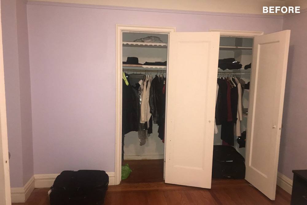
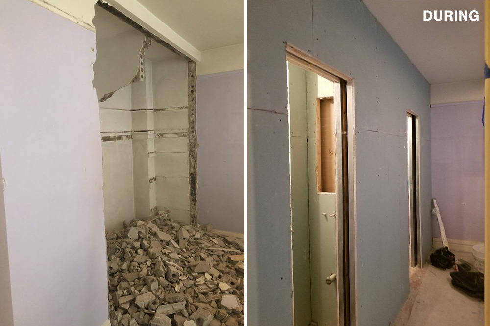
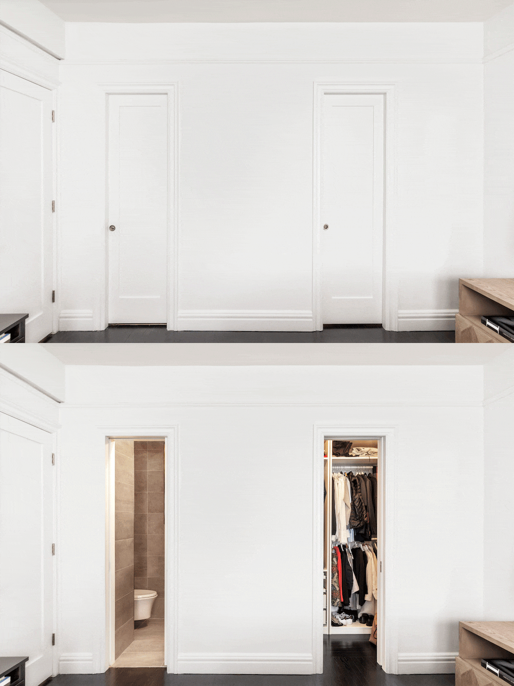
Our Sweeten contractor had a very high level of service and gave us great advice throughout the process. One of the best suggestions they made was to build a large closet space (bigger than we thought we needed) in the hallway, and he was right. Our original thought was to make a narrow closet that would just fit coats, but we’ve found ourselves using every inch of that space to the max, not just for coats and shoes. The smart design of the closet allows us to fit storage baskets, along with various other items like suitcases and lifestyle gear.
Because of all the gear, our contractor also suggested we add a smaller closet in an additional room which we didn’t realize we’d need at the start of the renovation. Without the advice of our contractor, we would have made a mistake. Their experience and ability to see our vision allowed them to create exactly what we needed.
The biggest hurdle was getting the approvals needed for each part of the project like adding a bathroom into our master bedroom. (We ultimately had to settle on a smaller space due to some approval issues.)
Now that we’re reno pros to a degree, there are a few things we’d suggest for those looking to take on a project like ours: First, choose your contractors carefully. We spent time and effort to research the best options, and it paid off. We also like financial visibility in our contract—a fixed price and no surprises. And lastly, don’t try to live in the apartment while doing a full gut reno.
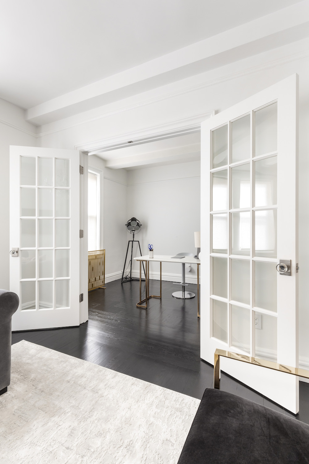
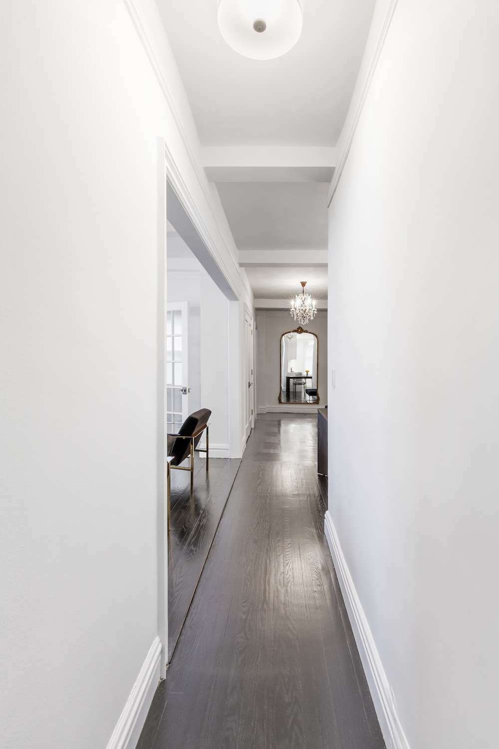
Once the reno was done, we were left with this blank canvas we love with its dark floors, white walls, beamed ceilings, and a modern clean kitchen. We want to host people all the time and never leave home.
Thank you for sharing your home with us!
KITCHEN RESOURCES: Custom flat-panel cabinets in white: Miralis. Statuary Classique quartz on countertops and backsplash: MSI. Sink, #KHU23: Kraus. Faucet, #MK6557: Miseno. Refrigerator, dishwasher, and stove: Bosch/Wolf. Lighting: Restoration Hardware. Stainless steel cabinet pulls: Amerock.
MASTER BATHROOM RESOURCES: Floor and wall tile: Porcelanosa. Aquia IV elongated toilet: Toto. Starck 60″ soaking bathtub: Duravit. Vanity: Tuxedo Rough Chic custom vanity: Miralis.
Catalan 15″ single door medicine cabinet with triple mirror; Purist shower fixtures: Kohler.
GUEST BATHROOM RESOURCES: Vanity with rosewood facade: Duravit. Verdera medicine cabinet: Kohler.
FLOORING RESOURCE: Select oak floors finished in Ebony stain.
—
Sweeten handpicks the best general contractors to match each project’s location, budget, and scope, helping until project completion. Follow the blog, Sweeten Stories, for renovation ideas and inspiration and when you’re ready to renovate, start your renovation on Sweeten.

