My Sweeten Story: A Family Finds Home Again in Hudson Heights
After years in transit, a family of five returns to a Manhattan neighborhood they love
- Homeowners: Erin, a former elementary school teacher, and Chris, a product designer in the tech industry, posted their Hudson Heights co-op remodel on Sweeten
- Where: Hudson Heights, New York City
- Primary renovation: Updating a 3-bedroom, 2-bathroom, co-op with a more modern and open floor plan
- Sweeten general contractor
- Sweeten’s role: Sweeten matches home renovators with vetted general contractors, offering advice, support, and up to $50,000 in financial protection—for free
Guest blog post by homeowner Erin
Change in scenery
Hudson Heights is a veritable small town in the big city. Chris and I moved to the neighborhood from the Upper West Side when we started our family. We stumbled across it after a bike ride up the west side bike path to the Cloisters, and it felt like no other neighborhood in the city—quiet, beautiful, on top of a hill overlooking the Hudson River, yet it still had everything that makes New York City such a special and diverse place to live. And the housing market offered more space for our money, so that was also appealing.
We bought a one-bedroom apartment, had three children, and found a home in this amazing neighborhood and community. Fast forward to nine years later, and Chris was offered a position in the California Bay Area. We were incredibly sad to leave Hudson Heights, but we had outgrown our one-bedroom apartment and knew a change was inevitable.
Back to the beginning
We spent two wonderful, adventure-filled years in California, but our old neighborhood, city, and home in New York City were always calling us back. When an opportunity came up for Chris to move to a team here, we knew it was meant to be. We immediately started looking for a home in Hudson Heights, and after many months of searching, the listing for this apartment appeared. It was the perfect space for our family. After so many years of uncertainty and bouncing around, we finally felt like we found a home to settle down in.
The apartment—a 1,200-square-foot, three-bedroom, two-bath co-op in a post-war, 1950s building—was all in its original condition, except for a replaced refrigerator. Even the metal cabinets stuck together with paint and the linoleum kitchen floors were still intact. Thankfully, our budget allowed us to factor in a renovation, but we had never done anything like this before, not even in the old one-bedroom that we owned. Just thinking about being able to make a home specific to our taste and design was so exciting.
Scoping out work for the renovation
We wanted to update everything. Our hope was for a bright and airy home that looked modern and clean. I spent many late nights scouring Pinterest, so we knew what we liked and had an idea of ways to achieve that using certain colors, materials, and furniture, but we were still completely overwhelmed with choices of materials, where to get them, and how to stay within our budget.
A floor to match the aesthetic
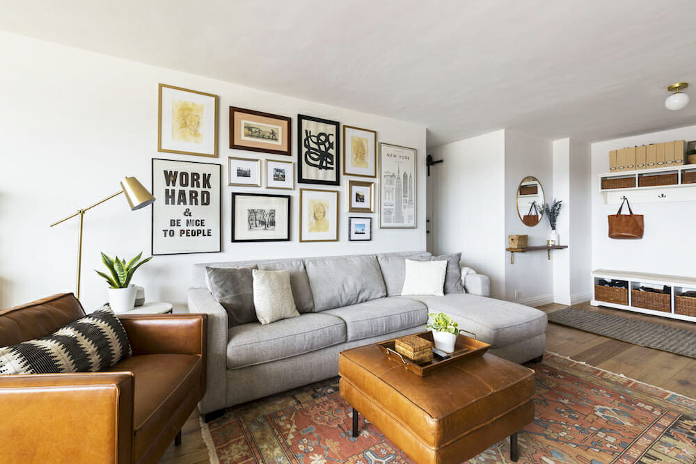
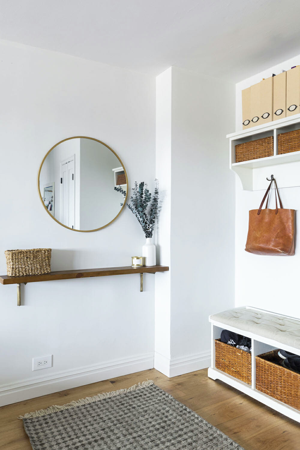
Our Sweeten design-build team guided us through all of that, suggesting brands, vendors, and materials to achieve our overall look. Thinking about our budget, I was definitely on the fence about where to spend and where to save, and I even waffled on whether we should get new floors. I thought the parquet floors held up well enough and still looked beautiful, but since we were going for a different modern look, we decided to redo the floors. I have to say, I am so glad we did because it completely changed the whole feel of the space.
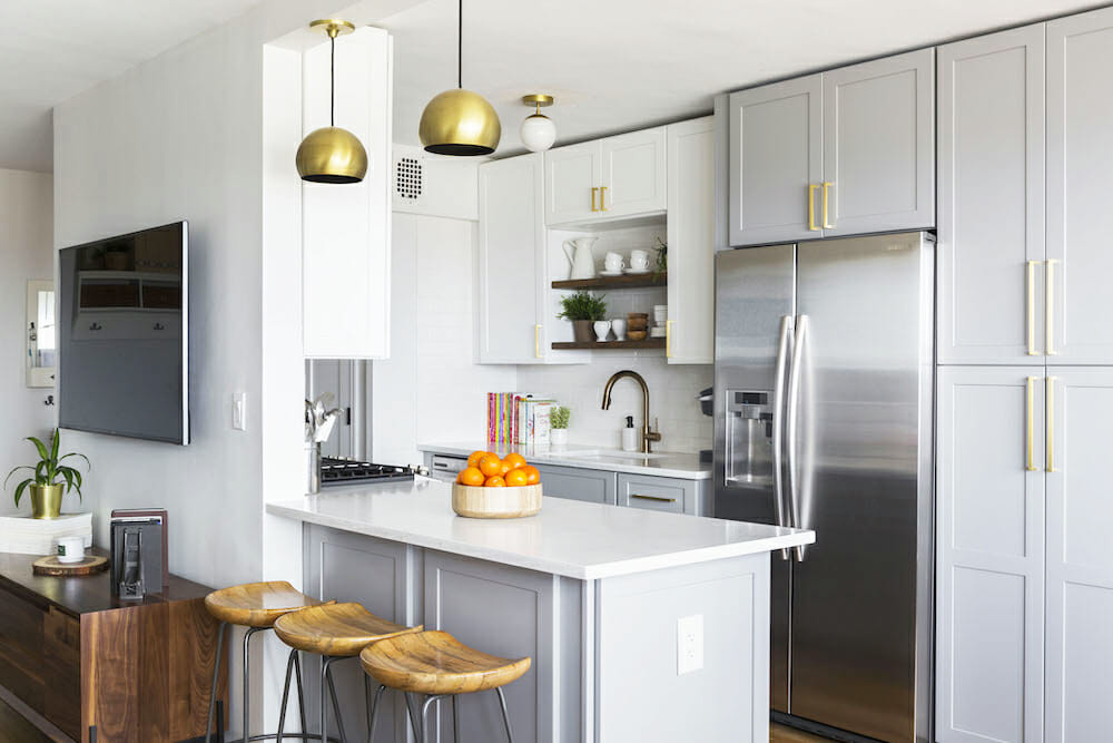
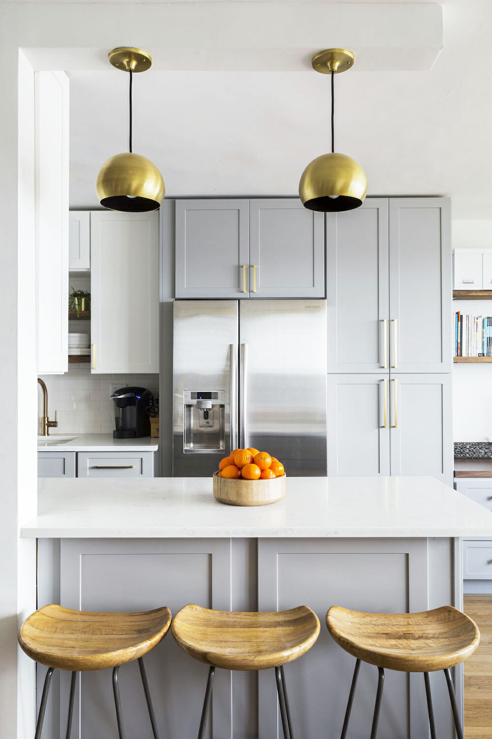
Pancake mornings are more zen now that everyone has their own stool to sit on to help.
Letting the design-team lead
Overall, our design-build team was awesome. When we met, they were professional, listened to and understood our vision, and also offered wonderful ideas we hadn’t thought of. It felt like their excitement for the project was mutual. And as we were first-time renovators, they were so great and helpful walking us through each step. They were constantly offering suggestions telling us what works and what doesn’t, always steering us in the right direction. Our biggest question was, “Would you please hold our hand throughout this whole process because we do not know what the heck we are doing!”.
Shifting the floor plan
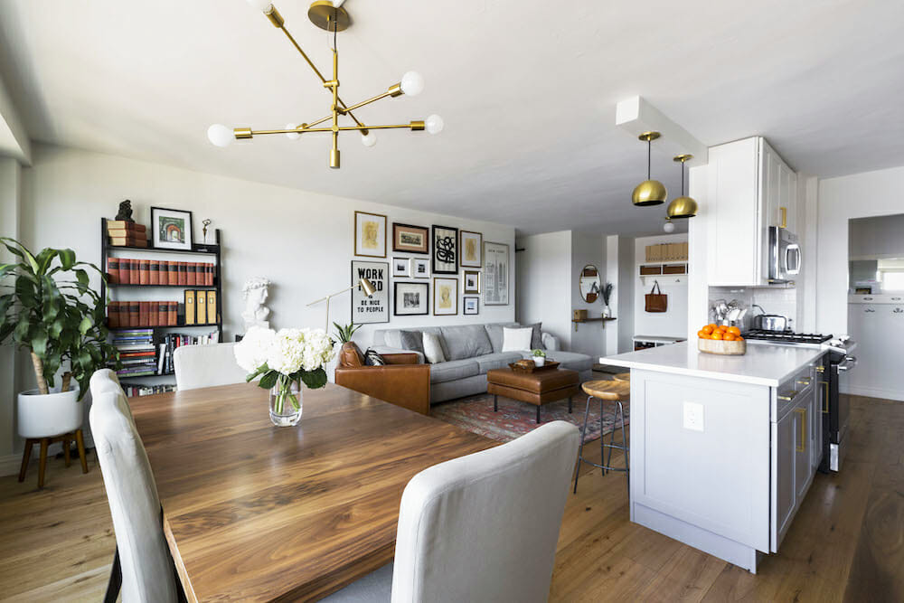
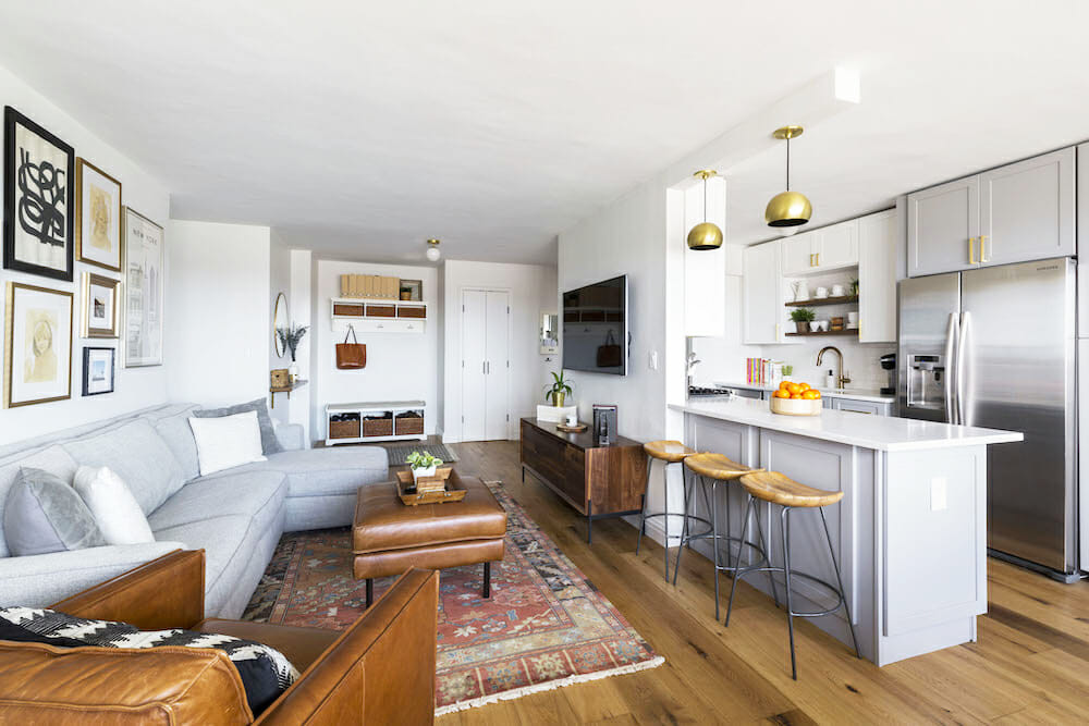
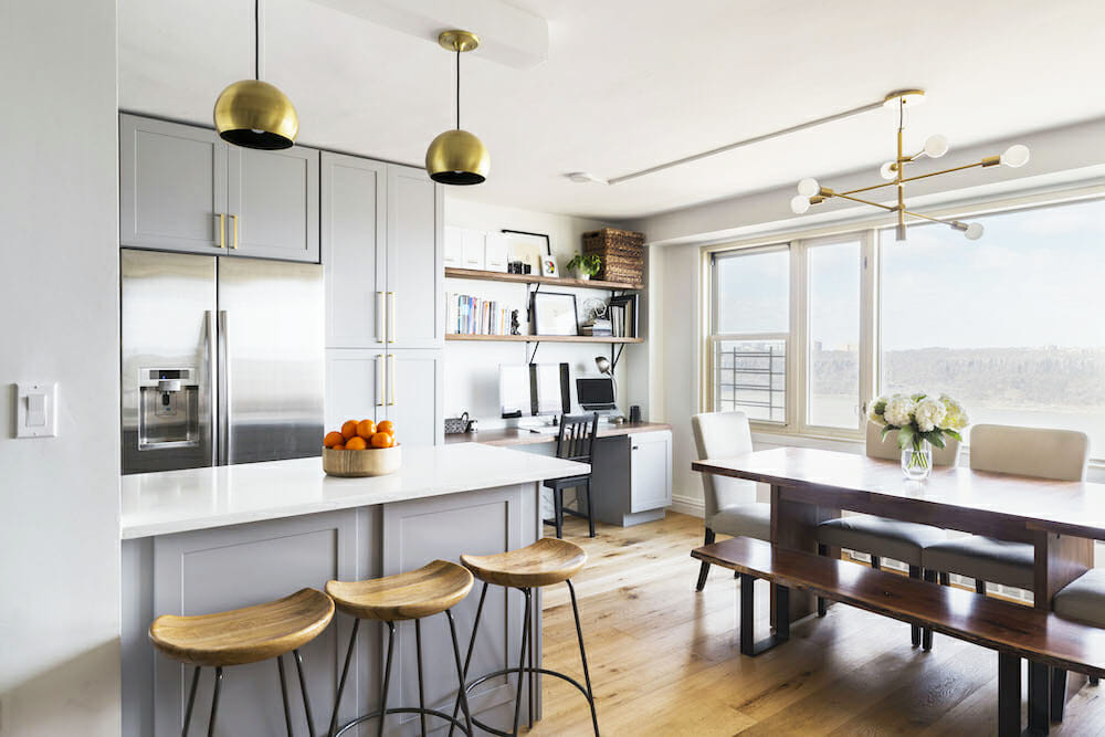
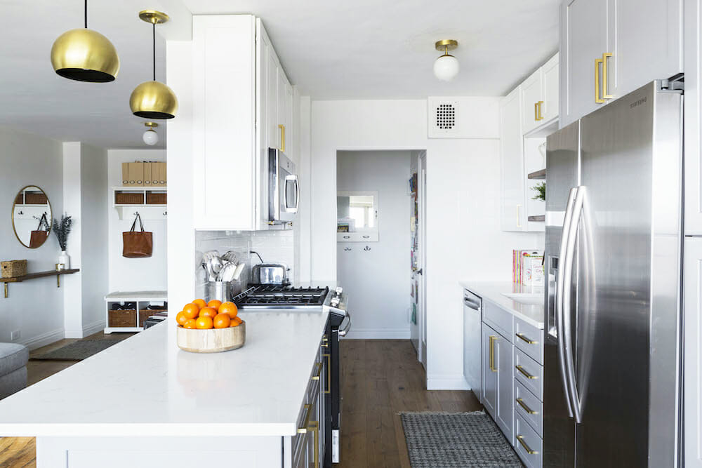
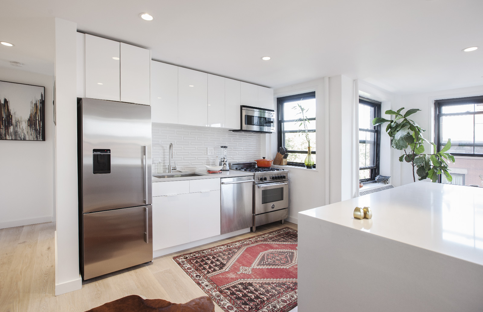
The kitchen needed the most improvement. In our previous homes, we always had wall-facing counters or a separate kitchen away from the living space, so entertaining was always a challenge or just had a difficult flow. With that in mind, we decided to partially open up the existing kitchen wall to create a two-sided counter with an area for stools on the other side where the kids or guests can sit.
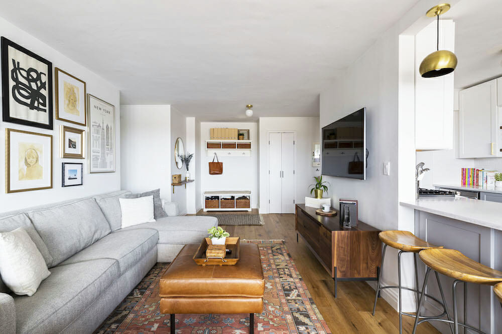
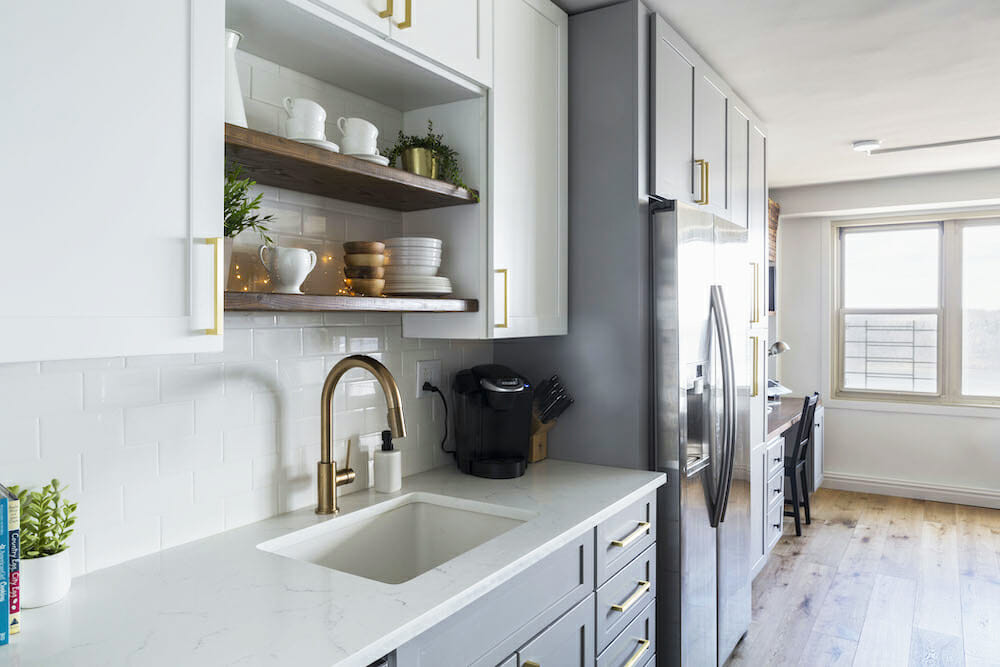
We also shifted the floor plan a little, pushing out the wall between the kitchen and the living room to widen the galley. We told our design-build team our vision, and they helped us figure out the best way to do that given the space and structure of the apartment.
Versatility in the kitchen
It is now so much easier when the kids want to help us in the kitchen. There is definitely a lot less pushing and arguing for space and for who gets to sit on a random chair we used to pull up to the counter. Pancake mornings are more zen now that everyone has their own stool to sit on to help.
Renovate expertly with Sweeten
Sweeten brings homeowners an exceptional renovation experience by personally matching trusted general contractors to your project, while offering expert guidance and support—at no cost to you.
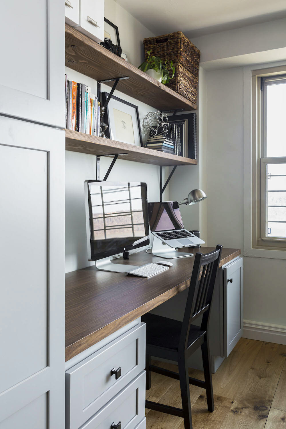
I think if you asked Chris what he was the most excited about, it would be the built-in desk and cabinet space. We were able to work with our design-build team to create an organized drawer and cabinet system for our work and creative space, as well as a system for the constant flow of kids’ schoolwork, art supplies, and collections.
A modern update
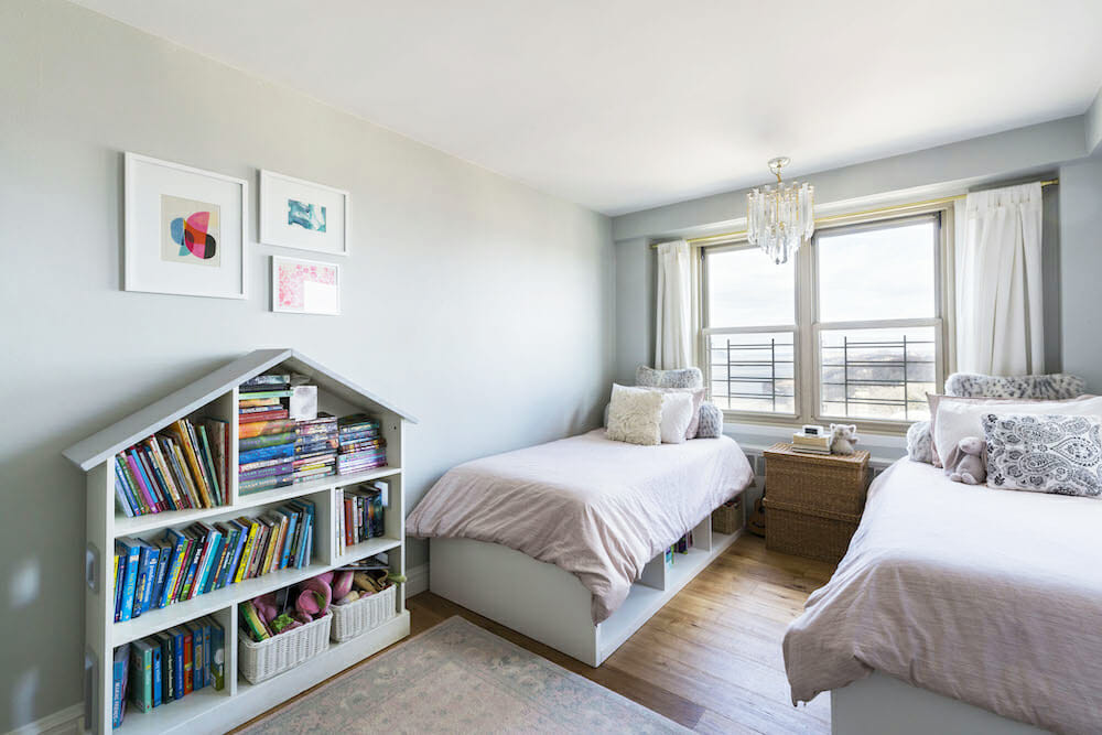
In the dining room, we got a new light fixture for over the table, but we saved the original 1950s art deco chandelier that had hung over the original dining area and decided to shine it up and use it as a fixture in the girls’ bedroom. They love it and it definitely makes for a fancy splash of fun in that room.
A bathroom that fits just right
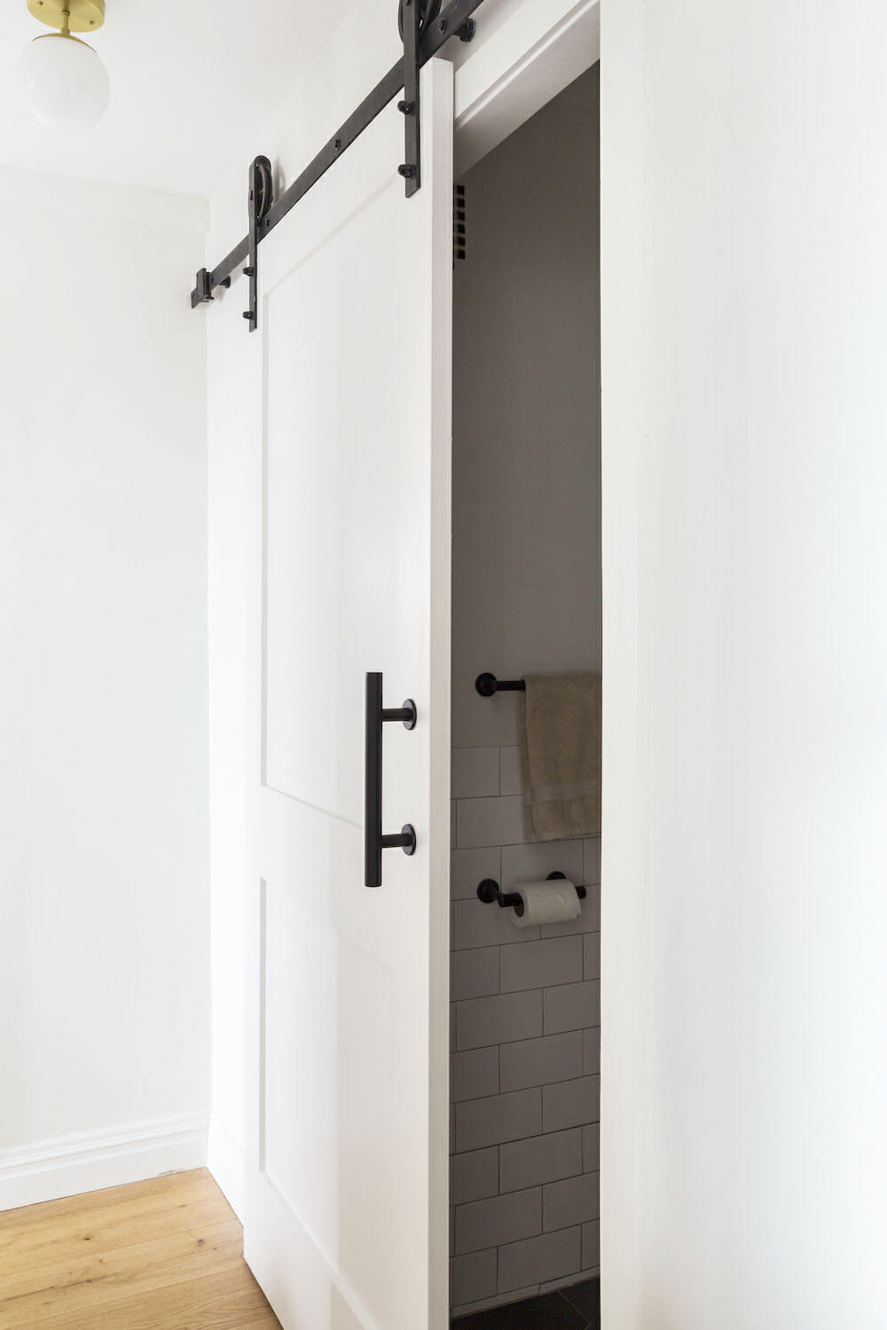
For the bathroom, which is tiny, we had a barn door put on instead of having a door that opens into the bathroom, making the space even tighter.
More room, more convenient
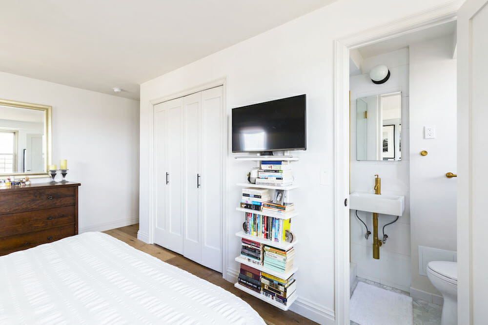
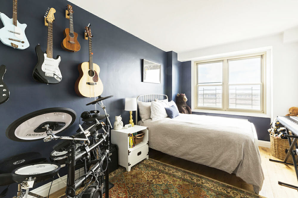
Our design-build team also suggested the double doors for closets throughout the apartment in place of a single door. Our son plays the drums so having a wider entry opening was helpful. The double doors took up the least amount of space when opened and allowed for more wiggle room with our furniture. It made a world of difference.
Plan for the ‘just-in-case’
With any major project like this one, there will always be hiccups. Whether it be with the schedule, or with finding pipes in the wall you didn’t know were there, or with materials that you did not account for in the budget. Our advice to future renovators: Plan accordingly, but also maybe plan for “just-in-case.” Give yourself a buffer for scheduling and for budget, if you are able. It will most likely be needed.
We certainly needed it. We were renting elsewhere on a one-year lease, and when we bought the unit, we only had a few months left to go on our lease. So we were eager to get the ball rolling. The contractors gave us a clear schedule that aligned with the end of our lease, perfectly. There were some unforeseen hiccups around approvals and it could have taken much longer if it weren’t for our contractor and design team always going to bat for us and making necessary calls and contacting the powers that be to make sure things moved along at a faster pace.
Working with remodeling hiccups
Because of slow approvals, the schedule did get pushed back a few weeks. Our time renting had ended and we had to be out. But the project was still very much in the throes of construction, so we ended up staying at an extended-stay suite in the neighborhood directly across the bridge from us in New Jersey! We were carpooling back and forth over the George Washington Bridge for work and school—a traffic nightmare. Our contractor was very understanding and sympathetic to our needs, so he doubled his team and had everyone finishing up the place at top speed. And even if my kids did appreciate the free cookies at the hotel counter every day, we were thrilled to finally be in our finished apartment after a week in the hotel.
Looking back on it all, our newly renovated home makes us feel super grateful—grateful for having the ability to make the changes we wanted and grateful we found such a great team to help and make those changes.
Thank you, Erin and Chris, for sharing your home with us!
Renovation Materials
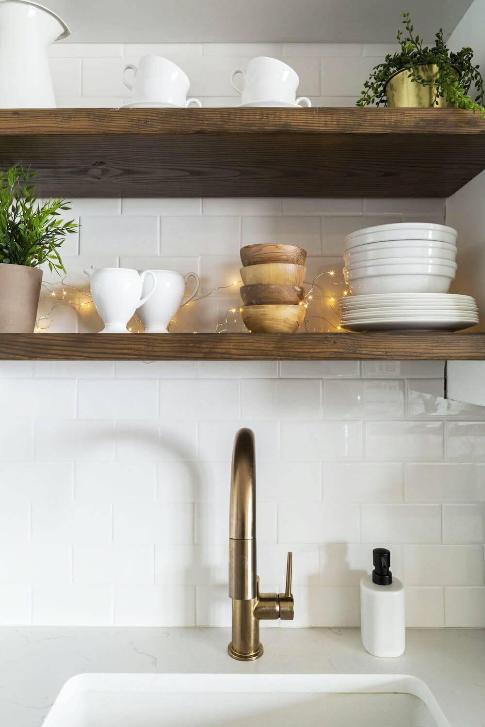
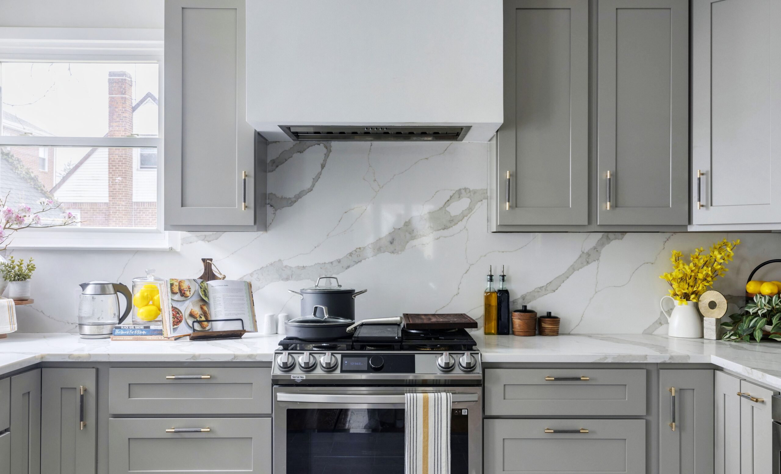
KITCHEN RESOURCES: Engineered prefinished hardwood flooring in European White Oak: PID Floors. Allure lower cabinets, pantry, and desk in Galaxy and Nickel; Allure upper cabinets in Galaxy and Frost: Fabuwood. Cabinet hardware: Schoolhouse. White Carrera quartz countertops: Custom. Wood shelves over sink: Custom. American Walnut shelf stain: Minwax. Subway tile 3×6 backsplash in white: Daltile. Faucet: Delta. Elkay quartz classic sink: Elkay. Samsung refrigerator and dishwasher: Samsung. LG stove: LG. Peninsula and ceiling lighting: Schoolhouse. Wall paint in Winter White, #2140-70: Benjamin Moore. Bar stools: West Elm.
LIVING ROOM RESOURCES: Light fixtures: Schoolhouse. Wall paint in Winter White, #2140-70: Benjamin Moore. Bar stools: West Elm. Engineered prefinished hardwood flooring in European White Oak: PID Floors.
DINING AREA RESOURCES: Lighting: West Elm.
MASTER BEDROOM RESOURCES: Wall paint in Silver Gray, #2131-60: Benjamin Moore.
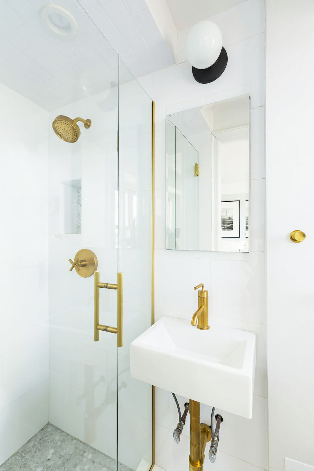
MASTER BATHROOM RESOURCES: Floor tile in Carrara 3″ hexagons and shower floor tile in Carrara 1″ hexagons and 12×24 composition glazed ceramic CP01 Gesso gloss: Daltile. Kohler Purist hardware and fixtures; Vibrant Moderne brushed sink; vanity mirror and medicine cabinet: Kohler. Toto Utramax ll toilet: Toto. Lighting: Rejuvenation.
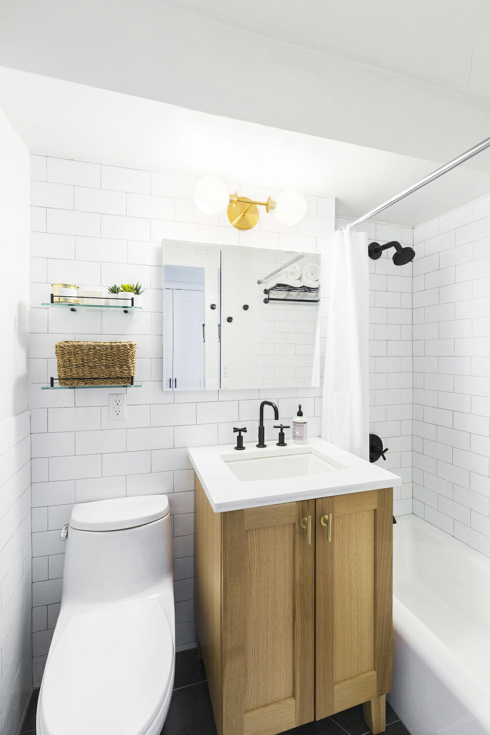
SECOND BATHROOM RESOURCES: Floor tile in Anthracite Hex Disc series and wall tile 4×8 subway in white: Daltile. Kohler Purist hardware and fixtures in matte black; Poplin vanity in khaki; White oak sink; Bellwether bathtub; Vanity mirror and medicine cabinet: Kohler. Toto Utramax ll toilet: Toto. Lighting: West Elm.
KIDS’ ROOMS: Girls’ room paint in Stonington Gray, #HC-170 and Super White, #PM-1; Boy’s room paint in Hale Navy, #HC-154: Benjamin Moore.
Thank you to Erin, Chris, and their family for sharing your Hudson Heights co-op renovation with us!
—
See how one family swapped around a floor plan to make it more family-friendly.
Sweeten handpicks the best general contractors to match each project’s location, budget, scope, and style. Follow the blog, Sweeten Stories, for renovation ideas and inspiration and when you’re ready to renovate, start your renovation on Sweeten.
