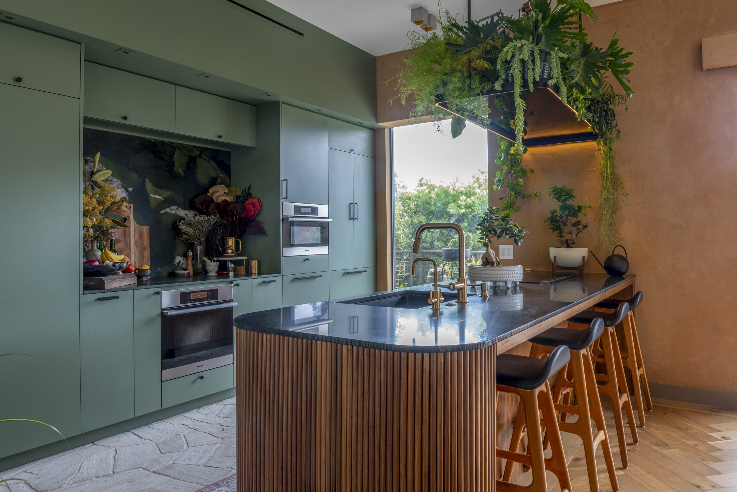
Sweetening the Kitchen: It’s All About the Cabinets
When I began the design for my kitchen the only thing I knew for certain was that it would have dark wood cabinets. Sweeten brings homeowners an exceptional renovation experience by personally matching trusted general contractors to your project, while offering expert guidance and support—at no cost to you. Renovate expertly with Sweeten
This was in part a nostalgia for the large, eat-in kitchen of my childhood home, which had heavy plywood cabinets with a thickly varnished walnut finish. Although these cabinets weren’t pretty they’re still strongly wound up with my idea of “kitchen cabinet.” (Interestingly, my mother didn’t share my nostalgia and tried to steer me towards lighter-colored woods.)
I found a cabinet supplier who offered sturdy, reasonably-priced, cabinets. I chose cherry wood because the grain is straight, fine and regular, but agonized over the finish. The cherry came in a range of brandy, cranberry, and nut-colored stains. I scrutinized my samples at every opportunity, struggling to select the right one. Finally, after seeing full-size cabinets at the supplier showroom, a finish called “Coffee” (at the far left in the photo) jumped right out at me. Although dark it was luminous, with undertones perfectly balanced between red and yellow.
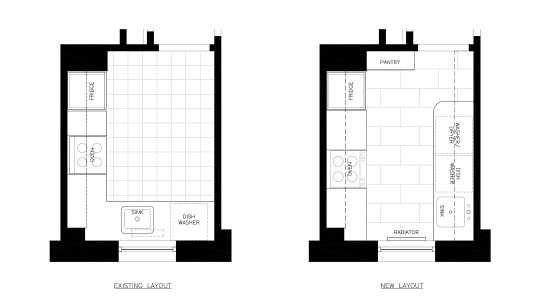
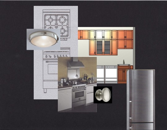
Once I’d selected the cabinets and a layout the other details came together quickly. Because of the tight space I was limited to 24″-wide appliances, which focused my search. Although I selected appliances with a brushed stainless steel finish and contemporary details, I still wanted the room to have a traditional feeling, in keeping with the whole apartment.
I chose a “Shaker” cabinet door style that straddled the line between Contemporary and Traditional, and a sink faucet, ceiling lights, and cabinet door pulls that were similarly styled, all in a satin nickel finish. I found a grey ceramic tile for the floor and a pale blue-grey paint for the walls that both brought out the warmth of the wood.
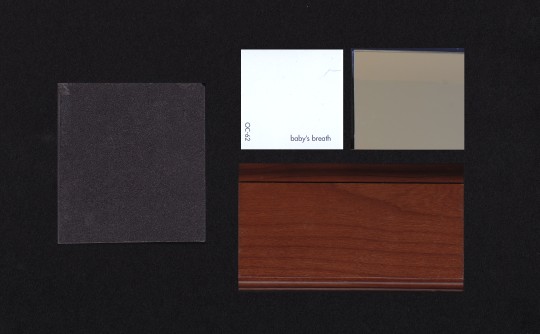
I wanted stone countertops because the natural variation in the material adds depth to an interior. My preference was absolute black granite: it was durable and had fine markings and a classic look. But I didn’t like the typical dark, polished surface; it felt too severe for the room. Instead I selected a softer honed finish, which was not as dark (not as “absolute”) but similarly simple to maintain.
The final element to fall into place was the backsplash. I was afraid that stone or ceramic tile might weigh down the narrow space. Then one afternoon I visited my friend Bonnie, an interior designer, and saw her elegant bronze mirror backsplash. It caught light from the windows and offered soft reflections. I thought that this would open up my kitchen nicely and add just the right bit of sparkle. The next morning I visited a glass supplier to get an estimate, and my kitchen design was complete.
