A New Neutral: Light Green Kitchen Cabinets
Move over, beige. Mint green, sage, and celadon are delighting kitchens.
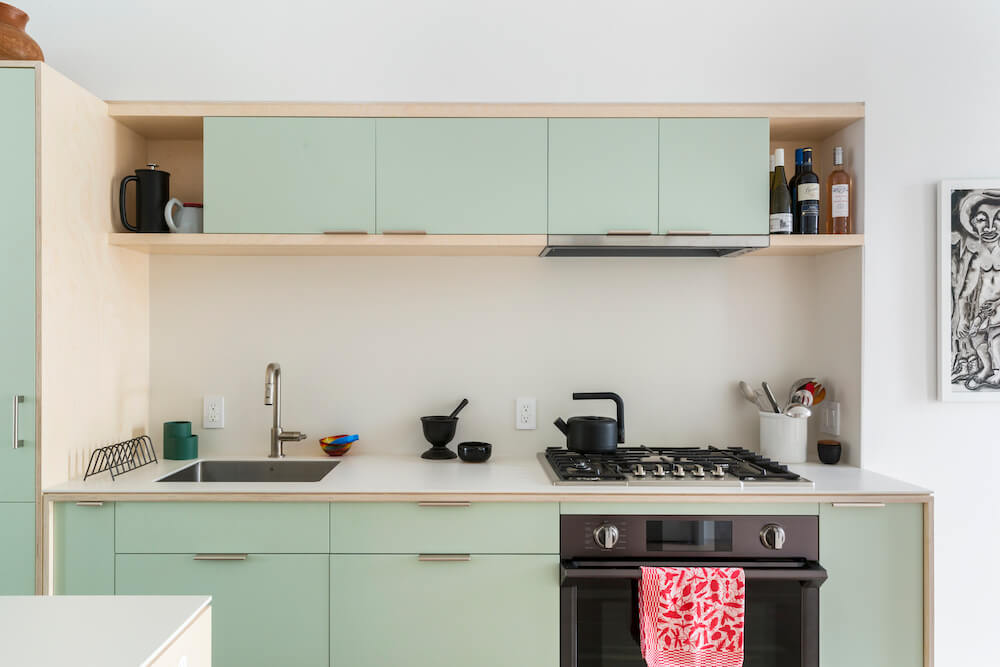
Just right for a touch of color
Finding light green in the home is a natural choice. The shade is so closely aligned with plants, trees, and the fresh outdoor air that it’s no wonder it brings comfort. We’ve been seeing light green kitchen cabinets—from mint green to light pistachio—remain popular over time earning their place as a dependable, go-to neutral.
Here, examples of how Sweeten homeowners are bringing this kitchen design trend to life.
Sweeten matches home renovation projects with vetted general contractors, offering advice, support, and secure payments—for free.
From builder-grade to sage green farmhouse cabinets
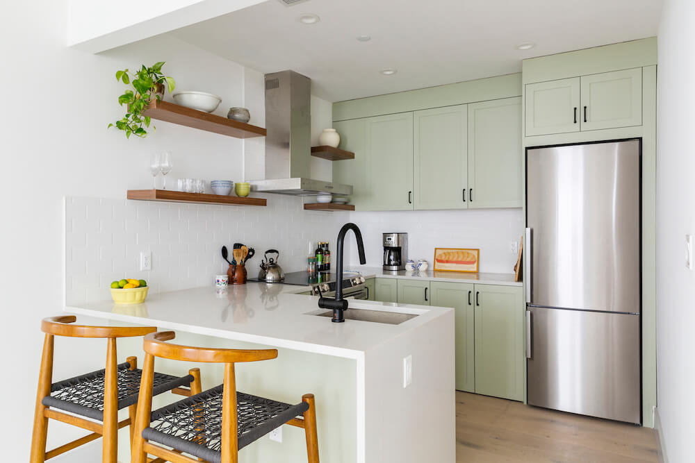
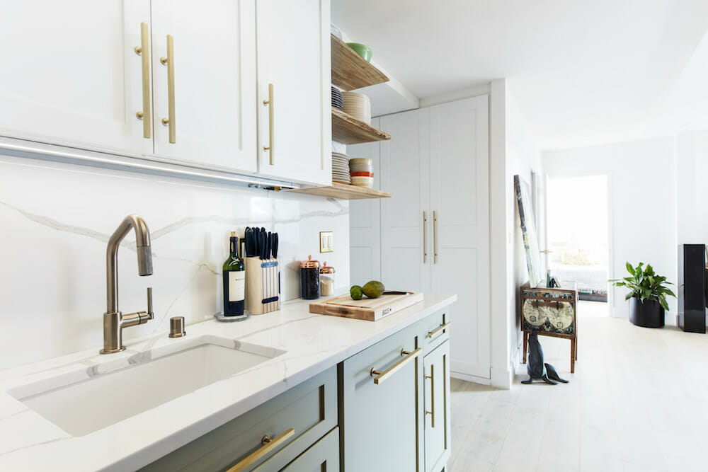
Even though Abby’s building was newly-built, the builder-grade materials found in her kitchen weren’t feeling like home to her. In particular, she didn’t like the dark green cabinets but preferred a lighter, airier version of the color. The design she wanted was a farmhouse look for her kitchen remodel. Her Sweeten contractor worked with a subcontractor to custom-make Shaker-style cabinets.
“I had been thinking about green kitchen cabinets for a long time,” she said. “Sage green kitchen cabinets have color but are a tone that isn’t overwhelming.” Black fixtures and walnut shelves complemented the sage green.
Light green kitchen cabinets in verdigris

The Sweeten homeowners of this 1882 Bronx rowhouse were Steve, a professor at the School of Visual Arts, and Lewis, a tax professional. Each floor would be made into an open concept, which required a true townhouse gut renovation. Everything was demolished down to the brick and joists.
Renovate expertly with Sweeten
Sweeten brings homeowners an exceptional renovation experience by personally matching trusted general contractors to your project, while offering expert guidance and support—at no cost to you.
The couple aimed for a design aesthetic of warm minimalism. Located on the middle level with the living and dining rooms, the kitchen cabinets were custom-built. The modern, flat-front panels were painted a hue that was of the palest verdigris. To create a unified look with other spaces in the home, the master bathroom upstairs also featured this color family in yellow-greens and gray-greens.
A galley kitchen in mint-green
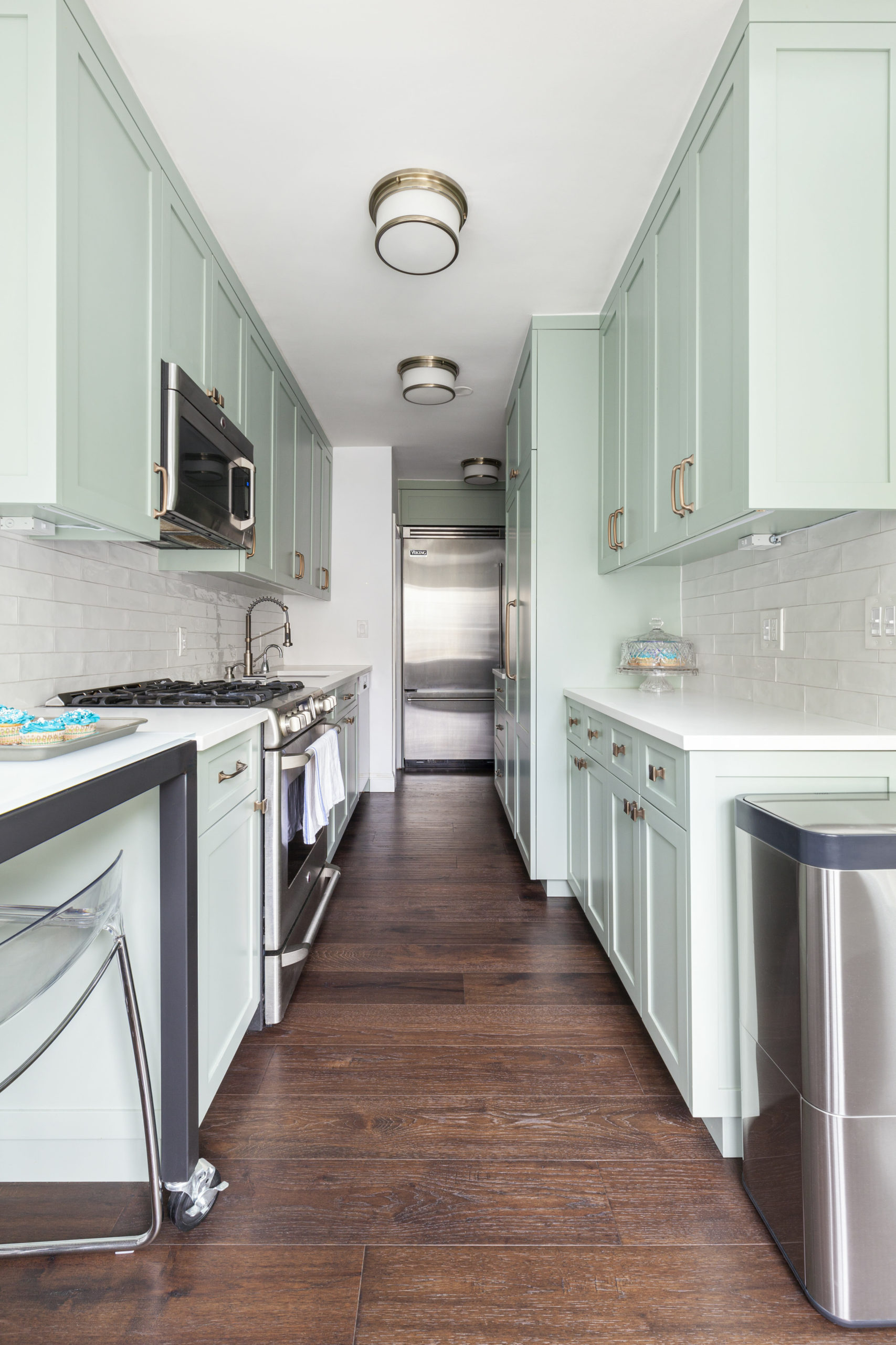
Laura and Tim lived in their 1929 brick townhouse in Rego Park, Queens, for many years before deciding to renovate. They loved their home. However, it became what Laura called “grungy and old.” The kitchen had been damaged by a leaky shower from the bathroom above and needed new cabinets, flooring, and wall treatments.
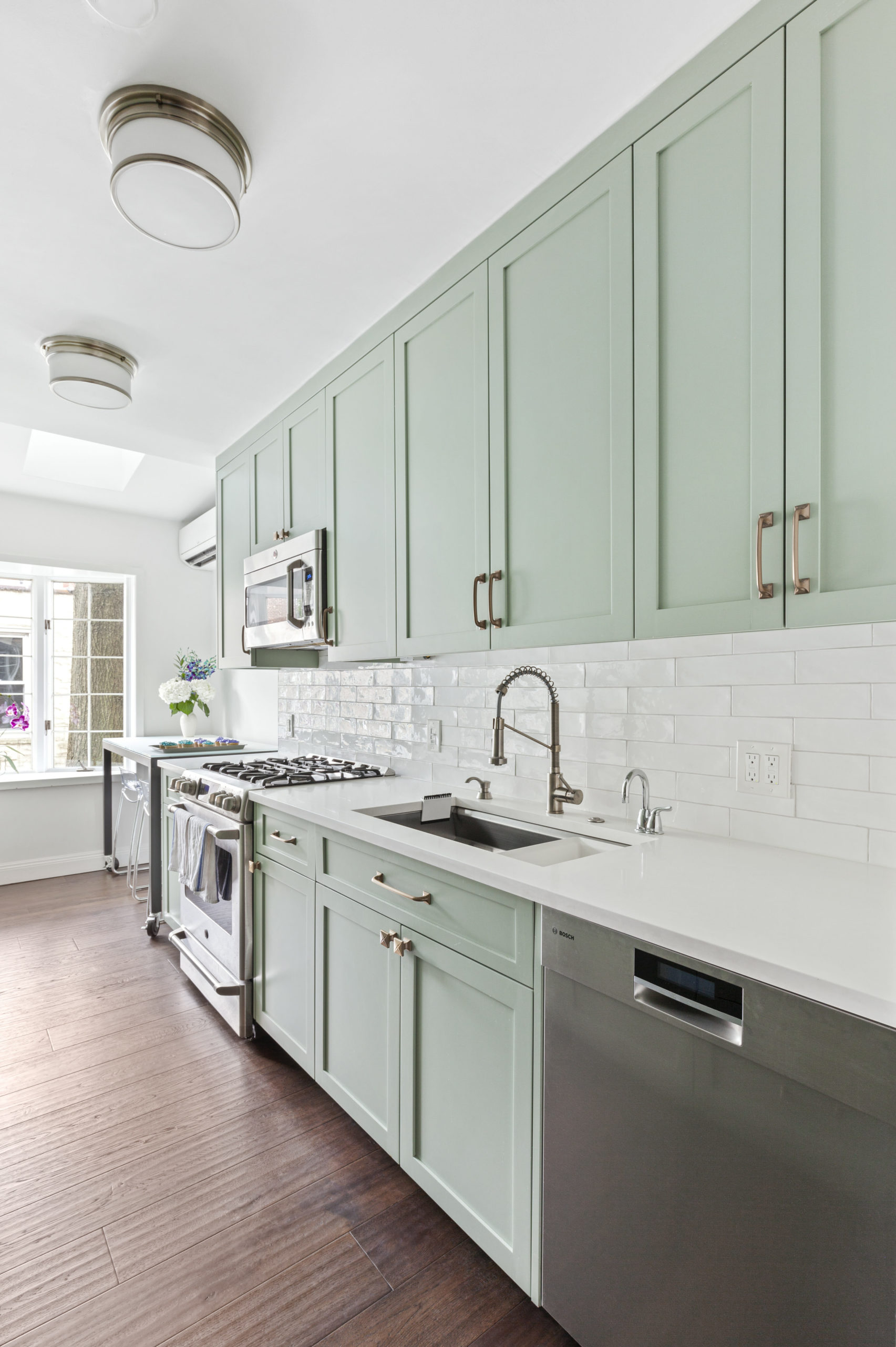
The couple turned to Sweeten for the overhaul. Their contractor enclosed an outdoor patio connecting it to the back of the kitchen. With the introduction of skylights and a new color palette, the kitchen became a cheerful space for the family to gather.
Laura and Tim selected Shaker-style cabinet fronts in mint green. The hue “matches the feel of the old house but is also clean and modern at the same time,” said Laura. Moreover, the brushed bronze hardware and stainless-steel appliances provide a nice contrast. “The kitchen came out beautifully,” Laura said.
Light green kitchen cabinets include agave
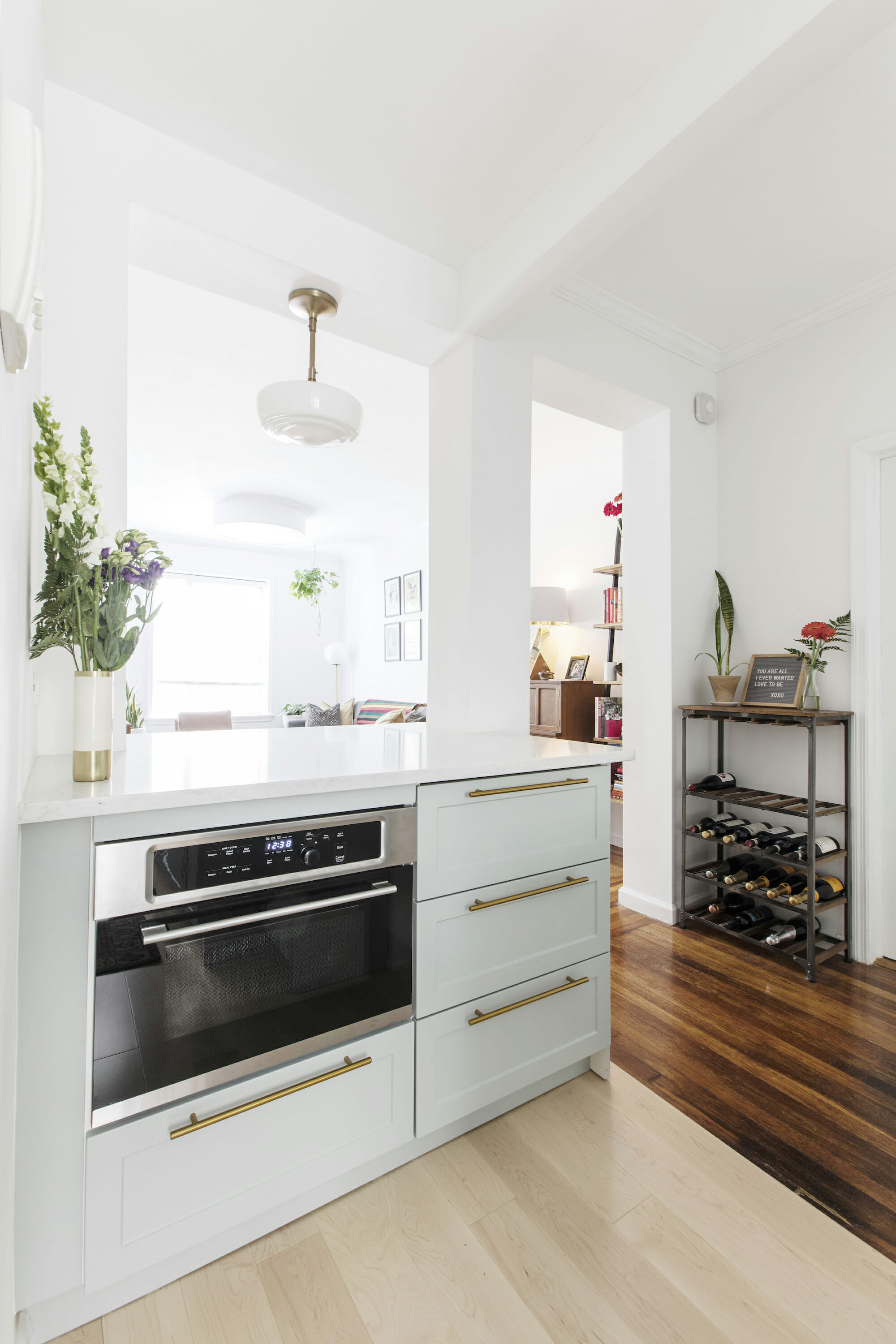
Two years after buying their two-bedroom apartment in Queens, Gina and Andrew decided to renovate. The couple wanted to fix the kitchen’s small, awkward layout and create a space that would inspire them to cook.
The pair was inspired by the lovely mix of greens in their co-op courtyard. To bring this into their design, they chose beautiful lower cabinets in the shade of agave. Warm brass hardware stands out against the more muted green cabinets. “I never used to cook and after our renovation, I’m cooking up a storm,” said Andrew.
When you’re ready to get started on your kitchen or home remodel, work with Sweeten to renovate with the best contractors.
Two designers compromise on color
Design is definitely in this couple’s wheelhouse. An interior designer and former architect, respectively, Maggie and Adam knew that they would have to make some concessions when designing their own co-op. Their focus: the kitchen.
Their kitchen was small and outdated. Luckily, they were able to make it much larger by removing the surrounding wall, changing the location of the refrigerator, and adding shelves instead of upper cabinets.
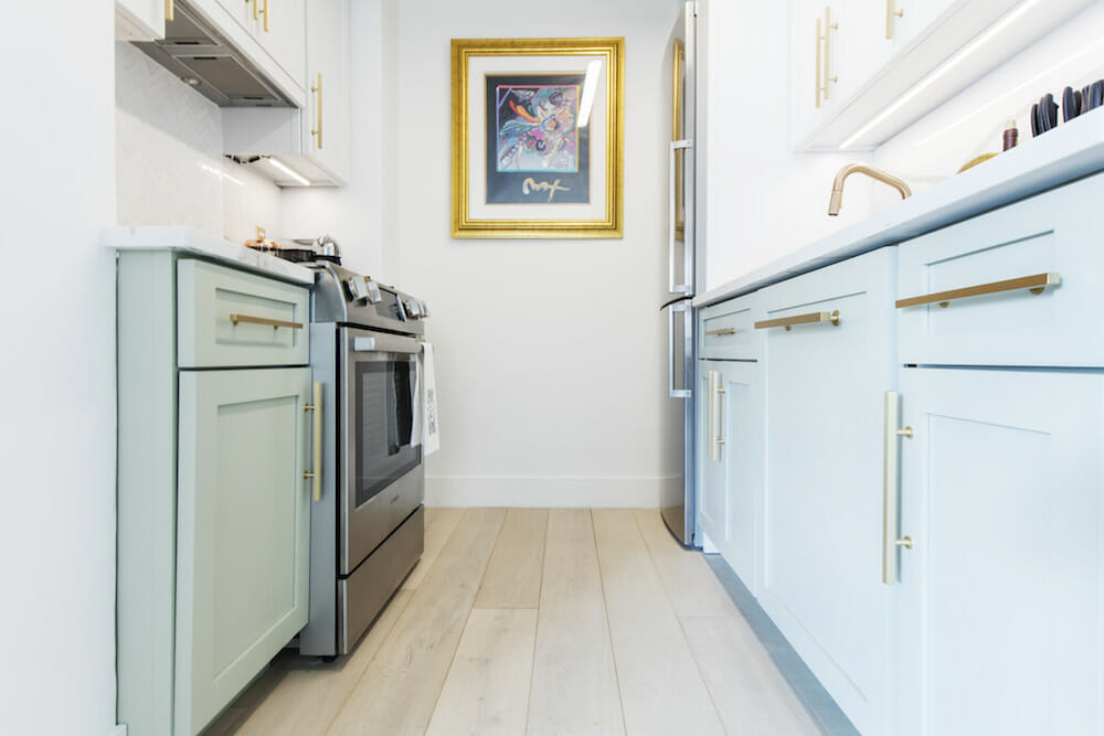
According to the Sweeten couple, the kitchen really revealed the way they communicated. “The kitchen shows the full-scale of compromise between our distinct design ideas,” said Adam. “For instance, the light green lower cabinets add the layer of color that fit her style, but have a gray tone that doesn’t stray from my own style.”
It was important to Maggie to “add a personal touch, warmth, and texture to the kitchen,” which they achieved through the mint-green cabinetry—a style that is classic yet contemporary.
—
Sweeten handpicks the best general contractors to match each project’s location, budget, scope, and style. Follow the blog, Sweeten Stories, for renovation ideas and inspiration and when you’re ready to renovate, start your renovation with Sweeten.
