Heather’s Sweetened Upper West Side Kitchen Renovation – Homeowner Guest Post
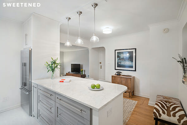
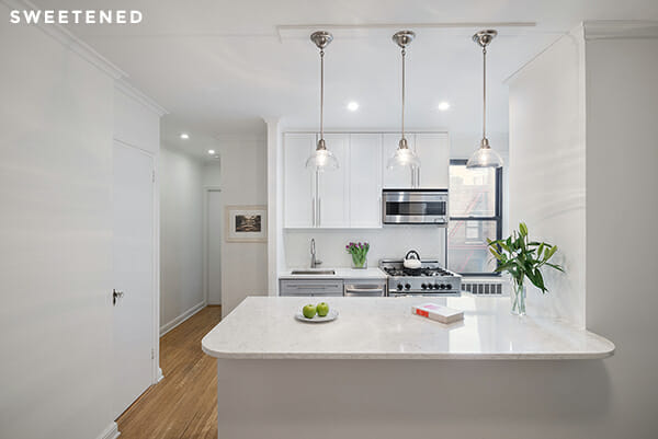
This week’s guest post comes to us from Heather in Manhattan, a first-time homebuyer and renovator who set out to re-do her Upper West Side galley kitchen with a single-minded focus on removing an offending wall and filling the new open space with sleek basics. Inspired by the open kitchen in the apartment directly above hers, Heather posted her project on Sweeten and was especially smart to upload inspiration photos with features her small kitchen could actually accommodate – her sources of inspiration featured nearly identical layouts to her own kitchen. We put up a photo of Heather’s kitchen in a blog post comparing custom and IKEA cabinets, and commenters demanded to know more about this beautiful millwork, so Heather was kind enough to take the stage this week with a full recap of her renovation.
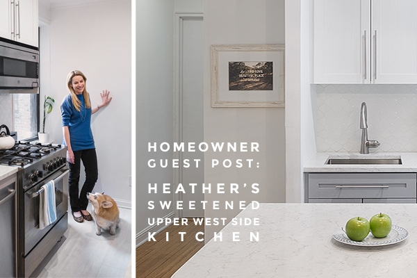
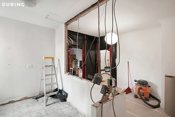
I bought my one bedroom apartment on the Upper West Side in the spring of 2013 after months of looking for just the right space. I loved the place, but I knew that the outdated kitchen and compartmentalized dining room were keeping my new home from really coming together. The kitchen needed a complete overhaul – I really wanted to knock out a portion of the wall that separated the kitchen from the living area to create more of a pass-through and let light in, and my wish list included all of the other classic components of a typical kitchen renovation like new cabinets, a tiled backsplash, countertops, and sleek appliances. I was ready to renovate but couldn’t help feeling nervous; this would be my first ever renovation and I kind of didn’t know where to start. Luckily, I found Sweeten and they connected me with a design-build firm.
Sweeten brings homeowners an exceptional renovation experience by personally matching trusted general contractors to your project, while offering expert guidance and support—at no cost to you. 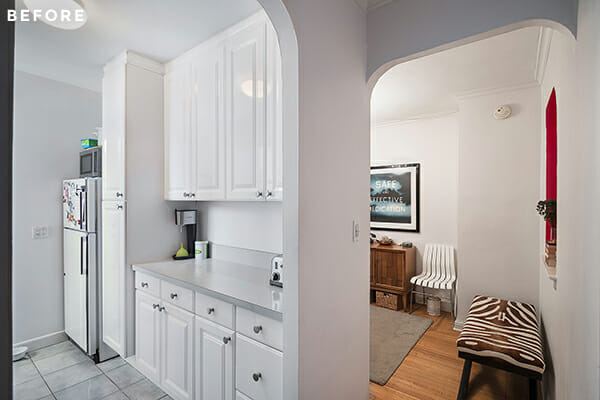
Renovate expertly with Sweeten
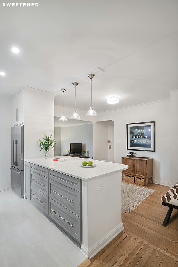
What I loved about my Sweeten design-build firm is that they worked as a contractor and designer team. It was so helpful to have the designer’s eye on everything as I went through the process, and the contractor is an extremely skilled craftsman who navigated the design (and many changes!) with ease. First, we decided on a plan that would knock out most of the wall between the kitchen and the blocked dining room. This change was the one I was most excited about: in addition to making the awkwardly placed dining room more functional, it was going to allow light from the kitchen window to flow into the space, which was especially key for me.
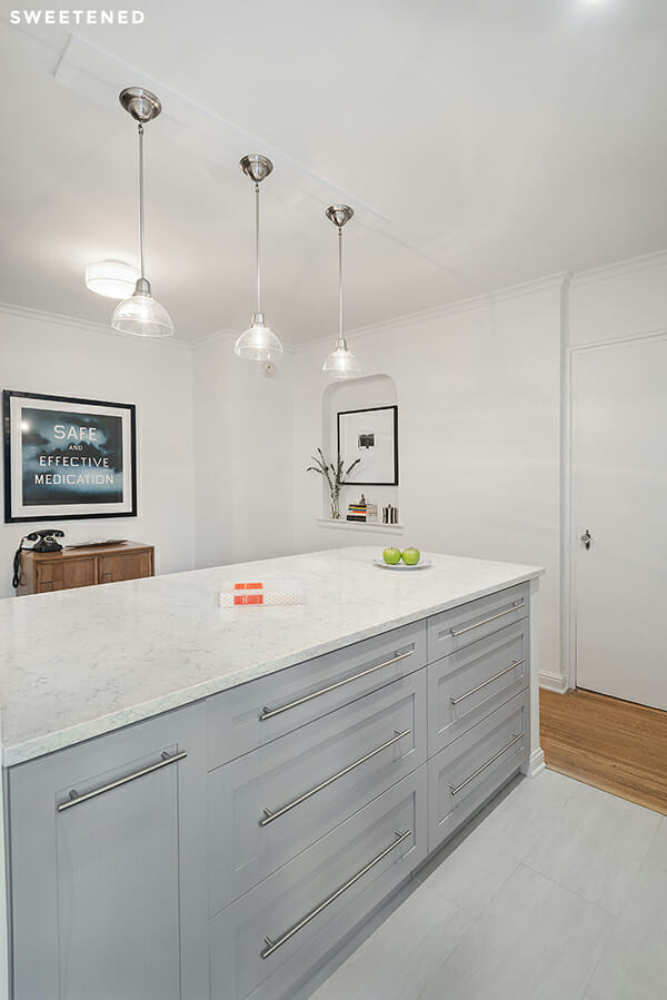
Next we set to work designing the cabinetry and the functionality of the kitchen. I originally assumed that IKEA cabinets were the best bet for my budget, but my designer helped me understand that custom cabinetry would add more storage and function to the kitchen, without adding all that much to the total cost. I was surprised to find out that I could make room for custom cabinets in my budget by keeping the designs and materials simple. I learned a lot during the design process – like how important electrical outlet placement is and that picking a paint color can be agonizing. My Sweeten contractor and designer were extremely patient with me. I asked a million questions and changed my mind about materials a bunch of times.
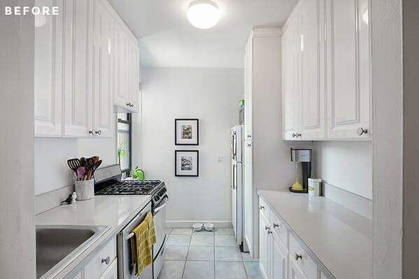
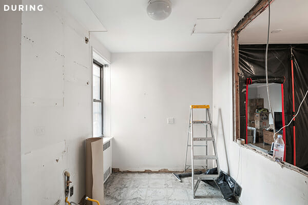
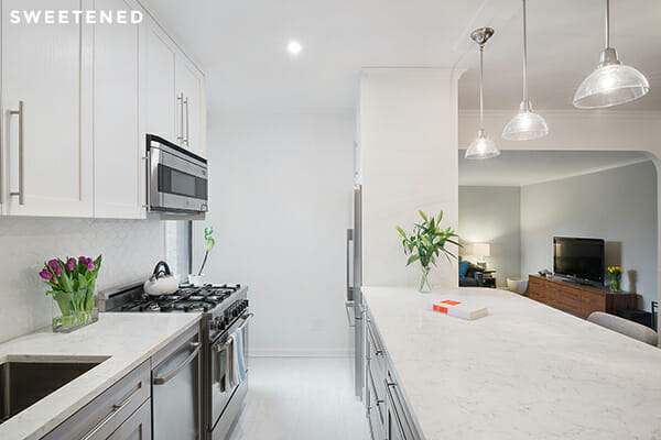
Once all of the key design decisions were made, it was so exciting to watch the project come together. The wall came out first and that was pretty amazing…even in the mess of demolition I could see how big of a difference it was going to make in the ways I planned to use the space. There were parts of the renovation that were so much fun – like picking out appliances and coming home to find cabinets installed. There were also parts that were not so fun – like countertop sticker shock, mulling over endless lighting options, and discovering that my ceiling was uneven and needed to be redone. I was pretty pragmatic about what I wanted overall but I was still unprepared for the challenge of making new decisions every day. It felt like just when I had decided on something – like paint colors – my picks wouldn’t work for some reason, so the design was a constantly evolving process and stressful at times. Thankfully, I had a designer and contractor, so I was not nearly as lost as I would have been with a contractor alone. I love my designer!
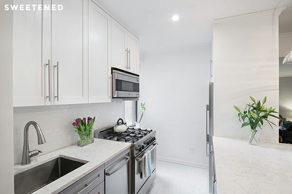
I ended up deciding on a neutral gray and white palette for most of the materials. I found backsplash and floor tiles from Nemo (the Atom wall tile in Eggshell and the Oxy porcelain floor tile in Royal White). My Sweeten contractor used solid ash for the cabinets and included a pull-out mini pantry, extra drawers where toe kicks would traditionally be, and a sponge tray along the sink. After a lot of back and forth, I decided to go with Benjamin Moore paint and alternated with White Heron on the upper cabinets (and walls) against Gull Wing Gray on the base cabinets. I loved the look of natural stone countertop materials, but I didn’t want to stress about stains or red wine spills, so I decided to go with LG’s Viatera in Cirrus, a durable Quartz surface that still evokes a natural marble feel. I found a great French-door fridge from Fisher & Paykel that I love – light years beyond the beat-up and dingy 1980s fridge that it replaced. My new, slimmer dishwasher is from Bosch and my new stove and microwave are both from Bertazzoni.
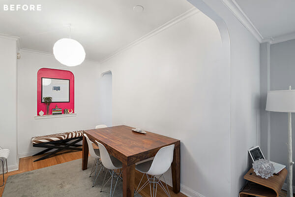
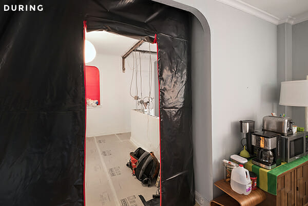
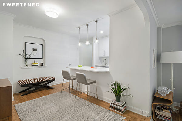
Now that it’s done, it’s hard to imagine my apartment any other way. The workmanship of every part of my kitchen is beautiful – the contractor even came back to finish a few last pieces at no extra charge to me. I love having guests over and can invite them to sit at the counter while I’m prepping snacks or a meal. Opening the wall has had an effect on the entire living space of the apartment connecting the kitchen, dining, and living rooms and giving them more of an open-plan feeling. Taking on a renovation is definitely stressful, and it was hard to come home to a little bit of chaos every day, but the end result is fantastic and so worth it. I love cooking and hosting guests at my house now, and I can’t wait to start planning my bathroom renovation!
—
Moving walls? Not moving walls? Heather’s kitchen would have been gorgeous either way, but we’re so glad she was able to work with Sweeten’s experts to completely re-imagine the flow of her home. If your tiny kitchen is ready for a transformative overhaul, post your project on Sweeten and we’ll match you with renovation experts who are right for your project’s budget, location, scope, and style.
