Broadening A Crowded Clinton Hill Co-op Kitchen
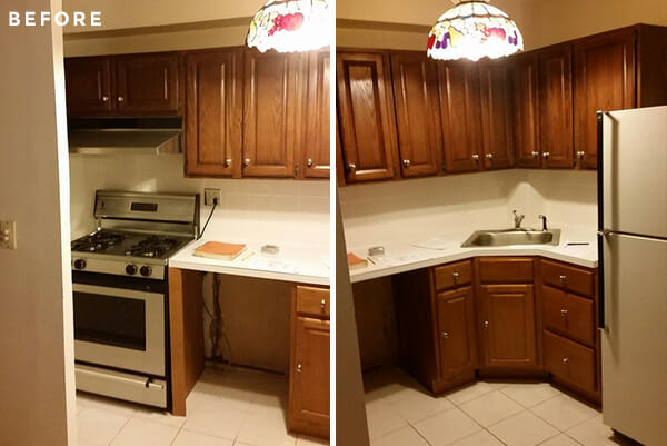
Gregg and Kelly were right where they wanted to be. The couple had just closed on a sought-after two-bedroom in a very popular Brooklyn co-op. But there was a big nagging problem lurking in the “heartbeat” of their home: severely dated decor wrapped in really bad wiring. The new homeowners just couldn’t focus on a future in their new apartment when the kitchen was so obviously stuck in the dark. Read on down for Gregg’s take on their sleek new kitchen renovation!
Guest post by Gregg, Brooklyn homeowner
For about one year, Kelly and I searched all over Brooklyn to not only find the perfect apartment, but also the perfect neighborhood. The more we saw, the more our search started to narrow to Clinton Hill and the Clinton Hill Co-ops in particular. Located on what I think is one of the most beautiful streets in Brooklyn, the Clinton Hill Co-op campus had everything we were looking for: a sensible layout, sturdy prewar structure, and great value for the money.
We zero’d in on a two-bedroom unit that was in need of a lot of work. Many of the apartments in the Co-ops have been renovated before; this one never had and it was a mess. In fact, it was so untouched that even the light switches were still push button rather than actual switches. But, having seen numerous posts on Sweeten, we knew the potential of the space and had a vision for what it could be. The first and most important thing for us to get to was the kitchen and dining room area. We posted our project on Sweeten and found Sweeten Expert Mick to help us with the project.
Sweeten brings homeowners an exceptional renovation experience by personally matching trusted general contractors to your project, while offering expert guidance and support—at no cost to you. Renovate expertly with Sweeten
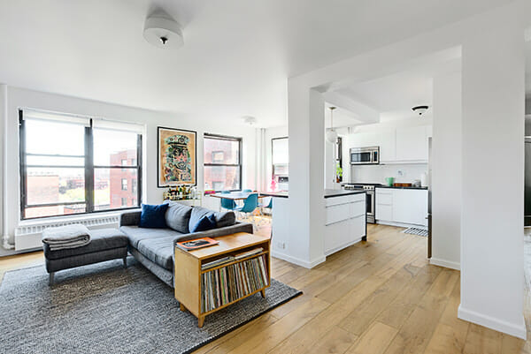
There were a few things we really wanted. First, we wanted something light and airy. Our old apartment only had two windows and both were in constant shadow, so we wanted something that really allowed the light to filter into the living space. We also wanted a place that we could host people in and have a couple of different gathering spots. And finally, I wanted a place that would be easy to cook in and easy for storage.
Mick guided us through all that needed to be done, had suggestions along the way about how to make the space work even better, and let us know what to expect as things went on. We were lucky to have someone who was so honest and upfront as the apartment was in such bad shape. For instance, after knocking down some of the walls, we really got to see how bad some of the wiring was. Mick walked us through the options and took care of everything.

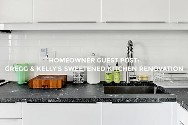
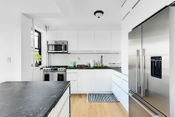
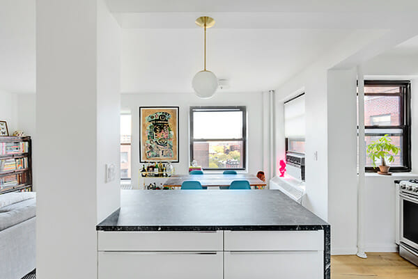
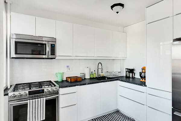
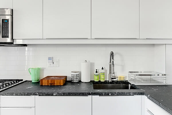
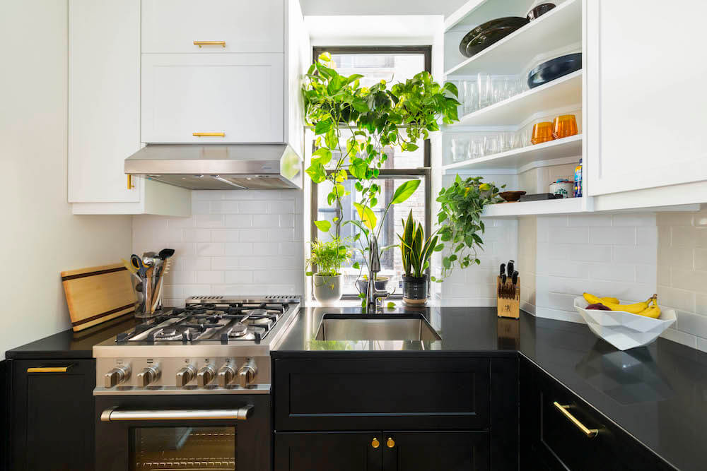
With walls down and new wiring installed, we were ready for the fun stuff. We wanted finishes that were clean and bright, again to allow the sunlight to come in and to make it feel fresh and open. We decided to go with modern white IKEA cabinets because of the solid quality and affordable pricing. Mick, as someone who normally creates custom cabinetry, was able to really help us design a plan that would make the cabinets not feel so cookie-cutter. For the countertops, we went with honed black granite because we wanted the look of a soapstone or black marble, but with a little more durability. The stone looks fantastic and is really a great contrast to the high-gloss cabinets. It was Mick who recommended we get a counter-depth fridge in order to keep things more open with clean lines. It turned out to be a great recommendation.
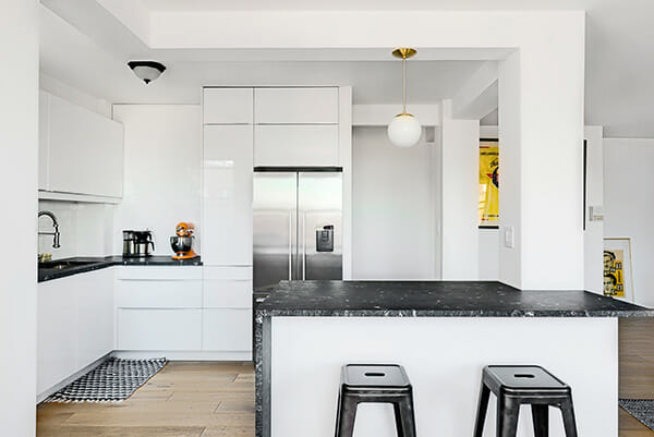
We put in new wood floors ourselves that I think bring some much needed warmth to the space. They are engineered floors and we really liked that they felt lived-in but not in a way that seemed artificial. We wanted something that was matte, had character, but would also be durable. This flooring ticked off all of those boxes.
Overall, we couldn’t be more thrilled with the results. The before and after photos really tell the tale. Mick was able to do a fantastic job–and on budget. Not only that, he has an attention to detail that is very hard to find in many NYC contractors. Most contractors are concerned with getting the job done and that is it – Mick is concerned with getting the job done and getting it done right.
It has been several months since the renovation and we both still say “we can’t believe this is actually our apartment”.
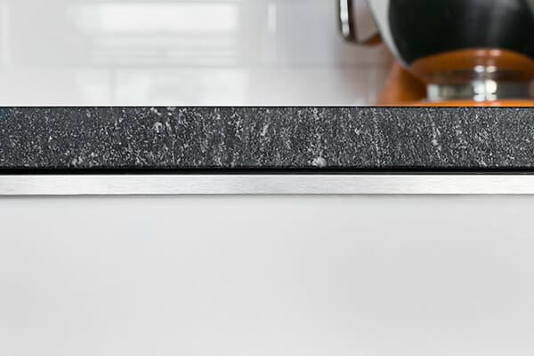
Kitchen selects >> floors: Bella Cera / cabinets: IKEA / counters: honed black granite / backsplash: white subway tiles / sink & faucet: IKEA / fridge: Fisher & Paykel / pendants: Cedar and Moss
—
Sweeten handpicks the best general contractors to match each project’s location, budget, scope, and style. Follow the blog for renovation ideas and inspiration and when you’re ready to renovate, start your renovation on Sweeten.
