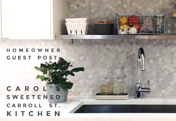
Carol’s Sweetened Carroll Street Kitchen – Homeowner Guest Post
This past summer, Carol W. and her husband took on the kitchen renovation they spent nearly three years envisioning. Today, Carol shares their renovation story and walks us through each of the detailed decisions they made.
One by one, these changes resolved individual storage and surface problems; together, these edits transformed the function and feel of this modern Park Slope home.
Story & photos by: Carol W., Park Slope homeowner
I posted our kitchen renovation project to Sweeten this past summer, but I’d been hoping to update our kitchen from the moment I set eyes on it three years ago. My husband and I found our apartment after a long search, and while the kitchen was in excellent condition, it was the one thing we knew we’d want to change when money and time would allow.
Living with it for a while had its benefits though: we learned a lot about how we use it and what we needed to change to make it more functional.
Inadequate storage and impractical materials
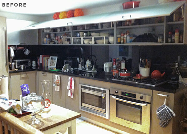
We had a decent amount of wall storage, but the high placement of the cabinets meant that, at 5’4”, I couldn’t reach half of the shelves. The cabinets were originally placed about 23 inches up from the counter, which is about 5 inches higher than the standard, and they didn’t extend all the way to the ceiling, which was a waste of space that could be helpful for storing less frequently used items.
We were also using a small Ikea kitchen island, which added some counter space but didn’t provide enough storage underneath.
Although the kitchen was very modern and minimalist, a look I’m usually drawn to, the materials were all wrong. The cabinet fronts were made of etched glass, a porous surface that began to stain almost immediately and irreversibly, as we and all of our new neighbors quickly discovered (there were some pretty involved discussions on our building listserv about how to fix the staining!).
The black countertops, combined with inadequate lighting, made the windowless kitchen even darker and resulted in us sometimes accidentally slamming glasses into the counter as we set them down (maybe we just have depth perception problems? I like to think it was a problem related to lighting and not my eyesight!).
Insufficient lighting and poor air circulation
The kitchen only had four small recessed lights, which weren’t enough to fight off the light-sucking ability of the countertops. We found ourselves gravitating to one brightly lit spot whenever we did cooking prep, especially with sharp knives.
In addition, we don’t have outdoor venting for the stove, which, although not ideal, is not terribly uncommon in New York apartments. The odd thing was that in order for the stove hood to actually recirculate air properly, we had to leave open the doors to the cabinet housing the hood.
Given that the doors were faced with glass and opened upwards, it was a serious head-bumping hazard. In addition to these needed improvements, we also wanted to lighten up the general color scheme and add some open shelving.
Sweeten brings homeowners an exceptional renovation experience by personally matching trusted general contractors to your project, while offering expert guidance and support—at no cost to you. Renovate expertly with Sweeten
Pinning & prepping
Between moving into the apartment and taking on the renovation, I went to Beijing for a year. The timing wasn’t great—especially since we had also just gotten married—but it had to be done (I was doing field research for my dissertation, something that had been in the works for a while).
While I was there, I worked by day and dreamed about my new kitchen by night. I pinned, I sketched, and I came across Sweeten. Sweeten’s project pages and blog posts gave me insight into what was, to me, a very mysterious process and gave me a better sense of what a renovation would entail and how to prepare for it.
I found Lisa’s kitchen post (part one and part two) particularly useful!
Posting the project to Sweeten was the first step, and we decided to go with our Sweeten contractor after going over a few bids. I also began translating my chicken scratches into Ikea’s 3D Kitchen Planner and researched online sources for the backsplash, counters, and lighting.
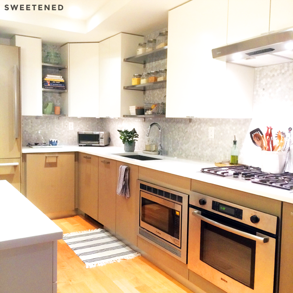
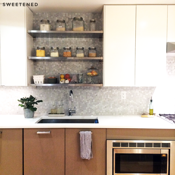
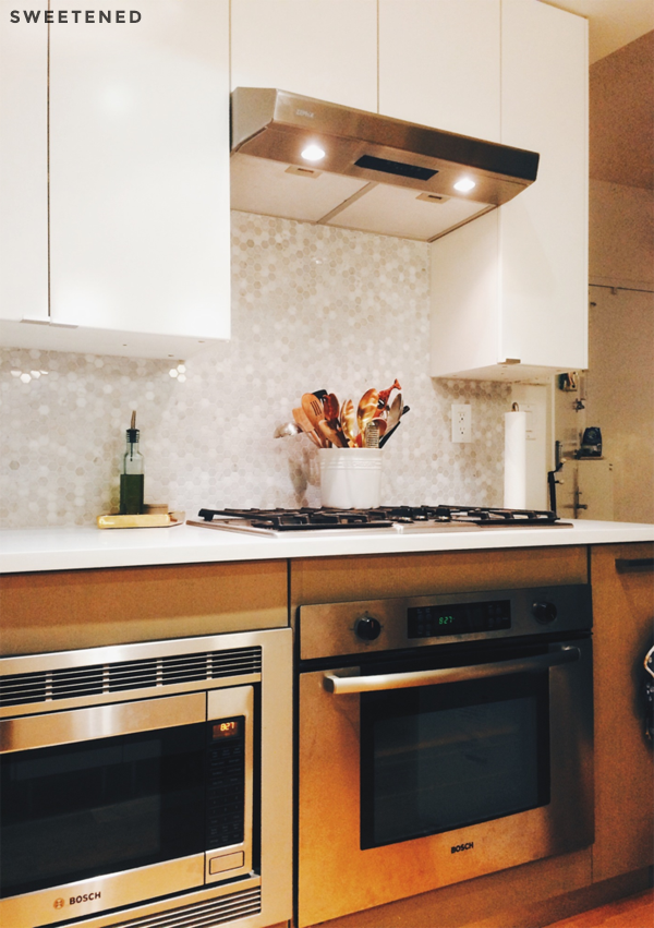
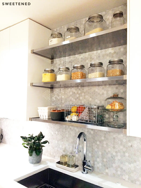
We decided early on that keeping the base cabinets as well as the appliances (except for the hood) would reduce costs, and I liked the idea of two-tone cabinets. We also went with 39-inch wall cabinets, which would come down from the ceiling enough to allow me to reach the two bottom shelves while leaving the third at the top for less-used items.
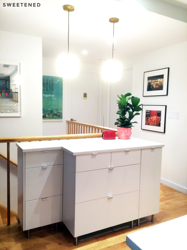
So I mapped out the new upper cabinets on Ikea’s planning software, and also designed a new island out of three sets of base cabinets with drawers and other pull-out components. We went with the Applad white drawer and cabinet fronts, and simple Blankett 2-inch pulls that would complement the existing stainless steel pulls on our base cabinets. Ikea also had stainless steel shelving that could be cut to fit between the wall cabinets.
For the counters, we decided to top the island and the counters with 1 ¼ inch-thick pure white quartz for cohesiveness. I found an affordable marble hex tile mosaic on Amazon and a Zephyr hood from Build.com. Lastly, we planned to hardwire some Dioder LED puck lights for under-cabinet lighting and install two pendant lights from West Elm over the island.
Working with Sweeten
Sweeten made it easy to find quality, licensed contractors. It was reassuring to be able to see examples of their work prior to meeting with them and to know that Sweeten staff were there for additional support and troubleshooting. Our contractor and his assistant were both great to work with, a relief since I’d recently been hearing about the experiences of friends going through nightmare renovations with sub-par contractors.
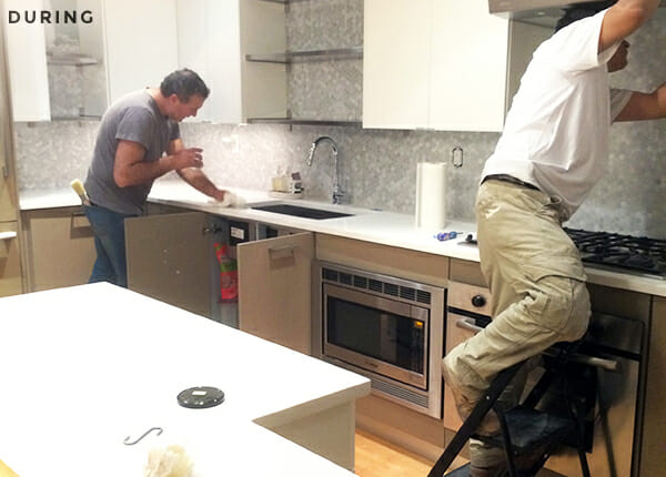
The contractor offered helpful solutions to problems that came up through the course of nine days of work, and made adjustments to accommodate a few bumps. For example, we couldn’t find an appropriately sized panel to cover the back of the semi-custom island, so he made one out of plywood and painted it in Simply White by Benjamin Moore to match the front. When it turned out that we were three feet short on the mosaic tile, he worked to track some down locally.
Unfortunately it wasn’t an exact match, but he happily came back a few days after the order arrived to install the last section and to ensure that everything on the punch list had been checked off. He and Victor were very clean, sweeping up, hanging tarp, and laying down clean paper at the end of each day to make sure that we could still enjoy our home in the evenings. I would definitely use them again and recommend them!
Life after the renovation
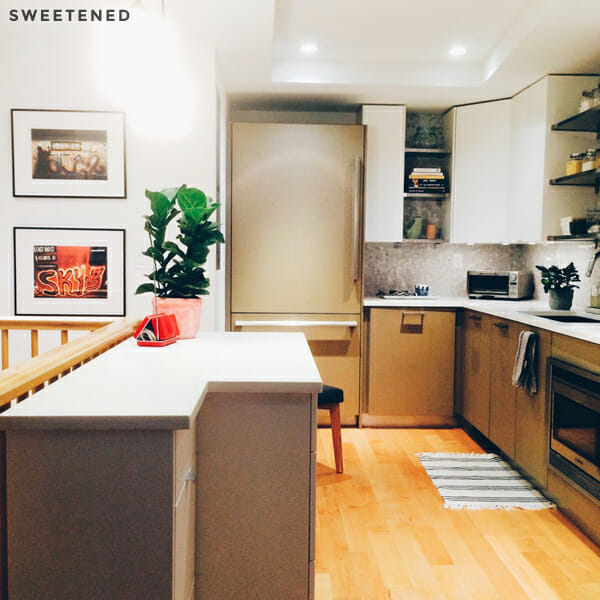
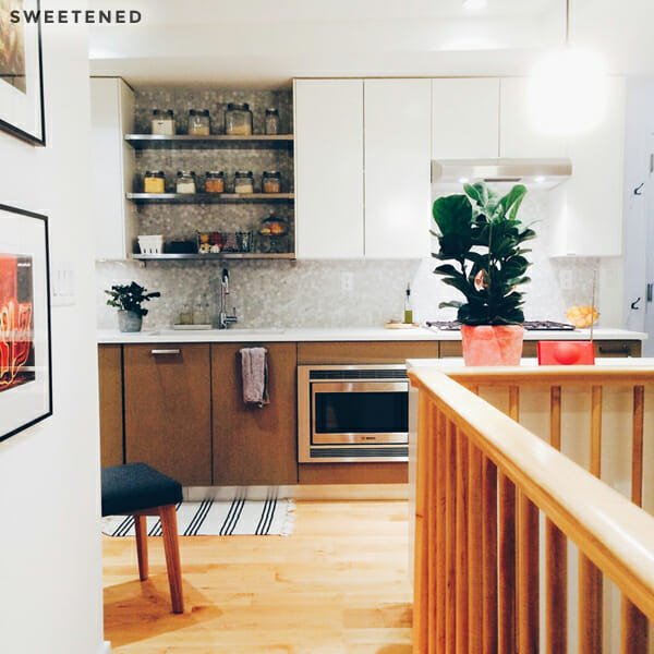
We’ve already made several meals in the new kitchen and are thrilled with how functional it is. There are so many drawers, making it much easier to reach utensils and cookware. There’s finally a place for everything! Not only that, we can actually see it all given the much-improved lighting situation and white counters.
Appearance-wise, I’m so happy with the lighter, softer look as well as the open shelving for displaying our more attractive kitchen items. The kitchen opens up into the living room, so it’s really changed the feel of the whole space. Every morning, I walk into the kitchen to make my morning coffee, and am so glad we did it.
—
Thank you, Carol, for this especially insightful look at your planning work and project success. We’ll be keeping an eye on your stylish blog, @ Carol on Carroll, for any future home renovation plans you might be dreaming up!
