Lisa & Brian’s Kitchen Renovation – Homeowner Guest Post
Last month, we shared the first-hand renovation story of Lisa Law, a Brooklyn Heights homeowner who used theSweeten to update her crumbling kitchen, and today, we’re excited to share our 2nd homeowner guest post — coincidentally, this story also comes from a Brooklyn homeowner named Lisa who used theSweeten to renovate her kitchen!
Lisa B., who works in the architecture & interiors industry, and her husband Brian, a media studies professor & author, had lived in their Kensington apartment for 8 years before taking the leap to renovate their kitchen. The couple posted to Sweeten were matched with a Sweeten general contractor.
Today we have before & afters of the transformed kitchen, along with Lisa’s insightful narrative on the new design and the process of making it happen.

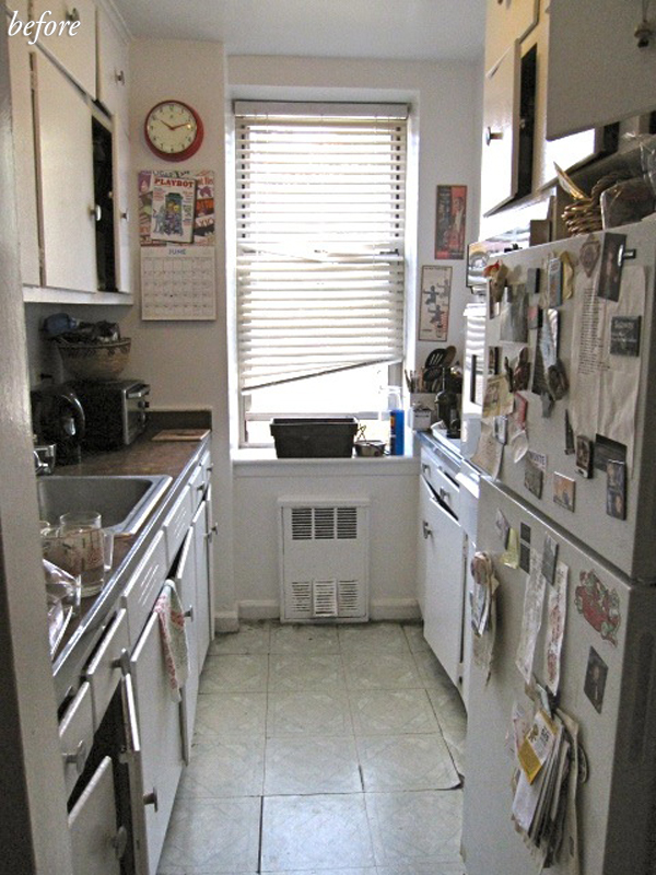
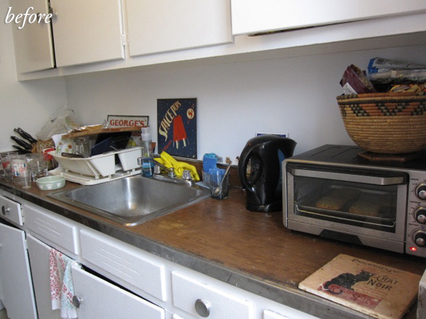
Before renovating, our kitchen had its original, 1960s pine cabinets that were custom-built for the space, but had many layers of bad paint jobs and several of the doors didn’t close. We thought about trying to save them, but they were so solidly built that there was no way to cut them down to fit our new design plan.
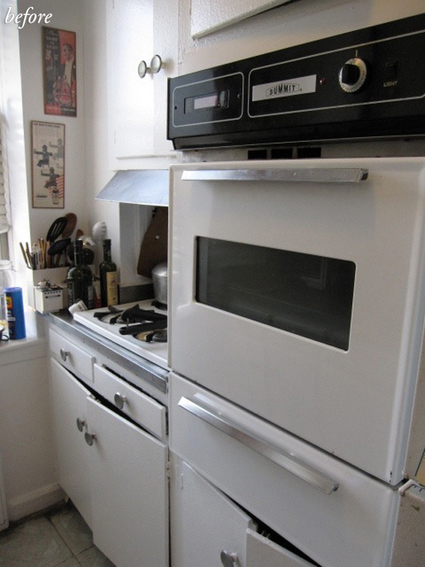
Plus, stripping all that paint off would have been a nightmare. The vinyl flooring was peeling, the wall oven didn’t work, the cooktop was barely functional and it was almost impossible to see what you were cooking since it was stuck in a corner under a metal hood. The countertops were horrible, fake woodgrain formica.
When we first moved in, they were even worse — there was contact paper on them, which we were able to pull up, but we were disappointed with what we uncovered!
We needed a gut renovation! Everything had to go, down to the studs, which meant new drywall, ceilings, cabinets, fixtures, appliances, flooring, backsplash and lighting.
I read about Sweeten a while ago in NYMag and kept it in the back of my mind because I knew we were going to renovate our kitchen. Although I worked in the interior design field, most of the contractors I knew were doing high-end renovations in Manhattan.
I posted before pictures of my kitchen on the site and Sweeten introduced me via email to three contractors, all of whom I met with and who gave me estimates. They all seemed good, but as someone who knows about renovation, I appreciated that our contractor took extra time to really look at the kitchen, open up the cabinets, anticipate potential problems, and talk in depth about the process.
Design / Style: Having worked as a design assistant for an architectural interior design firm, I got to see a lot of custom kitchens being made, usually with white millwork and cabinetry, which I really like – it’s clean and timeless. I learned about a lot of interesting materials and fixtures, too, and my style leans towards a mix of mid-century modern and contemporary — definitely not ultra-modern.
Even though the building was built in 1961, the apartment has some nice, almost mid-century modern, details: a curved hallway soffit, hardwood floors, baseboard moldings, and a really neat custom pantry closet with separate compartments. I wanted the kitchen to fit the era of the apartment and the building, but still be updated. Sweeten brings homeowners an exceptional renovation experience by personally matching trusted general contractors to your project, while offering expert guidance and support—at no cost to you. Renovate expertly with Sweeten
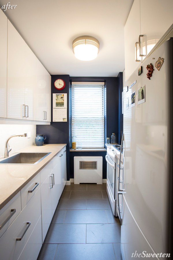
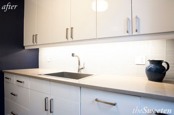
I knew that I wanted high gloss, white cabinets and appliances in order to create a feeling of space, plus they are so much easier to clean. The kitchen is small, so having simple lines and using materials in a way that make the space feel bigger were key factors in the design.
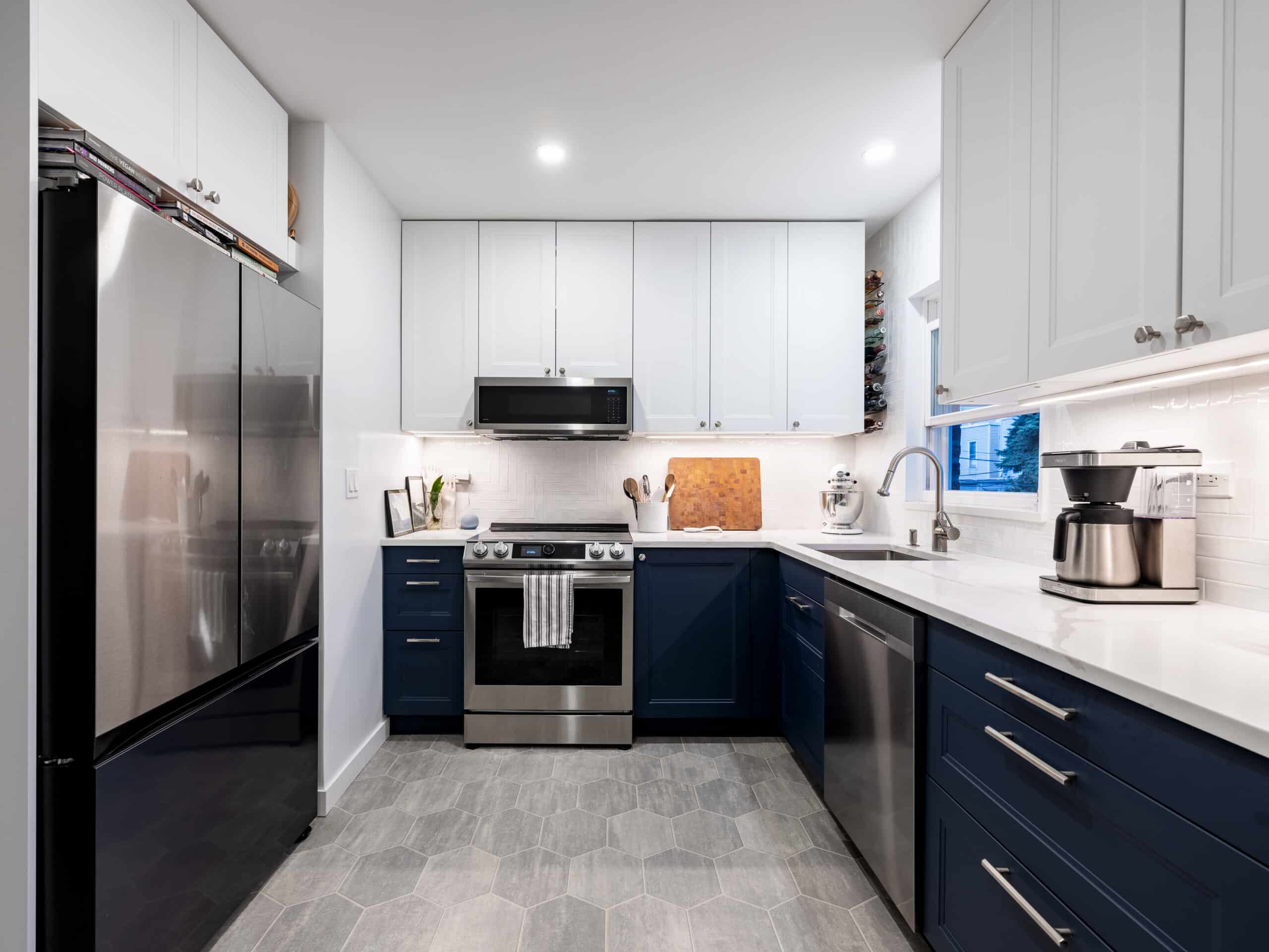
I’m not afraid of dark or saturated colors, but you have to know how to use them. Using the dark navy color on the back wall was yet another way to create the illusion of space by making that wall disappear, or recede, into the background.
You also need to consider the light in the space when choosing a wall color, and sometimes the right color can be almost counter-intuitive.
It’s always difficult to do a gut renovation in an apartment. Living in a construction zone is messy and stressful, although Nick’s team did their best to keep the dust and debris to a minimum. Of course, budget was a challenge. You have to think about what to spend your money on to get the most bang for your buck.
Flooring: I was so tempted to spend a lot on the flooring, but in a small space, it’s often not really worth it. I decided on porcelain tile because of price point and durability, but finding one was tricky; there weren’t a lot of color options that would compliment my countertops, which I had already picked out.
I finally found an Italian porcelain, which wasn’t expensive; I used a big 12″ x 24″ tile in a staggered brick pattern laid horizontally to give the illusion of width.
Cabinets: I knew that I wanted to buy the cabinets from Ikea, which is a great, budget-friendly, option. They are really well-made — much better than cabinets from the big box stores and even sometimes better than the ones you can get from custom cabinet dealers. Planning a kitchen from scratch is a challenge, and if you are buying cabinets from Ikea, you really need to have a good idea of what you want before you order, especially since the cabinets only come in a limited range of sizes.
The designers there are helpful, but only up to a certain point. I had to think a lot about the functionality of the space, the flow, and the most efficient way to store everything. It helps to have a contractor who has installed Ikea cabinets before, and Nick knew what to expect. Nick was also great at coming up with custom solutions — when the new cabinets didn’t fit exactly how we wanted them, he created a modified, open cabinet so that we would still get the added storage.
He also built a very sleek, custom radiator cover which can be easily removed to get to the radiator, if necessary.
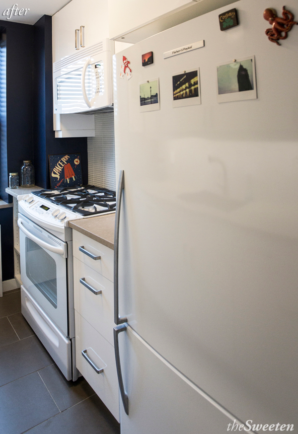
Appliances: Because it’s a small kitchen, I also needed to think about things like appliance door clearance — we wanted an integrated dishwasher next to the sink, and had to figure out where was best to install it in order to keep from disrupting the flow in the kitchen.
Even figuring out which way the cabinet doors would open was important to plan out ahead of time. Finding a counter-depth, 32″ wide refrigerator in a smooth white finish was also a challenge. Europeans have the leg up on American manufacturers when it comes to smaller, apartment size appliances.
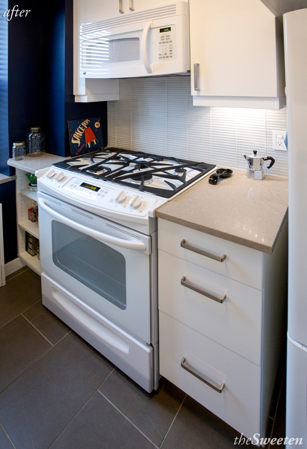
Product Specs:
- Cabinets: Ikea Akrum cabinets with doors in Abstrakt high gloss white
- Refrigerator: Fisher and Paykel Active Smart 17.6 cu. ft., bottom freezer in white
- Range: GE 30″ slide-in self cleaning gas range in white
- Microwave: GE Spacemaker over-the-range self venting microwave in white
- Dishwasher: Bosch 18″ wide integrated model (with Ikea panel/door)
- Countertops: Caesarstone in Shitake, 1.5″ thick w/ square edge
- Sink: Kohler Vault stainless steel sink
- Faucet: Kohler Elate faucet with pull out sprayhead in Vibrant Stainless
- Backsplash: Nemo Tile’s Embarcadero glass mosaic tile in Candlestick, 5/8″ x 6″
- Floor: Alerio Stone Arenaria Porcelain Tile 12″ x 24″ in Taupe
- Undercabinet lighting: Philips Alcko Aris LED hardwired strip lights
- Ceiling fixture: Philips Hope 3-light ceiling light in brushed nickel
- Hardware: Omnia Ultima cabinet pulls in satin nickel
- Wall paint: Benjamin Moore in Old Navy
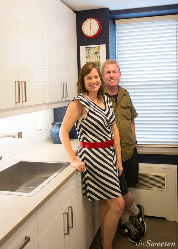
Having a functional kitchen has made life so much easier and made our home life so much more pleasant.
Many thanks to Lisa & Brian for sharing their wonderful insight, and congrats on your lovely new kitchen!
Inspired to renovate? Post your project on Sweeten!
