A Gallery Director Curates Her Perfect Apartment
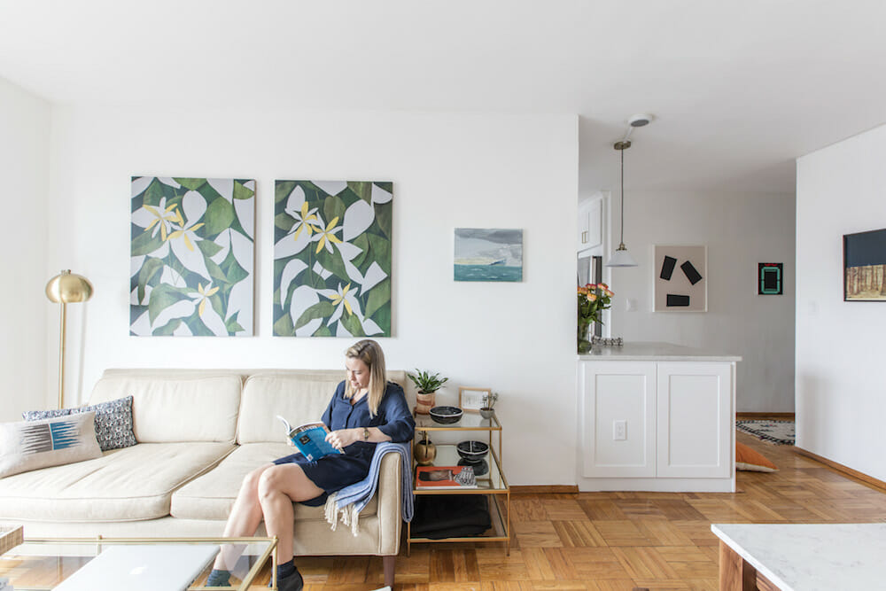
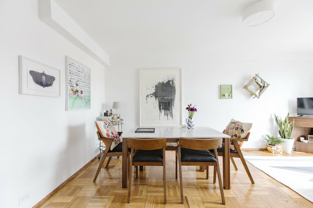
As a director at the Marianne Boesky Gallery in Manhattan’s Chelsea neighborhood, Kristen Becker knew the value and versatility of the color white. It was ideal for creating a “bright and crisp but serene” backdrop for the art on her walls, as well as the textiles and ceramics that she had collected over the years.
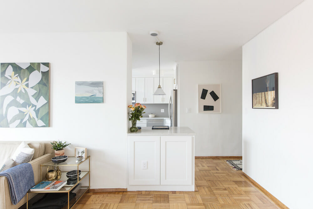
By opening up walls, renovating a kitchen to be more efficient, and updating her master bed and bath, she achieved the lifestyle she wanted—to entertain, to relax and to work comfortably, all while surrounded by her favorite things.
Guest post by Kristen, Clinton Hill homeowner
Before moving to Clinton Hill, I lived in a 450-square-foot studio apartment in Brooklyn Heights for 10 years. I adored that apartment, but was ready to move into a new space after maneuvering around a small home that had few windows and limited space for entertaining.
This apartment, a co-op in the Clinton Hill Co-ops (a complex with considerable Sweeten history!) is nearly twice as large at 800 square feet, and had been converted to a two-bedroom by the previous owners. I closed on this apartment in August 2016, and posted the project to Sweeten. I had been looking at the site for a few months even before I found my apartment so by the time I was ready to start construction I had a clear sense of how the process worked.
Once I selected a contractor, the team at Sweeten checked in to make sure things were progressing. My Sweeten contractor and the architect made themselves available to come to the apartment multiple times before I closed so we could discuss the best options for my space. They presented a range of design ideas that addressed my needs/wants and they were always clear and upfront about costs and time frame.
I lived in my apartment for about eight weeks before construction began which allowed me to learn a bit about the space before making final decisions. I saw the apartment in the summer, so I knew the potential of the strong, natural light that existed and which areas needed a boost. I could consider how I’d like to live in each section of the space.
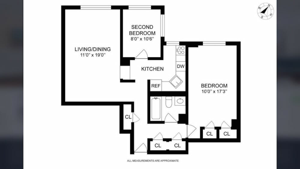
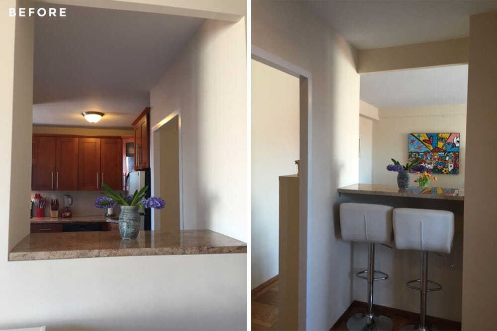
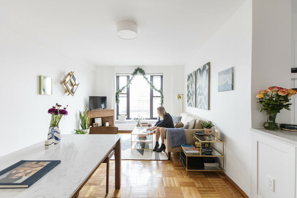
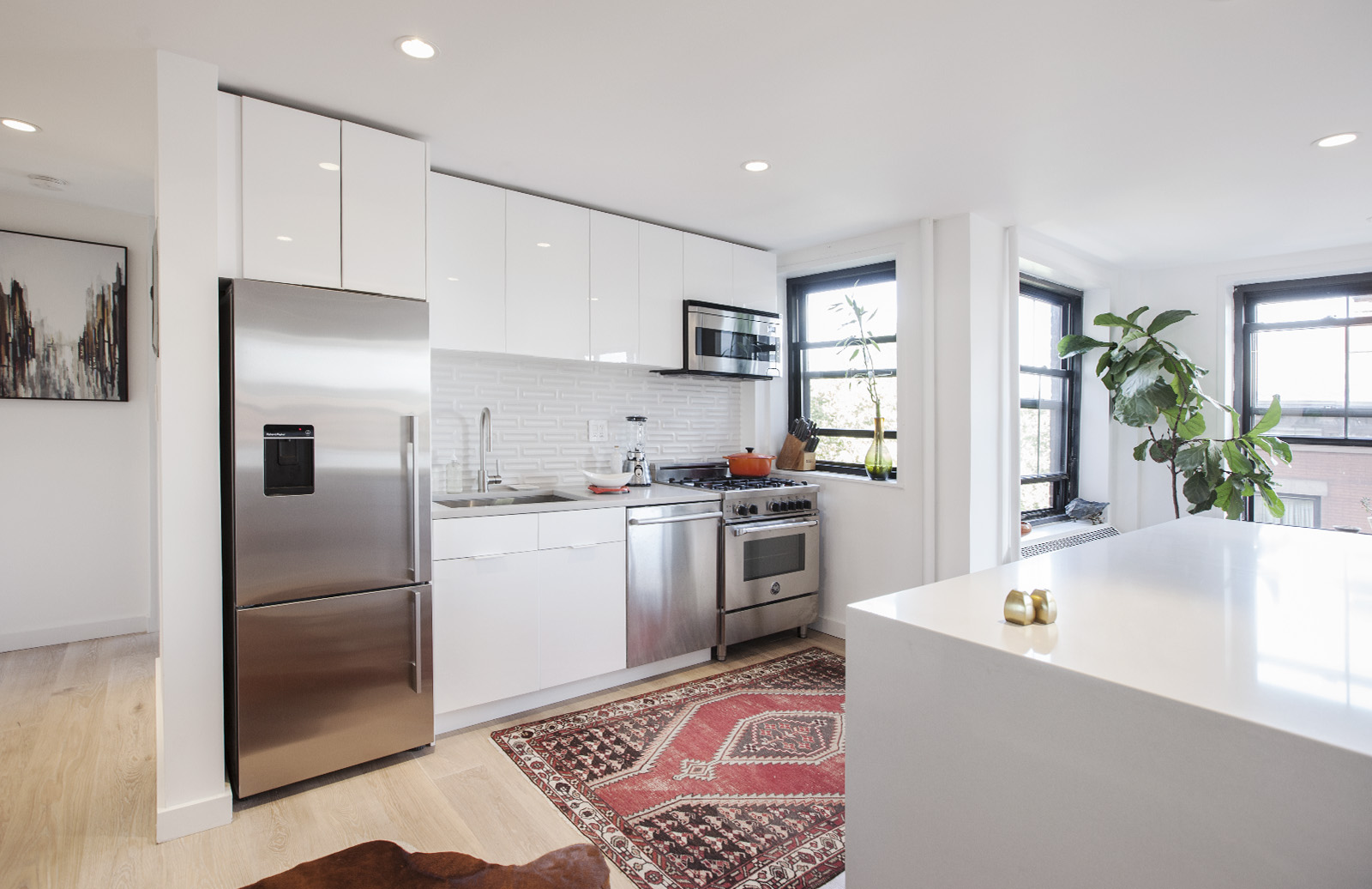
My main objective was to open up the kitchen. A wall between the kitchen and living room dampened all the light, while a second wall featured a window frame-type of cutout with an awkward shoulder-height countertop. By knocking down the walls, the kitchen would open up into the dining and living areas, allowing those spaces to flow more easily—from workspace to entertaining to relaxation. Additional overhead lighting would brighten up the space even more.
I cook often and my priority for the kitchen was to install a peninsula with large, deep drawers so I could easily store large pots and pans and not keep them in the oven! It would provide substantial work space, and allow for an easy transitional section for entertaining.
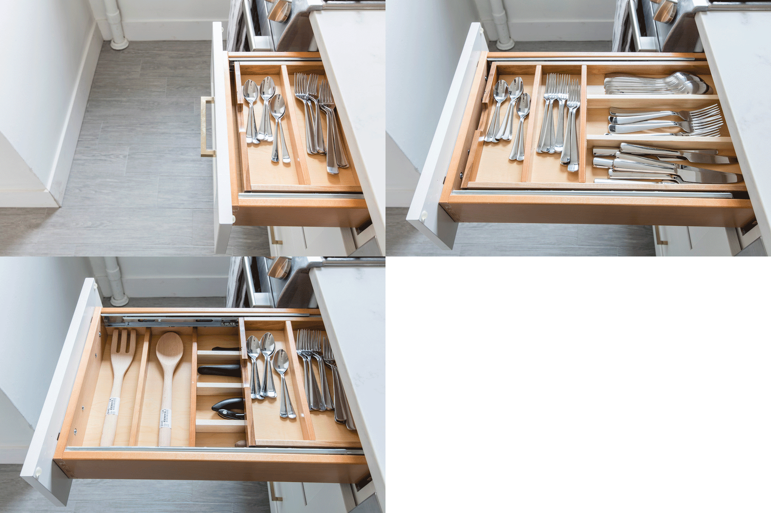
While they probably seem like minor choices, I think sliding double drawers for utensils and a separate spice cabinet were a good use of space so items are readily accessible. Lastly, my previous building didn’t allow for a dishwasher, so being able to have one was a massive step up and a life-changing purchase!
My overall vision for the space was a bright, crisp but serene environment. I have worked in commercial art galleries for the past 17 years, so the artwork I own is really what I want to be the focal point of every space. I wanted the surroundings to quietly complement the art on view, and I think the clean lines really set up a solid framework to showcase the things I love.
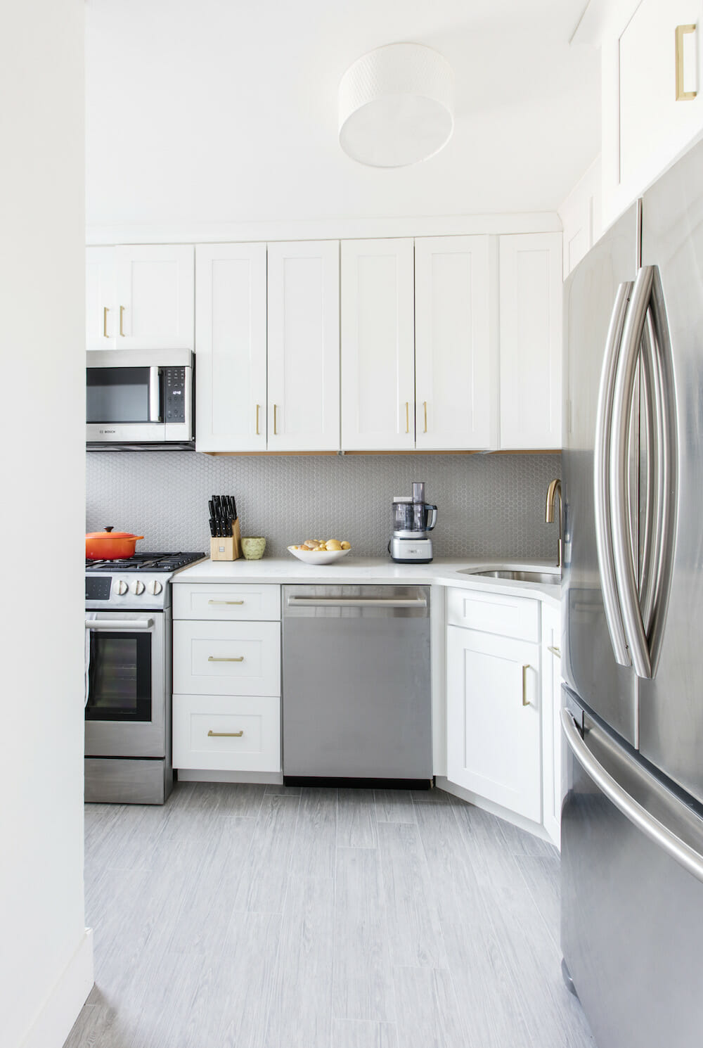
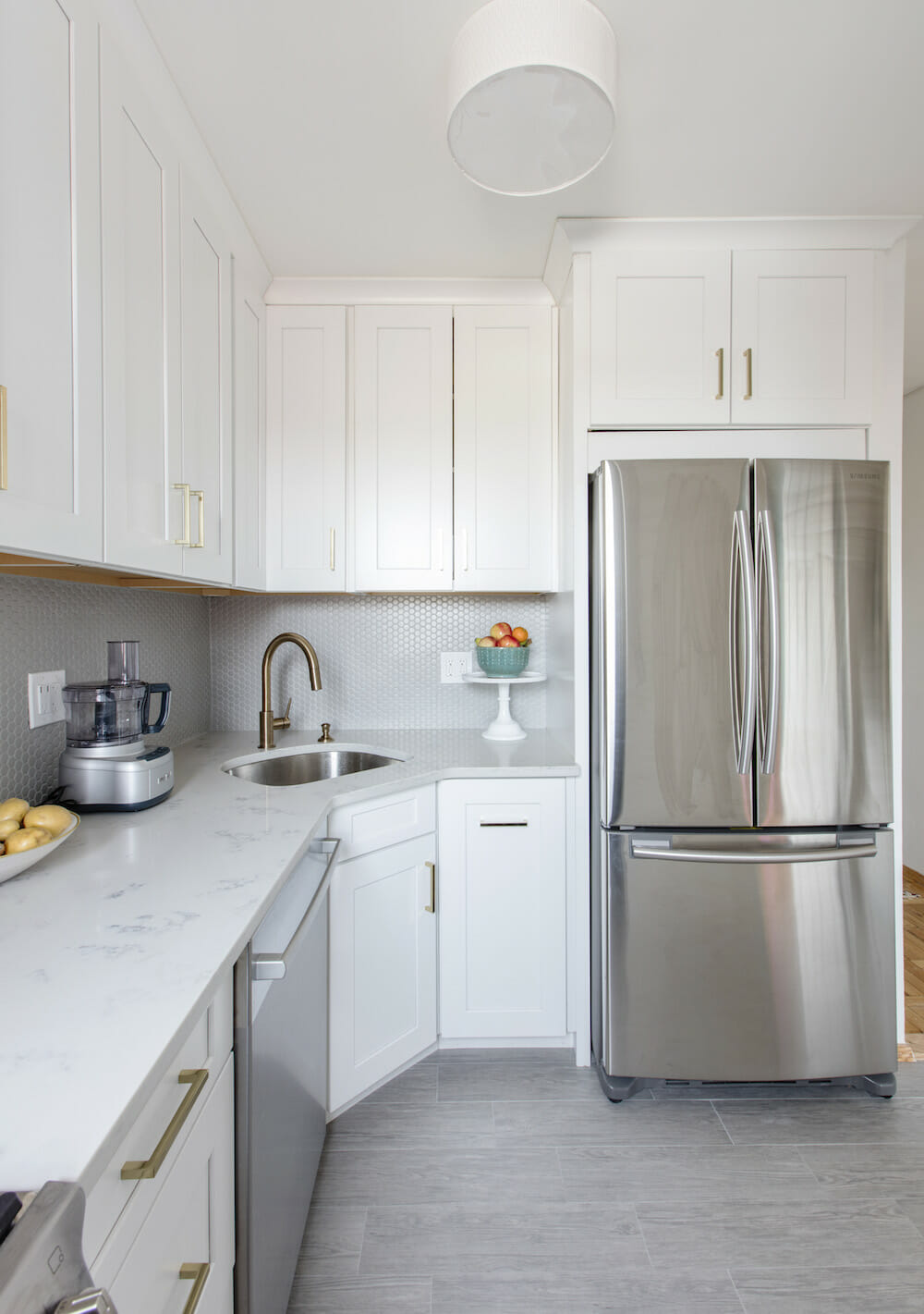
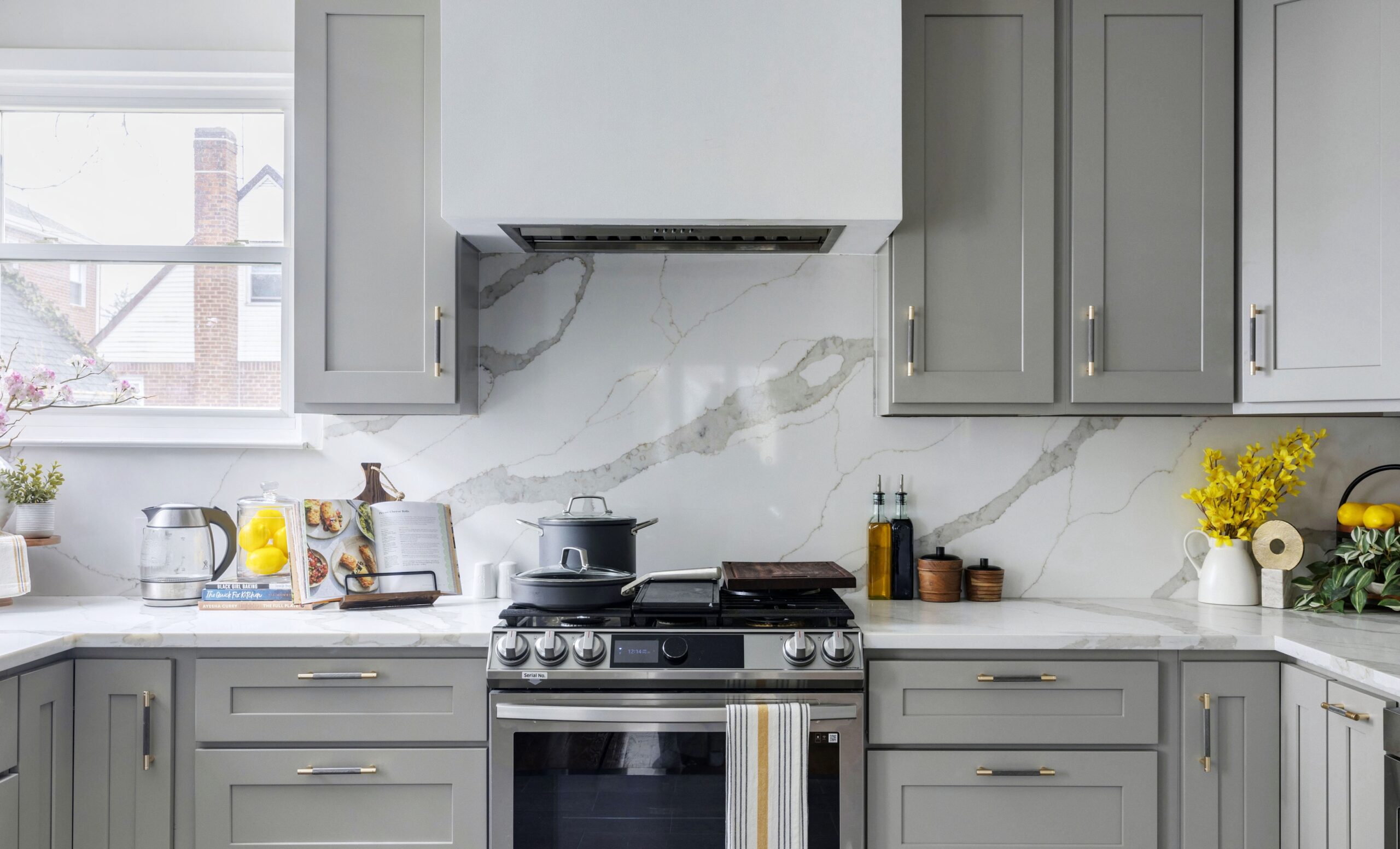
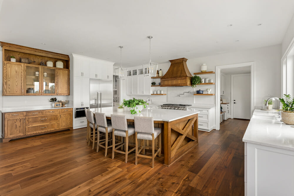
Aesthetically, I wanted a modern, warm and clean kitchen that could serve as a neutral backdrop for any display of accessories, ceramics, or statement pieces. The previous cabinets were a wood color that dulled the natural light, and I chose instead a classic white shaker-style cabinet that worked nicely with the modern lines used elsewhere in the apartment. Sweeten brings homeowners an exceptional renovation experience by personally matching trusted general contractors to your project, while offering expert guidance and support—at no cost to you. Renovate expertly with Sweeten
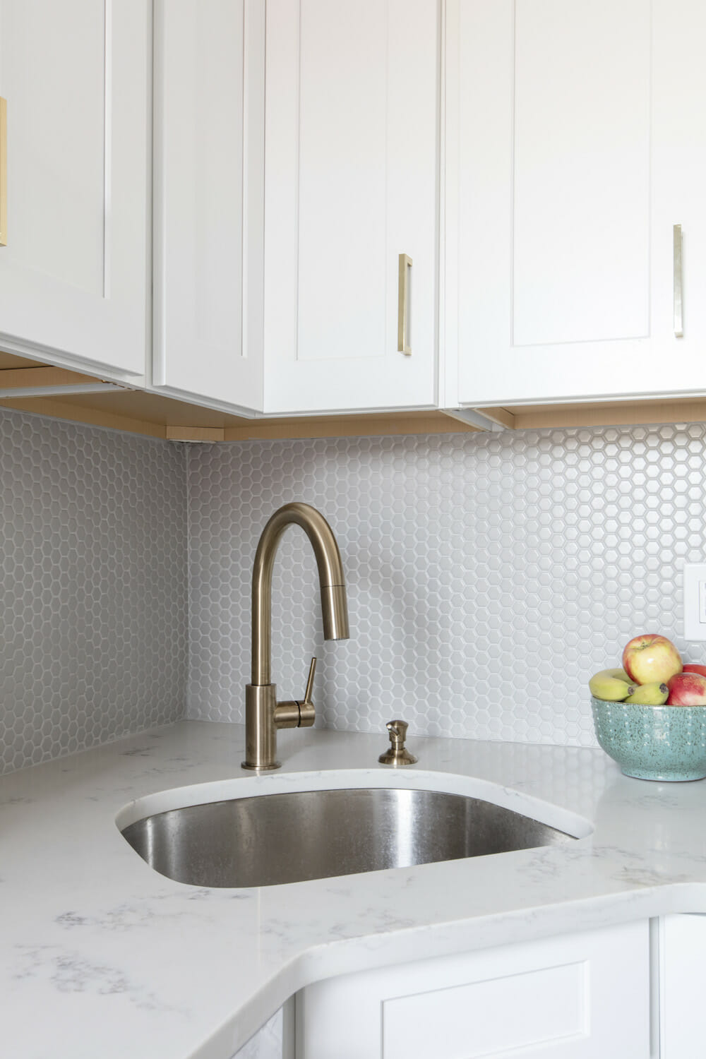
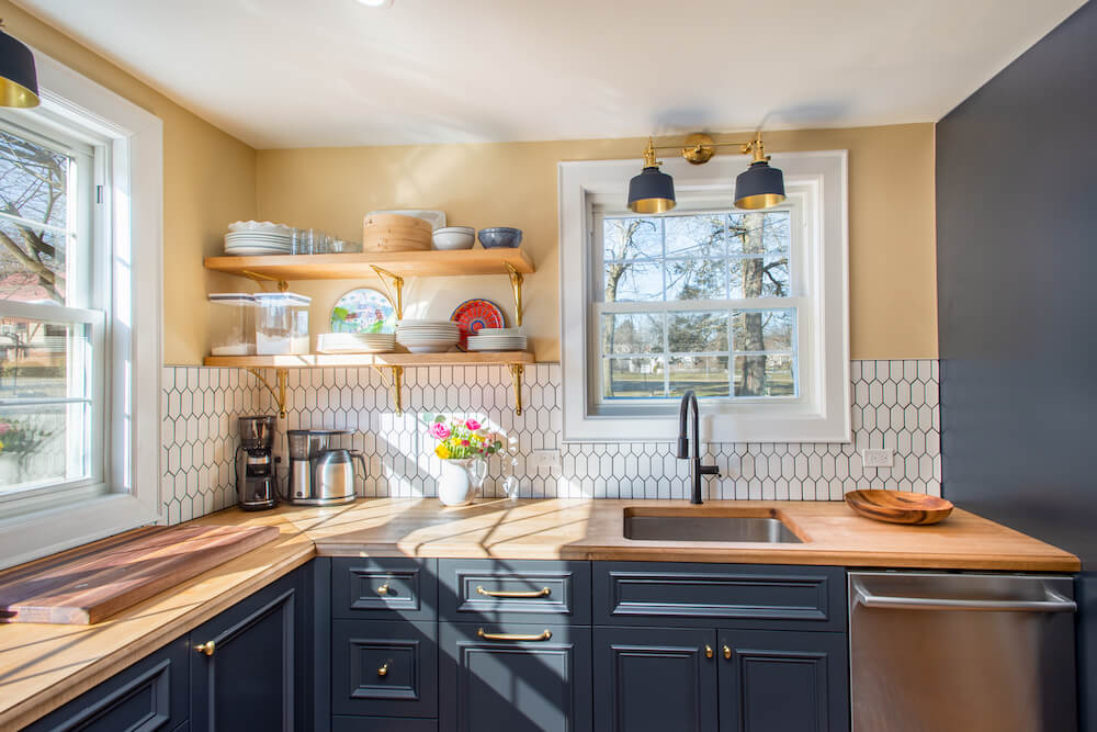
More functional than marble, the quartz countertop features traditional light gray veining that goes well with the gray variations of the flooring. Of all the choices to be made, I had the most difficult time finding a backsplash tile I liked; most were too clinical and slick or seemed dated.
My Sweeten contractor brought me to a tile vendor for more options, and in the course showed me the material he had recently installed in his own full bath. Although he had used it as flooring, I really responded to the matte surface and the subtle geometric shape. Also on my wishlist was stainless steel appliances. I love that the oven is flush with the countertop with no back panel or raised display, enhancing the kitchen’s clean lines.
I decided on brass hardware which doesn’t match the appliances, but the gold tones of the metal add another dimension without making things busy.
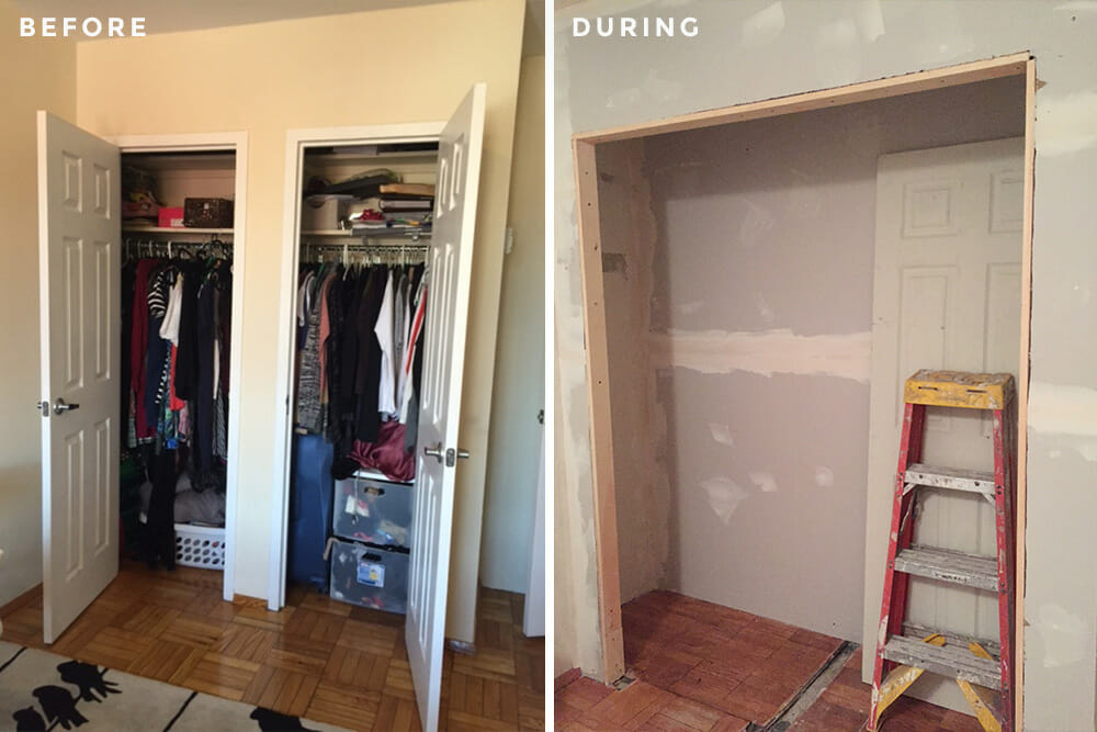
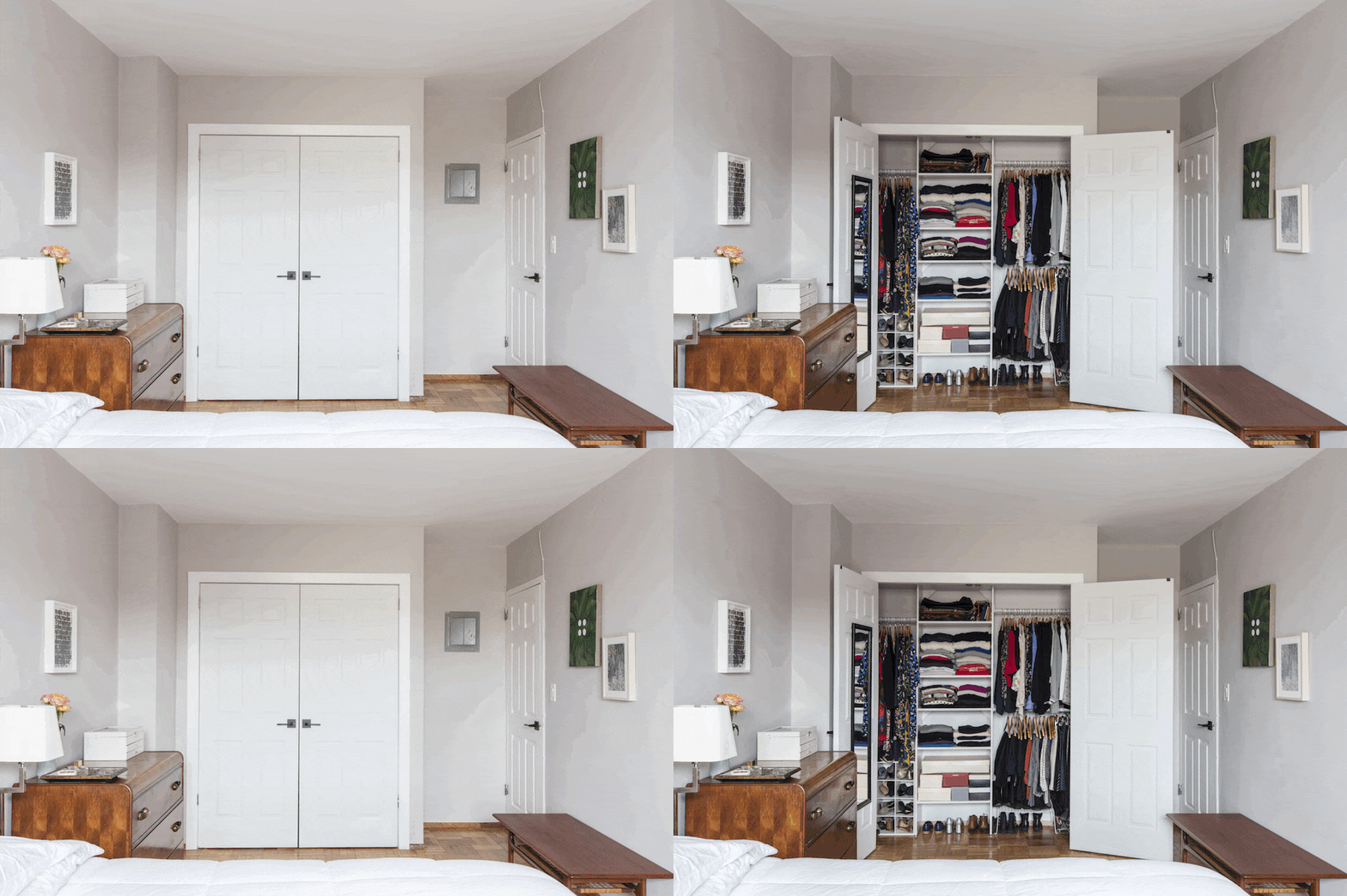
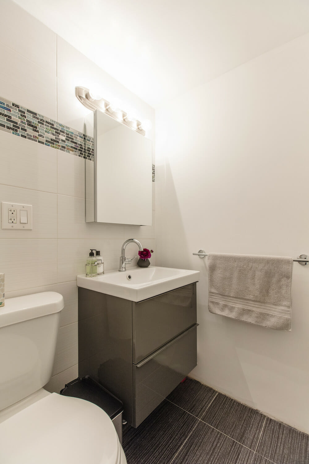
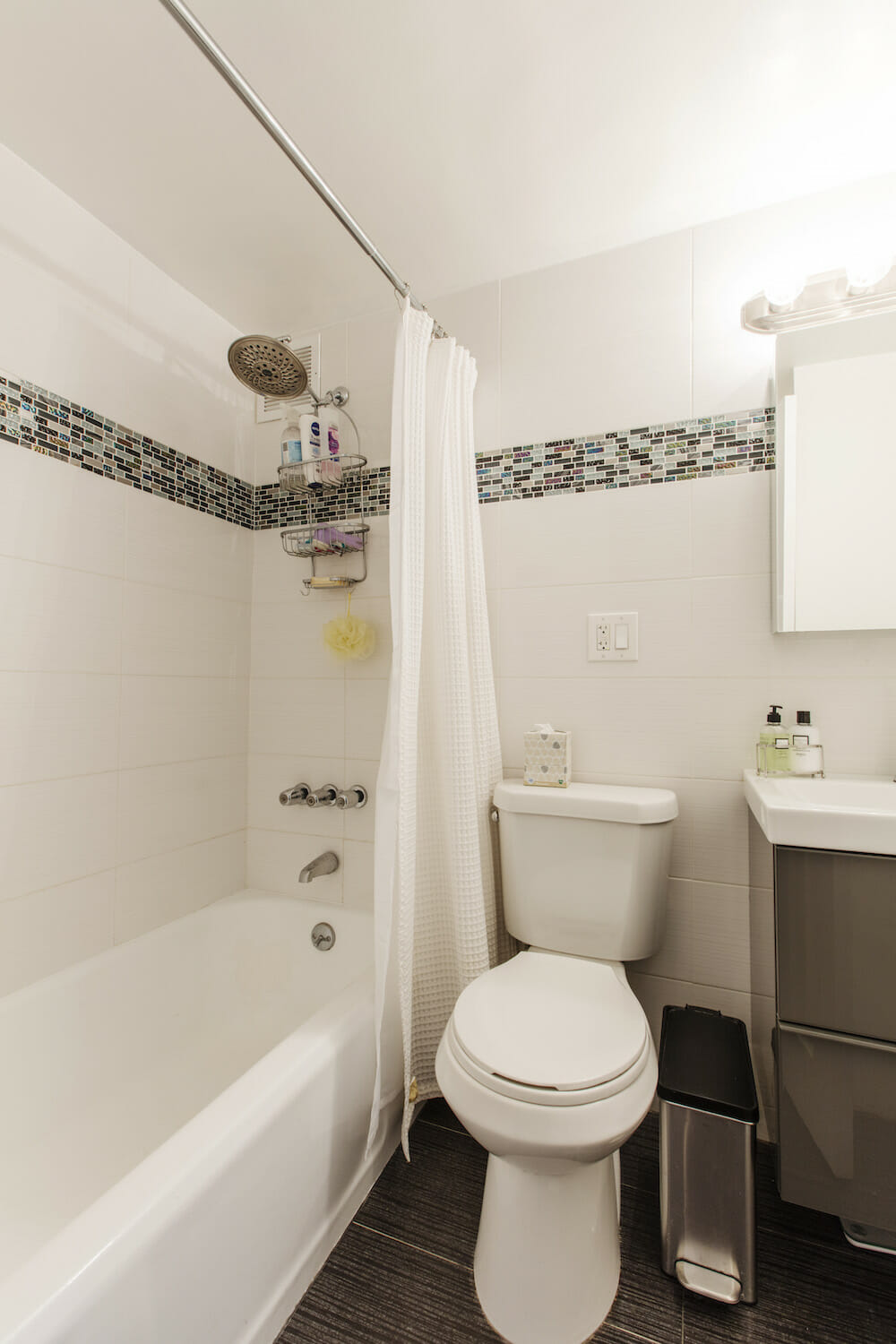
In addition to the kitchen, I wanted to upgrade the storage in the apartment. The interiors of some closets were refinished and cleaned up after years of use, while two bedroom closets were merged into one large one. The bathroom received an upgrade with a new sink, vanity and medicine cabinet. What makes me happiest is now there is a place for everything.
In my old apartment, everything I owned had to serve several functions—the coffee table was also hidden storage, the closets were jammed with paperwork, clothing, cleaning products, and pantry items. My current apartment is so well organized; my beautiful bedroom closet makes me want to keep everything in its place.
The biggest challenge was patience. When you start a project like this, it can be very daunting if you have never done it before. I chose to live in the apartment while work was done, and while I wouldn’t change that decision, I think it took a toll. It was great to see the progress being made every day, but there are only so many nights you can be comfortable sleeping in plaster dust or having dinner behind a big plastic sheet.
Doing construction in New York City has its trials—like getting to all the supply stores without a car. My Sweeten contractor and his crew doing the work on a daily basis were understanding and accommodating and that definitely lessened the stress.
I came into the renovation with many questions about timeframe and finances. I had heard horror stories about contractors abandoning jobs and I was fearful that I’d end up paying for an incomplete job. The members on my contractor’s team, however each were helpful in different ways. I really benefited from the experience and opinions of multiple people.
The job wasn’t huge overall, but they treated me with respect, and knew this was a significant decision for me. They were all realistic about my options, pricing, and the pros/cons of different materials. It was challenging to keep everything straight, but anytime things went off course they were quickly corrected.
On a more personal note, I was a bit nervous that I’d have a difficult time making so many decisions. There are infinite outlets for design and it’s easy to be overwhelmed even if you have a clear sense of your own style. Stay true to your goals and make decisions for your space that will benefit you every day.
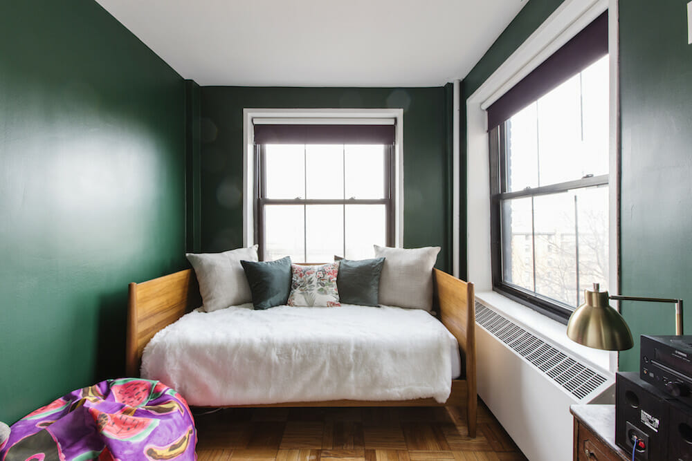
I learned that it pays off to do something bold even if it is small: the kitchen is neutral because it opens up into my living area, but the second bedroom didn’t face the same constraints. I painted it a dark green and love sitting in that space. In the end, I worried less about creating a showplace, and came away with a home that I am proud of and that suits me.
Thanks so much, Kristen, for sharing your beautiful home, and showing us how you use your space to surround yourself with the items you love.
KITCHEN RESOURCES: Italian floor tiles: Rondine. White Shaker cabinets: Waypoint. French gold Atlas Successi 5” pulls: Wayfair. Marbled “white cloud” quartz countertops: MS International. 1” gray matte hex tile backsplash: Builder Depot. Delta Trinsic brass faucet: eFaucets. Samsung refrigerator: AJ Madison. Bosch stove: Drimmers. Bosch dishwasher: BestBuy. Bosch microwave: Appliances Connection. Crosby pendant lighting: Target. Decorators White paint: Benjamin Moore.
BATH RESOURCES: Delta Trinsic faucet: Delta. Godmorgon sink/vanity: IKEA.
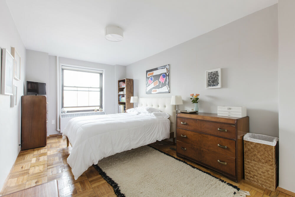
MISCELLANEOUS RESOURCES: Decorator’s White Paint (living room): Benjamin Moore. Chrome Green paint (second bedroom): Benjamin Moore. Cornforth White paint (master bedroom): Farrow and Ball.
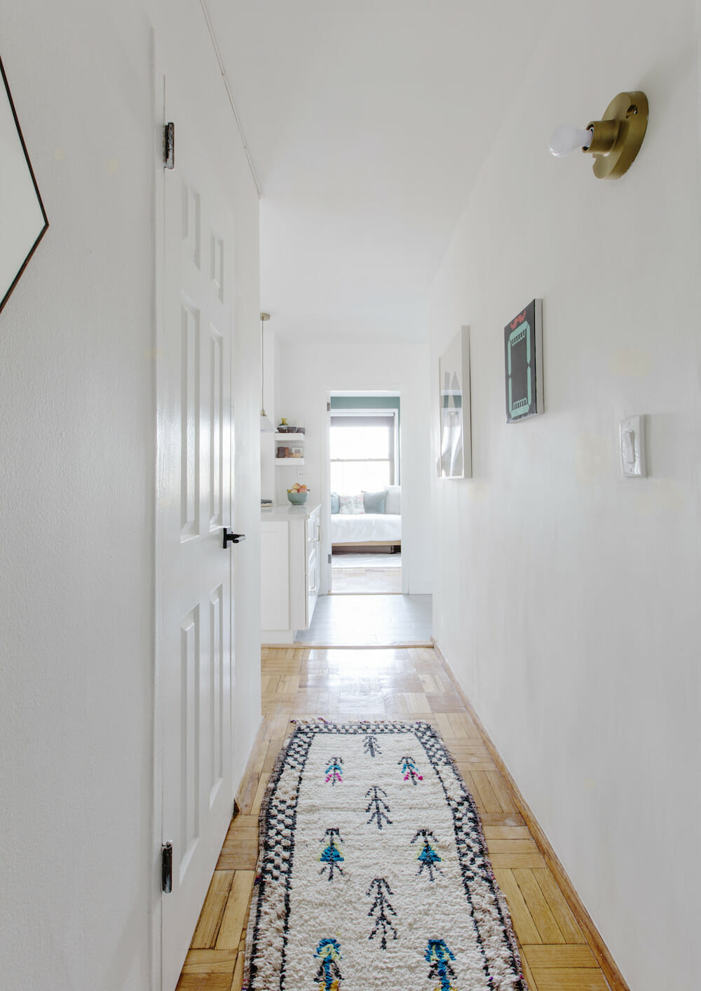
ART RESOURCES: Living room: Ryan Mrozowski, Ragnar Kjartansson, Lisa Williamson, Tim Hyde, Elad Lassry, Heather Rowe, Theaster Gates, Zarina Hashmi. Master bedroom: Katherine Bernhardt, Glenn Ligon, Ryan Mrozowski, Sara VanDerBeek, Rosemarie Trockel, Frank Stella, Mia Taylor. Dining area: R.H. Quaytman, John Houck, Christopher Wool, Elad Lassry, Heather Rowe, Theaster Gates. Hallway: Emily Mae Smith, Lisa Williamson. Guest bedroom: Katherine Bernhardt bean bag chair.
—
Buying a new home is a major consideration. Prepare yourself by doing your research on budget and the process including how to finance a home renovation.
Sweeten handpicks the best general contractors to match each project’s location, budget, scope, and style. Follow the blog for renovation ideas and inspiration and when you’re ready to renovate, start your renovation on Sweeten.
