Uncovering a 1929 Upper East Side Gem – Claudia’s Sweeten Renovation
Fifteen years after Claudia purchased her one-bedroom, one-bath apartment in a quaint Upper East Side co-op, she felt ready to renovate. Since arriving in 2001, this software engineer knew that she’d eventually need to address the 30 year-old carpeting, fixtures, and odd space issues…or simply move on and find a new home. Loving everything about the building, the neighborhood, and her lifestyle, she decided to stay put and find a designer who could bring an architectural approach and a restorative eye to this lovely space. Read on for the stunning reveal of Claudia’s thoughtful and personal apartment renovation!
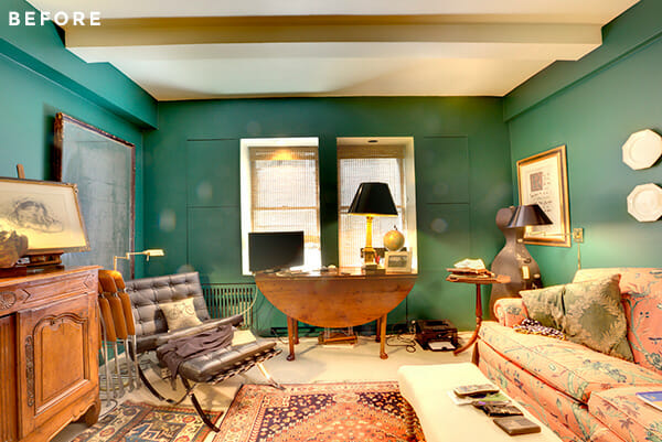
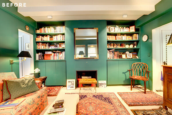
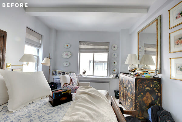
Claudia first readied herself with a straightforward list of tasks she wanted to accomplish. Sure, the place hadn’t been updated anywhere in three decades, so finishes throughout were more than dated. But she also craved more space, and after seeing neighboring units without the built-ins and boxy windows that had been added in a mid-80s renovation, she realized she might be able to reclaim some hidden square footage (and long-missing electrical outlets) in her own unit. The kitchen and bathroom needed a complete treatment, and the living room and bedroom required diametrically opposed designs: out with chunky built-ins on multiple walls in the living room, and in with a thoughtful and multi-functional built-in for the windowed bedroom wall.
Wishlist near complete, Claudia decided to post her project on Sweeten and was matched with a Sweeten contractor, who specializes in creating architecture and interior design solutions.
Upon meeting with Frederick and his team, Claudia made an overarching goal clear: She wasn’t interested in solely installing modern finishes over the old. The original bones were just as important as the final coat of paint. That pristine 1929 appeal needed to show through and reveal itself via new design details. With extensive renovations planned in every room, Claudia moved out of the apartment temporarily to allow for Frederick and his crew to get started.
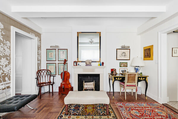
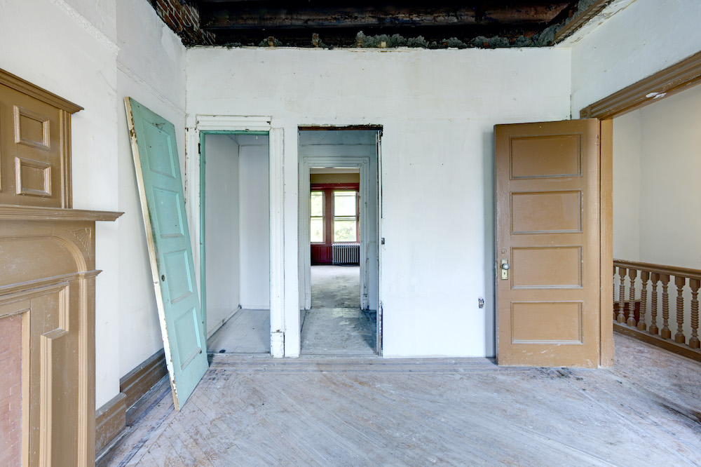
Claudia believed that original parquet floors were hiding underneath all the carpeting, and she was right. Frederick had the wood floors sanded and refinished, bringing them back to life without introducing any new materials. With extra sheetrock walls encroaching in multiple directions, the team chipped away at the wall of boxed windows, disposing of an 18 inch layer of brick and wood.
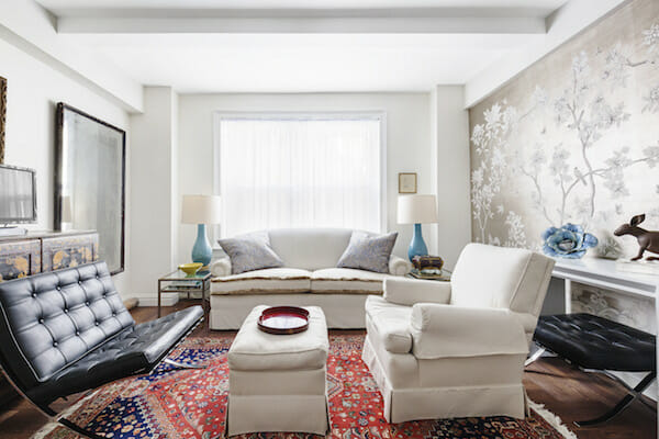
Avert your eyes if you live in a typical NYC co-op, because you will probably NEVER experience this, but somehow Claudia nearly doubled the size of her living room windows by combining them, flooding the space with lovely natural light. All of the windows were replaced with double-paned versions, up to code with the building and boasting the required heat, freeze and UV protections.
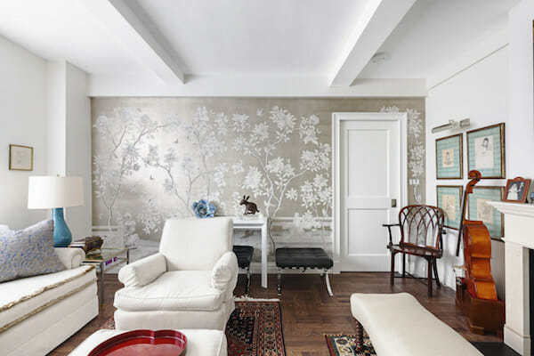
On the opposite end of the room, the crew stripped away the ever-so-slightly-asymmetrical built-in shelving and cabinetry to reveal an open, wood-burning hearth. Claudia turned to a local Italian couple who specialize in old world mantels for an understated limestone facade, and Frederick brought in a specialist to design and install crown moldings along the doorways, windows, ceiling and floor boards throughout the apartment. Claudia’s mother helped source the final touch: an accent wall in a serene, neutral palette is an elegant and stylish addition to an inviting new living room.

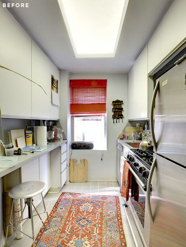
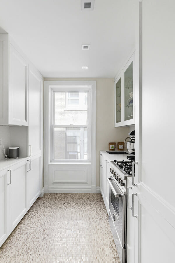
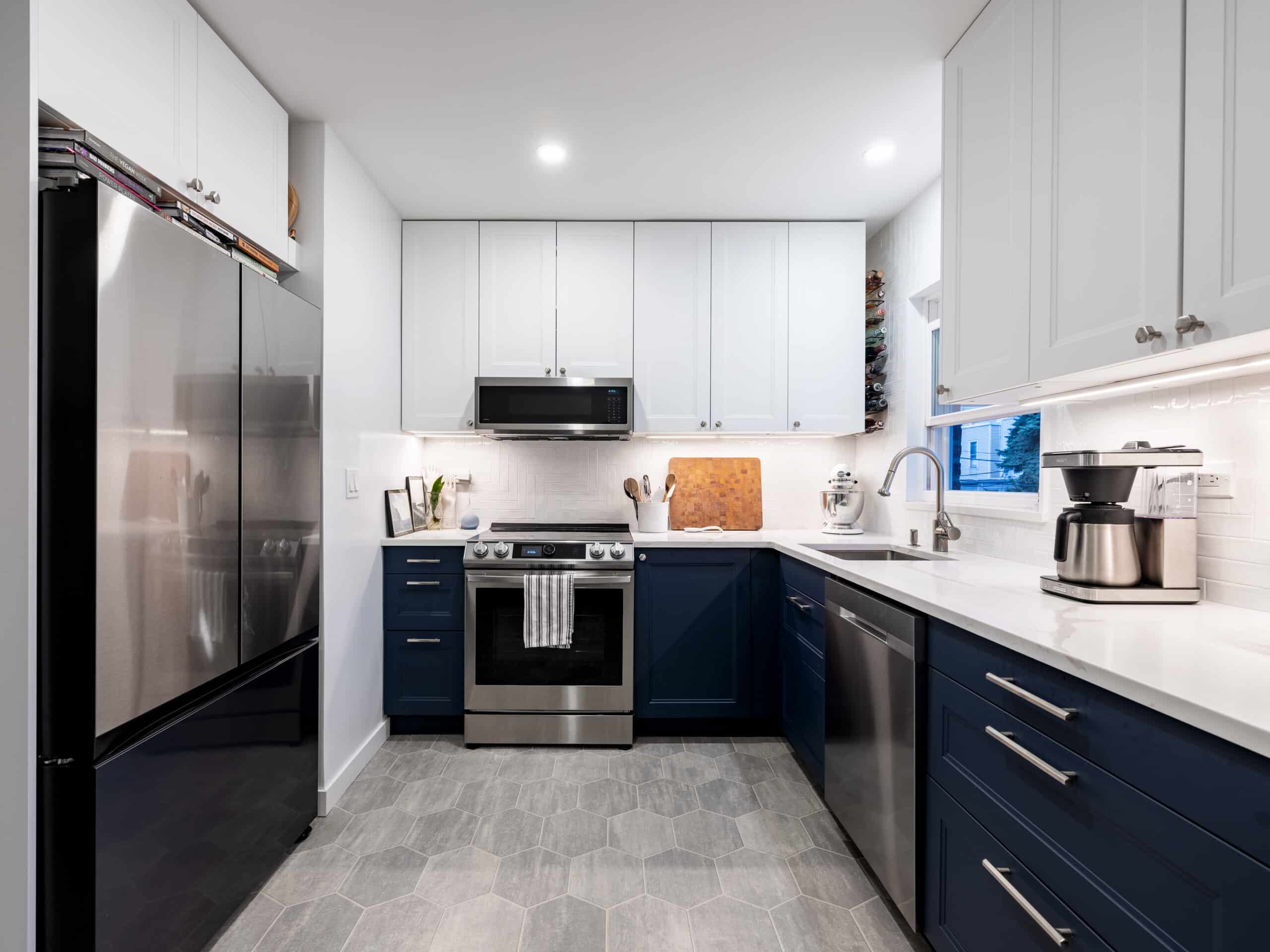
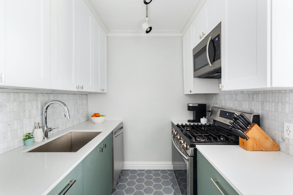
In the kitchen, Claudia knew she wanted a white kitchen and was unsentimental about getting rid of the “horrible” gray linoleum floors. Cosmetic features aside, she wanted more storage space and a way to install an exhaust fan over a new cooktop. In an attempt to carve out some casual eating space, the previous owners had put some very limited cabinetry along the left-side of the galley, and appliances took up most of the storage and prep space on the right side. Sweeten brings homeowners an exceptional renovation experience by personally matching trusted general contractors to your project, while offering expert guidance and support—at no cost to you. Renovate expertly with Sweeten
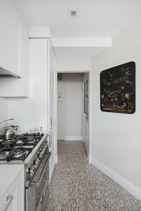
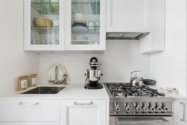
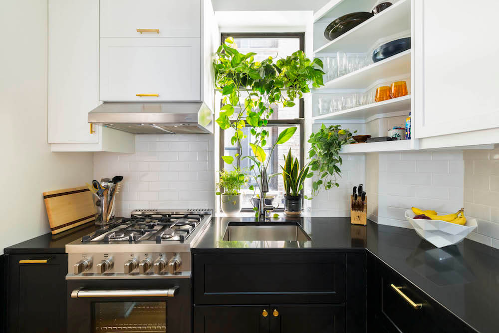
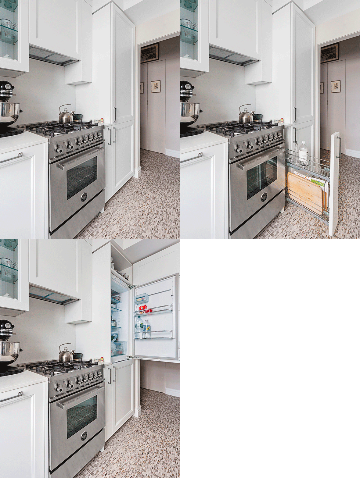
Claudia chose a small pearlescent stone tile in a melange of pebble hues to take the place of the severely dated synthetic floor she’d grown to detest. High-impact cabinet changes were custom fit into the small space. Claudia worked with an Italian purveyor specializing in hidden compartments for the fridge and hood, and managed to conceal all of the major stainless steel appliances except for the striking new Bertazzoni range, because, Bertazzoni! The laminate countertops were removed and replaced with a white Caesarstone slab and corresponding backsplash, and an undermount stainless sink–supplied by the same producer as the cabinets–was installed.
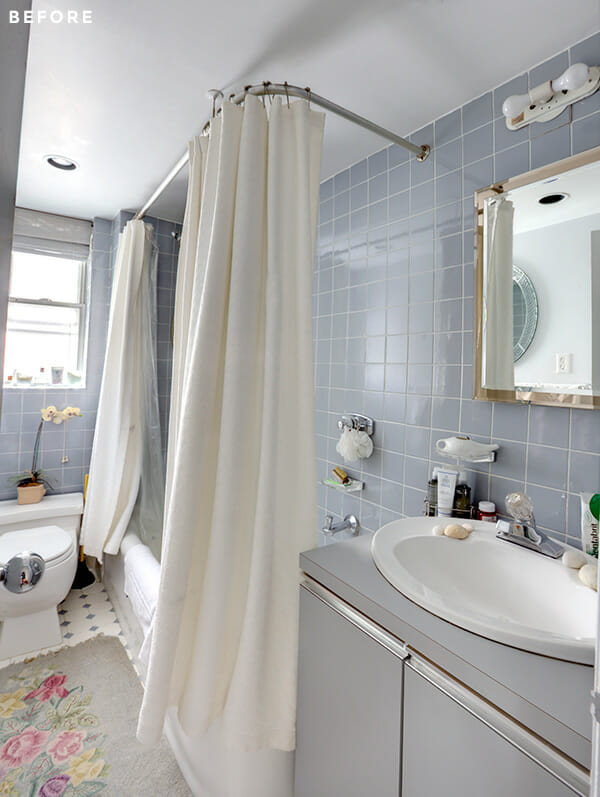
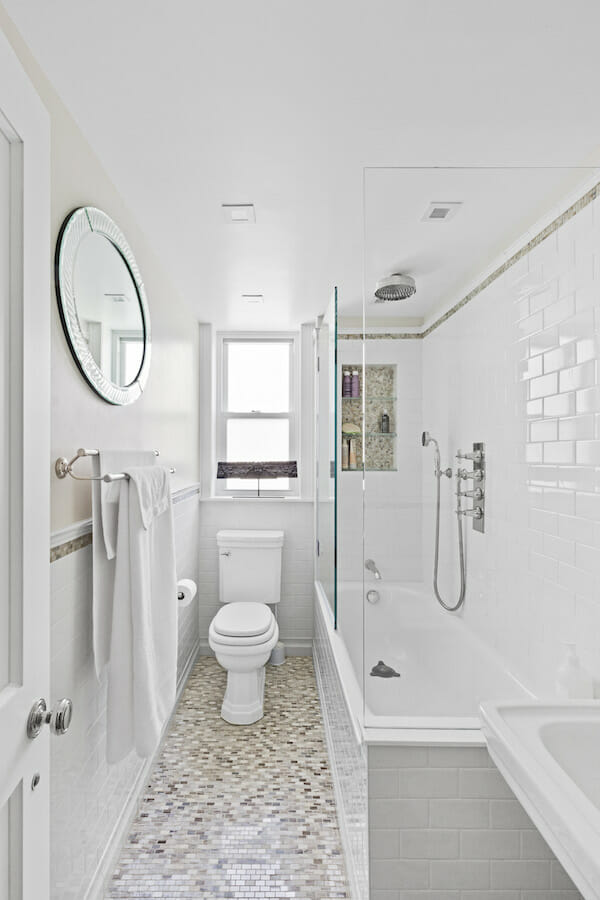
Claudia knew she didn’t need to change the footprint of her bathroom to incorporate the many features she wanted here. The tub needed two shower curtains to keep water in, the full surround of blue-gray tile muted natural light, and the bulky vanity was topped with a throwback plastic ball faucet.
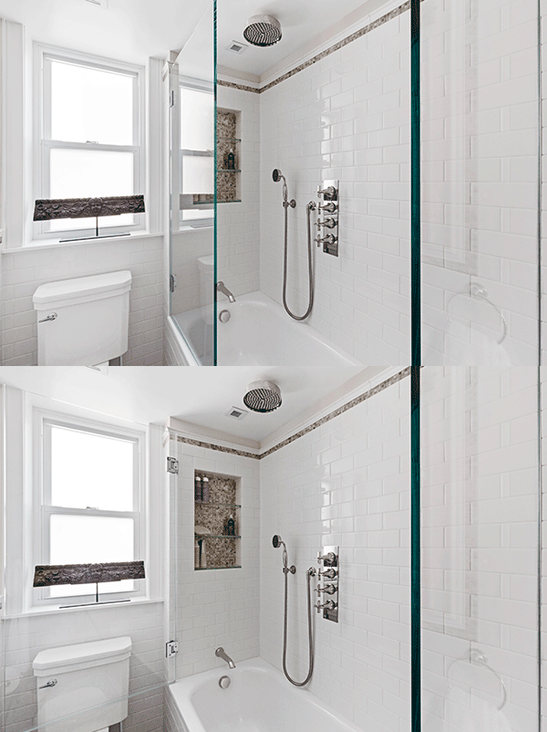
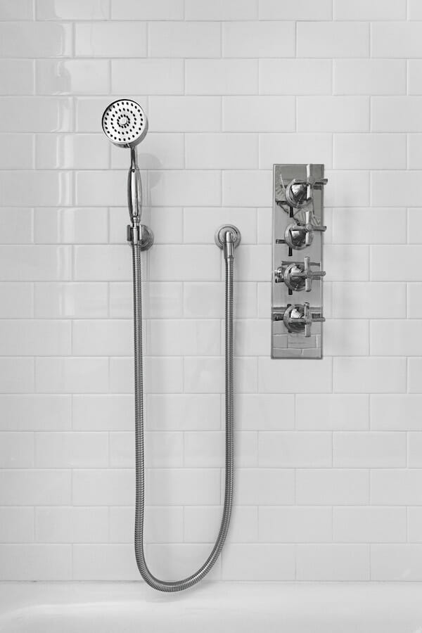
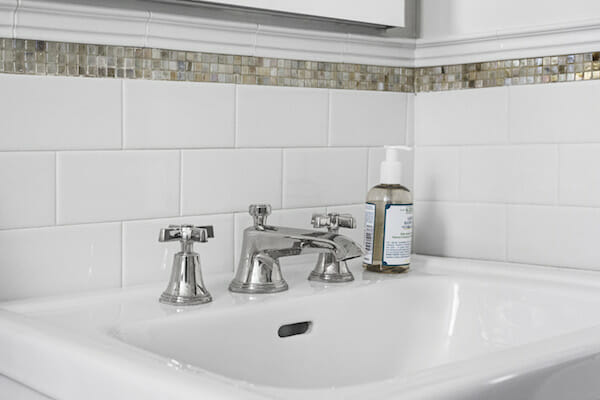
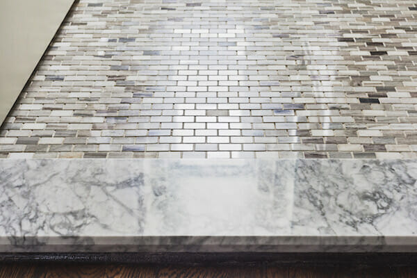
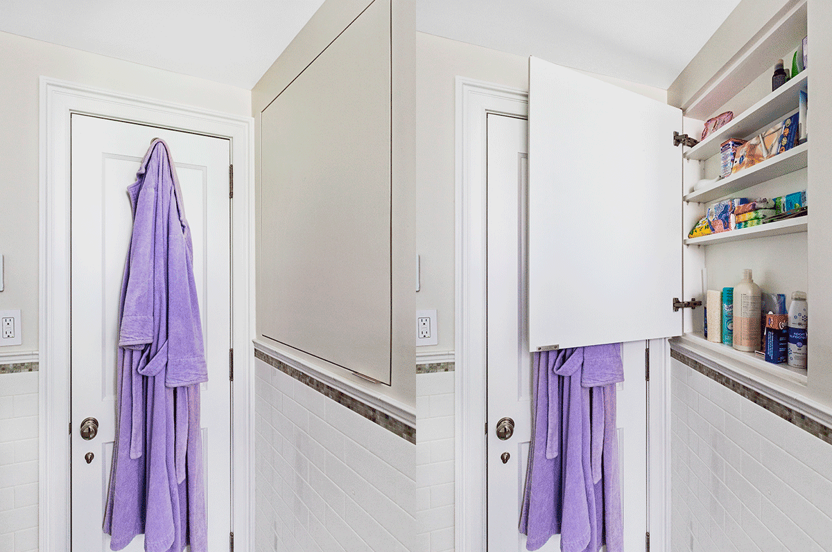
Claudia went with a floor tile pick that is complementary but different to those used in the kitchen, and with Frederick’s help, incorporated extra pieces into a design detail border along the wall of freshly installed white subway tiles. The tub came out and was replaced with a slightly larger and more modern German piece to coincide with new spa accessories: a rainwater shower head plus a handheld option for added luxe. The fixed shower rod was taken down to make way for a glass partition and hinged glass door that swings out for maximum function and style. Claudia chose a pedestal sink for extra floor and knee space, opting to place storage behind hidden cabinets in the wall instead. Almost all of the bathroom features were handpicked from local design shop Elegance in Hardware, including the polished nickel door knobs, which are exclusive to the outlet.
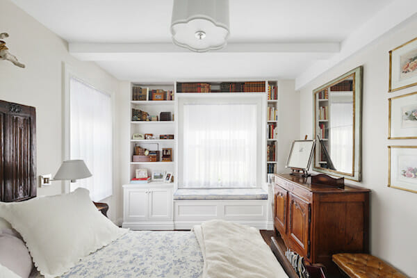
In the bedroom, Claudia and her design-build team pursued the opposite approach. Instead of doing away with built-ins, they found areas where custom additions would have a meaningful impact on space use.
They added a custom closet in the hallway, outfitted by California Closets, just outside the bath before entering the living room and introduced this same custom storage concept in the bedroom, behind a mirrored closet wall—one of the only major features that remained.
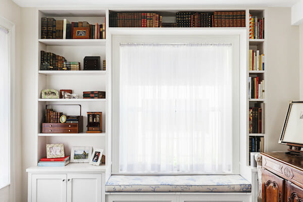
Once the carpet was torn out in the bedroom, Claudia approached Frederick with her hopes of incorporating a window seat before new wall treatment and molding went in. The designer re-enlisted his subcontractor to fashion a custom wooden seat built right into the new shelving set. The homeowner would just need an upholstered cushion and good book to make it complete.
Claudia revealed to us that upon visiting her apartment, after the renovations were complete and the dust had nearly cleared, she stood and looked around the empty rooms and was filled with the sense that nothing had changed. It was as if she were apartment shopping in 1929, which, she explained, is exactly what she wanted.

Living room selects >> wallpaper: Gracie / fireplace: A & R Asta, Ltd / lighting: Foundry Lighting / windows (throughout): Panorama / table: Goliath
Kitchen selects >> Floor tiles: Daltile Chenille White/Silver Screen / cabinets: GD Cucine / counters: Caesarstone / sink: GD Cucine / oven range: Bertazzoni / fridge: Liebherr / dishwasher: Miele
Bathroom selects >> floor tiles: Daltile Marble Panaro Blend / showerhead: Samuel Heath – Style Moderne via Elegance in Hardware / mirror and remaining hardware: Elegance in Hardware / lighting: Foundry Lighting / hallway closet: California Closets
Bedroom selects >> window: Panorama / window seat: custom / closet storage: California Closets / lighting: Foundry Lighting
—
Sweeten handpicks the best general contractors to match each project’s location, budget, scope, and style. Follow the blog for renovation ideas and inspiration and when you’re ready to renovate, start your renovation on Sweeten.
