John and Katharine’s Sweetened Manhattan Apartment Renovation – Homeowner Guest Post!
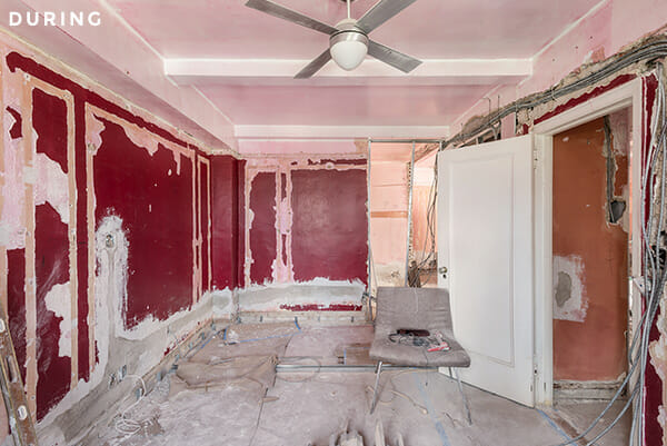
John lived in his two-bedroom Hell’s Kitchen co-op apartment for practically a decade before addressing a number of areas in the home that had been neglected over time. Stately pre-war molding from the early 1920s was buried under years of paint, ancient water damage permeated some walls, electrical outlets were sparse–even door knobs were finicky. Ready to make significant changes to the kitchen, bedrooms, and book storage space just in time for Katharine to move in, the couple—both behind-the-scenes professionals in the entertainment industry—needed a crew to help transform their home into a modern day co-op with old-world charm. Read on for John’s take on their thoroughly ambitious home renovation!
Guest post by John, Hell’s Kitchen homeowner
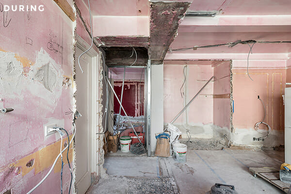
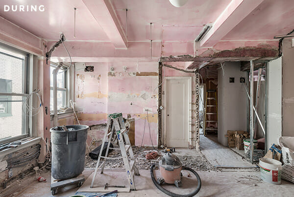
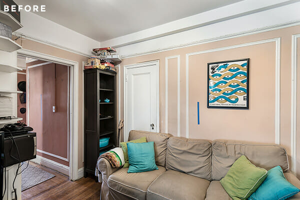
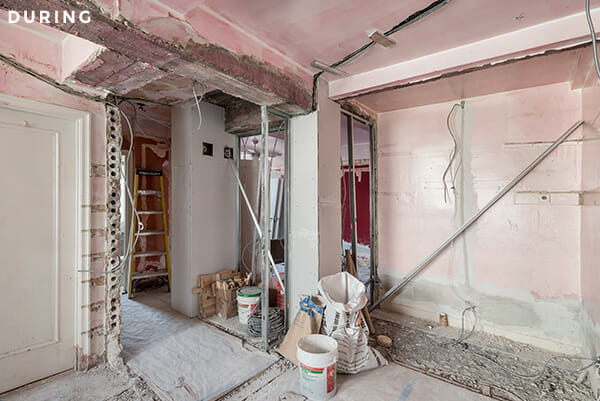
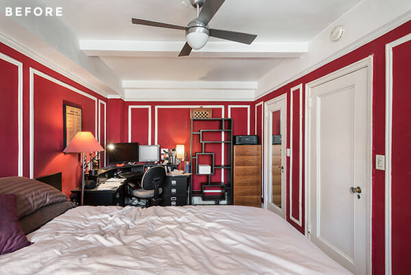
Much of the apartment was largely in its original, 1923 state. We loved a lot of the classic details but many of them had begun to decay and the plaster walls were in various states of disrepair. It was increasingly difficult to keep clean. So, the primary goal was to restore the walls and floors to good working order, replace the trim and molding that was falling apart, and generally remove a lot of the cluttered and clashing elements that had built up over the years.
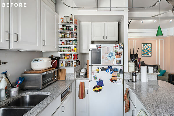
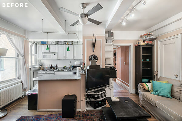
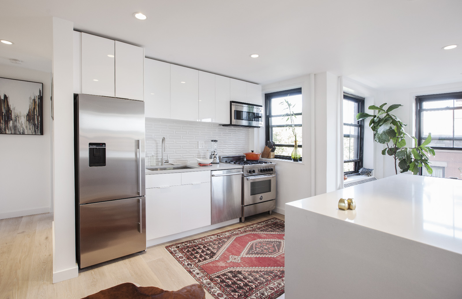
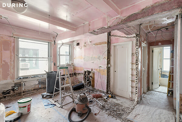
The kitchen had been redone at least once, probably in the late 90s, but the life of that renovation was ending and the cabinets were breaking and falling apart. We wanted to find a way to make the small kitchen/living room space work. We weren’t making substantial structural changes and wouldn’t be moving plumbing or gas, but the whole space definitely needed a general cosmetic and electrical make-over. So, we posted our project on Sweeten to find a design and construction team to take on the work.
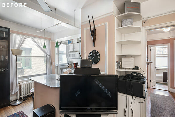
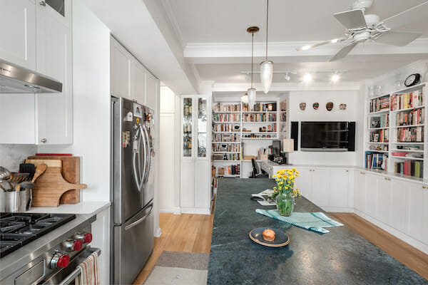
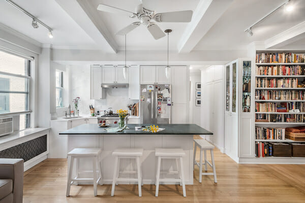
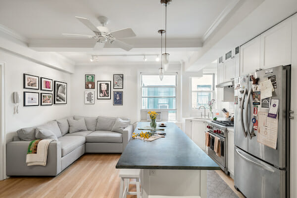
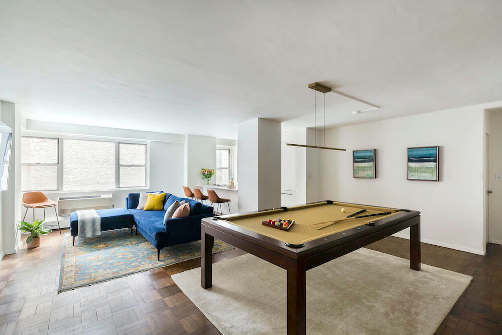
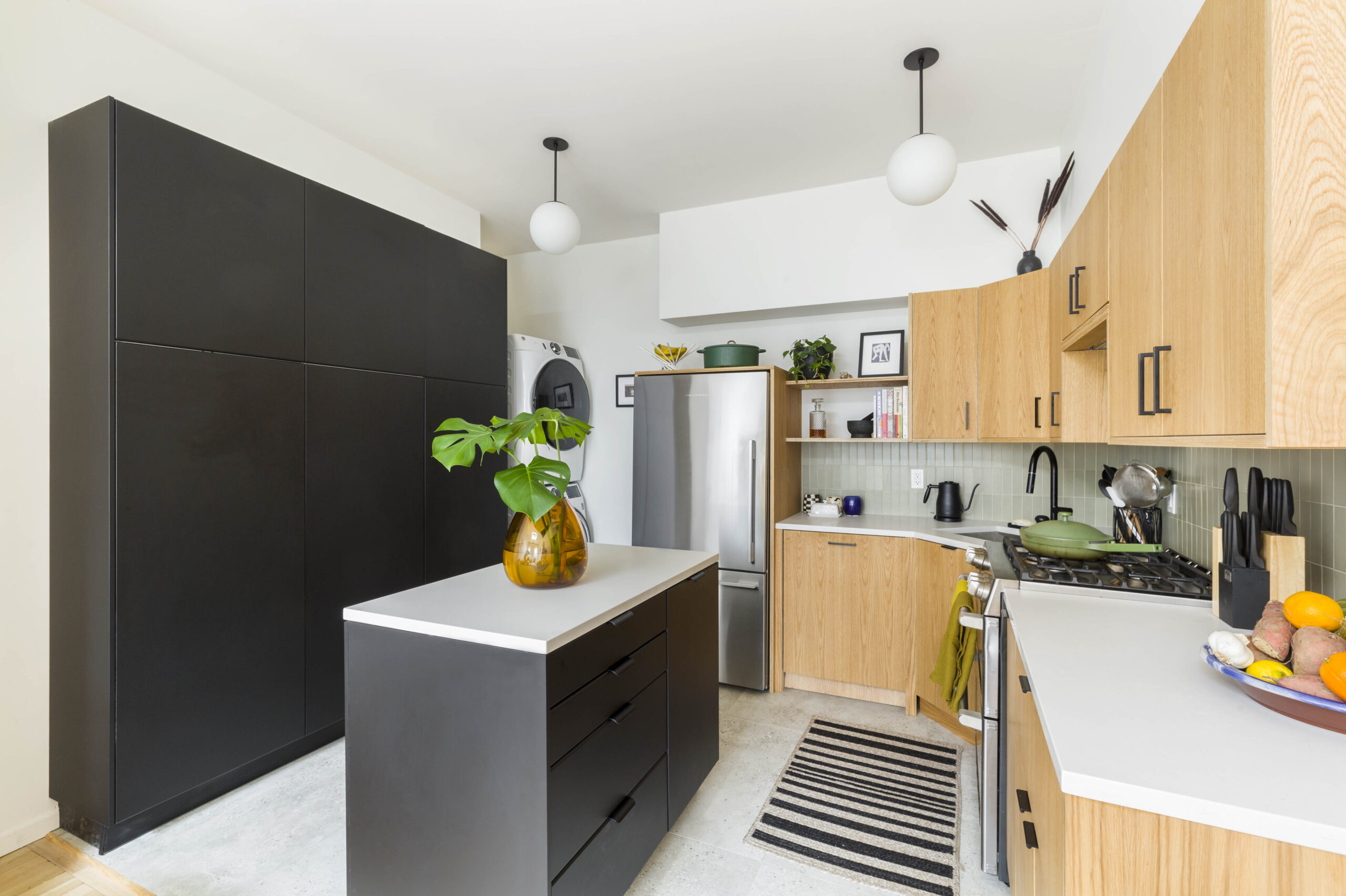
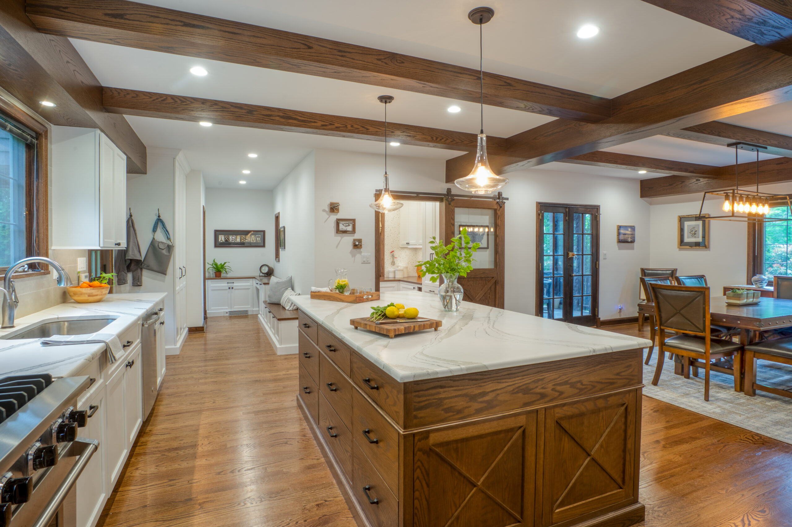
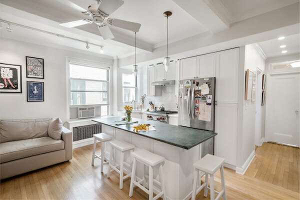
The living room, especially, was a challenge. It had a reasonably sized kitchen, which is great because I cook a lot, but finding a way to balance the space between kitchen and living room without shortchanging either was really the central problem we tackled. It had previously been semi-divided by a wall and an island which left the corner around the couch dark and cramped, and still didn’t allow for a full-sized fridge. We removed the wall and created a central island that could function as both a work space and a dining table.
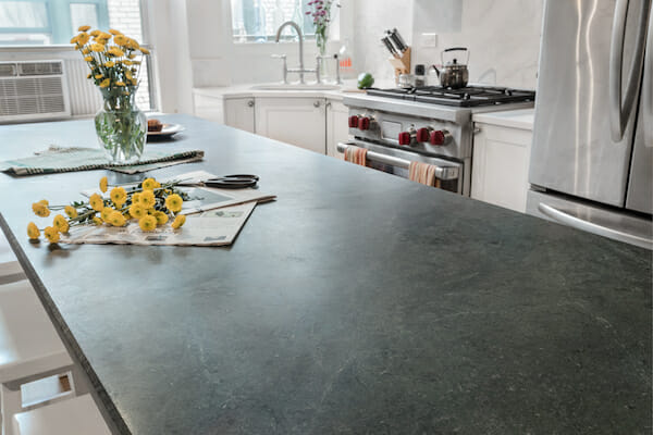
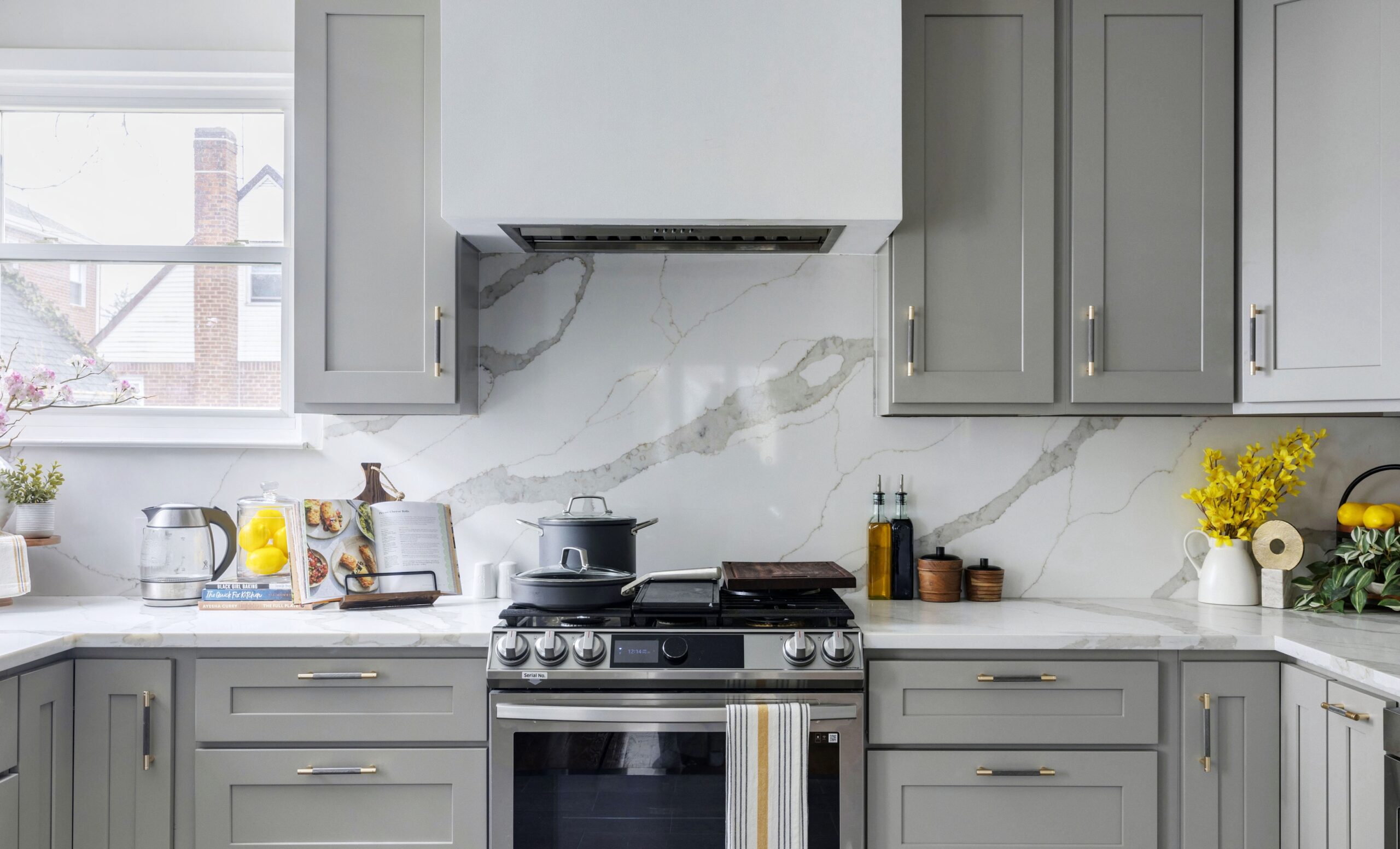
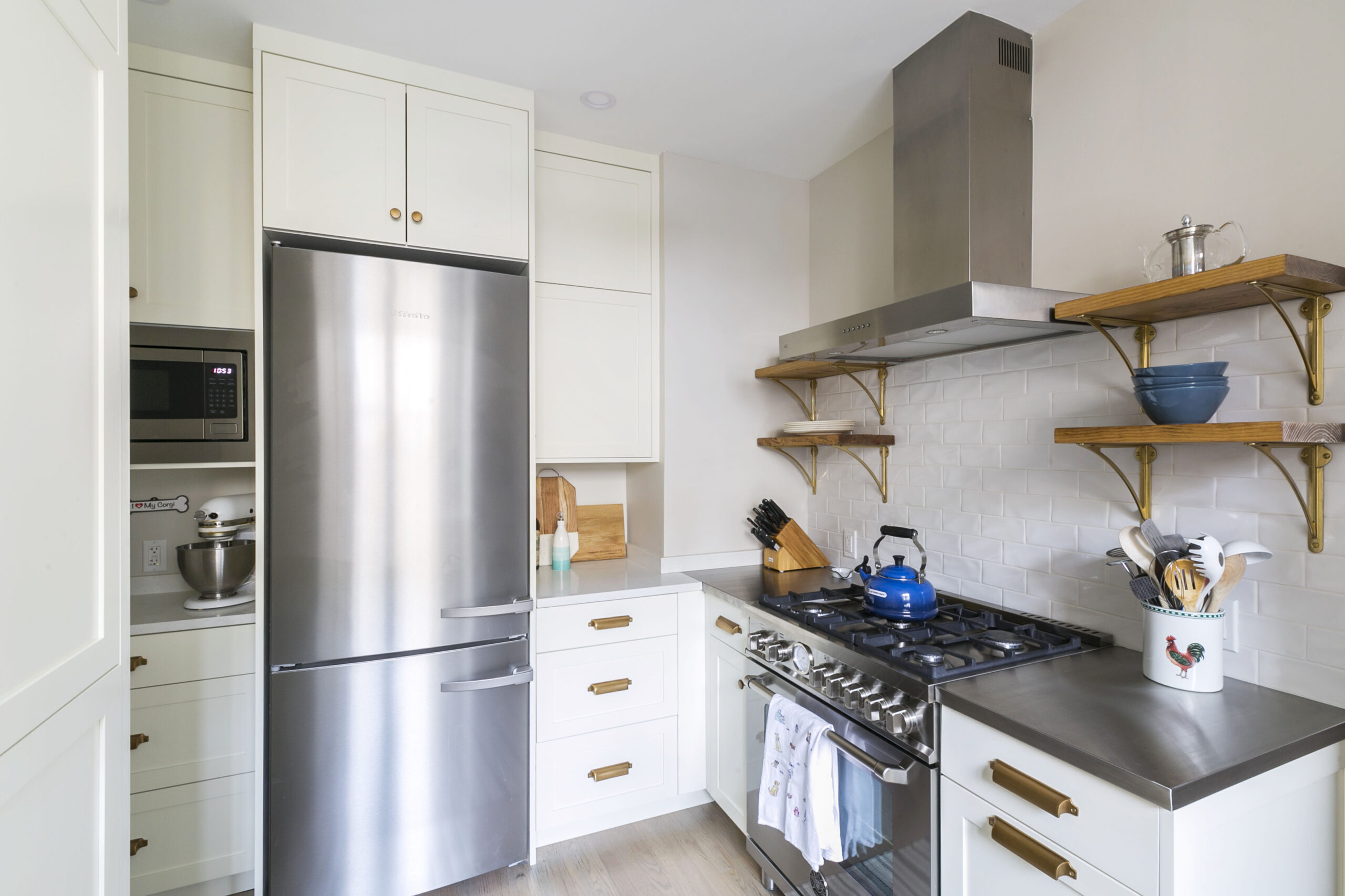
I splurged on a dual-fuel Wolf range, which was right up against the realm of possibility given the amount of available power to the apartment, but which I’m pretty happy about (a gas stovetop is basically essential, as far as I’m concerned). The refrigerator is a 32″ french door model, not quite “full sized”; I found the unit that offered the most storage volume but which could still physically fit, with the doors removed, into the small freight elevator in our building. We originally had a slightly larger model that did not fit. I toyed with recruiting friends to help me carry it up to the tenth floor. In retrospect, this probably would have been a mistake.
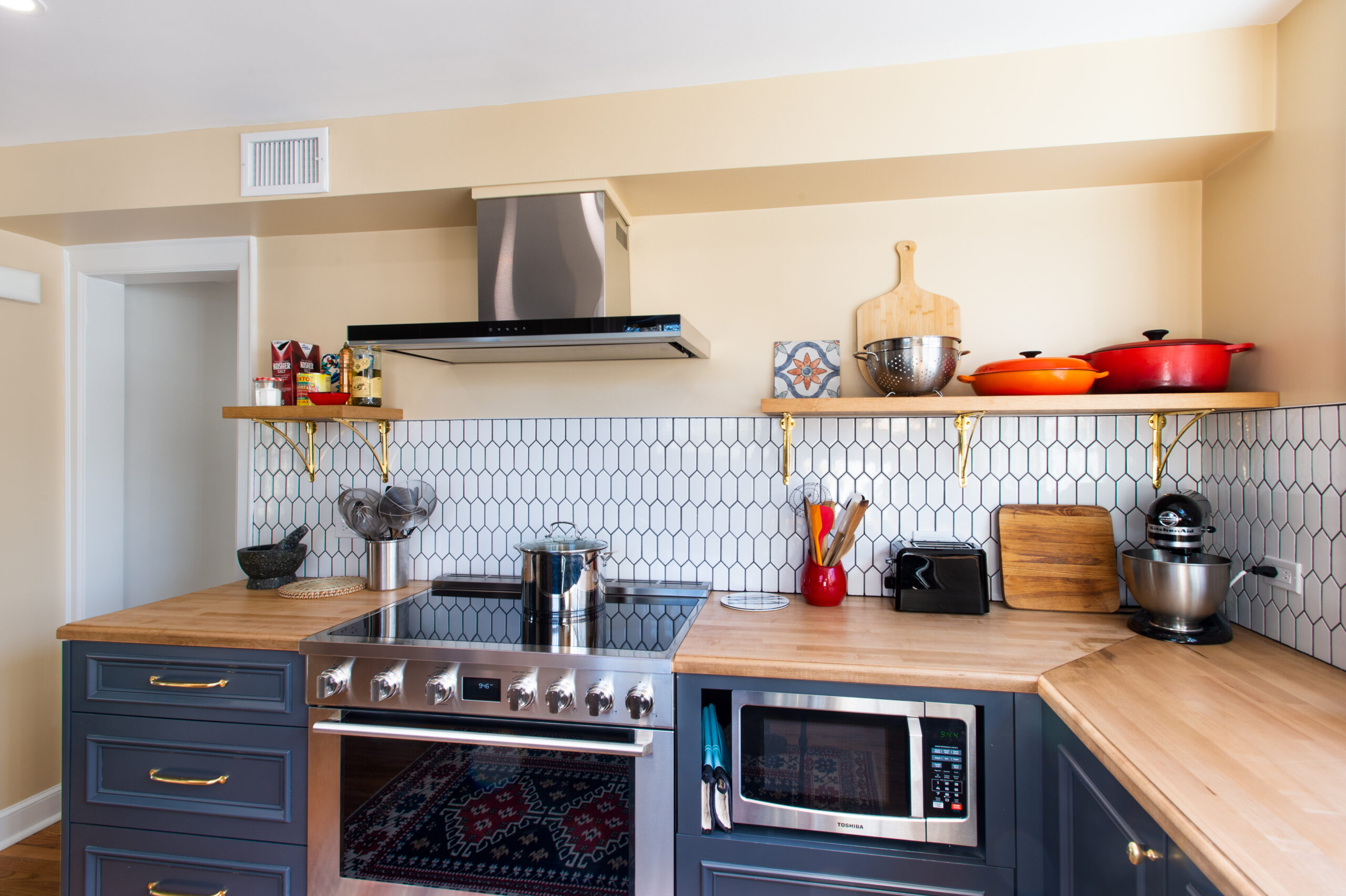
The microwave is also Wolf; they make a unit that opens like a drawer and can be loaded from the top, rather than the traditional swing door style. It’s a little silly but this allowed us to install it in the kitchen island facing away from the front door, rather than in the more normal spot above the stove. I don’t use the microwave a ton and it seemed silly to give it that front and center pride of place; better to have the nice custom cabinet-fronts there. Sweeten brings homeowners an exceptional renovation experience by personally matching trusted general contractors to your project, while offering expert guidance and support—at no cost to you. Renovate expertly with Sweeten
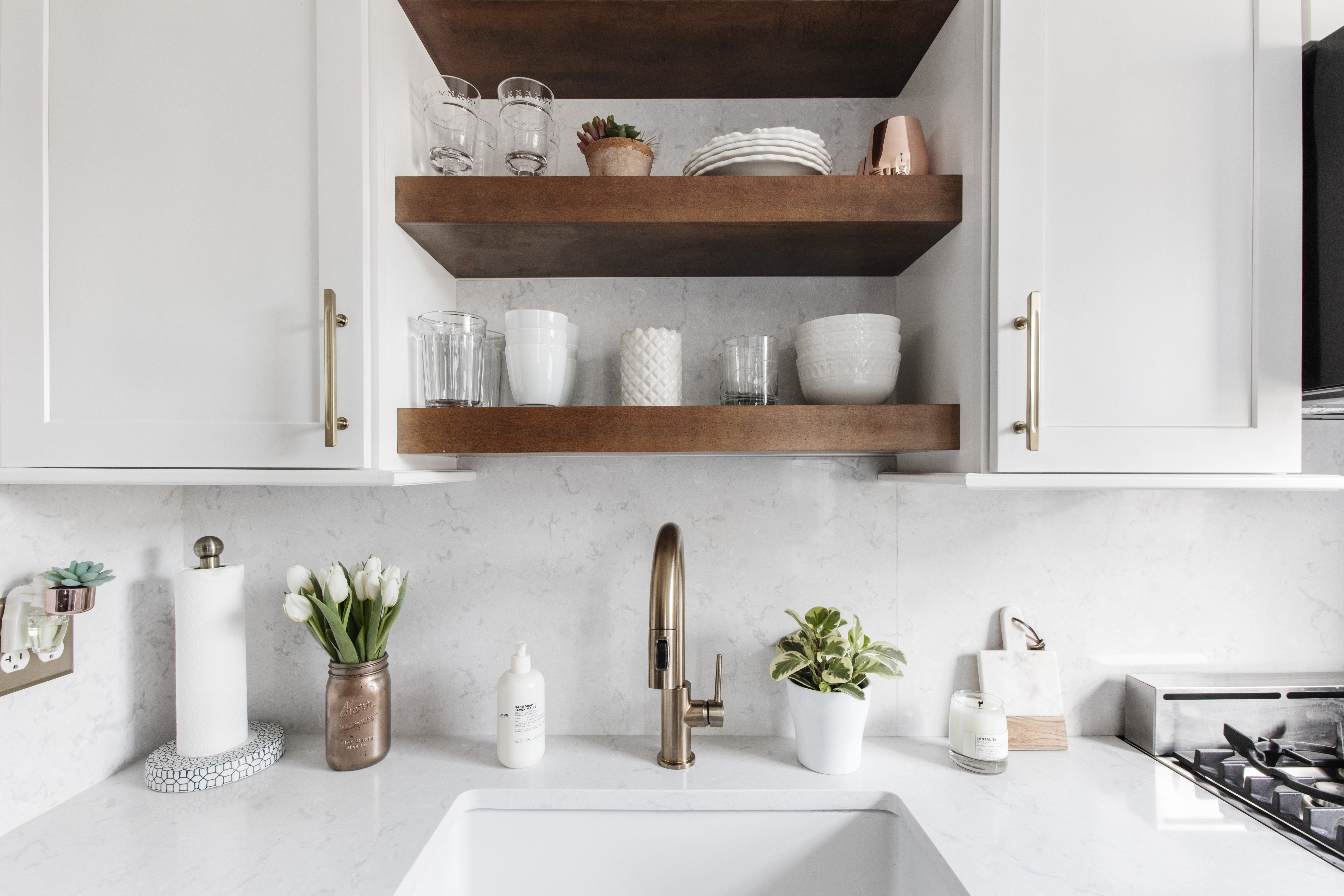
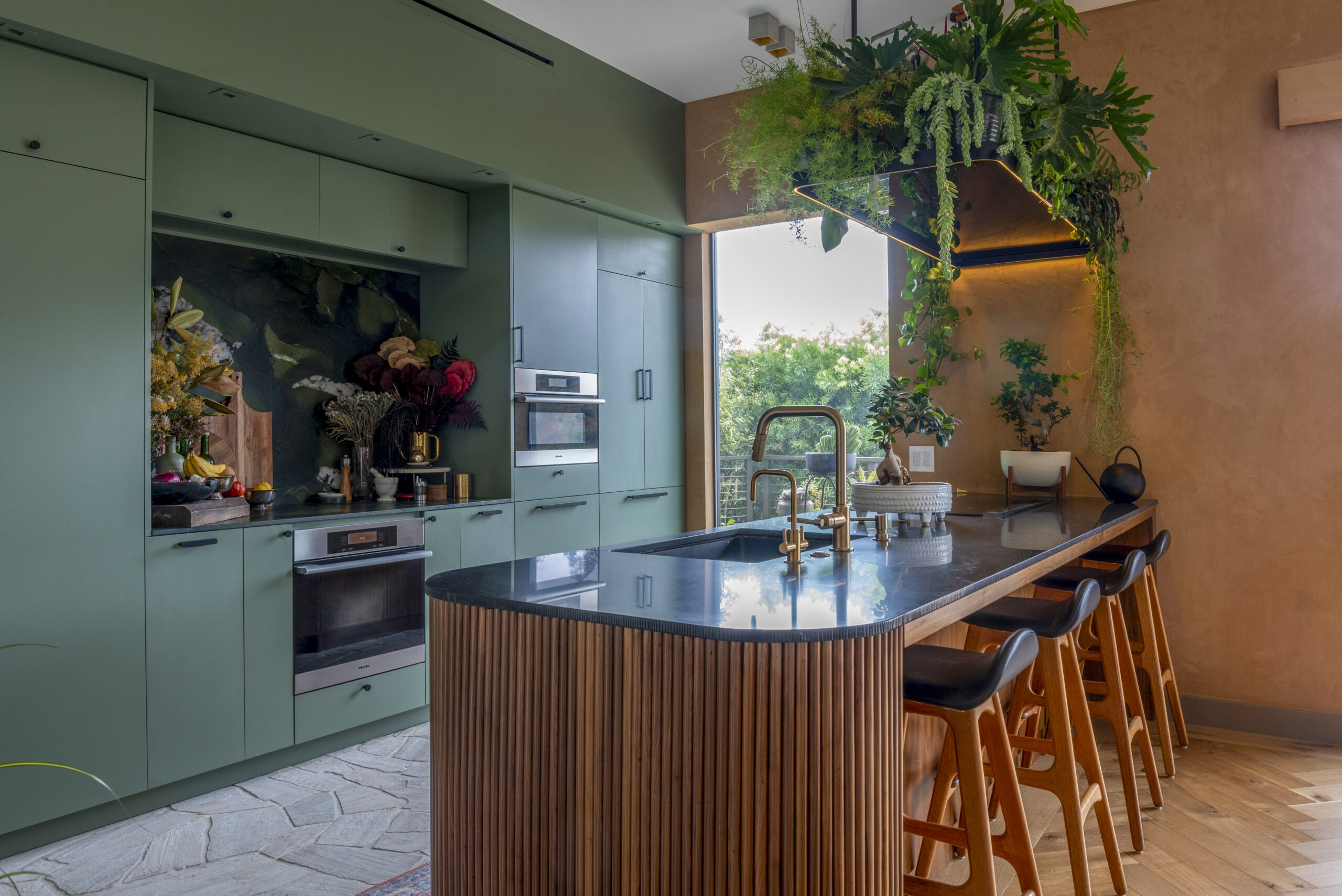
We got fairly traditional knobs and miscellaneous hardware; we used unlacquered brass for the “living room” side of the main room and nickel for the “kitchen” side as a way to differentiate the shared space. We love the brass; the original knobs and apartment hardware are all nearly 100-year-old brass, and we specifically sought out the unlacquered pieces, which seem a little less common, because our hope is that over the years they will patina and start to take on some of the character of the old ones. Most of our miscellaneous hardware pieces are from Simon’s Hardware and Bath, and we’ve been pretty happy with them. We got slightly funky drawer pulls from Urban Archaeology, which were pricey, but which we really love. The pendant lights are from O’Lampia, a shop on the Bowery; the guy there makes custom pieces that we both really like, and we would enthusiastically recommend him.
The kitchen faucet is Rohl, less expensive than the ubiquitous Waterworks (which is what I used for the bathroom renovation in 2008) and supposedly, at least according to our plumber, more reliable. Lever handles are key for me for a kitchen faucet, since it’s difficult to turn on cross handles with your elbows when your hands are covered in raw chicken. Having the spout elevated as high above the sink as possible is also pretty important to me, it allows more space to work when washing dishes (no dishwashers allowed in my building!).
I would count our (very consciously UN-oiled) blue/green soapstone on the kitchen island among our riskier–but ultimately most rewarding–design choices.
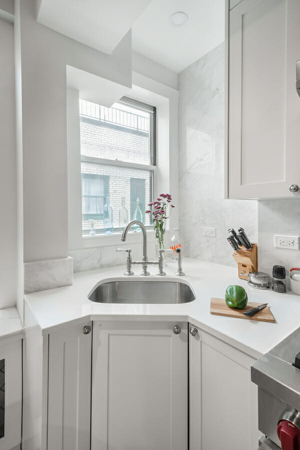
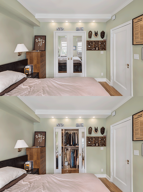
Throughout the apartment, we wanted to maintain as much of the pre-war character as possible, while also lightening and opening up the space. There was picture frame molding partway up the walls, which we replaced with crown molding at the ceiling. The style is similar but it makes the ceilings feel higher and complements the many beams without calling too much attention to them. Most of the choices we made were along these lines, classic in style but slightly more understated than the original as befits a fairly small apartment. We refurbished and kept original elements where we could, like the heavy doors and metal door frames.
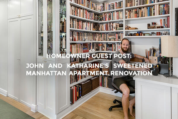
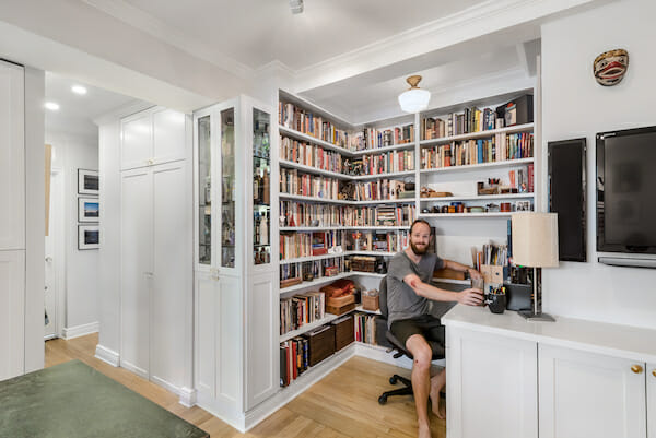
We built in a lot of shelves and cabinets in order to maximize space and we opened-up the awkwardly placed living room closet (originally blocked by the couch) to make a kind of library/office nook that also makes the space feel larger.
For non-decorative lighting in the smaller spaces, we went with simple schoolhouse ceiling fixtures that are pretty similar to what was originally installed, again with brass accents. To fill out the three rooms, we also added track lighting, which is perhaps a little unusual. They are fairly unobtrusive and allow a lot of coverage, flexibility, and directionality while staying as close to the ceiling as possible (we would have had to drop the ceiling to install in-ceiling lights). We accented with warm-tone, high CRI LED fixtures in places where they could be installed, like in cabinets, the hallways, and in the kitchen.
Kitchen selects >> cabinets: custom / drawer pulls: Urban Archaeology / knobs: Simon’s Hardware & Bath / counter: M. Teixeira Soapstone / backsplash: Arabescato Marble SMC Stone / fridge: KitchenAid / gas range: Wolf / faucet: Rohl / living room walls: Benjamin Moore in Silver Satin / bedroom walls: Benjamin Moore in Guilford Green / cabinets and molding: Benjamin Moore in Simply White / pendants: O’Lampia
—
Sweeten handpicks the best general contractors to match each project’s location, budget, scope, and style. Follow the blog for renovation ideas and inspiration and when you’re ready to renovate, start your renovation on Sweeten.
