A Galley Kitchen and Sunken Living Room Get a Holistic Re-Design
A newfound Prospect Heights apartment gets a top-to-bottom makeover
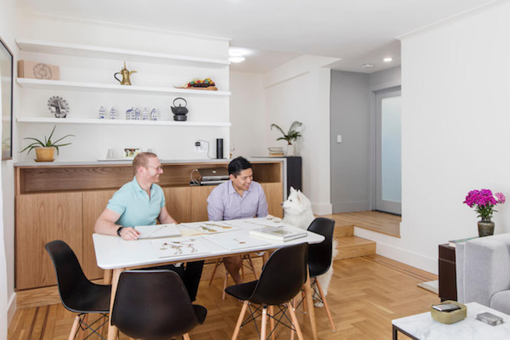
Work, business school, and an appetite for adventure had Joel and Eric relocating from NYC to overseas and back again. With New York soil permanently underfoot, the couple set their sights on a spacious one-bedroom co-op with loads of potential in the heart of Brooklyn’s Prospect Heights area. Ready to undo a decade-old renovation of glitter paint and overly dark finishes, this couple teamed up with a Sweeten general contractor and his past Sweeten clients, designers Casey and Kumar, to get it done.
Guest post by Joel, Prospect Heights homeowner
In 2009, work opportunities and the promise of adventure led my partner, Eric, and I to leave NYC. We lived abroad, I went to business school, and we even found ourselves settling in Downtown Detroit for a while. But in early 2015, moving prompted us yet again; this time unexpectedly back to where our journey began.
In hindsight, it was smart that we kept the small studio apartment that Eric owned when we left. It made the logistics of moving back to the city easy to stomach. To save money, we set a goal of living in the studio for as long as possible. “How bad could it be?” we thought: the studio is in an awesome location with great subway access, and is surrounded by dog-friendly parks. This was wishful thinking. 400 square feet turned out to be far too small for two men and a precocious American Eskimo Dog named Comet.
Finding a new home in Prospect Heights
We embarked on a hunt for more spacious digs with some basic criteria: a well-proportioned, reasonably priced (by NYC standards), pet-friendly 1BR/1BA apartment with dog-friendly parks nearby. After a four-month search, we finally closed on a large, corner apartment in a welcoming co-op. We had spent summer and fall weekends attending open houses from Hamilton Heights to Jackson Heights to Brooklyn Heights – only to end up in the building right next door to where we were already living – in Prospect Heights.
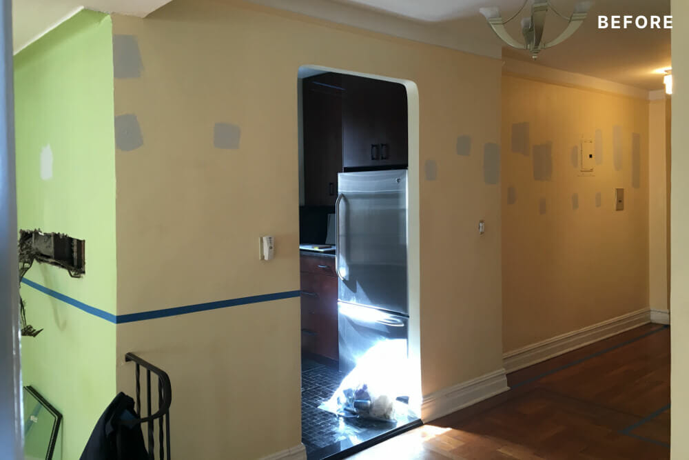
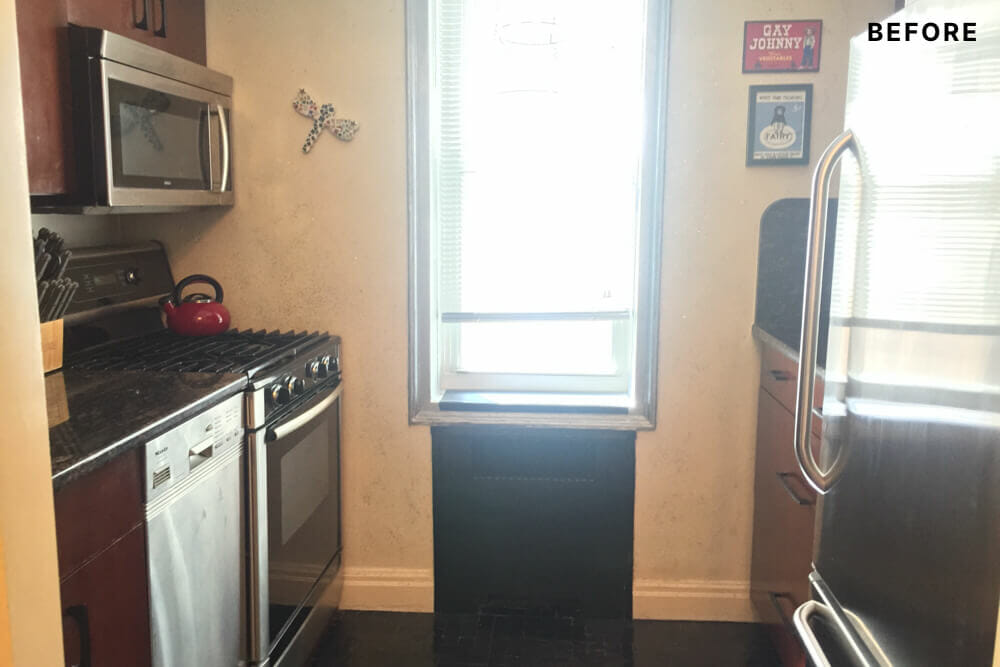
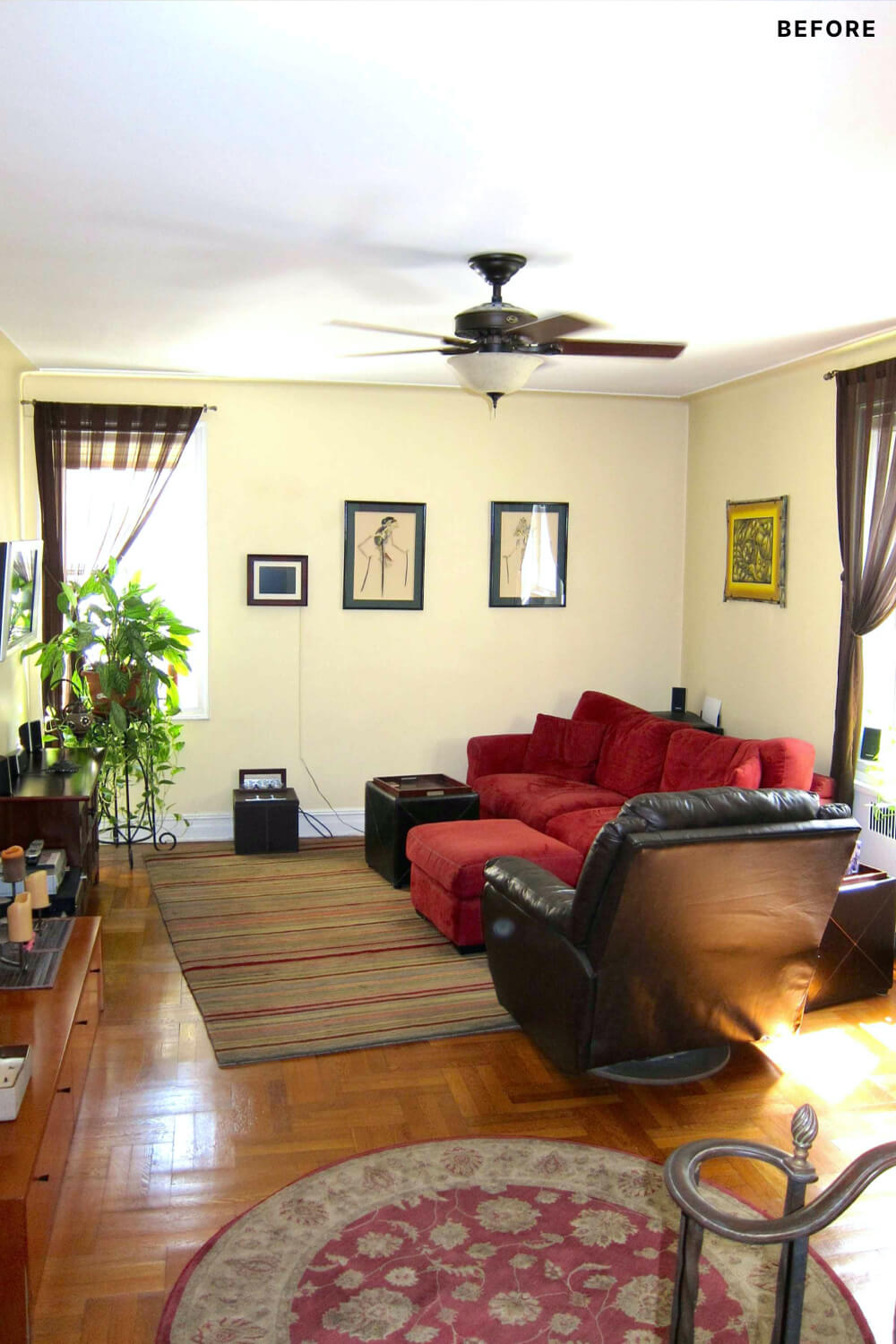
Features in the new apartment that struck us during our first open house visit: plentiful sunlight streaming in from multiple large windows on three sides, ample storage space, an in-unit washer and dryer, and rooms with generous proportions. The apartment is located in a 1920’s-era co-op building on a stretch of Eastern Parkway where many units contain sunken living rooms, high ceilings, and elaborate ornamental details. But sometime in the early 2000s, our apartment suffered a poorly executed renovation that installed heavy, dark cabinetry throughout, dark flooring and dark paint colors. One of the strangest choices: kitchen walls painted metallic silver in which actual glitter had been included.
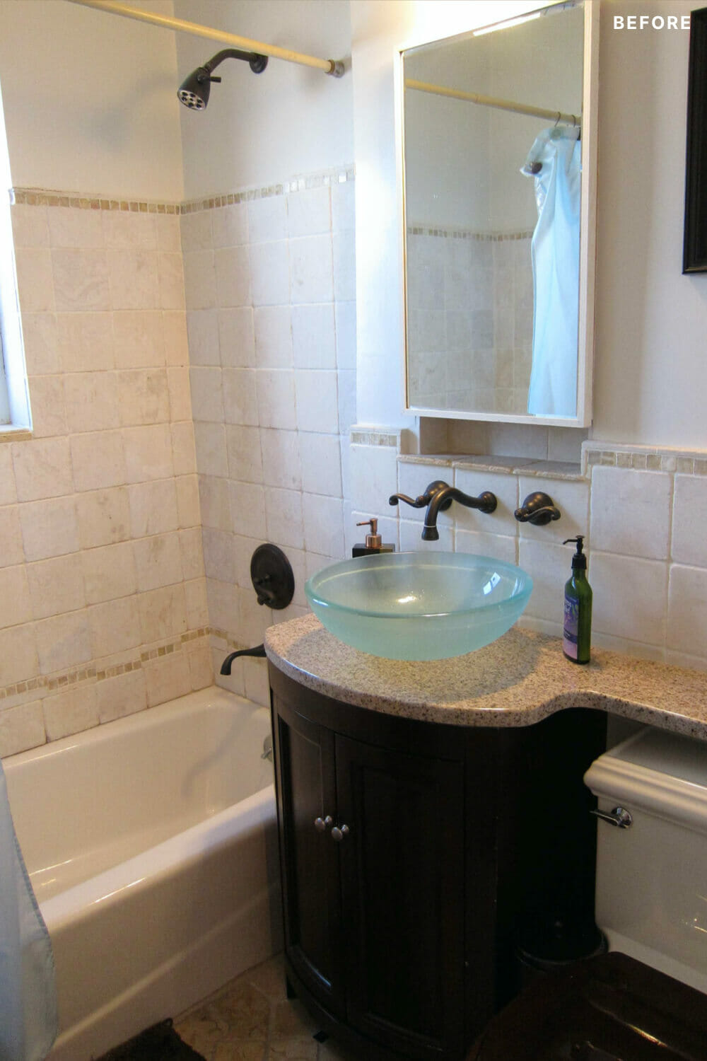
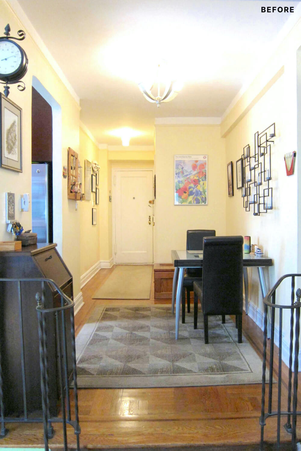
Aside from these superficial issues, there were also some fundamental flaws in the floor plan that we wanted to change. An awkward entry foyer – too small to fit a full-size dining table but too large to be a hallway – adjoined an enclosed, undersized kitchen. Similarly, a short, dark hallway led to a cramped bathroom that lacked sufficient storage and counter space. The bathroom always smelled damp and musty because the floor and walls were finished with absorbent limestone tiles.
Finding the right experts for the job
During the weekends we spent open-house hopping, Eric and I met a woman selling her charmingly renovated Crown Heights apartment who raved about Sweeten. Months later, after closing, we recalled this conversation and posted the vision for our renovation on Sweeten. We eventually connected with our general contractor. Eric and I were impressed by the portfolio of work that Kris had executed for other clients, especially his focus on simple finishes and quality craftsmanship. Eric and I contacted references; one of the references was a designer named Kumar. He and his wife Casey, also a designer, had just moved into their apartment and had renovated with Sweeten and the same contractor. Kumar invited us to visit. When Eric and I arrived at Casey and Kumar’s apartment, we were stunned by their beautiful, comfortable, modernist apartment renovation that was full of thoughtful construction details.
Though Eric and I fancy ourselves as design-minded, we didn’t have the ability to design or manage a renovation that would approach Casey and Kumar’s beautiful home. Kumar must have intuited this because he suggested that we could hire Casey, who was already planning to launch a freelance design career, to serve as our project designer and manager. We loved this proposal and signed up as their inaugural client.
Sweeten brings homeowners an exceptional renovation experience by personally matching trusted general contractors to your project, while offering expert guidance and support—at no cost to you. 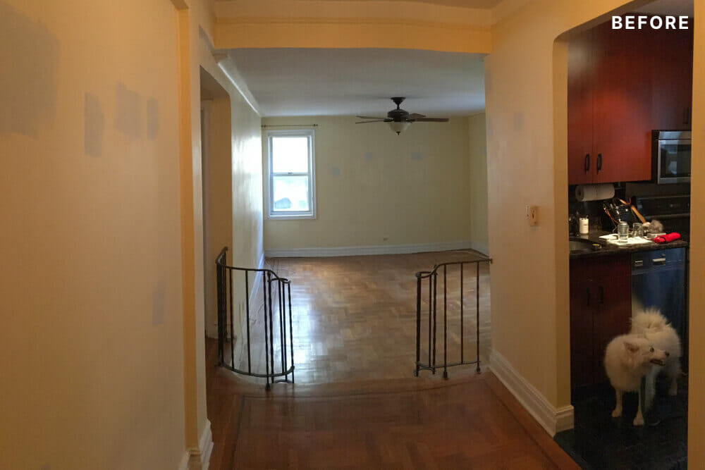
Renovate expertly with Sweeten
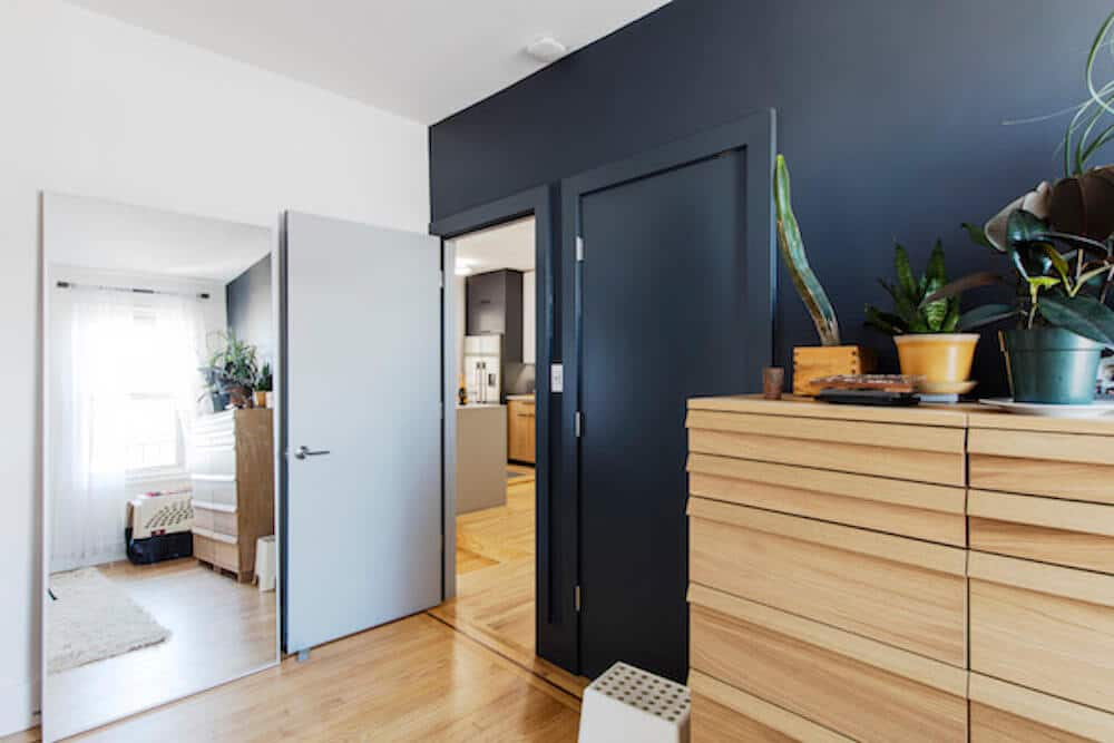
The design process was holistic and thorough. They started our first meetings asking us how we lived our lives at home, the kinds of physical objects and furniture we have (or would like to have), and how we wanted to use the new space. Knowing that Eric and I wanted a calm and minimalist aesthetic with some warmth, Casey composed a palette of colors in shades of white, grey and blue and materials consisting of stones and wood grain to employ throughout the apartment.
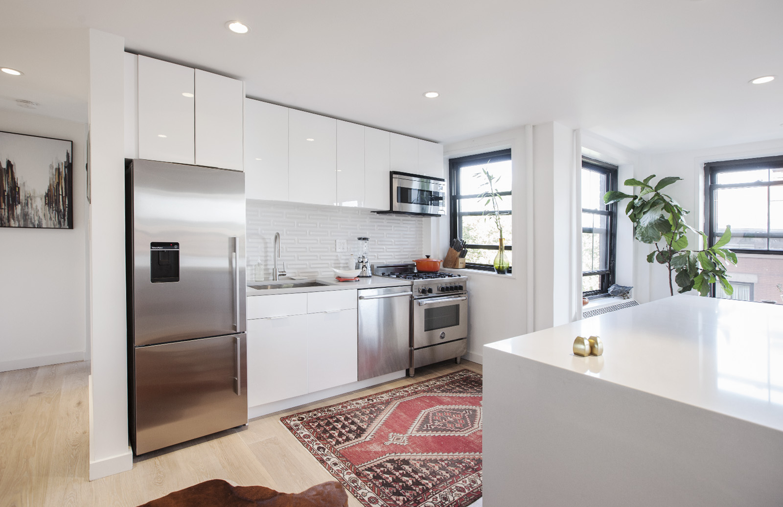
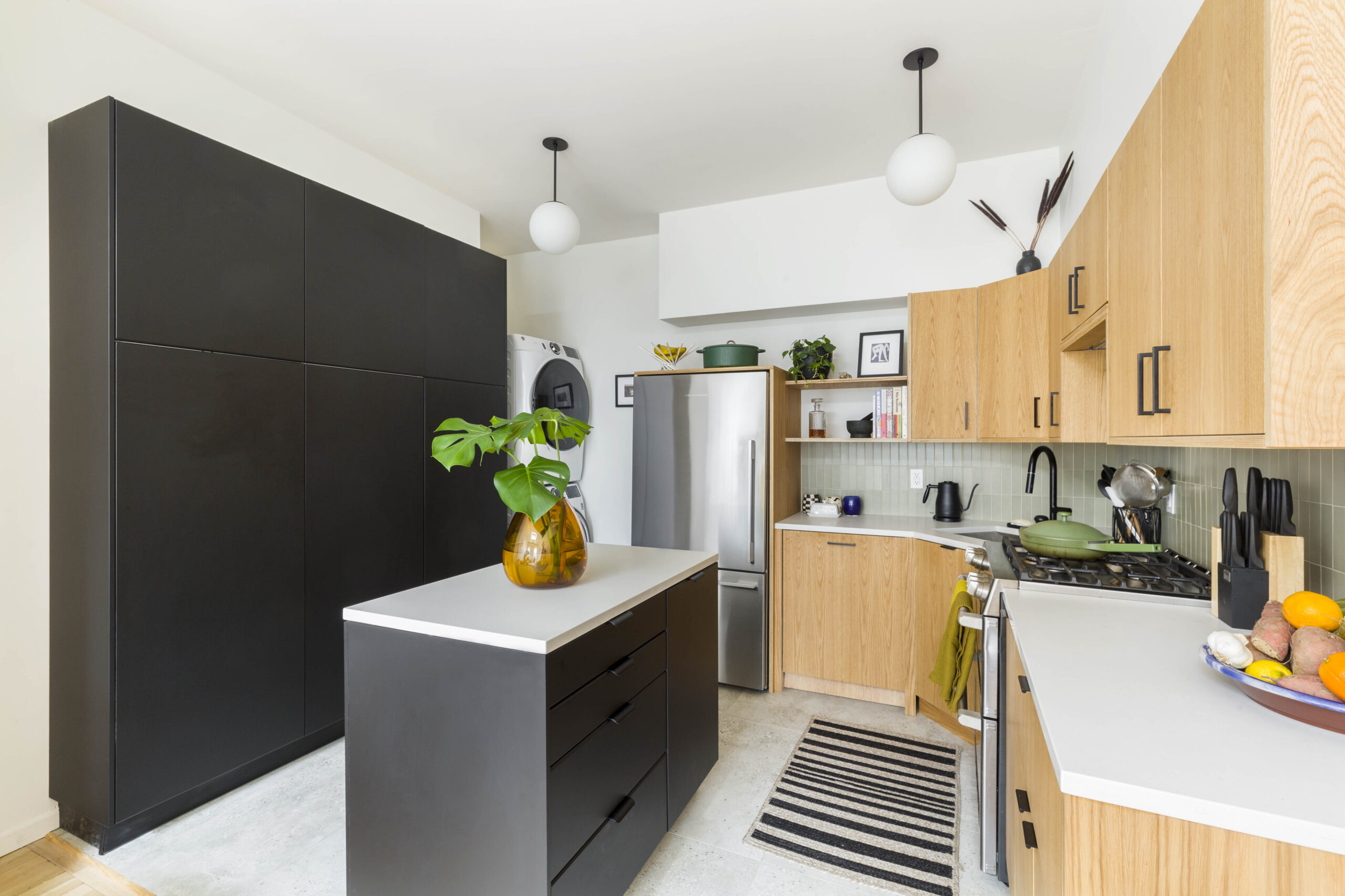
For the kitchen, Kumar strongly advised that since we had a well-proportioned apartment, converting the kitchen to an open concept with the living room wasn’t desirable. With our contractor’s help, we discovered that multiple gas and water pipes in the wall between the kitchen and living room made this idea impractical. He determined it was feasible to enlarge the kitchen by removing the wall separating it from the foyer. With a larger kitchen, we gained an opportunity to extend the countertop and increase the workspace.
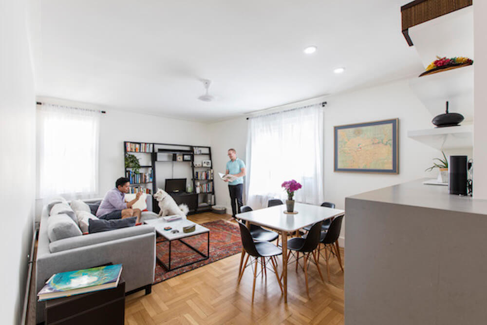
But to somehow create a relationship between the kitchen and living room, Casey came up with the brilliant idea of installing a unified countertop, designed as a monumental piece of furniture, that wraps around the wall between the two rooms with plenty of integrated storage underneath. On the kitchen side, this counter would serve as the kitchen prep workspace. On the living room side, the countertop could function as a buffet surface adjacent to where we planned to place a dining table. At the peninsula end where the two sides meet, a beautiful waterfall edge would function as a service and conversational area for drinks or appetizers during dinner parties.
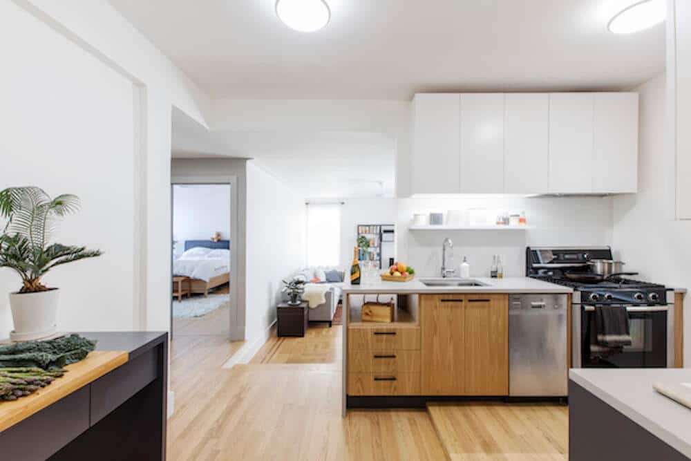
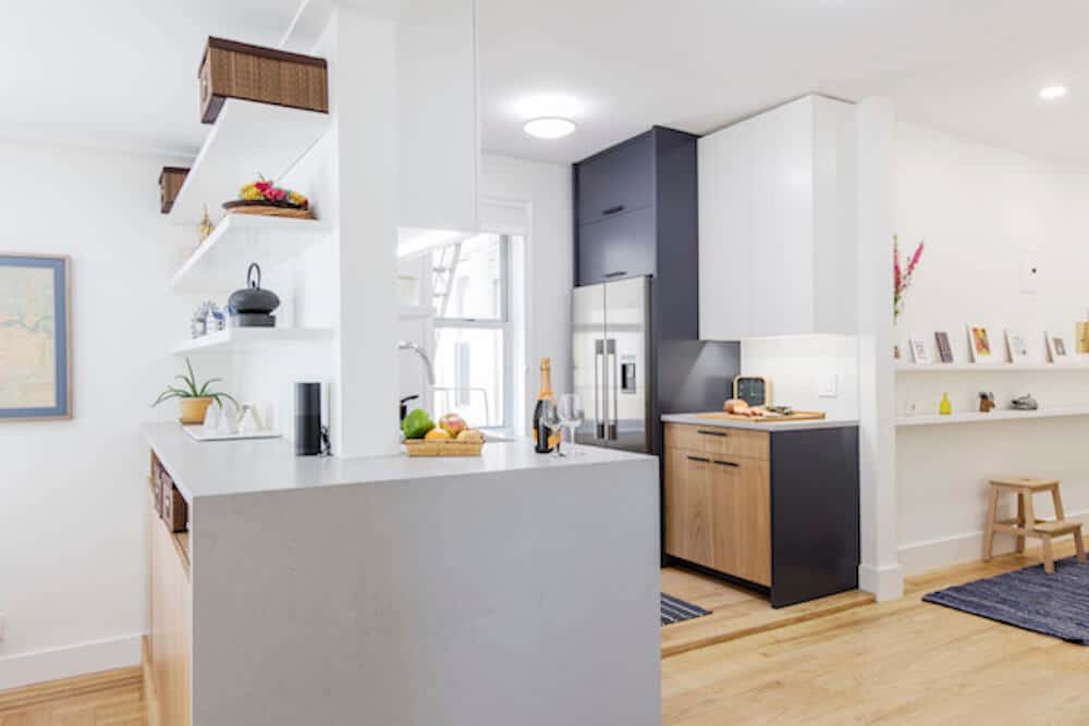
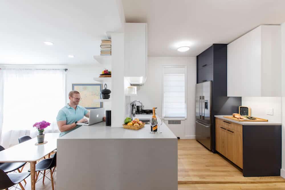
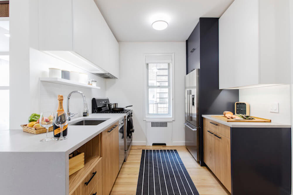
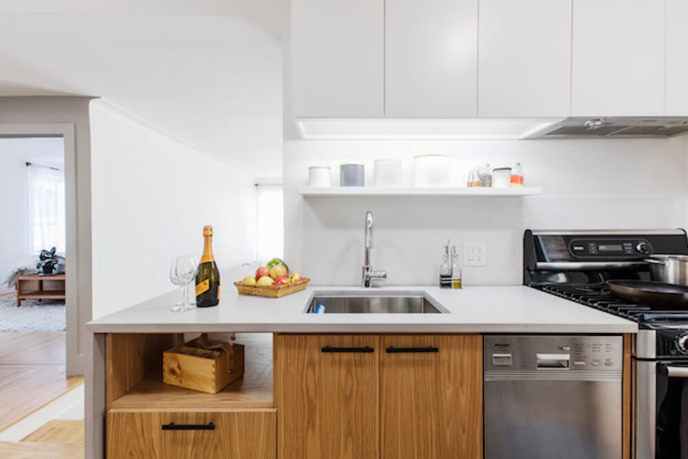
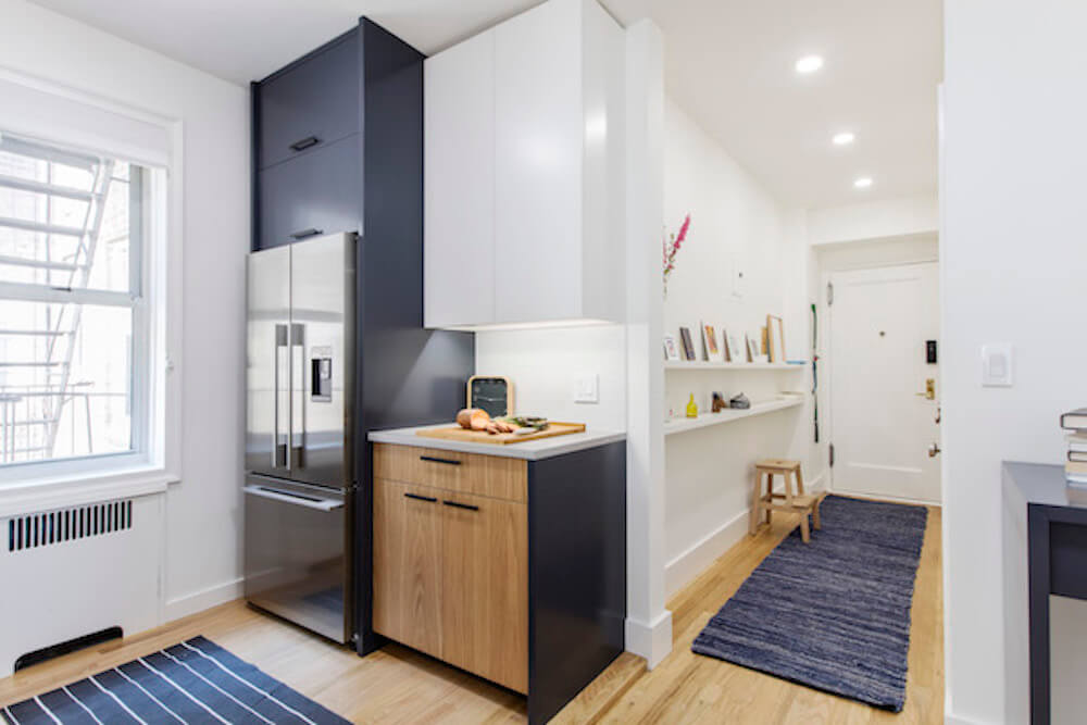
For the countertop material, Eric and I wanted marble but decided against it due to cost, softness, and tendency to absorb stains. Our contractor recommended we use durable Caesarstone and we went with the “Raw Concrete” finish. Working with his carpenter, Casey and Kumar designed custom white oak kitchen cabinets to mirror the new lighter wood flooring that replaced the black mosaic floor tiles. We stripped the existing floors elsewhere in the apartment and refinished them with a much lighter stain to match the new kitchen floor. The two items we kept from the original kitchen were the Bosch stove and dishwasher left by the previous owners.
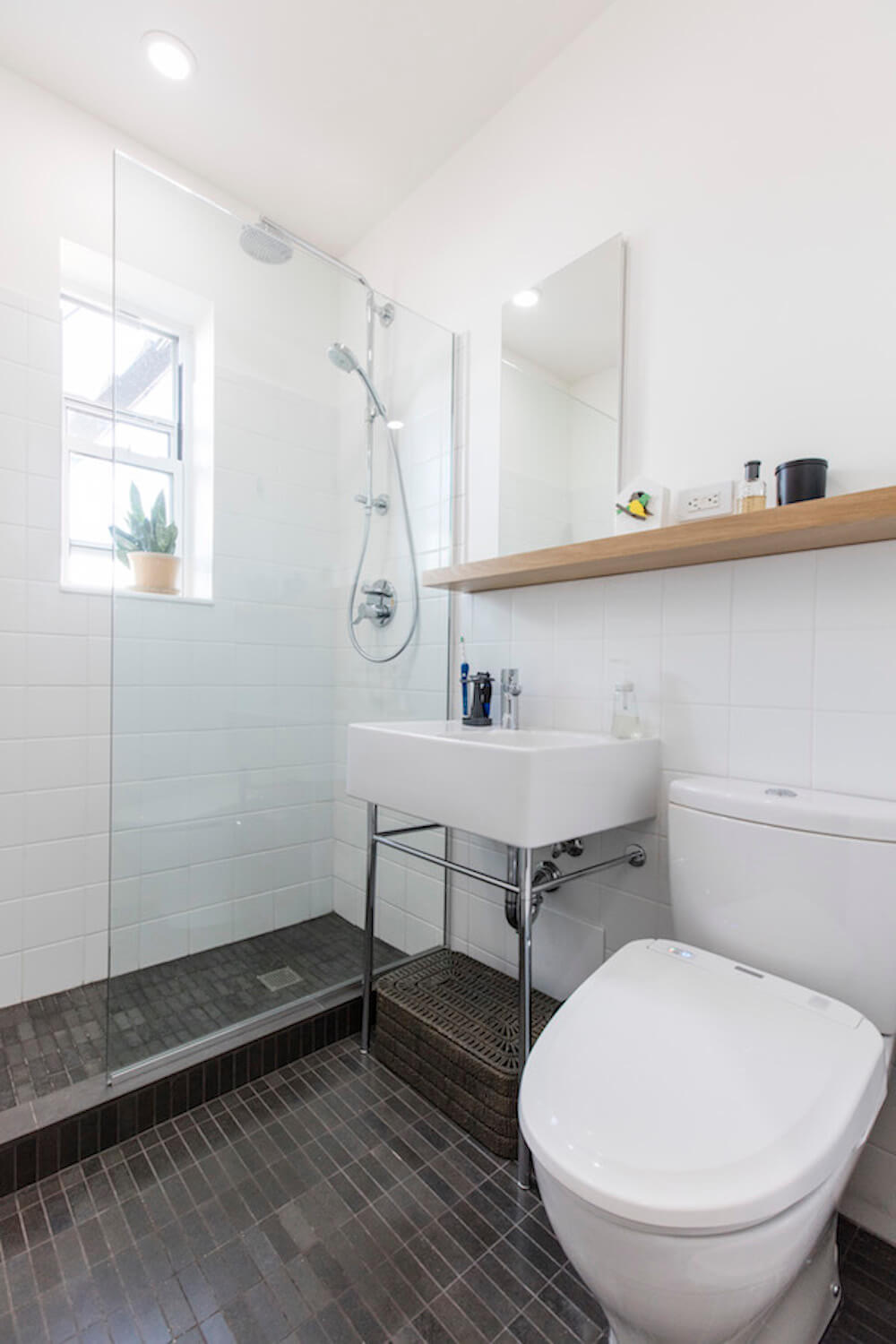
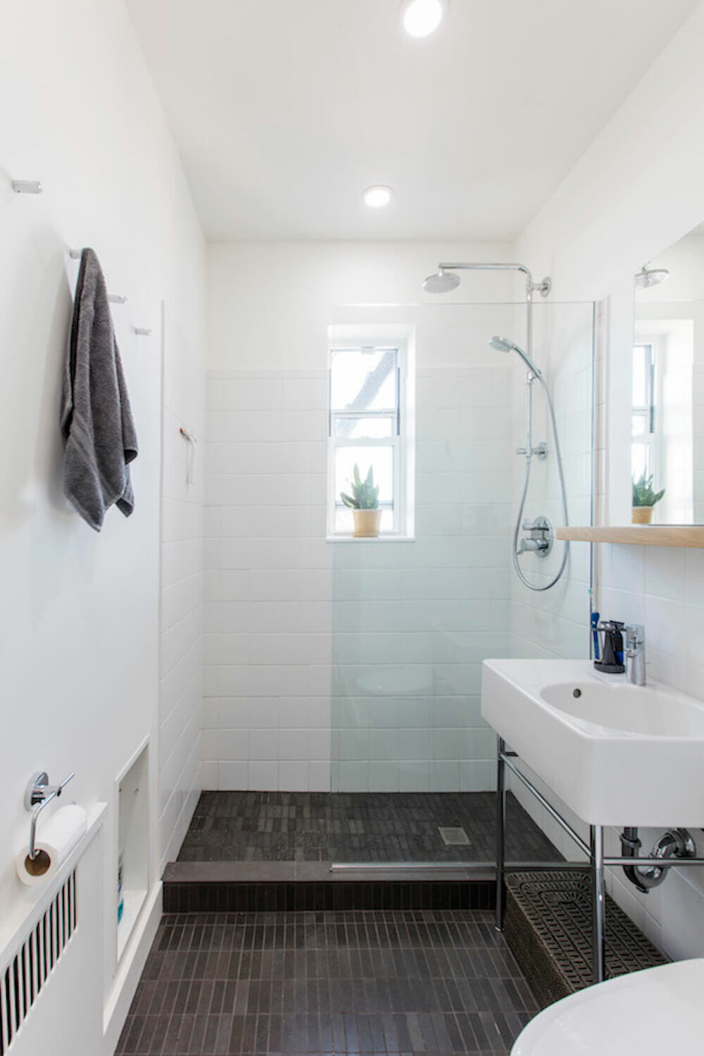
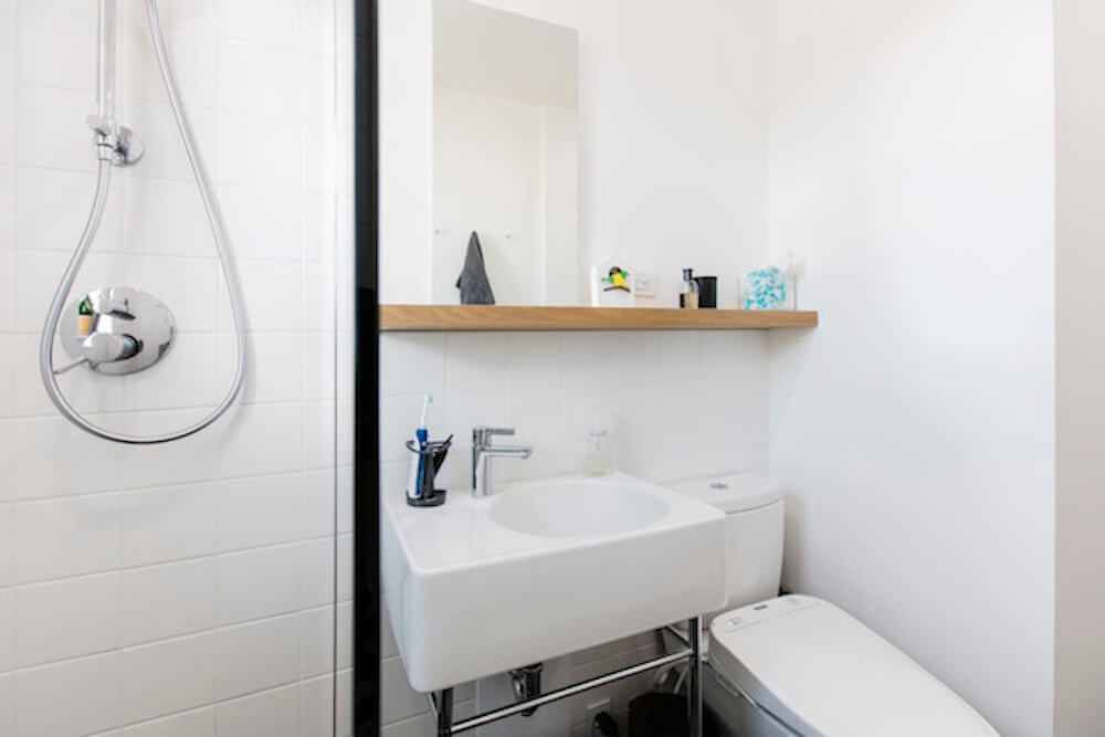
We completely gutted the bathroom and indeed enlarged it by incorporating part of the adjacent hallway. The washer/dryer closet door used to open into this narrow hallway that would now be part of the bathroom. We reversed the orientation of the washer/dryer closet so it opened instead to the more spacious bedroom. Casey designed a glass enclosed shower stall to replace the tub. The floating Duravit Scola sink and streamlined Toto toilet were chosen for their minimal footprints, helping to increase the sense of openness in the small space. We utilized a minimalist material palette for the bathroom: honed slate tile floors and white subway tiles for the walls, with a floating white oak shelf above the sink for a touch of warmth. The Toto toilet washlet was an indulgence we wanted to include from our experience abroad.
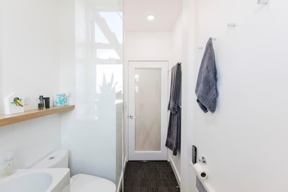
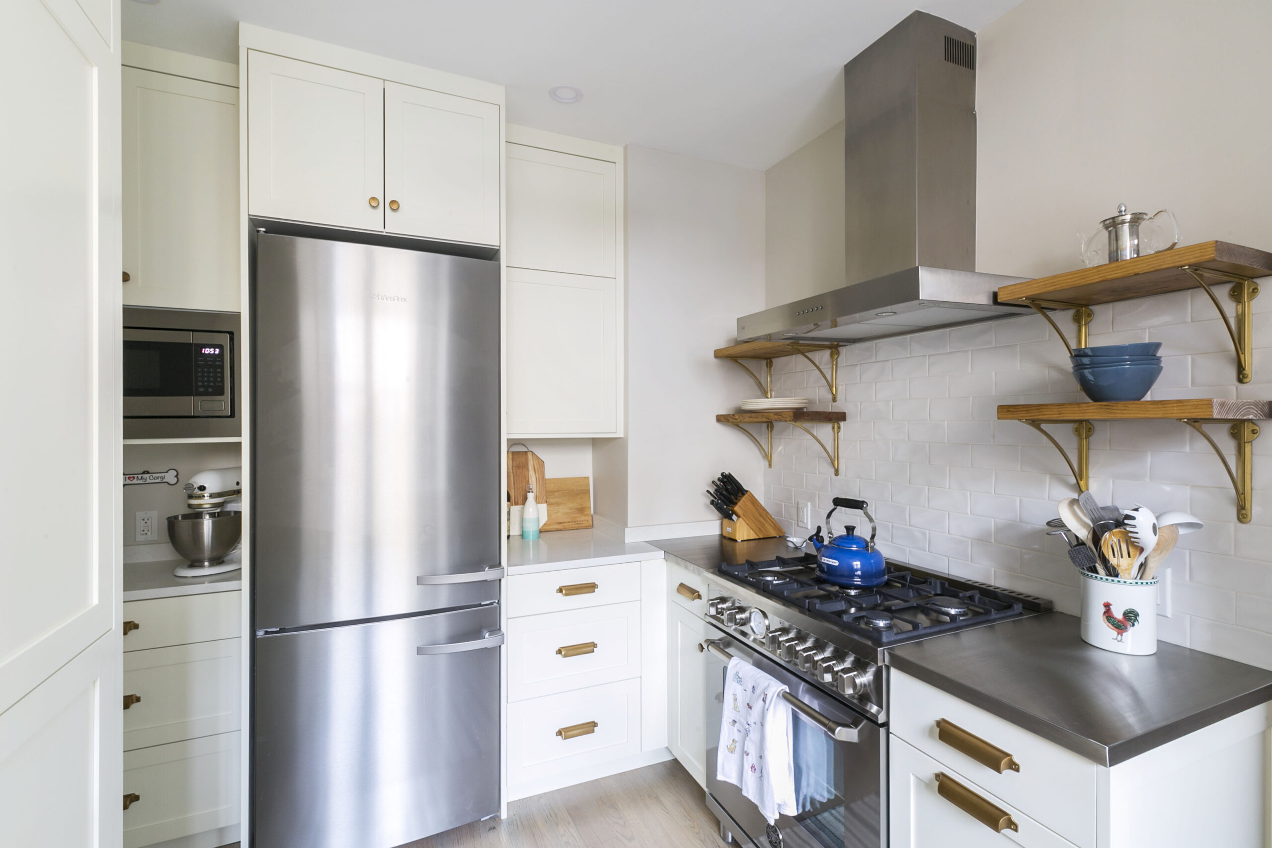
The kitchen and the bathroom were the biggest design and construction interventions in our project. But throughout the apartment, our designers were adamant that we address numerous small and simple details that Eric and I never would have thought of on our own. A few examples: In the entry hallway there was already a large coat closet. Casey and Kumar convinced us to create a new pantry out of some of the former foyer space. Not only did we get additional food storage, but the outer wall of the new pantry now lined up with the refrigerator wall of the kitchen, helping to reinforce the visual identity of our newly enlarged kitchen space. At the entry to the sunken living room, the team recommended removing the wrought iron rails and squaring off the formerly rounded stair landing. And inside the shortened hall between the bedroom and bathroom that used to be a shadow cove, the decorative arch was removed and the ceiling lowered to be flush with the lower ceiling level of the adjacent sunken living room. These and other small changes clarified what used to be many intersecting and conflicting lines and helped the overall design feel cohesive.
The design scheme for our apartment was far more thoughtful and sophisticated than Eric and I expected. But the quality of the end result would not have been possible without the customer commitment and attention to quality from our contractor. From the very beginning, we felt confident that we were putting our investment in safe and competent hands. In any construction project, you expect a certain amount of unforeseen problems and ours was no exception. One significant example towards the end of the project: the stone subcontractor installed the three massive pieces of the Caesarstone countertop. After the installation cured, it looked beautiful, but the pieces were not sized perfectly. To an untrained eye, the difference wasn’t immediately noticeable, but Casey noticed the problem and brought it to our attention. Our Sweeten contractor immediately took ownership of the error. A week or so later, the stone fabricators returned and put in new pieces.
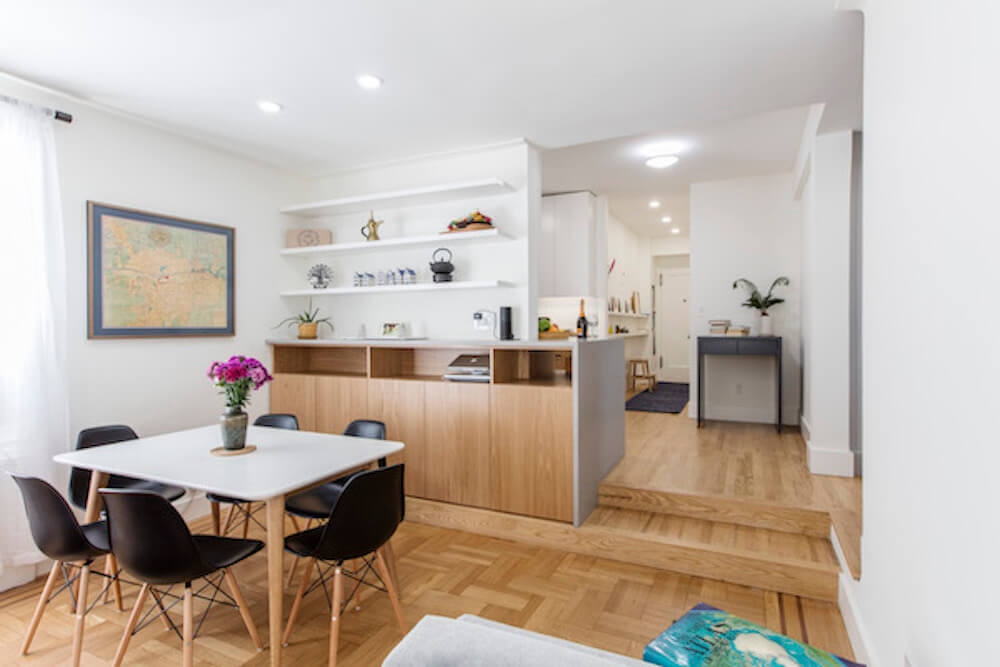

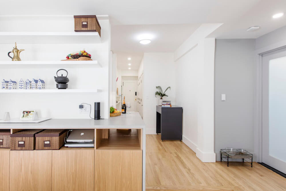
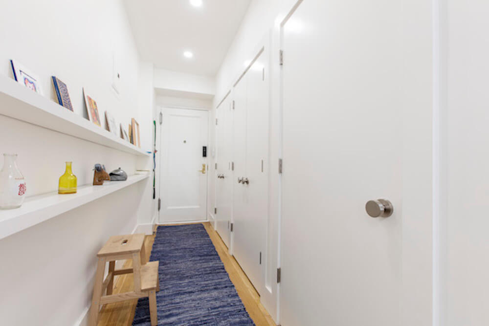
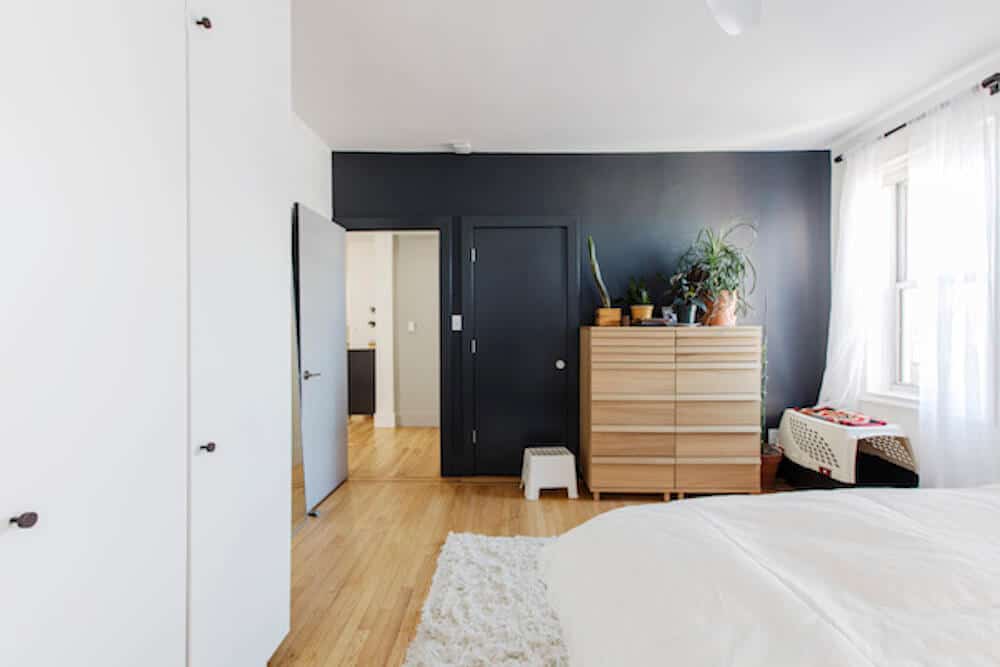
We couldn’t be happier with the end result of our apartment renovation. It’s an amazing feeling to come off the busy streets of New York City and enter our new home that is beautiful, serene, and supremely comfortable, and have space to entertain or host guests. We got to this result through the work of a couple of talented young designers and a builder we were incredibly happy to work with. Sweeten made this all possible. A happy customer told us about Sweeten. Sweeten helped us find an excellent contractor. And through good word-of-mouth from the contractor’s previous client, we unexpectedly also ended up hiring that client as our project designer and manager. As very satisfied customers, Eric and I are happy to continue that virtuous cycle.

Renovation Materials
Kitchen selects >> cabinets: custom / hardware: Topex Design by Colonial Hardware / counters: Caesarstone Raw Concrete / faucet: Grohe / backsplash: Matte White by Ann Sacks / exhaust hood, #702.995.63: IKEA Eventuell / fridge: Fisher & Paykel / paint: Benjamin Moore / lighting: Philips Hue: Phoenix
Bathroom selects >> flooring: Stone Source: Inca Grey Honed / wall tiles: Daltile: White subway / sink: Duravit / faucet: Hansgrohe / mirror cabinet: Robern / shower hardware: Kohler & Hansgrohe / toilet: Toto / lighting: Philips Hue
—
Sweeten handpicks the best general contractors to match each project’s location, budget, scope, and style. Follow the blog for renovation ideas and inspiration and when you’re ready to renovate, start your renovation on Sweeten.
