Saskia and Ben’s Sweetened Downtown Brooklyn Studio
“We had a lot of questions and were really involved. Sweeten Expert Mark was incredibly accommodating. We would text him with annoying questions while we were shopping for materials and he would help us make the call right away.”
–Saskia S., Downtown Brooklyn homeowner
If you have set foot in more than three New York City apartments, you have probably seen one of these: a standard issue, L-shaped studio in a concrete block, post-war high-rise. First-time homeowners Saskia and Ben left a two-bedroom rental apartment where they had lived for five years to buy this 650 square foot studio in a co-op building in bustling Downtown Brooklyn. They knew that they had some work to do to make this blank slate feel like home, but just as they were settling in and scheming about renovation possibilities, they had to muddle through a tough math problem: how does a couple downsize from a two-bedroom to a studio and then make room for the arrival of a brand new family member!?
Saskia, who works for a non-profit, and Ben, an attorney, turned to Sweeten to find a general contractor who would help them use the space as efficiently as possible. In their Sweeten project post, they set up four goal lines: divide the living and sleeping areas, build customized storage, upgrade and open up the kitchen, and do something (anything!) with the 1970s tile in the bathroom. We happily pointed them to Sweeten Expert Mark of recent Sweeten Blog fame to figure this equation out.
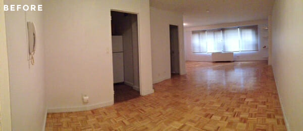
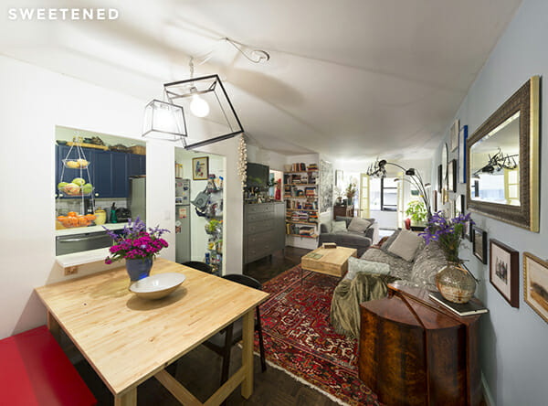
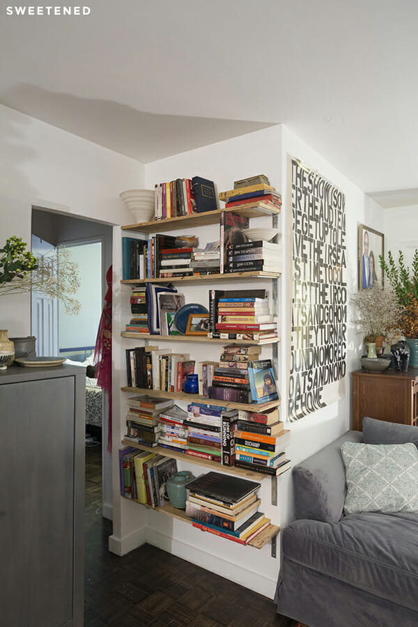
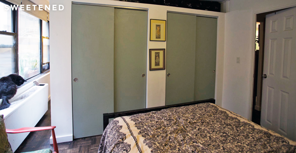
Saskia and Ben were refreshingly pragmatic and totally unfazed by the actual square footage; they felt sure that they didn’t need more space, they just needed to find ways to make the most of the space they had. Separating the living and sleeping areas was an obvious first move that brought an intriguing possibility: putting up a wall is standard fare in NYC, but a new wall in this co-op required a more complicated set of approvals and architect drawings. To save the time and money they might have spent down that route, Mark proposed a partition that would visually separate the room without veering into the structural and paperwork requirements of a new wall. Saskia went further: could the partition double as custom storage? Mark was ready with one more element – they could create a “wall” of custom storage AND set a few extra feet apart for a nursery nook. Somehow, incredibly, this studio apartment was on its way to life as an almost-two-bedroom for this growing family…! Sweeten brings homeowners an exceptional renovation experience by personally matching trusted general contractors to your project, while offering expert guidance and support—at no cost to you. Renovate expertly with Sweeten
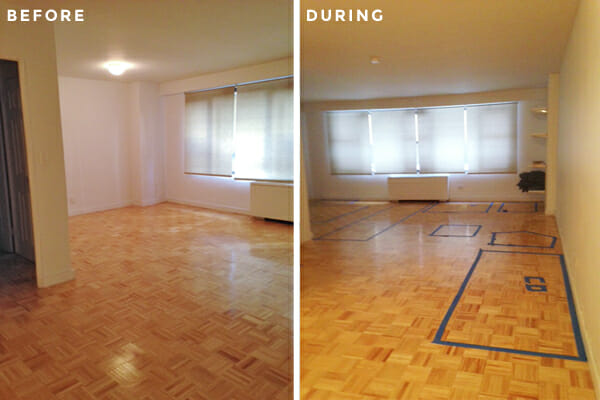
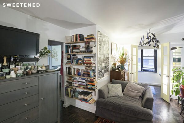
Mark created eight feet of his and hers closets that meld into the available space and serve as a fully functional partition. Mark also helped the couple capitalize on some existing elements of the apartment that helped guide the design; you can see where walls naturally extend or end in the original photos. These markers helped to define natural divisions and transitions for each of the new rooms. The French doors let in light through the nursery nook, add visual charm, and extend the sense of spaciousness to the new living room.
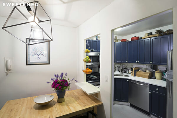
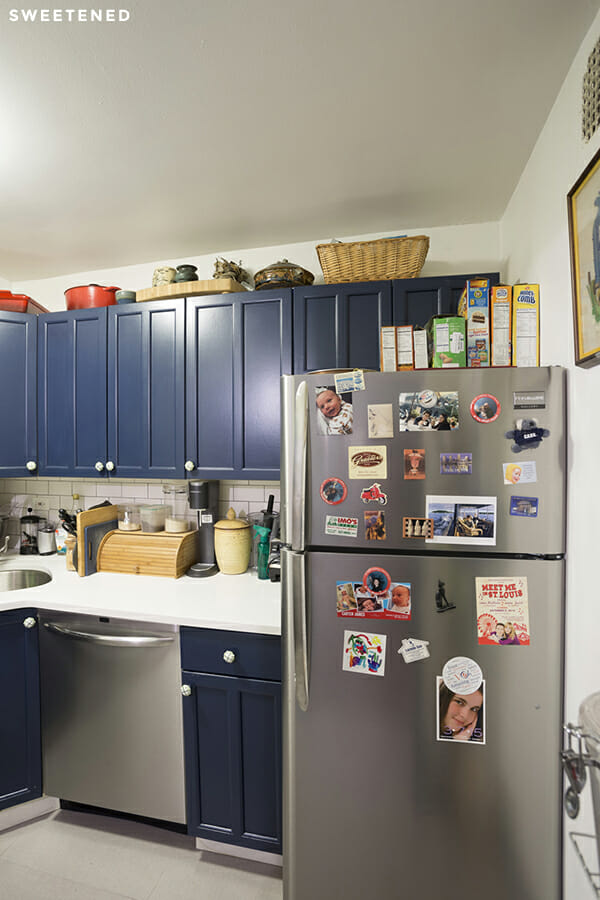
In the kitchen, Saskia and Ben were looking for the exact opposite effect. Hoping to free the tiny, boxed-in quarters, they initially explored taking down the wall between the kitchen and dining area. Mark proposed a simpler path: a pass-through, extended countertop, and widened entry would open up and connect the two areas without the mess, and still leave defined space for the dining set. Mark transformed the cabinets with a dark blue coat of paint offset by a white, subway-tiled backsplash lined with dark grout, and installed new stainless steel appliances and white granite countertops (an unusual find that Mark sourced). Here, the couple’s hard work and exacting taste paid off: Saskia loves the Anthropologie knob pulls she found and Ben insisted on a smudge-proof, fingerprint-resistant fridge, which will surely be a smart move when a little pair of hands is wreaking havoc around there!
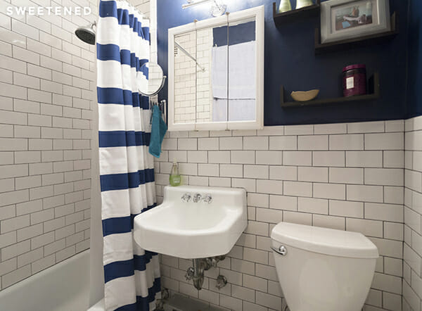
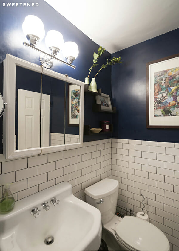
The couple decided to continue the white subway tile effect in the bathroom and found really simple but fun ways to play with light and dark contrast in the lighting, wall color, and accessories they chose. A new toilet from Home Depot was a major functional upgrade but the clear victory in this overhaul? A heated towel rack installed in the bathroom, per Ben’s insistent demand!
With the finish line in sight, Mark took one more swing through the entire place to re-finish and stain the original parquet floors. The effect is dramatic – the white walls feel brighter, the wood tone feels richer – this move really helped unify the space and take this home out of post-war-L-shaped-studio land.
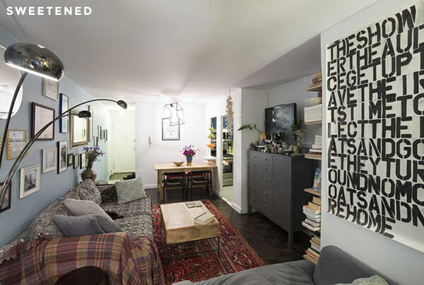
At press time, this thoroughly transformed home was still occupied by just two people. Saskia and Ben – thank you for this peek into your home. We think the new addition to your family is going to love it here!
