Erica & Donna’s Sweetened Brooklyn Schoolhouse Apartment
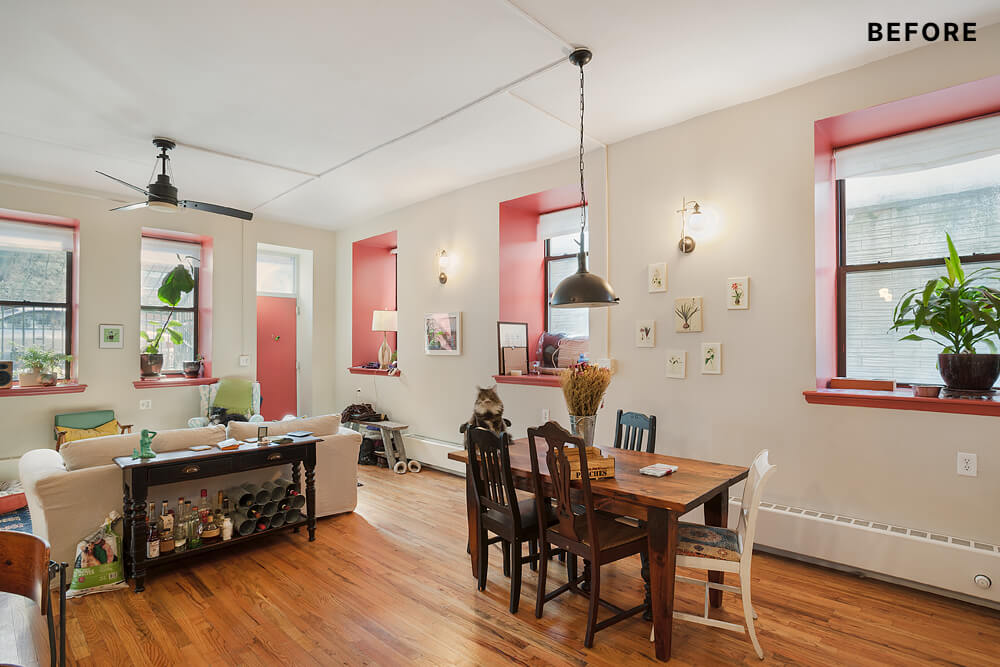
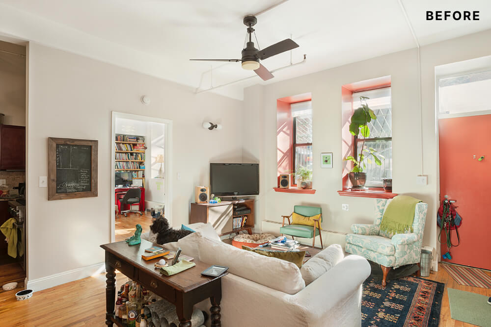
Erica and Donna moved into their two-bedroom home — a former kindergarten classroom in a converted South Slope / Greenwood Heights Catholic school — four years ago. High ceilings, check. Big windows, check. Modern urban oasis, check. Erica, who works for the City of New York, and Donna, a digital product consultant, were initially drawn to industrial and rustic decor as a way to balance and warm up the contemporary feel of their new space. But, after overspending on a pricey couch and accenting the windows and doors with a red paint that grew to irritate them both, the couple decided they needed design help. After they posted their project on Sweeten, we introduced them to this Sweeten designer to help bring new life to this old-school space.
“Our designer had a lot of creative ideas. Some of the areas of our apartment that she transformed were not even on our radar design-wise until she pointed them out.”
– Erica W., Brooklyn Homeowner
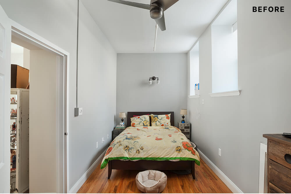
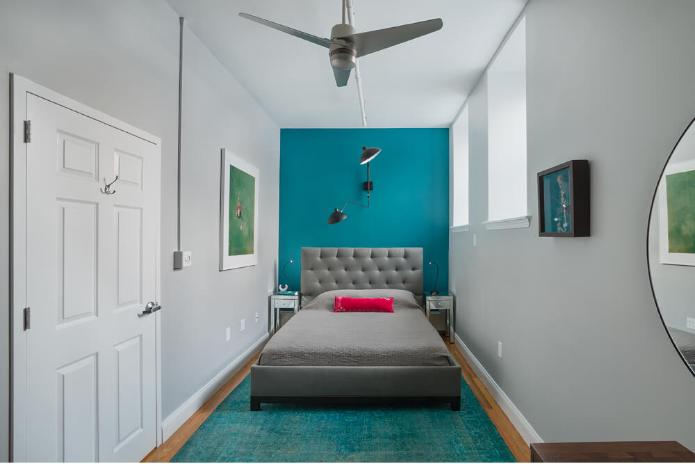
Erica and Donna focused first on their bedroom. They wanted tranquility, comfort, and a little romance; they also needed to maximize the long, narrow layout of the room and find art to make the space feel personal and vibrant.
The designer sought to create a relaxed retreat, in tune with the couple’s design preferences. She put together an inspiration booklet to illustrate creative concepts, drawings, and to simply nail the creative vision. The trio took group shopping trips and worked together to upgrade the shabby-schoolhouse-chic vibe with cleaner lines, bolder colors, and improved. Their designer led the way with an accent wall in Benjamin Moore Venezuelan Sea, offset by the existing gray on the remaining walls. Two smart tricks here: first, the accent wall appears to wash onto the overdyed rug, lengthening
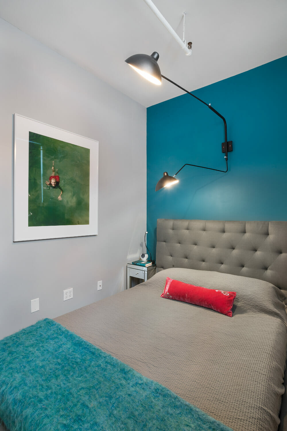
Erica and Donna love the gray tufted Cisco Brothers bed – it anchors the room and offers geometric depth to the monochromatic bedding (full disclosure: I am partial to gray tufted upholstery!). The designer found a gorgeous and super-functional armed lighting fixture on Apartment Therapy Classifieds to feature above the bed – a hat tip to Erica and Donna’s fondness for industrial pieces but with a decidedly glam finish. Mounting the lighting fixture on the wall above the bed freed up space on each bedside table, crucial in a room with just eight feet in width to spare. If you look closely, you can catch a side glimpse of Marilyn Monroe swimming in the photo on the left wall. Erica especially loves this piece and the shot of red and green it offers up to complement other accents in the room.
“I sought to create a refreshingly relaxed retreat. The solution was to carry varying hues of blue and green heavily-pigmented accent walls – the colors of the sea – throughout the space. Serene, but invigorating.”
– Sweeten Designer
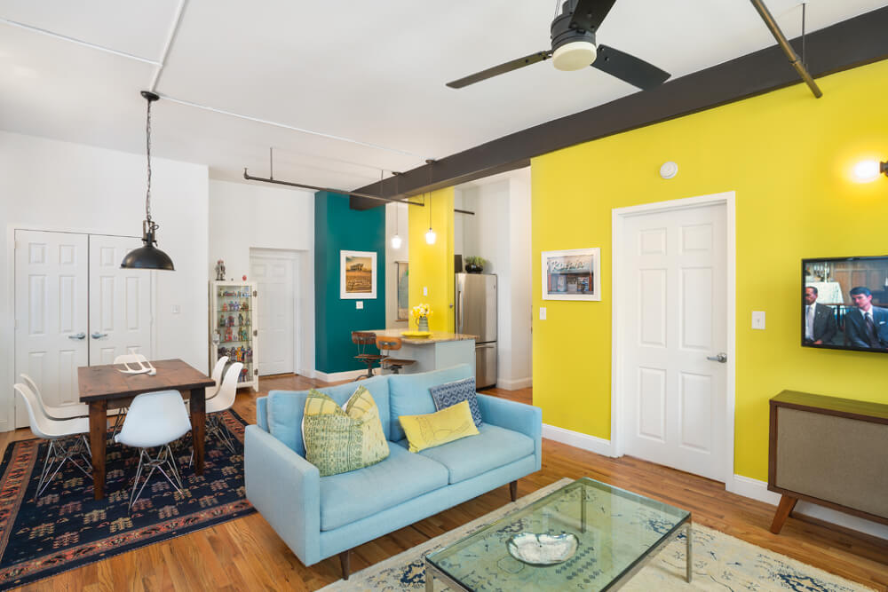
In the open living room, their designer set out to rehab the “expensive mistakes” that frustrated Erica and Donna. They focused on highly saturated paint colors and new, more comfortable furniture. The windows are such a central feature to the space; the designer restored their presence with Benjamin Moore Super White throughout the room and cleared away stuff that had accumulated on the unusually deep window sills. They also selected a central wall to saturate with yellow, anchoring the space. To further play up the industrial loft theme, a structural beam and elements of the sprinkler system were coated in a dark bronze.
Sweeten brings homeowners an exceptional renovation experience by personally matching trusted general contractors to your project, while offering expert guidance and support—at no cost to you. 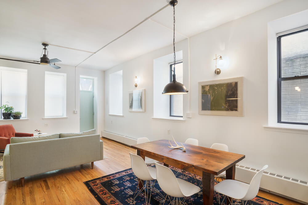
Renovate expertly with Sweeten
Erica and Donna swapped out their dining set for Eames molded chairs. The dining table, already part of their collection, reflects the couple’s love for reclaimed materials, but looks updated with the clean lines of the new chairs. The Milo Baughman coffee table is simple and uncluttered; the Saarinen side table plays up the clean and modern furniture touches – both were savvy finds on eBay.
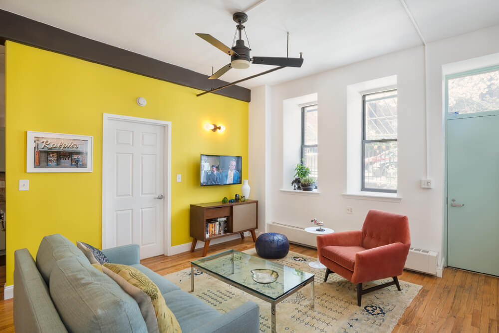
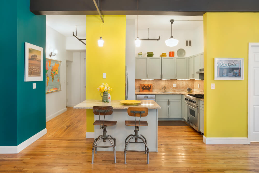
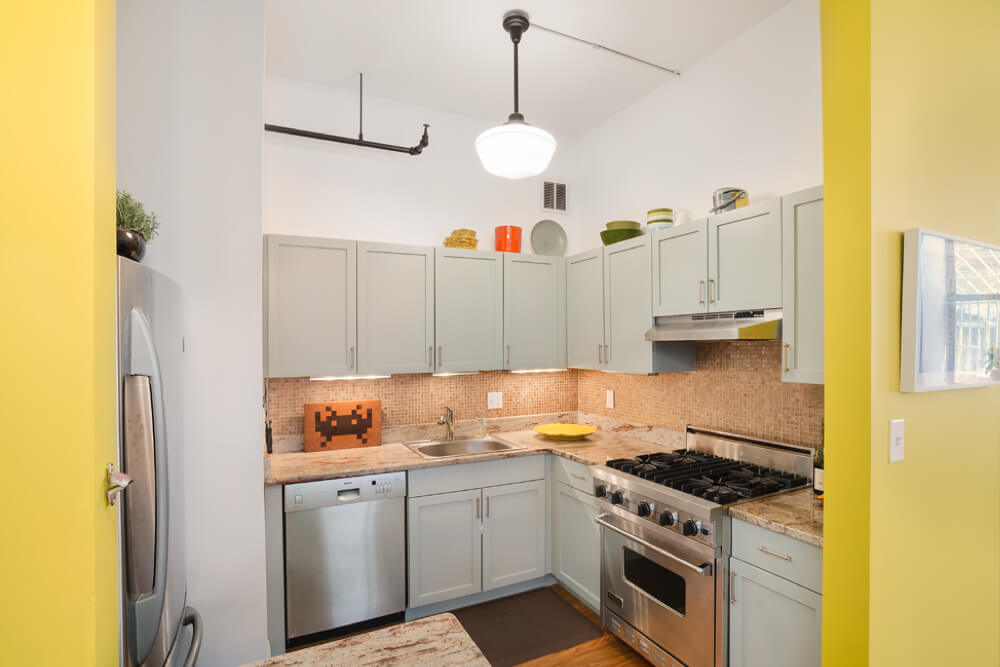
Toward the kitchen, visitors get their first glimpse of an accent wall coated in Benjamin Moore Juniper. As a standalone feature, it’s a fun addition to the yellow and white throughout the room. But, it also serves as a sneak peak into the new bedroom and ties the spaces together visually. Erica and Donna revived the old kitchen cabinets, originally finished with a faux cherry wood stain, by painting them with Farrow & Ball’s Light Blue. I love this color – it is equal parts vintage and modern, simple but playful.
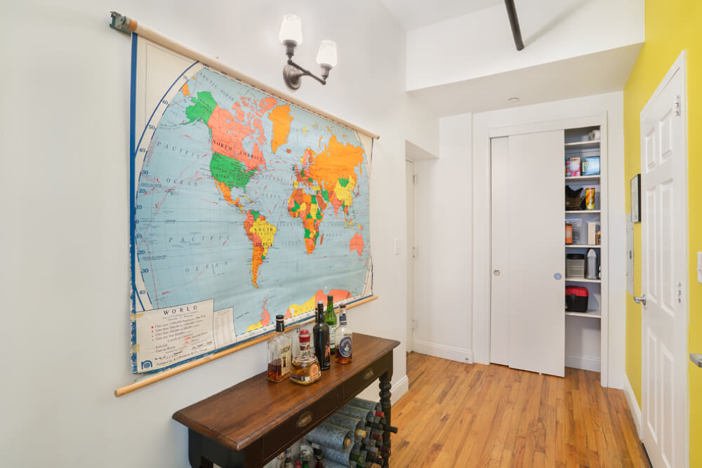
Behind the kitchen, Erica and Donna invested in creating a new closet space to help them keep stuff organized and out of sight. Working from the design, this Sweeten contractor built shelving and enclosed the closet with sliding doors and simple hardware.
So many thanks to Erica and Donna for showing us around!
Inspired by these hues? Take a look at the color recap, below, and post your project on Sweeten!
Color Recap:
Living room walls ~ Benjamin Moore Super White
Living room trim ~ Benjamin Moore Super White Satin Impervo
Bedroom accent wall ~ Benjamin Moore Venezuelan Sea
Living room accent wall ~ Benjamin Moore Citron
Hallway accent wall ~ Benjamin Moore Juniper
Structural beam ~ Benjamin Moore Midsummer Night
Cabinetry ~ Farrow & Ball Light Blue
