

A growing family needed more space from their modest cape in Pearl River, New York. Yet adding square footage was only part of the challenge. The expanded house also needed to feel connected to the home they already knew.
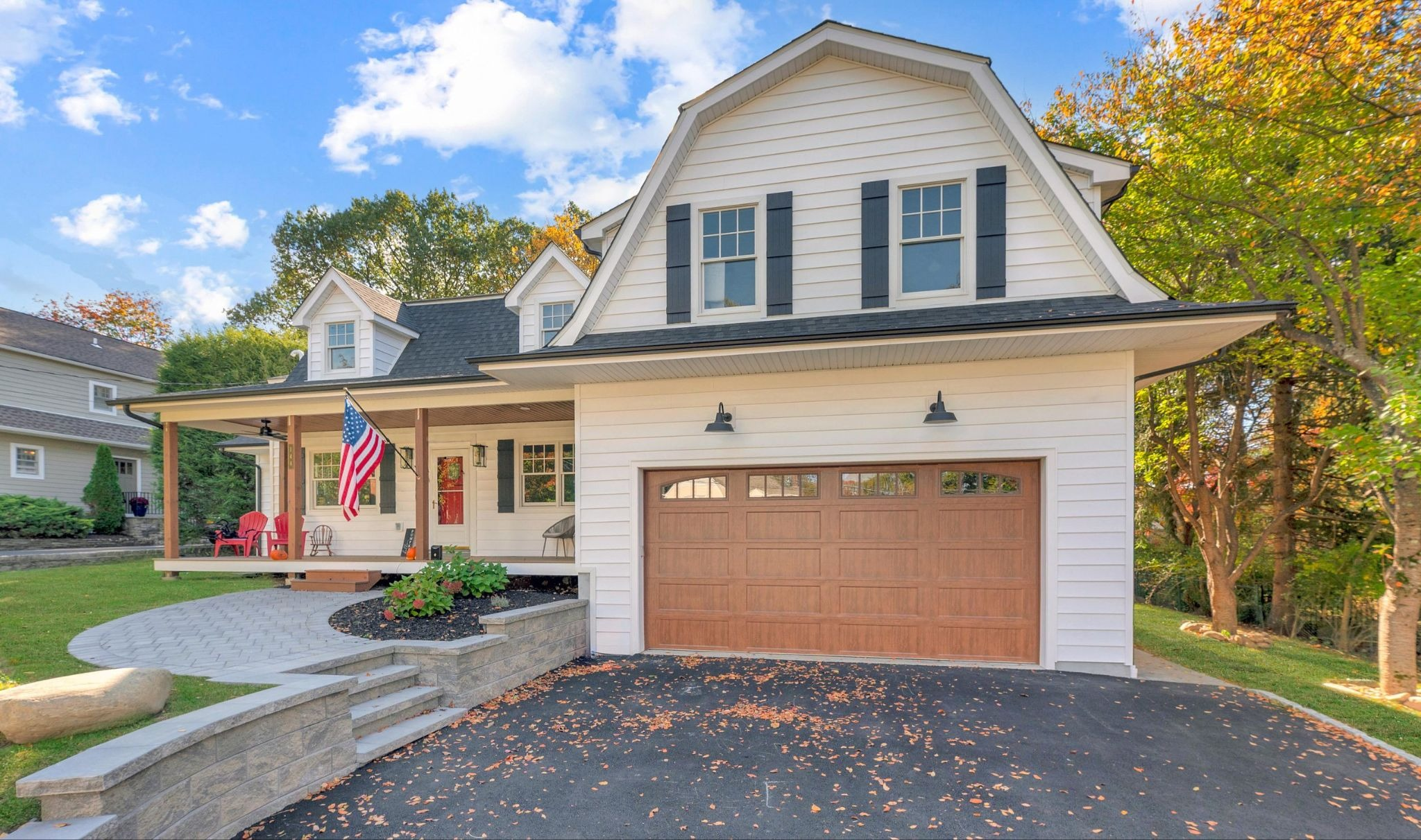
For architect Amy M. Nowak-Palmerini, AIA, LEED AP, the gambrel roof addition became the main architectural move behind the expansion. It created room for a two-car garage and private primary suite while repeating a roof shape already associated with the original cape.
Amy is the CEO and co-founding principal of ROAM Architecture. Drawing on her background in residential design, project management, and client relationships, she helped shape a 4,000-square-foot family home with a brighter first floor, a larger kitchen, a covered front porch, and more private space upstairs.
The completed home is considerably larger, but it still reads as a cape. Its repeated roof form, familiar exterior details, and connected interior spaces help the original house and new construction feel like parts of the same story.
- Homeowners: A growing family expanded and renovated their Pearl River home to create more shared living space and a private primary suite.
- Where: Pearl River, New York
- Primary renovation: A 1,500-square-foot renovation and 2,500-square-foot gambrel-roofed addition that created a 4,000-square-foot home with a two-car garage, expanded porch, connected first-floor layout, larger kitchen, and primary suite above the garage.
- Architect: Amy M. Nowak-Palmerini of ROAM Architecture, a licensed architect, LEED Accredited Professional, CEO, and co-founding principal with experience in single-family and multifamily residential design, corporate interiors, retail, healthcare, hospitality, government, and civic projects.
- Construction: Platinum Design Build Co.
- Project budget: Not provided
- Architect’s key idea: Amy expanded the house for a growing family while keeping the original cape recognizable through a repeated roof form, connected rooms, and coordinated exterior and interior details.
Bringing a broad perspective to residential design
Amy’s approach to residential architecture comes from a career that has included many types of buildings and interiors. She earned a Bachelor of Architecture and a Master of Science in Management from the New Jersey Institute of Technology in 1998.
She began her career at a small New York City architecture firm, where she worked on corporate interiors. That experience taught her about the many sides of an architectural project, including planning, coordination, and building strong relationships with clients.
Amy later worked at firms in Rockland County, New York, and Bergen County, New Jersey. Her projects included retail, multifamily, and single-family residential work, healthcare spaces, and hospitality settings. More recently, she has also focused on government and civic buildings.
That range gives her a practical view of design. A house must look considered, of course, but it also needs a clear plan, comfortable circulation, and spaces that suit the people living there.
Amy is licensed in New York, New Jersey, and Massachusetts. She became a LEED Accredited Professional in 2009, reflecting an ongoing commitment to sustainable design. Her attention to detail and varied background have contributed to hundreds of completed projects over her career.
A modest cape needed space for a growing family
The original home was a modest gambrel cape on a tree-lined street in Rockland County. As the family grew, they wanted more room for shared time, everyday routines, and a private primary suite.
The project renovated 1,500 square feet of the existing house and added another 2,500 square feet. Together, the work brought the finished home to 4,000 square feet.
An expansion of that size changes more than a floor plan. It also affects the roofline, exterior proportions, entrance, circulation, and the way old and new rooms meet.
Those pieces had to be considered as one connected project. The goal was to give the family significantly more space without setting aside the character that made the original cape feel familiar.
Connecting the gambrel roof addition to the original home
The new two-car garage and upper level introduced a large volume beside the original house. Without a clear visual connection, that new section could have appeared separate from the cape.
The addition uses a gambrel roof to create that connection. Repeating the familiar roof shape gives the original house and new construction a shared architectural feature, even though the finished home has a much larger footprint.
White horizontal siding, dark shutters, divided-light windows, and similar proportions add continuity. These familiar details allow the addition to feel related to the original architecture without hiding the fact that the house has changed.
The warmer exterior elements keep the mostly white facade from feeling plain. A wood-toned garage door and porch ceiling introduce contrast, while the revised roofline gives the front elevation a stronger sense of balance.
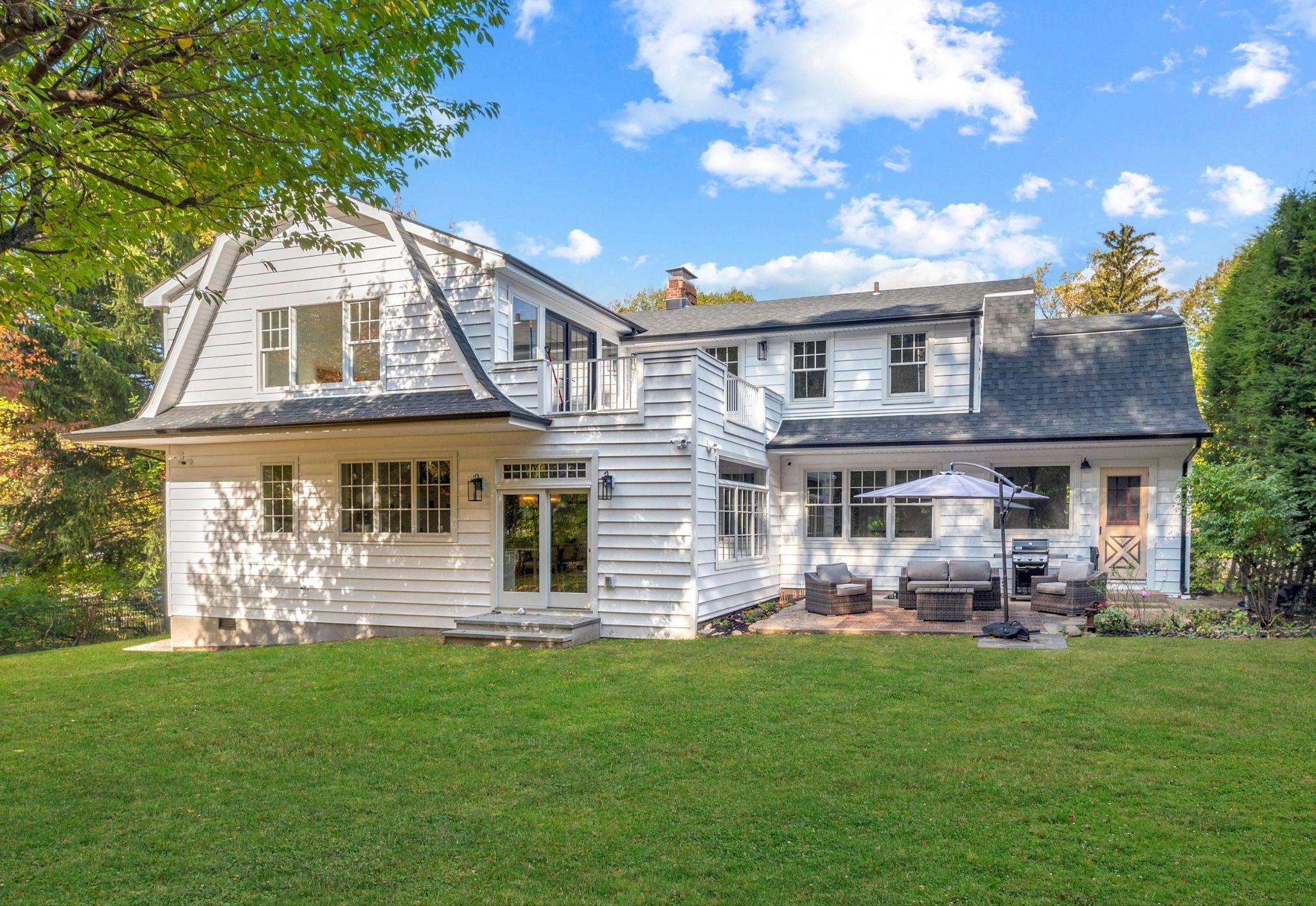
The rear view reveals the scale of the expansion more clearly. From this angle, readers can see how the new gambrel volume meets the original house and how the different rooflines relate to one another.
The expanded porch creates a clearer arrival
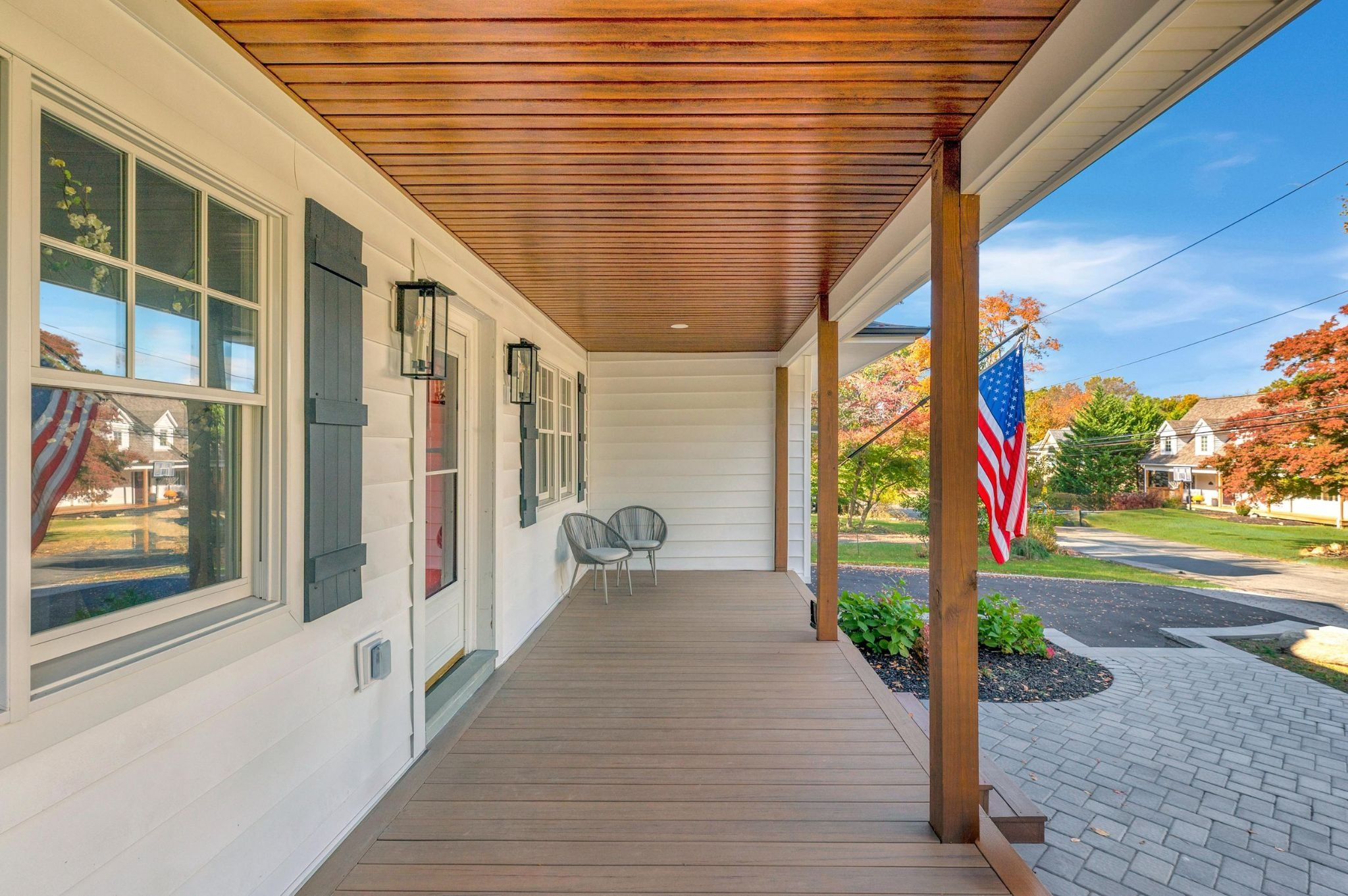
Before the renovation, the house had a much smaller entrance with limited coverage. The new porch stretches across more of the front elevation and continues toward the garage.
This longer covered area creates a clearer path between the driveway, garage, and front door. It also helps visually connect two sections of the house that might otherwise feel far apart.
The wood-toned ceiling adds warmth against the white siding. It also draws attention toward the entrance and gives the broad front elevation more depth.
The porch is a practical part of coming home, but it also improves the overall composition. That balance reflects Amy’s ability to consider everyday needs alongside the appearance of the finished house.
Opening up the first floor while keeping each area distinct
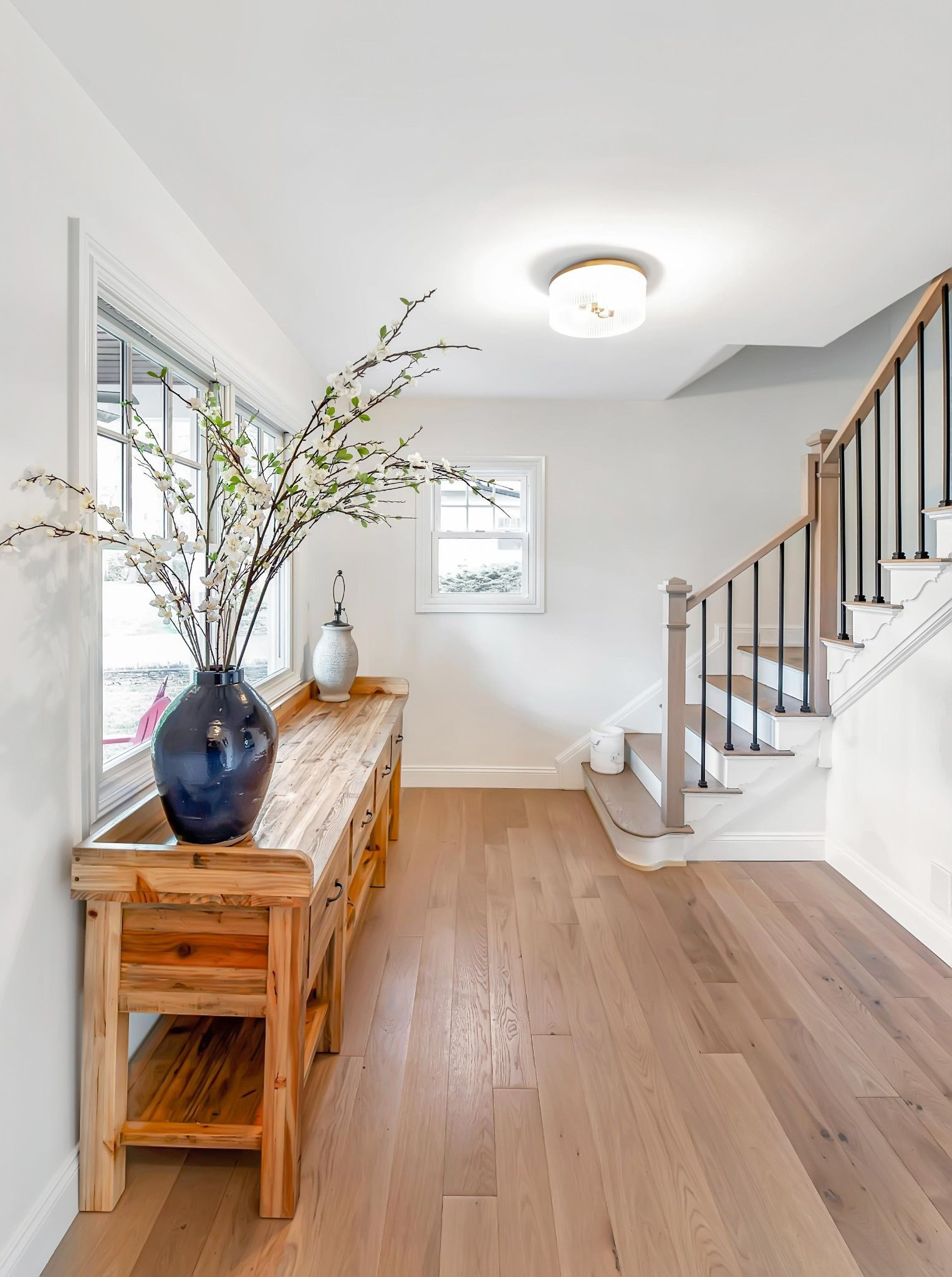
Inside, the renovation focused on improving the relationships between rooms. Selected walls were opened, and previously separated spaces were reconnected so light and movement could travel more easily through the first floor.
The entry, kitchen, dining, living, and work areas now relate more directly to one another. Still, the house does not feel like one large room without boundaries. Each area has a recognizable purpose.
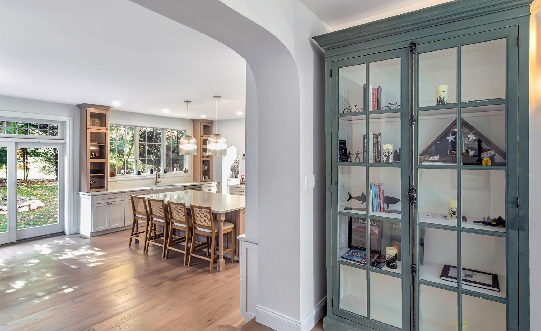
The arched opening is a good example. It provides a generous view toward the kitchen while preserving a sense of transition between rooms.
The renewed entrance and staircase also support the new layout. Light wood flooring continues through the surrounding spaces, while black balusters and a wood handrail give the stairs definition without making the entry feel closed in.
Amy’s early work in corporate interiors adds useful context here. Circulation, sightlines, and the way one space leads into the next matter in many building types. In this home, those same considerations help the first floor feel open without losing structure.
A larger kitchen becomes the center of the first floor

ROAM Architecture describes the original kitchen as small and uninviting. After the renovation, the kitchen became a generous gathering place at the center of the main level.
A large island provides room for preparing food, pulling up a seat, and spending casual time together. It also helps organize movement between the sink, range, refrigerator, surrounding storage, and nearby rooms.
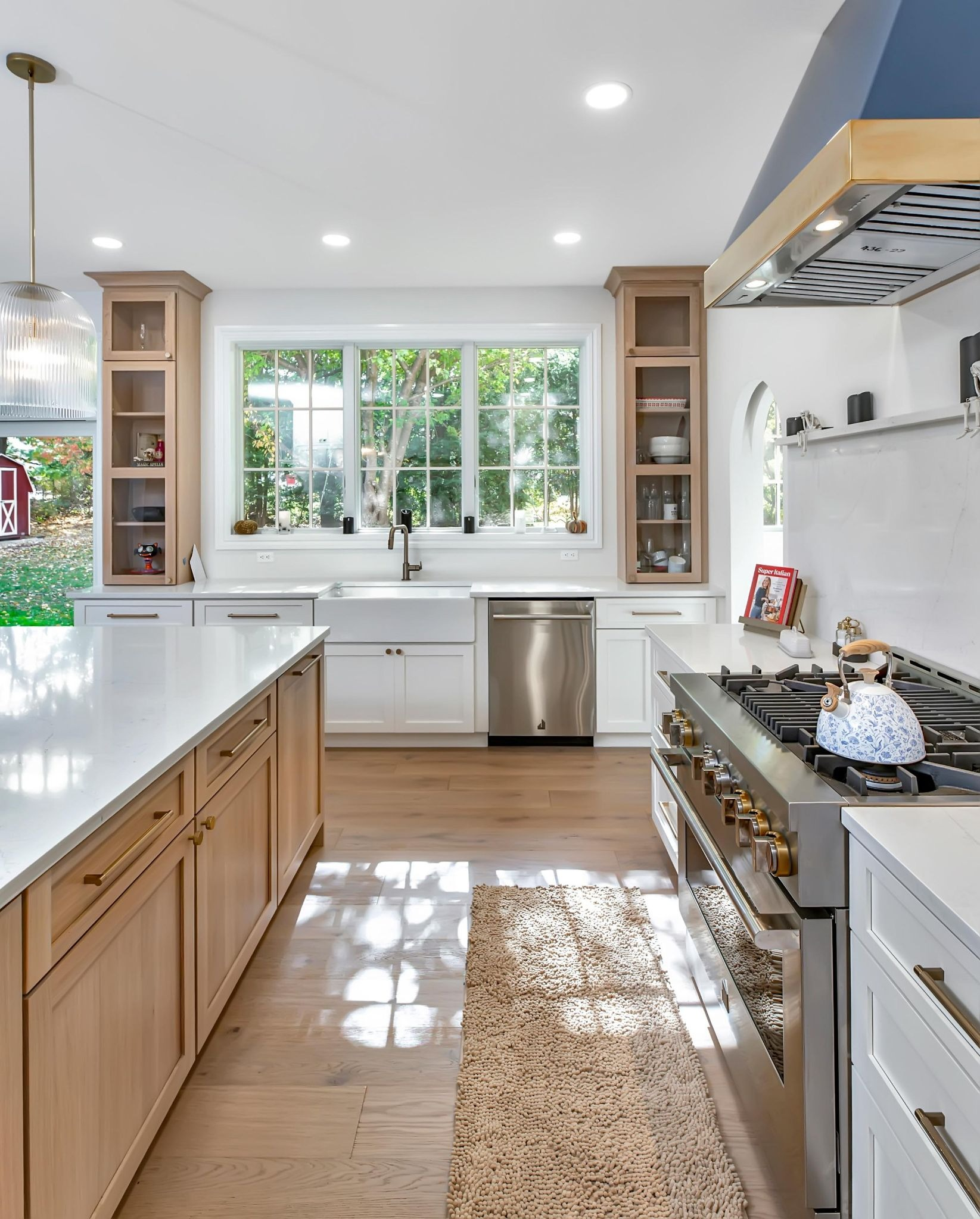
Wide windows around the sink bring plenty of natural light into the kitchen. Because the room now connects more openly with the rest of the floor, that light can reach into adjoining areas.
The kitchen feels spacious, but its layout remains clear. The island marks the center, while the perimeter cabinets define the cooking, cleaning, and storage zones.
There are many pieces to coordinate in a kitchen, from circulation and cabinetry to lighting, appliances, plumbing, and seating. Amy’s project management background provides useful context for the detailed coordination involved.
Color and materials bring warmth to the interior
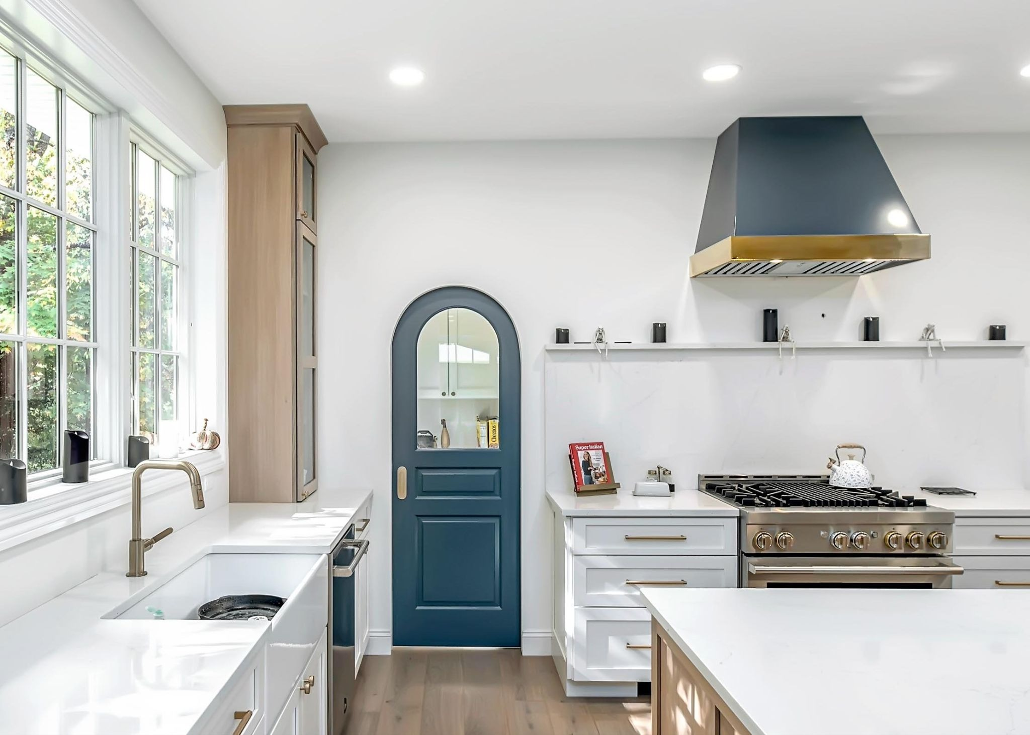
The first floor uses a relaxed mix of white, natural wood, deep blue, and brass-toned accents. Rather than repeating one finish everywhere, the kitchen combines lighter surfaces with warmer and darker details.
White perimeter cabinets keep the room bright. The wood-toned island adds warmth at the center and stands apart from the surrounding storage without feeling out of place.
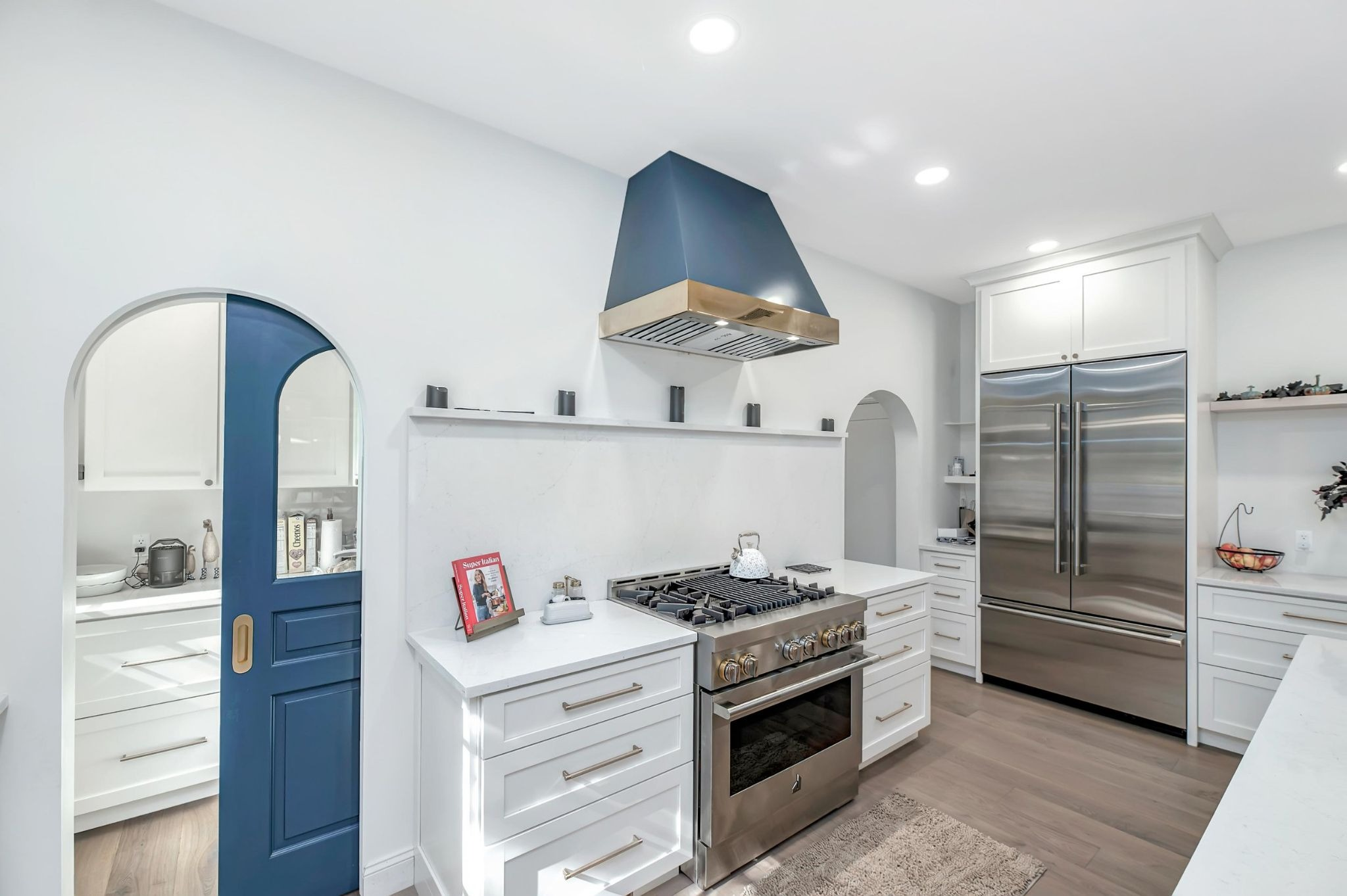
Deep blue appears on the range hood, arched door, and built-in cabinetry. Using the color in a few selected areas creates a visual thread without allowing it to dominate the room.
Brass-toned hardware and range details introduce smaller warm accents. Above the range, a narrow ledge creates room for a few objects without filling the wall with more cabinets.

Light wood flooring continues beyond the kitchen into adjoining areas. This repeated surface helps connect the first-floor rooms, while the mix of colors gives each part of the kitchen its own character.
ROAM Architecture does not identify the cabinet manufacturer, wood species, countertop material, tile brand, appliance models, or paint colors on the project page. Those details should be confirmed with Amy before specific brands or products are included in the published story.
A primary suite adds privacy above the garage

The gambrel roof addition also created room for a private primary suite above the new garage. This placement allowed the project to add practical space downstairs and a quiet bedroom and bathroom upstairs within the same new volume.
Windows on more than one side bring light into the bedroom. Glazed doors add another outdoor-facing connection, while neutral walls and light wood flooring keep the room calm.
Positioning the suite above the garage gives the homeowners some separation from the busier shared spaces on the first floor. At the same time, it remains part of the home’s main plan rather than feeling like a disconnected wing.
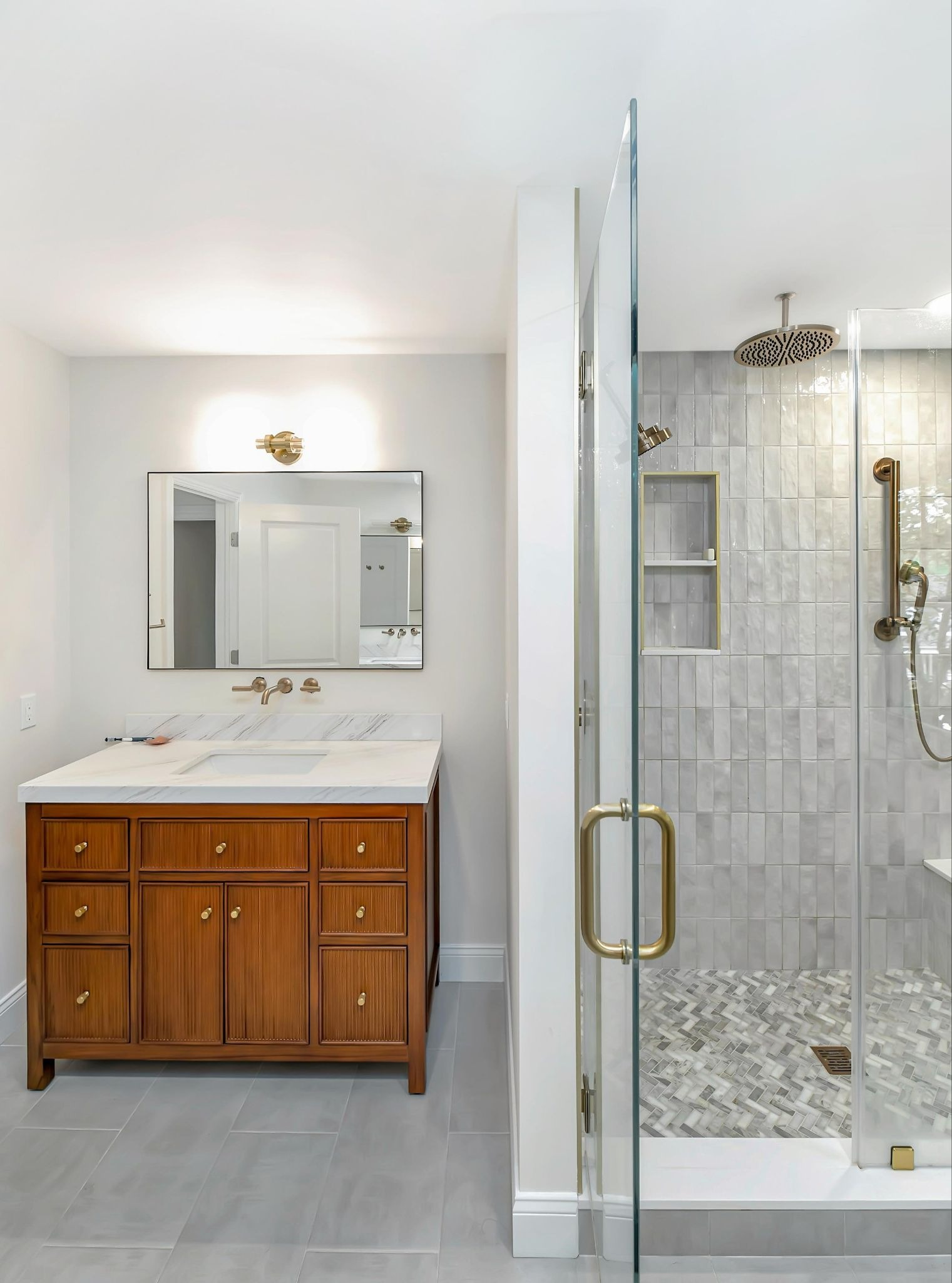
The adjoining bathroom continues the interior’s light, warm palette. A wood vanity introduces natural color, while pale tile and a clear glass shower enclosure keep the room feeling open.
This part of the project shows how the addition addressed several needs together. It created parking, more upper-level space, and a private area for the homeowners without placing those features in unrelated parts of the house.
A larger home shaped by careful planning
The completed house is much larger than the modest cape that came before it. It now includes a two-car garage, a primary suite, an expanded porch, a more connected first floor, and a kitchen designed for gathering.
Still, the project does not leave the original home’s identity behind. The repeated gambrel form links the addition to the cape, while the siding, shutters, windows, and exterior proportions create continuity across the front elevation.
Inside, the new layout supports easier movement and brings more light between rooms. The kitchen connects with the surrounding spaces but still feels like its own room. Upstairs, the primary suite offers privacy away from the activity below.
Amy’s broad architectural background appears in that balance. Large planning decisions, such as the placement of the garage and upper-level suite, work alongside smaller connections in the porch, openings, colors, and finishes.
Through ROAM Architecture, Amy helped shape a home that suits the family’s current needs while remaining connected to the familiar look of a Pearl River cape. The gambrel-style addition gave the house room to grow without asking it to become something entirely different.
Renovation materials
Exact brands and product specifications were not provided on the ROAM Architecture project page. Materials and finishes visible in the completed photography include:
- White horizontal exterior siding
- Dark roof shingles and shutters
- Warm wood-toned garage door
- Wood-toned porch ceiling and decking
- Light wood interior flooring
- Black stair balusters with a wood handrail
- White kitchen perimeter cabinetry
- Wood-toned kitchen island cabinetry
- Deep blue range hood
- Deep blue arched door
- Deep blue built-in cabinetry
- Light-colored kitchen countertops and backsplash
- Brass-toned kitchen hardware and range details
- Wood bathroom vanity
- Brass-toned bathroom fixtures
- Light gray bathroom floor and shower tile
- Clear glass shower enclosure
